Mitchell and I happened into an exhibit the other night and the subject matter stirred discussion between us. No, it was not some wildly controversial political statement or sexually explicit subject; the subject matter was Portland’s street scenes. The exhibit bothered me, got under my skin, and I couldn’t shake it off. I guess art should bother people too? Yesh.
As we drove back to the studio I could not let go of it, under the Steel Bridge and I saw the homeless sleeping, toward the I-5 and saw the sunset beyond and through the I-5 freeway, graceful as it crosses the Willamette.
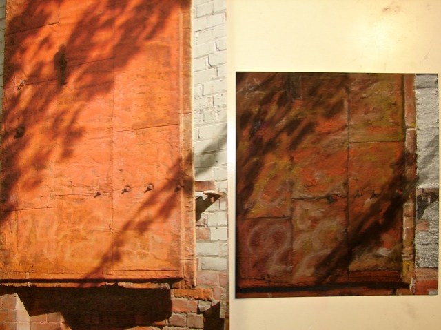
The artist was X (name changed, as potentially dissing the artist is not the point), and s/he painted Portland’s city streets — literally, the images focus on streets, rather than bridges or shops along the way or houses or flowers or any urban scene. . .
I looked at the images but was not drawn to them, though they are well executed. I wanted to find them interesting. In this exhibit (and all the work of this artist is not like this) they all looked like vast expanses of grey asphalt with a slightly different grey sky. Of them all I liked the one that could have been NW Portland in the rain at twilight, where the rain-soaked streets become a lively blue reflection; I’ve seen that street, those raindrops, and I love them. In fact, the two very wet reflective paintings moved me.
I wanted to post the artist’s statement, but you can find the artist with the statement. S/he said s/he was captivated by the streets, and strove to create a startling awareness of catching beauty in these things..
Maybe it is because I grew up part of my life with miles of grey streets, but I did not see the beauty in these scenes. I did not find the fascination with grey streets and changing grey skies. Maybe it was because the artist failed to connect me with the fascination and beauty of actual streets (not neighborhoods) in Portland. I find close up details of the urban-scape fascinating and beautiful: manhole covers, big tires, gate details, bricks, peeling paint, asphalt close-up, modern ruins. But expanses of grey undetailed asphalt with lines drawn down the middle, pastel cars on those streets, and a grey sky did not move me. So the question Mitchell and I discussed was, is the subject important or is it the artist not moving me?
I find Portland doesn’t have a lot of grey skies, which is why I like living here — the skies change so often, not like Seattle, which really is a very grey city, sky-wise. The Portland I see most days is raining HARD; or the clouds are moving moving fast as can be, puffy grey mixed with heavy grey and moving moving; or there is one side where the sky is grey and the other where it is blue and there is a rainbow in between; or it is clear blue and hot.
I kept wanting to know why, REALLY, s/he painted pale grey streets, cars, and the blandest of skies. Did she miss her home and was she trying to love Portland? My discussion with Mitchell centered on whether it was the subject or the artist that was the issue.
What do you think? Do subject’s matter when you look at a painting?

I am now agreeing to the Creative Commons Attribution-Non-Commercial 4.0 International License, which you can learn more about by visiting the site, or, visit my web page for a more user-friendly summary on my terms. My images/blog posts can be reposted; please link back to dkatiepowellart.
0.000000
0.000000
I'd love it if you shared this; please mention my blog name!


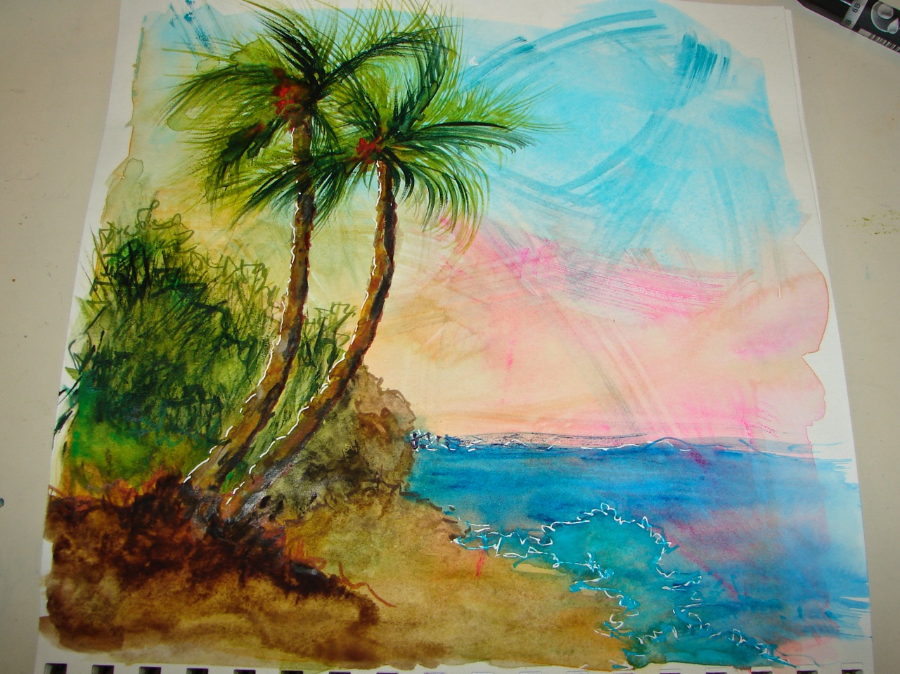
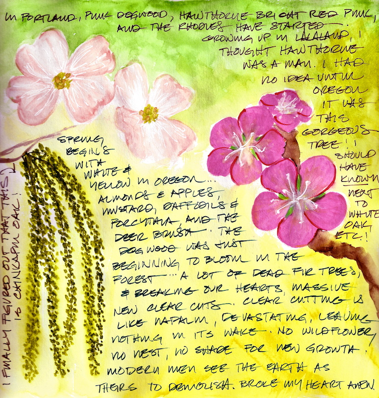
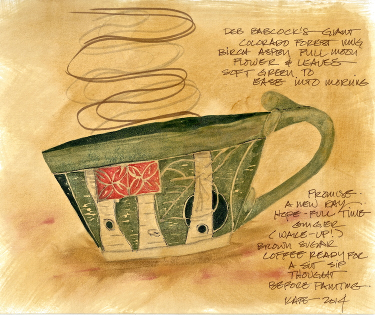
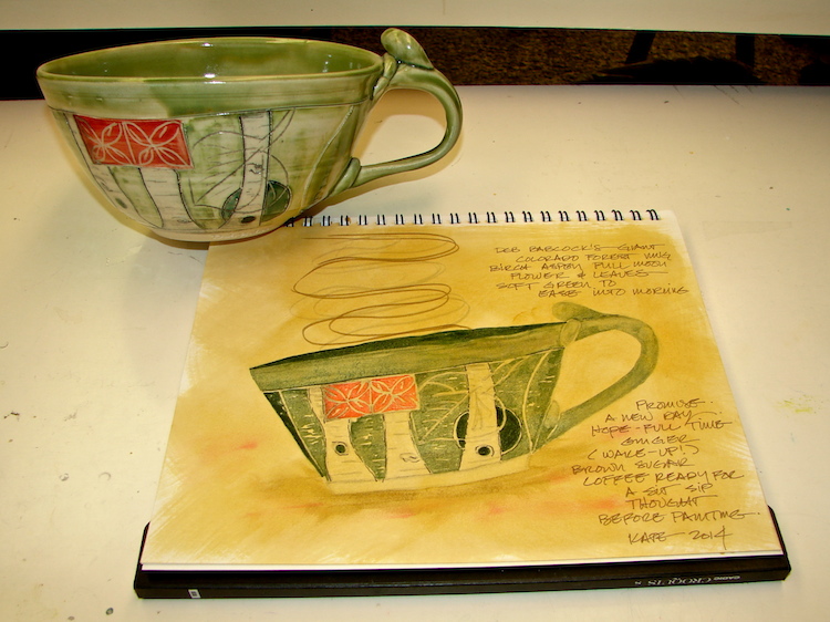
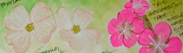 “As an acrylic artist I almost never used white except under other colors to pop them. But as a water-colorist I have reached for white a few times, and I am using an old Sakura Chinese white right now until it is all used up. I am still not sure I will use white; I’m not a pastel-pale kinda-gal! I have enjoyed playing with the whites as I paint spring flowers, but doubt I will continue in this vein — it is just not me.” That is what I wrote in my journal before I mixed the Chinese white with my colors.
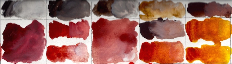
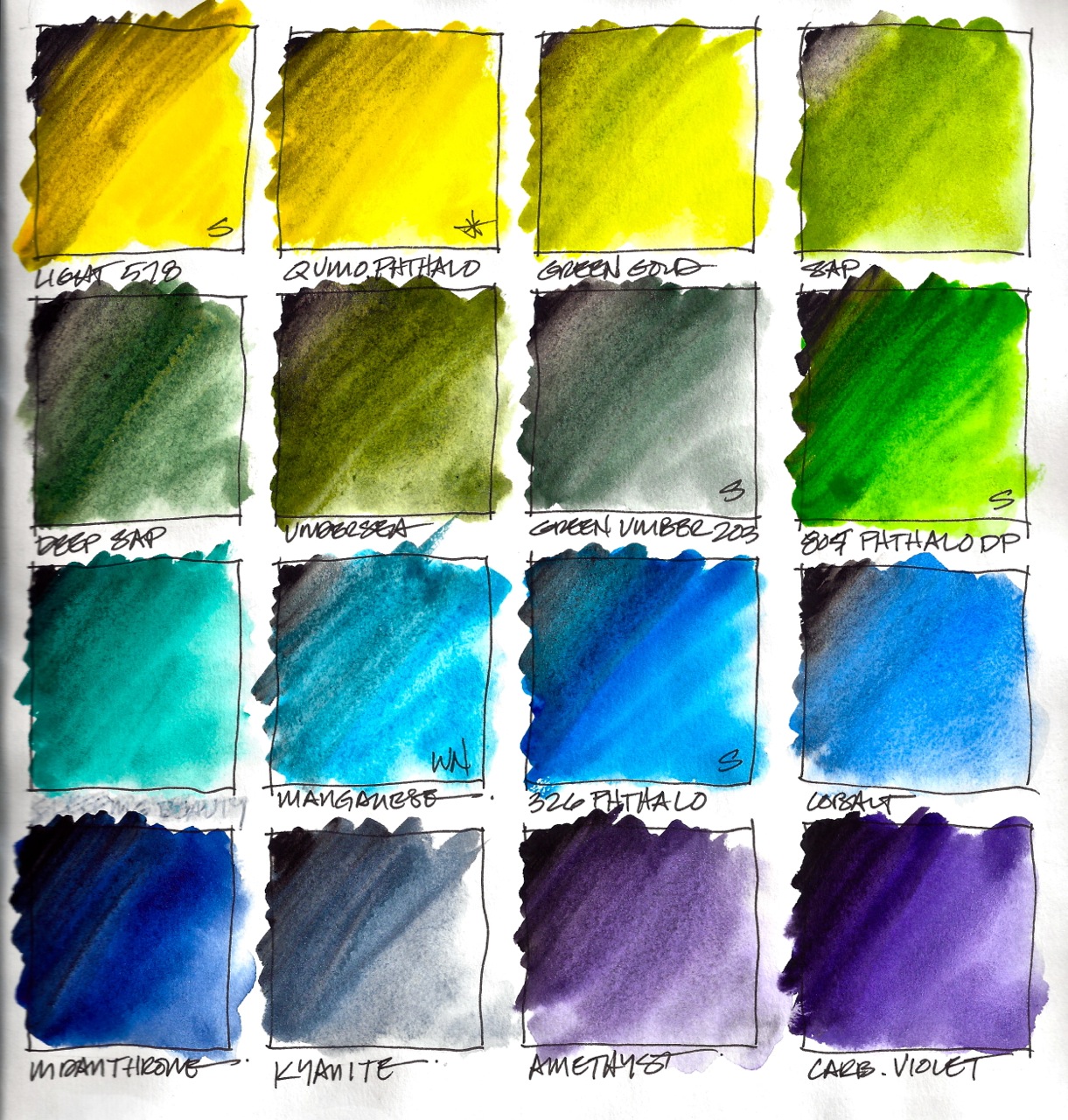
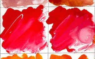 Anthraq Scarlet and Organic Vermillon, yummy
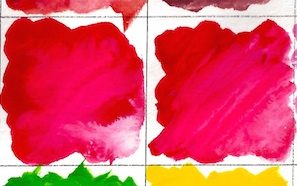 Quinacridone Coral and Quinacridone Red (Sennelier), yummy again
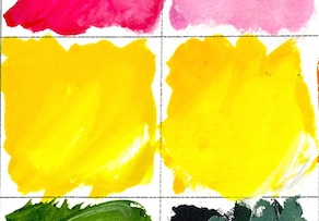 Light Yellow 578 (Sennelier) and Quinophthalo Yellow


 Building from
 New color paints are the yummiest, and my new clean watercolors all moist from a spray call to me.
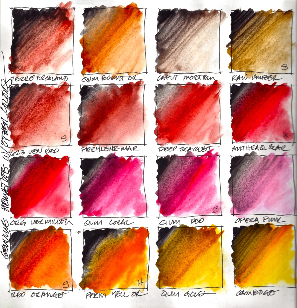


 This color has an approximate wavelength of 605 nm.”


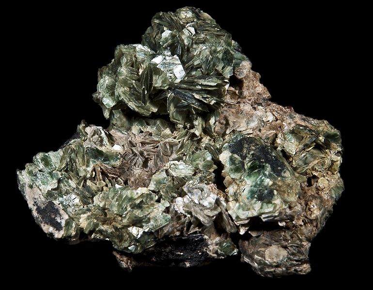
 Xanthophyll is the yellow pigments that brings many of the images on this page together: it is responsible for the egg-yolk yellow color in leaf pigments. Their structure is similar to carotenes, as in beta-carotenes, found in carrots, and responsible for the color orange.