
 The Washington State Campus is the home of the
State Legislative and Justice offices, and all the other
offices and libraries that are pertinent to
the State of Washington.

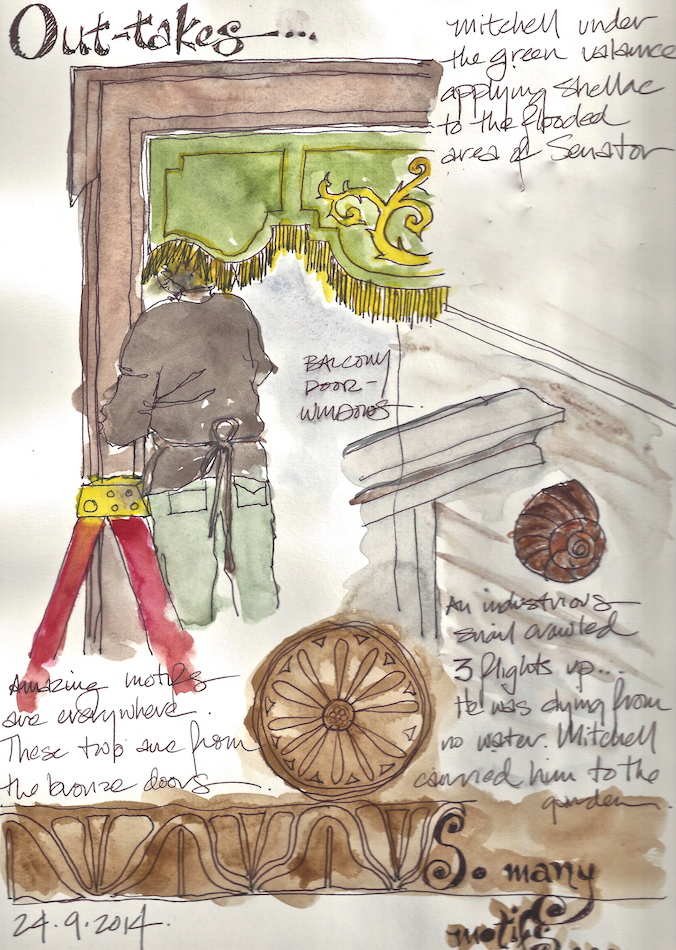
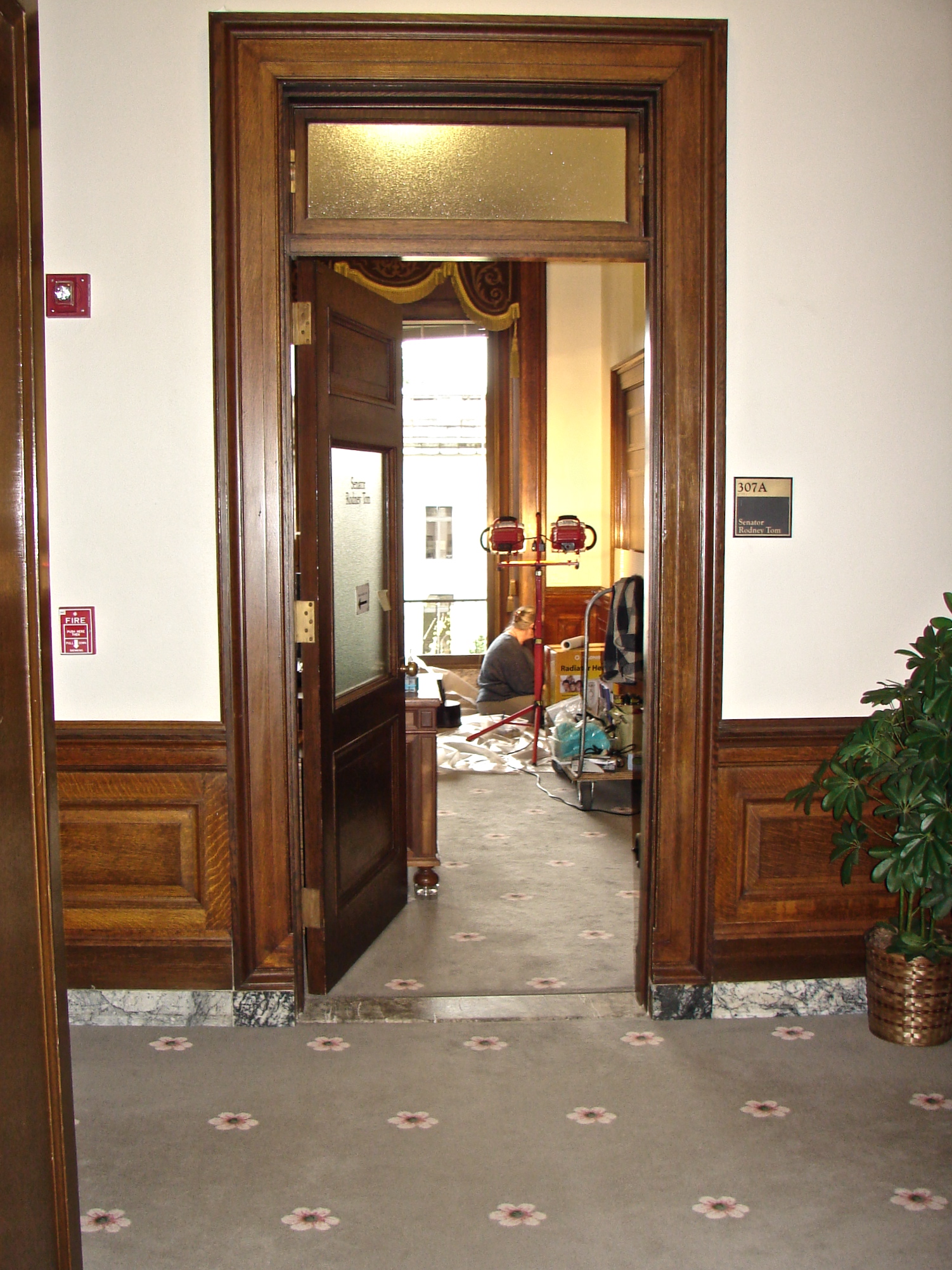
We were on location for off and on for weeks treating the walls of two State Senator’s offices in the Washington State Legislative Building. Because I sketched so many sketches on my down time (waiting for employees, shellac or for Mitchell, minutes stolen here and there) in the most beautiful buildings, I decided to dedicate a page to them. There will be more, as we love the buildings and we will visit again.
Most were sketched on site and painted in the studio.
(Watercolors in the buildings are not advised! I didn’t ask!)
These are my sketches and memories exploring the Capitol, not finished paintings.
Also, I had switched from a lifelong love of acrylics to watercolors,
so was learning as I went — what sketchbooks are for!
It is a time when I switched from throwaway pens to fountain pens, yay!
I was often unhappy with the watercolors added, but posted anyways!
By the end of this time I was feeling comfortable with the medium, if not proficient.
Note: Areas were obscured if in my sketchbook they included a name of a person.
At the Capitol
We’ve been working to the point where I’ve had little time to paint or
even sketch, however, we’ve been in a place I wanted to sketch:
we’ve been repairing historic shellac on the wainscot of two offices in the Legislative Building in the Washington State Capitol complex.
 I had two opportunities to sketch
last weekend — about twenty minutes each.
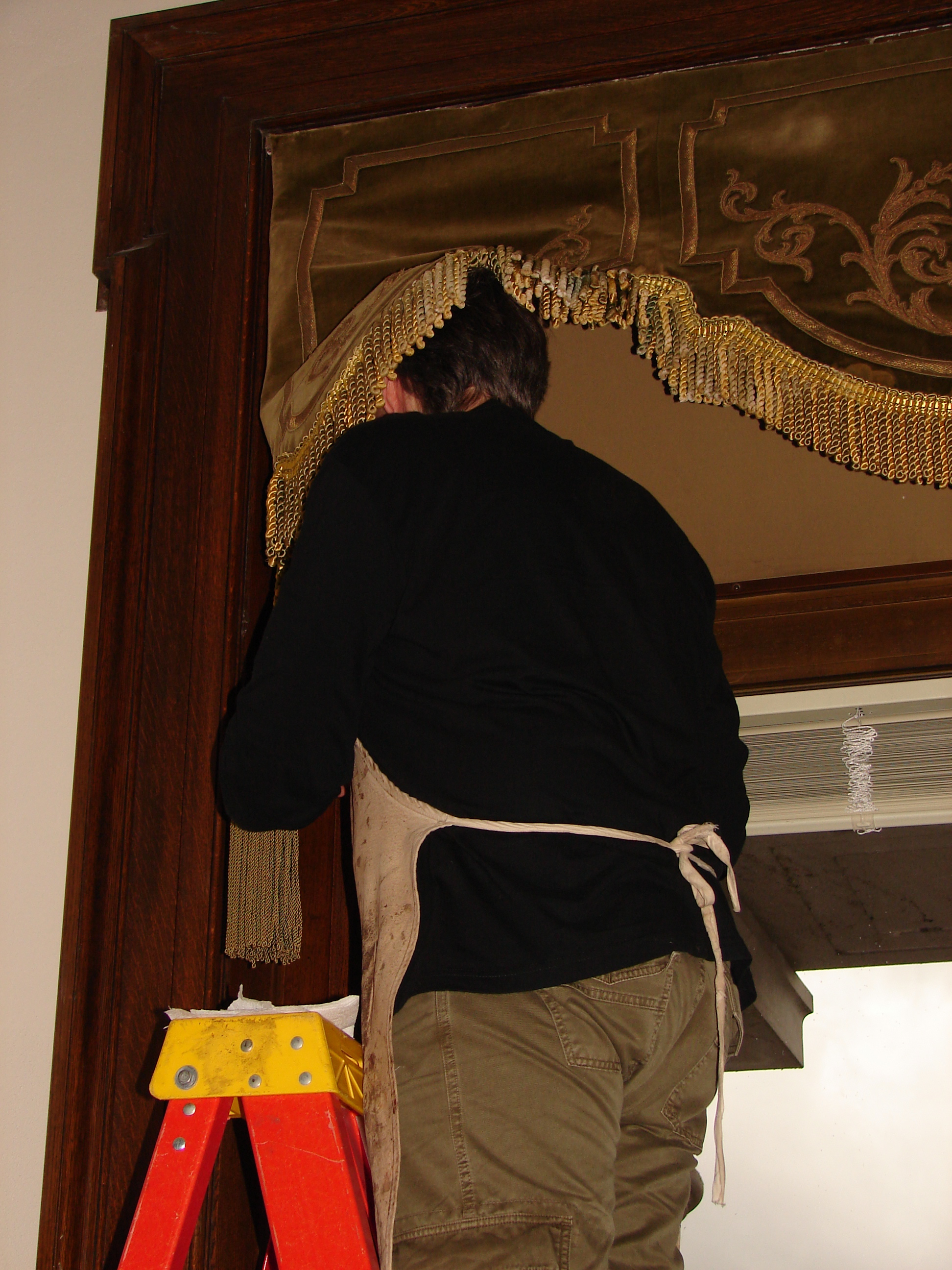
Mitchell’s ladder was blocking the
wainscoting I needed to repair;
I took advantage and sketched him on the ladder.
I took images in order to add
watercolor back in the studio; I didn’t dare
attempt watercolors in the Senate area


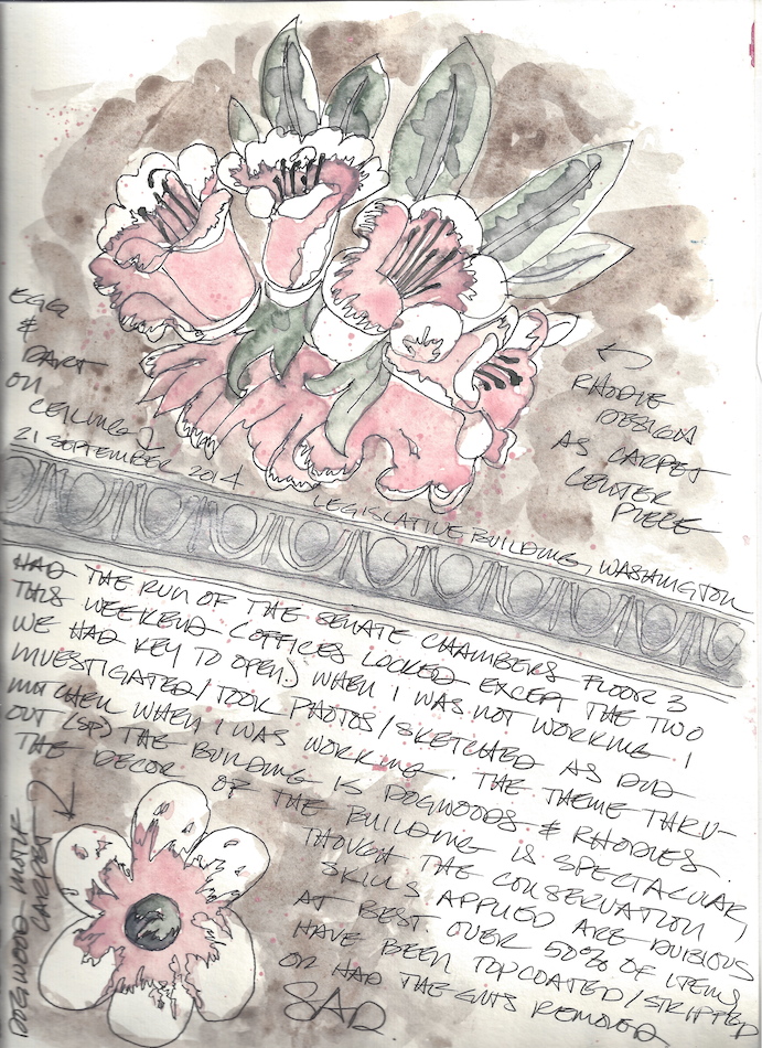
 The carpets are so beautiful:
Rhododendrons and Dogwoods.
Dogwoods are one of my favorite flowers;
they remind me of my grandma.
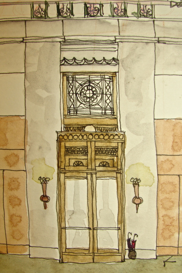
The details in the doors, ceilings
and lamps are amazing.
I’ve not seen such a beautiful building in a long time. Graceful and tasteful, just enough glitz!
Mitchell caught me working
in the senator’s office.
 Drawn in an Stillman & Birn Delta journal
with a Brown-Black Uni-ball pen and watercolors.
Urban Sketching at Capitol Park
Last Saturday we infilled missing color to the historic shellac. It is one of the few times when Mitchell had time to play a bit more than I did, and he took great images of the details around the Legislative Building (which I will paint!) On our way out we took a drive to Capitol Park, a lovely park below the Washington State Capitol. I had just enough time to paint the Capitol on an early autumn day before heading back home.
 The first time through I sketched then laid in color, above.
The second watercolor I simply dropped colors quickly.
I have my favorite of the two — do you?
 Drawn in an Stillman & Birn Delta journal
with a Brown-Black Uni-ball pen and Daniel Smith / QoR watercolors.
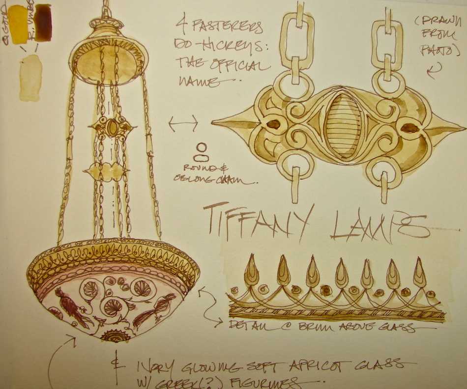
Tiffany Chandeliers South Entrance
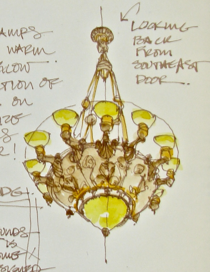 The chandeliers are a crowning point in the Washington State Capitol Legislative Building. The architects felt the most important fixtures were those in the north portico, in the rotunda, and in the entry in the south porte cochere, as well as the large gathering rooms. They went all the way to New York City to have Louis Comfort Tiffany create the fixtures (no one here in this wild wild west was competent), which, along with the six bronze doors, cost the state $158,000. They were designed by Carl Moser.
 I love the chandeliers in the entry in the South Porte Cochere.
The warm glow of the glass hits the delicately detailed bronze and
colors it nearly copper in places, so the lamps look like they are on fire.


 I started with sketches to understand the construction.
I didn’t lie on my back to sketch the underside because my architectural training allows me to see in plan anything I look at — building plans, drawings of the cars I sit in, etc.
I am glad, because I really would have looked ridiculous sprawled on the stairs.
This is so helpful, to look and do some sketches that allow you to see, in this case,
the twelve knobby “arms” that attach to the bowl with a decorative shell motif,
and look much like hand-held candle torchéres. Or the hanging mechanism,
which consists of chains hanging from a pendulum to four medallions before opening
and attaching inside the fixture, so they do not mar the exterior decorative bowl.
I was able to draw it from the side because the second floor balcony looks
straight into the light, and you are also closer to the fixtures.


I cheated when it came to the details. I took a close-up and sketched at home.
I wanted to be able to see the sweet floral designs that I only hinted at
(because it is so far away) in the two side views. The bottom band, just above the large glass lamp at the base, has the teeny tiny egg-and-dart motif found everywhere.
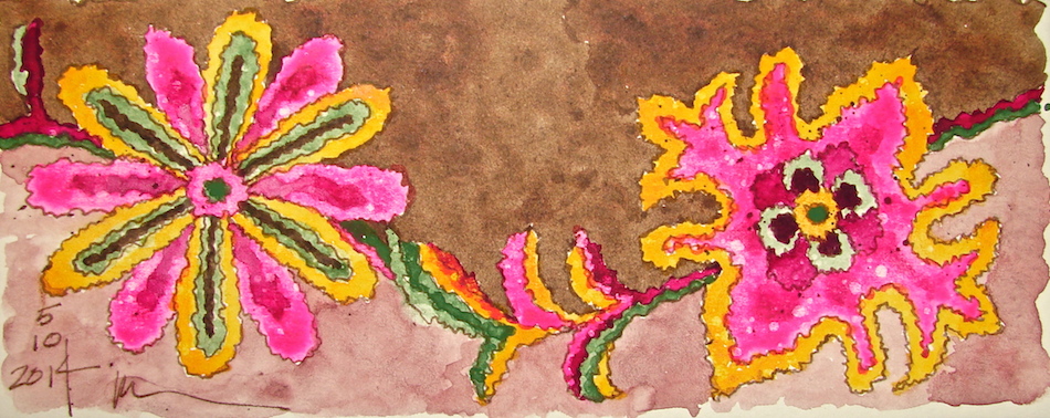
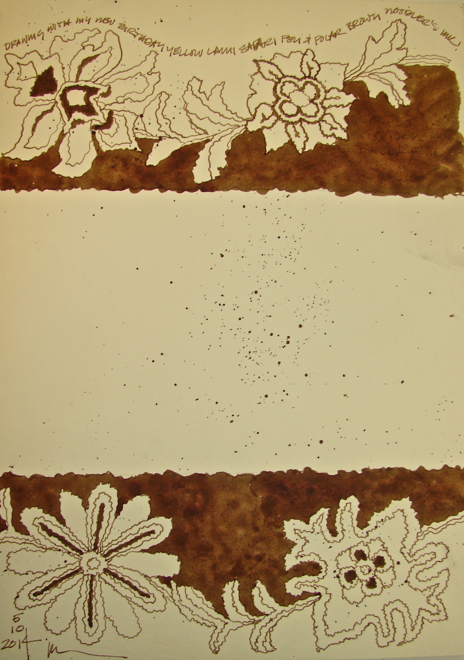
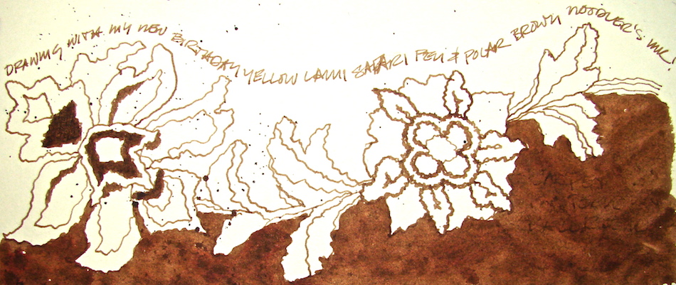
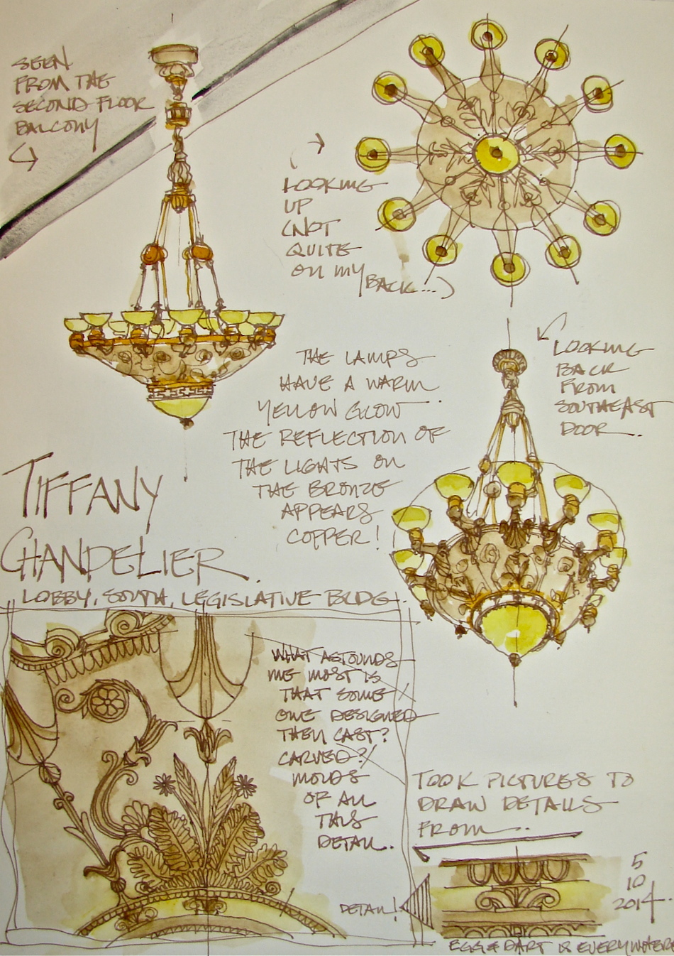 All drawn in an Stillman & Birn Delta journal (rich ivory paper)
with a Lamy Safari pen, a Pilot Preppie pen, Polar Brown Noodlers ink.
I added color with raw umber from Sennelier, quinophthalone yellow from
Daniel Smith and nickel azo yellow QoR watercolors.
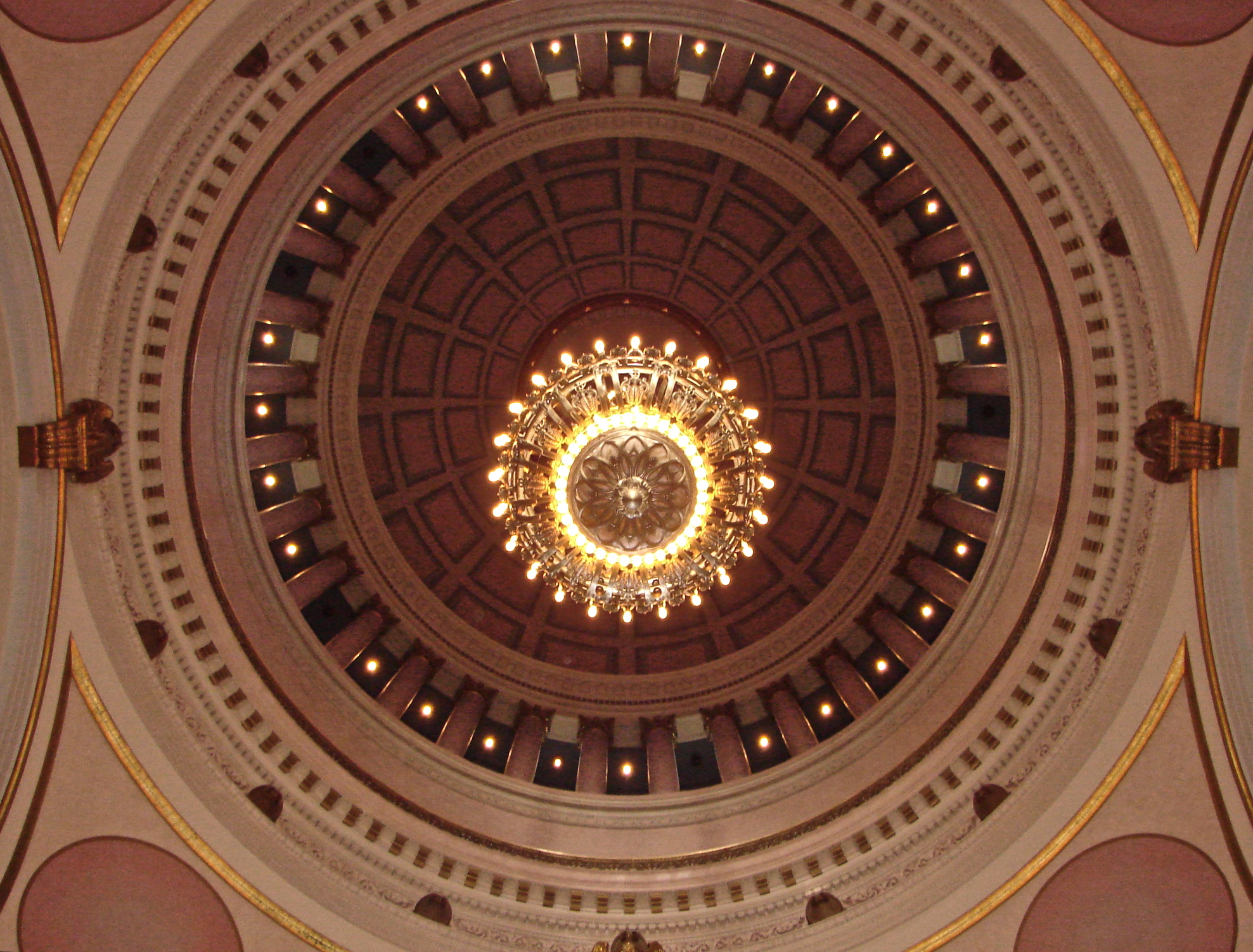
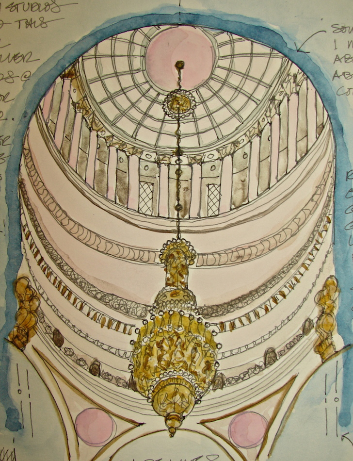
The Rotunda

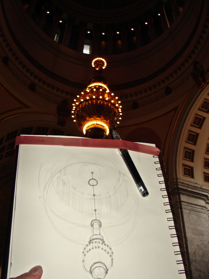 This week at the Washington State Legislative
Building I had a good deal of free time, as it was Mitchell doing the lion’s share of the work on the Senator’s offices. In the middle of a dark downpour, (the building was dark inside) I sketched all over the building.
I started in the Rotunda, with the beautiful dome overhead and the Tiffany chandelier, because it thoroughly intimidated me. I figured if I was able to do even a halfway decent drawing, I could do anything! The steps were cold, and people came to look over my shoulder and talk to me, more than normal.
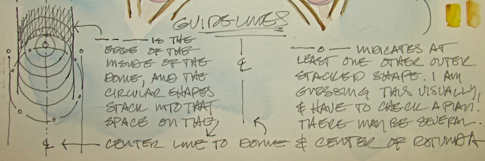
I began by understanding the geometry of what I was drawing, which I think is even more important in symmetrical buildings. If a building is wonky to begin with, then your mistakes may not be noticeable. With formal symmetry, if things are off they jump out at you. I did a pencil sketch roughly like the drawing below (the underlines were eventually erased), understanding that the dome was going to be a series of stacking circles along the center line of the drop of the chandelier, except many would be cut off from view. There were several other circles stacking on the center line which correlated to the circular balcony at the top of the dome (I MUST find a way to get up there sometime). As we reached the area where the cruciform plan of the rotunda reached out under arches in four directions, I would let the drawing go, so as not to make it too complicated.
Even with all the planning, I lost about three feet in the dome structure. Next time!
After the geometric guidelines, I began inking in stages, building definition and detail.
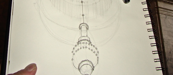


The chandelier was made by Tiffany Studios in NYC, of bronze and bulbs, highly detailed and elegant, stately but certainly not glitzy like the crystal chandeliers nearby. It cost one dollar per pound (what an odd way to charge) and so was $10,000. The body of the chandelier is twenty-five feet tall, eight feet wide, and hangs on a hundred foot chain. 204 bulbs circle top, middle and bottom, with an added matching lamp in the dome.
 Watercolors were added in the studio.
Drawn in an Stillman & Birn Delta journal with a Noodlers giveaway pen,
Lexington Grey ink, and Daniel Smith (quin gold, Indian yellow, tigereye, indigo), Sennelier (quin red, raw umber, phthalo blue 807, Chinese white),
and QoR (bohemian green) watercolors.
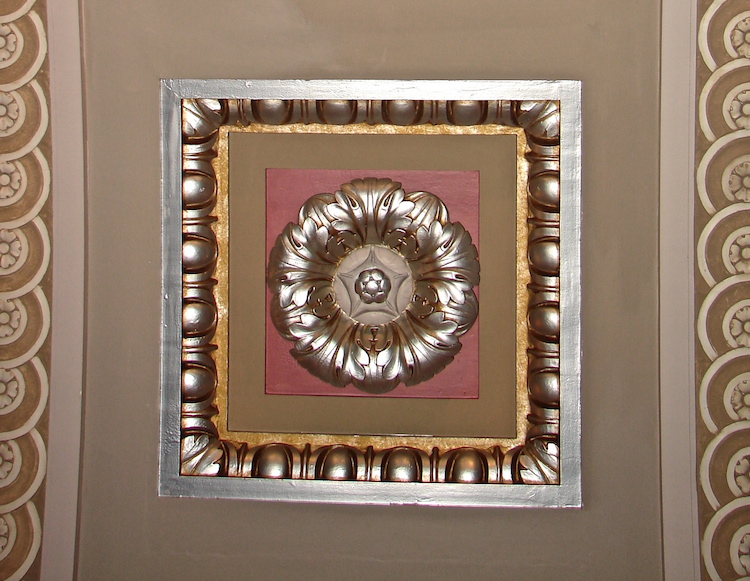
Senate Gallery Details
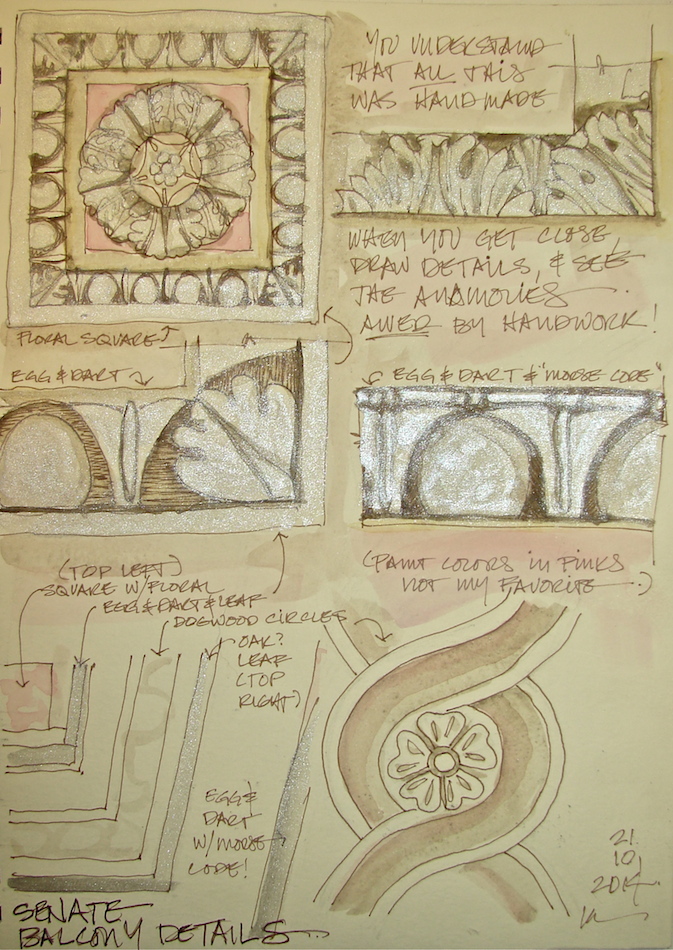 More drawing challenges in the
Washington State Legislative Building.
Before I went running around, I asked where I could go with the pass we used to get into the Senate office area. It was nice to sit in the Senate Gallery (the balcony for visitors that overlooks the Senate Floor) and draw without being rushed by a guide. It is also one of the places where you can get close to inspect the details of the various dogwood, egg-and-dart, and oak leaf motifs (and the chandeliers,
which I also drew for another day).

The building was finished during the Depression; money to paint the decorative elements was not available.The building was used unpainted until the late 1980’s.
I can’t have watercolors in the building (carpets, marble floors). I took
pictures for color. I am not fond of the colors used in the Legislative Building
(salmon, pink, mauve, and wine colors),
and yet they work, and when you see them next to the lovely marble the architects chose, it is inspiring, elegant, and beautiful.
Drawing the details up-close I struggled to have the motifs match. I began to realize that the motifs are NOT symmetrical in proportion. They are hand-made. Sitting in the gallery looking at all that detail work, knowing it was all carved/crafted by hand, is awesome. No two dogwood/oak flower motifs are exactly the same, and the egg-and-dart motifs vary!


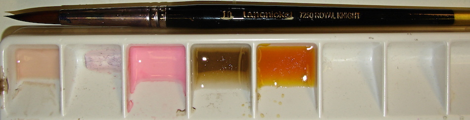
 I sketched background guidelines in pencil before inking the details; I had a layout and basic proportions to ink within. Silver was used on so many motifs, yet it had a gold-tone overlay to some of the paint (above), and also in the crevices. That is why I used Polar Brown Noodlers ink. The word is not out for me on using silver paint; note the detail images above. Yes, the motifs were silver, but the silver is not the same as the watercolor paint, and it lays oddly. I may stick to grey in future.
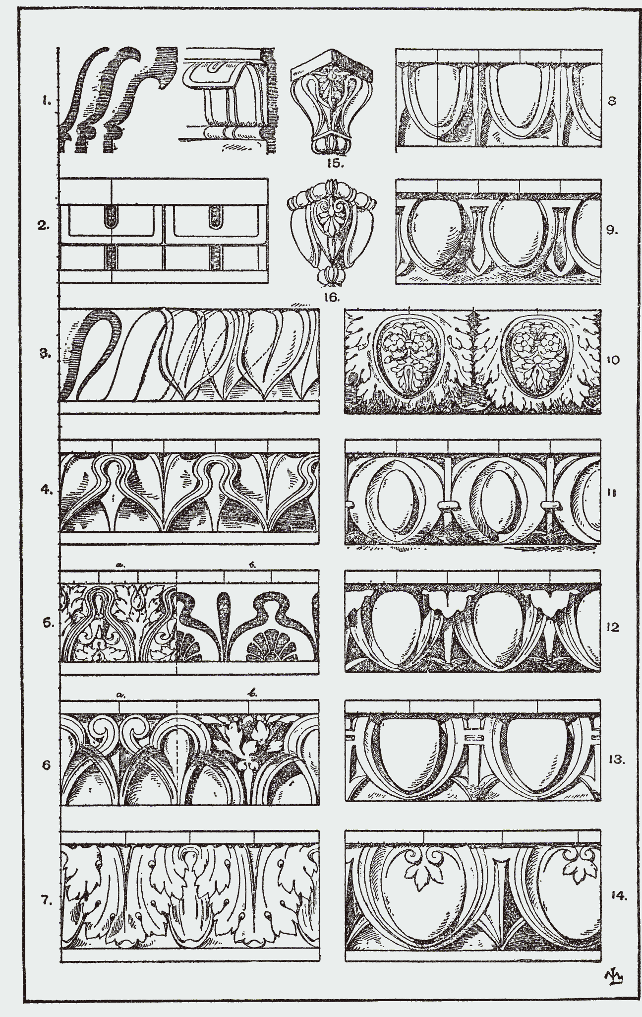
I thought I knew everything (okay, maybe not everything, but a lot) about the egg-and-dart pattern, but in a what-the-hell inspiration I looked it up on Wikipedia. Totally learned something! The oak leaf pattern is a variation of the egg-and-dart!
 Watercolors were added in the studio.
Drawn in an Stillman & Birn Delta journal with a Pilot Preppie pen, Polar Brown ink, and Daniel Smith (silver, quin gold, tigereye), and Sennelier (quin red, white) watercolors.
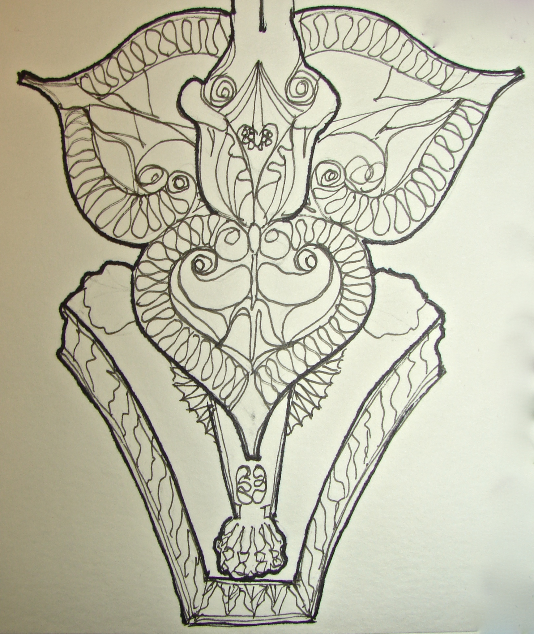
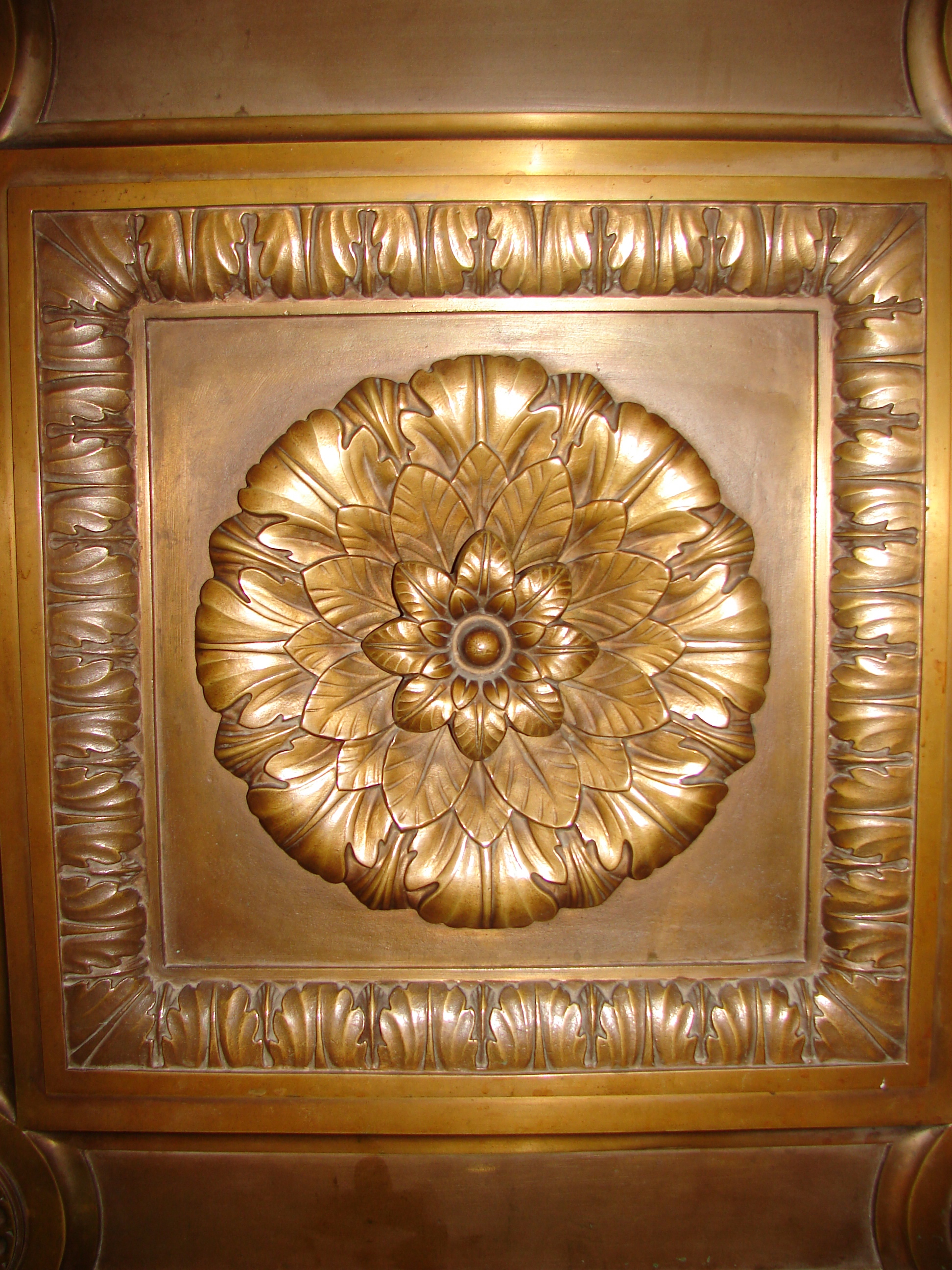
Torchére
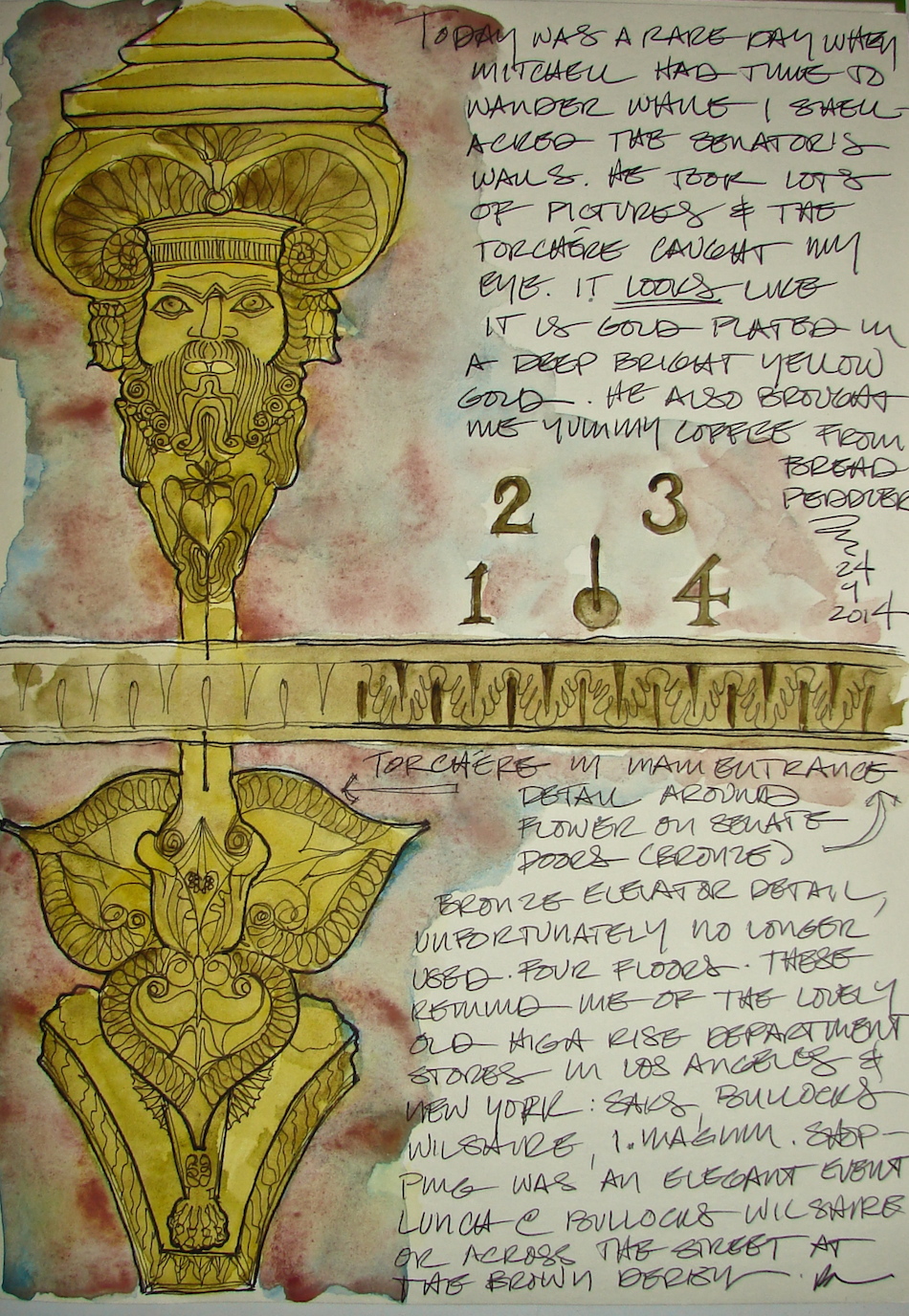 Mitchell took great images of object details around the Legislative Building, and the torchére caught my eye. Not the same as painting in front of it, but fun nonetheless.
I began with a detailed sketch, and almost left it alone, but color is my thang so
I took the risk. I like the gentle washes and think they add to the page.


 And the images these details came from:


 Drawn in an Stillman & Birn Delta journal
with a Brown-Black Uni-ball pen and Daniel Smith / QoR watercolors.
Outside Torchéres
The outside lighting at the Capitol is another one of those parts that must be overlooked
by visitors during the day, who are not drawn to the various sconces and torchéres
because the light does not draw their eyes like the sparkling light of the Tiffany lamps
in the interior spaces. They are every bit as beautiful, and highly detailed.


I drew onsite, and added water-color in the studio.
I am still overworking my watercolors a tad bit, but I don’t care —
these are all opportunities for learning and I like the effects of the Sleeping Beauty Turquoise and Minnesota Pipestone and Hematite by Daniel Smith.
The deep green-blue is Phthalo Blue by Sennelier.


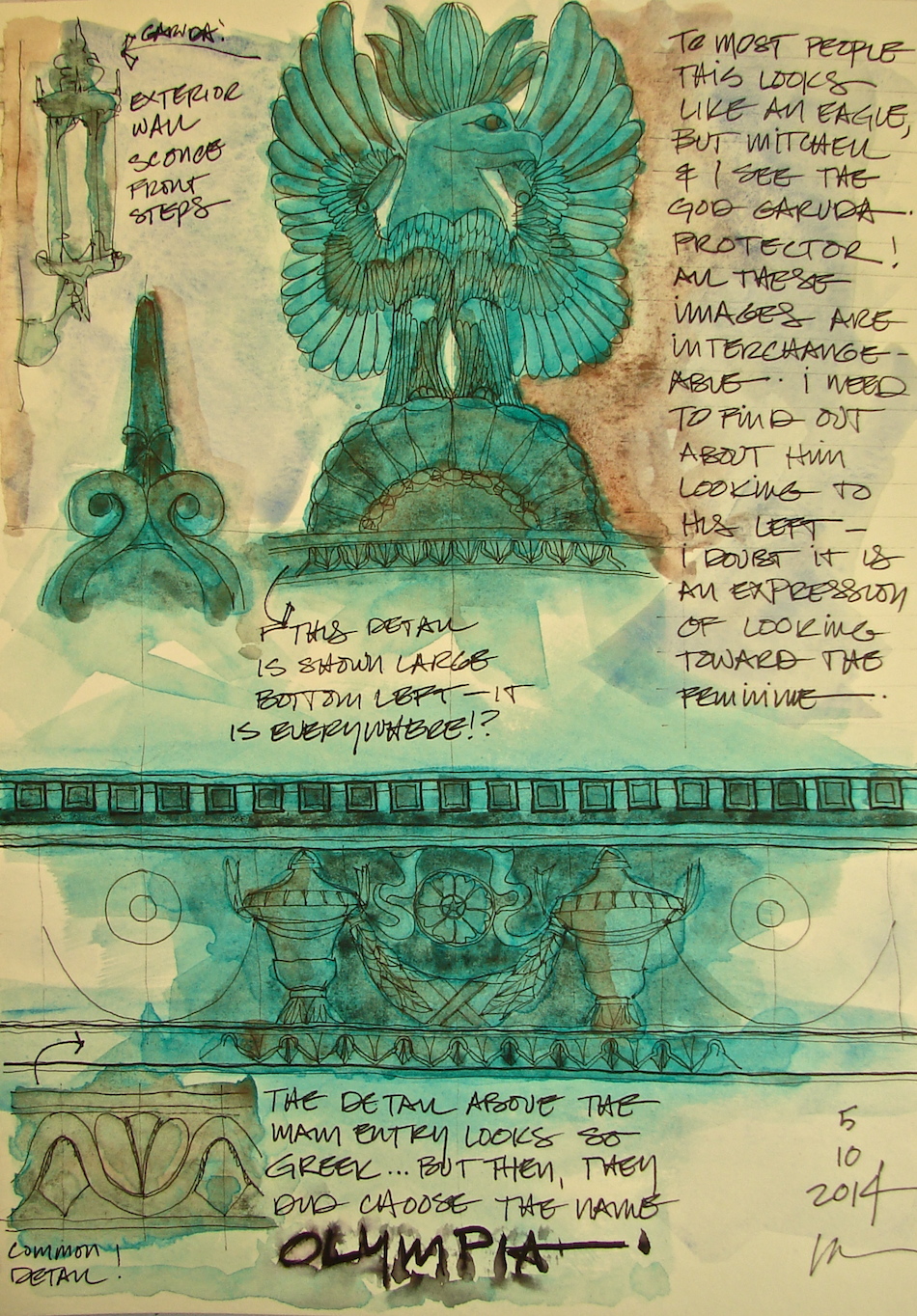 Drawn in an Stillman & Birn Delta journal
with a Pitt pens and Daniel Smith / QoR watercolors.
Happy Paint Party Friday and Friday Sketches!
Ballroom Rug
 Posting a page I am not 100% happy with.
I may even try again . . . We’ll get to that!
The carpet in the State Reception Room floored me.
It is so oddly modern when in fact it is a century old.
Meandering big bold flowers in electric wool
colors appear from the tropics!
Not even the touch of mauve against eggplant
bothered me because somehow it all works.
Until recently, this was the largest rug in the world.
Now a Saudi public building has that distinction.
I want to give you context on this amazing carpet in the room!


 The State Reception Room is closed except to tours (free); Mitchell snapped images from which to draw.
Initially I intended this to be a sepia page which would hold writing, right. Watercolors leapt to the page of their own accord. This is where I got into trouble.
It is SO easy to overwork a watercolor.
I wanted the colors to be as bold as they were in the State Reception Room. The watercolors were not vibrant enough, coming through as pastel version, so I added second and third layers.
*Sigh* Muckity muck muck MUCK.
 Unfortunately, this is also a case where the colors are pretty accurate but the whole does not appear the correct palette. My palette is simply too bright, too orange, too pink!
Since I was unhappy, I felt I had nothing to lose. I used the middle of the page to
sketch a faster impression of the carpet in watercolors. Quickly. This impression is closer to the feeling of the carpet when you are in the State Reception Room.
Then to save the overworked watercolor, I first tried spritzing a paper towel and blotting the overworked watercolor. I lifted a lot of paint, which helped, but it still looked all wrong. Then I tried spritzing the water-colored borders and blotting directly. This resulted in the mottled effect below. NOT what I was going for, but an improvement!
I really love this carpet — odd for me — and may have another go at it!
Maybe I can sit on the floor outside the glass doors!
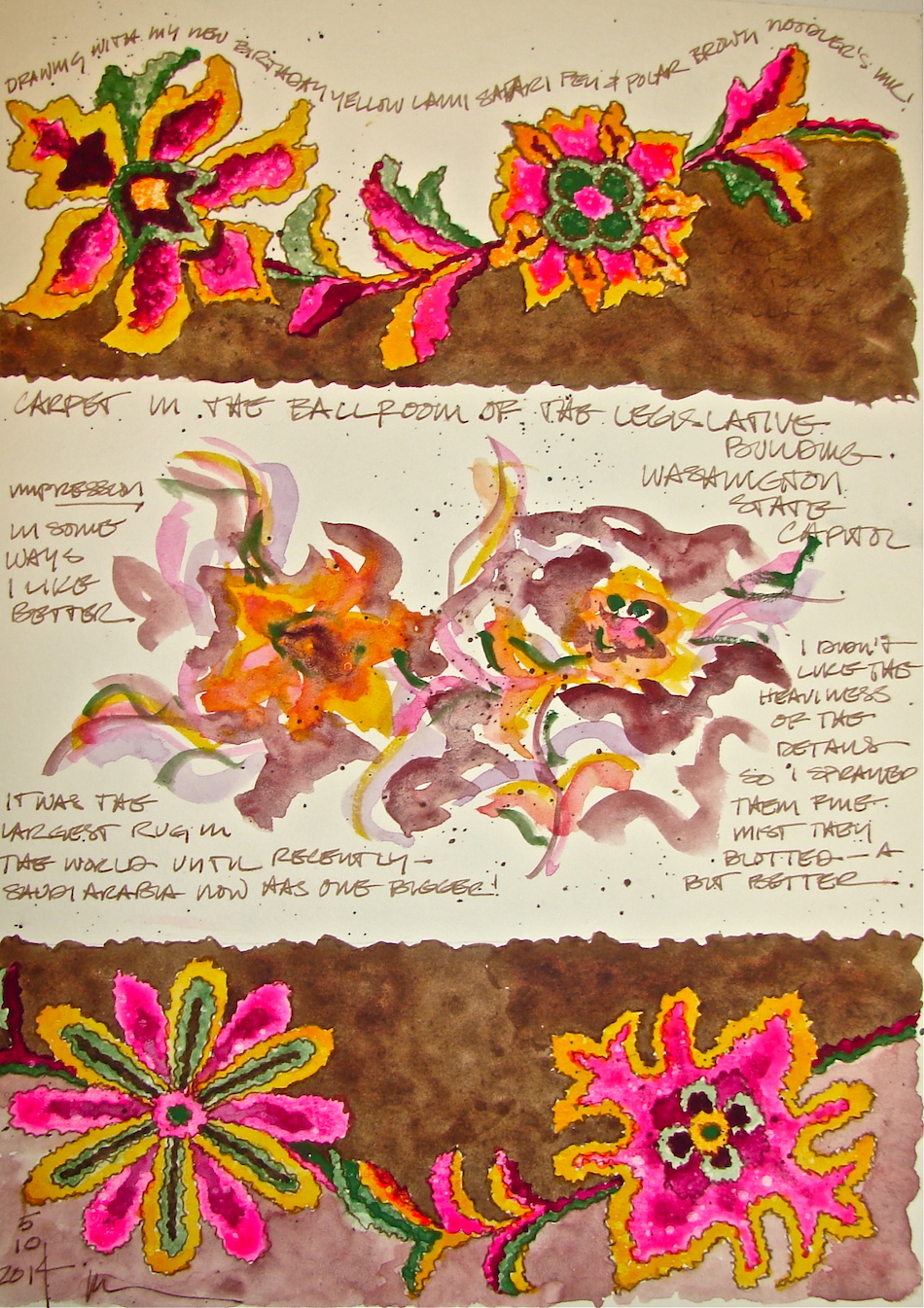 Drawn in an Stillman & Birn Delta journal with my bright shiny new yellow
Lamy Safari pen, a Noodlers’ giveaway pen, Polar Brown Noodlers ink.
Daniel Smith (Opera Pink, new Gamboge, Chrome Green — big mistake as it is opaque — Perelyne Maroon), Sennelier Quinacridone Red, and QoR Terra Verte watercolors.
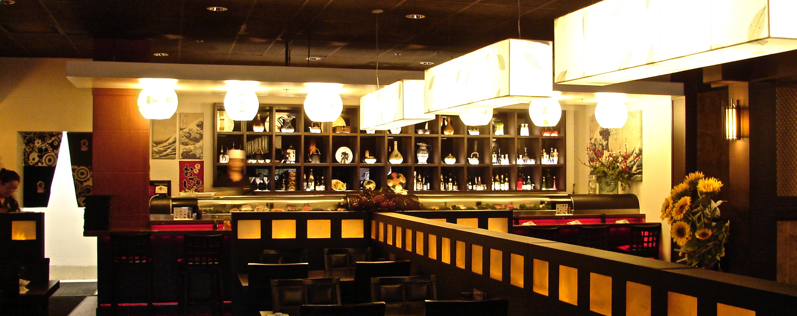
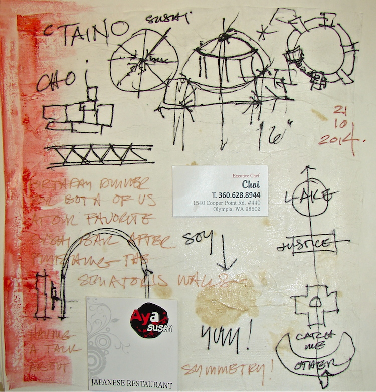
AYA Sushi
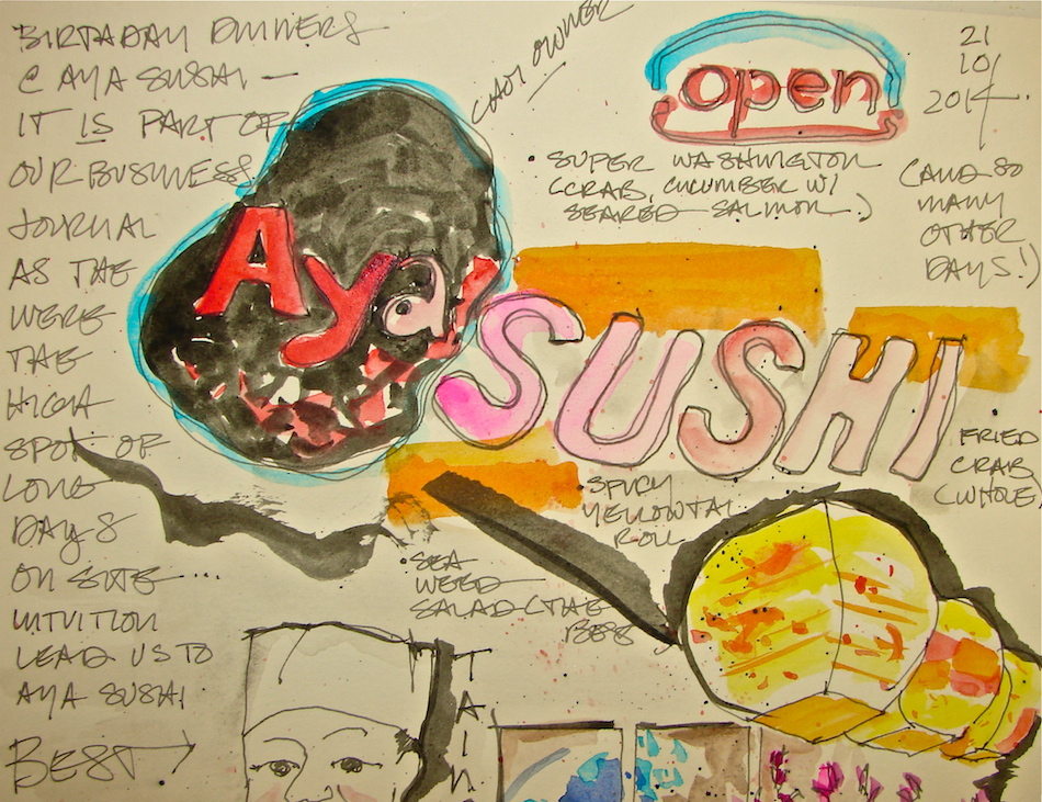 Aya Sushi sustained us during our days in Olympia. I am a sushi aficionado;
I was hooked during university. Aya Sushi is the best sushi I’ve had since Lalaland!
I reserved a page in our business sketchbook because we ate there every night
they were open while working on the Senate offices.
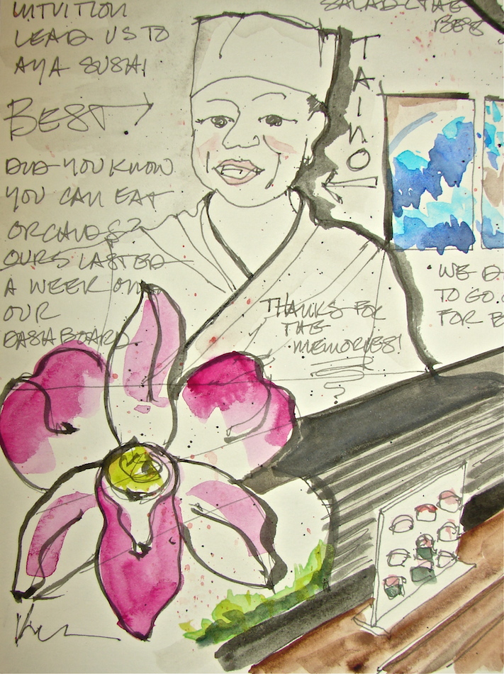 Taino humbly made dish after dish for us
(gads I apologize if I am spelling his name wrong).
On our birthdays made a salmon sumthin’ in a martini glass on the house.
Dishes came with beautiful orchids.
We put them on the dashboard of our Mountaineer and they lasted a week before dying.
Did you know they are to EAT?
Taino said they are not decoration — but told us too late!
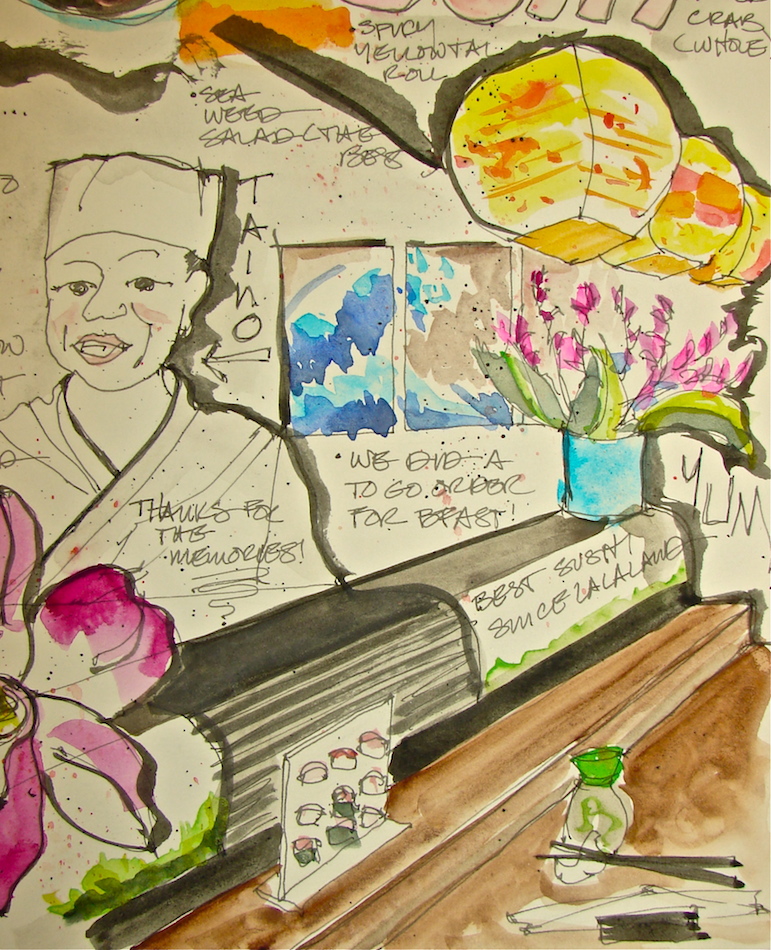 On top of all that, the surroundings are colorful and beautiful.
Hand-made paper lanterns overhead at the bar (where we sat) and
Japanese brush paintings of waves, very traditional.
Located in a mall, you wouldn’t suspect a great restaurant is behind that neon sign.
Super Washington was our favorite; Taino seared salmon till it was crunchy,
on top of a crab-cucumber-sumthin else roll! Second was an amazing seaweed salad. YUM YUM YUM spicy yellowtail hamachi fried soft shell crab roll unagi . . .

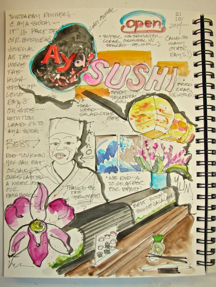 I didn’t draw on site — too busy munching happily.
I took pictures and left a page to play around with images. I kinda like it, though Taino is
better looking than my sketch!
Lamy Safari pen with Noodlers Lexington Grey (also with brush); Daniel Smith + Qor + Sennelier watercolors in my Stillman & Birn Delta book.
Oops lest I forget, my favorite part, the company of my husband. Talking with pen in hand.
I guess I did sketch on site. . .
North Entrance Details
More drawings of the North entrance, with beautiful Corinthian columns,
the dome with flanking “tomes”, and many details.
Sketched onsite, and watercolors added later.
The column was drawn looking up from the edge of the East side of the steps.
 Lamy Safari pen with Noodlers Lexington Grey ink;
Daniel Smith Primatek (Lapis and Hematite) +
QoR (Terre Verde and a grey) watercolors.
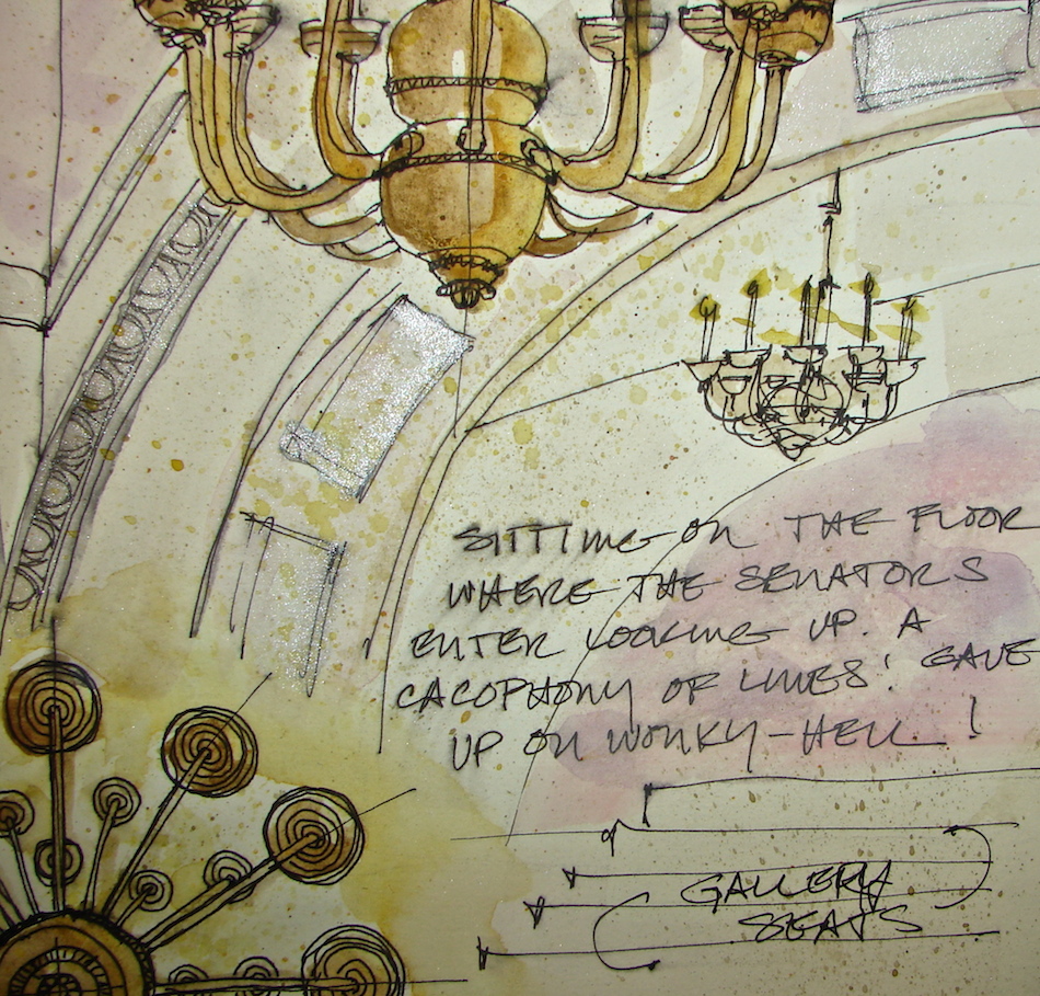
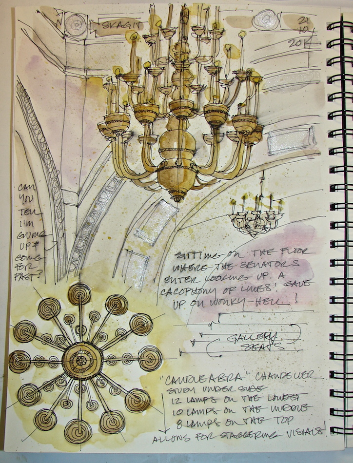
Sketching the Senate from the Floor
 Like my earlier post on drawing the
Senate gallery details, I came around to draw the Senate from a different angle. I sat on the floor of the first entry arch looking up into one of the corners, in order to catch the overall arch and the large bronze Tiffany chandelier. The corner of the room intrigued me; the architects cut the edges of the square room
in an odd detail, making more angles to
draw on top of the arches and gallery.
The chandelier reminds me of a candelabra, and that may be what Tiffany intended to inspire. The state keeps the Senate incredibly dark. I hear stories of ghost wandering the Senate and can believe it! Perhaps when the Senate is in session the lights are not set low?
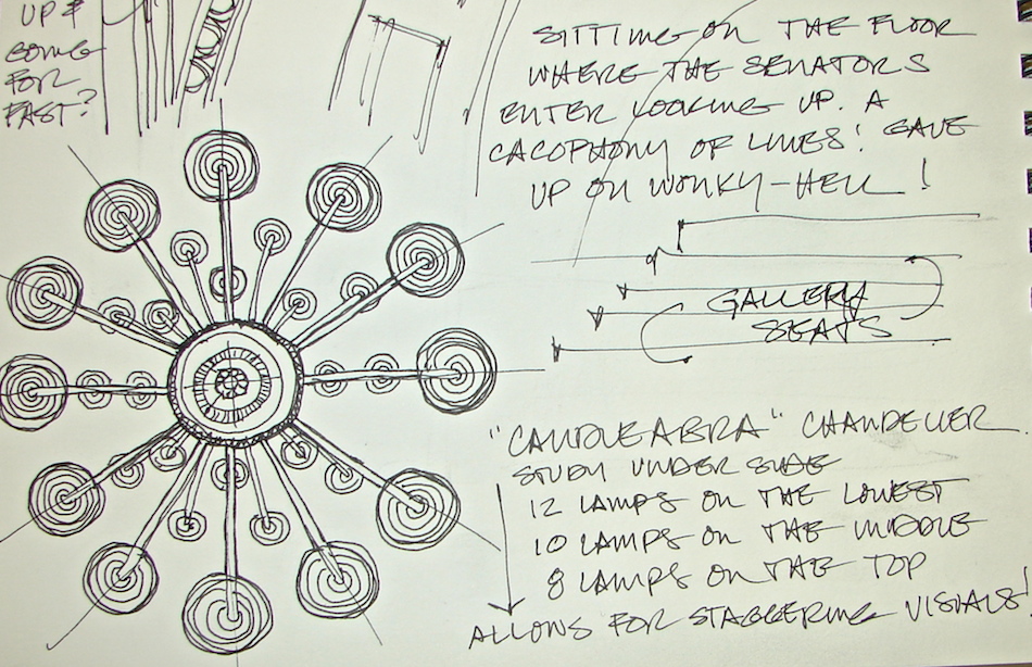
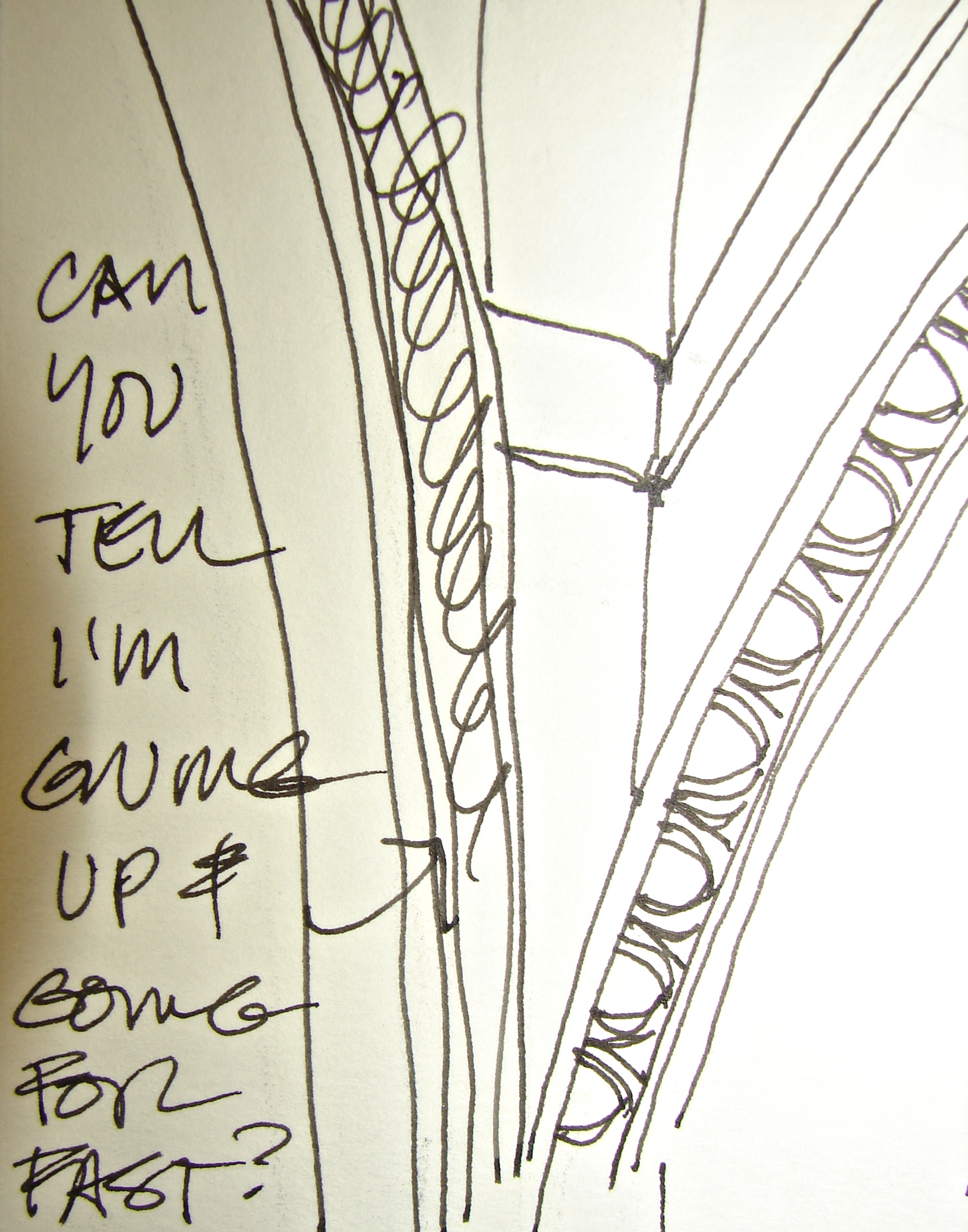 I blocked the basic design out in a Pentalic HB Woodless pencil (Grumbacher).
I was inking details and the design of the chandelier was making me a bit crazy.
Finally I went beyond the roped area, laid on my back and studied the design
from the bottom so I understood the light structure; this had helped me draw the
bronze chandelier in the entry off the South Porte Cochere. The cacophony of loopy
lines leading to tiny bulbs made a bit more sense; the bottom (twelve lamps) and
top eight lamps) tiers aligned; the middle (ten lamps) were off-center.


 Back to my seat on the entry floor to add detail to the graphite ghost blob I sketched in the corner. I was sorry I left my camera behind; I wanted to take an interim picture of the pencil sketch before I started inking.
I’m not in love with this chandelier, andI discovered that I have to be in love with the object in order to give it your all. Wonky lines no longer bothered me; I wanted to finish as Mitchell was wrapping up for the night. I wanted to head out to Aya Sushi for dinner. The best sushi in the Pacific NW!
Mitchell came by and took the picture above standing up; not quite the angle I saw from the floor but you can
see the darkness and the ornament. He also took pictures of me, and those mysteriously disappeared. Oops!
Having drawn the details from the luxury of the
Senate Gallery, I knew intimately what the egg-and-dart motifs looked like close up, but was getting sloppy. Frankly, I was getting tired of inking details,
but loved the Heart of Darkness ink! At one point spirals appeared to indicate the shape of the egg-and-darts!
Back in our studio two days later I
added color. Unfortunately, at the first swipe of watery glaze, the ink began to move! AAACK! I cried. I went online and commiserated with friends.
Then I figured I had nothing to lose,
the drawing was loosey-goosey and wonky, so went back to adding color. The ink still bled in places and I had license to make messes. I did!
My takeaway from this created the new rule:
ALWAYS TEST AN INK OUT ON EACH TYPE OF PAPER!
I’m not happy with the mauve color. It’s so easy to make mauve —
early in my painting career I made jars of it trying to mix a soft brown acrylic color.
I am happy with the wash of creamy Holbein quinacridone gold I threw on
for candlelight ambiance. Finally, I think my days of using silver are over!
 Almost the same colors as the Senate gallery details. Drawn in an Stillman & Birn
Delta journal with a Noodlers giveaway pen, Heart-of-Darkness ink (NOT waterproof), and Daniel Smith (silver, tiger-eye, quinacridone violet, Indian yellow),
Holbien (quinacridone gold) and Sennelier (quinacridone red, white) watercolors.
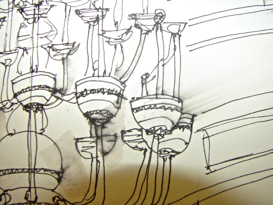
Tiffany Chandeliers Mark Pathways
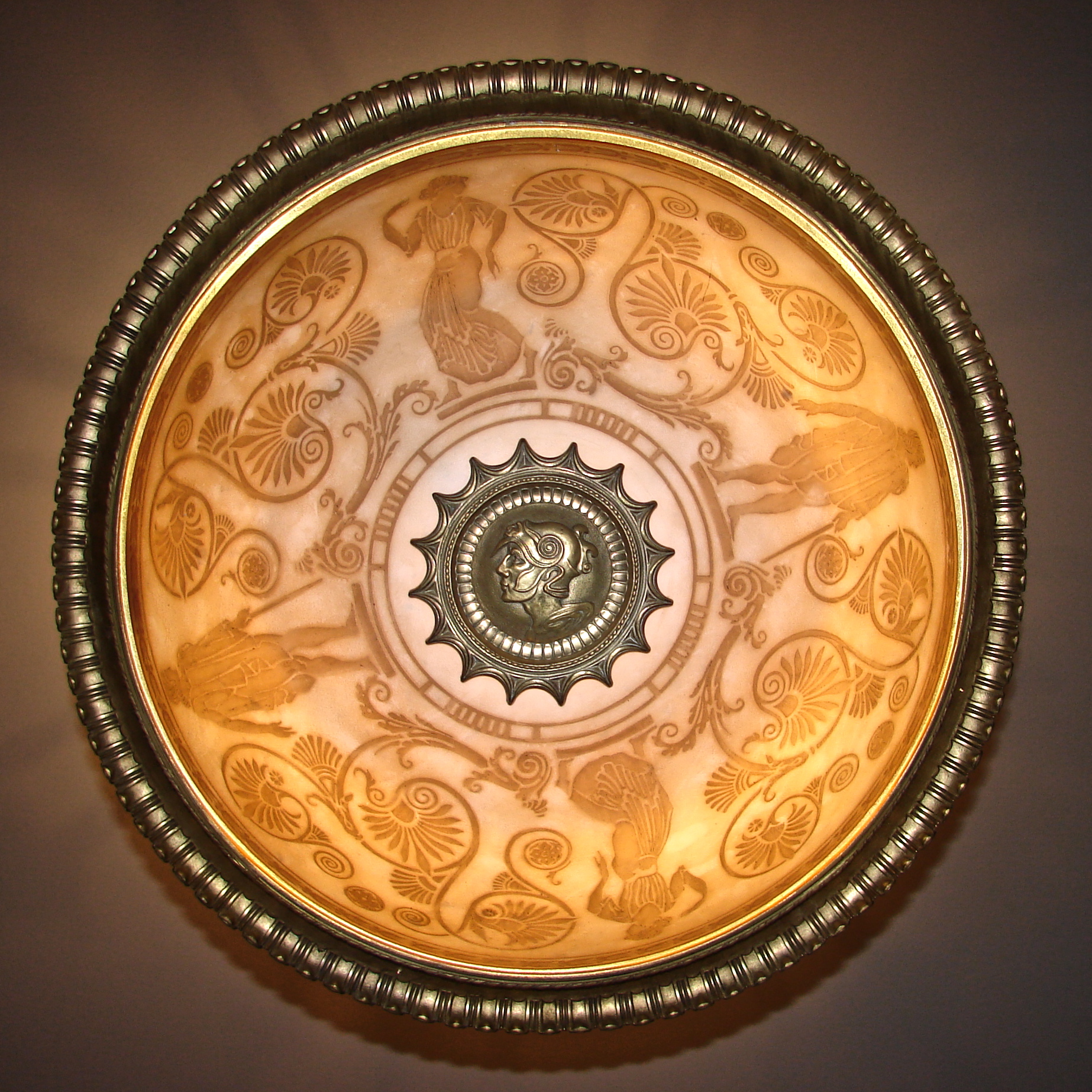
 It is unusual for me to start my sketchbook posts with photographs, but this Tiffany chandelier is simply too beautiful.
I did not do them justice!
They line the hallways and mark entrances
to the various rooms, providing a delicate glow to the halls (see more images below).
The globe is a luminescent milky glass and
I cannot tell how they created the globe
(even with the images, and the above image
I left full size for you).
I laid on my back to get the photograph above.
Yes, people stared. I am over it!
The design is from the Art Deco period,
and is a throwback to Greek times.
The Etruscan design reminded me of black painted vases, while the color reminded me
of the Athenian red pottery.


 Drawing slows me and brings me to the details that I overlook when I am simply walking and touring.
I think about Louis Tiffany, the unnamed artists who worked for him, and who inspired him.
Did the architects request these designs?
So much is not discussed in the books we buy.
As I was drawing the details of this chandelier,
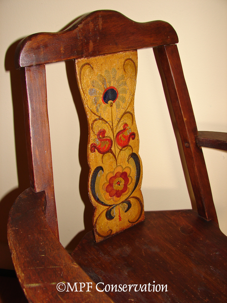
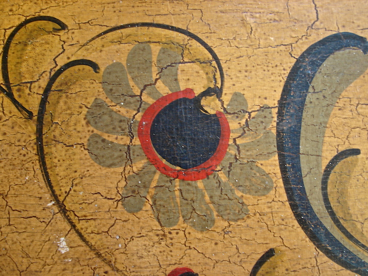
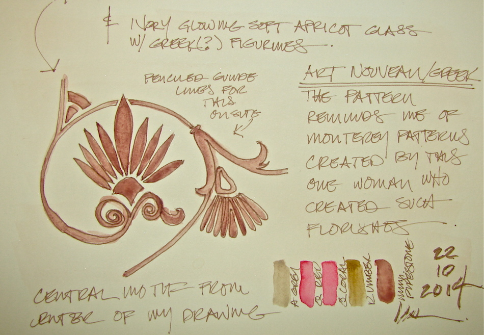
my hand remembered drawing the Mason Monterey floral patterns as I have conserved and restored
so many painted decorative pieces of Monterey.
There was one artist who created lovely flourishes. While drawing I had a physical memory and realized their origin began in the floral flourish above.
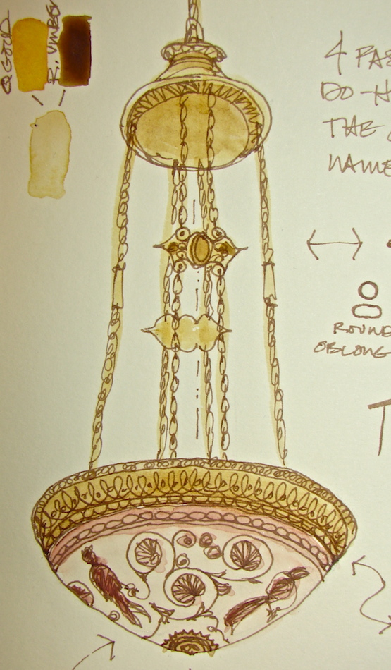
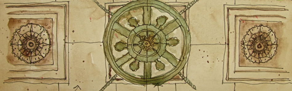
 Attention to was paid to the chains and the cover plate in the ceiling.
The elaborate fastener do-hickey (gads I should know the name of the dang thang)
and the chain design, which is a mixture of perfect circles and oblongs.
They THOUGHT about that. Where is this attention to detail in our world?
 All drawn onsite (except the corner do-hickey detail) in a
Stillman & Birn Delta journal (rich ivory paper) with a Lamy Safari pen,
a Noodler’s giveaway pen, and Polar Brown Noodlers ink.
I sketched a layout in pencil (including the do-hickey which I wanted to draw later),
but can FINALLY say I am freeing myself to go quickly to pencil.
In the studio I added color: Daniel Smith (Minnesota pipestone,
quinacridone coral, grey), Holbien (quinacridone gold = super creamy), QoR (bohemian green) and Sennelier (raw umber, quinacridone red, white) watercolors.
I roughly put the colors used next to the areas for which they were mixed.


Attention to was paid to the chains and the cover plate in the ceiling.
The elaborate fastener do-hickey (gads I should know the name of the dang thang)
and the chain design, which is a mixture of perfect circles and oblongs.
They THOUGHT about that. Where is this attention to detail in our world?

Images of the Tiffany Chandelier courtesy Mitchell Powell and myself;
Images of the Mason Monterey courtesy MPF Conservation;
Images of vases from Wikipedia, thanks to Marcus Cyron, Luis García, Robert Valette
Selfie in the Senate Hallway
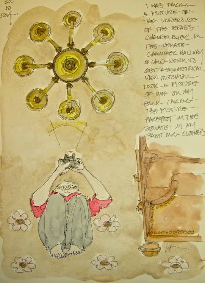
 I tend to lay down to get ceiling shots.
I also tend to take my shoes off anywhere I can.
Mitchell caught me taking a picture
of the chandelier on my back on the
Senate Hallway floor.
I have on painting clothes because
I was on a break shellacking the wainscoting.
We each have cameras so when I caught him
catching me I caught him too!
I sketched this from digital images
in the hotel room later.
Images in Stillman & Birn Delta journal with Pentalic pencil, a Preppie pen with
Lexington Grey Noodler’s ink, and Daniel Smith and QoR watercolor paints.
North Entrance Chandeliers
 I think these are my last lamps for a while. I’m not sure I want to become Kate-light!
 To draw this last Tiffany chandelier I could stand and rest my notebook on the marble railing, next to Big George.
All of the Tiffany chandeliers have small design details that are sweet. I don’t know that photographs do it justice, and I doubt most folks walking through are able to notice. Drawing makes me notice.
 There are tiny (almost) hearts at the bottom of the dome (above) that allow light to shine through, and a floral filigree pattern on the bottom (all images get bigger).
Teeny-tiny lights accent the floral pattern that graces the top of the lamp.
And the entire chandelier looks like a miniature gazebo, waiting for lovers!
The entry is an unusual space.
It is like they split a small inner dome
(and if you can’t visualize the plans you might believe it is a dome, somehow)
because the coves at either end simply suggest a split apart dome!
 Back in the Senate Chambers, I sketched a final hanging lamp,
but never wrote where I was, and know these exist in a couple of offices and
possibly the Democratic Caucus Room. I sat and sketched in a few places
from hallways and in rooms in two different sketchbooks, so not sure which was where!


I spent a bit of time sitting below one of the arches, contemplating the crazy spheres, arches, and marching colonnades in the dome tower. I would’ve liked to do the formal drawings for this building; right up my alley. Born at the wrong time!
A former Washingtonian artist spoke of climbing the dome prior to the earthquake,
when it was still open. Apparently it is quite a hike (she was a teenager) with steep steps, and she remembers that. I’m not sure I’m up to it but I’d like to try!


All drawn onsite in a Stillman & Birn Delta journal (rich ivory paper) with a Lamy Safari pen, a Pilot Preppie pen, and Polar Brown Noodlers ink.
In the studio I added color: Daniel Smith (green umber, quinophthalone yellow, grey), Holbien (quinacridone gold = super creamy), QoR (terre green, bohemian green) and Sennelier (raw umber, quinacridone red, white) watercolors.


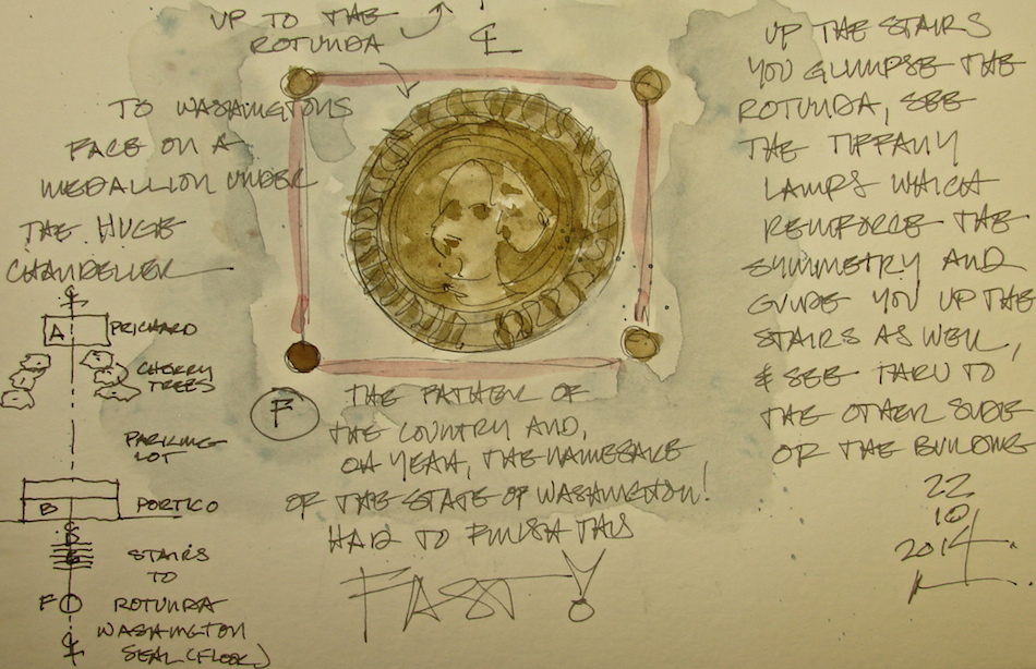
Symmetry + South Entrance


 I love it when an architect moves you through spaces,
making you experience an environment as it was meant
to be seen or felt. I also love symmetry, especially in
the hands of architects who know how to use it.
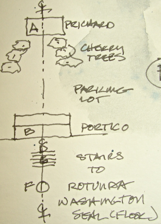
Taking a center line through the Prichard building
it runs straight into the Rotunda in the
Legislative Building and on to the Justice entrance.
The Washington State Capitol architects laid the
campus and the important buildings out in such a way
that they moved you to glimpse views of where you
are going before you get there, teasing you with the
beauty of the campus or various parts of the building.
We came in the “back” door (southern entry) most days, and allowing for the fact that the central doors on both the North and South sides are permanently closed for repair, you can see the architect’s hand guiding you to various views.


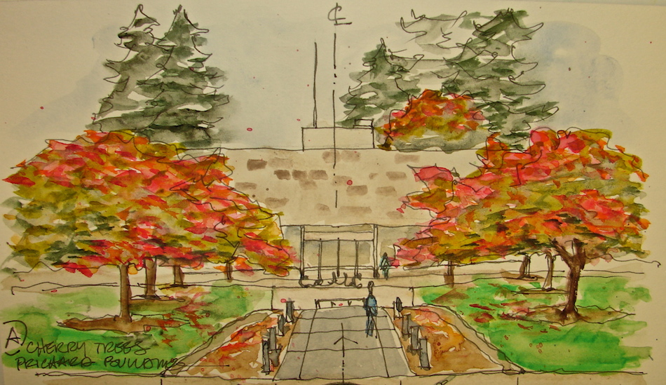 From the Prichard building you walk down the textured walkway by the
lovely cherry trees which were turning brilliant red and orange. The path takes you through a narrow opening and you are under the drive-through portico.
In Washington, the green grass really is that green as we head into autumn!


 Looking up under the portico the beautiful repeating dogwood motif is a rhythm across the ceiling. There is also a huge chandelier, whose bronze frame has the most beautiful
blue-green umber patina, locked to keep it from swinging in winds or in an earthquake.
It is centered so that you walk directly under it, and the sketch I made onsite was of the symmetrical placement and motif looking up as you head for the entry doors.
 If you entered the southern entry through the double doors and look back, walking as if you were continuing on the center-line, you see the Prichard Building again through the glass. Overhead are beautiful Tiffany chandeliers, and below are beautiful
marble floors with a compass pattern in taupe and grey marble.
 If you are standing on the compass and turn 180-degrees, you look up the grey marble stairs and see the elegant arch, columns, and see a smaller Tiffany chandelier that is covered in Greek figurines. These chandeliers mark the hallways and paths throughout the building. I walked straight up those stairs, as a visiting dignitary might after the limo dropped her or him off at the Portico entry. You look beyond and get your first glimpse of the Rotunda. On the balcony beyond you can see the Reception Room over the front entrance, flanked by two of the four torchéres that surround the State seal in the floor.
(These are not the torchéres shown in my first blog post.)
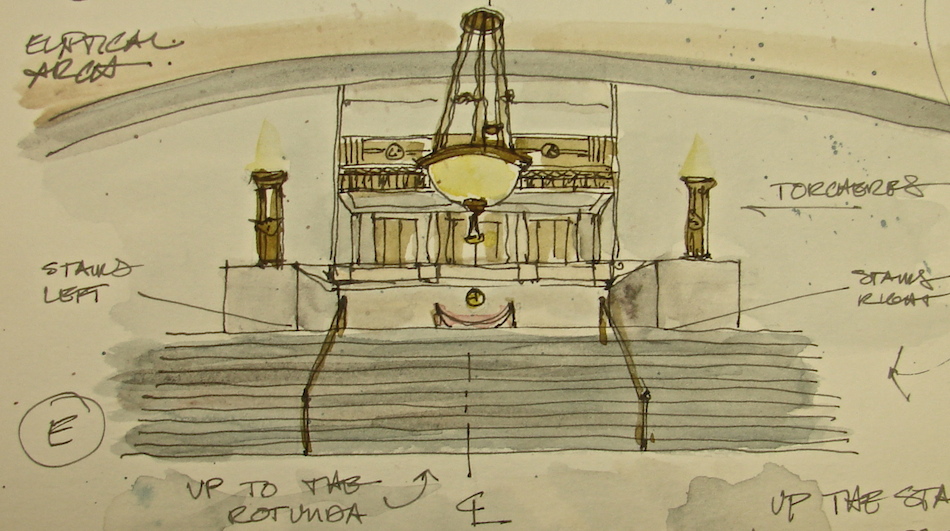
 Climbing the stairs you walk under the arch
and to the edge of the Rotunda. Your first instinct
is to look up, to see the beautiful main chandelier,
also made by Tiffany. The stunning colors
of the building, salmon pink and burgundy
and taupe and grey against bronze and
twinkling lights catch your eye. As you walk in,
you come almost under the light, which
reminds me of Spielberg’s rendition of the
mother ship. The State Seal of Washington’s face
in bronze is surrounding at this time by red velvet for viewing and to keep people from stepping on the seal.


 I also think that artists (and Urban Sketchers) can wake you to see things
(even your own home town) that you would not have noticed.
Next time you enter a building take the time to do it the way the architect wanted
you to enter, and try to see what s/he wanted you to experience.
I admit to running out of time sketching onsite for the day.
I took pictures of the same theme of centered axial circulation from the Northern entrance and intend to sketch these images later to show the formality from the other side.
Or maybe I will wait until my next trip to the Capitol.
Want to meet me for the grand tour?


Drawings made onsite; watercolors added later in my studio.
Images in Stillman & Birn Delta journal with Pentalic pencil, a Preppie pen with
Lexington Grey Noodler’s ink, and Daniel Smith and QoR watercolor paints.
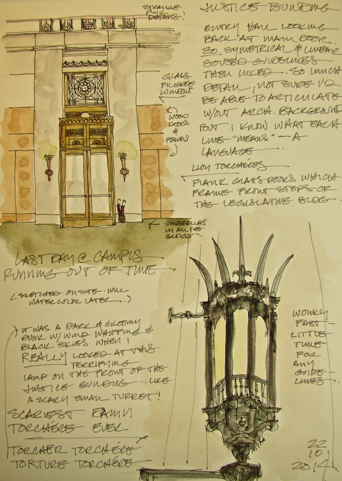
The Lion Torchéres

At the end of our last day working in the
Senate Offices of the Legislative Building on the Washington State Capitol Campus, we crossed the grass in the pouring rain to the Justice Building.
As you walk into the building there are several torchéres that illuminate the entry hall, right,
as well as an overhead skylight of some sort.
These torchéres have a much more
coppery appearance than the golden-green
bronze of the Tiffany lamps in the Legislative Building. I was unable to find out who the
maker of these torchéres was in the short time
we had — I chose sketching instead.
The Lion Torchéres are not only beautiful,
but the lions themselves have the sweetest expressions on their faces. (Actually, we found
this to be true in several lion-themed decorative motifs around the capitol; a testimony to the
friendly nature of the Pacific Northwest!)
I only had time to sketch the overall and a side view detail of on lion, below, but I shot a detail image of the faces hoping that I might try my hand at them later.
As always, I started with a pencil guideline, this time a watercolor pencil in a sepia tone.
I love working in watercolor and ink, but am not a subscriber to the notion that pencils should not be used. As an architect I learned to use pencil guidelines, and this has transferred to my sketching habits as well. I simply am much more likely to leave them instead of erasing them, and I use watercolor pencils a lot more often. By giving myself a guideline I am much more able to be accurate in my sketching, and also I can relax and enjoy the inking process knowing that I have the basic shapes mapped out.


After the pencil sketch and layout on my page, I inked the torchéres.
I only had so much time, and so the inking was loosey-goosey.
I was able to bring the sketches back into the studio (no watercolors in these buildings) and color them. In this case I built up color in washes in both, starting with Quinophthalone Yellow for the illumination, and then working in washes that were mixes of Daniel Smith Quinacridone Gold, Yavapei (Primatek), and Yellow Iron Oxide.
I layered color gradually and left white spaces when I could. The lion from the side view is one of my first pieces that I think is pretty good, though it is a bit harsh.
I am still working on understanding the nature of watercolors —
a huge departure from acrylics, which I began this year.
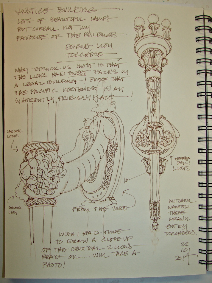
 My goal is not perfection, a photo perfect image,
but rather an impression of what I loved about a place or event.
As promised, their sweet faces, below. Think the sweet Cowardly Lion, not the predator!
 Images in Stillman & Birn Delta journal onsite with a Caran D’ache watercolor pencil,
followed by a Platinum Preppy fountain pen with Polar Brown Noodlers ink.
Daniel Smith watercolors added in studio.
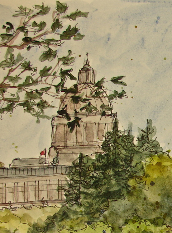
Washington Capitol Popular View
 It started with a popular view of the Washington State Capitol Legislative Building.
This is a view that is on all the postcards, all seasons, which I
sketched in early October while we were working in the building.
It’s a wonky sketch, but a nice sketch.
I found it boring. I wanted to play with the forms.
In my studio I added the watercolor.
About halfway through I thought I had made a mistake. Then I thought,
“What the hell?! I ruined it — I might as well mess with it some more!”
Now I like it. I wish I had an image halfway through to show you!
 Lamy Safari pen with Noodlers Lexington Grey ink;
Daniel Smith + Sennelier watercolors then Pitt pen to bold it . . .
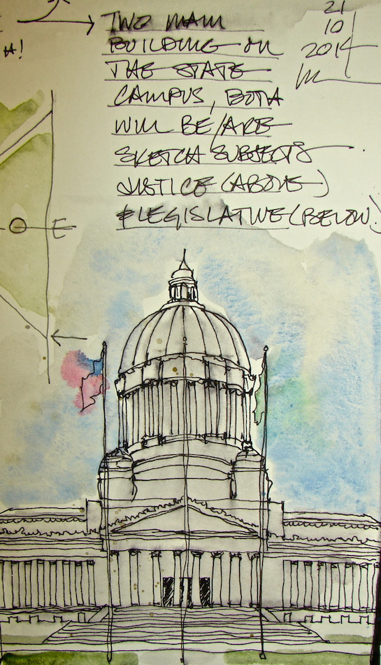
Washington State Campus
 Stepped outside at the end of the day while waiting for Mitchell to fetch me,
and decided to do a couple of quick sketches of the two main buildings on campus,
the Legislative Building (where we are working) and the Justice Building.
I started at the NW corner of the Legislative building to sketch the Justice building.
 I also drew a map, because I love maps
and symmetry. Reading the two main buildings and their placement on the axis, I know how the architects intended a visitor’s experience (the original design, not the current traffic pattern).
You were to enter formally from the main drag through one of two diagonal entrances. The entry forces you to turn around a statue (and possibly drive all around the statue) and glimpse differing angles of the two most important buildings. Then you take a turn around another grassy oblong where I can imagine a podium set for speeches, to see both buildings again as you parked in front of whichever building you were visiting.
The Governor’s Mansion sits on a hill overlooking the campus. He is quite important,
but his home is not public. The original driveway is inconspicuous, saying,
“No visitors, please.” We haven’t been; next time!
 If you wander too far South, you are caught by the catcher’s mitt the three buildings at the south end create, and forced back onto the axis. That experience is out a building flanked by two others on an angle (the only buildings placed at an angle in a very formal plan) that open up and gesture to the Legislative Building (wow, look at that!) You walk back through the South Port Cochere, through the Legislative Building (more on that formal layout later) and into the heart of the Justice Building. If you were cleared to walk through that building, you would exit formally to sit at Capitol Lake, enjoy the statuary, a lovely place to relax.
I wonder if the energy between the constituents and the elected officials has changed significantly now that they no longer allow visitors to experience and enter the campus the way the architects intended? This is all about Feng Shui, yes, which by the way is not new and is good design. Now it is very hard to enter the way the layout suggests, both outside and inside, which I may write about later. We came in the back door (South) or side door (East) all but the very first time, when we met our guides on the Capitol steps.
Also, I wonder if the chaos and sloppiness of our architecture has affected our people, making them sloppy and ineffectual and confused. I know so many people who vote to shoot themselves in the foot. Formality does imply structure, and seems to make us think. There is a place for it especially in these hallowed halls.
But then I love symmetry!


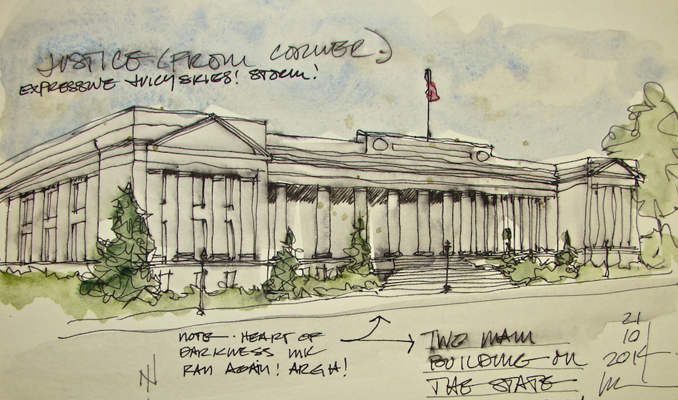
 I drew the Legislative building the next day, when it was pouring and we spent time
inside the Justice Building after we finished our project. I loved the building framed by the massive columns. Of course I had no idea that the Heart of Darkness ink would run;
I just loved the deep inky blackness on the paper.
Color was added in the studio, some fast washes, trying NOT to have it run!
Lamy Safari pen with Noodlers Lexington Grey (which is waterproof) and Heart-of-Darkness ink; Daniel Smith + Sennelier watercolors then Pitt pen to bold it.
Washington State Justice Building
 My last sketch onsite from earlier in the year, with watercolors added Sunday.
It was pouring, our work at the Capitol completed, and we were on our way home.
Mitchell wanted to explore the Justice Building.
The Library was lovely and I never got around to drawing in it because
we spent a good amount of time talking with the Librarian.
We had just a little bit of time.


 The lamps outside the Justice Building
are perhaps the scariest I’ve ever seen.
Seven sharp stabbing weapon-like details
with fleur-de-lis in between,
all made to look a bit like a tower.
You can almost imagine the princess held prisoner . . .
What were they thinking?
They are the opposite of the lovely Lion Torchéres,
which have such sweetness!
On this page I drew the placement of
the Lion Torchéres on the entry walls.
Images in Stillman & Birn Delta journal onsite with a Caran D’ache watercolor pencil,
followed by a Platinum Preppy fountain pen with Polar Brown Noodlers ink.
Daniel Smith watercolors added in studio.
More postings will be added as completed!
I agree to Creative Commons Attribution-Non-Commercial 4.0 International License, which you can learn more about by visiting the site, or,
visit my web page for a more user-friendly summary on my terms.
My images/blog posts may be reposted; please link back to dkatiepowellart.


