
 New color paints are the yummiest, and my new clean watercolors all moist from a spray call to me.
After buying mostly Golden Acrylics for 15 years (and they have watercolors coming out which I am dying to try), I learned one thing after sampling Sennelier, Utrecht, Holbien, Dick Blick, and Daniel Smith watercolors: all companies name their colors whatever they want, and frankly, this means that you might buy two almost exact colors unless you are standing in the store looking at actual samples. I now read the ingredients before buying — what a hoot — like I am at the market! I’ve come close to duplicating a few colors — or so I thought — until I began to play and compare.
Mixing colors is one of the things that watercolorists do on their palettes, which is very different than mixing acrylics in jars, ready to stir and paint predictably, exactly as you like them. There are nuances to mixing on a palette, less predictability! Over the next few days I will share what I learned about these superficially-the-same colors, as they were mixed with various other colors. First up, mixing with Genuine Hematite (BTW, I wrote about Hematite earlier this year.)
Primatek Genuine Hematite (love love love) by Daniel Smith is a deep grainy gem color, and like Golden Acrylic’s Micaceous Iron Oxide, I like the effects of it mixed with other colors.
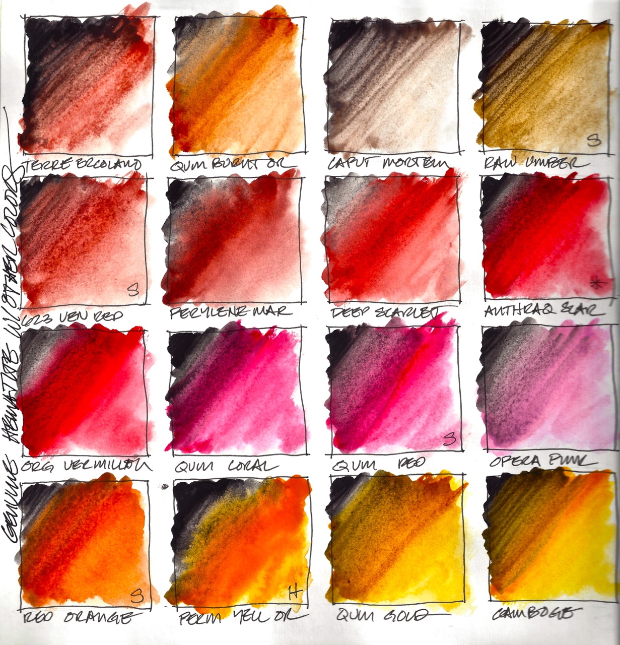 *Above and below, four sets of colors that look very close when spread by themselves on paper:
- Terre Ercolano and Venetian Red (Sennelier)
- Anthraq Scarlet and Organic Vermillon
- Quinacridone Coral and Quinacridone Red (Sennelier)
- Light Yellow 578 (Sennelier) and Quinophthalo Yellow
But when mixed with Hematite they react a bit differently. Sennelier’s Venetian Red holds its own better with the Hematite, so it appears more robust with it. Sennelier’s Quinacridone Red also holds its own with the Hematite, and feels thicker and creamier. Below, the Light Yellow (Sennelier) does not appear to stay as clear and muddies when mixed.
I was careful to use approximately the same amount of paint on the brush to mix, and to move the brush in approximately the same way. This tells me that except for the Scarlet and Vermillon, these paints respond differently when mixed, which is good to know. So I proceed, thinking there is something to this mixology of watercolors. BTW, I love the way the blues mix with Hematite, and the Kyanite goes deeper!
Tomorrow, two other colors are mixed!
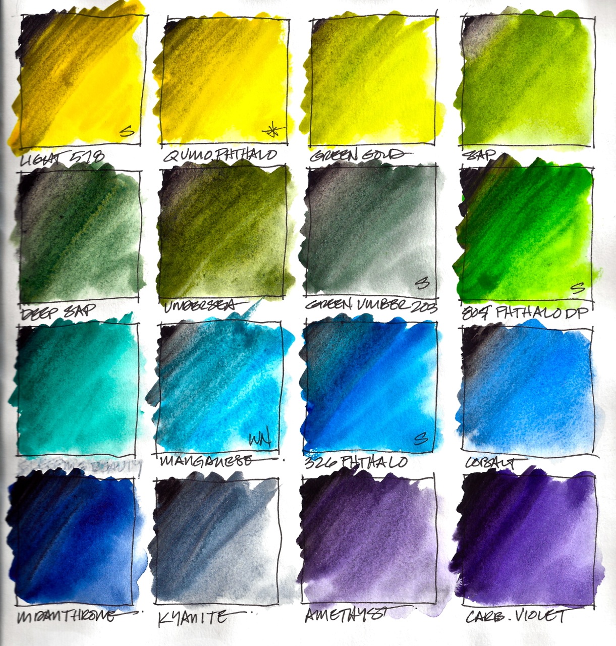 *All watercolors Daniel Smith unless stated otherwise.

I am now agreeing to the Creative Commons Attribution-Non-Commercial 4.0 International License, which you can learn more about by visiting the site, or, visit my web page for a more user-friendly summary on my terms. My images/blog posts can be reposted; please link back to dkatiepowellart.


Manganess, amethyst and carb violet for me. Good thing you only have to check labels for ingredients and not calories because they’re all quite delicious!
LikeLike
Amethyst is made with the real gemstone, and, like the Kyanite, is just a tiny bit sparkly . . . I guess you are also a subscriber to the poem, “When I am old [and young, and always] I shall wear purple . . . “
LikeLike
Absolutely !
LikeLike
Pingback: Process: Mixing Quinacridone + Caput Mortem Paints | D.Katie Powell Art