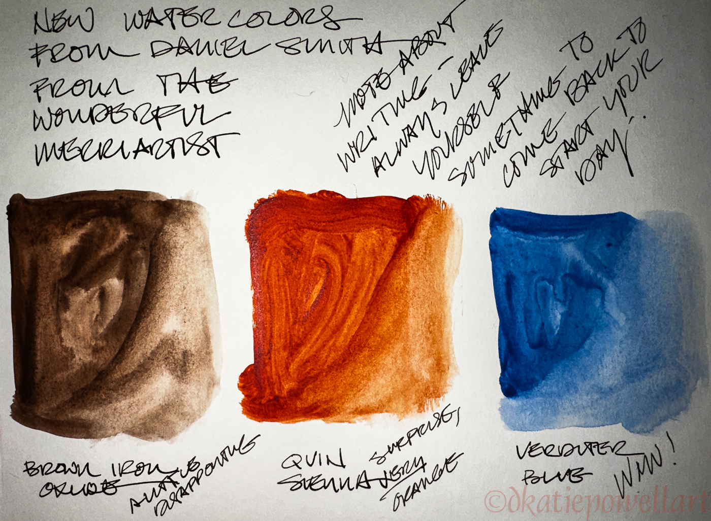
There is not much I buy that thrills me like a new paint color to play with! To those who say “true artists” mix colors and have a simple palette of 3 cool primaries, 3 warm primaries, + white, I say “BOO!”
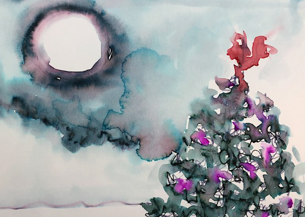
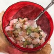
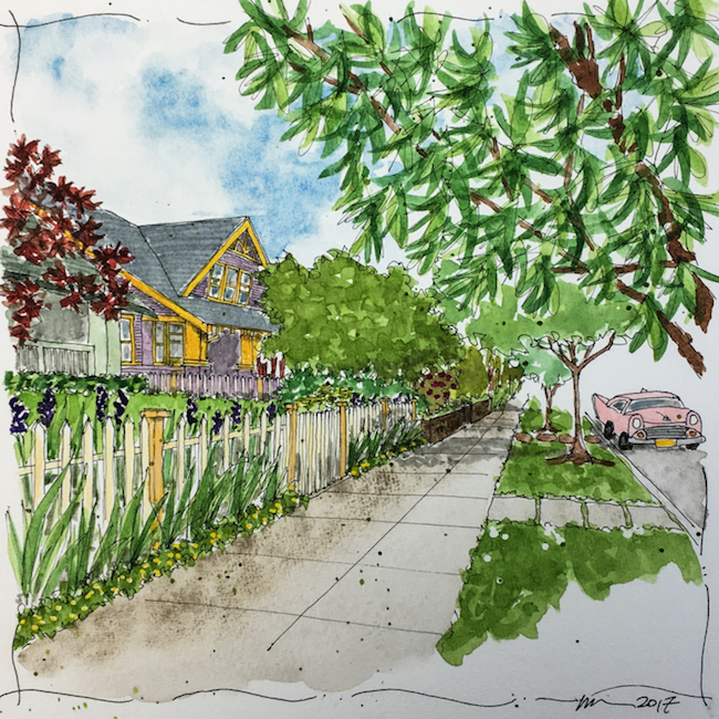
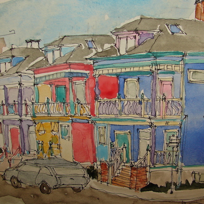
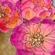
I learned to mix colors 50 years ago (gads can I be that old?) but it is too much fun to explore new colors, like the ones shown left.
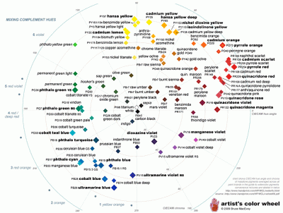 I learned from Handprint about pigments, hues, values, the Munsell System and now I rarely buy the same color with different names.
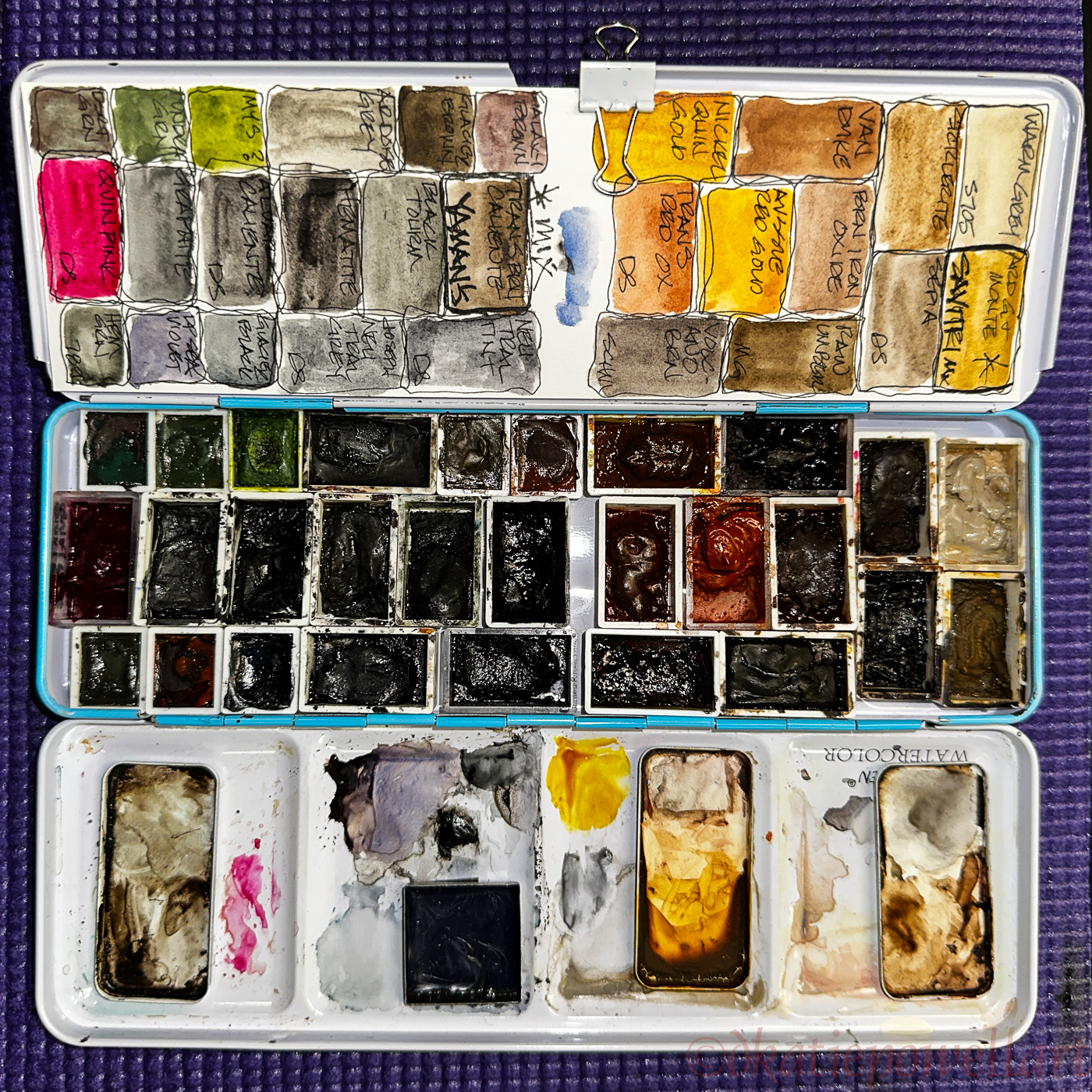
For instance, I love Quin Golds, and used to purchase them from every paint manufacturer. Once I found Handprint, I began looking at the nomenclature below the Quin Golds, “PO49″ and PO48, PY150”… This is the hue and value for each paint color, and by paying attention, and even organizing your paints around it, you can learn a lot (and take your notes with you next time you are on a buying spree!) I printed out most of his site because it is a great “book” on color!
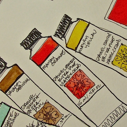
I have to admit that I now am narrowing my buying mostly to these brands — Holbein, DS Primatek watercolors, Daniel Smith Watercolors, Schmincke, and Sennelier — though I occasionally try a watercolor from a small maker for fun. I find these brands to be reliable, consistent and they have deep, luscious pigmentation.
My only beef with Holbein is that I have to go to their site to find out the information on the pigments used, whereas it is easy to get the 9-1-1 on the others, because they give you the pigment information right on the side. This might be true because we are getting an English version of their paint wraps.

Most used, and mostly Daniel Smith.

Daniel Smith Primateks, with a couple of smaller companies whose paints fall into that category.

Mostly Schmincke and Sennelier.

A second Daniel Smith combined with Holbien.
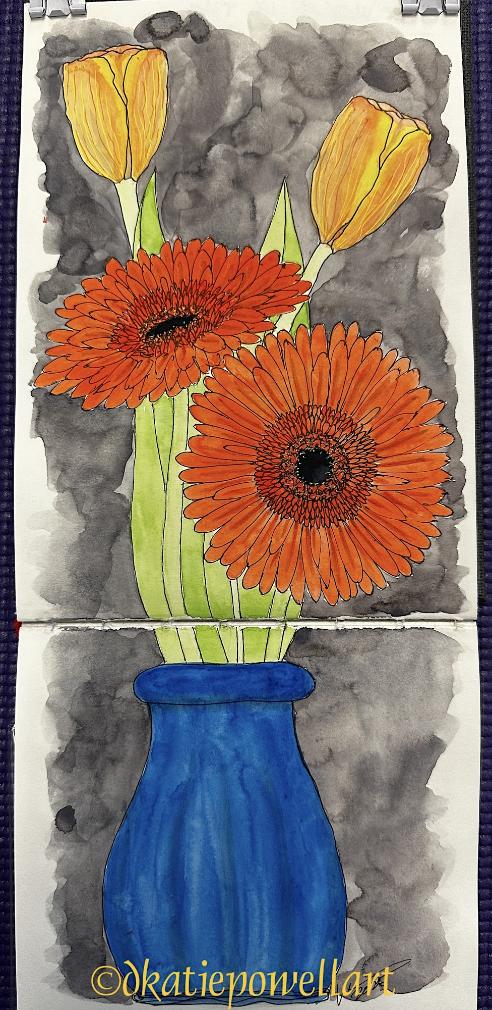
 Most of my palettes are a mix of colors meant to be taken out of the studio, like the ones shown above. They are divided roughly into brands and cover a range of colors so in the field I have what I need to mix in the metal magnetized palettes.
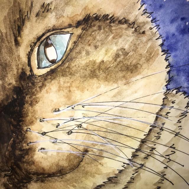
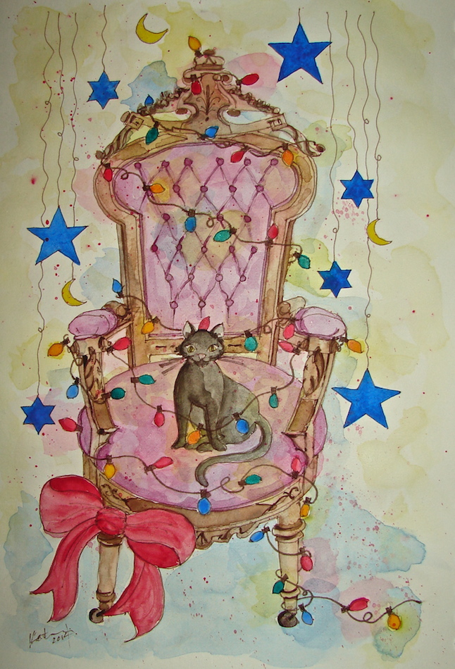
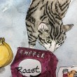
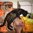
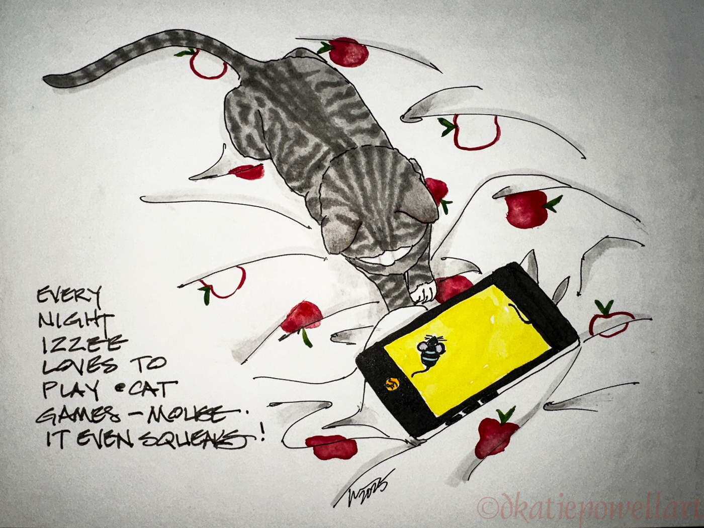
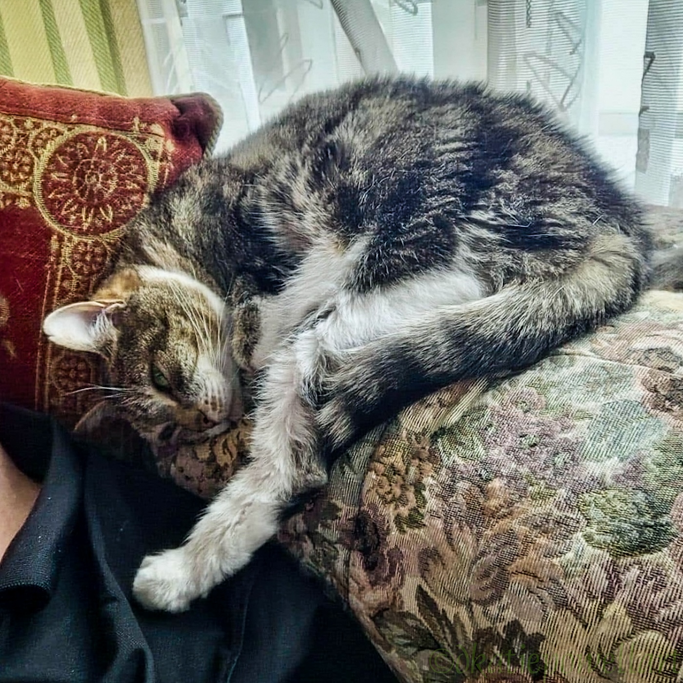
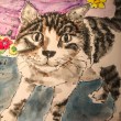
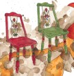
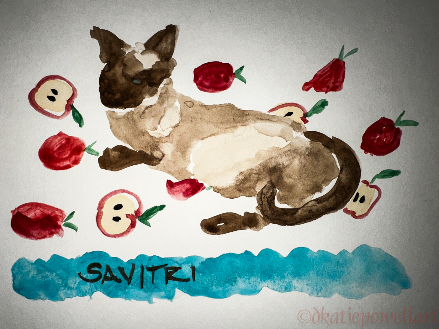
A few are specialty palettes like the one shown right, which was created for our cats. Some paints were specially mixed to make it easy for me to grab the premixed color I want, for our Siamese, Savitri, for instance.
The palette above I created after buying Some Holbein colors early on which were
matte and opaque, and I really had no understanding of how to use them. I preferred transparent color – still do – though now I know how to work with and the value of both opaque and transparent paints. I made one palette for myself and passed the rest of the tubes on to a friend. Not something I would do today!
The colors above in the small half pans were some sparkling paints I bought from a small paint maker in England. I was disappointed in the paints (why I won’t mention her name) as they did not have good depth of color. The large pans are colors from makers I love. I have them in tubes, and will probably never have to buy them again because I rarely use them, but they are beautiful iridescent paints color and sparkling metallic paints.
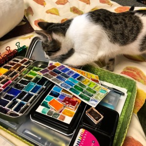 One final note: I like my palettes CLEAN, though I admit that I frequently find cat hairs in them. (I wonder how that happens?) I cannot stand to have my colors muddied and so I use the mixing spaces in the tins. I clean my paints with a cotton swab when I get them dirty.
Favorite watercolors in no particular order: JazperStardust, Holbein, DS Primatek watercolors, Daniel Smith Watercolors, Schmincke, and Sennelier. I buy them from MerriArtist or St. Louis Art Supply.
©D. Katie Powell.
My images/blog posts may be reposted; please link back to dkatiepowellart.
Note: As an Amazon Associate I earn from qualifying purchases.
To hear about classes, follow me on Instagram and Facebook.
Note: I was banned from IG until October for political postings.
I'd love it if you shared this; please mention my blog name!

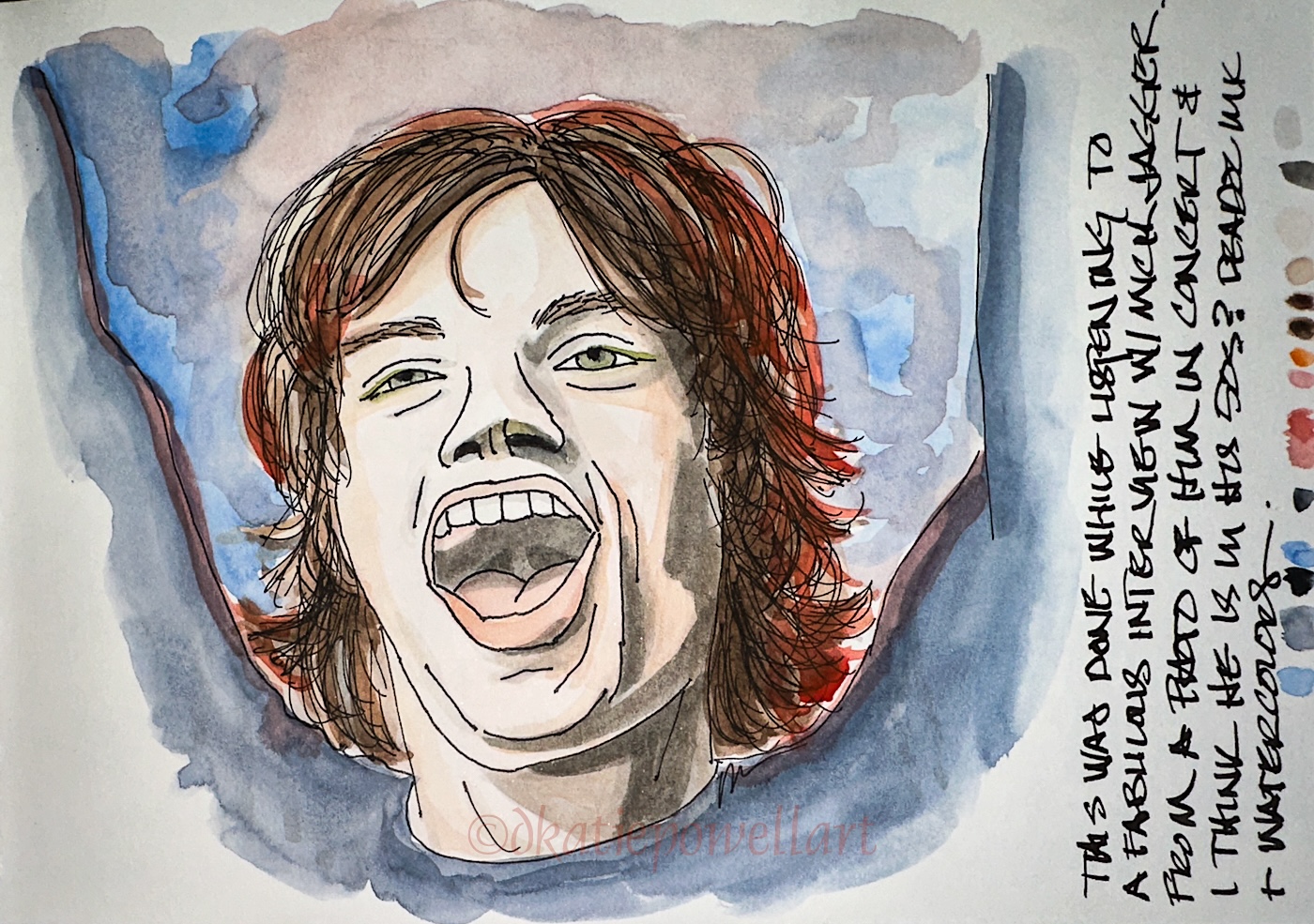
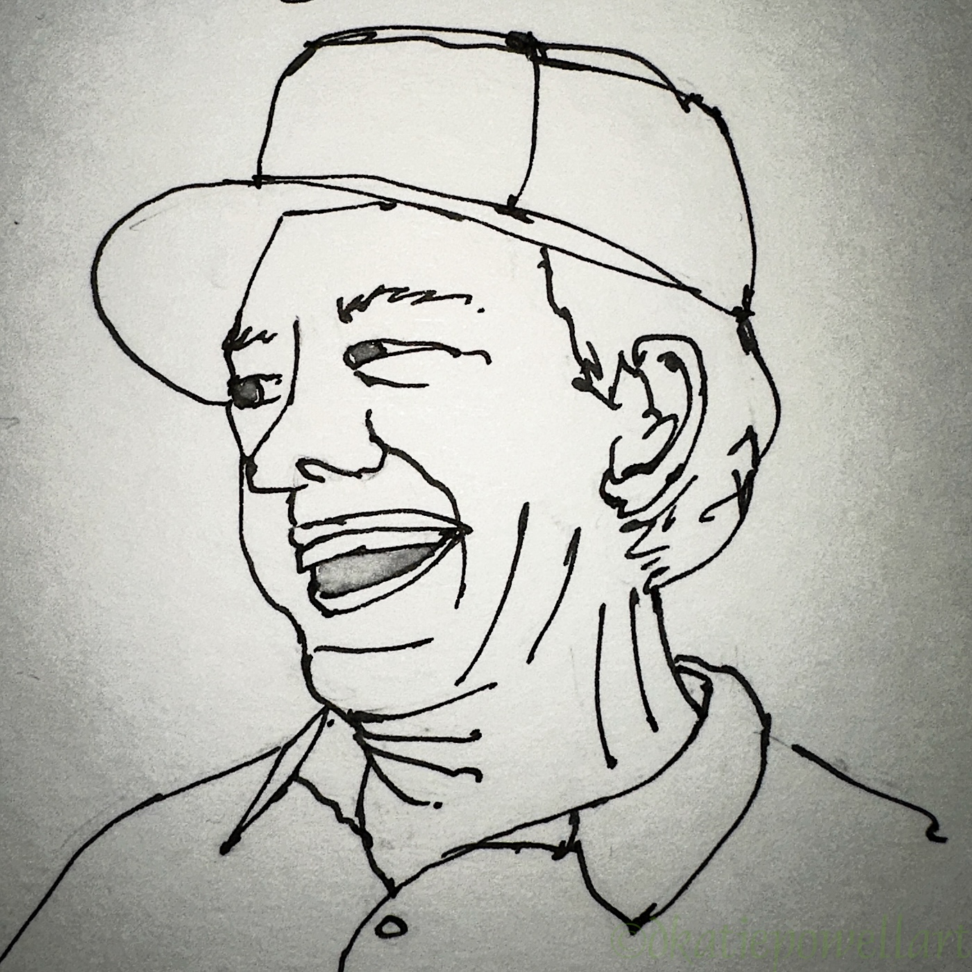
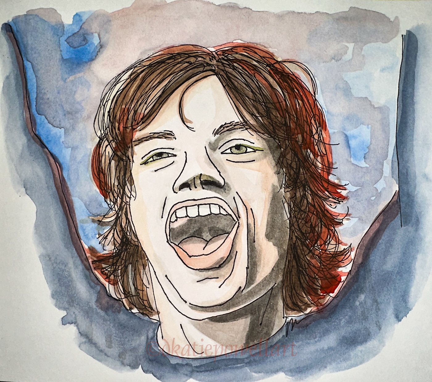 Okay, one portrait inspired another. Interesting people have been interviewed lately, and some died… perhaps that is what is inspiring me to do portraits! Mick Jagger had an excellent interview. (I hope they allow you to see it!)

 I had to give him a try… I used a screenshot I pulled from a concert, shown right.