I’ve been journaling for 50 years, art journaling for forty (first architectural ideas, now art). I’ve tried many journals before finding my perfect journal. I bought the Chinese Journals (left, and btw, review in links) from Chinatown in San Fransisco at age 20. Cheap paper, lined, and I managed to do a good deal of architectural sketching in them! The covers looked sorta red-black-white graphically architectural! I filled about ten of these before I moved to my next best journal.
I found the Okina journal in San Fransisco as well — perhaps that is the best journal city?
The size is a bit larger than a B5 (see it next to the Dingbat journal, left), and
I love the page layout: a grid across the top then tightly spaced lines.
The pocket at the back is so convenient when you are traveling or want to remember an event. But, because now my journal is a combined art/writing journal, and I want a blank sketching page which Okina doesn’t have, so we now use these in our business.

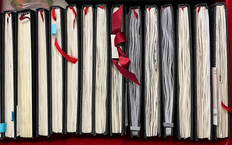
I have tried over a dozen “art” journals, certainly all the big names sold in the USA and the UK, some shown right. I won’t name them because most may be good journals for someone (not me), which is why I always state my preferences when I create a journal review.
I can tell you that never ever going to use a spiral bound journal. The ability to fold it back is not outweighed by having that big old metal spiral in the middle of pages!
The Bright Ideas journal (the colorful journal in the stack) I continue to work. I might not buy another, but sketching on the colorful pages is fun; I keep it by my bed or in the studio and pick it up from time to time.
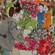
When I don’t like a journal I do not throw it out. I set it aside for an specific thing (like the two square flower journals left) or I gift it.

So now, my Perfect Journal!
But from the time I tried my first Hahnemuhle Nostalgie journal in 2017, I was hooked
and stopped looking. Now, two dozen journals later, I can say that I have
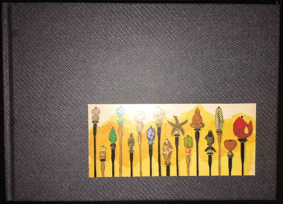
found my best journal (though I also use their Watercolor journals for special USk outings)! I use A5 daily, and A4 when I want a big spread, both landscape format.
What sold me on these journal? Of course, first, it is the paper.
The Hahnemuhle Nostalgie is not watercolor paper,
but the190 gsm natural acid free white sketch paper takes everything
I throw at it when I am sketching and journaling my thoughts,
and in two dozen books I’ve rarely had bleed through!
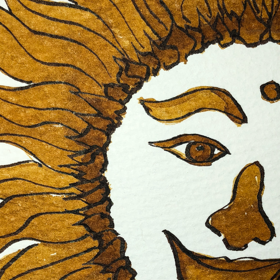
Even my finest point pens glide smoothly across the paper when writing or sketching,
and I use this book for both, as I long ago gave up dividing my life and
decided to use my sketching journal as my personal journal as well.

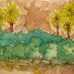
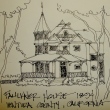
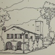
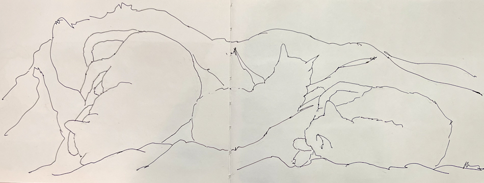
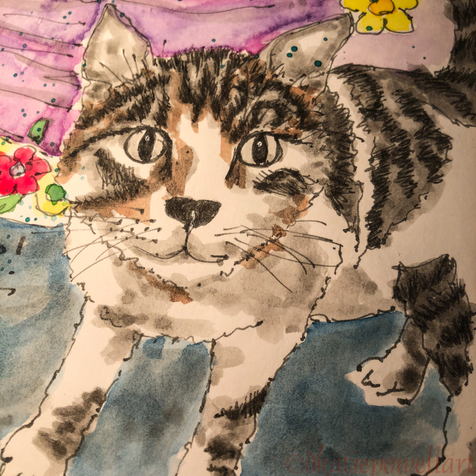
I usually write on the left facing page, and make my sketches on the right-facing pages,
but as you can see from samples above I also mix it up!
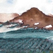
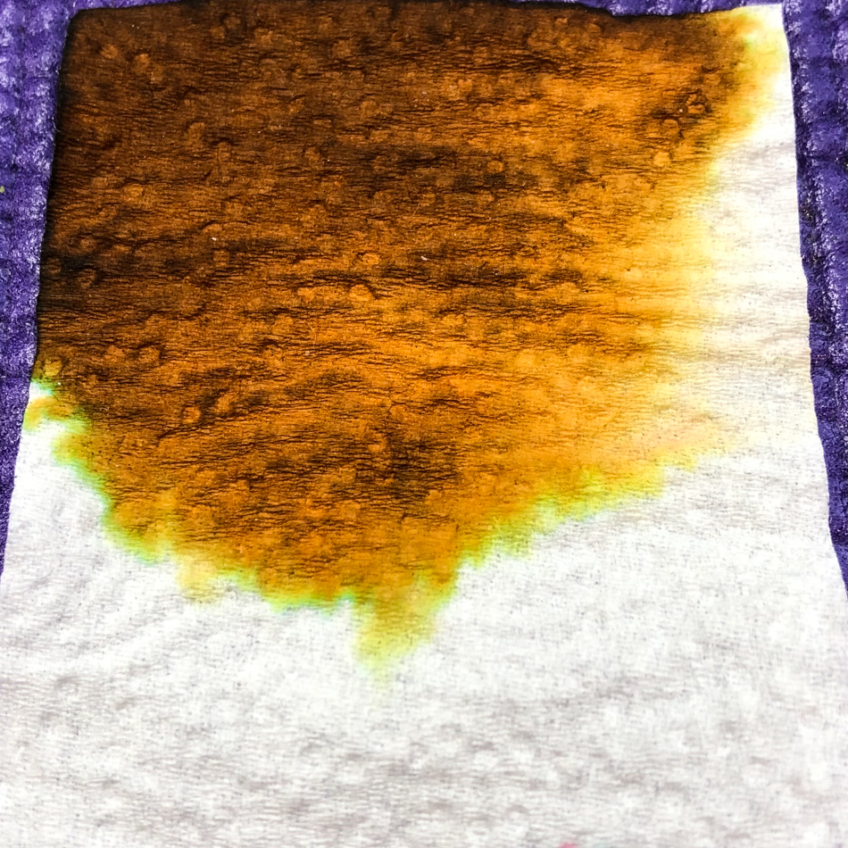
I regularly use watercolor and inks on this paper and it takes both beautifully,
though I do admit to clipping the corners with strong binder clips
when I am going to do a heavy water wash to keep the paper laying flat.
I have occasionally used masking fluid on the paper and no issues!
I also like the way the anthracite cover feels in my hands, and it is industrial strength —
I’ve never had a cover (nor the binding) give way or even show dirt.
I use stickers to decorate the outside of mine, but admit I have to use glue to
keep it on the anthracite cover. The 40 sheets (or 80 pages as I use both sides),
is a good size with which to carry and travel.
Finally, they are an environmentally responsible company.
I consider this in all my purchases.
In revisiting many old posts to finalize this one, I also came across old posts on journaling… If you want to start a practice or broaden your own, I have three posts on my journaling over the years:

 To hear about classes, follow me on Facebook
or check out my new, improved dkatiepowellart.com
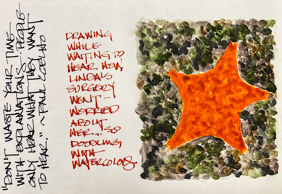
“Memory is more indelible than ink.”
Anita Loos, Gentlemen Prefer Blondes.
“I think not….”
Me… why I journal!
©D. Katie Powell.
My images/blog posts may be reposted; please link back to dkatiepowellart.
☾
 As my Patreon supporter, you will have
access to some content not on this website,
sneak previews, goodies, discounts on classes.
I teach architectural sketching,
art journaling (art+writing), creativity, watercolors.
That annoying loud-mouth editor/critic in your head? GONE! How great would that be?
I'd love it if you shared this; please mention my blog name!


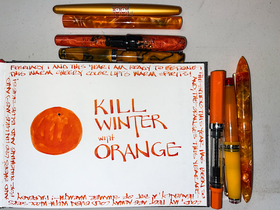
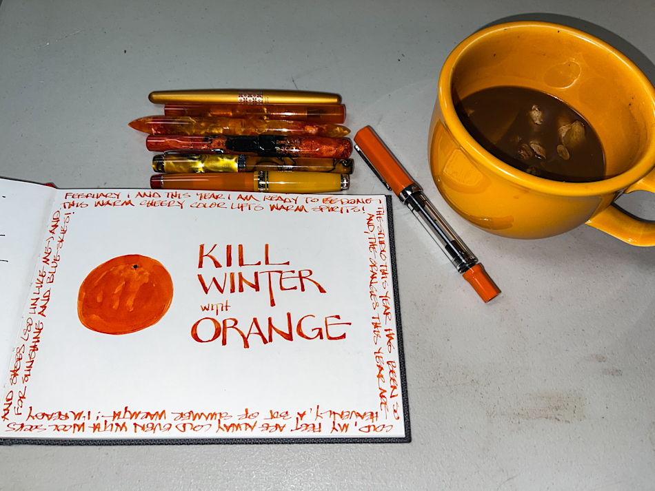


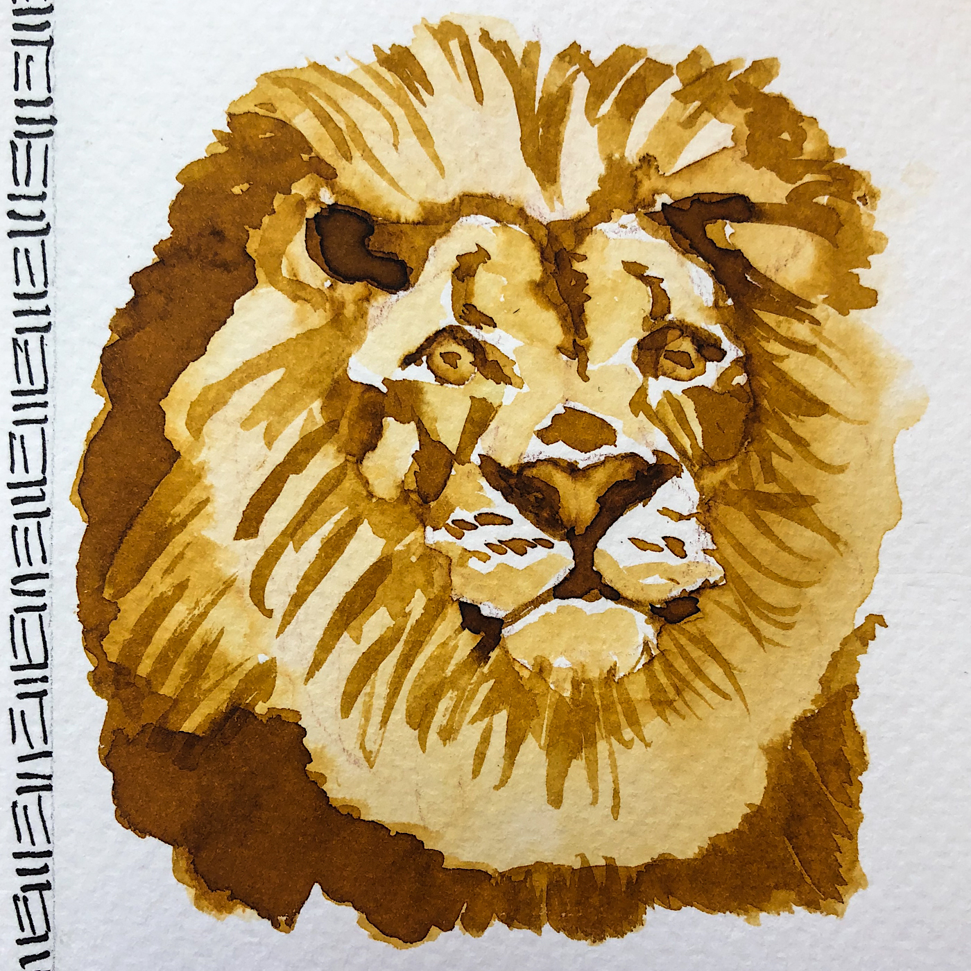


 For my large ink test