
I love sketching with soluble grey inks, and touching them with a waterbrush
to move the inky colors in interesting directions. Greys are rarely neutral,
leaning toward warm or cool. Robert Oster Charcoal is one of five favorite greys,
leaning into deep purple and blues when touched with water.
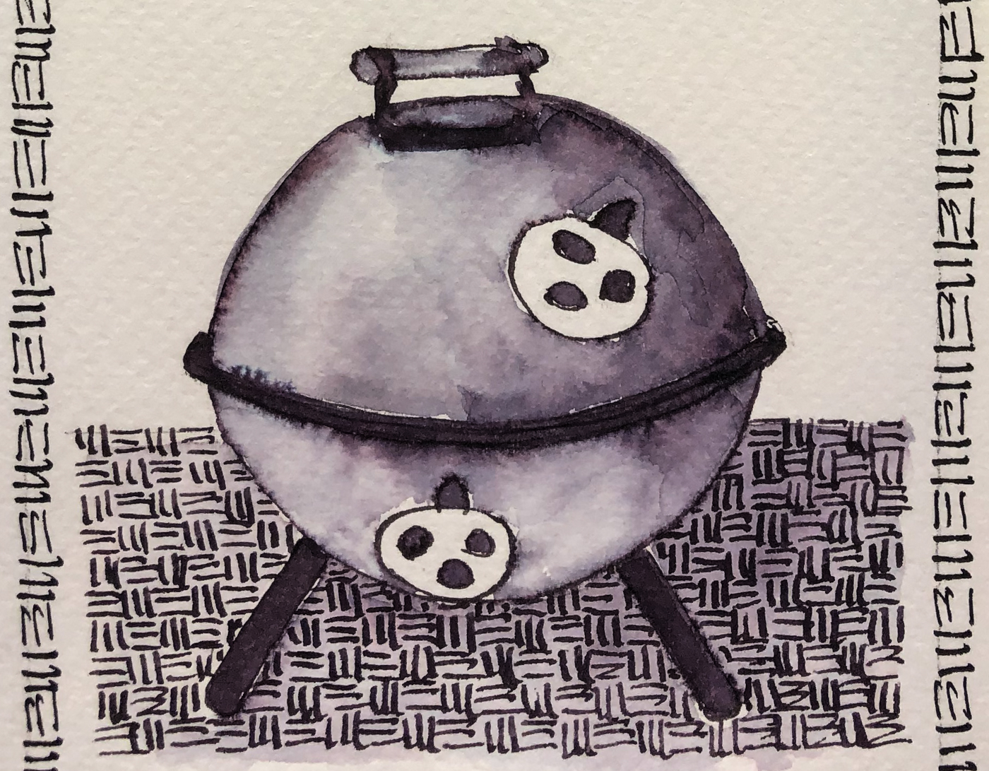
My hibachi was drawn with a FPR Himalayan with an ultra-flex nib on cold press watercolor paper, then the lines were touched with water using a Pentel Aquash waterbrush. The lines do not stay visible but quickly lose themselves in wet color;
The lines were added back in after the water moved the ink and dried!
Remember that others review these inks just for writing;
I am also interested in how they are used for ink-painting!

Properties of Robert Oster’s Charcoal:
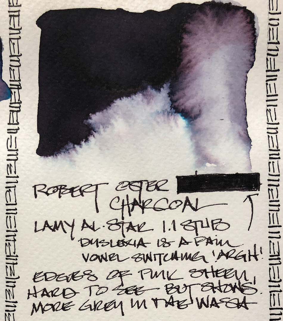
 This ink is well-behaved,
and does not feather on
any of the papers I normally use, even Post-its. I consider it a medium ink, neither wet nor dry, and it evaporates quickly with a wet nib. It has never smeared on me during a sketch. It has a hint of a
pink-red sheen, impossible to image. It contains amethyst, dark blue edging into turquoise when wet.
When hit with water it
moves easily with no resistance or ghosting.
It is not water resistant.


*Above, watercolors, from Daniel Smith.*
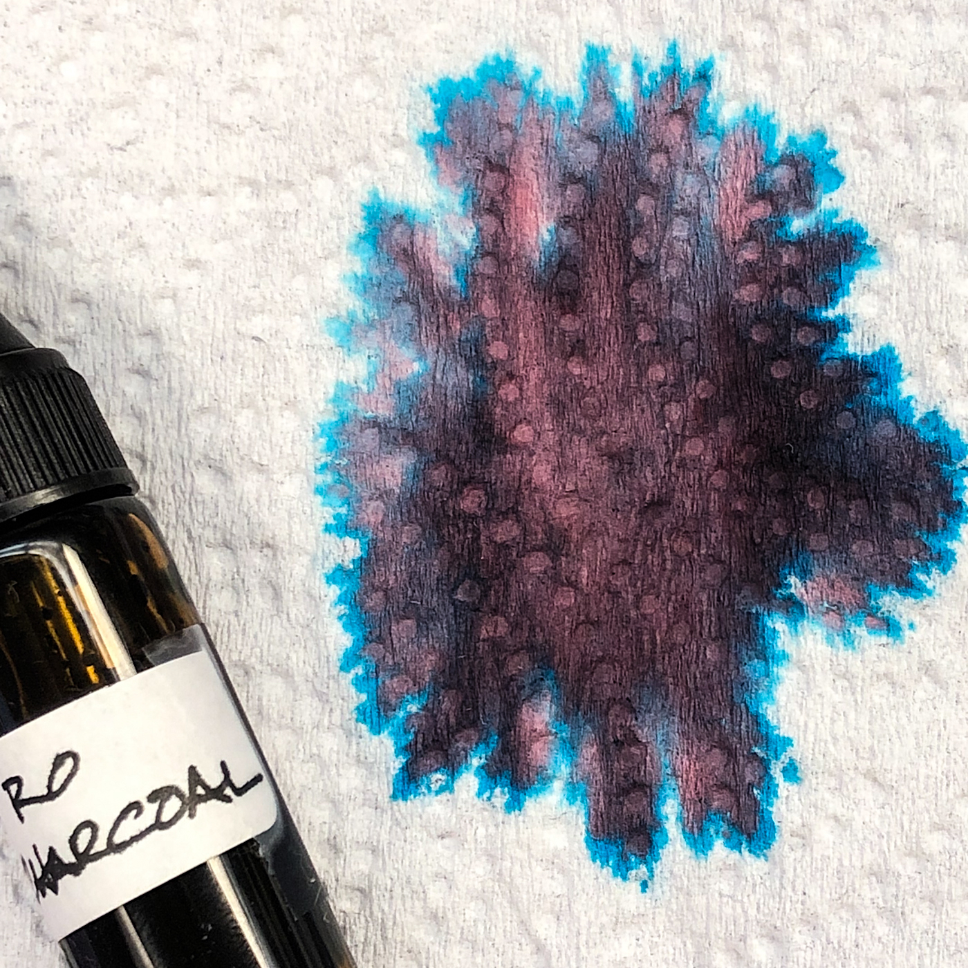 The paper towel test
shows how many colors
lay beneath the grey!
When the edge is touched with water it moves easily
into violet, dark blue,
blue-greens. Looking at watercolor comparisons,
I offer Daniel Smith’s Carbazole Violet, Amethyst, Indigo, Turquoise and Pphthalo Blue-Green.
The pigments fall into in
the following Munsell
ranges: PV23, PB27/PV19,
PB 15:3, PG36.
*For more info on the munsell system, go to this page. Knowing the pigments can
help you not to duplicate watercolors made of the same pigments.*
RO is experimenting and testing lightfast properties…
MOST water soluble ink companies do not pay attention to these things
because most artists who use ink are making prints of their work.
 On smooth Hahnemühle paper I created a very fast sketch of
de la Sainte Trinite in Paris, designed by architect Jean-Michel Wilmotte,
then came back and touched the tree lines and shadows… adding color on my
waterbrush in the spires, and a little more in the trees. I love the deep purpley grey.

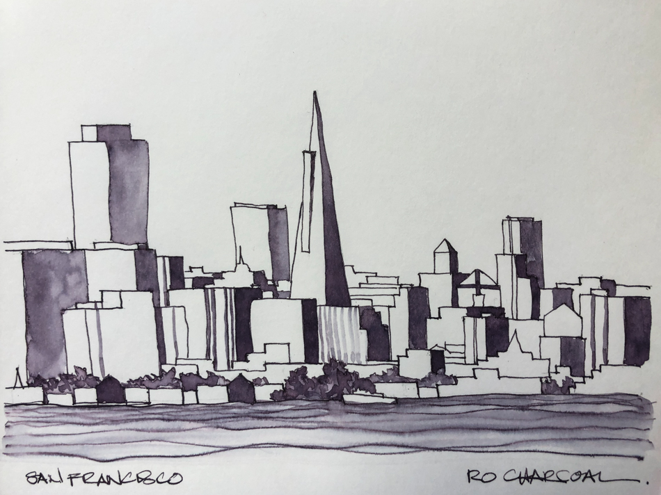
Playing with a San Francisco cityscape…


 A polychrome Egyptian chair I sketched when I was working
on the painted finish… A thicker line will lay down a lot more color
when touched with the FPR Himalayan with an ultra-flex nib.
Other Robert Oster Inks reviewed in this manner to date:
Robert Oster Jade, Robert Oster Melon Tea,
Robert Oster Fire Engine Red, Robert Oster Thunderstorm,
Robert Oster Fire Engine Red, and Robert Oster Aussie Brown
The non-toxic inks come in 50ml plastic bottles that are environmentally friendly, using recycled plastic.
They can be tippy, so I usually put them in a more solid container
to decant. All my pens fit easily into the bottle opening to fill.
I bought Robert Oster Charcoal at Vanness.


 To hear about classes, follow me on Facebook
or check out my new, improved dkatiepowellart.com
“Memory is more indelible than ink.”
Anita Loos, Gentlemen Prefer Blondes.
“I think not….”
Me… why I journal!
Hahnemühle journal, Pentel Aquash waterbrush,
FPR Himalayan withan Robert Oster Charcoal.


©D. Katie Powell.
My images/blog posts may be reposted; please link back to dkatiepowellart.
☾
 As my Patreon supporter, you will have
access to some content not on this website,
sneak previews, goodies, discounts on classes.
I teach architectural sketching,
art journaling (art+writing), creativity, watercolors.
That annoying loud-mouth editor/critic in your head? GONE! How great would that be?


Pingback: Inky Thots: Robert Oster Green at Night | D.Katie Powell Art
Pingback: Inky Thots: Robert Oster African Gold | D.Katie Powell Art
Pingback: Inky Thots: Robert Oster Monsoon Clouds | D.Katie Powell Art