
 From Robert Oster’s website:
“My great interest in fountain pen inks – and by extension inks
that combine many creative applications – began with the birth
of my love of fountain pens in 1989. The contents and packaging of my Inks are all nature friendly and
the colours a genuine inventory of the Australian palette.“
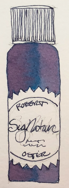
His bottles are not the most beautiful, but I am happy
they are environmentally friendly bottles, created from recycled chemical waste! His inks are non-toxic. This matters to me;
I started with fountain pens to stop the plastic pen trash.
I have more Robert Oster inks than any other brand.
Why? Because no other brand has the spectacular
mix of pigments within a color, which gives even his simplest inks
such beauty that it is a shame to waste them on writing!
This love affair with ink pigments began with brushing wet ink on paper
(below) and watching the colors move and separate… pure color, floating on paper!
Yes, I CAN watch ink dry! It is beautiful, art-full, and I take no credit for it!
Remember that others review these inks just for writing;
I am also interested in how they are used for ink-painting!
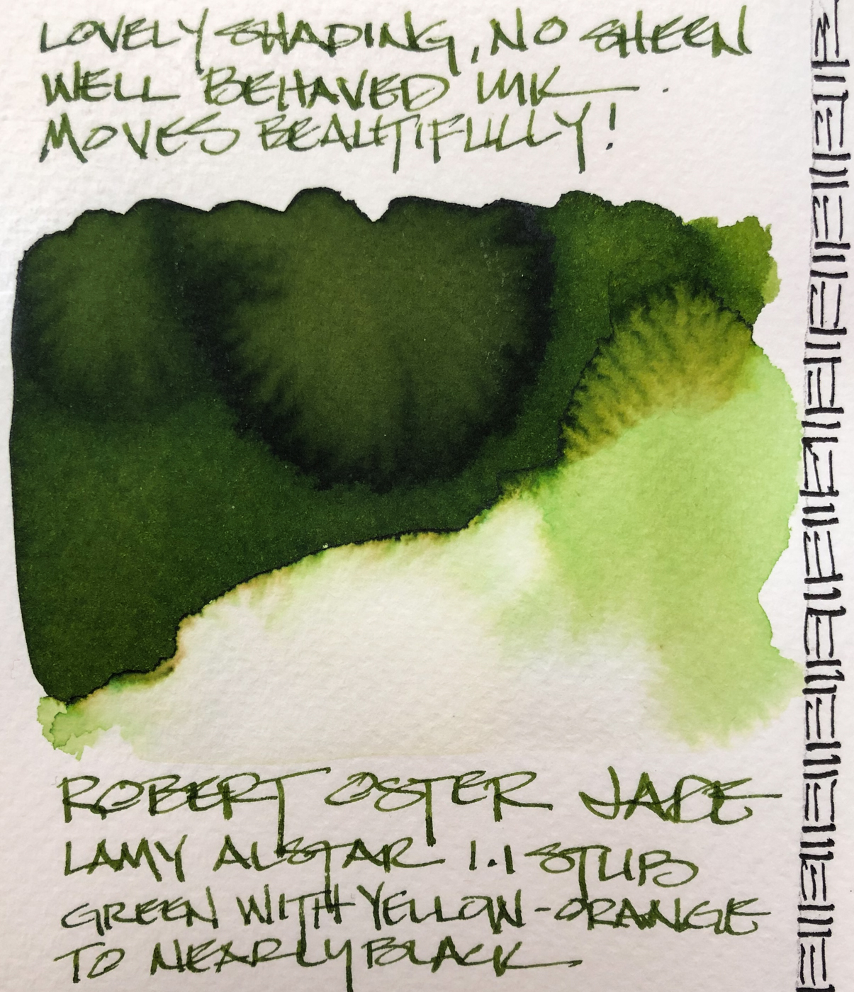
Properties of Robert Oster Jade:
Well behaved, for me this means neither dry nor wet,
and has enough body that it does not feather on the papers I use unless the paper is wet…
For the writers, I use it in my journal and on Post-its with no feathering issues.
Bleed-through is more about the paper than the ink!
Jade has no sheen, though when I tried to produce it by thickly
laying ink on the paper it I found the halo to be nearly black!
I will have to find a way to use that in my art… think the Black Forest in Germany!


*Above, four watercolors from Daniel Smith.*
 When the ink is dispersed on paper towel and water added, the electric yellow come through stronger!
When the edge is touched with water it moves easily with no resistance into yellow and rust tones. Looking at watercolor comparisons, the colors range from Sap or Green Apatite to Serpentine or Green Gold and a touch of Phthalo. In watercolors that puts the pigments in the Munsell ranges: P7, PO49, PG36, PY129, PY150, and Py3.
RO is experimenting and testing lightfast properties now…
MOST water soluble ink companies do not pay attention to these things
because most artists who use ink are making prints of their work.
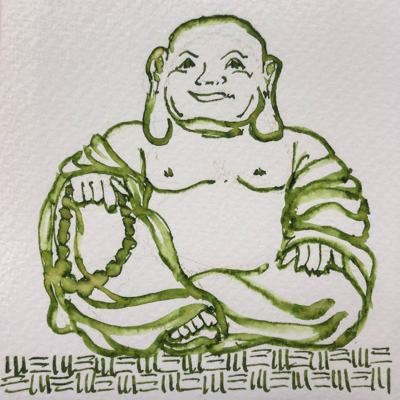
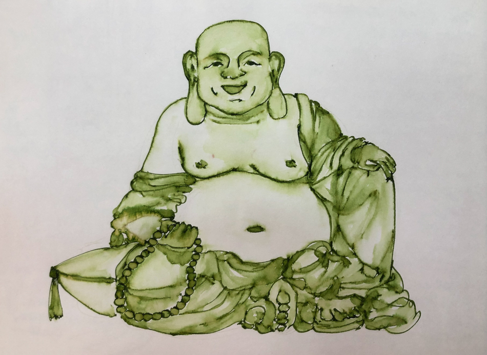
I drew Hotei Buddha on my test page with a
Lamy Al-Star 1.1 stub on cold press watercolor paper,
and touched the lines with water using a Pentel Aquash waterbrush.
This was a fifteen minute sketch…
The lines do not stay visible but quickly lose themselves in wet color;
if linework is wanted it has to be added back in after the water moves the ink.
Compare the Hotei above with the one below, which was carefully layered.
See how the beads float into the edges of his robe?
In my journal I tried a second image, as Jade is not a color I’ve used by itself:


On smooth Hahnemühle paper (my Nostalgie journal)
I sketched a second Hotei Buddha.
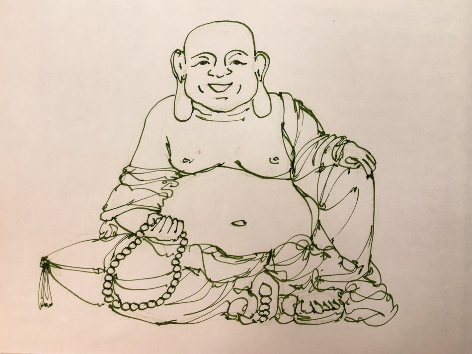
Penciled lightly with a watercolor pencil.
Sketched the loose lines of Hotei Buddha in Robert Oster Jade ink.
Erased most of the lines.
This time I slowed down when touching the waterbrush to the lines
in order to develop the layers.
I was careful to wet select areas at one time so wet ink did not migrate too far.
I started with the beads and his feet and part of his face first…
Separating these gave me a little bit of control,
but the lines still disappeared in many places.
Next I did the pillow, the rest of his face, soem folds on the robe
and his body and hands, letting those dry.
Finally I placed water on the robe layers.
Letting watery ink dry between layers takes about an hour on a 5×8 sketch.
I like it like this and sometimes stop here,
as I did above in the smaller cold press version.
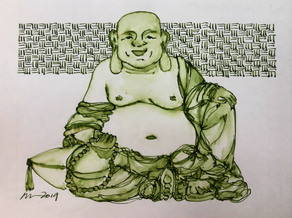
Finally I come back and selectively add lines again.
I am not trying to go over the lines I did the first time
(that tends to come off stilted not flowing or spontaneous)
but just find my new way with the folds and details of his body.
If you want to know why I am doing this series, read yesterday’s post.
I will also do some videos to accompany the sketches.
Disclosure, this ink was a gift… what an amazing gift!
It was not given to me to review, however, just a gift.


 To hear about classes, follow me on Facebook
or check out my new, improved dkatiepowellart.com
“Memory is more indelible than ink.”
Anita Loos, Gentlemen Prefer Blondes.
“I think not….”
Me… why I journal!
Hahnemühle journal,
Pentel Aquash waterbrush,
Lamy Al-Star with Robert Oster Jade ink.


©D. Katie Powell.
My images/blog posts may be reposted; please link back to dkatiepowellart.
☾
 As my Patreon supporter, you will have
access to some content not on this website,
sneak previews, goodies, discounts on classes.
I teach architectural sketching,
art journaling (art+writing), creativity, watercolors.
That annoying loud-mouth editor/critic in your head? GONE! How great would that be?


Nice work. Those Bhudda’s are charming. I don’t own any green fountain pen inks (and just one green drawing ink) because I don’t tend to be much drawn towards my green watercolours. Greens and oranges are probably my least used pans. I do, however, like the qualities of that RO ink that you’ve showcased.
LikeLike
I have a few gorgeous greens I’ll be showing in the first couple months. RO is such great ink!
LikeLiked by 1 person
Pingback: Inks in Depth: Robert Oster Melon Tea | D.Katie Powell Art
Pingback: Inks in Depth: Robert Oster Fire Engine Red | D.Katie Powell Art
Pingback: Inks in Depth: Robert Oster Aussie Brown | D.Katie Powell Art
Pingback: Inky Thots: Robert Oster Charcoal | D.Katie Powell Art
Pingback: Inky Thots: Robert Oster Green at Night | D.Katie Powell Art
Pingback: Inky Thots: Robert Oster African Gold | D.Katie Powell Art
Pingback: Inky Thots: Robert Oster Monsoon Clouds | D.Katie Powell Art