

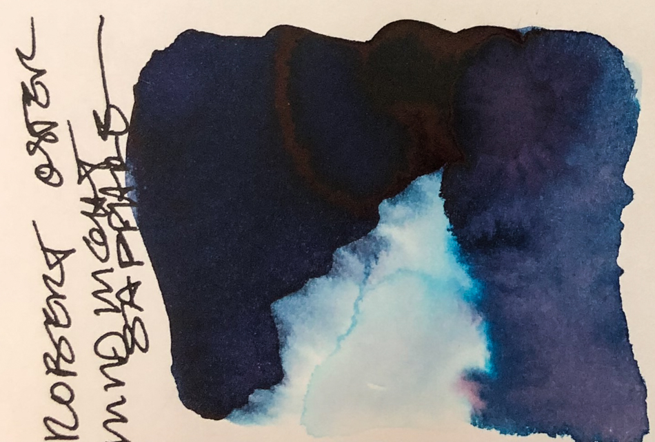
Robert Oster Midnight Sapphire might need to be renamed Blueberry,
though it is a moody deep blue-purple perfect for skies!
My blueberries ere built of of layers of darker color
and a little linework at the end while the paper was still damp.
Remember that others review these inks just for writing;
I am also interested in how they are used for ink-painting!


Properties of Robert Oster Midnight Sapphire:
 This ink is well-behaved (so far all Robert Oster non-shimmery inks are well behaved).
It does not feather on any of the papers I normally use, including Post-its. I consider it a medium ink, neither wet nor dry, and it evaporates quickly with a wet nib.
It has never smeared on me during a sketch. It has a red sheen if applied thickly on smooth paper like the Hahnemühle Nostalgie Sketchbook, above. When hit with water it moves easily with no resistance or ghosting. It is not water resistant.
I have said it is unpredictable to work with,m and that is in a painting because
it separates and has a mind of its own, and that is a good thing if you are
willing to work with this beautiful ink! Moody broody colors, as you can see!


*Above, watercolors, from Daniel Smith and Sennelier.*
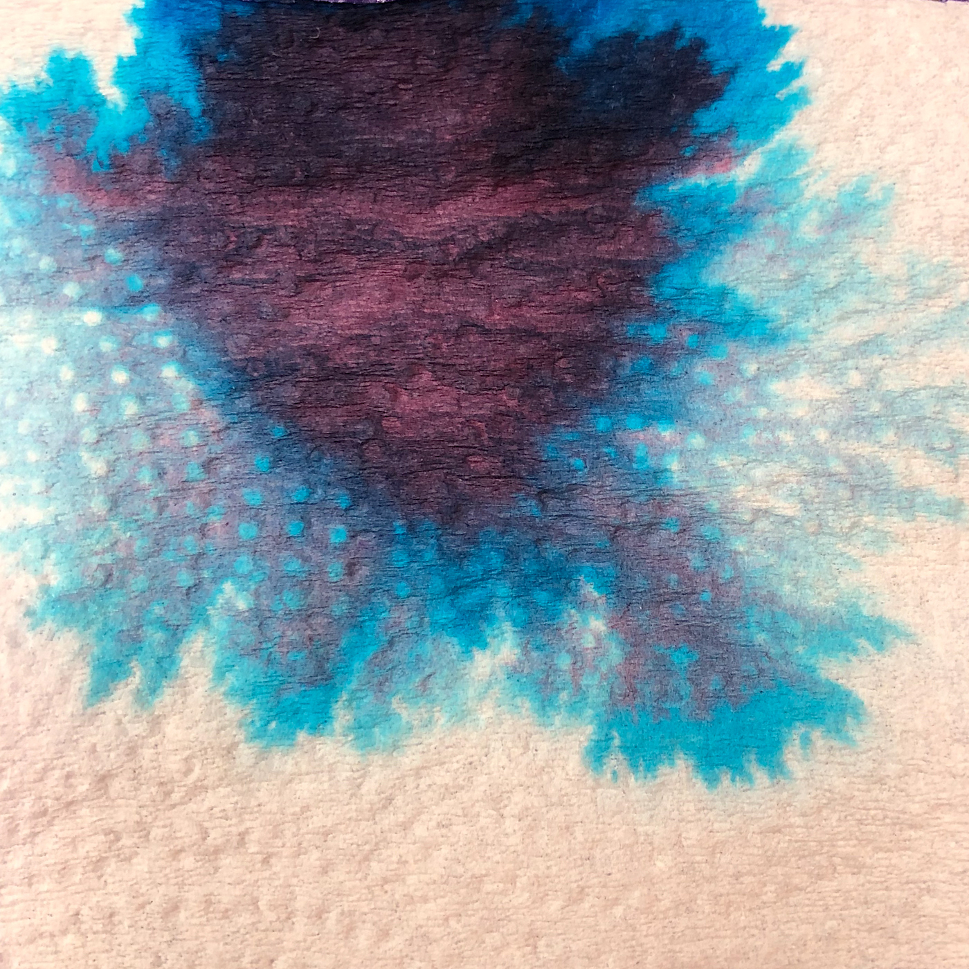 The paper towel test
shows how many colors
lay within the blueberry-colored ink! When the edge
is touched with water it
moves easily into violet to turquoise. Looking at watercolor comparisons,
I offer Daniel Smith’s Dioxazine Purple, Imperial Purple, Phthalo Blue,
and Cinerous Blue. The pigments fall into
in the following Munsell ranges: PV19, PV23, PV29,
PB 15:3, and PB36.
*For more info on the munsell system, go to this page. Knowing the pigments can
help you not to duplicate watercolors made of the same pigments.*
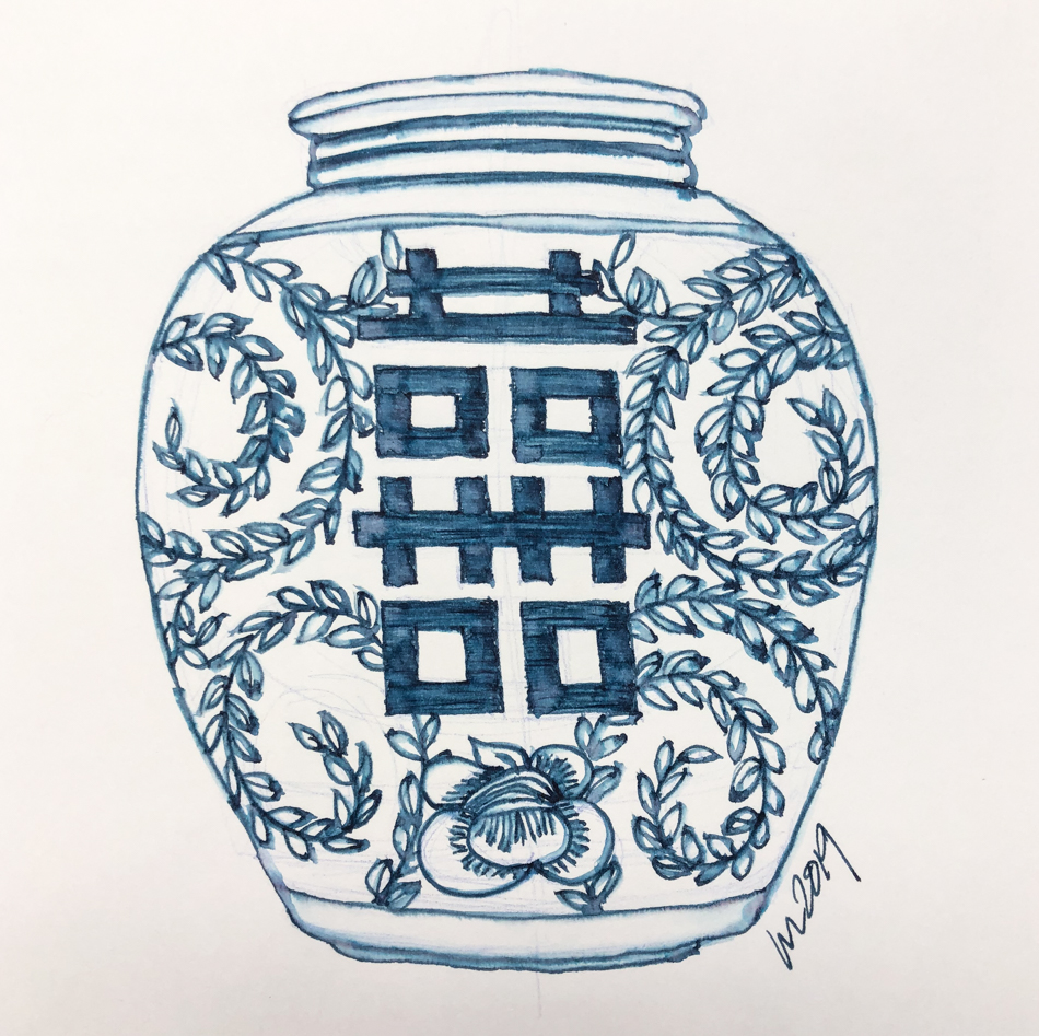
On smooth Hahnemühle Nostalgie Sketchbook paper I sketched my
Mom’s large Chinese container using a TWSBI Eco with a fine nib,
then touched the lines with a smaller Pentel Aquash waterbrush.
A small brush doesn’t lay down as much water so the lines might show a bit more;
seems tame here… but wait, as water brings the colors!
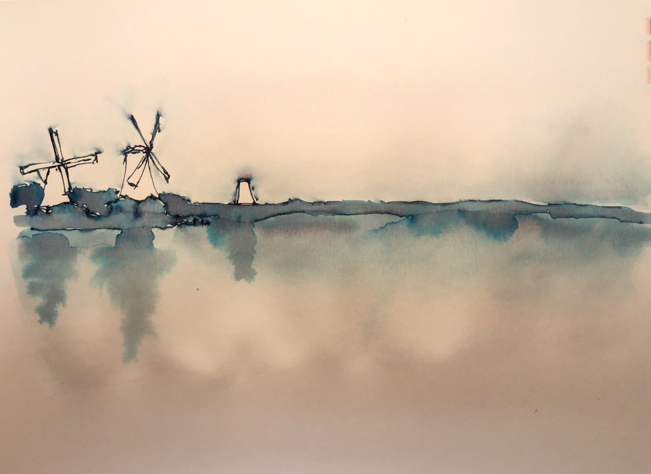
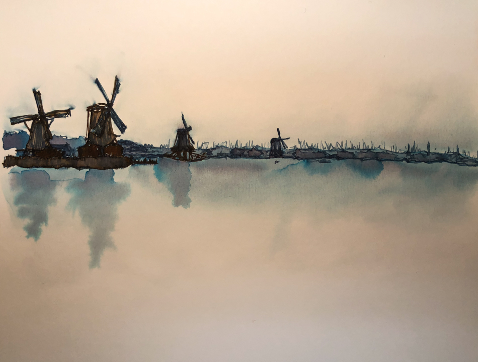 In an inky sketch of
windmills in a foggy morning. I started with a horizon line… then before I got too far in my sketch I pulled ink down for the water, and up for the sky (wet area above shows the distance of the pull.)
I wish I’d done this when I had just my horizon line in place, but it still worked.
The image was a foggy grey day across a body of water.
Over the dried ink wash I moved across the horizon line, adding lines for the various windmills and trees and such. I used two colors, the Robert Oster Midnight Sapphire, and then to warm the banks and wooden structures, Robert Oster Aussie Brown ink.
It is risky laying in two lines of colored inks — I suggest trying it on a test area
so you can see how dark it is getting and how saturated. A little ink goes LONG way.
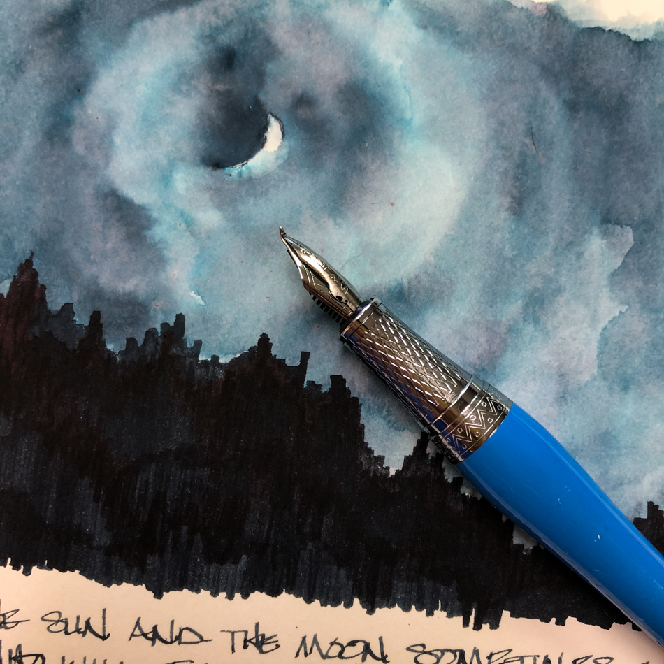
Also on Hahnemühle Nostalgie Sketchbook, a fast sketch using
the Duke Fude pen, laying on lots of ink and moving it fast;
more water around the sliver of the moon. Thankfully this time the ink cooperated!
RO is experimenting and testing lightfast properties…
MOST water soluble ink companies do not pay attention to these things
because most artists who use ink are making prints of their work.
 His inks are non-toxic. I have more Robert Oster inks
than any other brand. Why? Because no other brand
has the spectacular mix of pigments within a color,
which gives even his simplest inks such beauty to with which to sketch and paint that it is a shame to waste them on writing!
His bottles are not the most beautiful, but I am happy
they are environmentally friendly bottles, created
from recycled chemical waste! This matters to me;
I started with fountain pens to stop the plastic pen trash.
I can get the fattest pen into them to refill on the go.
Yes, they are a bit tippy. I don’t care.
His inks make up for all that.
Robert Oster does not use boxes. As mine all go into the trash, I am happy not to cut down a tree for a box around a bottle!
I bought Robert Oster Midnight Sapphire ink at Vanness;
click here to see my Robert Oster inks.


 To hear about classes, follow me on Facebook
or check out my new, improved dkatiepowellart.com
“Memory is more indelible than ink.”
Anita Loos, Gentlemen Prefer Blondes.
“I think not….”
Me… why I journal!
Hahnemühle journal, nameless bad watercolor journal, Pentel Aquash waterbrush,
TWSBI Eco with Robert Oster Midnight Sapphire ink.


©D. Katie Powell.
My images/blog posts may be reposted; please link back to dkatiepowellart.
☾
 As my Patreon supporter, you will have
access to some content not on this website,
sneak previews, goodies, discounts on classes.
I teach architectural sketching,
art journaling (art+writing), creativity, watercolors.
That annoying loud-mouth editor/critic in your head? GONE! How great would that be?


The ink is beautiful and your paintings are really lovely. Thanks for sharing the info. I would have to give ink this a try.
-Soma
LikeLike
It is a beautiful ink!
LikeLike
Pingback: Inky Thots: Robert Oster African Gold | D.Katie Powell Art
Pingback: Inky Thots: Robert Oster Monsoon Clouds | D.Katie Powell Art