


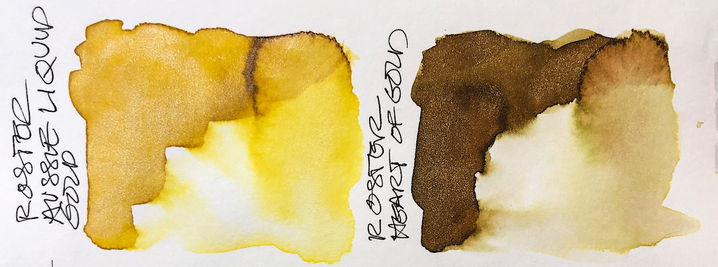
 I love Robert Oster Shake & Shimmer Heart of Gold ink, (shown for comparison),
but the wow factor in Robert Oster Shake & Shimmer Aussie Liquid Gold ink,
a clear bright yellow-gold is amazeballs (a technical term)!
Above, you can see the different in the ink on watercolor paper, (top row, with and without flash so you can see the glitteries!), versus on smooth Hahnemühle paper,
comparing Aussie Liquid Gold ink and Heart of Gold ink, second row.
Remember that others review these inks just for writing;
I am also interested in how they are used for ink-painting!
Properties of Robert Oster Aussie Liquid Gold ink:
![]() This ink is well-behaved,
This ink is well-behaved,
and does not feather on
any of the papers I normally
use, including calendars
and Post-its. I consider it a medium ink, neither wet
nor dry; it evaporates
quickly with a wet nib.
It has never smeared on me.
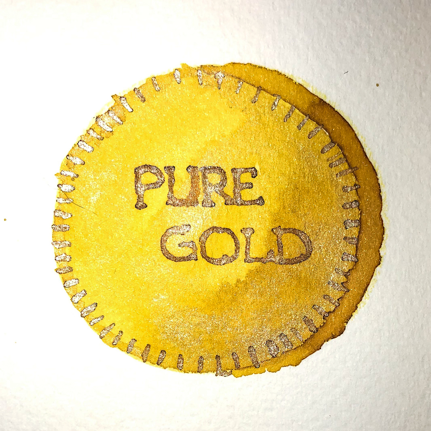
It has monster
white-gold glitter!
I found it hard to image but
there are several photos here.
When hit with water the base
color moves easily but
the gold tends have
some water resistance.


*Above, watercolors, from Daniel Smith and Sennelier.*


The base dye confounds me, as it looks to be warm in certain lighting and cool —
even a slight touch lemony green — in other lighting.
The paper towel test (above) shows a distinct green separation along the top.
I also see touches of Robert Oster’s Green Olive (above) in the washed color.
Looking at watercolor comparisons, above I offer Daniel Smith’s Indian Yellow, their Primatek colors Monte Amon Sienna, and Tiger Eye, as well as Sennelier’s Hansa Light and Lemon Yellow. The pigments fall into in the following Munsell ranges: PY108, PY153, and PY3.


Another comparison between Aussie Liquid Gold ink and Heart of Gold ink.

RO is experimenting and testing lightfast properties…
MOST water soluble ink companies do not pay attention to these things
because most artists who use ink are making prints of their work.
 His inks are non-toxic. I have more Robert Oster inks
than any other brand. Why? Because no other brand
has the spectacular mix of pigments within a color,
which gives even his simplest inks such beauty to with which to sketch and paint that it is a shame to waste them on writing!
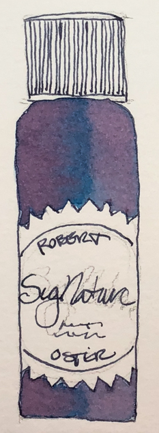
His bottles are not the most beautiful, but I am happy
they are environmentally friendly bottles, created
from recycled chemical waste! This matters to me;
I started with fountain pens to stop the plastic pen trash.
I can get the fattest pen into them to refill on the go.
Yes, they are a bit tippy. I don’t care.
His inks make up for all that.
Robert Oster does not use boxes. As all my ink boxes
go into the trash, I am happy not to cut down a tree f
or a box around a bottle!


 To hear about classes, follow me on Facebook
or check out my new, improved dkatiepowellart.com
“Memory is more indelible than ink.”
Anita Loos, Gentlemen Prefer Blondes.
“I think not….”
Me… why I journal!
Hahnemühle 1584 Journal, Hahnemühle Nostalgie Sketchbook,
Pentel Aquash waterbrushes, Robert Oster Shake & Shimmer Aussie Liquid Gold ink,
Robert Oster Shake & Shimmer Heart of Gold ink, Robert Oster Green Olive ink.


©D. Katie Powell.
My images/blog posts may be reposted; please link back to dkatiepowellart.
Note: As an Amazon Associate I earn from qualifying purchases.
☾
 As my Patreon supporter, you will have
access to some content not on this website,
sneak previews, goodies, discounts on classes.
I teach architectural sketching,
art journaling (art+writing), creativity, watercolors.
That annoying loud-mouth editor/critic in your head? GONE! How great would that be?


Pingback: Inky Thots: Robert Oster Heart of Gold | D.Katie Powell Art
Pingback: Inky Thots: Robert Oster Green at Night | D.Katie Powell Art
Pingback: Inky Thots: Robert Oster African Gold | D.Katie Powell Art
Pingback: Inky Thots: Robert Oster Monsoon Clouds | D.Katie Powell Art