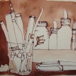
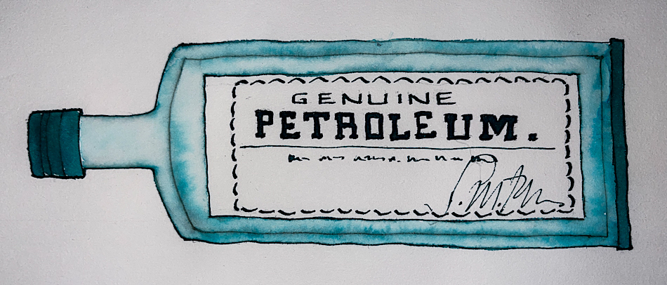
Above, Birmingham Petroleum on the bright white paper of a Hahnemuhle sketchbook.
I test my inks on many drawing and watercolor papers.
Remember that others review these inks just for writing;
I am also interested in how they are used for ink-painting!
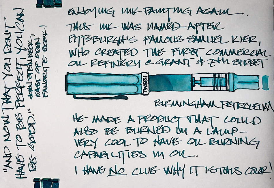
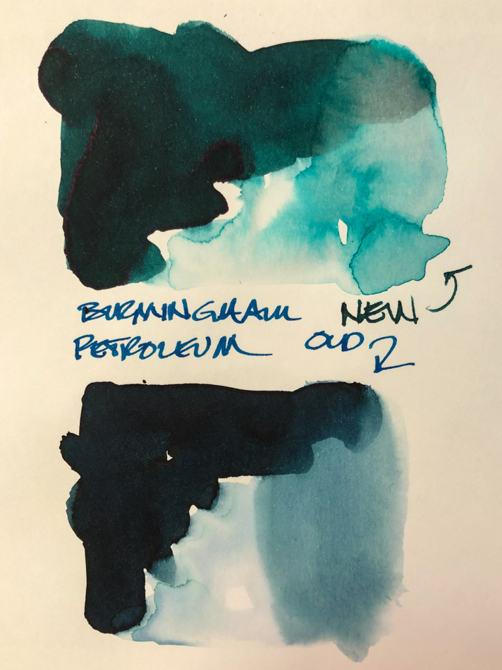
 Birmingham ink is named in honor of Samuel Kier, who erected America’s first commercial oil refinery near downtown Pittsburgh’s Grant & 7th St. He produced illuminating oil (for lamps) from petroleum. Although “coal oil” was well known at least as early as the 1700s as a byproduct of making coal gas and coal tar, it burned with a smoky flame that prevented its use in lamps. Mr. Kier had intermittent contact with Edwin Drake regarding his oil experimentation, as he shipped crude to Pittsburgh from Tarentum, north of Pittsburgh. Left, you can see the older version of Petroleum versus the new one — and I like the new one MUCH better!
Above you can see the pretty blue that pulls out of the dark writing ink.
 It is a well behaved ink which dries relatively quickly. It feathers slightly on Post-its (many inks do as it is cheap paper), but is fine in my Hahnemühle Nostalgie journal (see palm/beach images below) and on Hahnemuhle’s Hemp paper (below)! It is beautiful on watercolor paper, above. When I scrubbed it, top, it showed quite a lot water resistance (to the right), and further test sketches in my journals show it to leave a good imprint of water resistant ink lines when the waterbrush moves the color. It has no sheen that I could produce, and is not a strong shader with my 1.1 stub nib, but when painting it separates so I consider this a complex ink color. When the edge is touched with water it moves easily.

FUSHITE (SPARKLES)

SLEEPING BEAUTY TURQUOISE
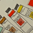
Looking at watercolor comparisons, I offer the paint colors above.
Watercolors, from Daniel Smith, Holbien, M.Graham, and Sennelier.*
MOST water soluble ink companies do not pay attention to lightfast qualities
and Birmingham is no different in this line of inks.
Most artists who use ink are making prints of their work —
But ink-painting is becoming more interesting so maybe it is time!

Above, a sketch on Hahnemuhle’s Hemp paper, which shows how well-behaved
the ink is for sketching. I drew the bottle on my test page with TWSBI Eco 1.1 stub
and touched the lines with water using a Pentel Aquash waterbrush.
 This blue shifts radically when water is added and under a flash vs normal lighting. Our studio is infused with natural light, and my desk is under a lovely huge northwest window. Above you can see the difference in lighting, but then look at the entire page, right, and see that the writing is about the correct color, whereas the sketch shows it leaning less green-blue.

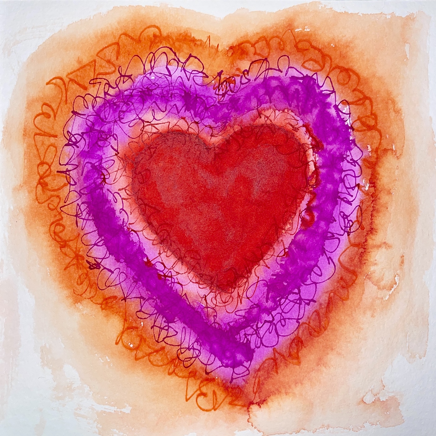
This is such a lovely moody blue!
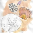
In this one sketch I show the range of ways to use it, from hard line sketching
(plant life bottom) to the ocean and fog and sky.
 I like what Birmingham says on their website:
“We started Birmingham Pen Co. in 2012 in the Southside of Pittsburgh, Pennsylvania. The region of Pittsburgh where we began once called “Little Birmingham” due to the area’s prolific manufacturing industry in the early 1900’s.
The Birmingham moniker was derived from Birmingham, UK – a manufacturing hub that specialized in, among other things, pen and nib manufacturing with thousands of craftspeople employed in the industry. We chose the name Birmingham Pen Company to share this little known piece of history and continue in the traditions behind the name.”
Birmingham’s bottles are glass, and functional
even in the small sizes. I like glass bottles;
they feel like they will last longer.

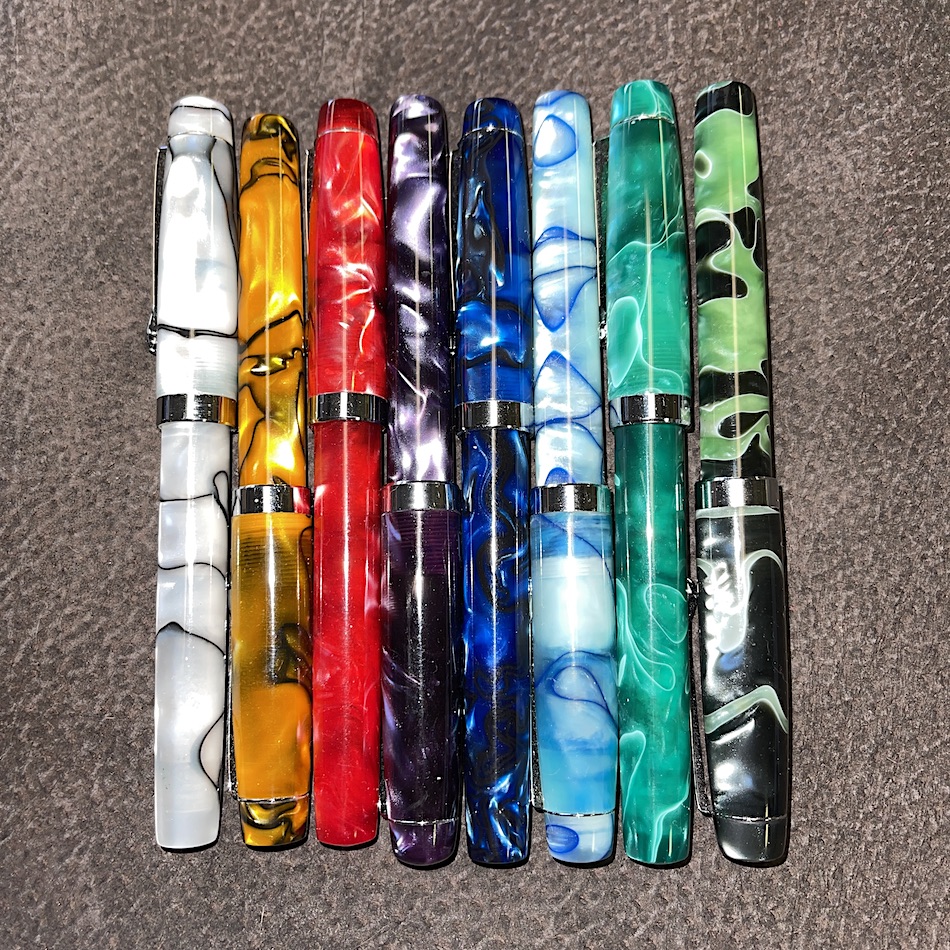
Birmingham also turns their own pens,
which I’ve noticed often sell out as fast as they make them!
*I LOVE my Model-A Demonstrator, Violet Beauregarde!*
This is a small family business run by four people! The brothers, Nick and Josh;
Dad is the chief pen machinist; and Mom does one of the coolest things about Birmingham, which is their amazing historic names!
Disclosure, I was gifted with this new ink from Birmingham.
 To hear about classes, follow me on Facebook
or check out my new, improved dkatiepowellart.com
“Memory is more indelible than ink.”
Anita Loos, Gentlemen Prefer Blondes.
“I think not….”
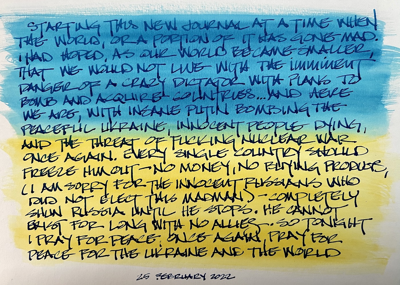
Me… why I journal!
©D. Katie Powell.
My images/blog posts may be reposted; please link back to dkatiepowellart.
☾
 As my Patreon supporter, you will have
access to some content not on this website,
sneak previews, goodies, discounts on classes.
I teach architectural sketching,
art journaling (art+writing), creativity, watercolors.
That annoying loud-mouth editor/critic in your head? GONE! How great would that be?
I'd love it if you shared this; please mention my blog name!