
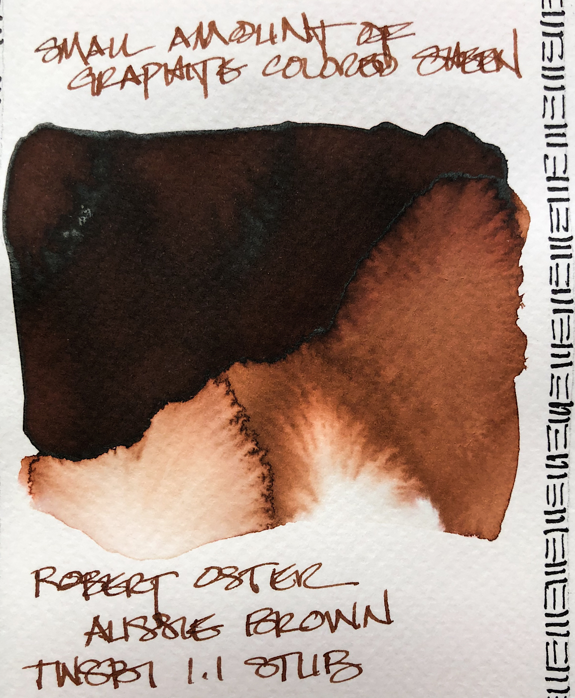
I love a great brown ink; Robert Oster Aussie Brown
is a favorite sketching and writing ink, suitable for the office. It is a rich dark
brown leaning red, and
has a touch of graphite
sheen, seen left. The ink shades, but I don’t think
of it as a shading ink.
Others review these inks just for writing; I am also interested in how they are used for ink-painting!
 Properties of Robert Oster’s Aussie Brown:
This ink is well-behaved,
and does not feather on
any of the papers I normally use, even Post-its. I consider it a medium ink, neither
wet nor dry, and it
evaporates quickly. It has never smeared on me
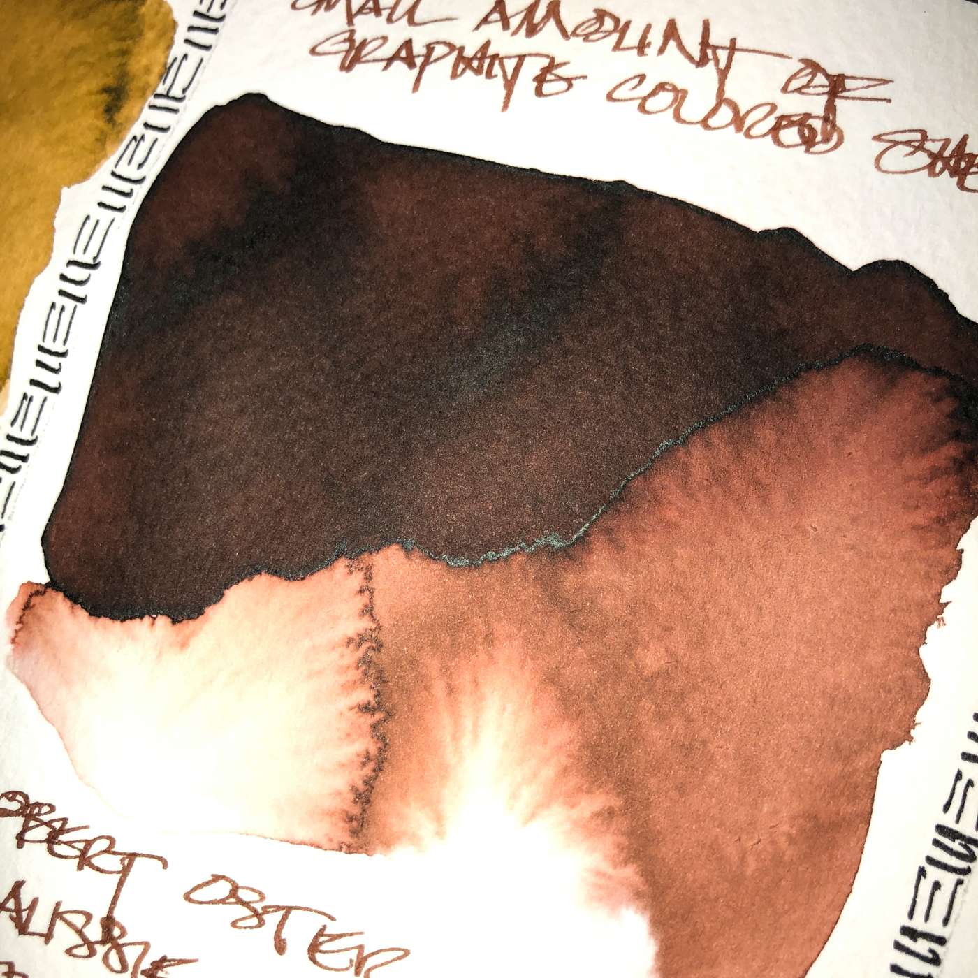
during a sketch. It has a hint of a graphite sheen,
barely seen above, and
when hit with water it moves easily with no ghosting,
so is not water resistant.


*Above, watercolors from Daniel Smith and QoR.*
 When the edge is touched with water it moves easily
with no resistance into
rust tones with a touch of green at the edges.
Looking at watercolor comparisons, above, good color matches are Van Dyke or Burnt Umber. The pigments in the following Munsell ranges: PBr7 / PR101.
*For more info on the munsell system, go to this page.
Knowing the pigments can help you not to duplicate watercolors made of
the same pigments.*
RO is experimenting and testing lightfast properties, but none have ratings at this time.
MOST water soluble ink companies do not pay attention to these things
because most artists who use ink are making prints of their work.
.
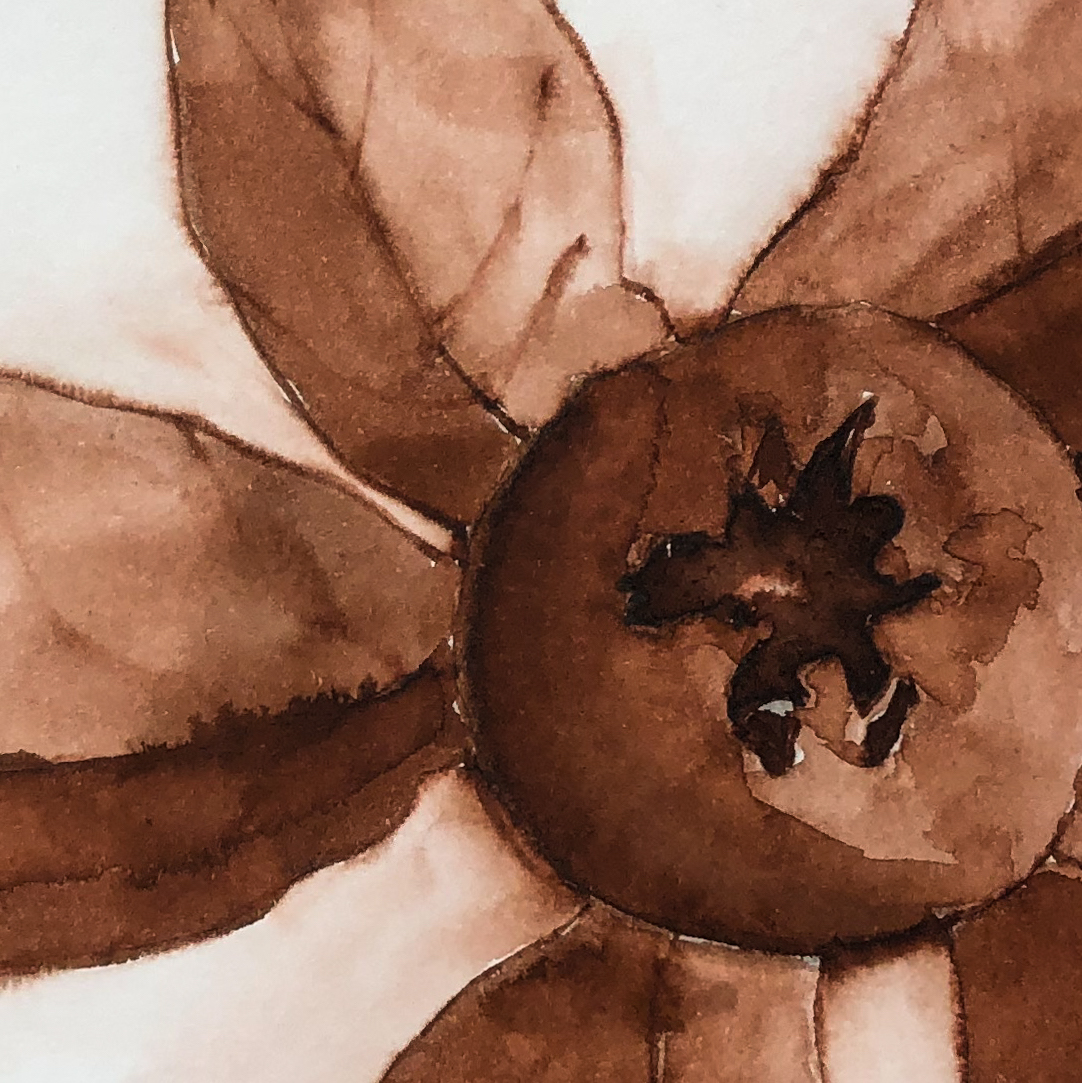
The scallop shell was drawn with a TWSBI Eco 1.1 on cold press watercolor paper,
then the lines were touched with water using a Pentel Aquash waterbrush.
The lines do not stay visible but quickly lose themselves in wet color; I was able to gently build up layers of color if I did so quickly, otherwise the ink below moved.
The lines were added back in after the water moved the ink and dried!
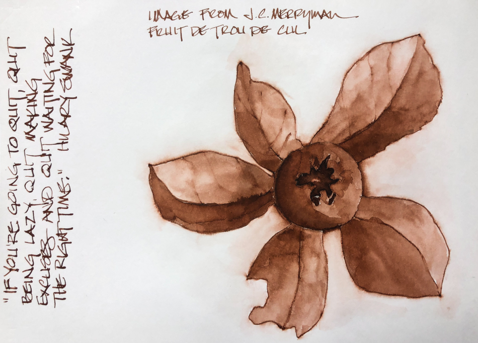
In the sketch after the photo by JC Merryman, I let the lines completely dry
on smooth Hahnemühle paper in my Hahnemühle Nostalgie Sketchbook.
I came back and touched the lines, adding color on my waterbrush
and layering once or twice, and surprisingly, again, the ink stayed in place and
allowed me to overlayer as long as I did not tarry.
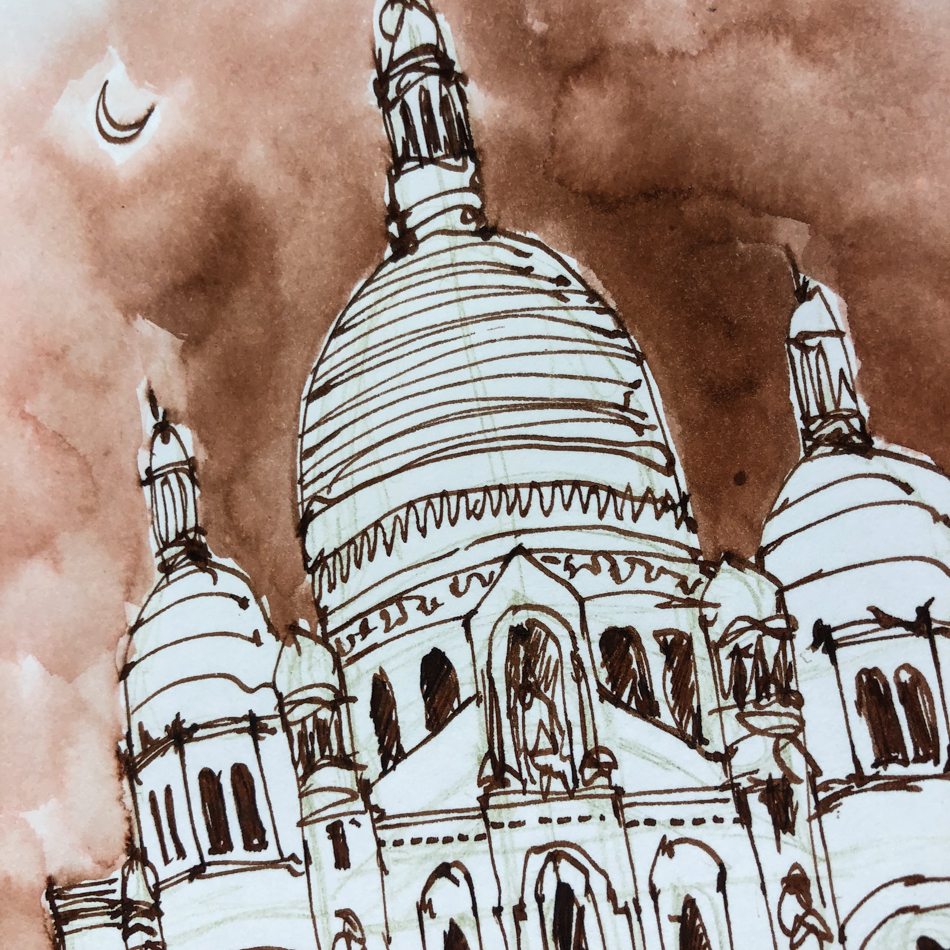
I sketched Sacré-Cœur Basilica in Paris.
The sky was not supposed to bloom quite so much, but thankfully with skies it is fine — makes them look like stormy cloudy moody skies.
 Other Robert Oster Inks
reviewed in this manner to date:
Robert Oster Jade;
Robert Oster Melon Tea
Robert Oster Fire Engine Red,
Robert Oster Thunderstorm,
Robert Oster Melon Tea, and
Robert Oster Fire Engine Red.
The non-toxic inks come in 50ml
plastic bottles that are environmentally
friendly, using recycled plastic.
They can be tippy, so I usually put
them in a more solid container to
decant. All my pens fit easily into
the bottle opening to fill.


 To hear about classes, follow me on Facebook
or check out my new, improved dkatiepowellart.com
“Memory is more indelible than ink.”
Anita Loos, Gentlemen Prefer Blondes.
“I think not….”
Me… why I journal!
Hahnemühle journals for sketches, Pentel Aquash waterbrush,
TWSBI Eco 1.1 with Robert Oster Aussie Brown ink.


©D. Katie Powell.
My images/blog posts may be reposted; please link back to dkatiepowellart.
Note: As an Amazon Associate I earn from qualifying purchases.
☾
 As my Patreon supporter, you will have
access to some content not on this website,
sneak previews, goodies, discounts on classes.
I teach architectural sketching,
art journaling (art+writing), creativity, watercolors.
That annoying loud-mouth editor/critic in your head? GONE! How great would that be?


Great series of drawings
LikeLike
Thank You!
LikeLike
Pingback: Inky Thots: Robert Oster Charcoal | D.Katie Powell Art
Pingback: Inky Thots: Robert Oster Green at Night | D.Katie Powell Art
Pingback: Inky Thots: Robert Oster African Gold | D.Katie Powell Art
Pingback: Inky Thots: Robert Oster Monsoon Clouds | D.Katie Powell Art