From My Earliest Art Journals on Design

W00 BECK DESIGN JOURNALS 3I came across my old architectural journals the other day.
Way way back in time I practiced architecture — in another life!
Back in the old days we didn’t call it art journaling, it was just what many of us did —
kept a sketchbook/journal for our ideas.
I had time to muse today — we are finally OFF for a few days.

Ennis_House_front_view_2005 Mike Dillon copy
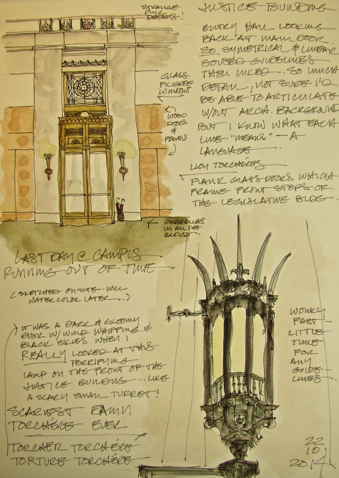
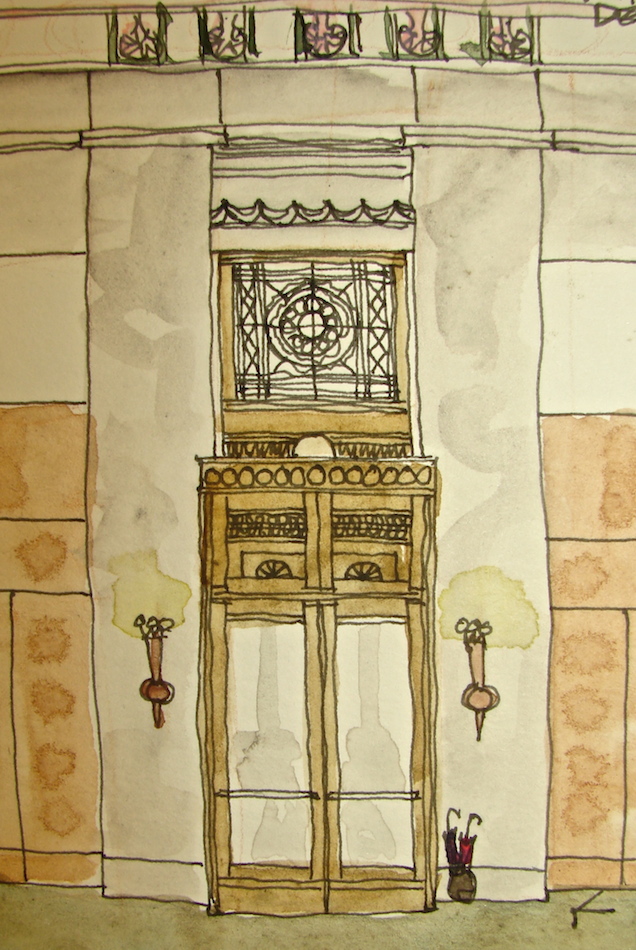
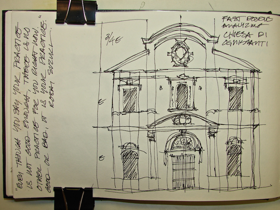
The  one above is an early sketch from
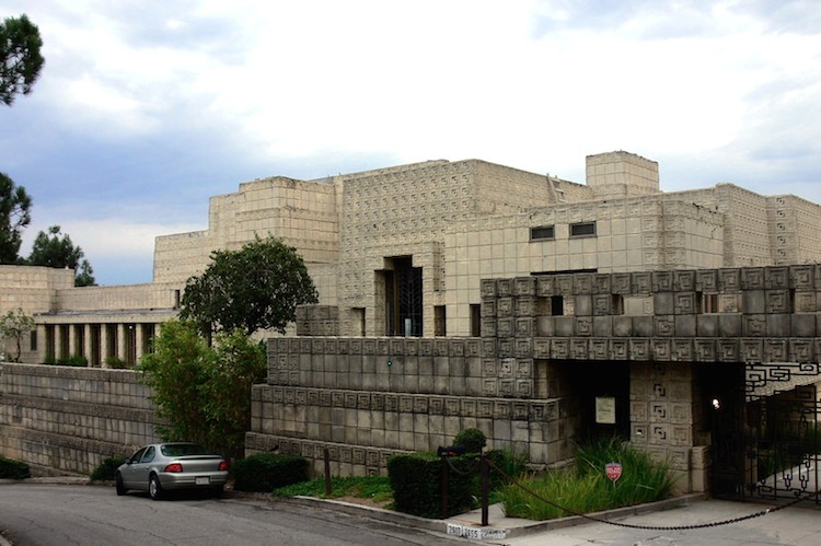
my first book, drawn while on tour at the
Ennis House (Frank Lloyd Wright).
I may have been in school at the time.  Notice I misspelled Ennis thinking the owners
were related to the Innes, from another historical house in Los Angeles
or it was my dyslexia switching the letters!

I was an early Urban Sketcher before you needed a badge!

The journals were lovely Chinese books I bought in Chinatown in San Francisco,
black and white patterned paper with red spines and tightly lined paper.
Everything that impressed me went into them, even personal things about my boyfriend, Hricak, and my professors, especially the very boring ones, like Roger Sherwood.
It was my journal, and I didn’t differentiate what I wrote in it!
I have five of these journals, and I value them today.

USC’s professors, with the exception of Ed Niles and Pierre Koenig,
never exposed us to modern architecture, but focused on classical architecture.
When I graduated and had the money to subscribe to Abitaré and GA I learned of the world I loved (Graves and Gwathmey and Kahn), not the world I’d been taught.
I “scrap-booked” these into the journal as well, above.

W00 BECK DESIGN JOURNALS 10
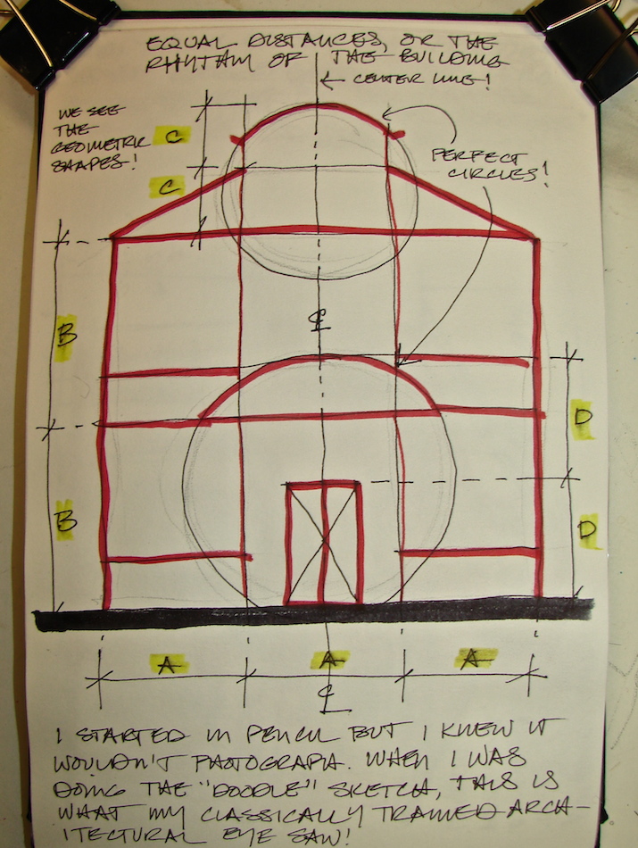
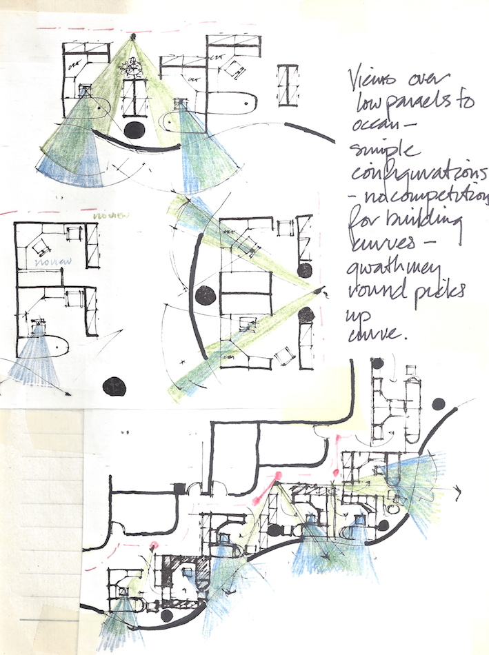
As I began designing myself, I also took notes and drew little design vignettes,
sometimes copying a portion of my plans and then playing with them in the journal,
drawing them over and over while figuring some design problem.
Arco’s corporate offices in Long Beach (Luckman Partnership, Architects,
Kaneko Laff, Interiors) went into an undulating building,
and the sketches above are a few I can share, as
I had the pleasure of designing the plans for the five floors.
Management went inside with glass blocks, and so the undulating fenestration was an open plan on many floors where all day long everyone could see out the windows.

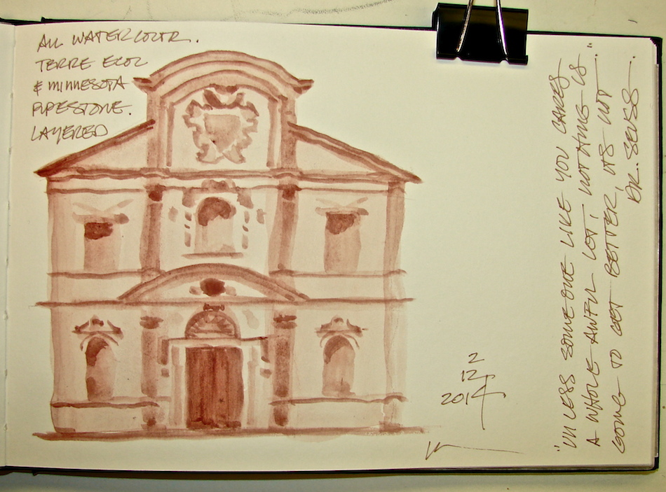
I’ve always kept “art journals” — for cooking, for design,
sketching for fine art, and now just for fun.


I agree to Creative Commons Attribution-Non-Commercial 4.0 International License, which you can learn more about by visiting the site, or,
visit my web page for a more user-friendly summary on my terms.
My images/blog posts may be reposted; please link back to dkatiepowellart.
Thanks to Wikipedia and to Mike Dillon for the Ennis House.

Posted in architecture, art journal, creativity, drawing, graphite, journal, memory, pen & ink, sketchbook | Tagged , , , , , , , , , | 15 Comments

A Look Back at This Moonth

This gallery contains 16 photos.

Originally posted on Lunar Moondae:
This moonth was an unplanned painting of what is happening as I design the class on journaling with the lunar cycles.  I wrote less, and painted more, my little gurl as she moved through the…

More Galleries | Tagged , , | Leave a comment

Happy Solstice and New Moon

W14 12 21 ST JOHNS WEATHER 1

Happy we are turning toward the light.
Even on this rainy day, I know the light is growing . . .
Looking across the river towards St. John’s, quick sketch while waiting.

Drawn in an Stillman & Birn Alpha journal with a
Preppie pen with Noodler’s Lexington Grey ink, and Daniel Smith watercolors.


I agree to Creative Commons Attribution-Non-Commercial 4.0 International License, which you can learn more about by visiting the site, or,
visit my web page for a more user-friendly summary on my terms.
My images/blog posts may be reposted; please link back to dkatiepowellart.

Posted in art, art journal, drawing, journal, painting, pen & ink, sketchbook, urban sketchers, watercolor | Tagged , , , , , , , , | Leave a comment

Cats: The End of a Sketchbook

W14 12 KAMALA 1

Kamala and I are the only gurls in the bedroom.  She thinks she owns Mitchell,
and competes with Jai, Sammy and me.  She spent eight years living outside our door in a rural area and fended for herself, with fresh water and occasional food from us — but she was wary of us.   That was my fault.  When we rented the house and she came to the back door all fat and pretty and I assumed she was a neighbor’s cat.  Our guys had not had their “outdoor” shots yet I shooed her away.  She learned too fast (one quiet shooing) that she was “not wanted” and it took us years to get her indoors.  She’s the smartest of them all — seriously — and a fierce protector.  When we were about to move to Portland possibly the other cats had a conversation with her, because she leapt into Mitchell’s arms — and there she rests.  It took her two more years to trust me.  Gads.  I’d never hurt an animal.

Anyway, she thinks she owns Mitchell and after one time of pretending
I owned him in front of her and her getting so worked into a lather I decided that was not funny for her —  not play at all — and so, I acquiesced.  She owns him.
Top cat, and all that, she allows me in her bed.

I think because of all the years spent making sure eagles, big-horned owls, raccoons, coyotes, bobcats and yes, even the occasional wolf didn’t get her made her so she never sleeps completely quietly.  Constantly moving.  Constantly watchful.
This makes her a bitch to draw.

W14 12 KAMALA 6She seems contented now, and this makes me happy even if I have to share.

Jai is our grey tabby male who coaxed her in with his cat-calls.
Now they are sworn frenemies.  He is older, and he gets some protection from us
at night so he sleeps a bit closer now.  Otherwise she might nip him.
Usually he sleeps like a doll but on the last page of my sketchbook he moved while I was doing the gesture and he ended up looking like a fox.  Oh well.  My fox.

W14 12 JAI FOX 2Aquabee Super Deluxe 9×9-inch (of course, a lunar number) journal with Uniball pen (running ink) or a Platinum Preppy fountain pen, Noodler’s Lexington Grey ink,
and Daniel Smith (Primatek too), Holbien and QoR watercolors.


I agree to Creative Commons Attribution-Non-Commercial 4.0 International License, which you can learn more about by visiting the site, or,
visit my web page for a more user-friendly summary on my terms.
My images/blog posts may be reposted; please link back to dkatiepowellart.

Posted in art, art journal, color, drawing, journal, memory, pen & ink, sketchbook, timed painting, watercolor | Tagged , , , , , , , , , , | 4 Comments

Booby Gurl is Coming Home to D.Katie Powell Art

I’ve made a hard decision during this Dark-of-the-Moon.  Previously I set up a
second blog that was dedicated to my love of working with Lunar energy.
Lunar Moondae was also home to my Booby Gurl images.  After a great deal of mind-heart contemplation, I realized I can’t split out my artwork like that.  So, Booby Gurl is coming to this blog and that makes my life much easier.  I am keeping Lunar Moondae because eventually I may do the weekly challenges, but not right now.  The whole point is working with intuition and intention, and while the other blog was a good idea,
my heart wasn’t moved to blog there — and I am moved to blog here.  So here I stay.

I will reblog a couple of posts from Lunar Moondae in the next few days.

W00 EARLY BOOBY GURL HEARTToday, to celebrate a New Moon and the Solstice, I’ve a new Booby Gurl post and
will tell the story of how she got her name.

She is my alter ego, and I have been drawing
her for almost as long as I have painted.
She came to me in a workshop while listening
to Brugh Joy, one of my best teachers,
and I think her first form that is
closest to who she is today is right, with a
“flash of bodhichitta” created in a workshop.
She became naked mostly because I am
“naked” spiritually before my tradition —
it is me at my most me-ness,
if that makes any sense.

And as I moved into painting so long ago, I found another kind of me-ness,
the kind where you sing at the top of your lungs for joy, dance with the cats, and put
bright colors on canvas and paper.  I would not find that kind of freedom within marriage or with any other human being until I married my second husband, Mitchell.
And she has been drawn, off and on, in various incarnations, for twenty-five years.

She was named over coffee with Gwenn Seemel, as I was discussing my interest in working with Lunar Moondae and showed her some of “my girls.”  She called her Booby Gurl, and it stuck.  My baby brother Patrick, deceased, would have loved the name.

In naming her, I think I committed to her all the more.
Now she is drawn several times a week, through emotional upheaval and joy.
I no longer relegate her to spiritual endeavors, but to all of my life —
and life is a pretty spiritual endeavor anyhow, doncha’ think?
Sometimes she is pregnant with ideas; sometimes she is pushing the river,
sometimes she dances or paints or contemplates.
Sometimes her boobs become the crescent moon.

I’ve been a bit blue the last couple of weeks, on and off.
I don’t know why, and maybe it is simply this year I long for the light more than normal.
The short days are getting to me, and I’m thrilled that today is the Solstice!
And New Moon, time to move into another moonth and toward brightness!

W14 12 10 BOOBY GURL SKETCHBOOKS 1I had a synchronistic day on the tenth, when I finished a sketchbook and placed it with
my others.  I thought about all my children, my boxes of painted horses and goddesses and bulls and now, all the Booby Gurls and sketchbooks of my journey.  They sit with 30 years of journals of architecture and writing and a bad marriage and a good marriage.
As I was feeling into this, going about my work day, on two completely different sites
two other women spoke of what to do with their sketchbooks!  One wanted to know what we did with them, the other was in distress and had to find a home for hers as she is older and no one in her family wants them.  (Same here; no one wants my children!)
The latter was going to give up her sketchbook habit.

Well, my art may well end up in the dump, most likely.  And still I paint, for me.
So the message Booby Gurl came to this day was pure zen, a meditation:

Paint Daily Paint Daily Paint Daily Paint Daily Paint!

W14 12 10 BOOBY GURL SKETCHBOOKS 2

Aquabee Super Deluxe 9×9-inch (of course, a lunar number)
journal with a Platinum Preppy fountain pen, Noodler’s Lexington Grey ink,
and (mostly) Daniel Smith watercolor paints.

W14 5 5 MOON PHASES NEW copy W14 5 5 MOON PHASES CRESCENT copy W14 5 5 MOON PHASES 1ST QUARTER copy W14 5 5 MOON PHASES FULL copy W14 5 5 MOON PHASES 3D QUARTER copy W14 5 5 MOON PHASES WANING CRESCENT copy W14 5 5 MOON PHASES NEW copy

I agree to Creative Commons Attribution-Non-Commercial 4.0 International License, which you can learn more about by visiting the site, or,
visit my web page for a more user-friendly summary on my terms.
My images/blog posts may be reposted; please link back to dkatiepowellart.
Booby Gurl is trademarked!

Posted in art, art journal, Booby Gurl, creativity, journal, meditation, memory, painting, sketchbook, writing | Tagged , , , , , , , , | 8 Comments

Chinese Silk Bag and HOBO Bag

W14 12 19 LS GEST CHIN BAG 1This is an exercise in gesture versus guidelines, and in permanence (in the form of lasting details and materials) versus impermanence (fast, light materials.)

I have two bags I reach for besides my painting bag.  One is this lovely silk Chinese bag which never lasts more than a season — the material and construction is not meant for  ever after.  These purses are bright, beautiful bursts of color and i buy them in Spring and they last until autumn.

The image above was created in under fifteen minutes including watercolor:
a Uniball pen in a fast gesture, with the essential colors caught on paper.
When I added the Quin Coral below and let it run, I did it consciously,
because the purse has many colors shot through the weave and the Quin Coral
is a secondary color, with two shades of gold, and a Phthalo blue.

The detailed drawing below is of my temporary seasonal purse with the addition of my longterm perfect purse, a black leather HOBO bag that I have had for about twenty years.  It hold almost everything I must have, zips securely, slings over my shoulder, and is small so it doesn’t hurt my back.  I love it.  It is not much to look at anymore but I have not found a replacement.  It is like an old friend.

Are all women so picky about their purses?
Having found the perfect purse, isn’t it hard to dump it for another?

I took a bit more time, but still only used guidelines to block in the essential shapes.  From there to ink, and on to watercolor.  I didn’t want a big blob of black, so mixed a bit of Primatek Hematite with purple to give it texture.  I’m happy with this — black is driving me crazy in the form of two of our black cats, who I keep trying to capture.  I also dropped a bit of Primatek Serpentine into the green of the purse, though this was not as successful — the purse is brighter.  I added the punch of colors in the flowers while things were still damp, so it blurred some areas and not others.  I like the effect.

W14 12 20 LS UNDER CHIN BAG 5Drawn in an Stillman & Birn Alpha journal
with blue-black Uniball (top, running ink) or
Caran D’ache watercolor pencil followed by Preppie pen with Noodler’s Lexington Grey ink, and Daniel Smith (Primatek too) and QoR watercolors.


I agree to Creative Commons Attribution-Non-Commercial 4.0 International License, which you can learn more about by visiting the site, or,
visit my web page for a more user-friendly summary on my terms.
My images/blog posts may be reposted; please link back to dkatiepowellart.

Posted in drawing, painting, pen & ink, process, sketchbook, watercolor | Tagged , , , , , , , , , , , , , , , , | 3 Comments

My Business Sketchbook: Our Holiday Card

W14 CHRISTMAS CARD 17It was fun to create a holiday card this year, the end of my first year of watercolors!
I had good models in a late 19th century chair from a set that will be conserved next year, and our cats, keeping us company in the offices as we work this season.

The chair is American, from the Aesthetic Movement.
It’s innards are intact, which is wonderful, and the finish is original, if damaged.
It’s worn fabric will be replaced with a lovely wine-colored velvet in
the new year after the internals are conserved and repaired and retied.

With those clients who are willing, our studio cats are allowed to curl into
the dusty old fabrics and “own” the pieces until it is time to begin work on them.
They think we bring these old pieces in just for them!

W14 CHRISTMAS CARD 14Images in Stillman & Birn Delta journal with a Caran D’ache watercolor pencil,
followed by a Platinum Preppy fountain pen with Polar Brown Noodlers ink.
Daniel Smith watercolors added in studio.


I agree to Creative Commons Attribution-Non-Commercial 4.0 International License, which you can learn more about by visiting the site, or,
visit my web page for a more user-friendly summary on my terms.
My images/blog posts may be reposted; please link back to dkatiepowellart.

Posted in art, cards, drawing, furniture, pen & ink, process, sketchbook, watercolor | Tagged , , , , , , , , , , , , , , , , , , , | 7 Comments

My “Business” Sketchbook: Washington State Justice Building

W14 10 22 WA CAP JUSTICE BLDG 1My last sketch onsite from earlier in the year, with watercolors added Sunday.
It was pouring, our work at the Capitol completed, and we were on our way home.
Mitchell wanted to explore the Justice Building.
The Library was lovely and I never got around to drawing in it because
we spent a good amount of time talking with the Librarian.
We had just a little bit of time.

W14 10 22 WA CAP JUSTICE BLDG 4The lamps outside the Justice Building
are perhaps the scariest I’ve ever seen.
Seven sharp stabbing weapon-like details
with fleur-de-lis in between,
all made to look a bit like a tower.
You can almost imagine the princess held prisoner . . .
What were they thinking?
They are the opposite of the lovely Lion Torchéres,
which have such sweetness!
On this page I drew the placement of
the Lion Torchéres on the entry walls.

Images in Stillman & Birn Delta journal onsite with a Caran D’ache watercolor pencil,
followed by a Platinum Preppy fountain pen with Polar Brown Noodlers ink.
Daniel Smith watercolors added in studio.


I agree to Creative Commons Attribution-Non-Commercial 4.0 International License, which you can learn more about by visiting the site, or,
visit my web page for a more user-friendly summary on my terms.
My images/blog posts may be reposted; please link back to dkatiepowellart.

Posted in architecture, drawing, journal, painting, pen & ink, sketchbook, urban sketchers, watercolor | Tagged , , , , , , , , , , , , , , , | 1 Comment

Monastery of the Precious Blood Portland Oregon

W14 12 LS MONASTERY PRESCIOUS BLOOD DOORS 3Drawn on site in Mount Tabor, this is such a pretty building.
Reminds me of Southern California, home home home . . .
Had almost no time!

Drawn in an Stillman & Birn Alpha journal on site with
Caran D’ache watercolor pencil followed by Lamy Safari pen with
Noodler’s Lexington Grey ink, and Daniel Smith and QoR watercolors.


I agree to Creative Commons Attribution-Non-Commercial 4.0 International License, which you can learn more about by visiting the site, or,
visit my web page for a more user-friendly summary on my terms.
My images/blog posts may be reposted; please link back to dkatiepowellart.

Posted in architecture, drawing, painting, pen & ink, pencil, sketchbook, timed painting, urban sketchers, watercolor | Tagged , , , , , , , , , , | 4 Comments

Architects Have Techniques in Common

W14 12 11 LS ARCH OBJECTS 2I’m taking an online course right now
from another architect turned artist.
This artist is quite protective about her coursework staying within students,
so I hesitate to discuss her by name.
As our drawing styles are similar,
I am taking the course primarily
to learn tips she may have to laying
down watercolors quickly on location.
Anyone who follows my blog knows
I am a proficient acrylic artist, and
switched to watercolors this year.
Watercolors are a whole other world,
very be-here-now in their nature,
and I am just beginning to get the
hang of them.  One thing I have observed in my own work as I’ve progressed, is that the best work is when I have little time and
just do it quickly without thinking too much,
and without fussing over the details.
It’s a one-stroke mentality, and I like it!

That said, I noticed that most of the architects-turned-watercolorists appear to use pencil to lay in some guidelines or the basic form of the sketch before laying in ink or color.
Yet especially with many Urban Sketchers and art journalers, that is a bit like admitting you are a cheater.  As an architect, I learned to use a pencil proficiently, especially to lay in guidelines.  I used the entire range of pencil types, hard to soft to blue, and had no idea that anyone did this any differently until I met watercolorists!   In this class I am taking, much of what is being taught is old news for me.  That doesn’t mean I have not learned anything — I can always learn something from a teacher, even if it through sharing!

W14 12 11 LS ARCH OBJECTS 4A lot of people have trouble with circles, ellipses, and even squares.
(Five minute freehand wonky drawing / watercolor above.)
When I was a young architect, I practiced drawing grids during lectures
(when I was not doodling stars) and this was a good thing because I was able to
freehand at 1/4-inch with no problem by the time I was out of college.
I had been an advanced draughtswomen for seven years, and had the many-hours-daily practice of circles, triangles, perfect squares, and endless grids paid off.
By the time I was working as a corporate architect, I could freehand about 20,000 sf and not be off by more than a foot or two in any direction.  This tool came in handy when dealing with clients, which allowed me into the conference room doors to do just that — design with the clients, instead of being relegated to drawing details for someone else.

What is the point of all this?  When an art teacher tells you to practice, PRACTICE!
If you are  in a meeting, draw circles and then more circles.  Take gridded paper with you to meetings and appointments and draw over the lines until your hand-to-eye coordination can do it in your sleep, then do it without the gridded paper.

W14 12 11 LS BR OBJECTS 6This morning I knocked out a quick sketch to satisfy the class requirement.  To make it more interesting, I timed each phase to see how long I took.
I learned something.  With the distraction of holding a morning cat in my arms, the pencil sketch took a minute, maybe two.  My Lamy Safari pen still is not working as smoothly as my cheap Preppie pens, and so that slowed me down — but that phase only took six minutes.  I rushed the watercolors because I had a blog to post (not this one) and while I
wished I had waited a bit longer on drying the paints — the colors ran — I finished the watercolor in under fifteen minutes.   WOW!  I said to the only living being up with me at 5am, my cat.  Maybe I am faster  than I thought!

Next goal, to get the hang of watercolor juicy washes and finding that just-right mix
of water-to-color ratio so that I don’t get puddles (see the rings around some of the
color in the detail image?) but instead lay in a nice just-right density of pigment.

And shadows.  I need to turn off the overhead fluorescent lights and paint shadows!

Drawn in an Stillman & Birn Alpha journal (sorry but I am not a fan of the small journal, which just doesn’t lay flat enough for me, and that is what I wrote in one of these pages — but I love Stillman & Birn).  A Caran D’ache watercolor pencil followed by Lamy Safari pen with Noodler’s Polar Brown ink, and Daniel Smith and QoR watercolors.


I agree to Creative Commons Attribution-Non-Commercial 4.0 International License, which you can learn more about by visiting the site, or,
visit my web page for a more user-friendly summary on my terms.
My images/blog posts may be reposted; please link back to dkatiepowellart.

Posted in art, drawing, painting, pen & ink, pencil, process, sketchbook, watercolor | Tagged , , , , , , , , , | 16 Comments

My “Business” Sketchbook: The Lion Torchéres

W14 10 22 WA CAP JUSTICE LION TORCH 12W14 10 21 WA CAPITOL CAMPUS 8

At the end of our last day working in the
Senate Offices of the Legislative Building on the Washington State Capitol Campus, we crossed the grass in the pouring rain  to the Justice Building.

As you walk into the building there are several torchéres that illuminate the entry hall, right,
as well as an overhead skylight of some sort.
These torchéres have a much more
coppery appearance than the golden-green
bronze of the Tiffany lamps in the Legislative Building.  I was unable to find out who the
maker of these torchéres was in the short time
we had — I chose sketching instead.
The Lion Torchéres are not only beautiful,
but the lions themselves have the sweetest expressions on their faces.  (Actually, we found
this to be true in several lion-themed decorative motifs around the capitol; a testimony to the
friendly nature of the Pacific Northwest!)

I only had time to sketch the overall and a side view detail of on lion, below, but I shot a detail image of the faces hoping that I might try my hand at them later.
As always, I started with a pencil guideline, this time a watercolor pencil in a sepia tone.
I love working in watercolor and ink, but am not a subscriber to the notion that pencils should not be used.  As an architect I learned to use pencil guidelines, and this has transferred to my sketching habits as well.  I simply am much more likely to leave them instead of erasing them, and I use watercolor pencils a lot more often.  By giving myself a guideline I am much more able to be accurate in my sketching, and also I can relax and enjoy the inking process knowing that I have the basic shapes mapped out.

After the pencil sketch and layout on my page, I inked the torchéres.
I only had so much time, and so the inking was loosey-goosey.

I was able to bring the sketches back into the studio (no watercolors in these buildings) and color them.  In this case I built up color in washes in both, starting with Quinophthalone Yellow for the illumination, and then working in washes that were mixes of Daniel Smith Quinacridone Gold, Yavapei (Primatek), and Yellow Iron Oxide.
I layered color gradually and left white spaces when I could.  The lion from the side view is one of my first pieces that I think is pretty good, though it is a bit harsh.
I am still working on understanding the nature of watercolors —
a huge departure from acrylics, which I began this year.

W14 10 22 WA CAP JUSTICE LION TORCH 14 W14 10 22 WA CAP JUSTICE LION TORCH 20My goal is not perfection, a photo perfect image,
but rather an impression of what I loved about a place or event.

As promised, their sweet faces, below.  Think the sweet Cowardly Lion, not the predator!

W14 WA CAP JUSTICE FRIENDLY LIONS Images in Stillman & Birn Delta journal onsite with a Caran D’ache watercolor pencil,
followed by a Platinum Preppy fountain pen with Polar Brown Noodlers ink.
Daniel Smith watercolors added in studio.


I agree to Creative Commons Attribution-Non-Commercial 4.0 International License, which you can learn more about by visiting the site, or,
visit my web page for a more user-friendly summary on my terms.
My images/blog posts may be reposted; please link back to dkatiepowellart.

Posted in architecture, art, color, drawing, journal, painting, pen & ink, pencil, process, sketchbook, urban sketchers, watercolor | Tagged , , , , , , , , , , , , , | 1 Comment

Brushes: Stippling and Sprays

W14 11 LS Stipple Brush 2A last minute memory of having a stipple brush I rarely used with acrylics;
I searched for it in my box of things not used.  I tested it with watercolors.  The stipple brush with fairly wet watercolors (upper left cobalt turquoise paint splotches)looks a bit like a footprint.  Stipple works so-so with the dry brush straight up (lower left turquoise paint).  Turned on its side and flung with my thumb did a good spray pattern, but why?  A toothbrush works well (finer spray in purple), and a #8 round (orange paint) taps out a nice pattern.  I use the rounds and splatter large drops, and rarely use the toothbrush.

 Painted images in Stillman & Birn Alpha journal with a  Platinum Preppy fountain pen, and Polar Brown Noodlers ink. Various watercolor paint brands.


I agree to Creative Commons Attribution-Non-Commercial 4.0 International License, which you can learn more about by visiting the site, or,
visit my web page for a more user-friendly summary on my terms.
My images/blog posts may be reposted; please link back to dkatiepowellart.

Posted in paint brush, painting, sketchbook, watercolor | Tagged , , , | 9 Comments

Our Antique Burro Chair, Monterey Style

W14 12 9 LS DONKEY CHAIR 9I started out to do a little post on painting one of our chairs.
Then I realized I was posting about a chair I had also painted —
so figured I should post about both restoration, painting the chair and my sketch!

Mitchell and I both love chairs —
I admit to having a fetish for them and that is not too strong a word,
as I can barely pass one by.  He is my partner in crime in that he is always willing to fix a broken down lovely old chair and then let me have my way with it —
unless it is valuable or for some crazy reason he takes a liking to the wood.
Me having my way with it means to paint it.  I love painted chairs, and when
I get too many I give some away to make way for the new.

These chairs are OLD and previously painted; they needed a new life.

W04 PAINTED BURRO CHAIR 3Mitchell insisted in re-gluing them.  I am impatient and would probably start on them without doing this but he doesn’t want to have to repair them after I’ve painted them.
He is right of course (they were rickety) but I don’t want to wait.

The fun started!  I wanted to create an homage to the western Mason Monterey genre but with my own designs.  Mitchell and I have seen lots of Mexican images of Burros carrying men, and wanted to do one with the Burro being carried by the man.

W11 THREE COLORS NO WAX MPFCMitchell’s commentary:
“I encouraged Kate to create the man and donkey motif because of the fable/social commentary I have enjoyed from my childhood.  People criticized the man because he rode the donkey into the village.   To satisfy the critics the man, next time he went to town, the man carried the donkey into the village. This is our version of this story and as you can see we have the donkey catching rain in the man’s hat!”

Base colors in oil were first; Mason Monterey is quite colorful!
We wanted Monterey Spanish Red and bright yellow!
The real thing restored for the Oregon Caves National Park, above.

W11 PAINTED BURRO CHAIR 9All of the designs were painted with a brush, finger-painted, or both.

I start with a sketch and then do a transfer, usually.
Then I gradually build the color in the designs and let dry.

W11 PAINTED BURRO CHAIR 10Finally the process of making it look old and “antiqued.”
It is my special secret. . .

W11 PAINTED BURRO CHAIR 11Mitchell upholstered them in lovely thick leather padded to be so comfy.
We own two of these chairs done Monterey style.
You can see the other one is a lovely cantina dancer who is losing her top!

And that is where our story begins and ends —
I decided to sketch one of them and that prompted this trip down memory lane for YOU!
I have been wondering why I am never moved to draw shadows — then I realized, I am often painting things in our studio which had fluorescent lighting and is very diffused lighting — we do not have strong shadows unless I take the time to crate them!

BTW, I can be commissioned to paint a set of chairs or anything else!

Painted images in Stillman & Birn Alpha journal with a  Platinum Preppy fountain pen, and Polar Brown Noodlers ink. Various watercolor paint brands.
Burro chair painted in my mixed formulas with Gamblin oil paints.


I agree to Creative Commons Attribution-Non-Commercial 4.0 International License, which you can learn more about by visiting the site, or,
visit my web page for a more user-friendly summary on my terms.
My images/blog posts may be reposted; please link back to dkatiepowellart.

Posted in color, creativity, furniture, memory, oil paint, painting, pen & ink, process, watercolor | Tagged , , , , , , , , , , , | 1 Comment

My “Business” Sketchbook: Symmetry + South Entrance

W14 10 22 WA CAP SYMMETRY 16I love it when an architect moves you through spaces,
making you experience an environment as it was meant
to be seen or felt.  I also love symmetry, especially in
the hands of architects who know how to use it.
Taking a center line through the Prichard building
it runs straight into the Rotunda in the
Legislative Building and on to the Justice entrance.

The Washington State Capitol architects laid the
campus and the important buildings out in such a way
that they moved you to glimpse views of where you
are going before you get there, teasing you with the
beauty of the campus or various parts of the building.

We came in the “back” door (southern entry) most days, and allowing for the fact that the central doors on both the North and South sides are permanently closed for repair, you can see the architect’s hand guiding you to various views.

W14 10 22 WA CAP SYMMETRY 2From the Prichard building you walk down the textured walkway by the
lovely cherry trees which were turning brilliant red and orange.   The path takes you through a narrow opening and you are under the drive-through portico.
In Washington, the green grass really is that green as we head into autumn!

W14 10 22 WA CAP SYMMETRY 4Looking up under the portico the beautiful repeating dogwood motif is a rhythm across the ceiling.  There is also a huge chandelier, whose bronze frame has the most beautiful
blue-green umber patina, locked to keep it from swinging in winds or in an earthquake.
It is centered so that you walk directly under it, and the sketch I made onsite was of the symmetrical placement and motif looking up as you head for the entry doors.

W14 10 22 WA CAP SYMMETRY 6If you entered the southern entry through the double doors and look back, walking as if you were continuing on the center-line, you see the Prichard Building again through the glass.  Overhead are beautiful Tiffany chandeliers, and below are beautiful
marble floors with a compass pattern in taupe and grey marble.

W14 10 22 WA CAP SYMMETRY 10If you are standing on the compass and turn 180-degrees, you look up the grey marble stairs and see the elegant arch, columns, and see a smaller Tiffany chandelier that is covered in Greek figurines.  These chandeliers mark the hallways and paths throughout the building.  I walked straight up those stairs, as a visiting dignitary might after the limo dropped her or him off at the Portico entry.  You look beyond and get your first glimpse of the Rotunda.  On the balcony beyond you can see the Reception Room over the front entrance, flanked by two of the four torchéres that surround the State seal in the floor.
(These are not the torchéres shown in my first blog post.)

W14 10 22 WA CAP SYMMETRY 12W14 10 21 WA CAPITOL ROTUNDA 11 copyClimbing the stairs you walk under the arch
and to the edge of the  Rotunda.  Your first instinct
is to look up, to see the beautiful main chandelier,
also made by Tiffany.  The stunning colors
of the building, salmon pink and burgundy
and taupe and grey against bronze and
twinkling lights catch your eye.  As you walk in,
you come almost under the light, which
reminds me of Spielberg’s rendition of the
mother ship.  The State Seal of Washington’s face
in bronze is surrounding at this time by red velvet for viewing and to keep people from stepping on the seal.

W14 10 22 WA CAP SYMMETRY 13I also think that artists (and Urban Sketchers) can wake you to see things
(even your own home town) that you would not have noticed.
Next time you enter a building take the time to do it the way the architect wanted
you to enter, and try to see what s/he wanted you to experience.

I admit to running out of time sketching onsite for the day.
I took pictures of the same theme of centered axial circulation from the Northern entrance and intend to sketch these images later to show the formality from the other side.
Or maybe I will wait until my next trip to the Capitol.
Want to meet me for the grand tour?

Drawings made onsite; watercolors added later in my studio.

Images in Stillman & Birn Delta journal with Pentalic pencil, a Preppie pen with
Lexington Grey Noodler’s ink, and Daniel Smith and QoR watercolor paints.


I agree to Creative Commons Attribution-Non-Commercial 4.0 International License, which you can learn more about by visiting the site, or,
visit my web page for a more user-friendly summary on my terms.
My images/blog posts may be reposted; please link back to dkatiepowellart.

Posted in architecture, art, creativity, history, pen & ink, sketchbook, timed painting, urban sketchers, watercolor | Tagged , , , , , , , , , , , , | 3 Comments

My “Business” Sketchbook: Selfie in the Senate Hallway

W14 10 22 WA CAP SENATE SELFIE  1w14 mitchell senate

I tend to lay down to get ceiling shots.
I also tend to take my shoes off anywhere I can.

Mitchell caught me taking a picture
of the chandelier on my back on the
Senate Hallway floor.
I have on painting clothes because
I was on a break shellacking the wainscoting.
We each have cameras so when I caught him
catching me I caught him too!
I sketched this from digital images
in the hotel room later.

Images in Stillman & Birn Delta journal with Pentalic pencil, a Preppie pen with
Lexington Grey Noodler’s ink, and Daniel Smith and QoR watercolor paints.


I agree to Creative Commons Attribution-Non-Commercial 4.0 International License, which you can learn more about by visiting the site, or,
visit my web page for a more user-friendly summary on my terms.
My images/blog posts may be reposted; please link back to dkatiepowellart.

Posted in drawing, graphite, journal, memory, painting, pen & ink, sketchbook, watercolor | Tagged , , , , , , , , , | Leave a comment

Sketching Eames House of Cards

W14 12 5 LS EAMES CARDS 4Ray_and_Charles_EamesCharles Eames House of Cards, above,
bought in NYC at the Whitney, I think, in 1973;
I bought them on my first traveling
assignment as a young architect,
to management school at IBM in New York.
I chose them as they are not easy,
and will stack them up and try again.
Under drawing below with messy graphite; watercolors added above.
It brought back so many memories!

Eames_house_entryI stalked the Eames’ at their home when I was 19 with my boyfriend.  They were used to students stalking them.  They were gracious; we were invited in for a very short hello.
They were my idols and I wanted to be like them, and wanted to work with my husband / relationship as they did with each other — they had a huge impact on my future choices.  I also met Charles as  young working architect for IBM; I have many interesting brochures from those days which were in-house pamphlets.  I sat next to Ray on a plane flight to NYC after he died; same outfit she always wore, full skirt and ponytail with a bow, but all in black.

eames book coverI was able to tour their studio in Venice California as a student.  So much stuff — collections of toys, gadgets, models.

I also was fortunate to see the art installations on American Revolution Bicentennial, The World of Franklin & Jefferson at IBM in NYC.  The most memorable and stunning installation was their very cool collection of “things” made into art at the IBM World Headquarters: seeds, stamps, grasses, bans, each carefully collected and viewed in plexiglass boxes.

Good memories, rubbing up against the gods of design.

W14 12 5 LS EAMES CARDS 1amazon's

Update:
Some people have never seen the cards.  This is an image from Amazon.
The original size (and the MOMA size)
was the size of a deck of cards, and
they have eight slits in them that allow
you to attach them one to the other.
They came out with a giant set in the 50’s, and a medium size in the 70’s (I think).
So you build little huts and so forth with them — yes, fun. The sides are printed with images of his collections in his studios.

Images in Stillman & Birn Alpha journal with Pentalic pencil, a Preppie pen with Polar Brown Noodler’s ink, and Daniel Smith and QoR watercolor paints.


I agree to Creative Commons Attribution-Non-Commercial 4.0 International License, which you can learn more about by visiting the site, or,
visit my web page for a more user-friendly summary on my terms.
My images/blog posts may be reposted; please link back to dkatiepowellart.
Thanks to Wikipedia for the image of the home.  Give $$ to support Wiki!

Posted in architecture, drawing, graphite, journal, memory, painting, pen & ink, sketchbook, watercolor | Tagged , , , , , , , , , | 2 Comments

Herman Pekel Channels Buddha

This is too fun not to share.  He is fast with the brush and it’s a fast little video, too cool.

Enjoy!

Posted in class, process, watercolor | Tagged | 3 Comments

Back to Architecture: Chiesa di Ognissanti, Italy

1280px-Chiesa_di_ognissanti,_firenzeChiesa di Ognissanti, Florence, Italy.  I wanted to draw something comforting last night, and pulled out images from Italy.  This is comforting to me — portraits are NOT!

W14 12 CHIESA DI OGNISSANTI 1This is the “doodle” I did to understand the building relationships.
Understanding how the architect Matteo Nigetti created this Franciscan church,
the shapes he used and the logic behind them is like reading a language.
I easily read the language because I am a classically trained architect.
However, you can learn to see the geometric shapes if you begin to sketch them.

W14 12 CHIESA DI OGNISSANTI 3I looked first to see the symmetry — was the building symmetrical?  Yes.
(*sigh* i love symmetry*)
I then found the center line, or the place where each side begins to mirror the other side, right down the center of this facade (see the dotted line with the initial “CL”?)
Then I looked for basic distances (dimensions) between floors and columns, or how the building details articulated various quadrants.  This building facade is quite square,
and so I easily discerned three nearly equal dimensions across the front (“A”).
Two of the lower “floors” (signified by windows) also were close to equidistant (“B”).
I also noticed the two arched shapes appeared to be circular, not elliptical,
and this made them easy to draw (if one can draw a circle)
if you can “spot” the circle’s form on the facade.
I did this unconsciously, but recreated it for you above, so you could see
how I “think” as I read the classical rhythms.  I quickly saw four repeating
dimensions I could use to distinguish sizes.  I saw the circles,
and the place where the building roof drops at an angle.

W14 12 CHIESA DI OGNISSANTI 2This “homework” allowed me to move forward confidently in creating a watercolor
with no lines, just a gradual buildup of Daniel Smith’s Terra Ecole and Minnesota Pipestone, above.  I am loving experimenting with no line-work, though I think
I will never do away with line work altogether.  I love line sketches.

W14 10 21 WA CAPITOL ROTUNDA 5I also show how I dissected the rotunda clearly in my own notes on the
Washington State Capitol Legislative Building Rotunda (more info on the post.)

Images in Stillman & Birn Alpha journal with Preppie pens and Noodler’s Heart of Darkness ink (not waterproof), Tombow pens, and Daniel Smith watercolor paints.


I agree to Creative Commons Attribution-Non-Commercial 4.0 International License, which you can learn more about by visiting the site, or,
visit my web page for a more user-friendly summary on my terms.
My images/blog posts may be reposted; please link back to dkatiepowellart.
Thanks to Wikipedia for images, and for the photographers who offered them for our use.

Posted in architecture, art, drawing, painting, pen & ink, process, sketchbook, watercolor | Tagged , , , , , , , , , , , , | 4 Comments