
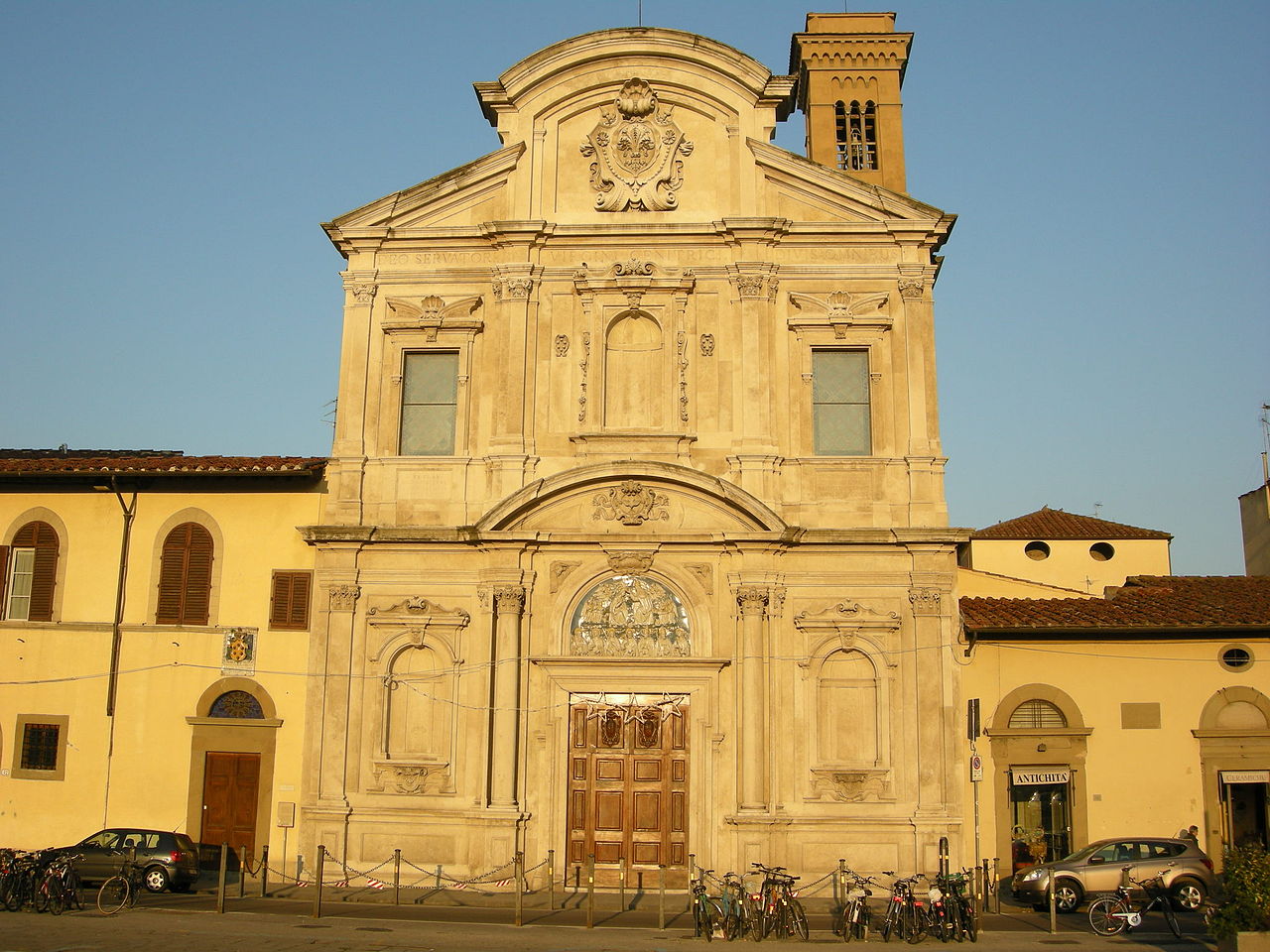
 Chiesa di Ognissanti, Florence, Italy. I wanted to draw something comforting last night, and pulled out images from Italy. This is comforting to me — portraits are NOT!
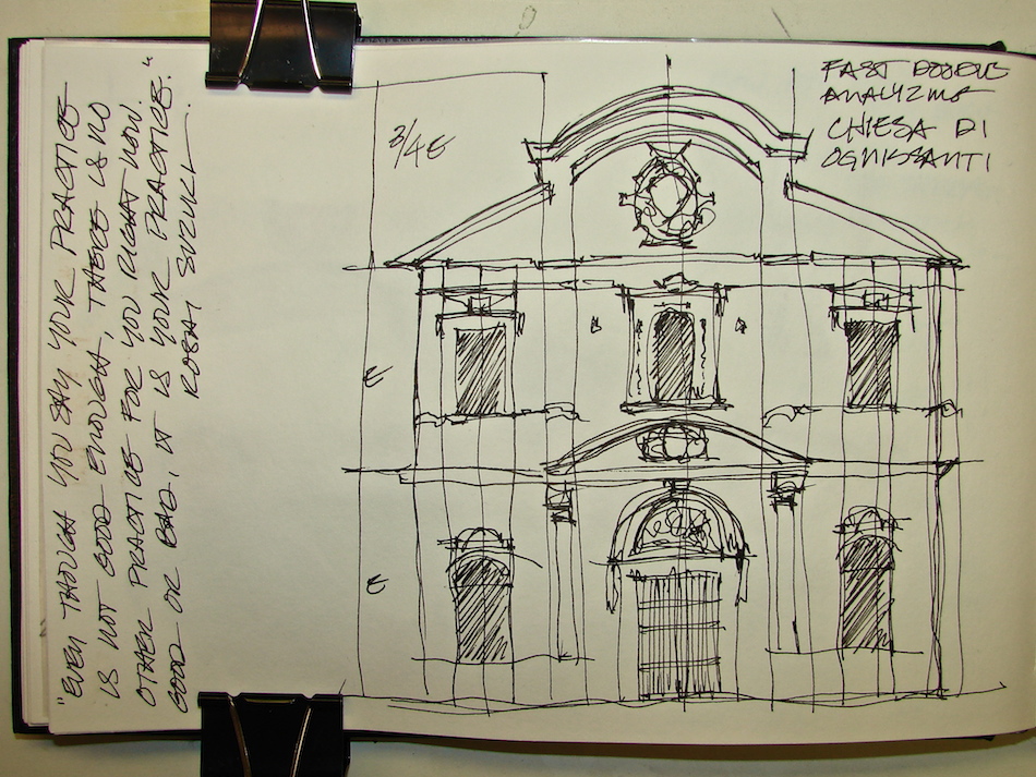 This is the “doodle” I did to understand the building relationships.
Understanding how the architect Matteo Nigetti created this Franciscan church,
the shapes he used and the logic behind them is like reading a language.
I easily read the language because I am a classically trained architect.
However, you can learn to see the geometric shapes if you begin to sketch them.
 I looked first to see the symmetry — was the building symmetrical? Yes.
(*sigh* i love symmetry*)
I then found the center line, or the place where each side begins to mirror the other side, right down the center of this facade (see the dotted line with the initial “CL”?)
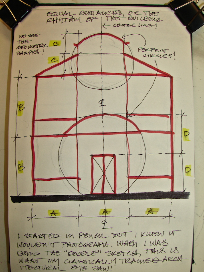
Then I looked for basic distances (dimensions) between floors and columns, or how the building details articulated various quadrants. This building facade is quite square,
and so I easily discerned three nearly equal dimensions across the front (“A”).
Two of the lower “floors” (signified by windows) also were close to equidistant (“B”).
I also noticed the two arched shapes appeared to be circular, not elliptical,
and this made them easy to draw (if one can draw a circle)
if you can “spot” the circle’s form on the facade.
I did this unconsciously, but recreated it for you above, so you could see
how I “think” as I read the classical rhythms. I quickly saw four repeating
dimensions I could use to distinguish sizes. I saw the circles,
and the place where the building roof drops at an angle.
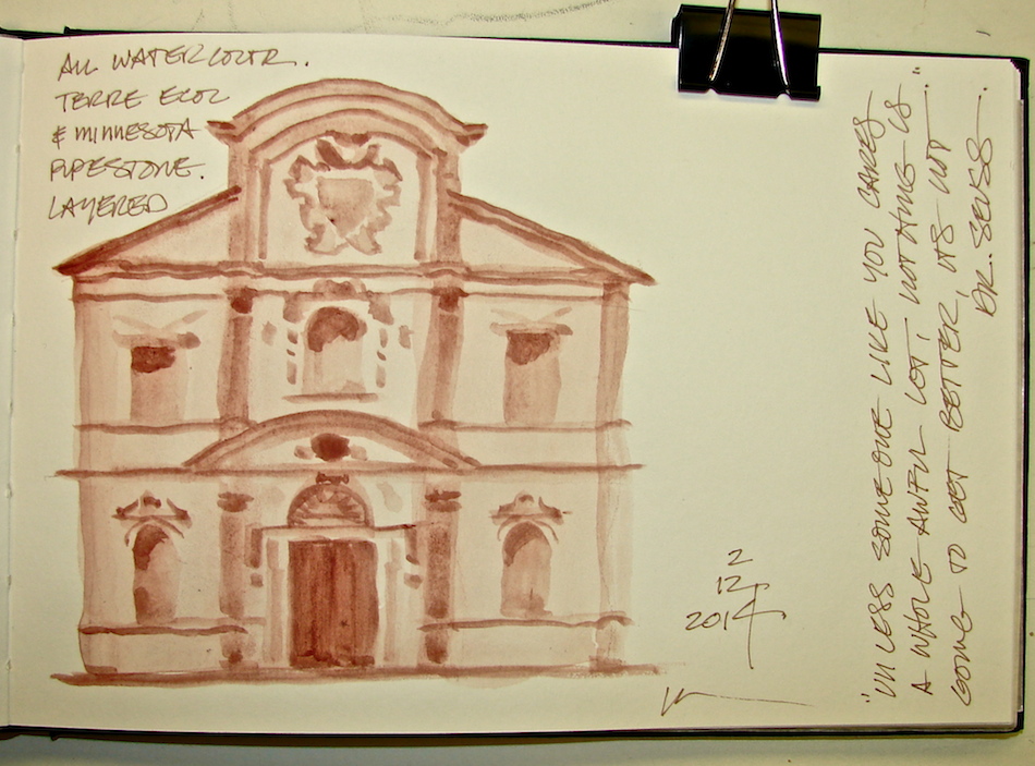 This “homework” allowed me to move forward confidently in creating a watercolor
with no lines, just a gradual buildup of Daniel Smith’s Terra Ecole and Minnesota Pipestone, above. I am loving experimenting with no line-work, though I think
I will never do away with line work altogether. I love line sketches.
 I also show how I dissected the rotunda clearly in my own notes on the
Washington State Capitol Legislative Building Rotunda (more info on the post.)
Images in Stillman & Birn Alpha journal with Preppie pens and Noodler’s Heart of Darkness ink (not waterproof), Tombow pens, and Daniel Smith watercolor paints.

I agree to Creative Commons Attribution-Non-Commercial 4.0 International License, which you can learn more about by visiting the site, or,
visit my web page for a more user-friendly summary on my terms.
My images/blog posts may be reposted; please link back to dkatiepowellart.
Thanks to Wikipedia for images, and for the photographers who offered them for our use.


wonderful sketches Kate. Happy PPF, Annette x
http://nettysartadventures.blogspot.co.uk/
LikeLike
Thanks Annette – have fun making cards!
LikeLike
Love your drawings!!! Architecture is so fascinating!
http://missdaniellerenee.blogspot.com/
LikeLike
Thanks Danielle . . .
To our Blogspot commenters, did you know that WordPress uses your bog link for your name if you give one!
LikeLike