Wong’s Chinese Laundry resided in the Wong Laundry Building on NW 3d St,
an area currently under constant demolition for high rises, many of poor design quality.
It was designed by Alexander Ewart in 1908, and has had many businesses in it,
the last being Wong’s Chinese Laundry (more history below).
It was chosen as one of Seven Endangered Places in 2014.
I had few good images to work with, and visited the site to gain perspective on the area.
This slideshow requires JavaScript.
I started with the two most obvious images —
the black and white image of the neon sign, and the street view.
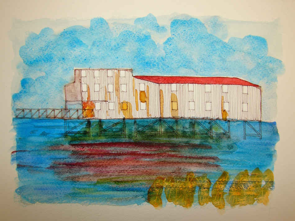
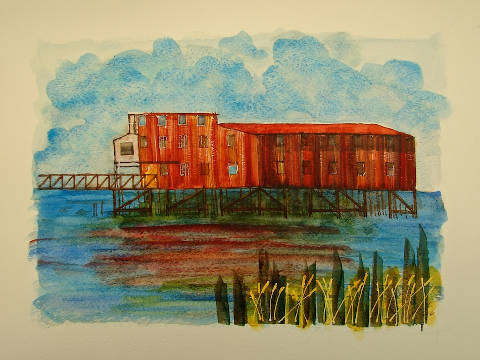
The images of the building and the state of the disrepair at this time are not
compelling and my task is to create a watercolor a donor might purchase.
I tried my own rough urban sketches onsite but for a donor to want to
buy the image, it needed much more spirit and visual kick!
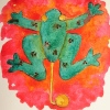
I added the Chinese Dragon
as if it were a New Year’s festival!
 Beginning with an inked sketch, I added masking to preserve the white and highlight various areas, like the neon. Overtime, I found other areas I wanted to highlight, so you see blue (that is the masking fluid) added to teeth, eyes, dragon’s ridge and flames.
 Under painting and grisaille using inks. I added black slowly as I went,
seeing where I wanted that inky darkness just as I saw the highlights.
 Quite a bit of color is added all at once, trying to be patient between colors.
Patience is not my strength, and so, greens ran into the sky and into the gold of the building. Thankfully perfection is not my goal, but a lively rendition of the energy
of the area when Wong Laundry Building was at its peak.
 I thought the piece was finished, and removed most of the masking fluid so the whites could pop. Standing back and looking, however, the ending of the building and the tree and the tail in the upper left-hand corner were not working. This is an issue with a collage-type sketch, because you start in one spot and begin moving and adding details.
I wanted it to appear almost as if the dragon was circling around the block in the distance. Instead the tail was simply floating in space at the upper left edge.
 Two things changed the feel completely:
pulling the sky across the top, even pushing it into the building and the tree,
and finally, defining edges with a heavier black line —
an old architectural presentation trick.
Roar!
 These images are donated to raise money for restorations!
 I found several interesting
articles on this building besides the Restore Oregon article:
The Changing Face of Chinatown
in Portland Oregon,
Longtime home, business of
Chinese matriarch for sale,
Portland New Chinatown /
Japantown Historic District (NPS).
The Chinese dragon doing its dance in front of the Wong Laundry Building is a made up entity from several images! May it bring this building good luck!
Previous Buildings:
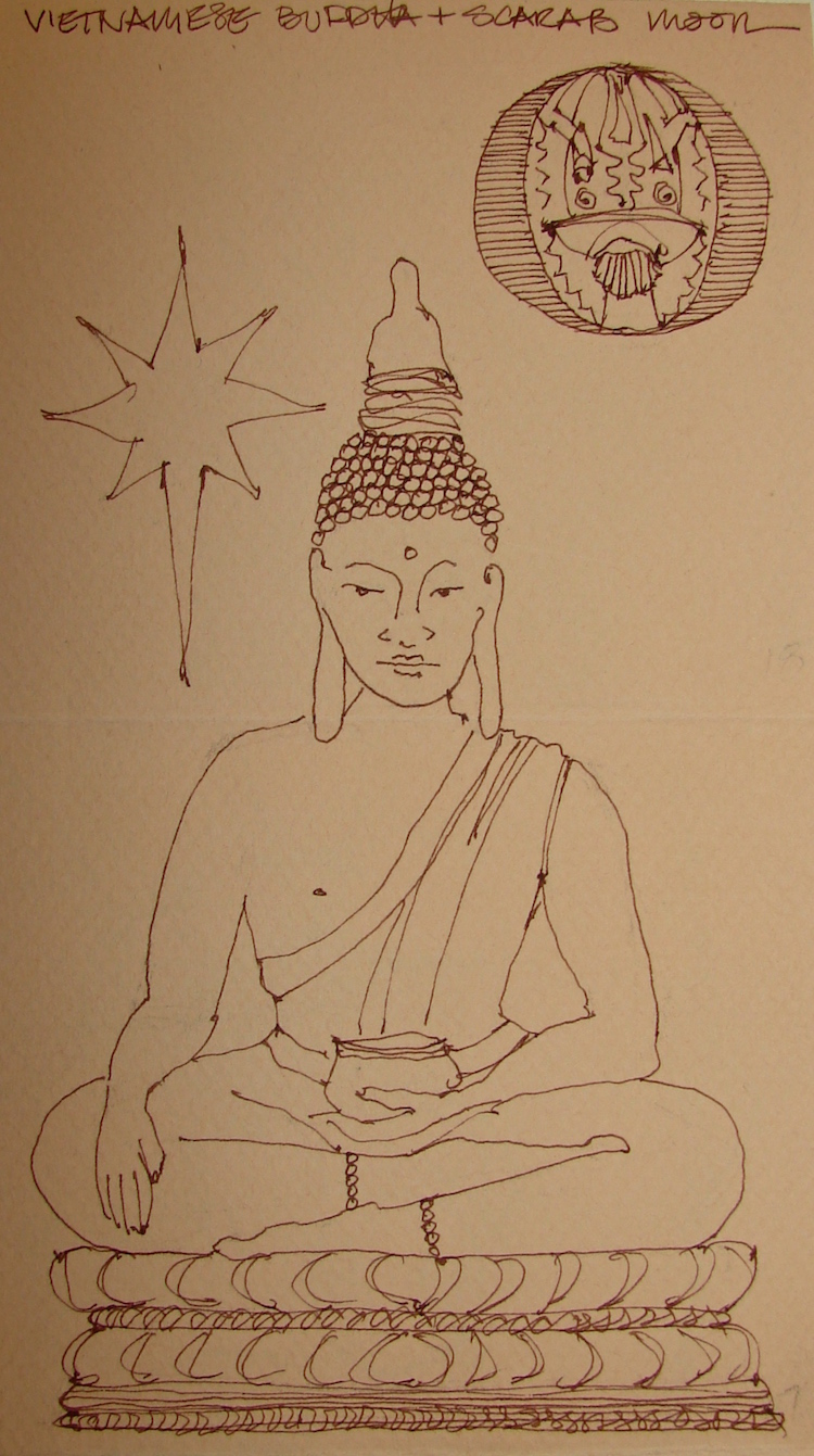
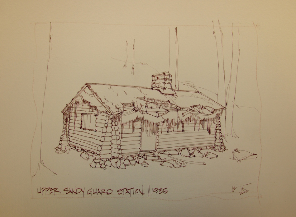
Upper Sandy Guard Station

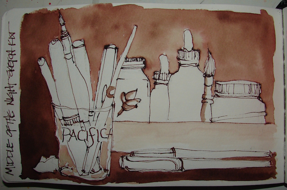
Strathmore 0r Fluid Cold Press papers, with a Pentalic 2B woodless pencil,
Lamy Al-Star with De Atramentis Document black ink
and Platinum Carbon pen with Platinum Carbon ink;
White Uniball Signo pen, Fineline Masking;
Sennelier, Holbein, QoR, M.Graham, and Daniel Smith watercolors.
©D. Katie Powell.
My images/blog posts may be reposted; please link back to dkatiepowellart.
I'd love it if you shared this; please mention my blog name!

 I am loving the paintings that I am doing for another,
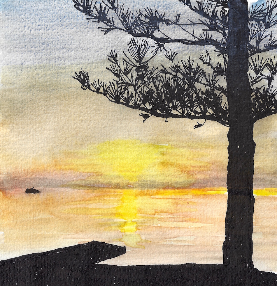 Pentalic Aqua Journal, Pentalic 2B woodless pencil, Platinum Carbon pen with Platinum Carbon ink; Lexington Gray ink, Sennelier, Holbein, and Daniel Smith watercolors.

 As my Patreon supporter, you will have


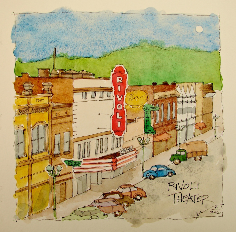


 An image of the building from the hilltops is here