VSW: Fjord

Pure, Lofoten is one of the most beautiful places on the planet!
I had to do another image from last month!


To hear about classes, follow me on Facebook or
check out my new and improved dkatiepowellart.com
and sign up for my newsletter!

Posted in architecture, art journal, challenge, landscape, pen & ink, virtual sketching | Tagged , , , , , , , , , , , , , , , , , , , | Leave a comment

New Journal: Hahnemühle DS Sketchbook


I’ve had this journal for a long time and as I am writing more I decided to give it a go!
It is a draft and sketchbook, but of course I will push boundaries
and eventually tell you what it can take, watercolors and painted inks?
*this is not a review yet*
A5, landscape, I’m paring it up with my  A4 Hahnemühle Watercolour Journal.
This allows me to be free to grab whatever journal fits the task.
It is breaking away from what I started out doing, separate journals for each type of thang — THAT resulted in lots of unfinished journals sitting around.  I will rarely do that again.

I have a goal during this new journal period.
These goals are a bit like New Year’s resolutions and I am always curious to see at the end how my intention and my life veered or aligned.

I am focusing on creativity and discipline to
move certain projects ahead despite my heavy work load.

When I started this Sketchbook Revival, a free set of 14 days of classes was starting.
I stopped by to listen, especially to those peeps I did not know, and found some gems.
I took notes in my new journal.

The first was Kiala Givehand teaching how she makes small journals for specific uses.
*yes i had to laugh after just deciding that this way of journaling was not for me*

What was fun about her class as
opposed to other bookmaking classes
I’ve taken it that it was very spontaneous
and free, emphasizing creativity and impulse rather than precision.  There is a place
for both, of course, and yet I think these
little journals will be USED, and that
is important.  I didn’t “learn” a bookmaking
tip I didn’t know, and yet I enjoyed
listening to her and in the process had
an aha moment for a review, right.

Danny Gregory from Sketchbook Skool is always entertaining.
I listened to him and doodled my pen…
He spoke of pairing habits with things you know you’ll do,
Like making tea… Good point.  I pair mine with going to sleep.

Val Webb’s class was also good…  I found my 40-year-old Sumi Ink bottle and dang if it wasn’t still good!  This whole spread was done while listening to her talk…
*i admit to fast forwarding through the introductions and occasional other thangs*

To hear about classes, follow me on Facebook
or check out my new, improved dkatiepowellart.com

Posted in art journal, creativity, drawing, ink painting, journal, painting, pen & ink, process, sketchbook, watercolor, writing | Tagged , , , , , , , , , , , , , | 2 Comments

Full Moon of Kurma Jayanti

Keeping this new Hahnemühle D & S Sketchbook at my work desk.
I can drop in a fast sketch on what is happening…  Full Moon last Sunday night
and the turtle played a central theme.  I realized I needed no craved that
slow earthy energy.  Fifteen minutes, just draw, write, paint.


And so far, the DS notebook is taking light washes… Yay!
They washes are light — and so sometimes the color is not as intense.

To hear about classes, follow me on Facebook
or check out my new, improved dkatiepowellart.com

Posted in art journal, creativity, drawing, journal, painting, pen & ink, sketchbook, watercolor, writing | Tagged , , , , , , , , , , , , , , , , | 6 Comments

Tools: Ink Journal

In the back of new journals, I make sure I try all inked pens on the new paper.
It is the second test I have for inks to see if they are waterproof, the first here.
I also get to see how the pen nib works on a given paper.
Above, my latest list in an A4 Hahnemühle Watercolour Journal, next to the pens
inked up; I rotate and use these pens each week through drawing and journaling.

I appreciate Goulet’s ink samples, an inexpensive way to test and compare inks to find the colors
I really love.  I take the rejected samples and paint with them, using them up having fun.
I’m sorry I didn’t find samples earlier, as I have a couple of inks that are just okay; having found much prettier inks through sampling.
I’ve looked for blues and will end up with a Robert Oster eventually.  I finally found a great purple, and an amazing orange, and will want those.  Ink bottles are big and last a LONG time!

The beginnings of the ink book, below.
I also comment on smelly inks —
and many are.  I am not fond of any of the perfumed inks I’ve tried yet except DeAtramentis Tobacco… It reminds me
of my grandparent’s ranch!

I am not a fan of the shimmer inks, last photo.  I put one in a wet 1.5 stub nib pen.  I twirled it, rocked it, (did a little dance with it), and I got little shimmer. They easily clog pens so you have to be meticulous in cleaning.

To see the post on workhorse waterproof inks, go here!

To hear about classes, follow me on Facebook
or check out my new, improved dkatiepowellart.com

Posted in art journal, color, drawing, ink painting, journal, pen & ink, process, review, sketchbook | Tagged , , , , , , , , , , , , , , , | 3 Comments

VSW: Norway

The beauty of doing a virtual sketchwalk is that you visit a place you might
not even have known about!  Norway was a gift to me when Sylvia chose it and
led our May sketchwalk; the images were beautiful and fun and inspiring!

Paulus Kirke has many photographs and I may want to revisit it!

Pure, Lofoten is one of the most beautiful places on the planet!

The mix of expansive views, fjords, city and small detail that
Sylvia offered us was a sweet mix.


To hear about classes, follow me on Facebook or
check out my new and improved dkatiepowellart.com
and sign up for my newsletter!

Posted in architecture, art journal, challenge, landscape, pen & ink, virtual sketching | Tagged , , , , , , , , , , , , , , , , , , | 2 Comments

Tools: Waterproof Inks Review

If you are a watercolor artist your definition of
“waterproof” must meets the highest standards.
A lovely drawing in ink has to hold while washes of watercolor
pour over it; the linework must stay put.
When people say, “It is waterproof MOST of the time”
I think about birth control!

Also, inks need to stay put on all kinds of paper.

There are only a handful that meet that qualification…
these have worked on all kinds of paper in journals and on watercolor blocks.

I test inks two ways.  One way is in my swatching.
I let the inks dry and then drop a big drop of water in the middle, and let it sit a minute, then begin to lift… waterproof will not lift.
See the Super5 “Atlantic” (swatch 1): no drop ghosting, so waterproof.  Rohrer & Klingner “Salix” surprised me in that it is slightly waterproof: leaves quite a lot of color on the page with vigorous scrubbing, showing some water resistance.
Robert Oster “School” shows a clean drop shape — not waterproof!
My swatches are done in an A4 journal whose paper I hate,
where I can take notes and find them, update impressions.


The second is to test an ink that seems waterproof in swatching by trying them
in the back page of a new journal (above) and/or on new papers.
This is where you find out if they inks are fully waterproof…
I always do this in new journals, with new papers, even with my favorite waterproof inks!


THE INKS

Platinum Carbon Pens (and Goulet sell them in fine and medium) and the
Platinum Carbon ink waterproof cartridges. WATERPROOF!
Amazing little cheap pens, ever-ready bunny workhorses…
I have one for purse, studio, and bed!
The ink has a slight sheen to it from the carbon, but it is a deep black.

ALL DeAtramentis Document Inks are waterproof.
I use the Black and Brown (such inventive names) all the time in three pens.
They have a line of crayola colors, some of which I’ve shown.
Their black is pitch black and a dream, never clogs my pens with regular cleaning.
Not the Archival line, the Document line.
PS: Their Fog Grey is really quite blue, above!


Note: now you can get Super5 inks in the states from Blue Rooster:
Support them so we always have it, as Amazon comes and goes!

Amazon: Super5 Frankfurt ink,  Super5 Darmstadt ink,   Super5 Australia ink,
Super5 Atlantic ink, Super5 Delhi ink, Super5 Dublin ink.
Amazing inks also, and lightfast (Yay!) Their inks colors are not like crayola colors,
but wonderful just-off colors. I love them, and use them all.
I use Frankfurt (a dark brown-grey) for both grisaille and linework.


I recently tried samples of several of the Rohrer & Klinger SketchINKs.
I was unimpressed — the colors were not as intense as they appeared in the images online.
I did end up purchasing “Marlene” and while it is not as blue
as I’d like it is a clear blue, in the ultramarine family, and so I added it to my lineup.
It will give me a chance to see how it performs on various papers.

REMEMBER, TEST FOR WATERPROOF
IN THE BACK OF EVERY SKETCHBOOK!


NO Noodler’s ink has ever worked as consistently waterproof
— I’ve had sad disasters.
Kinda like your birth control not working on some days…
Noodler’s inks left my studio, with the exception of Lexington Grey.  This
includes Noodler’s Polar Brown, Heart of Darkness, and Bad Gator Green (or whatever it is called!)

I also find they clog my pens.  I still use Lex Grey for grisaille, with a brush, but I TEST IT EVERY TIME IN EVERY NEW JOURNAL!  Fool me once…


Anyone have any others that are
tried and true for all kinds of paper?
Thoughts?

To hear about classes, follow me on Facebook
or check out my new, improved dkatiepowellart.com

Posted in art journal, creativity, drawing, ink painting, journal, painting, pen & ink, process, sketchbook, watercolor, writing | Tagged , , , , , , , , , , , , , , , , , , , , , , , , , , | 13 Comments

MPF Conservation: Washington State Flag First Drafts, Paper

In my other life (the one that pays the bills), Mitchell and I own
a conservation business which conserves (restores) antiquities.
I do a lot of finish (painting, shellacking) work in our business.

The DAR approached us to recreate the First Flag of Washington in order that the historic flag which hangs in the Reception Room of the Legislative Building be preserved.
The saga of the flag is posted on the business blog,
I thought you might find this interesting… My other identity!

If you want to read about the prep for the drafts, below, go here.

Beginning with the test sheets,
I created draft of George, oil on paper.
The paper was primed with shellac to prevent oil seepage.

New tracings from our master tracing are created each time so the marks are fresh.


My first draft was a portrait of George on plain shellacked paper.

The lovely background is not noticed much in our original because the original bright green silk has faded to the colors of the background.
The background was created so that it appears a light is coming from behind George.

The draft on shellacked paper helped to fine tune the paint formulas.


Okay, I had a bit of fun at the end of the day giving him cat’s whiskers!


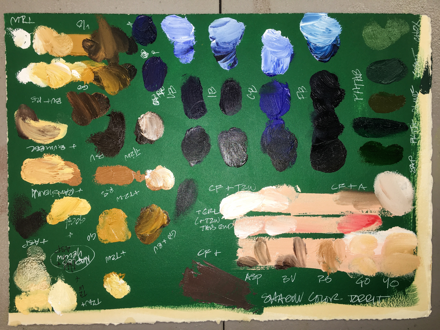
The original paint mixes when painted in the portrait draft were changed slightly.


Pasty face also taught me not to let the paint dry, but to mix shadings in the moment…
I painted the draft slowly, using the the 50/50 galkyd/linseed mix to thin when needed.

The next four images were done in one day, so the shadings were created properly.


Building up the face.


The hair and lacy shirt…


Adding the green that matched the silk…

A few final tweaks, and the first test is completed, shown here against the original.

A second test was on green painted paper to work the colors again, over green.

Painting over a base of green changes methods just a bit;
the green tint bleeds through the paint.  Green George gave us laughs as his eyes followed us everywhere; I was a bit sorry to have to finish him!

Working green George I became much more comfortable with the paint colors
and the techniques to create his likeness.  His face needs to be a bit thinner and
his hair is a bit wildly curly still.  Painting George has prompted me to review other
images of Washington, because really, while I am creating a likeness of the flag,
I am not a forger and have come to realize the painting will have my hand and strokes
no matter how I attempt to reproduce it.  What I want is his eyes to look at you in the manner of the flag and his smile (which has degraded) to be accurate to his personality.

We tried to find the image the original makers used as a model but no luck so far…
We thought that they may have copied a famous painting.
Our research is leading us to believe the historic flag’s image was
an amalgamation of two or three images we’ve found.
If anyone has any further history we’ll be happy to share that in this post..

This has been an honor and adventure so far;
really nothing I’ve done to date has been quite like it.

I am not quite finished with this test
(hair, costume) but not sure that I will finish him; I’ve learned a good bit from
the paper tests and am now ready for the silk, next post!

To begin at the beginning, visit Washington State Flag, 1.

©MPF Conservation.  May be printed for your own use.
May be reposted if our url + copyright is used as reference.

Posted in commission, history, oil paint, painting, portrait | Tagged , , , , , , , , , , , , , , | 4 Comments

Toilet Time


Our Morning Rituals are important.
To Her too!

To hear about classes, follow me on Facebook
or check out my new, improved dkatiepowellart.com

Posted in animals, art journal, journal, memory, painting, pen & ink, sketchbook, watercolor | Tagged , , , , , , , , , , , , , , , | 2 Comments

My First Zine: Toilet Paper

My first Zine!

I took a class from Skillshare (two months free from Doodlewash, I figured why not)
and was surprised at the fun of listening to Kate Bingaman-Burt’s enthusiastic class
Making Your First Zine: From Idea to Illustration“.
It was much more than I thought it would be and I recommend!

It saved me a lot of figuring-it-out time…

My biggest takeaway from this class was not to make this first zine precious,
but to take an idea and run with it.  I had no clue what to create — the zines I previously
considered would take much more time than an hour or two.  

Then I sat on the toilet.  Without reading material.   The rest is herstory.


Frightening to share this
first zine with you because it is
raw writing of 
stream of consciousness
thoughts recorded into a zine.
My. Crazy. Silly. Musings.
ON TOILET PAPER CONSERVATION!

I laid out the pages on the letter
(8 1.2 x 11 inch) paper.
Cut it as instructed, and folded it!

WA-LAH, A ZINE!

This slideshow requires JavaScript.

Don’t laugh at me….
Laugh with me!

Platinum Carbon Pen with Platinum Carbon ink waterproof cartridges on copy paper.


Posted in art journal | Tagged , , | 12 Comments

Bright Ideas Journal, Cat Memories


At the end of 2016 I made a commitment to finishing off wayward abandoned journals.
I’ve made great headway in that, with only a couple to go.

The Bright Ideas Journal isn’t one of them,
Though I picked it up again (found it in the pile is more like it),
and it was nice to be back to line drawings only (or mostly).
A hundred+  pages left to go means this is a long project!

The Bright Ideas began as a memory journal,
mostly about family objects I am giving away to someone who wants them,
while I retain their memory.


Now I’ve added other object+memories.

I never said all the drawings would be good….
Worst. Shading. Ever.
But I am new to these finny crayons so okay!


Savitri has this thing for the Purple Mousey Majesty.
She goes nuts for the purple furry mousey, not red, not yellow.
Not the purple stripy mousey.


Kamala (RIP) loved the red feathered bird and a crazy squeaky blue mouse that
I cannot find (meaning the kittens have carried it off to a hiding place.)
She would kick and toss and generally get a little crazy on her own


Duckmouse is Sammy’s favorite…
It can sooth the slightly psychotic nature of Sam, who is skittery and obstinate and hard to handle… except when he is not!  Old age is making him more so!  But when Duckmouse is pulled from the toy box he gets all loving, rolling and purring and I do not know what powers this scrappy little felt yellow and green mouse has, but they are formidable!

And BTW, cats see color because how else would they have favorite colors?

Older memories of Cats and toys…

Bright Ideas journal multi-color journal with Platinum Carbon pen,
Lamy Al-Star with De Atramentis Document black ink,
and colored pencils and crayons….

w16-5-11-wold-heart-01-sq w16-10-10-bi-stars-too-sq W16 4 21 BI STUPID PHONE 01 SQ w16-5-5-altar-dish-05-sq w16-10-6-bi-rhinestone-stars-sq

Posted in animals, art journal, drawing, journal, memory, pen & ink, sketchbook | Tagged , , , , , , , , , | 4 Comments

Florian Afflerbach: Der Zeichner


Florian Afflerbach was an amazing urban sketcher and architect.
I wish I’d known him; I wrote to him once to tell him how his drawings were an inspiration to me… I’ve seen many many architects turn to art, but Florian’s work was exceptional.
When the crowdfunding for a tome about him was offered, I immediately said yes…


His pencil + watercolors were my favorites, and this book is full of
inspiration for me to peruse for many years.  They are delicate but not timid,
and the buildings are served by his beautiful renditions.


He painted some of my favorite architect’s buildings.

I think most will know him by his images of cars and bikes.

The book is 300 pages of amazing commentary, and mostly, images!
His legacy will live on…

Links: http://www.florian-afflerbach-der-zeichner.com/

To purchase (while they last): https://schaff-verlag.de/produkt/florian-afflerbach-der-zeichner/

And his Flickr site, amazing!

Posted in review, urban sketchers | 4 Comments

Lojong 34: About Your Attitude

I’ve studied through the slogans a dozen times in my life;
these are my musings on the slogan currently, not a formal interpretation.
For that reason they are less about straight Buddhist teachings,
and I think able to be shared with most practitioners of other faiths or no faith
(unless yours doesn’t allow you to read any other tradition.) 

If you have time and the inclination, I published the WHOLE  thang here!


“24: Change your attitude but remain neutral.”

For the longest time, this one stymied me.

Then I heard, “What you resist, persists!”
I wish I could remember who said it… Brugh Joy?  AA meeting?
Anyhow, it was about not defending, but leaning into whatever harshness was coming up.  Instead of defensiveness and guarding your territory,
you breathed in sadness or shame or anger or righteousness or being stupid
or fat or whatever might be being said about you or whatever was criticism was floating around in your own monkeymind, whether accurate or not,
and opened to the possibility that there might be truth in there.
Sometimes not, but the blustering defensiveness is a waste of energy.

If there ever was going to be any change within yourself or your relationship with others, changing the defensive posturing was a beginning.


Day eight of #the100daysproject, in which I will be WRITING each day…
I won’t always be able to share it with you in the blog…

Okina Journal, with pen and ink, in this case
Platinum Carbon Pen with Platinum Carbon ink waterproof cartridges.


Posted in art, Buddha, journal, lojong, meditation, pen & ink, ritual, tonglen | Tagged , , , , , , , , , , , , , , , , , | Leave a comment

Milking a Steer


I wrote a lot about my mom last week in my journal, as I didn’t do anything
but engage her and medical people and Medicaid… my work went on hold.
Our system is corrupt and we are a cruel country, as I said a week ago,
and still it is another story for another time.

To keep my sanity I am drawing/sketching/water-coloring each day,
however much I can…
I decided to commit to the 100 days project, and I will be writing daily.
I may not be able to share it all, however.
This is one of those days, because I might be sued for the rant on the facility she is in…
Yes, she is difficult right now, and yet, unless she is hitting and biting or whatever they should be able to take it and serve her or they can hang up their medical credentials.


I leave you with the general idea of
what it is like to try to deal with the system and ALL THAT!

“You ever try to milk a steer?”
Perry, on Lois & Clark (Superman).

To hear about classes, follow me on Facebook
or check out my new, improved dkatiepowellart.com

Posted in art journal, drawing, journal, painting, sketchbook, watercolor, writing | Tagged , , , , , , , , , , , , | 2 Comments

USk: Williams Shopping Trip


We took a trip to the store on Saturday, not our usual day.
Whenever we go to the Williams store we pass by this brightly colored
green and purple store, which I thought was a children’s bookstore.
Turns out it is a publishing house!

A great example of the disappearing culture of Portland,
being taken over by beige and cream and gold thinking… I love these crazy paint-jobs!


At the store there were magnolia
blossoms in varying stages.
Locals call these tulip trees, not sure why, but they are one of the few
brilliant pink early Spring flowering trees.
By noon I think the blooms
may have scattered, as this
was a day when we had a huge
windstorm that came with our downpour!
The local crows that visit the studio neighborhood were shocked by the suddenness and we watched them scramble for safety, some coming down on the pavement.  I love the rain, but not so much the wind. It slammed against the windows, but didn’t deter the Cal-Bag truck washers from their jobs washing the trucks!


I continue to journal about my mom, the system, and the family struggling to care for her.
When I can share I am sharing the writing too…

This was also recorded for Moment Sketchers... Check it out… Join in!

To hear about classes, follow me on Facebook
or check out my new, improved dkatiepowellart.com

Posted in art journal, creativity, drawing, ink painting, journal, painting, pen & ink, sketchbook, watercolor, writing | Tagged , , , , , , , , , , , , , , , , , , , | 2 Comments

Lojong 33: Boddhisattva Vow

I’ve studied through the slogans a dozen times in my life;
these are my musings on the slogan currently, not a formal interpretation.
For that reason they are less about straight Buddhist teachings,
and I think able to be shared with most practitioners of other faiths or no faith
(unless yours doesn’t allow you to read any other tradition.) 

If you have time and the inclination, I published the WHOLE  thang here!


I haven’t much time these days…
My daily work is to repair/conserve/preserve objects;
and make sure that my mother has the least amount of suffering at this stage of her life.
The source of much of her suffering right now is her own monkeymind,
her failing body,
and our system in the USA, or how we treat the elderly.

“23: Always abide by the 3 basic principles:
1) Keeping the vows of Refuge & Boddhisattva;
2) Refrain from outrageous action;
3)  Develop patience.”

I am glad that I’ve managed to learn,
somewhere in my mid-thirties, to refrain from outrageous action.
By this they don’t mean having a walloping good time doing this or that…
Mostly the slogan is referring to harmful behavior,
like flying off the handle, in my case, or jumping to conclusions or being a drama queen!
I was a very different person in my twenties;
I worked hard to become mindful and  change that pattern.

“Pause.  Center.  Shift.”

An excellent supportive phrase that another excellent
spiritual teacher frequently said, and it became a mantra that
helped me to stop and find my heart/mind center.
From there I could shift my observations and
actions into what might be a more productive pattern.

Develop patience?  Peals of laughter!
Not even close to saying that I have that one down.
Really, it shows in everything like when I have an idea I must do it whether I have all the right materials or not, to when I must wait for an answer to anything…

I wish I had a bit more time on this one this week but really,
I am shocked I managed to get to this at all!

Day two of #the100daysproject, in which I will be WRITING each day…
I won’t always be able to share it with you in the blog…

Okina Journal, with pen and ink, in this case
Platinum Carbon Pen with Platinum Carbon ink waterproof cartridges.

Posted in art, Buddha, journal, lojong, meditation, pen & ink, ritual, tonglen | Tagged , , , , , , , , , , , , , , , | 5 Comments

VSW: Menton France Turnaround


Quick doodling sketches while waiting for yet
another crazy phone call from hospital staff…
NOTHING like art to  calm and soothe!

To hear about classes, follow me on Facebook or
check out my new and improved dkatiepowellart.com
and sign up for my newsletter!

Posted in art journal, challenge, pen & ink, process, sketchbook, virtual sketching, watercolor | Tagged , , , , , , , , , , , , , , | 2 Comments

Certified Humane: Smart Chicken, Niman Ranch Meats


Smart Chicken is the first chicken available nationally (to my awareness, and please inform) that is Certified Humane®, and 100% of Niman Ranch’s meats – Pork, Beef, Lamb, and Processed Products like bacon – are Certified Humane®!

I’m sorry we need such a program, but we do.

Certified Humane® governs the way the meat is raised, and it is a great program which is all about making sure the animals are treated humanely.
Certified Humane® was born by people like myself who were disgusted by animal torture.  We wrote and called and voting with our $$$ and also talked to the markets about what we wanted.  Telling them when we didn’t buy their meat and
how disappointed we were in what was available has impact.

Yes, you can make a difference.

Smart Chicken also has amazing taste.  It is coming in at New Seasons at
$2.79 to $3.99/pound, depending upon if it is Organic or not.  (I buy organic when on
sale — freeze — or occasionally.)  Because we eat so many beans, rice, and veggies the rest of the time, the cost of buying healthy meat in alignment with our values and health requirements has actually gone down.  Smart Chicken also does not add water which all other companies do (unless you are buying a local chicken from the farm), which means you are not paying for added water, which also often has chemicals added to it. They don’t give you the wing tips, giblets, or necks — which MOST people don’t want — so you are not paying for that either.  The birds don’t come stuffed with extra fat.
The point of this is that the chicken is actually well-priced!

The birds usually are a bit smaller, which we like, with less fattening up as
factory farms do, which is the way it ought to be, and that is healthier for you.
We use all the leftover drippings in our bean dishes because the birds are not so fatty!
The flesh is firmer, as if the bird has truly run around, but not tough at all.
They roast heavenly!

All the Smart Chicken is non-GMO, no hormones, and no fed antibiotics.
Organic is optional... and we feel okay about eating their non-organic chickens.

Smart Chickens are raised where they are killed, and are used to their handlers.
They are not placed in small cages and trucked many miles which scares the hell out of them.  They are in a space just before they are killed whereby the oxygen
is slowly removed from the room, so they basically fall asleep without stress or fear.
Once asleep, they are slaughtered.  No fear kills.

You can find out who carries Smart Chicken in your area here.

And we dropped buying any other meats
but Niman Ranch‘s sausages, ham, bacon, etc.
Their meats are non-GMO,
no hormones, and not fed antibiotics
.
Organic is optional
Their Apple Gouda Sausage is a
treat for us for breakfast!
You can find out who carries
Niman Ranch in your area here.

To hear about classes, follow me on Facebook
or check out my new, improved dkatiepowellart.com

Posted in art journal, drawing, ink painting, journal, painting, pen & ink, review, sketchbook, watercolor, writing | Tagged , , , , , , , , , , , , , , , , , , , | 2 Comments

Doodlewash: 1000 Days

Charlie from Doodlewash posted his 1000th doodlewash todayHis post is worth reading from beginning to end, and I concur.  Great minds and all that.
At the end of the post he has three takeaways worth following!

One is about finding a group to share and post your images.
Doodlewash is such a group (come find me and ask for friendship),
and there are private groups on Facebook as well.
The reason it is good to share is you find out that your aaack-awful-gads-give-it-up beginnings are really not so bad, and maybe even good!
You might even encourage another reluctant artist to share also!

I love his Doodlewash Manifesto — Charlie is all about the positive,
and as a teacher, that is something I can get behind!!

My first 100% watercolor was the boat and water image…
Remember I was an artist before but worked acrylics and this is so different!

I was curious about when I started, and it was in January 2014, and I’m at 957 postings.
I’ve not counted my images, but I am sure I am over 1000 now, and it is true, that if you practice every day you will get better and better, developing a wonderful creative habit.
I work full-time, and often my mark-making is at night.  I’d love to get out with
the local Urban Sketchers but Saturdays are working days for me…

When I was learning I did more challenges and painted what someone suggested…
As I found my way I migrated back to what I like doing, and I love journaling and painting alongside it, a record of what interested me in my life and what was troubling or wonderful about my days.  Now I am all about that, unless I am entering a competition.
I doodle what I love, palms and moons and windows….

Posted in art, art journal, challenge, creativity, drawing, ink painting, journal, painting, watercolor | Tagged , , , , , , , , , , , , , , , , | Leave a comment