SoCS: Meowr

I  journal mornings with stream of consciousness exercises,
and participate in Linda Hill’s Stream of Consciousness Saturday  whenever I have time.  I write to a timer, 15-20 minutes, no editing except spelling, and of course I add my art!  You can join us!

The Friday prompt for Stream of Consciousness Saturday is “animal sounds.” Write about the sounds animals make and how I experience them.


Izzee was the hardest to get to  know because she screams bloody murder
at being touched by the cats while playing — she is so vocal that in the beginning
we were always running to what sounded like murderous squeals
but the truth was she was PLAYING.  She squeals that way when she is picked up too,
if she doesn’t want to be picked up — so if someone were to  overhear her
they’d think we were torturing her.  But she has a slight variation of that
which now we know — and THAT squeal, so close to the other, is a distress call.

They do have a language.

For the rules, go to Linda’s blog;  feel free to join the fun!

Posted in art journal, creativity, journal, pen & ink, sketchbook, writing | Tagged , , , , , | 6 Comments

Morning Coffee


I wanted to be writing a different
kind of blog about my artwork “Morning Coffee” today.

I sketch about our lives,
and especially times with Mitchell and the cats, the best times of the day, cooking, laughing, color, sharing.
Mitchell makes coffee every morning.  I see a scene like this in the morning on the counter, watching my amazing husband start our day.  We love this colorful pottery which I cannot name, because lawyers have stopped me from naming what I own when describing my work. They call it copyright infringement.


We also love our coffee made in a Bodum press-pot,
and have fallen in love with our new colorful Emsa Samba thermos.
I also paint my favorite pens and inks bottles and THOSE companies love it —
they know it is free advertising because is a celebration of objects we love.
Some have asked if they could use it in a blog post for their company.

Anyhow, I painted it, made cards of it and then a lawyer from the firm of Andrew Cornelius, PC, representing HLC Holding, INC, notified Etsy that I had called my pottery by name, that it was a trademark violation, and proceeded to block the sale of my cards.  I named it innocently. If Etsy and the lawyers who blocked my cards from being sold on Etsy gave me a way to comply, this would be over, but the lawyers have to release me, all because I named “Fiestaware”.

They think I was co-opting it in order to make a buck.

btw, that is about right.  a buck a card…
and I wish people were clammering to buy my artwork
but i can’t quit my day job!

So it WAS trademark infringement, legally, and I learned something.  The spirit of it doesn’t matter –the truth was I was just describing my artwork, our mornings, and made a mistake.  I have no way to rectify that mistake, and sell the cards I’ve printed. Money to reproduce artwork does not come easy to this artist.

And now I am stuck with these cards because the
lawyer from the firm of Andrew Cornelius, PC, won’t write to Etsy.
 Etsy won’t give me a way back. 
Etsy won’t allow me to change what was said in my description,
to write to them and share the emails (I tried)
and show compliance and have my artwork released for sale.
I now have not one but three black marks against me on Etsy
(I sold my cards in packages, hence THREE removals)
I’ve written Andrew Cornelius, PC, many many times asking them to release my work,
that I am happy to comply, and other than the one email response in the beginning,

“You were using a federally registered trademark, FIESTA,
to market and sell artwork. You do not have a license
or permission to use the trademark.”

Etsy suggests that I hire a lawyer to fight it.

HAHAHAHAHAAAA
like I can afford to fight a big company
just to tell them I’M COMPLYING FOR GOD’S SAKE!!!

Gwenn Seemel, who introduced me to Creative Commons and whose blog
is not only lovely because she is a fantastic artist, but also because she speaks to our issues, wrote about my fight with these lawyers with a better spin on it.
She has written about others who had these fights with companies, including her own.
Every artist should read about these things.


That’s it, for now; if it changes (don’t hold your breath) I will tell you.
I doubt if we buy any more of the colorful pottery we’ve loved collecting.
When I set our table and open the cupboard to see
dozens of vintage and new plates and platters and cups and pitchers,
I makes me look at my favorite pieces very differently,
and leaves a bad taste in my mouth.  Not what I want to start my day.

I will leave you with Tom Paxton’s song… Gotta love him.
And btw, he has no issue with me using this song in my blog.


To hear about classes, follow me on Facebook
or check out my new, improved dkatiepowellart.com

Posted in art journal, calligraphy, cards, copyleft, creativity, drawing, ink painting, journal, making a living, memory, painting, pen & ink, ritual, sketchbook, tools, watercolor, writing | Tagged , , , , , , , , , , , , , , , , , , , , , , | 9 Comments

Comfort Food

I made the best
spicy chicken pot au feau!


Mitchell loved it — and I love it in all its incarnations but
he loved this one because of the rich beet broth addition.

This WILL help heal a cold!

BTW, our chicken, when we have it, is Certified Humane and Organic;
all over the country you can find one brand like this — Smart Chicken!

Yum Yum Yum…

To hear about classes, follow me on Facebook
or check out my new, improved dkatiepowellart.com

Posted in art journal, creativity, drawing, ink painting, journal, painting, pen & ink, process, sketchbook, watercolor, writing | Tagged , , , , , , , , , , , , , | Leave a comment

Tools: Sailor Mo Tangerine Ink

No Lojong today…
Wicked busy shellacking to a deadline!

First trip to Oblation Papers here in Portland. It took a friend visiting from out of town — so sorry I had not gone before but better for my wallet! Great store, lovely people, and we had fun sharing pen and ink stories.
I bought my first Sailor ink, Mo in Tangerine. I have to admit I was sold by the origami box… Beautiful product design!  A deeply pigmented orange ink, shown in journal and swabbed, below!  However, it has a very strange smell, like Band-aids!

The serendipity of using two orange inks in my 1584 Journal, I began to think they were very very similar.  But when I swabbed the inks, below, I could see differences. Diamine is brighter and leans pink, while yellows appears in the Tangerine.  I am enjoying this ink, but will not lament it when it is gone — when the smell is factored in, it is not a nice as other orange inks. Below I offer some comps, from my favorites, Pumpkin and Orange Zest, to warmer Robert Oster oranges.

Kill Winter With Orange!

Buddha is sporting fresh ink colors today.

To hear about classes, follow me on Facebook
or check out my new, improved dkatiepowellart.com

Posted in art journal, drawing, pen & ink, sketchbook, tools, watercolor, writing | Tagged , , , , , , , , , , , , , , | 2 Comments

1584 by Hahnemühle Giveaway!


The new 1584 Journal by Hahnemühle was sent to me for review by Hahnemühle.

They also sent me two journals for giveaway!

I added everything you need for your first day out with your journal!
To enter, sign up below tell me how you use your journals.

Entries close midnight the 22 of February;
winners (2) will be drawn and announced on 23d of February!
I will pick one winner from this blog and one from Instagram.
Comment below!
Yes you can enter in both!

(To enter separately on Instagram — follow those directions.)

Two chances to win a journal!
(so sorry, USA peeps only…)


BTW, they can be purchased at Wet Paint Art and Hyatt!
Last day for the sale at Wet Paint Art!

To hear about classes and the occasional giveaway,
follow me on Instagram, Facebook
or check out my new, improved dkatiepowellart.com

Posted in calligraphy, ink painting, journal, pen & ink, review, sketchbook, writing | Tagged , , , , , , , | 28 Comments

1584 by Hahnemühle, Journal, Review

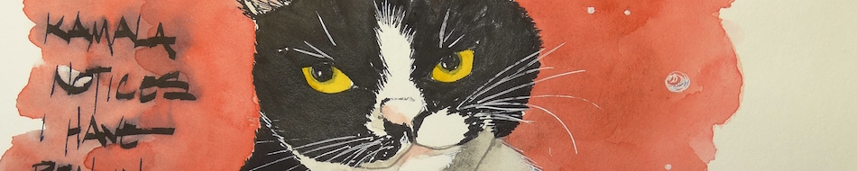
Image stolen shamelessly from Hahnemühle’s website.

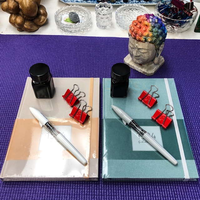
The new “1584 by Hahnemühle” notebook was sent to me for review by Hahnemühle.
I am both a fountain pen user and daily journaler, so this journal was a timely gift!
I have been happy with all my paper products from Hahnemühle,
and especially my art journals, some of the best ever, sturdy to take abuse and great paper.  I am excited that they now have a writer’s journal.

They can be bought at both Wet Paint Art and Hyatt!

The facts…

The journals currently come in one size, A5 (roughly 6×8), and in
three colors: Sea Green (my favorite), Lilac, and Peach.
I take images under several lights but wanted to show the green as I see it,
which has the slightly green-grey cast, below. 
While the company is
gearing its ads for a feminine notebook, I am suggesting

they drop that as these colors hardly suggest gender! 
Mitchell would happily use either of the colors I was sent, the Sea Green or Peach.

It has an unusual format in that it has 100 sheets, divided into the following:
40 sheets of 90gsm writing paper (mine was dot),
20 sheets of colored coordinated blank writing paper at 100gsm*,
and another 40 sheets of 90gsm writing paper (mine was dot)
for 200 pages of writing pages.
*Initially I didn’t know what I’d do with the central blank pages but it didn’t take me long to see I can have fun with them, below.  I will probably use them for our business budget notes and then I will always know where the current budget notes are located.

I unwrapped the Sea Green journal, and was happy with the feel of the beautiful fabric cover; I know from my other Hahnemühle journals it will also be durable. A strong elastic band keeps the journal closed when not in use.
Three ribbon markers are available; I can’t personally imagine using more than two: one for my current page, and one for my index, but I’ll see!  Others may use them to mark the three sections, especially if they use the sections for, say, personal and business notes.

There is also no loop for your pens; I don’t care about that.
They get in my way and I am always a bit concerned about one of my nice pens
getting scratched on the outside so my pens travel protected.
And you can buy the loops and add them if you like…

Opening the book I am thrilled to see that they don’t force me to fill in
my name and phone number.  Crazy, maybe, but I am not in grade school and
find it annoying as I have my own ways of doing things.
In almost every writing journal you’ll see me trying to cover the nameplate!

These pages are clean and elegantly understated.
The paper is white, not ivory — and I am again thrilled because
I love inks, collect them, and want to see their real color in my journal!

Moving to the back, they do not include an envelope.
Most of my journals don’t, but they are nice to have for ticket stubs and other bits.
I taped a sentimental envelope Mitchell sent me, which is easy enough,
but Hahnemühle should add one.

With that, my test pages, with a thicker stub nib,
first a TWSBI Eco 1.1 with Robert Oster Green at Night ink…
and my first marks made me happy because:
NO feathering!
NO bleed through!
You can see ghosting of the next pages text,
but that all my journals ghost because I prefer a fat stub nib!

My ink-bottle stamps using Ranger ink did bleed through, above; they bleed in every single journal I’ve ever used.  Not sure why Ranger’s inkpads bleed through.
I am careful to stamp the bottles exactly back to back to handle this problem…
Writing with a FPR Himalayan with Robert Oster Melon Tea ink and laying in a
normal flexed amount of ink also did not bleed through…  Just ghosting.

More testing and a closer look:

Look first at the top third of the
pages above left and right. The ink does not feather, and a normal pen (not like
the fat juicy ones calligraphy pens I tried
on the lower half) did not bleed through,
even when I scribbled in my half moon!

Then I decided to try wetter inks
and juicier thicker nibs, even those
I am unlikely to use in a journal.
I doubled back and filled in moons and
tried to make a mess. Other than
when I went over the same wet ink several
times, the pages held up to abuse, as you
can see on the back of the page above right.

The pen and ink combinations:

  1. Platinum Carbon Pen with Platinum Carbon ink waterproof cartridges
    (medium nib, waterproof thick pigmented ink), ghosting;
  2. Lamy Al-Star 1.5 nib with Pilot Asa-Gao ghosted, and when I went over it
    (pen wasn’t working) and scribbled the moon in, it bled some;
  3. Jinhao 750 with Goulet 1.1 stub nib with very wet Monteverde Chariote ink, ghosting;
  4. Platinum 3776 with a music nib with Monteverde Horizon Blue ink (wet AND thick nib), shockingly no bleed on normal writing (only when scribbled over) and ghosting;
  5. Finally my Kaweco Calligraphy Sport with the twin nib in Pelikan Star Ruby ink,
  6. some bleed on normal writing (and when scribbled over) and ghosting.

Happy, I set about making this journal my own to begin on the New Moon.
This new moon was also the first new moon of the decade and the new moon marking Chinese new Year, the year of the Metal Rat!

I usually put one of my own stickers on the front of my journal, above;
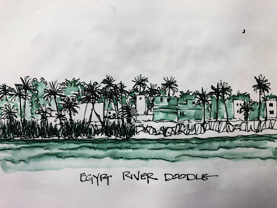
sample pages showing inks and journal entries follow,
plus the envelope at the back with my bits in it.

BTW, I have not missed dated calendar pages. Dates are logged on computer and phone. I find pre-dated calendar pages leave waste: sometimes pages get left totally blank (Sunday); some days I need several pages to pour my heart and mind out.
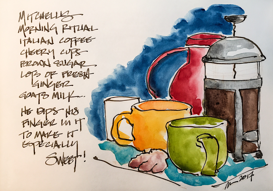
Now I put my ink stamp, the date / day, the moon phase, and the ink I am using on the top.  Sometimes a reference note goes above the line. I
can divide a page into two days or write for several pages on one day if so moved!

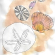
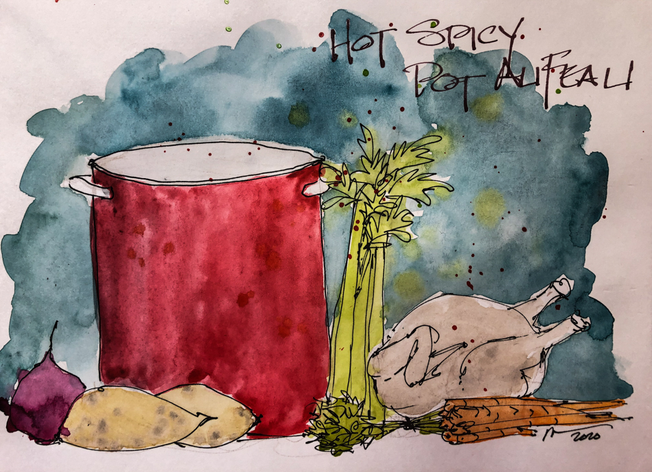
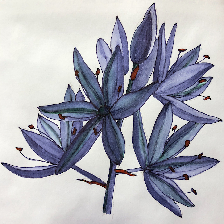
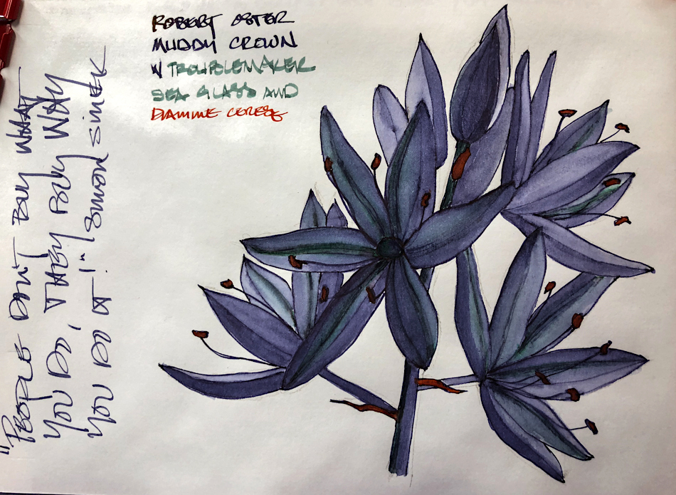
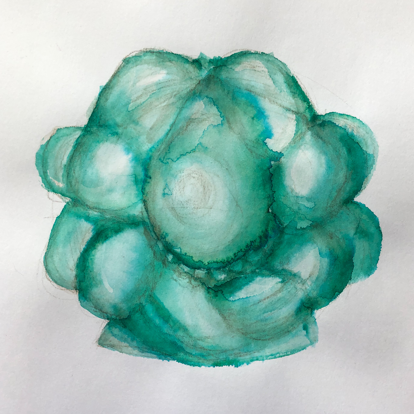
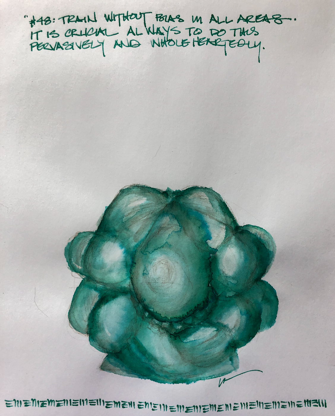
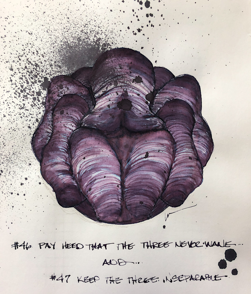
I tried out the blank green sketching pages in the middle.  (Lighting washes the paper out!)  I wanted notes on the Year of the Rat, and tried a sketch which turned into a wet juicy inkpainting as I pushed the paper’s boundaries and tried the pages for
ink and watercolor painting;
they took the wet mediums well with NO  bleed (the back, right). Amazeballs! I am loving this journal, especially knowing how well Hahnemühle’s products hold up; it’s a keeper.  I’ll follow up again in a couple months.

Giveaway coming:
Rules
announced here and
on Instagram later today!!

They can be purchased at Wet Paint Art and Hyatt!
Last day for the sale at Wet Paint Art!

To hear about classes and occcasional giveaways,
follow me on Instagram, Facebook
or check out my new, improved dkatiepowellart.com

Posted in art journal, creativity, drawing, ink painting, journal, painting, pen & ink, process, sketchbook, watercolor, writing | Tagged , , , , , , , , , , , , , , , , , , , | 4 Comments

Painting on Demand

I find commission work,
or painting on demand,
very different than painting for myself.  I spend most of my time creating for myself, exploring something that I find interesting, a medium
or color or an idea.

Commission work is usually someone else’s idea,
and the artist (me) shows up to interpret that joint vision.
It is fraught with the potential for problems… and can also be a source of great pleasure!

Interpreting the vision to
bring about the best result relies
on what words can describe,
what the client’s expectations are
(in their mind’s eye), and what
the artist (me) envisions when
I hear the request — even when
there are pictures to work from,
there is still the interpretation
of the images into artwork.

Sometimes commission work
is pure pleasure… When you resonate with the subject, when you resonate with the client, and when you are at the
top of your game!  Even when you’ve never painted a big old hairy sheep!

This is not a final image, but an underpainting… He won’t look splotchy and strange!

The lapels colors are off, too bright. Even the strokes are mediocre.

In the case of a reproduction, which I am doing for the
DAR, I am working from a very old damaged portrait,
and interpreting it into present day materials…
We discussed recreating
the portrait as it is now,
faded and degraded,
but the DAR decided to
have me interpret George
way he looked when he was new. It will hang and someday fade to what it is today!  Re-envisioning
and executing a creative reproduction means
I must be in that good centered painting place.

This is not true of infilling damaged areas, where  expertise sustains me, right.

What about when the mood doesn’t strike me? Being a practicing professional helps, experience with materials, with pushing forward in practice sessions.  Sometimes pushing forward by showing up sets the tone and I arrive
in a creative space.  Having experience with a variety of strokes, and then setting up for a “practice” session, can help me find my way.

And, it can also result in a bad day when work needs to be redone…
Always off-putting, discouraging, and sets up a feeling of failure that has to be overcome!
The two images above, underpaintings of George Washington, may not look that different to you, but I was not at the top of my game that day I created the second image.
The next day, while the paint was still wet, I went in and changed the lapels
to the proper lighter colors (the first image), and saved the areas I messed up.

Thank you Universe for oil paints!

Sometimes, I know that I am going to blow it if I touch an image…
then I wait.  Especially with watercolors, which are unsave-able if I blow it.
I have to start over if I blow it.  Then I wait.
Not ideal if money is an issue, but sometimes it is what it is…
I fool around until my best artist self shows up!
Above, friends who are waiting for my best self to show up…

To hear about classes, follow me on Facebook
or check out my new, improved dkatiepowellart.com

Posted in art journal, commission, history, oil paint, painting, portrait | Tagged , , , , , , , , , , , , , , , , | 7 Comments

Purple Lilies


Ink-painting with lovely new ink colors…
Nostalgie sketchbook takes watercolor washes well,
but sometimes ink washes get bogged down in the paper…
Especially inks I have not played with enough to see how they move.

Troublemaker Sea Glass (green) is the ink that clung to the paper oddly!

To hear about classes, follow me on Instagram, Facebook
or check out my new, improved dkatiepowellart.com

Posted in art journal, creativity, ink painting, journal, pen & ink, sketchbook, writing | Tagged , , , , , , , , , , , , , , , , , , , | 4 Comments

Sammy’s Chair

   
Sammy held the post as
Chief Studio Cat and Greeter!

When clients visited, he was never shy…
He came out to set them at ease and contribute to our contractual discussions.

Whenever a new piece came into the studio, he had to check it out!
In every instance, he decidedly liked the old upholstery better
and begged us to leave things be!
*Note: None of the cats are allowed near museum pieces
or items where our clients don’t have critters themselves…
and all studio cats have their claws clipped every week!*


He also had his own chair,
a piece we played with that
was on its way to the landfill… Sammy claimed it, and when
it was time for him to
relinquish the client’s chair (which happens when the furniture loses its stuffings
and what is left  is a pile of springs or a gaping hole) the chair we call “Montecello” was brought in for him.  Our old man, he liked to sleep alone in the studio, completely happy not to have to share-a-chair!

One of my cards (Etsy) is
a capture of him curled up on
Montecello.

The full spread!

Announcing my new card line!

To hear about classes, follow me on Facebook
or check out my new, improved dkatiepowellart.com

Posted in animals, art journal, ink painting, journal, memory, painting, pen & ink, sketchbook, watercolor, writing | Tagged , , , , , , , , , , , , , , , , , , , , , , , , , | 4 Comments

VSW: Bellingham, Larrabee State Park


View of the Larrabee State Park, near Bellingham, WA,
from a photo by “Complicated” on Flickr.
 

Doodling in keeping my commitment to a sketch a day, with
a Conklin Duragraph w/ 1.1 Stub with Super5 Australia ink.

This one started as a doodle… but I just kept adding ink… then watercolors!
The Hahnemühle Nostalgie Sketchbook isn’t quite meant for several layers of watercolor —
though it held up well.  No pilling.  The thing is, that watercolor paper helps the process, whereas non-watercolor paper, even if it can take the wet, doesn’t accept them as well.

Middle of the night, and I thank “Complicated” and all the photographers who
allow use of their images for non-commercial applications, like this one!

To hear about classes, follow me on Facebook
or check out my new, improved dkatiepowellart.com

Posted in architecture, art journal, creativity, drawing, ink painting, journal, landscape, pen & ink, sketchbook, virtual sketching, watercolor | Tagged , , , , , , , , , , , , , | 2 Comments

Lojong 48: Train Without Bias

I’ve studied through the slogans a dozen times in my life;
these are my musings on the slogan currently, what comes up on the day that
I am posting the slogan,
not a formal interpretation.
For that reason they are less about straight Buddhist teachings,
and I think able to be shared with most practitioners of other faiths or no faith
(unless yours doesn’t allow you to read any other tradition.)
If you have time and the inclination, I published the WHOLE  thang here!


#48: Train without bias in all areas.  It is crucial
to do this pervasively and wholeheartedly
.

The slogan itself was harder for me to understand,
but Pema Chodron’s commentary helped,
and I see the intention and it moved me far along the path.

See the bias in your own mind when you are in a situation.
Acknowledge the bias you have — so for instance, I don’t want to hear what a Trump supporter has to say.  I have to drop bias in order to be present for it if it naturally arises in front of me (and I have relatives who are on that side of the fence.)
Dropping bias in this sense means to stay open so you can BE PRESENT.
While I might never agree with their views, if i don’t drop bias enough to listen, there will never ever even be a chance for a discussion wiht anyone of the “opposite” side and without that option to understand, there will never be any change.

It is exactly what is going on in the USA right now — polarizing, demonizing.
It didn’t used to be this way.

If you can see the bias, then you can train in any situation,
with any sentient being in front of you.

Ani Pema also goes further to discuss how to begin, which is good:


Start with yourself… it is
harder than it seems to breathe in your own suffering, especially after years of being told to think positive and push away
the suffering.  It can be horrifying at first, but the process shifts as you move into it.  Send out to others your wins and joys and good feelings.  When I cannot think of a positive to send to someone, I send an image of sunflowers, which embody sunshine and joy and blue skies and happiness.

Then practice with those your love, taking in their pain and sending your best to them.

Then as you get adept at this, move to people who are neutral —
people who do not arose a particular hatred or negative feeling, but are also not your friends and loved ones.  This is usually not to difficult.

Finally, send and take with your most hated enemy…
Don’t say you haven’t got them, they can be the one you are yelling at in traffic,
a political crazy person, your parent.  When it arises, when they are pissing you off,
take in the anger and hatred, and send them peace and consciousness.
Take in their vile statements, and send them loving kindness.

Do this without wanting an outcome, do it as practice.

In this weekly commentary on the lojong, I am interested in hearing about
YOUR life or how the lojong affected you or your practice awakening in some manner.
For more info about why, go here.


 OE or OKINA NOTEBOOKS (my favorite journals, also known as Cadic),
Lamy Al-Star with Robert Oster Opal Green ink.

Posted in art, Buddha, journal, lojong, meditation, pen & ink, ritual, tonglen, watercolor | Tagged , , , , , , , , , , , , , , , , , , , , , , | Leave a comment

Tools: Esterbrook “Estie” Blueberry


I adore this lovely Estie… it is not the newer Lilac color but the older Blueberry.
It is a cross between lovey deep blue-purples and mother-of-pearl.
Sweet stub nib glides across the Nostalgie paper!

Esterbrook is an excellent company — there was a problem with the pen
and they sent me a new nib unit to solve the problem pronto!

To hear about classes, follow me on Instagram, Facebook
or check out my new, improved dkatiepowellart.com

Posted in art journal, drawing, ink painting, journal, pen & ink, sketchbook, writing | Tagged , , , , , , , , , , , , | 2 Comments

VSW: Egypt, 4 Giza Sphinx


View of the Sphinx, from a photo by Evalyn Baker.
 

Doodling in keeping my commitment to a sketch a day, with a
TWSBI Eco 1.1 with Robert Oster Aussie Brown ink.

If you’d like to take our virtual sketchwalks the images are posted
in this closed facebook group — come join us!

To hear about classes, follow me on Facebook
or check out my new, improved dkatiepowellart.com

Posted in architecture, art journal, creativity, drawing, ink painting, journal, landscape, pen & ink, sketchbook, virtual sketching, watercolor | Tagged , , , , , , , , , , , , , , | Leave a comment

Inky Thots: Troublemaker’s Sea Glass!


I’ve been waiting to try Troublemaker Inks for a long time…
My first bottle (there will be more) finally arrived from Cebu, a province of the Philippines after several weeks, and that after waiting to order for several months.
Now they can be purchased from Shigure Inks, however, they still sell out FAST!

Image courtesy of http://www.pennoob.com.

Why should it take so long to get inks?
Troublemaker Inks is a small studio producing amazingly beautiful and complex inks.  Nobody thinks the young owners, Gabriel Arnado and Kaiser Dale Diragos,
anticipated their inks would be so loved, and they are barely keeping up with the demand.
(You can read an interview with them from Pennoob from the Manila Pen Show.)


The two men have a strong background in science as they both attended
science high high schools.  My math tells me they may have started their business
while still IN high school!   Gabriel is studying to become a graphic designer, and the lovely packaging is very zen-like, with a twist of humor in the labeling.

I am dying to get my hands on more colors: Abalone, Kelp Tea, Hanging Rice, Mango, Petrichor, and Copper Patina, inspired by their homeland… and their inks remind me of my home too, Laguna Beach.  This ink is moody and evocative, but it also reminds me of the simpler life growing up collecting shells and beach glass… I lived on the beach!

The ink appears to behave well
in my first efforts with it.  It does not feel particularly dry and
has a nice lubrication.  Sea Glass
is in my Parallel pen, and so
it is harder to compare.
It showed no feathering on watercolor paper, and no
water resistance. Troublemaker
(if you order direct from them — when they are available and
good luck on that) will custom your order to your desired
ink flow, though I was I was unable to take advantage of this quality on my first order.

Frankly I was so dang happy to get a bottle I was about to say send whatever you have!
Sea Glass is complex and separates into amazing colors, shown above.
Most of the watercolors that provide a good match are Daniel Smith’s Primateks!

Ultimately this ink is going to go into a lovely pen I have on order
from Tom Gauntt of Chesapeake Pen Company.  For now,
I had to be able to use it, so I have it in my pilot Parallel pen!

To hear about classes, follow me on Facebook
or check out my new, improved dkatiepowellart.com

Posted in art journal, ink painting, journal, painting, pen & ink, review, sketchbook, writing | Tagged , , , , , , | 6 Comments

VSW: Egypt, 3 River


View of the river banks near the Valley of the Kings,
from a photo by Evalyn Baker.
 

If you’d like to take our virtual sketchwalks the images
are posted in this closed facebook group — come join us!

To hear about classes, follow me on Facebook
or check out my new, improved dkatiepowellart.com

Posted in architecture, art journal, creativity, drawing, ink painting, journal, landscape, pen & ink, sketchbook, virtual sketching, watercolor | Tagged , , , , , , , , , , , , , , | Leave a comment

Lojong 47: Encouragement

I’ve studied through the slogans a dozen times in my life;
these are my musings on the slogan currently, what comes up on the day that
I am posting the slogan,
not a formal interpretation.
For that reason they are less about straight Buddhist teachings,
and I think able to be shared with most practitioners of other faiths or no faith
(unless yours doesn’t allow you to read any other tradition.)
If you have time and the inclination, I published the WHOLE  thang here!


#46: Pay heed that the three never wane.
&
#47: Keep the three inseparable.

To me this is more encouragement (I like that better than admonishment)
that it is important, especially when you are starting out, to be devoted to
the practice in its many forms, starting with the three keys to #46:

  1. Be devoted and grateful to your spiritual friends.
  2. Have a heartfelt appreciation of the practice.
  3. Pay heed to the vows you take…

The latter has always felt important to me in that it is akin to me keeping
the promises I make to myself and my loved ones.
Those are the vows.

#47 is to train wholeheartedly with body mind and spirit.

I combined these because while slightly different,
they go hand in hand with last week’s slogan.

In this weekly commentary on the lojong, I am interested in hearing about
YOUR life or how the lojong affected you or your practice awakening in some manner.
For more info about why, go here.

 OE or OKINA NOTEBOOKS (my favorite journals, also known as Cadic)

Okina Journal, Esterbrook Estie Blueberry stub 1.1
with Robert Oster Sydney Lavender ink.

Posted in art, Buddha, journal, lojong, meditation, pen & ink, ritual, tonglen, watercolor | Tagged , , , , , , , , , | Leave a comment

SoCS: Choices

I  journal mornings with stream of consciousness exercises,
and participate in Linda Hill’s Stream of Consciousness Saturday  whenever I have time.  I write to a timer, 15-20 minutes, no editing except spelling, and of course I add my art!  You can join us!

The Friday prompt for Stream of Consciousness Saturday is “choices.”
Base your post on the subject of making small, uneventful choices. Enjoy!

“Small uneventful. choices?”

I got nothing… so my small choice for this morning is to follow my stream of consciousness for ten minutes and see where it takes me.

As I am in the middle of doing my taxes I am seeing where small choices last year took me — and wow, how much ink I bought last year.  I think I need a New Year’s Resolution not to buy so much ink… or a budget.  Color is hard to resist.  For an artist, you may not even know how you are going to use it but it doesn’t matter, you have to be immersed in the stuff.  I love color.  Deep bright bold pure clear colors, and all those murky shades of grey.  If I had it to do over again — this life — I might go into the ink-making business.
Become a color expert.  A scientist that is immersed in color.  When we are young it is the wrong time to make these choices, we don’t know enough.  If you don’t know about a job how can you make a choice that will effect your entire life?  I didn’t choose poorly,
I just didn’t love what I chose.  Not in the long run.

Being an architect was not very creative because the clients rarely allow you freedom to make creative choices within the parameters of their needs.  They want to micro manage and more than once I wanted to give them what they asked for to teach them a lesson.  Round Chinese red door and white picket fence and cedar shingles to live in… they can’t imagine what it will look like so they want all these Better-Homes-and-Gardens things but they don’t realize that they designers who ended up exciting their imaginations were allowed to make choices without being encumbered by no vision or bad taste.

Or you have a beautiful design and the owner decides to call his wife in and inevitably they muck it up, making changes, changes they cannot imagine in the space and they look horrid and cause all kinds of damage to the design function.

I would have enjoyed architecture without people in it!

Cats.  Life with cats no people!

I make the best choices when I lead with my heart.  Look at falling in love with Mitchell… Best choice, all heart choice.  Or letting too many cats in our lives…
Timer went off.  I guess I wrote a bit about choices anywho.

For the rules, go to Linda’s blog;  feel free to join the fun!

Posted in art journal, creativity, journal, pen & ink, sketchbook, writing | Tagged , , , , , , , | Leave a comment

Inky Thots: Birmingham Green Weenie


I was lucky enough to get a couple more Slag Greys before
Nick and Josh announced their new line — and
picked up some Bob Prince Green Weenie.  If you are inclined,
they have a few more bottles of older inks left!!

To hear about classes, follow me on Facebook
or check out my new, improved dkatiepowellart.com

Posted in art journal, journal, memory, pen & ink, sketchbook, urban sketchers | Tagged , , , , , , , | 2 Comments