F is for Favorite Artists: A-to-Z Challenge

A friend (and favorite artist) published a blog post the other day relating how her style evolved.  It has a lot to do with artists who influenced her.  I know several of my favorite artists influenced my tendency to one aspect of my style, which is to repeat a subject or even a particular image or shape repeatedly.

I wrote a bit about this on one blog post, Repeat, as an answer to people asking me “Why?  Is it because you are trying to get it right?”  No!  I love some of my horses, and I fell in love with them and then went right back in and did another one.

800px-WLA_moma_Claude_Monet_Reflections_of_Clouds_on_the_Water-Lily_PondThe first artist I fell in love with was Claude Monet.  It was August, and I was 20, alone in NYC on a hot humid summer Saturday in August.   I walked into a deserted Metropolitan Museum as a young woman who had been bored by art museums in Los Angeles, deciding to see the Monet exhibit.  I studied art as an architect, but of course, had seen poor slides and teeny images.  There in one elegant room was a huge painting, an entire wall, of one painting of Monet’s waterlilies.  A convenient bench caught me as I sank in front of it and stared, transfixed, for a long time.  I was in love.

Above, Claude Monet, who repeatedly painted images, from the Haystack series
(two shown above), to the Rouen Cathedral series to his Water Lilies.
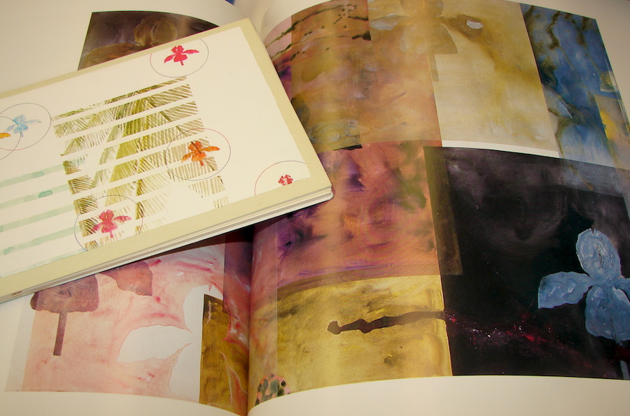
Below, two of my books opened to images of his Draculas.

billy al booksThe next artist I fell in love with was Billy Al Bengston.  I sat across from one of his Draculas at Gensler, and loved the large iris.  When the Puerto Escondido series came out, I was hooked, and wished I could afford it.  Being local, I had the pleasure of meeting and breaking bread with him on several occasions, and he was the one who talked me out of going back to art school.  He said, “Take the $15,000  and a year off and paint!  Develope your skills and style.  School will make you a good high school teacher. . .” (Note: $15,000 was the cost of a masters degree waaaay back then.)  Bengston was a good model for me because he was both crisp and graphic, and had a textural quality.  Something I also noticed in my own work.

Marc_Chagall,_1911,_I_and_the_Village,_oil_on_canvas,_192.1_x_151.4_cm,_Museum_of_Modern_Art,_New_YorkBoth of my first favorite artists did repetitive imagery.

There were others: David Hockney (seeing his California Pools in London’s Tate made me realize how special my life was as a Southern California girl.)  He was all loose and rambling in his series on streets in Los Angeles, and I liked the way he was childlike.  I wanted to be that loose (something I still strive for), and to also paint the places I love.

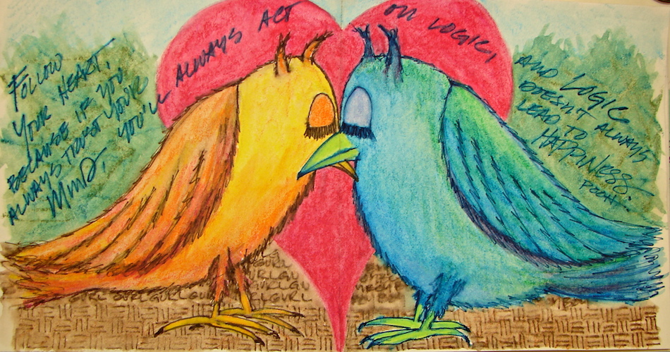
Marc Chagall, who told the most wonderful tales through an almost musical simplicity, stories of villages and roosters and donkeys and marriages and life.   I aspire to that in some of mine, especially lately.

web zen
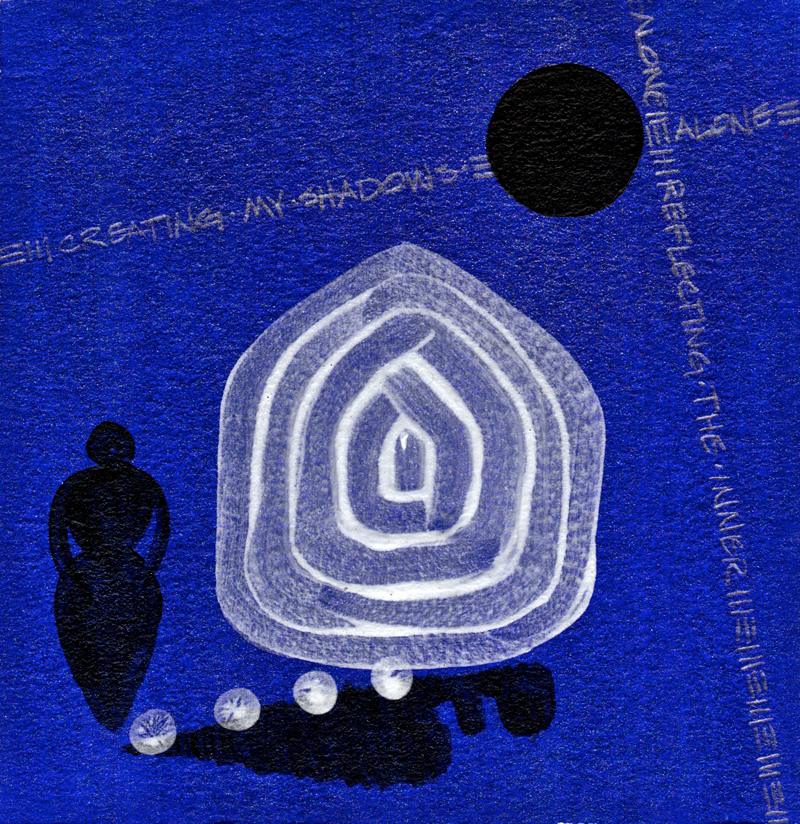
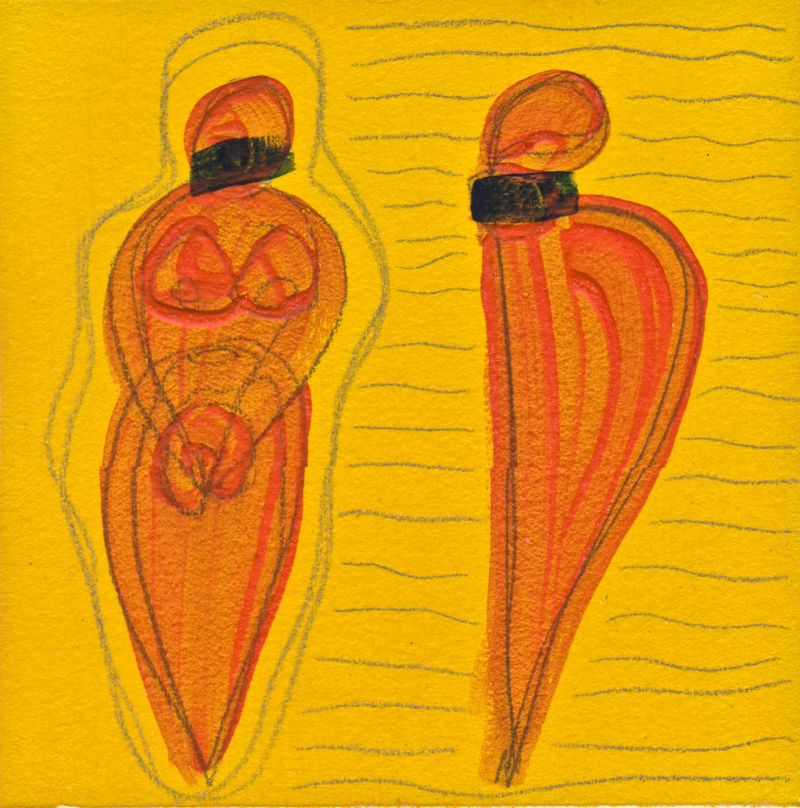
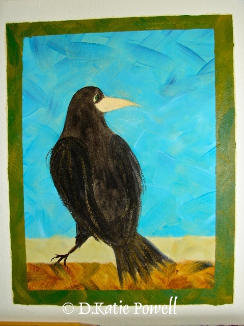
Coming full circle, why do I like painting the same images repeatedly?  And why did some of my favorite artists?  I speculate on them, but it may for the same reasons.  I have thought about it more after my first quick posting a year ago.  I love color, textures, and the way color floats on paper or is heavy on canvas.  I love the texture of handmade paper, which is why I have a good collection.  I like what graphite does, the way it makes a hard line or smears into unruly stains.   Sometimes I think I should just paint color and textures, but I’ve never felt comfortable painting just lines or color.  I have tried, and here is one of my few surviving images, meaning I liked it enough to not paint over it!  (it is not as sparkly as the image suggests.)

And I never was attracted to completely abstract paintings, with one exception, and he takes my breath away:  Mark Rothko.  I saw him in NYC in my 30’s.  I was intrigued by his work, but oh wow, had no idea how it would transform me to sit before one of his painting.  I fell into color.  With Monet I was on the outside looking in; with Rothko I was in the inside.

Rothko_No_14        

I am now agreeing to the  Creative Commons Attribution-Non-Commercial 4.0 International License, which you can learn more about by visiting the site, or, visit my web page for a more user-friendly summary on my terms.  My images/blog posts can be reposted; please link back to dkatiepowellart.
Monet images are Creative Commons or Public Domain, courtesy Wikipedia:
Grainstacks_in_the_Sunlight,_Morning_Effect,_1890,_oil_on_canvas;
Haystack,End_of_the_Summer,_Morning._1891._Oil_on_canvas._Louvre,_Paris,_France;
MOMA_Claude_Monet_Reflections_of_Clouds_on_the_Water-Lily_Pond;
Marc Chagall, I and the Village, 1911, oil on canvas MOMA;
Mark Rothko No. 14.

Posted in art, creativity, painting, process, series | Tagged , , , , , | 6 Comments

Sunday is Shameless Plug Day

PALM MOON SUN EARTH by dkatiepowellartI am working on becoming a full-time artist,
not a starving artist and not an artist that has another job, even if I am my own boss.
All I wanna do is paint *sigh* don’t we all?

I expect you all to get something for your money.
I’ll soon be teaching some classes,
and of course, my originals are for sale!
But, if you like my work, but maybe can’t afford original art, try sending a card (folks may not know what they are, so you may have to send instructions, being that they are not electronic) or art card (that is a cool postcard, like the one below, of which I hope to eventually find mine in an art museum shop someday.)  They are for sale on Redbubble!

CHINESE RUST HORSE RUNNING by dkatiepowellart

RED HONU SEA TURTLE YELLOW SQUARE by dkatiepowellart

End of Shameless Sunday Plug Day.  Oops, not quite, because I have a new page
(in the menu bar up top) where I links to images of products.

Monday, F is for Favorite . . .

Posted in cards, prints | Tagged , , , , , | 5 Comments

E is for Environmentally Friendly: A-to-Z Challenge

I’m talking toxicity versus environmentally friendly and how to read labels.  Above are three labels: Golden’s “AP Nontoxic”, Gamblin’s information label stated clearly, and an older tube of Cotman Cadmiun Red that shows a Health Label requiring no labeling (again, this is old, but you still find these today, especially if you have an old stash; today this would probably have an AP Nontoxic label.)  Windsor Newton has an excellent page on health labels and how to read them.

Why should you care?  Children and pets can die from toxic products, and toxic products going into water systems and dumps messes with our Eco-system.   If you use your fingers, lick you brush tip (argh), or have a water well, then toxic products will impact you quickly.

In the right image, are three watercolor tubes:

  1. The top, Daniel Smith Genuine Hematite is a labeled AP Non-toxic, and conforms to “ASTM D 4236.” this is a designation that they have full disclosure on what parts may be toxic, and are generally non-toxic, with possible exceptions (see below.)
  2. DSC09854
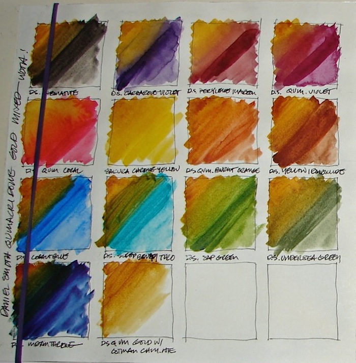
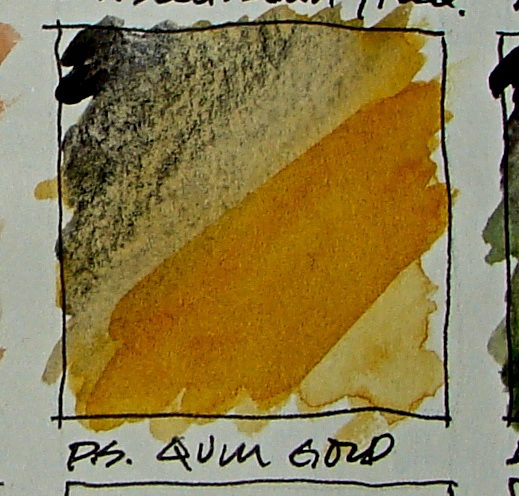
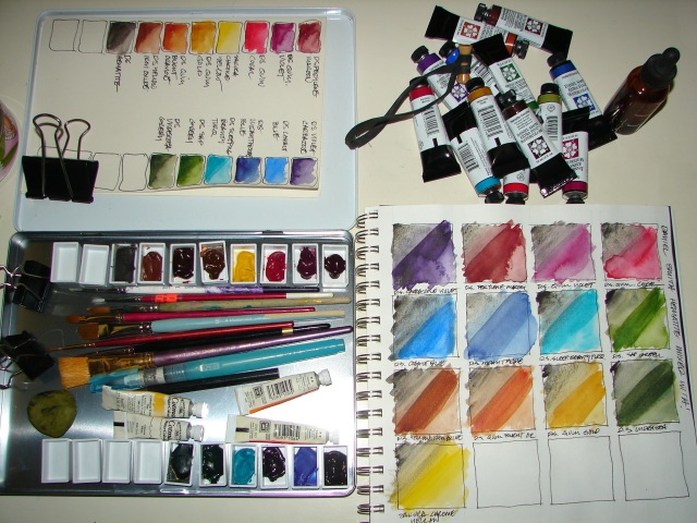
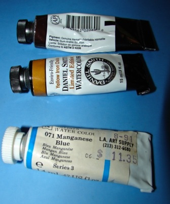
Environmentally friendly (as labeled on the Daniel Smith watercolor, center left in the image, right) is not a legal distinction, but a promise that this is a step in the right direction. To an unscrupulous company, it can be a marketing ploy to get you to think this is a “green” product. When a product says it is environmentally friendly, like the Daniel Smith Yellow Iron Oxide, I tend to become curious.  I check out the specs, often set as a link to the MSDS (MATERIAL SAFETY DATA SHEET) to see whether the company is actually living up to its promise.  You should get to know what an MSDS is, and overcome any discomfort with not understanding what it is saying.  You will understand the important aspects, like the hazards (most people ignore them to their peril), disposal information, handling and interactive chemical data, and toxic ingredients, if any.  Starting on page 5 of their MSDS, Daniel Smith lists all their products, and notes the ones that contain nickel, copper, and cobalt.  If you have small children or live on a well, you might want to avoid these colors, or dispose of their water differently.  In Daniel Smith’s case, their commitment to full disclosure is apparent.  This is not so with many other products.
  3. The last image is of a VERY old Windsor Newton Manganese Blue.  It is quite toxic, and you do not want it in your well.  I bought two tubes 25 years ago, before I knew about manganese.  I happened to be reading about Golden’s approach to paint-making, and read that manganese was toxic.  I only now am using the paint, and use a separate water container for rinsing, a small herbal jar that caps, and allow it to dry.  When I am through with the color I will dispose of the tube and the dry rinse jar through the dump with full disclosure.  BTW, I wrote to W/N asking about the level of toxicity of Manganese Blue, and the rep was quite casual in his reply that he didn’t think it was very toxic.  Hmmm; buyer beware.

DSC09850I tend to cut through the worry about toxicity and green products by supporting companies that are committed to the environment and and artist’s health.  At present I am committed to Golden acrylic paints, Gamblin oil paints, and Daniel Smith watercolors.

Environmental also is about the waste involved.  I am looking for an alternative to Pitt pens, which I LOVE, because of the plastic waste.  If I can find a good refillable alternative I will let go of them, especially in the colors of black and sepia, which I use constantly, drawing.

I wrote to Faber-Castell regarding the toxicity of their Pitt pens, because I tend to move the color with my fingertips.  Their MSDS is in German or Austrian!  they responded, non-toxic!  Yah!

Be Safe!

pen2        

I am now agreeing to the  Creative Commons Attribution-Non-Commercial 4.0 International License, which you can learn more about by visiting the site, or, visit my web page for a more user-friendly summary on my terms.  My images/blog posts can be reposted; please link back to dkatiepowellart.

Posted in acrylic, oil paint, pastel, pencil, shellac, watercolor | Tagged , , , , , , , | 5 Comments

D is for Drawing Pens: A-to-Z Challenge

My favorite drawing pens are Faber Castell Pitt Artist Pens, shown right as the top three pens with their caps off.  I love them because they are wonderfully waterproofed India ink, and work best of all the pens on shellacked paper, which I am loving in my journal. pens1 
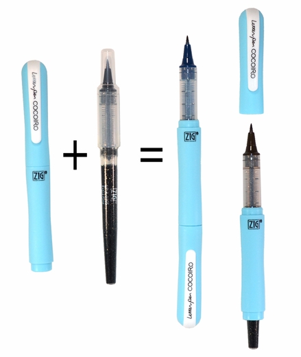
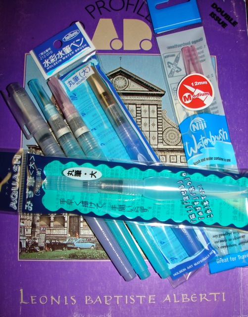
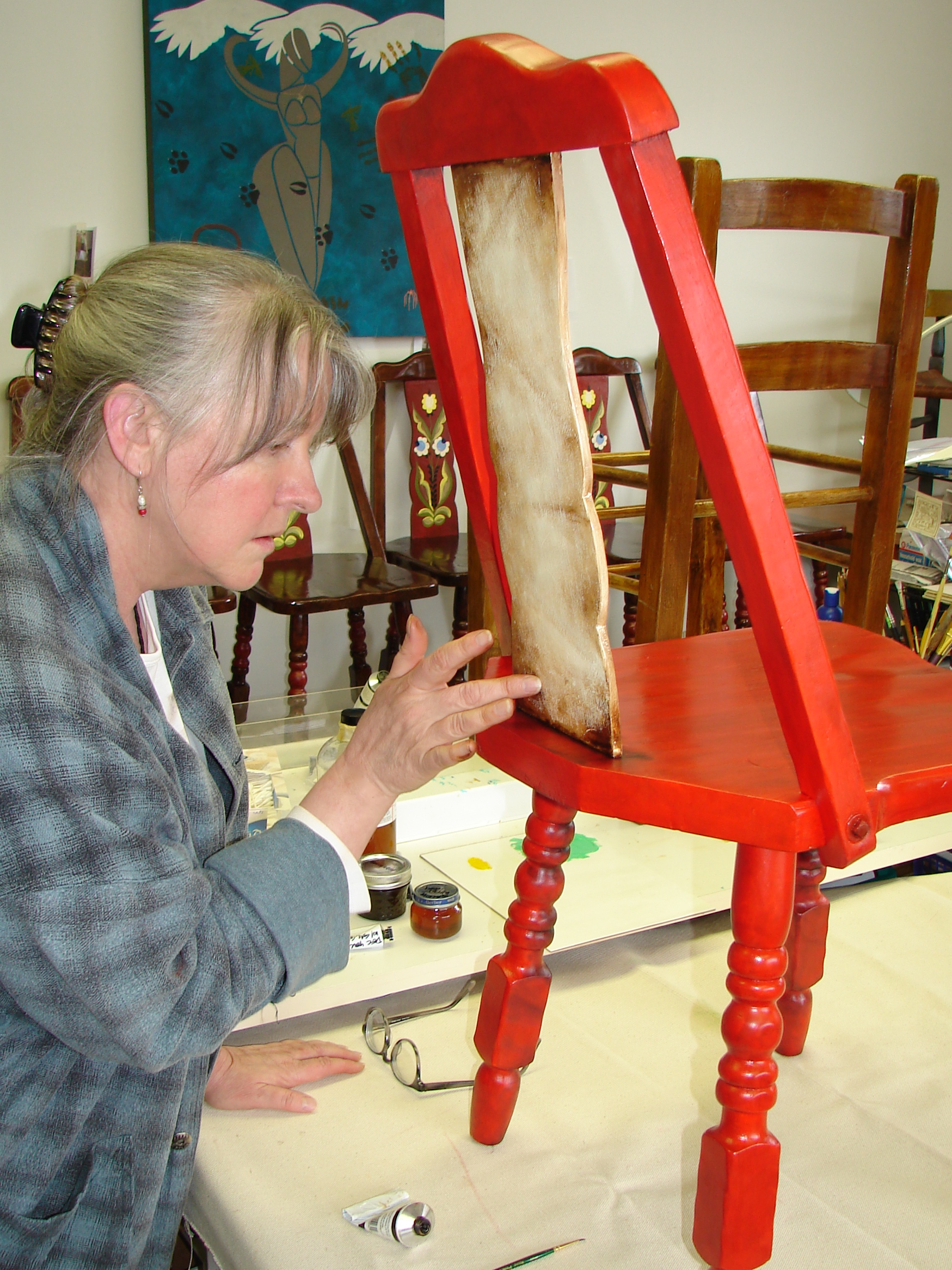
Their range is excellent, shown above, and can be subtle, bright, or layered, even on shellac!  I normally work in Dark Sepia, Sanguine or black to sketch, in sizes XS, S, F, and brush.  I have two complaints: They only make the white pen in the ultra fat size, and the colors of their tops and cases are deceiving and inaccurate.  I have a coral color that looks like a dark red cap, and the red looks pale.  Oops!  It can lead to mistakes so I must be very careful.

For watercolor pens, I love the Tombow Dual Brush Pen (the orange double tipped pen bottom right with both caps off); I used them in my early years as an architect, and they are wonderful, well-priced, last long, and the tips hold up to a lot of work.  Their colors are great and the caps are much closer to the real color!  I like them best in a sketch journal, fooling around, shown below.  they do not work on shellac.

yhst-131221940731303_2272_192366941Currently I am starting to play with the Cocoiro Lettering Pen.  One general problem I have with the Pitt and Tombow is the waste — lots of plastic going into landfills.  With the Cocoiro you keep the outer pen, and just replace the insides in whatever color and brush type you want; I like less waste in the landfill.  I bought four pens, brush black, black hard-tip, sepia hard-tip, and blue-black hard-tip.  The prices are good!

One problem with the design is that the caps do not stay on tight.  SO, I think they always need to be in a small plastic bag when traveling, or caps will fly off and my purse will be ink-stained.  Also, I wish they were India ink or waterproof ink, but watercolor artists like them because they will wash and the color will move.  I tried using my waterbrush on them and the ink immediately moved.  A new toy for me to get used to as I move into watercolors!

DSC09848Soul food Cocoiro pens on a card made for my husband, where I used Neocolor II crayons and a waterbrush to move the color where I wanted it.  He could not tell these guys were owls, but lots of owls have ears.  He liked it anyway!


I am now agreeing to the  Creative Commons Attribution-Non-Commercial 4.0 International License, which you can learn more about by visiting the site, or, visit my web page for a more user-friendly summary on my terms.  My images/blog posts can be reposted; please link back to dkatiepowellart.

Posted in art, creativity, drawing, journal, painting, process, shellac, sketchbook, watercolor | Tagged , , , , | 19 Comments

C is for Color: A to Z Challenge

DSC09850 copy 2Omigoddess I love color.  I became a painter for many reasons but chief among them is the use of all that delicious glistening wet color.  My current favorites, and I do have favorites in pure colors, are ALL the quinacridones, Prussian blue,  Sap green, green gold, Indian yellow.

Before I could paint, I bought color, pure color in the tube, and took it out and made squares of color on the table in my little apartment.  I had a complete set of Prismacolor pencils open in my office.

DSC09847I was an architect in another life, and all my walls were pure white.  My use of color was restricted to red-with-white, or turquoise-with white, or whatever-with-white.  (Though I had my secret stash of paint chips, fabrics, and tiny tubes of paint.)  I thought that this modernist tradition of white was because images placed on them would be seen pure and uninfluenced against the non-color.  Then one day I painted a bedroom wall an amazing quinacridone gold, with touches of golden orange yellow, washed over with a hematite glaze.  I meant to do one wall and did the entire small guest bedroom.  Sunny, happy, earthy color, and my paintings looked wonderful against the gold.

I was sold on color on walls, and realize that often architects don’t know color and were a bit afraid of it, Michael Graves and Frank Gehry excepted.

DSC09846_2I play with color, layering and mixing, as you can see in the study above on hematite (black-grey paint made from crushed hematite) mixed with my Daniel Smith watercolor palette.  As I move into watercolors and oils and away from acrylics as a mainstay (at least for now) I tend to mix more, experiment more.   With acrylics I simply painted over my experiments; with watercolors especially it is important for me to have an idea of the mixology of the pigments, as watercolors are so fluid and unpredictable!  The zen of pigments!

Gotta go — I get a painting day today!  OOOOOOH, look at all those paint tubes!

W HORSE STRADDLING RED BALL DKP        

I am now agreeing to the  Creative Commons Attribution-Non-Commercial 4.0 International License, which you can learn more about by visiting the site, or, visit my web page for a more user-friendly summary on my terms.  My images/blog posts can be reposted; please link back to dkatiepowellart.

Posted in art, color, painting | Tagged , , | 7 Comments

B is for Brush Pens! A-to-A Challenge

brush pensI am just learning to use brush pens, as I move to smaller formats and water colors to work my artistic ways.   Brush pens are these super devices where the water is carried in  tube which attaches to the watercolor brush.  You squeeze the tube to adjust the water content you want in the brushes, which allows you to do a light colored wash (squeeze a lot of water out) or a dark line or deep colored wash (squeeze just a bit of water out.)

You can use them with Neocolor II or water-color pencils, by drawing first then squeezing the water gently from your waterbrush to achieve the effect your want.  Or, you can use them with dampened watercolors.

They are wonderful for travel or journaling, or in my case, setting on my business desk where I don’t want our studio cats drinking out of the watercolor glass or spilling a glass of water over documents.  I can take a break during my work day and play, then back to work, with little effort now!

I’ve been experimenting with various brushes to see what I like best.  The Holbein is brand new to me, and it carries the most water of the brushes.  I like the tip, but it does squeeze water rather freely so it takes getting used to or you dump a blob of water where you may not want it (The joys of water color on the go.)

So far my favorite go-to brush is the Niji waterbrush with the medium tip.  I just bought a second one.  I use it constantly, and did the entire piece below with it.  It holds a good amount of water, and it feels good in my hand, and the best part, the squeeze is just right for me — no getting used to the flow.  I have the Niji in two other sizes, and will probably use the small, but I am so disappointed in the flat.  I love working with flats, and this one just doesn’t have a good brush to it.  It sort of flattens out with no strength or shape..  I may take it into Blick’s and see if I have a bad brush.

The Aquash by Pentel is smaller, and the water holder is not as large.  I haven’t enjoyed it as much because I have to refill it frequently — but it might be small enough to fit into my little purse for travel!

Below, one of my Buddhas done using Neocolor II and the medium Niji brush!

W14 2 SKETCH WEEP BUDDHA 5        

I am now agreeing to the  Creative Commons Attribution-Non-Commercial 4.0 International License, which you can learn more about by visiting the site, or, visit my web page for a more user-friendly summary on my terms.  My images/blog posts can be reposted; please link back to dkatiepowellart.

Posted in art, creativity, journal, painting, process, sketchbook, watercolor | Tagged , , | 5 Comments

A is fo Asphaltum, A-to-Z Challenge

W11 ANTIQUE MASON SPAN RED CHAIR MPFCI discovered asphaltum when I was conserving/restoring two dozen pieces of Mason Monterey furniture for the National Park Service.   Being a painter who up until that time primarily used acrylics, I had never heard of it before.

Asphaltum (also called bitumen) was once made of a broad range of naturally occurring substances, namely pitch or petroleum or bitumen of Jerusalem, and occasionally referred to a dark resin from the sap of trees, called burgundy pitch.

Artists were trying to find a good source of transparent black or deep brown oil paint, and generally used a mineral substance based on petroleum for the pigment.  The color produced was unreliable because the sources were so varied in mineral content.  Two common methods for creating the oil paint were to melt the asphaltum in spirits (turpentine), then add it to beeswax and boiled linseed oil.  This produced a paint that lacked body, and so many old recipes added more resins or mastic.  A second method was to burn the asphaltum until the highly volatile material was reduced to ash, further crush it into a fine powder, and then add it to the linseed oil.  This resulted in more durable and reliable paint.

These paints were typically used sparingly, for subtle shadow especially in nudes.

Mason used asphaltum as part of his glaze in the Monterey line.  Did I mention that asphaltum was and is also highly toxic, with lead and other poisonous minerals?  Even if I could find it today I was not able to use it in the historic hotel furniture!

I was very happy to find that Gamblin produced a wonderful non-toxic “Asphaltum” of Transparent Mars Red and Bone Black to use in the restoration of the hotel furniture.  For more information old masters and their colors, I recommend Robert Gamblin’s article on Earth Pigments, “Evolving Earth.”

As I move into painting with oils, I find asphaltum a wonderful pigment to use as a glaze, in place of the hematite or quinacridones I used when painting with acrylics.

W11 OLD WOOD FINISH MPFC


I am now agreeing to the  Creative Commons Attribution-Non-Commercial 4.0 International License, which you can learn more about by visiting the site, or, visit my web page for a more user-friendly summary on my terms.  My images/blog posts can be reposted; please link back to dkatiepowellart.
Images courtesy of MPF Conservation (Mitchell and Kate Powell, Partners!)

Posted in art, oil paint, painting | Tagged , , , , , | 10 Comments

Working With Watercolors in My Journal: Paint Party Friday

W14 3 19 SKETCH AT SG 1I know that the best way to get over fear-of-watercolor-mistakes is to make a lot of them.  So I finally dove into my journals, coloring sketches and moving graphite with water.  the sketch above was partly made on-site; then colored later, using mostly Daniel Smith water colors.

The sketch below was painted from images from two years ago which I documented; it was a good day but it brought the devil into our lives!  I now commemorate it because that time is OVER!  Yay!  Kenahora!  I liked all the textures I saw through my lens that day.

I used my new Cocoiro pens on the right side of the sketch, with Daniel Smith watercolors and Pitt pens, and tried not using pencil lines (eek) for the cover plate for “DUMP NO WASTE.”  I like the effort; I am unhappy with the line work because given a pencil I can do better!

W14 3 27 PARTEE DAY2 copy        

I am now agreeing to the  Creative Commons Attribution-Non-Commercial 4.0 International License, which you can learn more about by visiting the site, or, visit my web page for a more user-friendly summary on my terms.  My images/blog posts can be reposted; please link back to dkatiepowellart.

Posted in art, creativity, drawing, graphite, journal, painting, sketchbook, watercolor | Tagged , , , | 9 Comments

My A-to-Z Reveal: AR

This is a no-brainer.  In the A-to-Z Challenge I will be writing about ART techniques and process and interesting facts about art products.  I promise not to be an advertisement, but give info on why I like this or that, and how I use it!

That’s all folks!

Below, I am restoring Mason Monterey furniture that lost its paint in a flood to its original glory for the Oregon Caves National Park, oils and fingertips on furniture.  See how informative I can be?

2011 6 7 441 SPRED FINISH ASPH  69

Posted in writing | 6 Comments

Process: Struggling with Watercolors

I was able to carve out a day to play with my new watercolors from Daniel Smith.  Having good watercolors makes a huge difference in my finished product, the viability and brilliance of the colors and the way they lay on the paper.

W14 3 23 MISSION SAN GABRIEL 1 copyI chose Mission San Gabriel Arcángel for my practice material.  I have some images I took long ago, and I worked off a few vintage sepia toned images, one of them by Carlton Watkins, 1829-1916 (right.)  These were my third and fourth attempt at actual watercolors (not Neocolors and a water brush, which is MUCH easier.)

What I learned after my intense and sometimes frustrating day:

  1. I have NO control over watercolors.  They have a mind of their own, and will do as they please.
  2. I can’t really use the same brushes for acrylics and water colors *sigh* and must buy some watercolor brushes.  With acrylics I usually use flat brushes, but with watercolors I understand what fat wet rounds are for!  And I need a good mopping-type brush.
  3. It is SO easy to overwork.  Water-colorists make it look so easy to lay the paint into those charming quirky interpretive (that’s what I am going for, not realism.)  I definitely overworked the image above.
  4. Did I say I felt like I had no control?
  5. Balance is harder with colors because they dry a bit lighter.  Acrylics are exactly what they look like in the pot, except may be matte instead of shiny.
  6. I have to become a mixologist (I think this is a term for bartenders but it is good here.)  With acrylics, and I painted big canvases, and mixed colors as I needed them in jam or baby food jars.
  7. Finishing is important.  I wanted to walk away from the piece below but am glad I persevered, as I learned a LOT, which is the point right now — learning.  Maybe always.
  8. I need to develop patience or learn to work well in lots of wet water that runs everywhere.
  9. And then there is the warped paper.
  10. Again, out-of-control, so so very out-of-control

So why do it?  I love acrylics, but don’t like tubes, like 4-oz pots of paint, and cannot carry them everywhere.  I have a fantasy whereby I can have a small workstation on the return at my desk (installed now), and work small seven days a week for a couple of hours in the morning.  Or even three.  I can journal/paint, two of my favorite things!  I can take them on the road with me when we travel.  I vaguely remember a learning curve with acrylics, and so, I will persevere.

I like the two details in the one below, but I’m not happy with the overall.  The composition is fine, but the palm became so dark, overpowering the lighter mission.  I tried laying in darker color on the mission, but it just doesn’t take before it would be way too dark.  So, the palm needed to be lighter.  This is where understand how the watercolors dry would be invaluable.

W14 3 23 MISSION SAN GABRIEL 2 copy


I am now agreeing to the  Creative Commons Attribution-Non-Commercial 4.0 International License, which you can learn more about by visiting the site, or, visit my web page for a more user-friendly summary on my terms.  My images/blog posts can be reposted; please link back to dkatiepowellart.

Posted in art, color, sketchbook, watercolor | Tagged , , | 6 Comments

Garuda Sketch: Paint Party Friday

W14 2 Sketch Garuda 2Paint Party Friday’s post this week is about Mitchell’s Garuda statue.

Mitchell went to a friend’s home and they were drumming.  The drumming was meant to further visions, for which Mitchell had no experience.  He achieved a trance-like state, closed his eyes, and saw a huge fierce bird-man who raised his wings fully in front of him.

I was importing statues for a gallery, and found a college professor from Chicago who was working with some talented artisans in Nepal.   Working with him insured the artisans received the bulk of the money.  The next time he visited Nepal, he spoke with the artist on our behalf.  The artist said he needed to send a statue to my husband.  the professor was very clear, saying we were not ready to place an order.  The man said, “No, this was a gift.”

When it arrived Mitchell said it was the bird-man he saw.  We have since researched Garuda, a deity in both the Vedic and Buddhist traditions.  Here Garuda is standing in front of my old blue glass milk vase with lovely mums.  Normally he sits on our rather eclectic altar.

W14 2 Sketch Garuda 3


I am now agreeing to the  Creative Commons Attribution-Non-Commercial 4.0 International License, which you can learn more about by visiting the site, or, visit my web page for a more user-friendly summary on my terms.  My images/blog posts can be reposted; please link back to dkatiepowellart.

Posted in art, drawing, painting, sketchbook, watercolor | Tagged , , , , , , , | 7 Comments

A Very Cool Journal Company Here In Portland

I am promoting a very cool, very GREEN business here in Portland Oregon, Ex Libris Anonymous.  They take old books that are beyond reselling status that have good hardcovers, and turn them into wonderful writing or sketching journals!

From their website:

“not unlike a snowflake, a soft puppy, or a slice of warm pie, every journal we make here at ex libris anonymous is one-of-a-kind, unique, and completely unrepeatable experience. we start by exhaustively searching for the most interesting recycled books we can find, and after carefully curating our favorites, we salvage the covers (and selected pages) of the lucky book.

our next step is to fill the journal with around 75 pages of blank, 24/60#, acid-free paper (which makes for great journaling or sketching paper). we then interleave actual pages from the book right alongside the blank journal paper.  you’ll be amazed at all the lovely stuff in these old books — beautiful cover pages, delightful illustrations, half-filled library cards, cool old maps, personal inscriptions for mysterious previous owners — with every page you turn, it’s like getting the prize at the bottom of the cereal box. (so really, it’s like getting a whole bunch of prizes from a whole bunch of cereal boxes).”

I know I want one very soon — Maybe this Sneeches cover from Dr. Seuss!

Posted in journal, sketchbook | Tagged , , , , | 2 Comments

Paint Party Friday #1, As I am New to This Party

Been sick with the flu(?) cold(?) god/dess knows — but it has been a LONG time!  paint party friday 4120To entertain myself I have painted on shellacked paper with India ink.   Always in love with the sunny images of Mexico, and seen them all round my house growing up, I decided to do some suns and add moons to the mix.  Some of these will go into cards on RedBubble in the next week as I am feeling better!

It’s turning into a MexiCali series!

And, I am joining the Paint Party Friday group!  Looks like fun — this is my first time!

W14 MEXICALI MOON 3 300DPI W14 MEXICALI SUN 6 300DPI


I am now agreeing to the  Creative Commons Attribution-Non-Commercial 4.0 International License, which you can learn more about by visiting the site, or, visit my web page for a more user-friendly summary on my terms.  My images/blog posts can be reposted; please link back to dkatiepowellart.

Posted in art, painting, shellac | Tagged , , , , , | 12 Comments

Four Siblings: Part of “My Family” Series

Many moons ago I was part of a year-long study group with Brugh Joy, an amazing spiritual teacher.  We were given an exercise to get to know our ancestors and family, and write about it.  I painted it.  I painted portraits of family members long gone, and  people I had never met — my paternal grandparents and dad.  On the people I had never met I was to meditate to find what I knew about them, petition my dreams, and in my case, sketch.  I learned a lot about those that were dead.  When my mom saw the paintings of the people I had not met or didn’t know hardly at all, after I explained some of the symbols I used, she said I had caught them.  Possibly I heard stories unconsciously; who knows?

At the time I was only painting about a year, but I already loved painting BIG.  These were created on canvases that were 30×36-inches.

As it relates to this post, I created portraits of my siblings.

I like painting a series; your paintings tell a story.  Mine tells the story of my crazy California family, colorful characters all, and many creatives!  I always wished that the images could have been seen altogether in a gallery or even at my home by everyone living, but that was impossible.  Most were eventually given to the family member.

Below are the four canvases I painted of my brothers and I.


I am now agreeing to the  Creative Commons Attribution-Non-Commercial 4.0 International License, which you can learn more about by visiting the site, or, visit my web page for a more user-friendly summary on my terms.  My images/blog posts can be reposted; please link back to dkatiepowellart.
A version of this was originally published in my blog zenkatwrites.

Posted in acrylic, art, creativity, painting, series | Tagged , , , | 1 Comment

Basilica of the Mission San Carlos Borromeo de Carmelo: Sketch to Finished Piece

MissionCarmelSEGL2 COOMON

Carmel Mission (long name is Mission San Carlos Borromeo de Carmelo, link to Wiki article) is one of my favorite missions.  I am taking you through my sketching process from rough pencil sketches (which I wish I had not lost) to some sort of finished product in this post.

I always start from sketches, usually using Grumbacher’s Pentalic Woodless Pencil.  I may create several until one feels just right.  In this case I tried several angles, some way back looking through the courtyard, and some straight on.  In the end I liked the idea of looking up at the mission from the garden, and did two from that angle.  I created a clean ink sketch from the pencil sketches, in this case using a Staedler Fine Lumocolor pen in my sketchbook.

I liked the one best that really leaned toward the sky, and was drawn (no pun intended) to the crescent moon in the sky for Carmel.  Palms on the side reach to the moon.  There are both palms and eucalyptus on the property, but not in that location.  This is not realism, but interpretation.

I’m experimenting with the effects of various mediums on shellacked paper: various pens, acrylic or oil.  I like the golden Tuscany tones of the paper with orange or garnet shellac on it, especially when it soaks in unevenly.  It adds another texture to the art.

I did a pencil-to-ink drawing on shellacked paper using a .3 Staedtler Pigment Liner, which I won’t use again on shellac.  The lines melted away with Pitt pens or even an kneaded eraser used over them, so that pen is very unstable.  It’s a pen that needs the tooth of paper to be permanent, and the shellac doesn’t give it that tooth.  Still, I loved the lines of the black pen on the dark shellac.  I decided to leave it as is, a nice line drawing, and move on to a line drawing with a Pitt pen.

W14 1 Carmel Mission 6

So I made another.  They are the same and not; small differences are in each.  The center one is the one I will color, leaving the other as an ink drawing.  I used XS Pitt pen in black  to ink the pencil sketch on the center, lightly shellacked paper.  I liked it but decided I wanted it darker, so after testing I put a second coat of 1-lb orange shellac over the top of the one I wanted to color.  Thankfully the shellac didn’t move the Pitt india ink, and it allows me to soften the colors on the drawing.

W14 1 Carmel Mission 9

Below you can see the second coat, and it took an hour to fully dry.  Shellac flashes, so I am not sure why it takes longer to dry on paper than on furniture!

W14 CARMEL MISSION 10

I was up at 3:15am to finish the Carmel mission in color.  I am so glad I put the extra coat of orange shellac on the paper as it allowed me to blend the Pitt pens.  I may add a bit more color after it sits on my desk, but right now I call it finished!

W14 1 Carmel Mission 11

I am thinking of offering a class on working with shellac on paper; follow me if you want to be notified of a class towards the end of the year, or leave a comment below and I will place you on a list to be notified.


I am now agreeing to the  Creative Commons Attribution-Non-Commercial 4.0 International License, which you can learn more about by visiting the site, or, visit my web page for a more user-friendly summary on my terms.  My images/blog posts can be reposted; please link back to dkatiepowellart.
A version of this was originally published in my blog zenkatwrites.

Basilica of the Mission San Carlos Borromeo de Carmelo, Carmel, California, view of the main frontage reduced from a photograph taken 16th June 2004 by Stephen Lea. From: Wikipedia.

Posted in art, creativity, drawing, painting, process, shellac | 6 Comments

Emotional Art: Images as a Dream

A moonth stretches out in front of me, 1994.  My former husband is in South America, screwing a woman he met there on the pretense of traveling with a male friend, my friend too.  (No longer my friend too.)  The dark new winter moon is high in the sky over the cattle fields as I walk to my studio.  I stand on one side of an abyss from my childhood that terrified me, ready to confront my demon dream through art.  A moonth of near silence, a moonth of painting, a moonth of contemplation.  Working with the rhythm of the moon.

I was always afraid in the city walking alone at night, but walking across the empty fields in the darkness in the country never scares me.  The expanse of darkness, the shadows, the smell of the damp country, and the sounds of the shuffling of the cattle on the other side of the fence is comforting.  I can hear them breathing.  I am part of that natural darkness.

W STUDY ONE 1994 CLRFirst painting of the series, I stand ready to go back through the eye of the needle, to bring it all up, the shadow material.  How did it serve me, the original dream at 12 which shook me to my roots, made me begin lying to my mother?  How did it serve to have my mixed up understanding of Catholicism lead me to think I might be crazy?  I stand far away and can see only the shadow of the girl and the knife and the man, but she is tied to me and I need to bring her, them, into the studio.  The colors are the colors of that night in summer in Southern California.

W STUDY THREE 1994 CLR

Now I walk the knife edge each time I enter the studio.  Sketching and sketching, the small colorful sketches fall to the floor as begin to uncover anger and a smothering fear.  What I thought was a dream about my father was really about my mother.  Surprise, I uncover the what’s so that two years of therapy could not.  New moon, and I am seeing the shadow, reliving the dream, but I am meeting it instead of it surprising me, stealing into my bed in the middle of the night.  It is not as frightening when I beckon it to come.

W 1994 KNIFE DREAM SERIES 15

I break silence to return a call from my brother Patrick one evening.  When he hears I am painting knives, he asks, “Do I need to come to stay with you?”

“No, I am fine.  I am painting the dream.  Really, I’m fine.”

The last thing I want is a chaperon, though I understand his concern, and may have to call him a few times during this painting session to allay his fears.  He was there the night I finally told my fears to my college boyfriend and he drove me home so I had to tell them to my mother and my brother.  A family conference.   My fears scared them.  To the therapist I went, breakdown in progress!

But now, I am juggling knives!

W STUDY TWO 1994 CLR

Colorful sketches as I move away from deep night colors.  I am twelve again, sunflower yellow drenches the paper and I see myself wrapped as a cocoon, unable to talk, unable to be creative.  She is into everything, and into my mind.  What I thought was closeness is unnatural.  She was a good mother when I was dependent upon her, but as I move into freedom and separation she becomes cloying, intrusive, and manipulative.  I am alone with her, brothers all grown.  “Pick up the knife, cut the chords, be yourself with your own voice, you are pregnant with your sexuality and creativity, and creativity is your path.”  Is the knife my pregnant self or is the knife the tool to bring the creativity forth?

The largest kitchen knife we have now walks with me daily to the studio.  What an oddity.  Thankfully I am alone on many acres.  Once my ritual kitchen knife and I are alone in the sanctity of the studio-temple, I find joy in the wet paint, and literally dance with the knife, which sits in the middle of the paints.  The angry fists have dissipated, crazy has dissipated, and now it is color, joy, freedom.

OLYMPUS DIGITAL CAMERA

Sexuality color vision grace hope dances within me on a background of Oregon winter colors.  “dancing on the edge with the demons in my mind temple guardians frighten the children“ is the creed.  The knife is a being.

w-surrender-dkp

New moon.  Sanctuary.  This time is coming to a close.  Damaged children all are protected, as adults move into the world wielding knives of truth.  “And the truth shall set you free.”  Where did I first hear that?  It banged around in my young head for years, and I wonder that guidance of some sort was giving me the way out of my problems, because I doodled it on school folders.  My shadow is foundation and shelter, elusive until it needs my attention.  Sitting on the zafu, I reflect on protectors, demons, freedoms, choices, and the path ahead.


I am now agreeing to the  Creative Commons Attribution-Non-Commercial 4.0 International License, which you can learn more about by visiting the site, or, visit my web page for a more user-friendly summary on my terms.  My images/blog posts can be reposted; please link back to dkatiepowellart.
A version of this was originally published in my blog zenkatwrites.

Posted in acrylic, art, journal, painting, process, series, writing | Tagged , , , , , , | 3 Comments

PROCESS: From Acrylic to Oil Paints

DSC04743

I paint with oils in our business but in my own artwork have used acrylics or gouache.  Painting in our business is very different; I am working precisely toward an image that is not mine, shown right, in a restorative or reproduction piece.

When I am creating artwork, I am moving to where ever my inner vision takes me, free form.

I am used to acrylic paint.  I am used to paint that dries fast and allows me to build washes quickly, creating depth.  Thin coats, glazes, many applied in a day.  Layering for effects.  While still in that painting frenzy, I can use soft charcoal pencils right after painting!

As I try my hand at oils it feels like I am moving through mud.  What my eye wants and what the oils do seem to be two different things.  I like that I can blend — which is not easy with acrylics, which dry too fast to blend.  I know, there are retarders, but frankly, I have had failures with acrylic retarders and so, zen fashion, I work with what-is-so, and acrylics dry fast.  I work with their nature.

Oils dry relatively slow, even Gamblin’s Fastmatte oils.  Sigh.  I must work with oil paint’s nature also if I want to work with oils.

DSC00176

Patience is not my strength.  Oils appear to take patience.  Waiting, waiting, while this dries so that this can be added.  What am I not getting?  I feel a bit like a beginner again, seeing what I want to do in my mind’s eye, and falling short when I put brush to paper.  With acrylics I can add and paint over right away, change what I don’t like.  I began with two crow sketches, experiments with the oils, above.

I learned more as I tried to work pencil into the painting after the oils dried.  I am not happy with my pencil addition because I had to work it too much; the pencil wasn’t attaching to the oil paint and so I “worked” it, and that usually results in less spontaneity.  Oils don’t seem to have much tooth, and I don’t know how to change that yet, as I do with acrylics.

I like adding soft charcoal or graphite pencil to my paintings and often do; sometimes I like to work colored pencils as well.

DSC00175

Above is my first finished attempt at an oil painting.  Mitchell likes it, which is nice.  I do not, yet.  Not finished, drying drying.  Patience!

DSC00180

My second crow is also so-so, and again, Mitchell likes him.  I think we are going to need a bigger refrigerator for my crow oils!  I will want to come back and add pencil to this one as well, possibly.

That’s all for now — back to the “real” work conserving a tapestry. . . .


I am now agreeing to the  Creative Commons Attribution-Non-Commercial 4.0 International License, which you can learn more about by visiting the site, or, visit my web page for a more user-friendly summary on my terms.  My images/blog posts can be reposted; please link back to dkatiepowellart.
A version of this was originally published in my blog zenkatwrites.

Posted in art, creativity, oil paint, process | Tagged , | Leave a comment

PROCESS: Patrick in my Art, or Detox Series 1995

W DTX 1995 1 CLR DKPIn 1995 I was painting a hundred hearts, and in the middle of that series, my brother Patrick called from Seattle with hiccups that would not end, terrified, and said he was on his way to my house, hundreds of miles away in Southern Oregon.  No cell phones in 1995, and I knew he was badly drunk, needed to get sober, needed to detox.  I could not make him wait for me to fly to get him.  He drove drunk with the hiccups, endangering himself and everyone else on the road.

It’s a life-long story, but when he arrived, he was not his usual immaculate self.  He was a mess, his trailer was filthy, and he was drunk.   We parked his trailer and truck on our property, and I drove him to a good center in the Rogue Valley.  I was not able to visit him for the first few days.  For one thing, he was dependent upon me, and he needed to move away from that dependency and into the life of rehab (understand this is a good thing for alcoholics.)  The second reason is he was first to be hospitalized for two to three days.  Many people don’t know this, but it is easier to die as you detox from alcohol than many serious drugs.  You may THINK you are going to die from heroin withdrawal, you may WISH you were dead during withdrawal from cocaine, but alcohol withdrawal is much more likely to KILL you.  This was the first time of many times he detoxed at my home or near me.

I continued to paint hearts, but also was overcome by emotions and painted into the mini series below called “Detox.”  The series will probably never be shown, but it is a snapshot of feelings and fears and sorrows and hopes during the first few days of his detox.

Some of the hearts became about him.

And some were sketches of him as he arrived, or in rehab.

W DTX 1995 13

He went through detox three times on my watch, and once on our older brother’s.  Patrick would not remain sober, always insisted he didn’t really have a drinking problem, and would never work the 12 Step Program.  He was loved, and when he was sober he was maybe the sweetest sibling in our family.  When he was drinking he became verbally abusive and mean.  He was bright, funny, creative, and good with his hands as a fix-it man.  When he drank he was just another drunk, wallowing in the past, letting go of all creative possibilities.  If challenged he would choose beer over a human relationship, even one close such as myself, his children, or a woman for whom he cared.  The story of his inability to stop drinking will remain with his family members, and the legacy of his drinking has passed to his children and stepchildren, who now get to decide how they will deal with it in themselves and their children and their children’s children.

W DTX 1995 13He died of esophageal cancer 23 May 2012, as a direct result of years of drinking dozens of bottles of beer a day.  He would hate this post, as he was in denial until he died.

These originals are not for sale because they are so personal; I’d love to see them in a show about alcoholism just once.  Maybe this is my show.

For more about my relationship with my brother Patrick and to read more writings as I post them about my brothers, visit my page on my blog zenkatwrites: “Brothers.”


I am now agreeing to the  Creative Commons Attribution-Non-Commercial 4.0 International License, which you can learn more about by visiting the site, or, visit my web page for a more user-friendly summary on my terms.  My images/blog posts can be reposted; please link back to dkatiepowellart.
A version of this was originally published in my blog zenkatwrites.

Posted in acrylic, art, journal, painting, process, series | Tagged , , , , , , | 8 Comments