
 Omigoddess I love color. I became a painter for many reasons but chief among them is the use of all that delicious glistening wet color. My current favorites, and I do have favorites in pure colors, are ALL the quinacridones, Prussian blue, Sap green, green gold, Indian yellow.
Before I could paint, I bought color, pure color in the tube, and took it out and made squares of color on the table in my little apartment. I had a complete set of Prismacolor pencils open in my office.
 I was an architect in another life, and all my walls were pure white. My use of color was restricted to red-with-white, or turquoise-with white, or whatever-with-white. (Though I had my secret stash of paint chips, fabrics, and tiny tubes of paint.) I thought that this modernist tradition of white was because images placed on them would be seen pure and uninfluenced against the non-color. Then one day I painted a bedroom wall an amazing quinacridone gold, with touches of golden orange yellow, washed over with a hematite glaze. I meant to do one wall and did the entire small guest bedroom. Sunny, happy, earthy color, and my paintings looked wonderful against the gold.
I was sold on color on walls, and realize that often architects don’t know color and were a bit afraid of it, Michael Graves and Frank Gehry excepted.
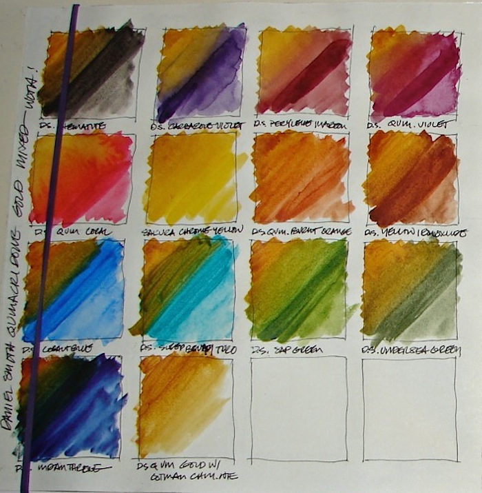
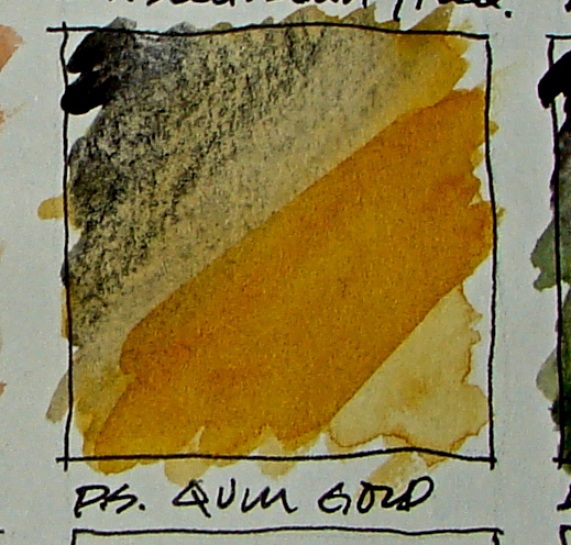
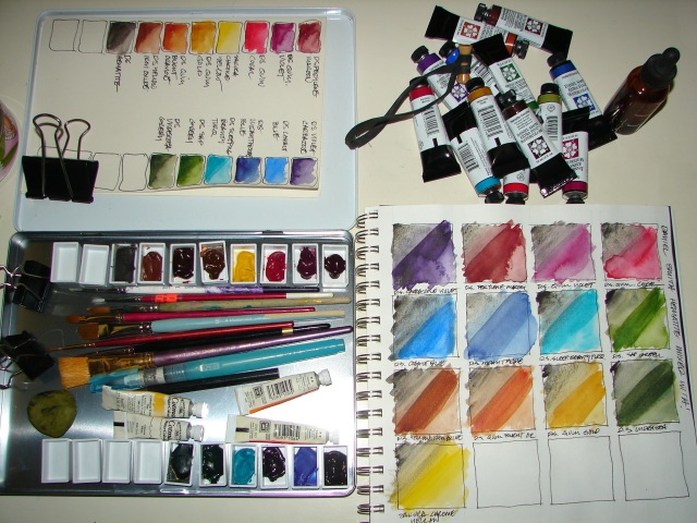 I play with color, layering and mixing, as you can see in the study above on hematite (black-grey paint made from crushed hematite) mixed with my Daniel Smith watercolor palette. As I move into watercolors and oils and away from acrylics as a mainstay (at least for now) I tend to mix more, experiment more. With acrylics I simply painted over my experiments; with watercolors especially it is important for me to have an idea of the mixology of the pigments, as watercolors are so fluid and unpredictable! The zen of pigments!
Gotta go — I get a painting day today! OOOOOOH, look at all those paint tubes!

I am now agreeing to the Creative Commons Attribution-Non-Commercial 4.0 International License, which you can learn more about by visiting the site, or, visit my web page for a more user-friendly summary on my terms. My images/blog posts can be reposted; please link back to dkatiepowellart.


I had to google quinacridone; love the way it rolls off my tongue, and even more the colors you show. Would be a great “Q” word for someone who knew what they were talking about 🙂 Have a terrific paint day – you sound very happy about that!!
LikeLike
I LOVE your blog!
And I, too, love color.
Your color-story was awesome to read. I’ve never studied architecture (besides the week or two in art history classes!) but I find it so interesting that many were afraid of color. I wonder why this is? My mind is filling with the possibilities…
Yes, colored walls can enhance paintings for sure! Our homes don’t have to look like art galleries… right now my apartment has white walls, but I plan on going crazy with color once we have a place we’re allowed to paint!
This post so makes me want to paint! Thank you! Off to do that now…
-Raquel from A Bowl of Moonlight
LikeLike
Thanks — I love yours as well! Fun post today from Natalie!
LikeLike
Nice post. I love the painting of the boat in your banner. It brings back happy memories. I’ve always wished I could paint. Never stop.
LikeLike
I did too, so I started late. And I love it! I visited your blog — GREAT post today. Hey everyone — go see this blog: http://somberscribbler.wordpress.com/
Best, Kate
LikeLike
It’s been too long since I’ve really painted anything, apart from helping my campers with art projects. My big thing has always been drawing, though I know I’m an amateur artist and not the next Klee, Picasso, or Schiele. I also love creating art with embroidery, and all the awesome range of colors the thread comes in.
LikeLike
Like your blog — get going with that color, gurl!
LikeLike