
Each Sunday for the next few weeks I am looking at my paint “collection.”
In the last weeks:
Tools: Watercolors, 1, Yellow-Orange;
Tools: Watercolors, 2, Red-Pink
One general comment about the greens is MANY of them are based with
Phthalocyanine (sounds like a spy poison), which of course means you can mix greens
with phthalo green (not typically found in nature) and make amazing colors!
I will take Phthalo greens out for a spin: another post coming!
![]()
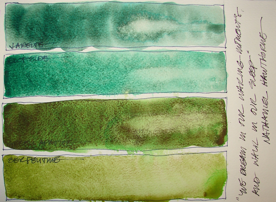 I buy a lot of Primatek colors from Daniel Smith.
Primateks are ground stones in raw form, and their raw forms allow them to separate and move in surprising ways.
They are difficult to control, but then, my attraction to watercolor is the zen-like quality
of the medium. Primateks are even more spontaneous. Some separate in unexpected colors, like the Green Apatite and Serpentine, above. Because I love them, I continue to play and experiment, finding ways to use them, especially in deity images, like Garuda, below, where I am using Green Apatite, Piemonite, Amazonite and Yavapei.
Magical!


Further, when mixed with other colors the results are amazing, shown below!
Yavapei + Ultramarine, left, making a moody blue shadow. Center, the two squares are Serpentine + Sap +Yavapei in the center, and Serpentine + Sap +Yavapei on the bottom. The far right is Amazonite + Yavapei; below it Amazonite + Serpentine.
I could mix paints all day and never paint an image.
Is there a job called colorist? Tester extraordinaire?

 NOTE: All paints Daniel Smith (DS) unless it says
otherwise — including the Primatek colors.
 First, let’s talk colors that look the same,
have the same pigment structure,
or are called by the same name out of the way:


Two Permanent Green Light, both too muddy for my tastes:
DS (with many ingredients) PY3-PG7, and QoR (many ingredients) PY3-PG7.
Proof that occasionally to colors with the same pigment values can be quite different. Why are the so different? It is the binders? More for me to learn about.
If I bought one again it would likely be the Daniel Smith version.


Two “Green Gold‘s” that are completely different, and a reason to look at the
pigment values not just the name. Green Gold, PY115/3-PG36, and QoR’s Green Gold, Copper Complex of Azomethine, PY129. QoR’s is a muddy color by its nature,
but is not muddy as it it rich with pigment, and one of the few QoR’s
I will keep — in fact, both are keepers for me.


A comparison of tube and pan watercolors in the same hue, from Sennelier:
Phthalo Green Light 805 tube (many ingredients) PY153-PG7, and pan.
The pan is thicker, muddier, darker and less transparent.
I may never been a fan of pan watercolors.
To see references on YELLOW and GREEN from handprint, click through.
The Keepers:


Which are keepers? I want vibrant surprises or deep shadowy colors;
and I mix a lot of my greens on paper. I love both QoR’s Bohemian, (nearly Pure Amorphous Carbon, Chlorinated Copper Phthalocyanine, Synthetic Iron Oxide — REALLY, ALL THAT?), PBk7-PG7-PR101-PY42 and QoR’s Green Gold, PY129,
even though the Bohemian is a bit muddy — it is great for underleaves and mossy stone and is deep and lovely. I’ll keep both QoR and 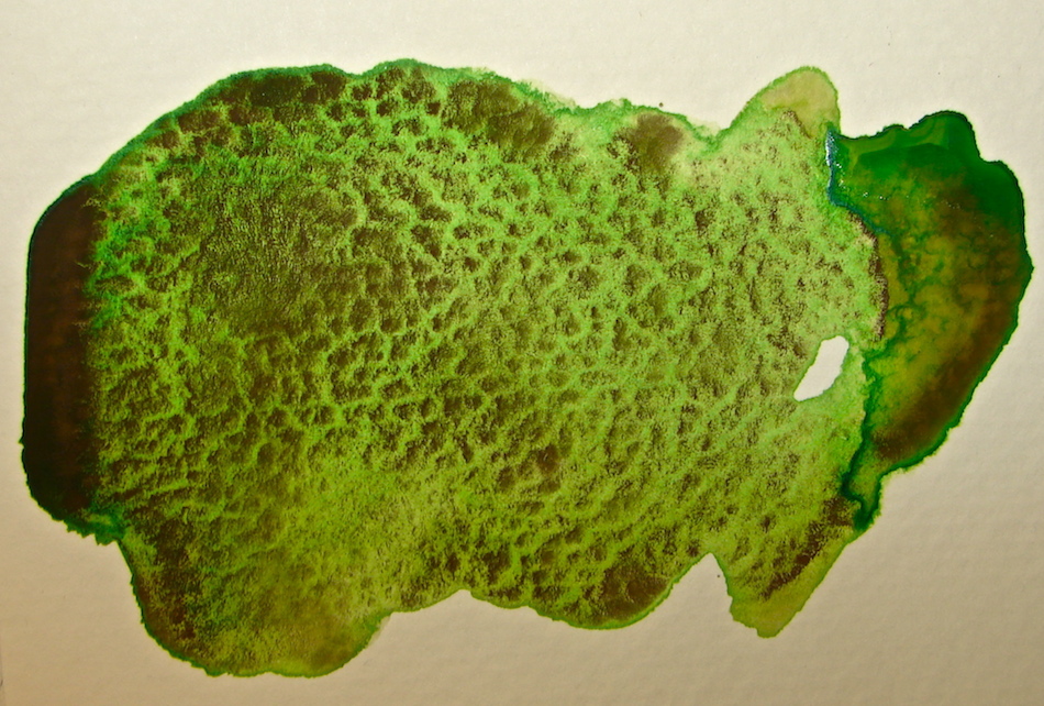 DS’s Green Gold, (also many
ingredients) PY115/3-PG36. Primatek Serpentine, Primatek Green Apatite, right, and Primatek Diopside are often used keepers. The latter is the reason I probably will not buy as much of the Primatek Jadeite, because I simply reach for it more in mixes, a surprisingly versatile color.
Sap Green, Quinacridone + Phthalocyanine, PO49-PG7, is the green color
I use up most in the greens, especially when I am on the fly and not mixing.
QoR Terre Green PG23, barely made the cut, and I will try Daniel Smith’s version before I purchase it again. Mostly, it is a soft color, but I find I use it often.
I’d like to find a better version, as QoR doesn’t wet easily, and I don’t know why;
I put a couple of drops of water in and let it sit for a long time before adding even more water in my pan. (Suggestions welcome here!) Sennelier Phthalo Green Light 805, (many ingredients) PY153-PG7 is a good spring-mix color, captures the brilliance
much better than the pan version. Deep Sap, (many ingredients) PB27-PO48-PG3,
and Undersea Green, Ultramarine + Quinacridone, PB29-PO49, both offer
great shadow options for foliage and building shadows.
The Rarely or Never Agains:
There are some great colors in this batch, and in many instances in all the
“Never Agains” it is because they either:
don’t work the way I work (totally opaque does not work for me hardly ever) or
there is a color I prefer (Jadeite, Green Umber).
And after looking at all these colors, posted or not,
I can safely say I don’t like pan watercolors.
They have a different feel and opacity or lack of vibrancy even in the best colors.


Sometimes it is a matter of what I will use most, sometimes they are
muddy or dull or blah pigments. Sennelier Phthalo Green Light 805 PAN
(many ingredients) PY153-PG7 is out — and maybe all pans are out for me. Dullsville! Spring Green, (many ingredients) PY53/151-PG36, and I prefer the Phthalo instead. Primatek Jadeite, because I reach for Diopside, is a color I’ll rarely buy again. Sennelier Forest Green 899 PAN, blah. QoR Permanent Green Light (Chlorinated Copper Phthalocyanine, Arylide Yellow) PY3-PG7 is just too muddy; Sennelier’s (above) is much more transparent and “bright.” QoR Chromium Oxide, PG17, is so opaque a tube might last me a lifetime; again, I perfer transparent watercolors. Sennelier Green Umber 203, PY83-PB6036-PBk7, is a no-go because I reach for Deep Sap or Undersea Green. Primatek Black Tourmaline was a huge disappointment. Blah…
Viridians I put with the blue-green in the next posting… You’ll see my logic!


Pentalic Field Journal, Platinum Carbon pen, and Greenleaf & Blueberry,
Sennelier, Holbein, QoR, M.Graham and Daniel Smith watercolors.

I agree to Creative Commons Attribution-Non-Commercial 4.0 International License, which you can learn more about by visiting the site, or,
visit my web page for a more user-friendly summary on my terms.
My images/blog posts may be reposted; please link back to dkatiepowellart.


I cannot have enough of that Apatite Green! I have to look closely for more Primatek from DS! Thanks for sharing your experiences!
LikeLike
I use them quite a lot in mixes, and in moody backgrounds, skies, etc. It is one of my favorite colors!
LikeLiked by 1 person
So interesting to see your process. The serpentine rocks I just took to my niece’s wedding were closer in color to apatite and undersea than to the serpentine in these samples. Interesting.
LikeLike
Where did you find serpentine Rocks? I know we have some in Oregon but it is very grey.
LikeLiked by 1 person
The Bay Area is filled with serpentine, but it is more green than any other color.
LikeLike
MMM, must look next time I am down that way!
LikeLiked by 1 person
Pingback: Tool: Watercolors, 4, Blues to Greens | D.Katie Powell Art
Pingback: Tools: Watercolors, 5, Violet and Purple! | D.Katie Powell Art
Pingback: Tools: Watercolors, 6, Browns and Golds | D.Katie Powell Art
Pingback: Inks in Depth: Robert Oster Jade | D.Katie Powell Art
Pingback: Inks in Depth: Birmingham Allegheny Observatory Celestial Blue | D.Katie Powell Art
Pingback: Inks in Depth: Krishna Ghat Green | D.Katie Powell Art
Pingback: Inky Thots: Krishna Pencil | D.Katie Powell Art
Pingback: Inky Thots: Birmingham Tarnished Nickel | D.Katie Powell Art