 I LOVE complex colors —
Inks (or watercolors) that are just a little unpredictable in that they change
and do their own thing when touched by water!
Some all it shading, but it rarely happens except in wide nibbed pens.
Remember that others review these inks just for writing;
I am also interested in how they are used for ink-painting!

Properties of Robert Oster’s Melon Tea:
 This ink is well-behaved, and does not feather on any of the papers I normally use, even Post-its. I consider it on the wet side, though it evaporates quickly enough with a wet nib such as the ultraflex, right. It has never smeared on me during a sketch. It has a hint of a graphite sheen, barely seen above, and When hit with water it moves easily with no resistance or ghosting, so is not water resistant. It has a permanent home
in my lovely FPR Himalayan
with an ultra-flex nib
*Above, watercolors, from Daniel Smith, QoR, and Sennelier.*
 When the edge is touched
with water it moves easily
with no resistance into yellow and rust tones, and the bright turquoise is where he pulls the touches of green in the image above. Looking at watercolor comparisons and the Munsell ranges, the colors range from Bohemian, a Green-gold (PY42/PBk7/PG7/PR101) to Sepia (Pbk7/Pbk9) and a murky Green called Undersea (PB29/PO49). It includes the mineral paints Raw Umber, Sicklerite, and Tiger’s Eye.
RO is experimenting and testing lightfast properties…
MOST water soluble ink companies do not pay attention to these things
because most artists who use ink are making prints of their work.
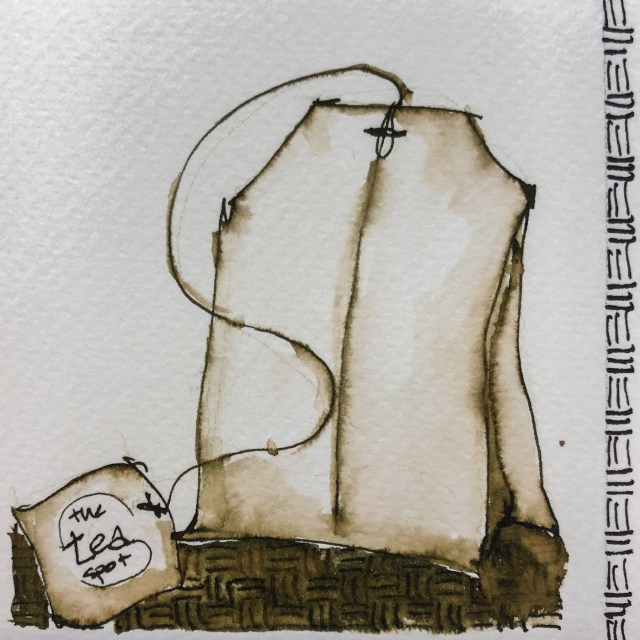
My ®teaspot tea bag was drawn with a FPR Himalayan
with an ultra-flex nib on cold press watercolor paper,
then the lines were touched with water using a Pentel Aquash waterbrush.
The lines do not stay visible but quickly lose themselves in wet color;
The lines were added back in after the water moved the ink and dried!

On smooth Hahnemühle Nostalgie Sketchbook (white, but the lighting was poor)
paper I sketched Église Saint Germain l’Auxerrois; I let the lines completely dry.

I came back and touched the lines, only adding color on my waterbrush
in the sky and the street line and a little in the trees.
I was able to have a little bit of control,
though the lines disappeared in many places.
Howling Coyote (Hahnemühle Nostalgie Sketchbook),
is a matter of just touching lines with water, as are the faces below on Hahnemühle Cappuccino Sketchbook coffee-colored paper.
One thing to note is a thicker line will lay down a lot more color when touched.
With the FPR Himalayan with an ultra-flex nib a lot of ink can be laid onto the paper.
I bought Robert Oster Melon Tea at Vanness:
It is also sold at Goulet.
 To hear about classes, follow me on Facebook
or check out my new, improved dkatiepowellart.com
“Memory is more indelible than ink.”
Anita Loos, Gentlemen Prefer Blondes.
“I think not….”
Me… why I journal!
Hahnemühle journal, Hahnemühle Cappuccino Sketchbook,
Pentel Aquash waterbrush,
FPR Himalayan withan ultra-flex nib with Robert Oster Melon Tea.


©D. Katie Powell.
My images/blog posts may be reposted; please link back to dkatiepowellart.
☾
 As my Patreon supporter, you will have
access to some content not on this website,
sneak previews, goodies, discounts on classes.
I teach architectural sketching,
art journaling (art+writing), creativity, watercolors.
That annoying loud-mouth editor/critic in your head? GONE! How great would that be?







Pingback: Inks in Depth: Robert Oster Aussie Brown | D.Katie Powell Art