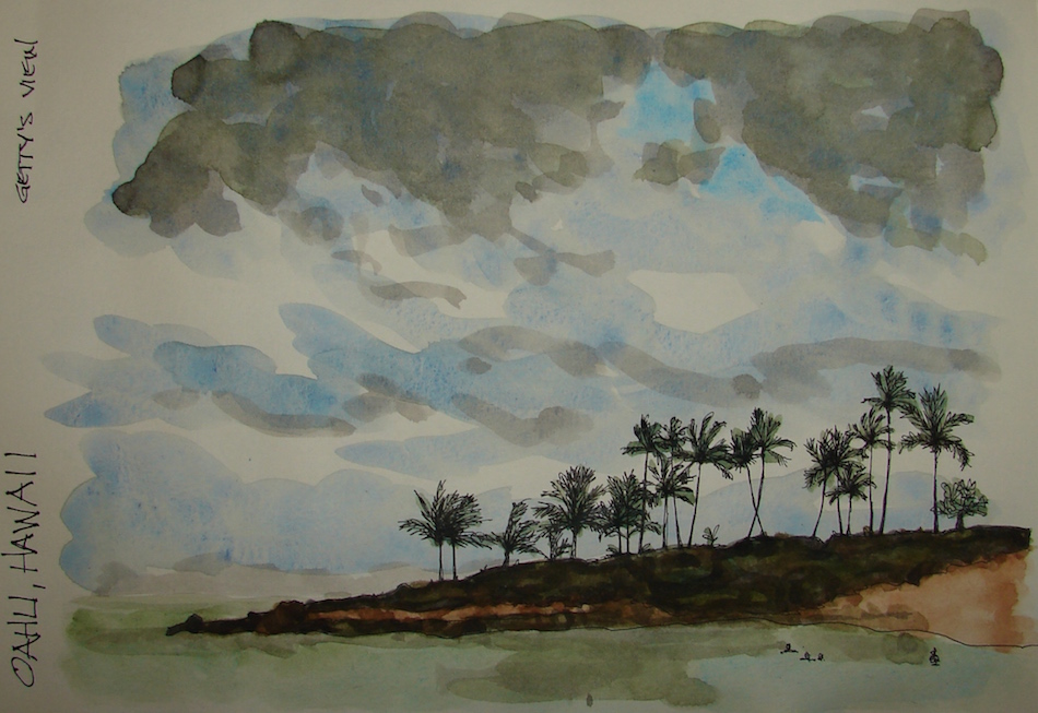
Skies as expressive as a tropical ocean. Deep calm.
Pentalic Aqua Journal, Platinum Carbon pen, De Atramentis Document black ink;
Holbein and Daniel Smith watercolors.
Photograph by Murilo Romeiro of a beach in Brazil.
What object do you cherish? Paint it and enter it in Cherished Blogfest July 29, 30, 31!
Tell us the story you tell about one of your cherished objects. Tell us what your object is, post a painting / drawing / photo, and tell us why you cherish it. 500 words, pictures, posted on the July 29th, 30th or 31st. Help us spread the word: save (right-click, save image) the badge, right, and place it on your sidebar. Tell your friends on social media. Hashtag: #cherishedblogfest.
When the Cherished Blogfest goes live on the 29th, enter your blog post entry into the Linky List.
I love this image by Joan Wilson of the
Ucluelet in British Columbia.
Working on skies and washes,
they are so not easy.
Challenges the zennie in me; they can be overworked in the blink of an eye!
Pentalic Aqua Journal, Platinum Carbon pen,
Lamy Al-Star, De Atramentis Document black
and Noodler’s Lexington Grey ink;
Holbein and Daniel Smith watercolors.
What object do you cherish? Paint it and enter it in Cherished Blogfest July 29, 30, 31!
Tell us the story you tell about one of your cherished objects. Tell us what your object is, post a painting / drawing / photo, and tell us why you cherish it. 500 words, pictures, posted on the July 29th, 30th or 31st. Help us spread the word: save (right-click, save image) the badge, right, and place it on your sidebar. Tell your friends on social media. Hashtag: #cherishedblogfest.
When the Cherished Blogfest goes live on the 29th, enter your blog post entry into the Linky List.
I'd love it if you shared this; please mention my blog name!
It’s that time of year when everyone in the West living
near forests and fields worries about fireworks.
Crazily, they still allow personal street fireworks as part of a RIGHT
as if people’s homes, livelihood and our lovely forests are not a right too…
We’ve already heard what sounds like M80s pop-pop-pop!
We’ll be spending our time in the studio so if there is a problem
we can evacuate as we call the fire department.
Can’t have museum artifacts and take a chance.
Good news, from our studio we can see half a dozen fireworks shows on the Columbia.
New Moon Astrology is wild right now. Andandashree advises us to:
“Steady the mind, anchor your truth, and prepare yourself for the incoming storms…
If possible, take time for self-care and healing practices and avoid harsh situations
and isolation. Practicing mindfulness-based meditation will be especially
soothing at this time, as well as taking peaceful walks in natural settings.”
Based on our in-and-out of ER these past few days, I think we will lay low anywho!
This is my first time using Fineline masking fluid;
amazingly easy stuff, and nice thin lines!
It is blue so it is also easy to see.
So many budding watercolorists don’t want
to do World Watercolor Month —
but let me say this about that:
Do it from whatever place you are in!
I’m working on washes and learning masking fluid and deepening colors to have them pop, and
developing my writing —
while working on several commissions.
Pentalic Aqua Journal, Platinum Carbon pen,
Lamy Al-Star, De Atramentis Document black ink; Fineline masking fluid;
and Sennelier, Holbein, and Daniel Smith watercolors.
What object do you cherish?
Paint it and enter it in Cherished Blogfest July 29, 30, 31!
Tell us the story you tell about one of your cherished objects. Tell us what your object is, post a painting / drawing / photo, and tell us why you cherish it. 500 words, pictures, posted on the July 29th, 30th or 31st. Help us spread the word: save (right-click, save image) the badge, right, and place it on your sidebar. Tell your friends on social media. Hashtag: #cherishedblogfest.
When the Cherished Blogfest goes live on the 29th, enter your blog post entry into the Linky List.
I'd love it if you shared this; please mention my blog name!
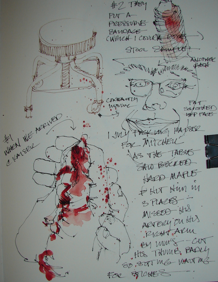
Mitchell had a saw buck and a piece of wood went flying yesterday.
We are very lucky and thanked KaliMa that it missed his artery in his arm by mere mms!
Hit him in the middle of his two eyes but did not hit his eyes!
It did not cut the tendon on his right thumb, though we could see the tendon!
OUCH OUCH OUCH!
The cut was about 3/4-inch and 1/4 inch deep
We spent from 2-7:00 pm dealing waiting at the glorious Kaiser ER with his hand UP
so it might not bleed more while they took people in order with no thought to triage
I saw no one else who looked like they needed immediate attention.
Next time Mitchell is going to take my advice and begin bleeding all over the floor.
I had time to sketch and so, sketch I did
always have that with me but NO blood red watercolors damn damn damn….
M’s core temperature dropped from shock and freezing air conditioning
(in Oregon, really necessary? open a window…)
until they had to wrap him all up in warm blankets.
Crapity crap crap medical facility.
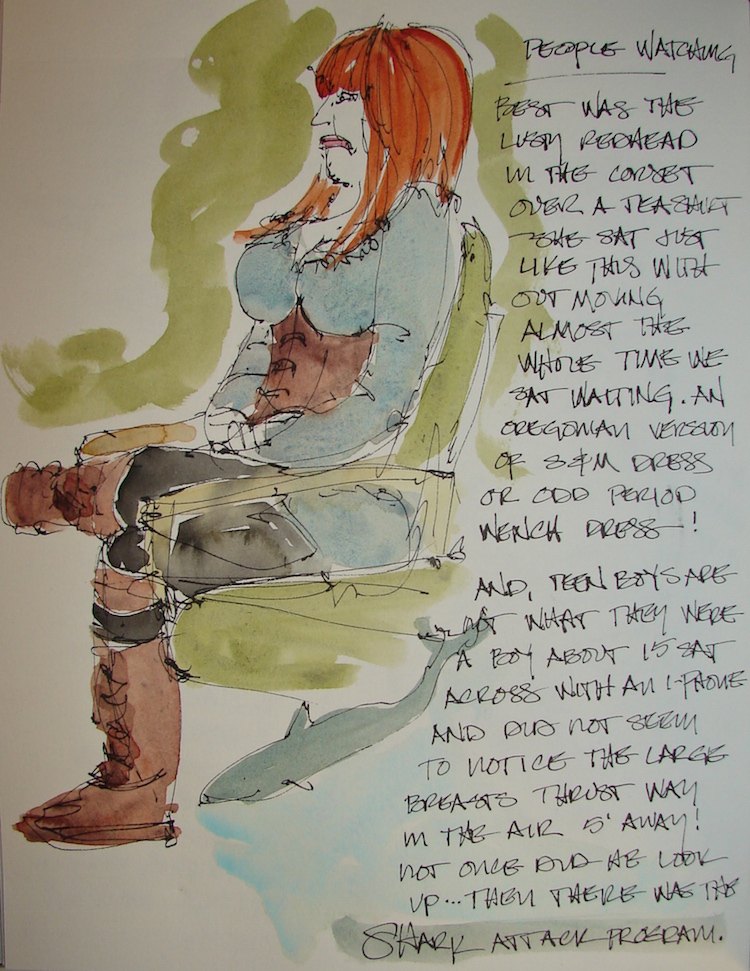
Five shows of shark attack. PuhLeeze. All evil all the time!
Annoyed at the hating on a whole species!
Good people watching, a gorgeous woman with violet-brown skin in a lovely wavy skirt
(which I didn’t get to draw because she was in and out fast).
Then there was the Lusty Red-Haired Wench,
and in true Oregon style
(I apologize to my fellow Oregonians but really, it is a thing here)
she was corseted up laced up leathered up and trying to be all sexy
but then she put the damn thing over a grey striped tee that hung down over her bottom.
*giggle* *not hollywood haight lalaland fer sure*
The teenage boy across from her never looked up from his smart phone
at the large rack that was right under his nose, and
I heard my brother Patrick in my head, wondering what the hell?
She did look pissed most of the time but maybe she knew I was sketching her?
Doc was a snappy dresser, apple green checked shirt and bright orange mocs.
He had 4 stitches but could not stitch everywhere because it came down next to his nail. He didn’t cry but he almost did as the damn numbing agent hurt like hell…
They did not give him antibiotics. I wish they had but they said it didn’t need it,
and Mitchell said he didn’t want them. Thankfully he’s had his tetanus shot.
I told him next time he wants Friday
off early PLEEZE just take it!
Strathmore Mixed Media journal with Platinum Carbon pen
and Daniel Smith watercolors.
What object do you cherish?
Paint it and enter it in Cherished Blogfest July 29, 30, 31!
Tell us the story you tell about one of your cherished objects. Tell us what your object is, post a painting / drawing / photo, and tell us why you cherish it. 500 words, pictures, posted on the July 29th, 30th or 31st. Help us spread the word: save (right-click, save image) the badge, right, and place it on your sidebar. Tell your friends on social media. Hashtag: #cherishedblogfest.
When the Cherished Blogfest goes live on the 29th, enter your blog post entry into the Linky List.
I'd love it if you shared this; please mention my blog name!
I hated pink and purple as a girl; I was a tomboy.
I wanted a purple bike as a kid for about five seconds, but, well, tomboy…
Purpley-pink was just so GURLIE! I’ve never navigated to purple, don’t remember ever buying but maybe one purple piece of clothing. As hit my teens, of course, I found out how amazing a tan blonde girl looks in soft pink, and so I liked it for clothing…
and later hot pink or magenta as an adult: it was shocking, sexy, and intense.
Violet? Purple?
Maybe I never liked purple / magenta because I like truth and on some level
I intuited that purple was a trick of the eye! (Just kidding.) Unlike violet, which exists in the light spectrum as red moved to blue, purple isn’t real in the color spectrum of light photons. Our brains make it up! In terms of what the colors suggest in our world —
when you say purple it is the color closer to red, between crimson and violet. Violet is closer to blue, and is usually less saturated than purple.
On the other hand, I need purples to paint with occasionally —
and am having a hard time finding one I love,
coming to watercolors from acrylics, where the colors are intense.
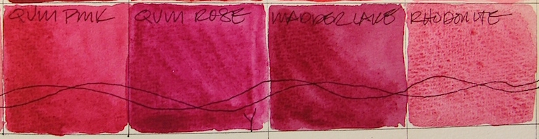
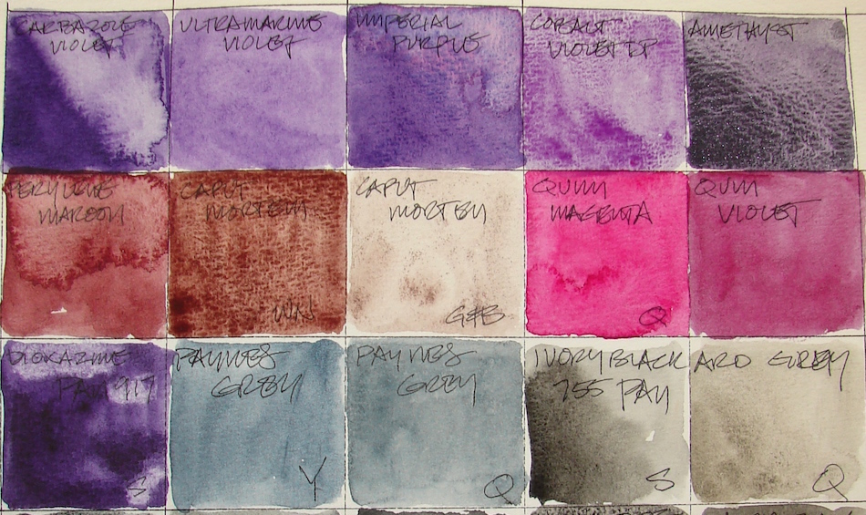
NOTE: All paints Daniel Smith (DS) unless it says otherwise — including the Primatek colors.
Included in this posting are magenta-purpley pinks, as opposed to
the peachy pinks from the posting on Red. Some were painted first in the Reds palette.
First, let’s talk colors that look the same,
have the same pigment structure, or are called by the same name out of the way:
Greenleaf & Blueberry Caput Mortem is not the Caput Mortem I want (which is DS Caput Mortem, much less purple, and also discontinued, far right.) I am bringing together all the Caput Mortems, even though I put the DS version into the brown posting because it really has no tinge of purple. Windsor Newton Caput Mortem, PR101, is an intense mauve that I really hate…. but I had to try it to see if it would take the place of DS.
BTW, if anyone has Daniel Smith Caput Mortem
I’d be eternally grateful and happily pay for it!
To see references on VIOLET and MAGENTA from handprint, click through.
The Keepers:
DIOXAZINE
CARBAZOLE VIOLET
IMPERIAL PURPLE
Which are keepers? In the purple ranges, I will keep Sennelier Dioxazine Purple 917 PAN, PV25 — though I will move to the tube version — and Carbazole Violet, Dioxazine, PV23(RS). Both are dioxazines…
I love Imperial Purple, Quinacridone + Ultramarine, PV19 / PB29, but it has its limitations because it separates into lovely pinks and purpley-blues.
Still, I’m not a realist, and so, I am keeping it because it is beautiful. Cobalt Violet Deep, PV14, I am keeping only because I need the hue, but I will keep looking for a deeper color, because it is sort of wishy-washy.
I am disappointed in some of the quinacridone magentas, and I have a half-dozen!
I will keep these, because they are clear and bright: QoR Quinacridone Magenta, PR122 (more lightfast that Opera pink and just as brilliant.) Quinacridone Pink, PV42, is more pink than shown on my screen. Yarka’s Quinacridone Rose is a bit muddy, but for now, I’m using it a lot so I will keep it until I find a better version.
Greenleaf & Blueberry Caput Mortem is such fun to use sometimes
in purpley stonework. Perylene Maroon, PR179 is SO not a favorite color of mine,
but it fills the need in some mixes, and so it stays.
The Rarely or Never Agains:
To me, these really are losers. I just don’t like them, and ought to trade them with someone NOW. Why? Ultramarine Violet, PV15 is Blah, wishy-washy, flat. Quinacridone Violet, PV19, flat. Yarka Madder Lake is muddy and should pop. Windsor Newton Caput Mortem, PR101, ugly.
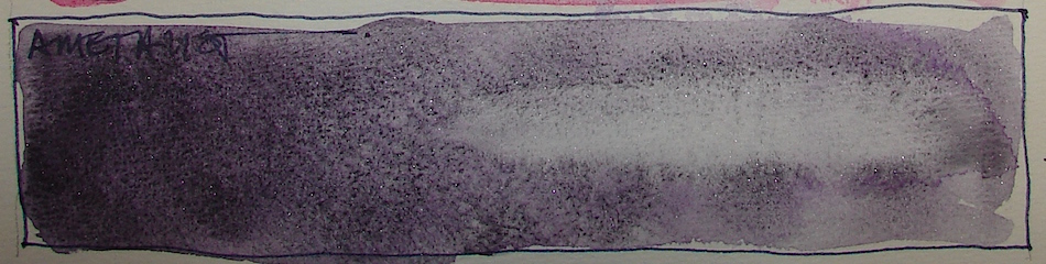
Primatek Amethyst, unfortunately, while a responsive solid Primatek,
probably loses out because it is expensive and I am not a purple gurl!
I don’t think I’ve ever used it! Tomboy still?
Pentalic Field Journal, Platinum Carbon pen, and Greenleaf & Blueberry,
Sennelier, Holbein, QoR, M.Graham and Daniel Smith watercolors.
What object do you cherish? Paint it and enter it in Cherished Blogfest July 29, 30, 31!
Tell us the story you tell about one of your cherished objects. Tell us what your object is, post a painting / drawing / photo, and tell us why you cherish it. 500 words, pictures, posted on the July 29th, 30th or 31st. Help us spread the word: save (right-click, save image) the badge, right, and place it on your sidebar. Tell your friends on social media. Hashtag: #cherishedblogfest.
When the Cherished Blogfest goes live on the 29th, enter your blog post entry into the Linky List.
I'd love it if you shared this; please mention my blog name!
Charlie from Doodlewash starting World Watercolor Month
to celebrate that which many of us love — WATERCOLORS —
and to help benefit kids without access to art supplies. Artists from around the world
will be posting their daily efforts on their blogs and on the facebook page.
I am slammed this month and will not do a watercolor a day but wow I wish I could!
In this busy month, I am dreaming of palm trees and refreshing breezes and
time with my hunny and a sketchbook on the beach.
Research has shown that art education has a tremendous impact on the developmental growth of every child and has proven to help level the learning field across socioeconomic boundaries. Unfortunately, arts education programs are too often the first to be cut when cuts are necessary, so more and more children each year are missing out on the important benefits of art classes.
The Dreaming Zebra Foundation is unique in that they provide an art recycling program that is free to the public. Reusable art & music supplies that would otherwise be discarded, along with new or unsold materials, are donated by individuals and businesses and matched to recipients who have requested those materials for arts education purposes in communities around the world.
Have some beginner watercolor sets you no longer use, but still have some life in them? You can also support the cause by sending your reusable art supplies to:
The Dreaming Zebra Foundation 5331 SW Macadam Ave., Ste. 258-522 Portland, OR 97239
Pentalic Aqua Journal, Platinum Carbon pen, Lamy Al-Star,
De Atramentis Document, and Daniel Smith watercolors.
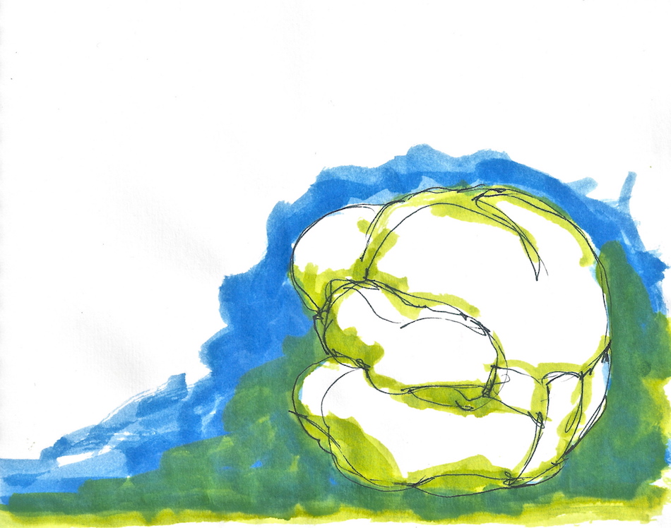
Last year my blogger friends organized the Cherished Blogfest in which we talked about the most cherished objects in our lives, sharing stories, memories, and emotions.
I wrote and painted about Buddha Ball (above), which I’ve had on my altar for many years, on my other blog, zenkatwrites. As a result of this blogfest and reading / engaging many others on their blogs,
I made some real life cyber friends!
By drawing objects and their memories
in the Bright Ideas journal, below, I see
how objects I keep are linked to memories so that each time I see or handle the
object I think of the memory. Drawing the object embeds the memories in my paintings — which is why a sketchbook is so
much better than photos when I travel (right, from a trip Mitchell I took last May)!
This year I will paint my entry on this page — and I invite you all to do the same.
What object do you cherish? Show and tell us on Cherished Blogfest July 29, 30, 31!
Dan Antion, Sharukh Bamboat, Damyanti Biswas, Mary Giese, Peter Nena, Cheryl Pennington and I (hosts) will be getting to know you through the story you tell about one of your cherished objects. Tell us what your object is,
post a painting/drawing/photo of it if you like, and tell us why you cherish it.
500 words, pictures, posted on the 29th, 30th or 31st of July 2016
(or all three if you are ambitious!) Through the Cherished Blogfest Linky List you can share your story and make new connections and renew old ones.
Help us spread the word: save (right-click, save image)
the badge, right, and place it on your sidebar.
Tell your friends on social media.
Hashtag: #cherishedblogfest.
When the Cherished Blogfest goes live on the 29th, you will enter your blog post entry into a second Linky List. That list will be preserved here so that your post will continue to be associated with the Cherished Blogfest and people will always be able to find your post from this site.
BTW, I will be writing on both my blogs,
because my artist self cherishes very different
objects than my other self.
Wow these selves can get confused….
Classes are great if you can takeaway even one thing that you use all the time.
Tracey Fletcher King’s class helped me to pop or intensify my watercolors.
Beginner to intermediate watercolorists, this is a great class!
She is having a two day sale with 20% off Delicious Paint… Lifetime access to all materials, videos and updates as well as access to a wonderful private group on Facebook Where you can connect with other Delicious painters… Join me before midnight June 30 to take advantage of the discount… Click here for details: https://coursecraft.net/c/deliciouspaint?code=YESPLEASE
I'd love it if you shared this; please mention my blog name!
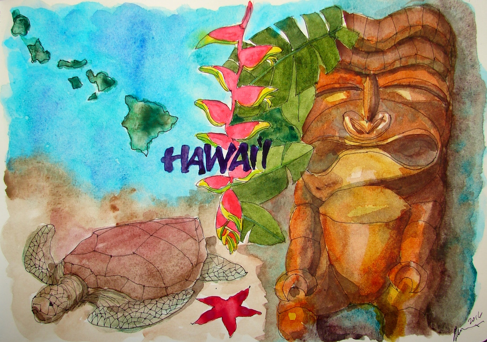
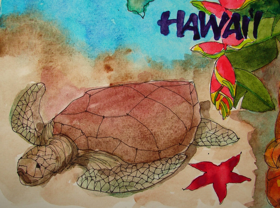
Amy Lauren Gettys *thank you* gave us wonderful images to paint, and I had fun
in this incredibly busy month putting together the second page in the spread.
I haven’t done a collage in ages, and because of my shortened time I just kept
adding sketches of this and that until it all came together with the colors.
Sea Turtles, Tiki statues, Macaw flowers, Star Shooter, Monsteras… When gods walked
the earth as men, Tiki images recognized their divinity,and their human qualities.
One of the most fun walks we’ve done — and finally I used Cobalt Teal!
Moleskin 8×11 watercolor journal, Pentalic HB woodless pencil, watercolor pencils, Platinum Carbon and Lamy pens with De Atramentis Document black and turquoise ink,
and Sennelier, Holbein, QoR and Daniel Smith watercolors.
I sketched these in the Bright Ideas journal, and have begun to pick up
whatever color ink I want to use. Rules are meant to be broken!
We didn’t have a lot of money but Christmas was always a lot of fun.
Sometimes we drove to my grandparent’s ranch in Grass Valley;
sometimes we stayed at home. Stockings were the best part, because somehow
Santa always knew the silly things that would delight…
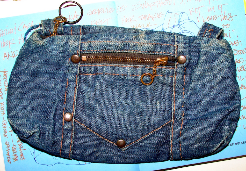
My grandmother wore this on her belt when she hiked. It usually ha the snake kit in it;
I used to wear it when bike riding on the Venice Beach strand.
It is one of my favorite things of hers, memories of horny toads and snakes
and turtles and horses and deer and cats and kittens and her garden…
Grandma’s meat grinder is a dilemma. I love these kinds of very cool old objects, and
this was used by her for her whole life. On the other hand, if I make sausages I will use my bright orange Cuisinart Mixer… while hers is big, clunky, a relic. I think it is time for
me to get rid of it as we have downsized, so drawing it before I let go is a good thing,
My brother Patrick (RIP) often brought me things that I didn’t know I would love and then I did… most part of California history. He brought me an entire set of Red Anthurium Santa Anita Ware and I used it like crazy in my twenties. Lots of it has been broken and I thought about cashing in (collectors look for pieces) but rally, I want to use it up!
Bear and Sashi. Best. Dogs. Ever.
Bright Ideas multi-color journal with Platinum Carbon pen,
Lamy Al-Star with De Atramentis Document black ink,
White Uniball Signo pen, Fat white Pitt pen, and colored pencils.
I had to make myself purchase blues. I love turquoise blues, and bought Primateks
when I discovered them, and had Cobalt Blue and Ultramarine Blue because they
came in sets from Daniel Smith. I tend to use them only in landscapes, because what is around me is not blue — though I’d love to have an excuse to paint with blues everyday because I miss home, the deep blue Pacific. I think blues are tricky, and doubt I explore more blues than the ones I am keeping now, because so many disappoint:
muddy, thick, not what blue should be, which is clear and clean and refreshing.
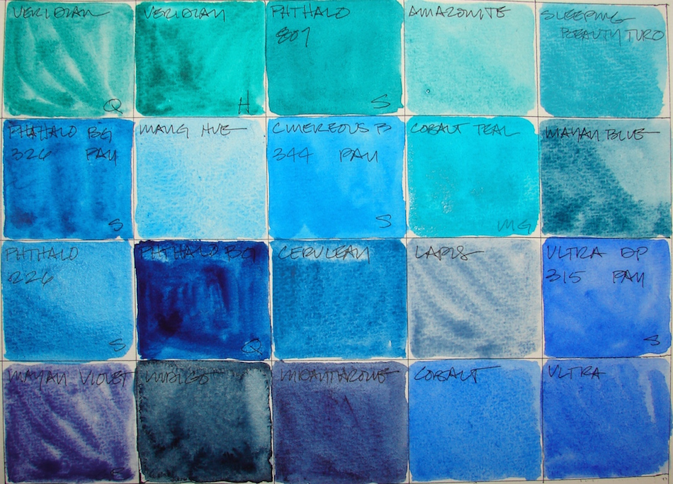
NOTE: All paints Daniel Smith (DS) unless it says otherwise — including the Primatek colors.
First, let’s talk colors that look the same,
have the same pigment structure, or are called by the same name out of the way:
QoR Viridian, Hydrous Chromium Sesquioxide, PG18, and Holbein Viridian, PG7,
are called by the same name but the pigments/formulas are different. Bruce MacEvoy from handprint has this to say about it: “Holbein’s “viridian”, although it provides a nice granulation, is formulated with phthalo green, their “cobalt green” doesn’t match the color of genuine cobalt green, contains no cobalt, and doesn’t use the word “hue” in the name to indicate it contains no cobalt: four strikes, you’re out.” (BTW, I bow to the work MacEvoy has done — I have much to learn. Kindergartner here!)
“Below, Sennelier Phthalo Blue 326, Sennelier Phthalo Blue 326 PAN,
and QoR Phthalo Blue, are all PB15:3, though the QoR is very dark.
PHTHALO BLUEGREEN
Then there are the comparisons between pan and tube watercolors with the same pigments: Sennelier Phthalo Blue 326, and Sennelier Phthalo Blue 326 PAN, both PB15:3, and Ultramarine Blue (and French Ultramarine Blue) and Sennelier Ultramarine Blue 315 PAN, also both the same pigments, PB29.
To see references on BLUE and GREEN from handprint, click through.
The Keepers:
CERULEAN
INDIGO
INDANTHRONE
By now if you’ve been following the Sunday’s watercolor posts, you know I love brilliant and clear bright colors. So which are keepers? Surprisingly, I’m keeping Holbein Viridian, PG7, for now, but may try MacEvoy’s recommendations in future.
I like it for the reasons he doesn’t — it has such variation: it can be almost a black-green and lighten to a brilliant blue green, the color of a Carmel, California cove.
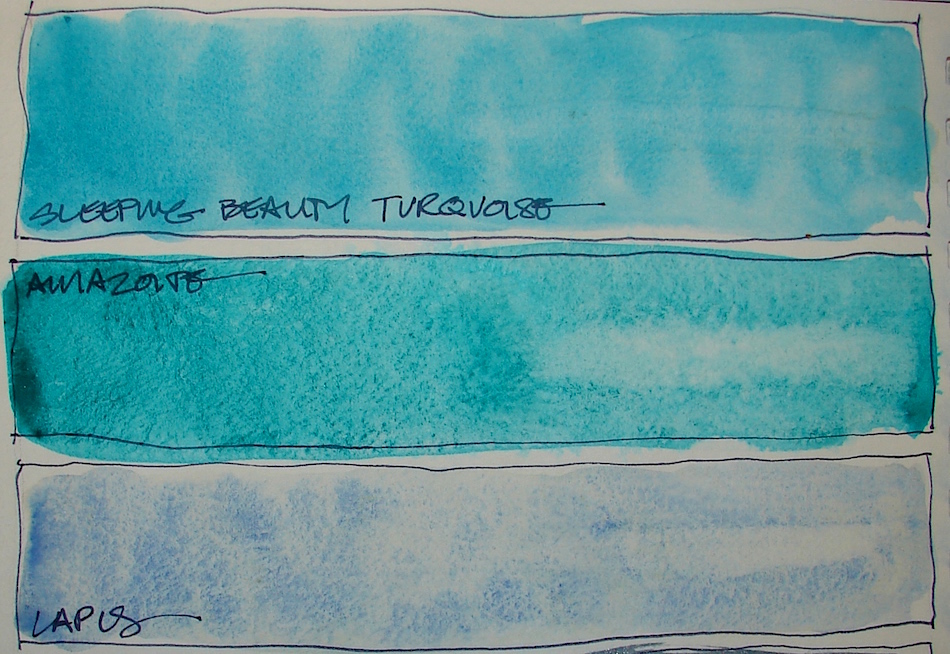
Primatek Amazonite, Primatek Sleeping Beauty Turquoise, and Primatek Lapis, are all keepers. Lapis makes a base for easy skies, often combined with Manganese Blue Hue, or the littlest touch of Cobalt Blue, or even QoR Indigo, Right, I used it in
sky and ocean, mixing with green to create the ocean colors.
Keeping M.Graham’s Cobalt Teal, PB28, is a surprise. It is opaque, so not one of my favorite paints (though the color is a favorite colors), but there is nothing like it in a transparent watercolor. It thins nicely in a wash, left. I may try it in DS next time, as MG’s tends to separate and not dry thoroughly.
Other keepers: Manganese Blue Hue, Phthalocyanine, PB15, a lovely soft hue
which I use frequently in skies. I’ll keep Cerulean Blue Chromium, PB36,
though it is more opaque than semi-transparent. Sennelier Phthalo Blue 326, PB15:3, brilliant and clear, and QoR Indigo, PB15:3 / PBk7 / PV19, a staple —
but I may move to Daniel Smith’s versions. Indigo and Indanthrone, PB60 make for heavenly night skies mixed with Lapis. Finally Cobalt Blue, PB28, the clearest
true blue I have , along with Ultramarine Blue (and French Ultramarine Blue), PB29. I will give DS a hard time for the latter two names on the same color,
I have both, and they are EXACTLY the same color. Fool me once.
The Rarely or Never Agains:
PHTHALO BLUEGREEN
CINEROUS
QoR Viridian, Hydrous Chromium Sesquioxide, PG18, is more expensive and less creamy than Holbein’s. QoR is a bit muddy. Sennelier Phthalo Green Deep 807, PB15:3 / PG7, QoR Phthalo Blue, PB15:3 is too dark and muddy.
I will use up the pan colors, but not replace them because they just aren’t as brilliant
as the tubes: Sennelier Phthalo Blue 326 PAN, PB15:3, Sennelier Ultramarine Blue 315 PAN, PB29, and Sennelier Cinereous Blue 344 PAN,
Finally, I am unimpressed by the Mayans: Primatek Mayan Blue and Greenleaf & Blueberry Mayan Violet.
In a future post I will talk about the Mayan Colors…
What they are, what I like and dislike about them.
Must build the collection to discuss!
MAYAN VIOLET
MAYAN BLUE
Then there is this, because, well, Linda.
Pentalic Field Journal, Platinum Carbon pen, and Greenleaf & Blueberry,
Sennelier, Holbein, QoR, M.Graham and Daniel Smith watercolors.
Extremely busy week; all work and almost no painting!
An exhausting but good week, we are embarking on a new adventure.
I’ll talk about it soon; you will get to see what I do when I am using my painting skills in our business. But this week, it was moving furniture, number crunching, contracts.
When not that, back O-U-T, trips to my acupuncturist, woozy painkillers. ARGH!
We did have all contracts signed by the full moon.
I am quite superstitious that way.
Black-eyed Susans sketched as a memory; middle-of-the-night.
I see them in two places on my drive to and from the studio.
One of the happiest of flowers!
Pentalic Aqua Journal, Lamy Joy/Al-Star with stub nibs,
De Atramentis Document Black ink and Daniel Smith watercolors.
I am very excited about the new
De Atramentis Document White ink (DeA hereafter).
I use white inks from time to time, mostly in sketching, and have finally found
good white ink sketch pens: Faber-Castell PITT artist pen WHITE 101 (fat, pale white,
love it), and the Uniball Signo UM-153 (think brilliant white lines).
However, I love fountain pens, and also paint with inks in place of watercolors from
time to time. I want waterproof inks. I also don’t want to contribute,
however small, to the mounting plastic headed for the dump.
I began tests, playing on smooth paper, above, and Canson paper, rough, below.
On smooth paper (granted the paper is yellow but it is against the other inks) the ink doesn’t perform quite as well as on the more textured Canson papers.
I brushed the DeA ink and wrote with the Jinhao, below, on Canson papers:
Sometimes I test while making silly cards for Mitchell.
I also popped some Luma watercolors over the top to test the waterproof qualities.
Everything is excellent: crisp, brilliant, waterproof.
Conclusion, I LOVE IT!
I will keep my Pitt and Uniball Signo for travel, as I can leave them in for long periods of time without use — but the De Atramentis Document white ink is a keeper!
Bright Ideas multi-color journal and Canson Blue homemade folding journal; Jinhao pen (too fat and heavy for words) with De Atramentis Document white ink, and comparisons to the White Uniball Signo and fat Pitt white pen. Some Daniel Smith watercolors.
One general comment about the greens is MANY of them are based with
Phthalocyanine (sounds like a spy poison), which of course means you can mix greens
with phthalo green (not typically found in nature) and make amazing colors!
I will take Phthalo greens out for a spin: another post coming!
I buy a lot of Primatek colors from Daniel Smith.
Primateks are ground stones in raw form, and their raw forms allow them to separate and move in surprising ways.
They are difficult to control, but then, my attraction to watercolor is the zen-like quality
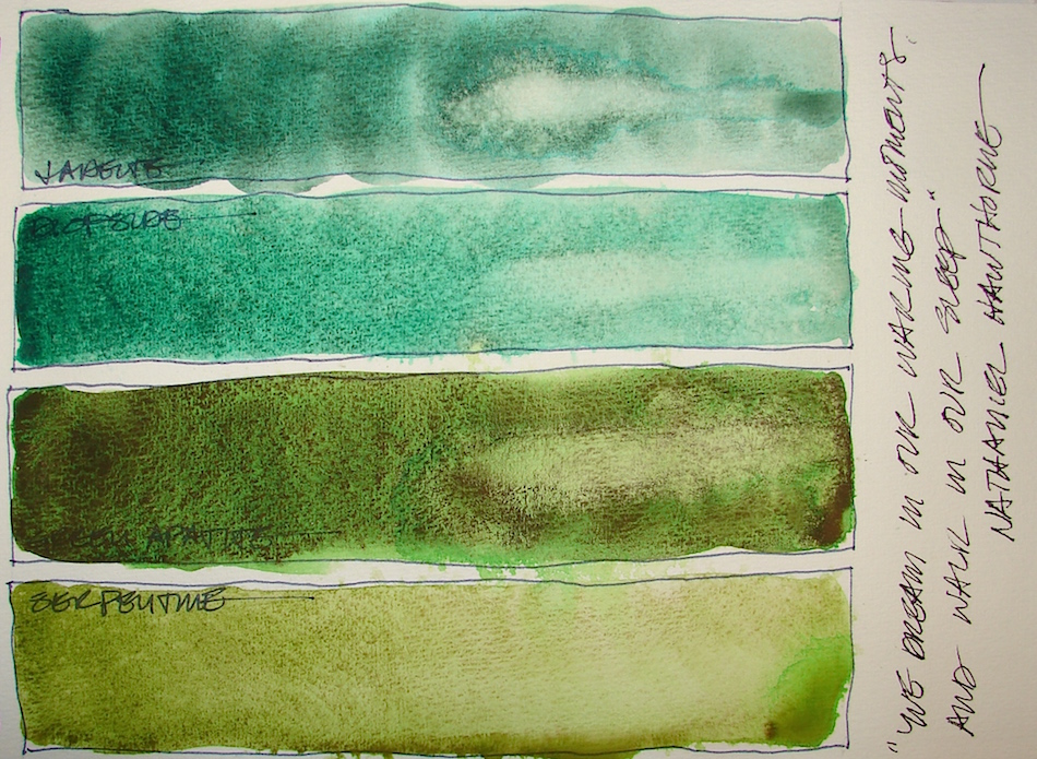
of the medium. Primateks are even more spontaneous. Some separate in unexpected colors, like the Green Apatite and Serpentine, above. Because I love them, I continue to play and experiment, finding ways to use them, especially in deity images, like Garuda, below, where I am using Green Apatite, Piemonite, Amazonite and Yavapei.
Magical!
Further, when mixed with other colors the results are amazing, shown below! Yavapei + Ultramarine, left, making a moody blue shadow. Center, the two squares are Serpentine + Sap +Yavapei in the center, and Serpentine + Sap +Yavapei on the bottom. The far right is Amazonite + Yavapei; below it Amazonite + Serpentine.
I could mix paints all day and never paint an image. Is there a job called colorist? Tester extraordinaire?
NOTE: All paints Daniel Smith (DS) unless it says otherwise — including the Primatek colors.
First, let’s talk colors that look the same,
have the same pigment structure, or are called by the same name out of the way:
Two Permanent Green Light, both too muddy for my tastes:
DS (with many ingredients) PY3-PG7, and QoR (many ingredients) PY3-PG7.
Proof that occasionally to colors with the same pigment values can be quite different. Why are the so different? It is the binders? More for me to learn about.
If I bought one again it would likely be the Daniel Smith version.
Watercolor
Two “Green Gold‘s” that are completely different, and a reason to look at the
pigment values not just the name. Green Gold, PY115/3-PG36, and QoR’s Green Gold, Copper Complex of Azomethine, PY129. QoR’s is a muddy color by its nature,
but is not muddy as it it rich with pigment, and one of the few QoR’s
I will keep — in fact, both are keepers for me.
A comparison of tube and pan watercolors in the same hue, from Sennelier: Phthalo Green Light 805 tube (many ingredients) PY153-PG7, and pan.
The pan is thicker, muddier, darker and less transparent.
I may never been a fan of pan watercolors.
To see references on YELLOW and GREEN from handprint, click through.
The Keepers:
Watercolor
Watercolor
UNDERSEA
Which are keepers? I want vibrant surprises or deep shadowy colors;
and I mix a lot of my greens on paper. I love both QoR’s Bohemian, (nearly Pure Amorphous Carbon, Chlorinated Copper Phthalocyanine, Synthetic Iron Oxide — REALLY, ALL THAT?), PBk7-PG7-PR101-PY42 and QoR’s Green Gold, PY129,
even though the Bohemian is a bit muddy — it is great for underleaves and mossy stone and is deep and lovely. I’ll keep both QoR and DS’s Green Gold, (also many ingredients) PY115/3-PG36. Primatek Serpentine, Primatek Green Apatite, right, and Primatek Diopside are often used keepers. The latter is the reason I probably will not buy as much of the Primatek Jadeite, because I simply reach for it more in mixes, a surprisingly versatile color.
Sap Green, Quinacridone + Phthalocyanine, PO49-PG7, is the green color
I use up most in the greens, especially when I am on the fly and not mixing. QoR Terre Green PG23, barely made the cut, and I will try Daniel Smith’s version before I purchase it again. Mostly, it is a soft color, but I find I use it often.
I’d like to find a better version, as QoR doesn’t wet easily, and I don’t know why;
I put a couple of drops of water in and let it sit for a long time before adding even more water in my pan. (Suggestions welcome here!) Sennelier Phthalo Green Light 805, (many ingredients) PY153-PG7 is a good spring-mix color, captures the brilliance
much better than the pan version. Deep Sap, (many ingredients) PB27-PO48-PG3,
and Undersea Green, Ultramarine + Quinacridone, PB29-PO49, both offer
great shadow options for foliage and building shadows.
The Rarely or Never Agains:
There are some great colors in this batch, and in many instances in all the
“Never Agains” it is because they either:
don’t work the way I work (totally opaque does not work for me hardly ever) or
there is a color I prefer (Jadeite, Green Umber).
And after looking at all these colors, posted or not,
I can safely say I don’t like pan watercolors.
They have a different feel and opacity or lack of vibrancy even in the best colors.
GREEN UMBER
TOURMALINE SENNELIER
Sometimes it is a matter of what I will use most, sometimes they are
muddy or dull or blah pigments. Sennelier Phthalo Green Light 805 PAN
(many ingredients) PY153-PG7 is out — and maybe all pans are out for me. Dullsville! Spring Green, (many ingredients) PY53/151-PG36, and I prefer the Phthalo instead. Primatek Jadeite, because I reach for Diopside, is a color I’ll rarely buy again. Sennelier Forest Green 899 PAN, blah. QoR Permanent Green Light (Chlorinated Copper Phthalocyanine, Arylide Yellow) PY3-PG7 is just too muddy; Sennelier’s (above) is much more transparent and “bright.” QoR Chromium Oxide, PG17, is so opaque a tube might last me a lifetime; again, I perfer transparent watercolors. Sennelier Green Umber 203, PY83-PB6036-PBk7, is a no-go because I reach for Deep Sap or Undersea Green. Primatek Black Tourmaline was a huge disappointment. Blah…
Viridians I put with the blue-green in the next posting… You’ll see my logic!
Pentalic Field Journal, Platinum Carbon pen, and Greenleaf & Blueberry,
Sennelier, Holbein, QoR, M.Graham and Daniel Smith watercolors.
When I am stuck, I play in color and texture. I see where materials take me without expectation.
To have the feeling of blah, no vision, heavy, stupid, dim, is hard on any creative.
Especially as being creative — at least for me —
creates a feeling of well-being or even ebullience.
When the critical voices tell me I haven’t got any creative juice AT ALL,
I push through them, write anyway, draw anyway, paint anyway.
I say, “Thank you for sharing Critical Editor (or Arse, if I am in that mood)
but now is no YOUR time…
later when I have to sort through masterpieces for my one-woman show
you will be in charge. First though, to paint!”
I put on great music or an audible mystery and keep moving the materials! I PLAY! Remember when you were a kid and
you laid down every new crayon color in the box?
I made “grids” and colored the squares,
sorting and smelling the waxy crayons and loving the color.
I was asked by [silly] adults, “Why?” Then I questioned why —
but my CREATIVE KID knew why — it’s all part of the process!
Today I’d call it getting-to-know-your-materials, but then it was just part of the play.
Now, knowing stuck-ness and whatever I am doing is likely to be crapity-crap-crap
gives me a certain freedom and the effort pays off:
a feeling of interest brewing, at least, or an A-HAH! of a new direction, at best!
Just having a bit of fun, playing with Ancient Copper ink OVER washes of watercolor.
There is a method to my madness in terms of the experiment…
Pentalic Aqua Journal, with a Pentalic HB woodless pencil, Platinum Carbon pen, Lamy Al-Star, De Atramentis Document black, Diamine Ancient Copper ink;
and Sennelier, Holbein, and Daniel Smith watercolors.
For the next few weeks I am looking at my paint “collection.”
I know better now how to judge what paints to buy, what I might love, and what I have — but it has taken me actually studying (*shudder* *gasp*) pigments to understand color and paint. My best sources for this study, handprint, a guide to painting, paint pigments, mixing paints, color theory. All kinds of great info, a degree in color all by itself.
Unfortunately — or maybe not, as the indiscriminate early buying also brought me to where I am today — I bought several paint tubes on the internet before I understood pigment colors. (A good post about pigments, and when I finally “got” it!)
And then there is my recent obsession with mixing colors… Truth is, I will enjoy the colors I’ve got until they run out. AND, I am really getting serious about my palette…
That is what these posts will be about. What I am choosing and why.
From handprint, about how artist’s buy colors:
“There is another layer of marketing that defines the paint manufacturer’s trade
image or brand style — a statement of the company’s goals, its ingredient choices
and paint manufacturing methods — and of course its relationship to you, the purchasing artist. I call this the marketing romance, and it exerts an amazing power over the many compulsive collectors of colored gum among watercolor painters.”
I was one of those collectors, and am
just now beginning to benefit from my studying. I admit, firstly, that yes,
I am easily seduced by the marketing
lore of Daniel Smith. Here are two
paints I am dying to buy because I know
that the ochre from Verona will make
my paintings magically come to life
because everything from Italy is magic,
and that people will clamor to buy my moon-sky paintings if I only have a
Lunar Blue night sky.
“Verona Gold Ochre, above: Pigment mined near this ancient northern Italian city gives Verona Gold Ochre unusual warmth and clarity for an earth color. Lunar Blue, right: The fabric of the night sky glides off the brush in this heavenly new shade. Granulating lunar black floats above a phthalo undertone, perfect for capturing a moonlit sky. Inky as midnight, or diffused as the moon on water, semi-transparent Lunar Blue lifts beautifully, leaving behind a mere shadow of itself. This moody new watercolor is sure to entrance.”
They say awareness and admitting you have a problem are the first steps
toward recovery. I know understanding pigments, transparency,
and hue steer me toward the right colors for my work.
However, I disagree with Bruce MacEvoy when it comes to Primateks.
In general, I love the effects of the grainy stone colors for skies, stones, cityscapes.
I have a few that I think are duds, but mostly,to use them is exciting, because even if you are quite good with them they can surprise you… and since I’ve already chosen
to embark on a medium that is basically out of control, this works for me!
NOTE: All paints Daniel Smith (DS) unless it says
otherwise — including the Primatek colors.
There is a mystery unless you begin to educate yourself about the various colors,
pigments, and ingredients. It does begin to give you a starting point, even if you are not a chemist, to stop you from buying five of the same watercolor tubes with different names!
I recommend you go to this handprint.com page, “the guide to watercolor pigments“. Along the top are the various colors: Print each one of them and begin,
however, slowly to study the colors you love. Note the pigment nomenclature, which i will highlight below in this section. Highlight the paints you have already bought. Make notes in the margins about the ones you love or hate and why. TAKE IT WITH YOU WHEN YOU GO TO THE ART STORE!
To see references on YELLOW and ORANGE from handprint, click through.
First, let’s talk colors that look the same,
have the same pigment structure, or are called by the same name out of the way:
Mayan Yellow looks like Indian Yellow; the Mayan colors are wrapped in DS mys-story: no pigment names. Two yellow that have the same name: DS’s Indian Yellow is Anthrapyrimidine (sounds like a disease), PY108; M.Graham’s (MG) Indian Yellow is Isoindolinone, PY110. are quite different in pigment and visual appearance.
DS makes Isoindolinone Yellow, PY139, quite opaque but smooth.
The Keepers:
LEMON YELLOW
Which are keepers? I love DS Indian Yellow and Isoindolinone Yellow.
I won’t buy Mayan Yellow and MG’s Indian Yellow again because they lay down thick, muddy and streaky, unlike DS’s Indian Yellow which will blend.
I don’t see the benefits of the others. New Gamboge is Nickel Dioxine, PY153,
and while thick is not streaky, it can also be thinned for beautiful washes that are never muddy, and so, is a keeper. My favorite go-to yellow is Quinophthalone Yellow, PY138, and Sennelier’s Hansa Light 578, PY153. Note that the both New Gamboge, above, and the latter have the same pigment numbers PY153? I don’t yet understand how that is possible, but am looking at getting that information! Thick or thin,
both are smooth and as transparent as is possible with yellows. In the Sennelier pan colors, few are brilliant, but Lemon Yellow is lively and makes the cut.
Oh, the search for transparent beautiful oranges! Holbein’s Permanent
Yellow-Orange PY74/83-PO73 is deeper than Isoindolinone Yellow, and lovely.
My favorite orange is Holbein’s Brilliant Orange PO7362; Sennelier
Red Orange PO43-PY83 comes in second. Perinome PO43 is deep, and while it can be semi-opaque, is never muddy. The last was originally shown on the Red chart for next week, Organic Vermilion, a Napthol Red, PR188, and while quite opaque, I’ll keep it in my opaques — one of only a half-dozen. I am NOT fond of opaque paints.
The Rarely or Never Agains:
Sometimes it is a matter of what I will use. The pale colors do not excite me. I seem to use them in only two places — skin tones and the occasional painted lady (Victorian painted home.) Besides those I’ve discussed, I never will buy Holbein’s Jaune Brillant (Cadmium) PO20-PY35-PW6 as one tube will last me forever.
Sennelier Naples 566 (muddy), QoR’s Nickel Azo (I prefer DS Indian Yellow and/or Holbein Quin Gold not shown yet), MG Azo Orange (Benzimidazolone) PO62, Yarka’s Titan Red (no info, pan, muddy) are no buys. While the latter it might be good for the grand Canyon, I have better colors. The last was originally shown on the Red chart for next week, but I pulled it back into oranges: Sennelier French Vermilion 675,
a pan color, which I find in person a bit flat compared to Organic Vermilion.
I might buy Hansa Medium again, but I doubt it — it is a bit muddy and Quinophthalone is simply prettier! I reach for clear drenched color every time!
In a future post I will talk about the Mayan Colors…
What they are, what I like and dislike about them.
Pentalic Field Journal, Platinum Carbon pen, and Greenleaf & Blueberry,
Sennelier, Holbein, QoR, M.Graham and Daniel Smith watercolors.
Mug Soulmates.
I don’t think anyone’s ever spoken of it before. It is a thing!
You have to be part of our inner-inner circle
to know the names of our mugs…
I was asking Mitchell to write this entry so
we may have an update in the next month.
Understand that this is not his thang but mine,
but he has this story down!
Mimi’s Watch Pin (or stopwatch). A Mystery.
OOOOH, fountain froggies.
So many many memories. Now they live nestled in our houseplants.
Made me switch to a green pen…
Yesh, the rules are definitely broken!
Bright Ideas multi-color journal with Platinum Carbon pen,
Lamy Al-Star with De Atramentis Document black ink,
White Uniball Signo pen, Fat white Pitt pen, and colored pencils.