
Each Sunday for the next few weeks I am looking at my paint “collection.”
OOPS. I HIT PUBLISH BY MISTAKE AND NO ERRORS.
HOW OFTEN DOES THAT HAPPEN?
SO THIS WEEK’S WILL BE PUBLISHED NEXT WEEK!
Because of this mistake, I am revising this post, pulling some of the
pinks-violet into the post on violet-purples coming later.
Last NEXT week: Tools: Watercolors, 1, Yellow-Orange.
Before we get started, there are colors for mixing other colors — I’d never use them
on my own — and then favorite colors. Skin tones, stones, shadows —
all these take some odd mixing colors. Odd for me at least!
 NOTE: All paints Daniel Smith (DS) unless it says
otherwise — including the Primatek colors.
 First, let’s talk colors that look the same,
have the same pigment structure,
or are called by the same name out of the way:
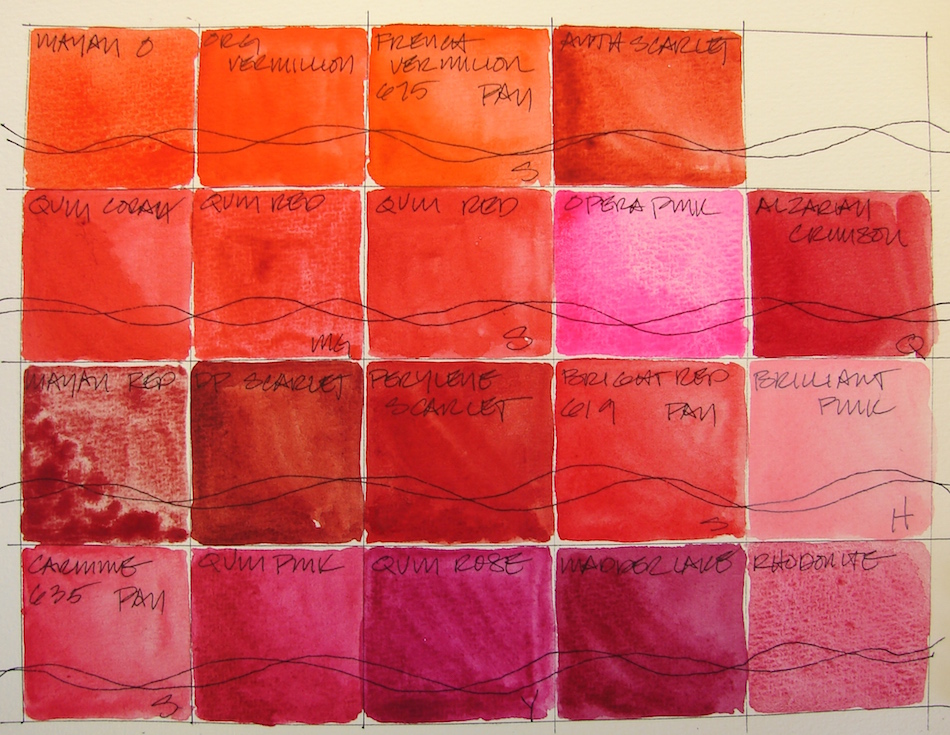


Sennelier makes a beautiful Quinacridone Red, PR209;
MG makes a muddier version, also PR209. The muddiness must be the honey binder.
There is also Quinacridone Coral, PR209.
Note these are all a bit different but all PR209!
 You don’t want to work with fugitive
paints — paints which are not
light-fast. Still, I can’t walk away from Opera Pink, Quinacridone, PR122, though it is fugative. You’ll see, there is
no other bright clear pink like it!
I’ve bought several Quinacridone pinks looking for it: while they are lovely,
they are not HOT PINK!
To see references on RED and MAGENTA from handprint, click through.
The Keepers:


Which are keepers? I love Quinacridone Coral and Sennelier Quinacridone RED 679, though both are supposedly PR209. Anthraquinoid Scarlet, PR168, has a muddy side, but is an excellent brick and building pigment, as is Perylene Scarlet, PR149. Perylene Red, PR178, is quite opaque, but beautiful, a true red. If only it were transparent! Love our first Primatek, Rhodonite, a grainy textural, lovely coral color!


Pale pinks are useful because of skin tones, and of course, Painted Ladies.
Holbein Shell Pink, PO73-PW6, is a mainstay part of skin tones.
I am undecided about Holbein Brilliant Pink, PO209-PW6.
The Rarely or Never Agains:


Sometimes it is a matter of what I will use. Some I’ve discussed. MG’s Quinacridone Red, PR209, is muddy and slow drying in the pan. Sennelier Bright Red 619, a pan color, and Sennelier Carmine 635 PAN are both blah. I might buy Deep Scarlet, Benzimidazole, PR175, because it is a good brick color. Greenleaf & Blueberry’s Mayan Red reminds me of Victorian wallpaper: very grainy and swirly, but not in a good way. Mayan Orange I probably won’t buy again, as it is very close to Vermilion.
In a future next post I will talk about the Mayan Colors…
What they are, what I like and dislike about them.
Must build the collection to discuss!


Pentalic Field Journal, Platinum Carbon pen, and Greenleaf & Blueberry,
Sennelier, Holbein, QoR, M.Graham and Daniel Smith watercolors.
I agree to Creative Commons Attribution-Non-Commercial 4.0 International License, which you can learn more about by visiting the site, or,
visit my web page for a more user-friendly summary on my terms.
My images/blog posts may be reposted; please link back to dkatiepowellart.


Ahhh, this is very interesting and informative to me. I am trying to learn about transparent and staining pigments, mostly to try an avoid “mud” in my watercolors. I am master of creating mud!!! Ugh. Who knew there were so many shades of pink/red… I own only one red and one orange (can’t remember their names/codes) but seeing this, I would definitely put my red in the”blah” category. Time to explore!
LikeLike
There will be another one of these posts each Sunday for awhile. I’ve been putting a lot of energy into really looking at paints… The Quin colors are really wonderful!
LikeLike
Pingback: Tools: Watercolors, 1, Yellow-Orange | D.Katie Powell Art
Pingback: Tools: Watercolors, 3, Greens to Yellows | D.Katie Powell Art
Pingback: Tool: Watercolors, 4, Blues to Greens | D.Katie Powell Art
Pingback: Tools: Watercolors, 5, Violet and Purple! | D.Katie Powell Art
Pingback: Tools: Watercolors, 6, Browns and Golds | D.Katie Powell Art
Pingback: Tools: Watercolors, 7, Black, White, Grey and Sparkly Colors!! | D.Katie Powell Art