
Each Sunday this summer I am looking at my paint “collection”:
Tools: Watercolors, 1, Yellow-Orange
Tools: Watercolors, 2, Red-Pink
Tools: Watercolors, 3, Greens to Yellows.
I had to make myself purchase blues. I love turquoise blues, and bought Primateks
when I discovered them, and had Cobalt Blue and Ultramarine Blue because they
came in sets from Daniel Smith. I tend to use them only in landscapes, because what is around me is not blue — though I’d love to have an excuse to paint with blues everyday because I miss home, the deep blue Pacific. I think blues are tricky, and doubt I explore more blues than the ones I am keeping now, because so many disappoint:
muddy, thick, not what blue should be, which is clear and clean and refreshing.
 NOTE: All paints Daniel Smith (DS) unless it says
otherwise — including the Primatek colors.
 First, let’s talk colors that look the same,
have the same pigment structure,
or are called by the same name out of the way:
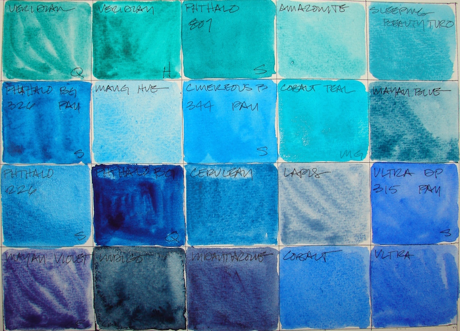


QoR Viridian, Hydrous Chromium Sesquioxide, PG18, and Holbein Viridian, PG7,
are called by the same name but the pigments/formulas are different.
Bruce MacEvoy from handprint has this to say about it: “Holbein’s “viridian”, although it provides a nice granulation, is formulated with phthalo green, their “cobalt green” doesn’t match the color of genuine cobalt green, contains no cobalt, and doesn’t use the word “hue” in the name to indicate it contains no cobalt: four strikes, you’re out.”
(BTW, I bow to the work MacEvoy has done — I have much to learn. Kindergartner here!)
“Below, Sennelier Phthalo Blue 326, Sennelier Phthalo Blue 326 PAN,
and QoR Phthalo Blue, are all PB15:3, though the QoR is very dark.


Then there are the comparisons between pan and tube watercolors with the same pigments: Sennelier Phthalo Blue 326, and Sennelier Phthalo Blue 326 PAN, both PB15:3, and Ultramarine Blue (and French Ultramarine Blue) and Sennelier Ultramarine Blue 315 PAN, also both the same pigments, PB29.
To see references on BLUE and GREEN from handprint, click through.
The Keepers:


By now if you’ve been following the Sunday’s watercolor posts, you know I love brilliant and clear bright colors. So which are keepers? Surprisingly, I’m keeping Holbein Viridian, PG7, for now, but may try MacEvoy’s recommendations in future.
I like it for the reasons he doesn’t — it has such variation: it can be almost a black-green and lighten to a brilliant blue green, the color of a Carmel, California cove.
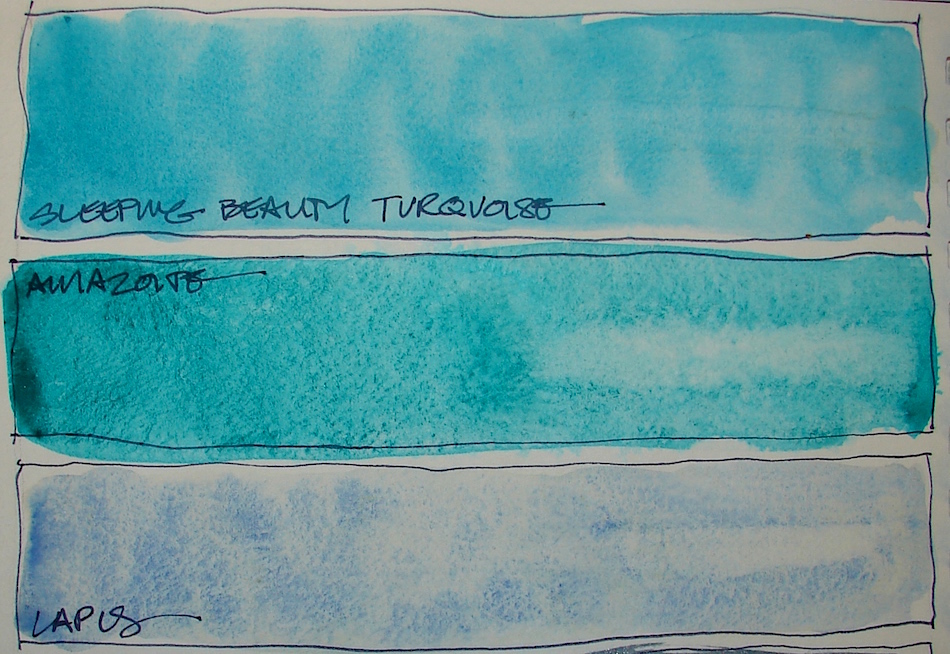
 Primatek Amazonite, Primatek Sleeping Beauty Turquoise, and Primatek Lapis, are all keepers. Lapis makes a base for easy skies, often combined with Manganese Blue Hue, or the littlest touch of Cobalt Blue, or even QoR Indigo, Right, I used it in
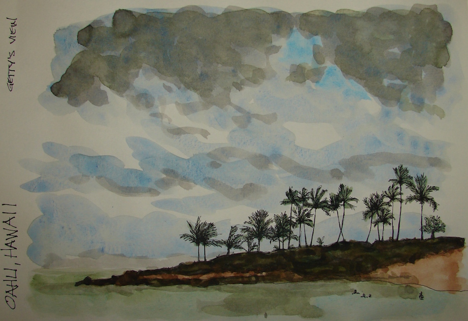
sky and ocean, mixing with green to create the ocean colors.
 Keeping M.Graham’s Cobalt Teal, PB28, is a surprise. It is opaque, so not one of my favorite paints (though the color is a favorite colors), but there is nothing like it in a transparent watercolor. It thins nicely in a wash, left. I may try it in DS next time, as MG’s tends to separate and not dry thoroughly.
Other keepers: Manganese Blue Hue, Phthalocyanine, PB15, a lovely soft hue
which I use frequently in skies. I’ll keep Cerulean Blue Chromium, PB36,
though it is more opaque than semi-transparent. Sennelier Phthalo Blue 326, PB15:3, brilliant and clear, and QoR Indigo, PB15:3 / PBk7 / PV19, a staple —
but I may move to Daniel Smith’s versions. Indigo and Indanthrone, PB60 make for heavenly night skies mixed with Lapis. Finally Cobalt Blue, PB28, the clearest
true blue I have , along with Ultramarine Blue (and French Ultramarine Blue), PB29. I will give DS a hard time for the latter two names on the same color,
I have both, and they are EXACTLY the same color. Fool me once.
The Rarely or Never Agains:


QoR Viridian, Hydrous Chromium Sesquioxide, PG18, is more expensive and less creamy than Holbein’s. QoR is a bit muddy. Sennelier Phthalo Green Deep 807, PB15:3 / PG7, QoR Phthalo Blue, PB15:3 is too dark and muddy.
I will use up the pan colors, but not replace them because they just aren’t as brilliant
as the tubes: Sennelier Phthalo Blue 326 PAN, PB15:3, Sennelier Ultramarine Blue 315 PAN, PB29, and Sennelier Cinereous Blue 344 PAN,
Finally, I am unimpressed by the Mayans:
Primatek Mayan Blue and Greenleaf & Blueberry Mayan Violet.
In a future post I will talk about the Mayan Colors…
What they are, what I like and dislike about them.
Must build the collection to discuss!


Then there is this, because, well, Linda.
Pentalic Field Journal, Platinum Carbon pen, and Greenleaf & Blueberry,
Sennelier, Holbein, QoR, M.Graham and Daniel Smith watercolors.
I agree to Creative Commons Attribution-Non-Commercial 4.0 International License, which you can learn more about by visiting the site, or,
visit my web page for a more user-friendly summary on my terms.
My images/blog posts may be reposted; please link back to dkatiepowellart.


Good song choice today! Blues and greens are a struggle for me. It is interesting to see you work through it though.
LikeLike
Glad you enjoyed… you know, I have a whole thang on color blindness coming soon….
LikeLiked by 1 person
I look forward to that. I wrote about it a while ago. It’s not as bad as it seems, but when I see entire pallets of color, it’s apparent.
LikeLike
Next week…
LikeLiked by 1 person
Pingback: Tools: Watercolors, 5, Violet and Purple! | D.Katie Powell Art
Pingback: Tools: Watercolors, 6, Browns and Golds | D.Katie Powell Art