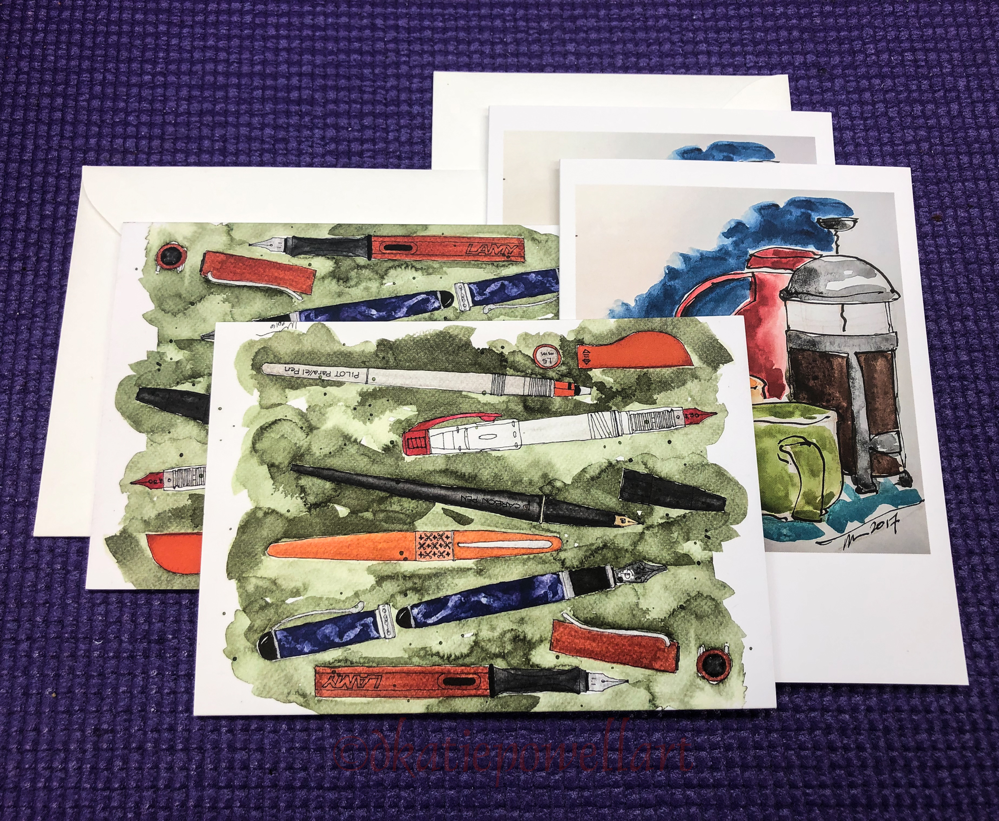
Inky Thots: Birmingham Allegheny Observatory Celestial Blue

 I like what Birmingham says on their website:
“We started Birmingham Pen Co. in 2012
in the Southside of Pittsburgh, Pennsylvania,
with the doors of our first retail shop opening
to the public in 2016. The region of Pittsburgh
where we began once called “Little Birmingham”
due to the area’s prolific manufacturing industry
in the early 1900’s. The Birmingham moniker
was derived from Birmingham, UK –
a manufacturing hub that specialized in,
among other things, pen and nib
manufacturing with thousands of
craftspeople employed in the industry.
We chose the name Birmingham Pen Company
to share this little known piece of history and
continue in the traditions behind the name.”

Birmingham also turns their own pens,
which I’ve noticed often sell out as fast as they make them!
*I am currently in line for the
“Model-A Demonstrator Fountain Pen, Violet Beauregarde,” hint hint!*
A small family business started by the brothers, Nick and Josh,
Dad is the chief pen machinist, and Mom does one of the coolest things about Birmingham, which is their amazing historic names!

This brings us to one of the prettiest dark blue inks,
Birmingham Allegheny Observatory Celestial Blue.
It is named after the Allegheny Observatory, opened in 1912.
Designed by Thorsten E. Billquist in the Classical Revival Style,
it is part of the University of Pittsburgh campus, and is now on the
National Register of Historic Places.

Remember that others review these inks just for writing;
I am also interested in how they are used for ink-painting!

Properties of Birmingham Allegheny Observatory Celestial Blue ink:

Celestial Blue is a well behaved ink
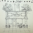
which dries relatively quickly.  It feathers slightly on Post-its, but not in my Hahnemühle Nostalgie journal even with a wet writer, right, nor on watercolor paper, above. When I scrubbed it, it seemed to be water resistant, and further test sketches in my journals show it to leave a good imprint of water resistant ink lines when the waterbrush moves the color, easily.

*Above, watercolors from Daniel Smith.*

When painting, it first goes on the paper with a hyacinth blue cast, then deepens.
Looking at watercolor comparisons, the colors fall in the Indigo to Indanthrone range.
It is closer to Indigo but has a bit of that brighter Indanthrone blue.
In watercolors that puts the pigments in the following Munsell ranges:
PB 15:3/PBk7/PV17 and PB60.
*For more info go to this page.*
It has no sheen that I could produce, and is not a strong shader, so I don’t consider this a complex ink color.  Above you can see the pretty blue that pulls out of the dark writing ink.

MOST water soluble ink companies do not pay attention to lightfast qualities and Birmingham is no different.  Most artists who use ink are making prints of their work —
But ink-painting is becoming more interesting so maybe it is time!


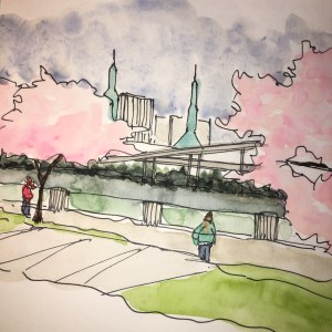
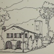
I drew the Allegheny Observatory on my test page with a
FPR Muft pen with a 1.0 stub nib (below on cold press watercolor paper,
and touched the lines with water using a Pentel Aquash waterbrush.
This was a 30 minute sketch with water movement…
The lines stay slightly visible but also release ink; which means slight water resistance.
I did not add linework in, but left some lines untouched.


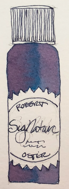
I’m committed to drawing every bottle too;
Birmingham’s are nothing special but they are glass, and functional, even in the small sizes.  I like glass bottles; they feel like they will last longer.
In my Hahnemühle Nostalgie journal, with the pen that is currently hosting it!


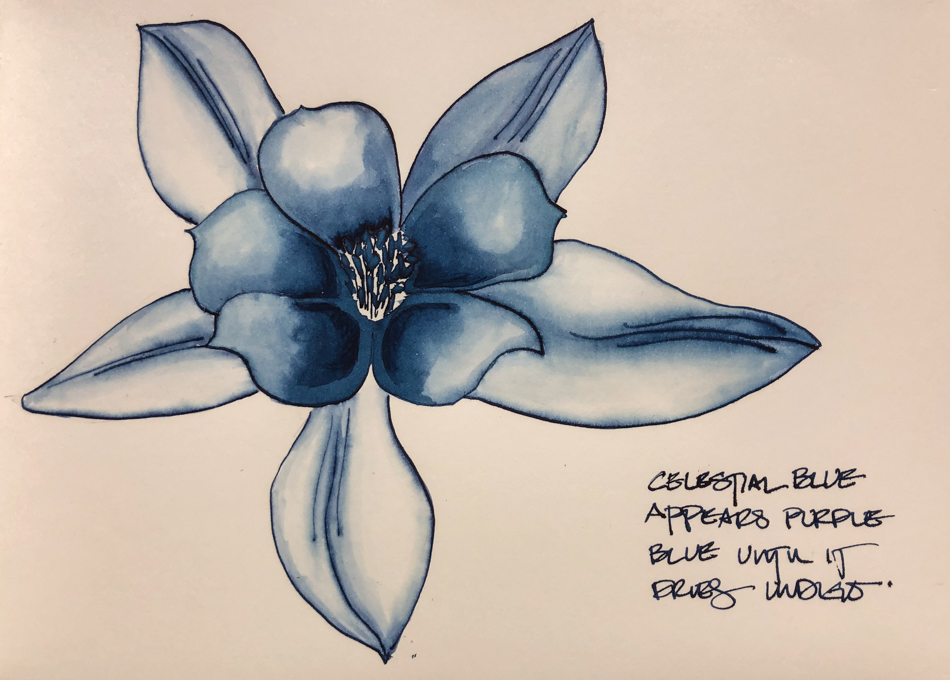
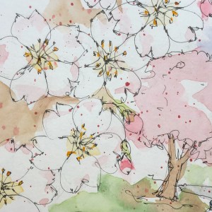
You can see the water resistant properties best in this posie,
as the lines of the ink stayed even after being hit with water.
They were not scrubbed, but the waterbrush was run repeatedly across
them lightly to move the ink where I wanted it to go.

Disclosure, I bought my own inks from Birmingham.

To hear about classes, follow me on Facebook
or check out my new, improved dkatiepowellart.com

Posted in art journal, creativity, drawing, ink painting, journal, painting, pen & ink, process, review, sketchbook, watercolor, writing | Tagged , , , , , , , | 6 Comments

Inky Blue Posie


My inky posie is in Birmingham Allegheny Observatory Celestial Blue ink.
This layered so nicely.  I used 2-3 layers, which often doesn’t work,
but maybe thoroughly drying in between helps —
Or the slight water resistance in the ink.
I won’t be sketching in color other than linework in this ink
because I didn’t know the lines would stay and I didn’t like the sloppy colored lines
I added at the base to bring in the dark ones.  Instead I will dip my brush tip in the ink.

Ink painting is a huge experiment for me!

To hear about classes, follow me on Facebook
or check out my new, improved dkatiepowellart.com

Posted in art journal, drawing, ink painting, painting, pen & ink, sketchbook | Tagged , , , , , , , , , , | 2 Comments

Wax Resist Pencils


I use a fluid resist sometimes, but an urban sketcher had a good pencil
he was using and I asked him repeatedly what that might be and
he even answered me once but without giving me the name of it…
so, withholding the name of a great tool, right?

I hate that!  I don’t do it!

So I bought one that described as what he said,
“A wax resist pencil”  Caran D’ache, above.  Not too good…

Then I tried every whitish colored pencil
(not the watercolor pencils) and the white one gave some resist… .


So I tried it again, pressing down.
So-so, though I love the colors mushed together.


I got more serious about it and made more images of Prismacolor white
and did it again, above, running inks over it.
Not what I want in a resist, but I like this effect.

Does anyone know of a good
resist pencil that works?

To hear about classes, follow me on Facebook
or check out my new, improved dkatiepowellart.com

Posted in art journal, creativity, drawing, ink painting, journal, painting, pen & ink, pencil, process, sketchbook, watercolor | Tagged , , , , , , , | 8 Comments

SoCS: Anti-Social

I  journal and do morning stream of consciousness exercises, and
I’m again participating in Linda Hill’s Stream of Consciousness Saturday. 
I write to a timer, 15-20 minutes, no editing except spelling, and of course I add my art!
You can do it too!
The Friday prompt for Stream of Consciousness Saturday is “social.” Write about the first thing that comes to mind when you think of the word “social.”

When I first heard the word for today, I thought of social media, and was going to write about how it is not making us more social, but maybe ill-mannered and righteous.

Then this morning I read news while waking, which I almost never do.

So here is the thing, my opinion.

The USA is a giant narcissistic antisocial two-year-old who cannot deal with facts
(many scientific ideas about global warming, for instance, including memory of normal weather, but no real scientist that is saying it is not happening),
and even if they did, does not care about the welfare of their children,
their grandchildren, and so I say, the worst kind of narcissistic child ever.  EVER.

This is non-partisan.  Maybe more Dems discuss it, but wait,
in the last election the Democratic candidate give it a bit of lip service but was unconvincing because she was unconvinced of its importance,
and the other one is the poster boy for the narcissistic two year old.
*I am over apologizing to Trump supporters…
I mean, come on: Megalomaniac crazy man.  You picked the wrong child.*
Obama talked about having this or that done by 2020 and here we are…
I guess they thought we had time despite what scientists said.
Nothing done, not really.

I mean, we have to get moving, each and every one of us.

The USA does more damage than any other Western society,
as they live in homes sized for their activity and family size,
drive less, waste less, use less fossil fuel…
Our war machine, which is not necessary, is a huge culprit;
this is what made me skip writing about social media this morning
and focus on our general stupidity as a nation.
It is not that the two year old is stupid, but two year olds grow up
in the face of peers who don’t like them, facts,
and being shunned by parents who say “go to your room.”
If they don’t, they become dangerous madpersons..

I don’t see us growing up.

Sine qua non.
Without this, nothing.

For the rules, go to Linda’s blog;  feel free to join the fun!

Posted in art journal, creativity, journal, pen & ink, sketchbook, writing | Tagged , , , , , , , | 8 Comments

Bottles!

Bottles matter!

The right bottle helps sell your ink!
A nice shape, brown preferably because it helps protect the ink inside.
A not too tall bottle or pear shaped is ideal so it doesn’t tip.

And of course, a beautiful bottle is amazing.

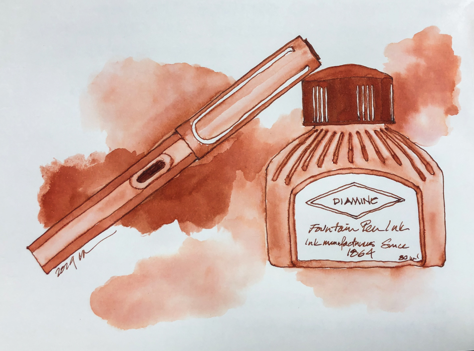
I am not sure why Diamine changed their old bottle, as it was lovely.
Simple, nice shape, proportional, and the lid was a nice lid that fit well
and looked as if it belonged to the bottle, not borrowed from another bottle.
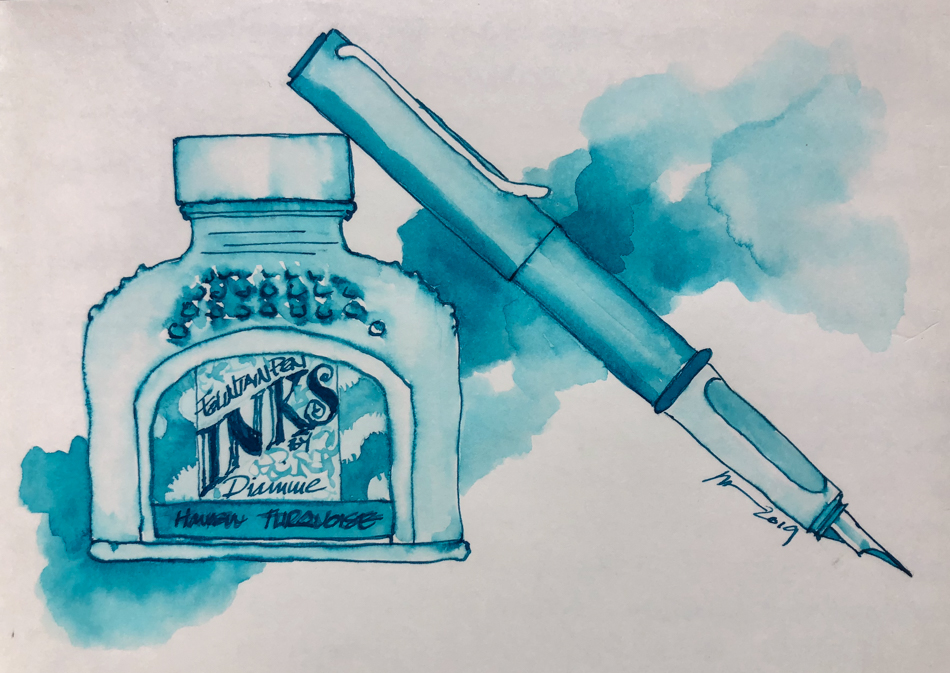
The new bottle is not bad, a bit taller proportionally.
But, it has an ugly gold lid that doesn’t work!


The older bottle, above, of Diamine Ancient Copper ink.

The top, and the way the
top seals is critical because
if the bottle tips with the top on tight and ink spills,
you lose ink, you stain things, and no one likes to clean up ink…  But there is more —
If you have your top screwed on tight and it leaks then
air is also getting into the bottle which means it is evaporating… And this is exactly what the new gold
tops from Diamine do,
they leak even when on tight.  Right, the leakage with the
top screwed on TIGHT…

The newer bottle, below, of Diamine Havasu Turquoise ink.

Understand, I LOVE Diamine inks. 
I just don’t love the new bottles…

To hear about classes, follow me on Facebook
or check out my new, improved dkatiepowellart.com

Posted in art journal, drawing, ink painting, pen & ink, sketchbook, writing | Tagged , , , , , , , , , | 4 Comments

VSW: Tuileries, Paris


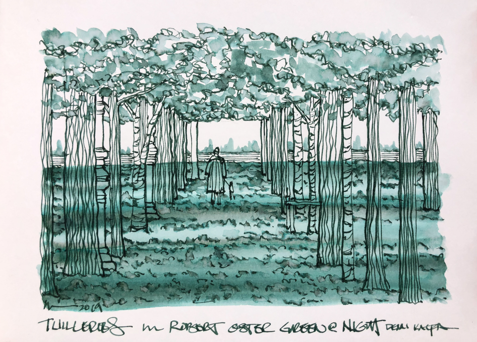
Tuileries, from an image
by Demi Kalfa for
Virtual Sketchwalk.

Robert Oster’s Green at
Night
is new to me,
on sale at Vanness in
Grandpa’s Basement
.
*I shouldn’t tell you about Grandpa’s basement
because, more for me.*

It has rich undertones of
black and also touches of
warm yellow, though it is hard
to see in the washes above.

I have been told that the way an artist crops an image changes the way the piece feels.
Maybe that is why I like playing with cropping after the fact…
Included in this cropping is the banner above (if you can see it on your phones.)
But I’m not sure about this.  I think it is line or brush stroke and color.

What say you?

*meanwhile, these french words are driving my dyslexia insane…
i double check spelling and still! u,e,i,l… i mix hem up when writing!*

To hear about classes, follow me on Facebook
or check out my new, improved dkatiepowellart.com

Posted in architecture, art journal, creativity, drawing, ink painting, journal, painting, pen & ink, process, sketchbook, writing | Tagged , , , , , , , , , , , , , , , | 6 Comments

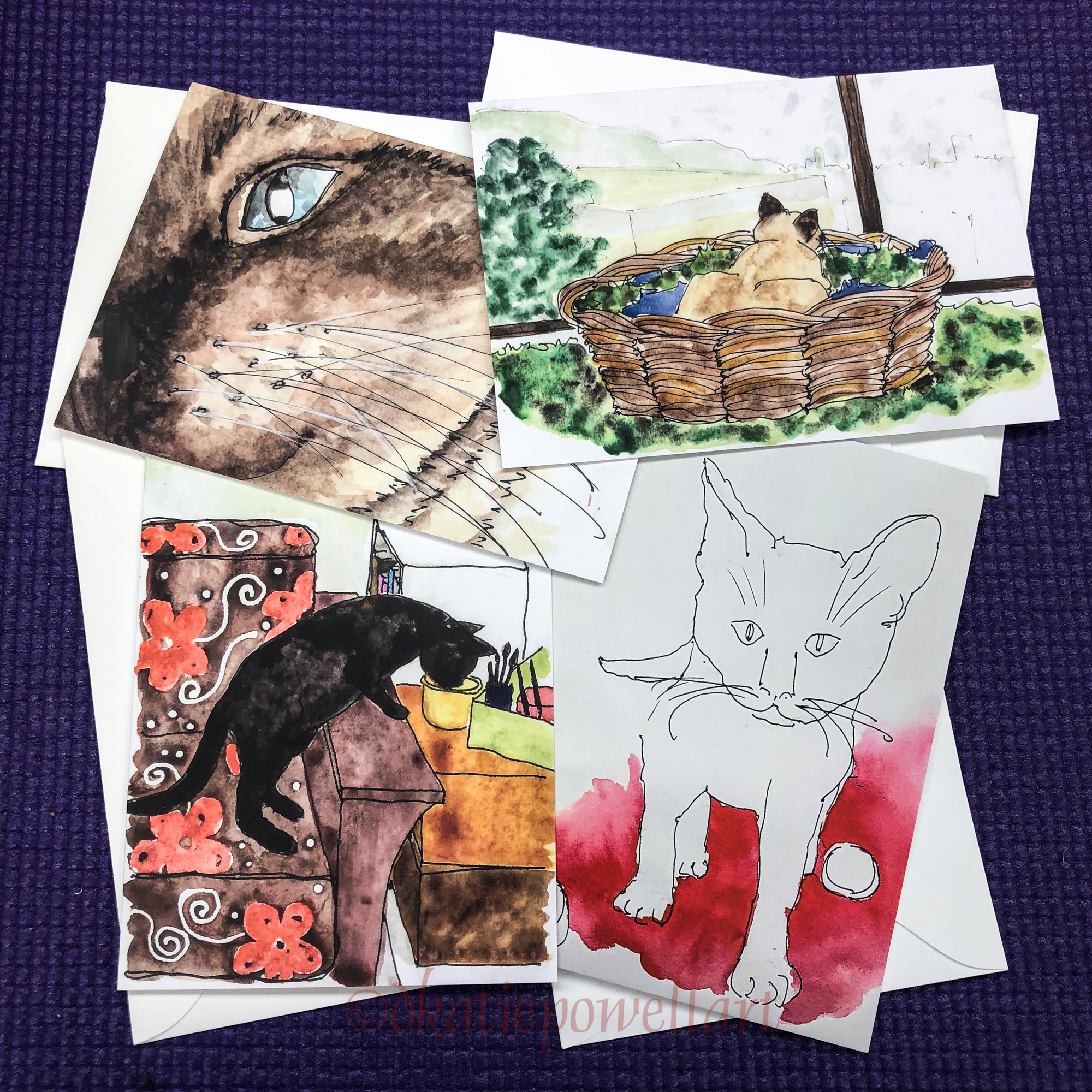
Puppy Postcards

And the showdown, water color versus ink!

Okay, we know that watercolors, good ones, have light-fast ratings.
This is a huge plus for sending postcards that someone might stick on a wall…
PBeaux (left) should last longer than Poppy (right)
especially the bright orange bowl he is sitting in.

Inks are much harder to paint with, they bloom much more easily than watercolors
Still, I love them!


He was a pup when this picture was taken…
Platinum Carbon pen and ink with watercolors.


He was a pup too, that fit in a Fiesta Bowl…
I had intended to borrow images from @muchofiesta (IG) for his lovely colorful bowls,
but look who caught my eye… his new Boston Terrier.

I do commissions!

To hear about classes, follow me on Facebook
or check out my new, improved dkatiepowellart.com

Posted in animals, creativity, drawing, ink painting, painting, pen & ink, portrait, watercolor, writing | Tagged , , , , , , , , , , , , , , , , , , | 2 Comments

VSW: Palais Bourban, Paris


Trying to participate in my Virtual Sketchwalk group more again…
Even quick sketches keep my hand in the game.

Palais Bourban, Paris, in a Jinhao 750 with JoWo nib and Super5 Darmstadt ink.
*Darmstadt is not an easy work for a dyslexic who regularly spells dharma…
I keep wanting two work an H in there!*

To hear about classes, follow me on Facebook
or check out my new, improved dkatiepowellart.com

Posted in architecture, art journal, creativity, drawing, ink painting, journal, painting, pen & ink, process, sketchbook, writing | Tagged , , , , , , , , , , , , | Leave a comment

Patriotic Jumper in Grey


The Patriotic Jumper is actually white.  He is huge, almost the size of a horse, and he is one of my favorites.

He ended up grey because
I had to save a perfectly good drawing which I messed up.
I reached for waterbrush
pens I had never tried and OOPS! they pretty well ruined a drawing with good linework in Birmingham’s Tarnished Nickel.  This is when he became a grey horse…
to save the drawing!

To hear about classes, follow me on Facebook
or check out my new, improved dkatiepowellart.com

Posted in art journal, challenge, creativity, drawing, ink painting, journal, pen & ink, process, sketchbook, virtual sketching | Tagged , , , , , , , , , , , , , , , | Leave a comment

SoCS: Grace

I  journal and do morning stream of consciousness exercises, and
I’m again participating in Linda Hill’s Stream of Consciousness Saturday. 
I write to a timer, 15-20 minutes, no editing except spelling, and of course I add my art!
You can do it too!
Your Friday prompt for Stream of Consciousness Saturday is “open book, point, write.” Pick up the closest book to you when you sit down to write your post. Close your eyes, open the book, and place your finger on the page. Whatever word or phrase your finger lands on, write about it. Enjoy!


A note after, wow this is long… I wrote longer than the timer!

Oddly enough, the only book next to my desk is my calendar
and I wrote a bit about grace yesterday and
had the word grace in a dozen places and grace is what it landed on.
Not “the”, which I thought would be very funny!

I took the time to look it up — just curious —
and the oddest thing is that the dictionary is SO Christian!!!
Their definition (of the type of grace of which I am thinking) is this:
“the free and unmerited favor of God” but then they wax on about Christian notions.
It assumes so much without owning that it does…
The Christian Dictionary is owning it.

God gives you a lovely path to walk if you are good?

That God controls destiny (which is not even what I was taught as a Catholic
when I argued with the nuns which btw got me kicked out of catechism at 5
because I wanted to know if God was so dang powerful why not just
STOP the devil from doing all this bad stuff like starving children?)
“Mrs. Beck, She is disrupting class again.”
I was right… You can’t have it both ways, so “free will” is present
and then the chips begin to fall where they may which is one reasons
why I switch teams and now bat for the Buddhists because, frankly,
without even considering god or no god, is more consistent and logical.

Okay this was not where I was heading before the detour of the dictionary,
which really should be non-denominational and tell us all religions ideas on “grace”
or leave off the overtly religious attitudes.

When I think of grace I think a bit of being in the flow.
Coming to the suchness of the situations and wrapping your attitude around it
and working with it when it is not what you thought you wanted.
So often what you didn’t want is actually some part of your path.
I never know what to say about the terrible stuff but I will tell you that when my former husband died I thought it was one of the worst things to happen to me but it brought Mitchell into my life, and honestly, I had a pretty bad marriage before, very disconnected and distant and I put up with all of it because I had not fully imagined THIS…
not consciously, anyway, to be lovers and best friends.

The Great Recession wiped us out and I am not sure where the trajectory will land us
(the story is not over)
but I will say that seeing the tsunami that was about to hit us and
moving into the wave to take whatever control over what happened
instead of fighting and denying it allowed us to survive with our business intact.
Friends did not recover, and no one wants to acknowledge the horrid things that good hardworking Americans have walked through in the last few decades.
They lost their business or job and went to live with their kids and never found a job.
We are not wealthy and we struggled (who didn’t)
and frankly are working much harder than we should at our age
and have not “recovered” what we lost
BUT BUT BUT but we are here and we work with each other and we are doing our craft.  We get to have out cats at work, how great is that?
We are not working separately at horrid jobs
(I worked taking payments at night for a bit to tide us over while he held down
the business and we were miserable BUT a great project saved us.)
There is grace in our lives.

So grace is being at one with, moving into the wave so it doesn’t knock you over, and getting back up if you slip and fall on your butt.  Reading the tea leaves as best you can.

AND BEING GRATEFUL.
IF I DID NOT PRACTICE DAILY GRATEFULNESS
I AM SURE I WOULD NOT HAVE MADE IT.

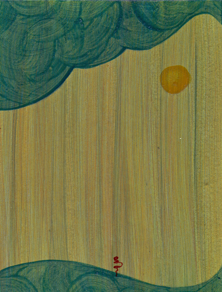
Below, Tsunami image… Acrylic, from 1995.

For the rules, go to Linda’s blog;  feel free to join the fun!

Posted in art journal, creativity, journal, pen & ink, sketchbook, writing | Tagged , , , , , , , | 7 Comments

30×30 Direct, Week 1, Finito


Okay why did I try this again?
Because I love Marc Holmes as a teacher (follow his blog artists)
and he is very gung ho on this.  I used inks not watercolors.

But a week later I still hate it.
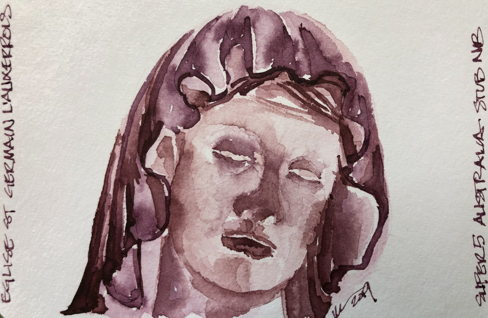
Of course, I overworked the first one of Église Saint Germain l’Auxerrois!

Turns out I really really love my pen, the feel of ink on paper!


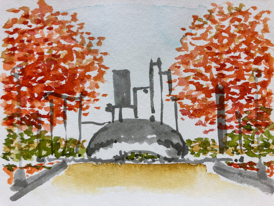
The Chicago USk event is on this week and
I did the Bean as a tribute to them.

I kinda had fun with this one..


I switched to flowers on Hahnemuhle Postcards
and had fun with this….


But not as much fun as this and
that is not direct watercolor!

See all those sexy sexy lines?  FUN!


Again for Virtual Sketchwalk I tried the Madonna at the Église Saint Germain l’Auxerrois.
Not to bad, but not fun.  Belabored.  Does it show?


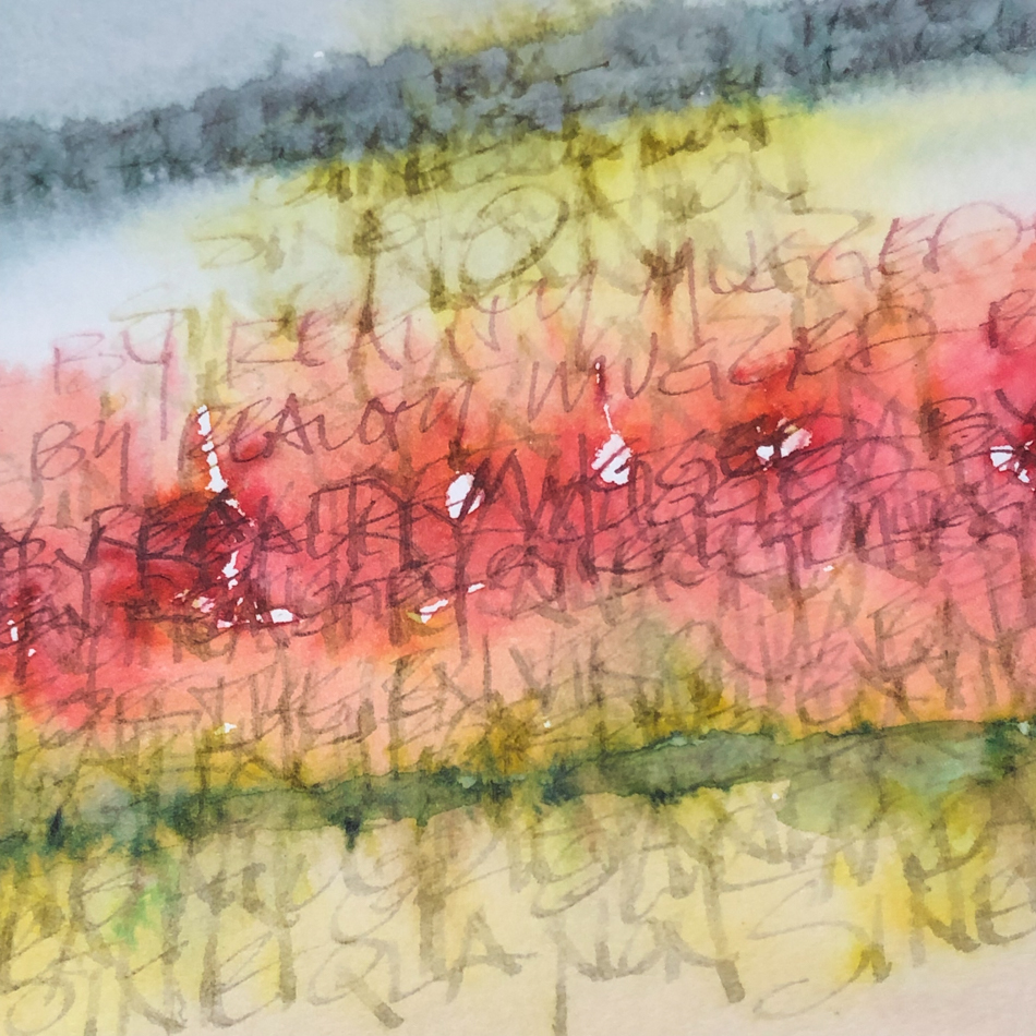
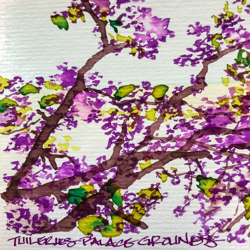
Layered inks of the Tuileries, Paris.  Postcard.

So I think I am done with
the direct watercolor challenge.

I have already sketched several other images
but the key is I had fun, dammit, with a PEN!

To hear about classes, follow me on Facebook or
check out my new and improved dkatiepowellart.com
and sign up for my newsletter!

“Memory is more indelible than ink.”
Anita Loos, Gentlemen Prefer Blondes.
“I think not….”  Me.

Posted in creativity, drawing, ink painting, painting, pen & ink, watercolor | Tagged , , , , , | 2 Comments

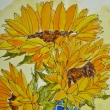
Sunflower


Mitchell brought me early sunflowers to cheer me;
I love sketching their cheery faces!

To hear about classes, follow me on Facebook
or check out my new, improved dkatiepowellart.com

Posted in art journal, color, journal, process, sketchbook, virtual sketching, watercolor | Tagged , , , , , , , , , , , , | Leave a comment

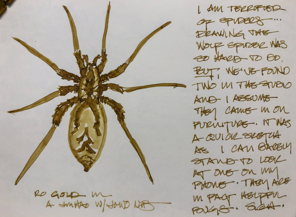
Wolf Spider

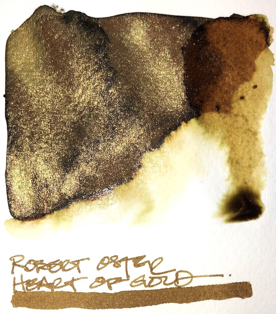
Stared with linework then tried to switch to a wet brush
using Robert Oster Heart of Gold ink.
Spiders scare me badly; I’ve done a lot of work on them.
I don’t kill them anymore unless they crawl out from under my keyboard
or some such nonsense then I figure they were committing suicide.

I am not a shimmer-fangurl but oh my gawd look at this!

.

To hear about classes, follow me on Facebook
or check out my new, improved dkatiepowellart.com

Posted in art journal, creativity, drawing, ink painting, journal, painting, pen & ink, sketchbook | Tagged , , , , , , , , , , , , | 6 Comments

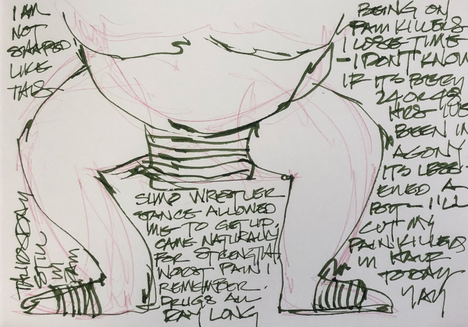
Pain


It showed up Tuesday morning, pain so bad I could barely move…
Seriously, I’ve dealt with pain all my life (dancer injury)
But I said to Mitchell, Shoot me NOW!”

I had pain killers and muscle relaxers and used them —
I was quite loopy so did things on the laptop that I could do —
NO running numbers, but editing and dropping in images.

Did I say I couldn’t use the stairs?
Working in BED!


I began to move like a sumo wrestler, a wide stance that grounded
and helped me to feel I would not tip over.
Day two the pain lessened by half.

It is likely that the deli changed a recipe.
I am terribly allergic to potatoes — ever since I took the shingles vaccine at 50.
Until then I had no arthritis and my only (mild) food allergy was to avocados…
After the shingles vaccine I stepped into bad arthritis and one of the trigger foods is potatoes.  I ate them my whole life with no issue, and now even one potato chip sends
me into excruciating pain.  I am careful about potato flour, which so many are
using now in “gluten-free” meals.  I ask and stay far away.  But perhaps they
changed the recipe on something I checked out long ago and so I learned my lesson —
Always ask even on foods you’ve eaten before!

I tried some direct watercolor though.  That was only somewhat annoying!
And as I go to publish this I am going to climb the stairs to work tomorrow.
Knee still hurts but omi not by comparison…

To hear about classes, follow me on Facebook
or check out my new, improved dkatiepowellart.com

Posted in art journal, creativity, drawing, ink painting, journal, painting, pen & ink, process, sketchbook, watercolor, writing | Tagged , , , , , , , , , , , , , , , , | 10 Comments

VSW: Église Saint Germain l’Auxerrois, Paris

A comparison, direct watercolor versus linework….


I’m struglling with the 30×30 Direct Watercolor Challenge.
I’m doing it because marc Holmes is such an amazing teacher —
I learn things from him all the time and his work is so exciting —
So I want to trust him and go along on this ride.

BUT…

I miss lines.
Above, grisaille then color… no lines.


Oh give me lines lotsa lines under starry skies above,
Don’t fence me in (with your non-linear stuff)!

Listen they are both fast because I has to be because I couldn’t sit easily
due to the bursa but I got so much more pleasure out of the lines and
water touching lines and watching the lines move into a body of something…

I’ll keep at it until next Friday and see how I feel about it.
Nothing ventured and all that.

To hear about classes, follow me on Facebook
or check out my new, improved dkatiepowellart.com

Posted in architecture, art journal, creativity, drawing, ink painting, journal, painting, pen & ink, process, sketchbook, writing | Tagged , , , , , , , , , , , , | 7 Comments

SoCS: New Moon Silence

I  journal and do morning stream of consciousness exercises, and
I’m again participating in Linda Hill’s Stream of Consciousness Saturday. 
I write to a timer, 15-20 minutes, no editing except spelling, and of course I add my art!
You can do it too!
The Friday prompt for Stream of Consciousness Saturday is “silent/silence.” Write about the first thing that comes to mind when you think of the word “silent/silence.”

Hmmm favorite activity…

Because I am talkative people can’t believe I love to go into silence.
It is a tradition that we try to observe silence at the New Moon.
It is a natural time to be quiet, to go within, to reset your body/mind
from a cycle of doing, rushing, activity-ing…
When I do it, I can feel the calm and the feeling of being in sync with the world.
When work just won’t allow the New Moon ritual,
I feel tired and cranky, a baby that doesn’t get that needed nap!

It is a time to be dreamy, think about where you are and
where you want to be or not think at all, just dream.
Around our house, we don’t observe complete no-talking,
but just keep the chatter down, and keep the tele off, unplug from electronics.
Slice of heaven.  We are in fact entering the Dark-of-the-Moon right now,
and oh I would love to take this week end off and be silent!
But especially because of being hurt this week, we can’t… deadline time.

For those that don’t know, I have a bursa issue;
I was on serious pain killers for a few days.
Coming off them now.

For the rules, go to Linda’s blog;  feel free to join the fun!

Posted in art journal, creativity, journal, pen & ink, sketchbook, watercolor, writing | Tagged , , , , , , , | 4 Comments

Coyote Cries

*warning… sad angry political post*

I love coyotes.  I love animals period.

The feds are going to allow them to be hunted for sport and are even making a game out of it.  I wept.  I am so over the top disgusted by these people.  DISGUSTED.


And I really hate hunting for sport —
as in, kill it for no good earthly reason except the joy of KILLING????
Crap, you are not going to eat the animal.
There is a family story where my brother Patrick was young
and out on the ranch with his gun and killed a porcupine.
My grandma made him strip it so they could eat it…
hard to do, they haven’t much on them, and her conversation with him
about it as he was trying to clean it taught him everything.
She cried.  He cried.  He never hunted for sport.
I grew up with very careful hunters who played by strict rules of engagement.
They only shot what they could eat, watched what was in short supply,
and for sport, cans on the fence, not live animals.

I see this as a prayer that the USA SOMEDAY MIGHT CHOOSE SANITY.
I see this killing-coyotes-for-sport as an war on the feminine.
May not be logical.  But there it is.

I am not holding my breath.
We are a mean vicious stupid people… Only by admitting it can you change it.


To hear about classes, follow me on Facebook
or check out my new, improved dkatiepowellart.com

Posted in art journal, creativity, drawing, ink painting, journal, painting, pen & ink, sketchbook | Tagged , , , , , , , , , , , , , | 1 Comment

Inky Thots: Robert Oster Jade

 From Robert Oster’s website:
“My great interest in fountain pen inks – and by extension inks
that combine many creative applications – began with the birth
of my love of fountain pens in 1989. 
The contents and packaging of my Inks are all nature friendly and
the colours a genuine inventory of the Australian palette.
“

His bottles are not the most beautiful, but I am happy
they are environmentally friendly bottles, created from recycled chemical waste!  His inks are non-toxic. This matters to me;
I started with fountain pens to stop the plastic pen trash.

I have more Robert Oster inks than any other brand.
Why?  Because no other brand has the spectacular
mix of pigments within a color, which gives even his simplest inks
such beauty that it is a shame to waste them on writing!

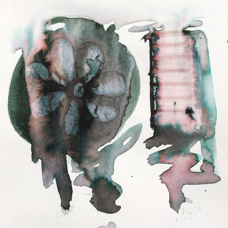
This love affair with ink pigments began with brushing wet ink on paper
(below) and watching the colors move and separate… pure color, floating on paper!
Yes, I CAN watch ink dry!  It is beautiful, art-full, and I take no credit for it!

Remember that others review these inks just for writing;
I am also interested in how they are used for ink-painting!


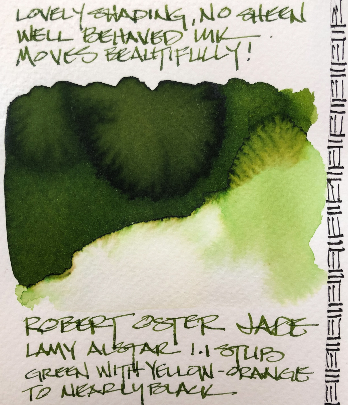
Properties of Robert Oster Jade:
Well behaved, for me this means neither dry nor wet,
and has enough body that it does not feather on the papers I use unless the paper is wet…
For the writers, I use it in my journal and on Post-its with no feathering issues.
Bleed-through is more about the paper than the ink!

Jade has no sheen, though when I tried to produce it by thickly
laying ink on the paper it I found the halo to be nearly black!
I will have to find a way to use that in my art… think the Black Forest in Germany!

*Above, four watercolors from Daniel Smith.*

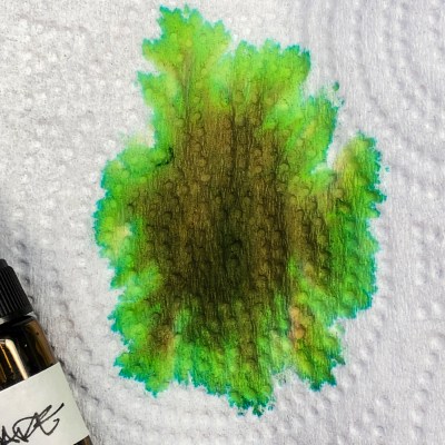
When the ink is dispersed on paper towel and water added, the electric yellow come through stronger!

When the edge is touched with water it moves easily with no resistance into yellow and rust tones. Looking at watercolor comparisons, the colors range from Sap or Green Apatite to Serpentine or Green Gold and a touch of Phthalo.  In watercolors that puts the pigments in the  Munsell ranges: P7, PO49, PG36, PY129, PY150, and Py3.

*For more info on the munsell system, go to this page.  Knowing the pigments can help you not to duplicate watercolors made of the same pigments.*

RO is experimenting and testing lightfast properties now…
MOST water soluble ink companies do not pay attention to these things
because most artists who use ink are making prints of their work.

 
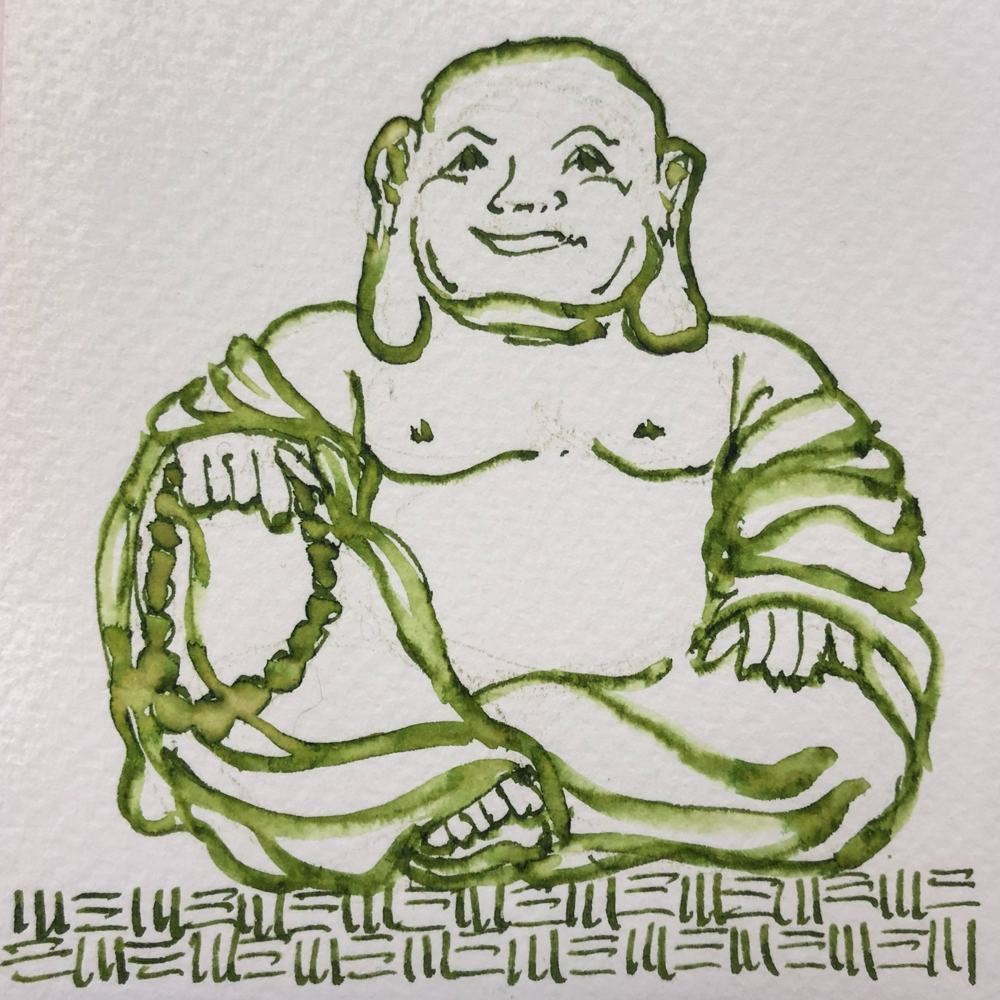
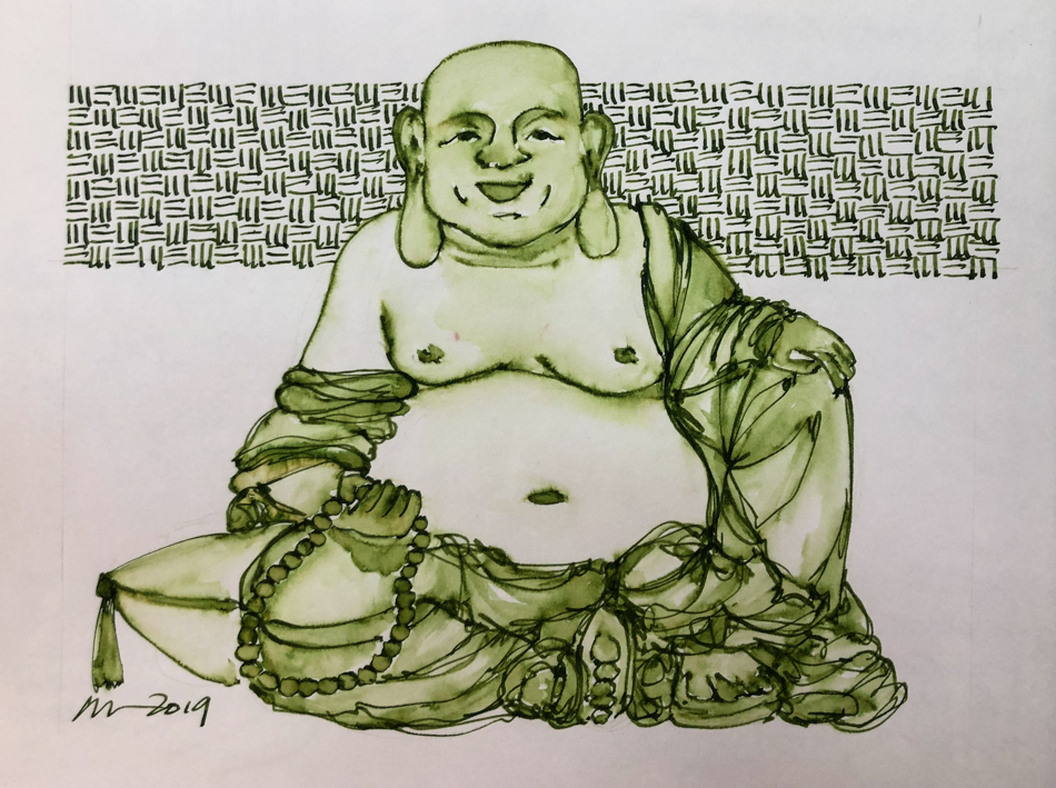
I drew Hotei Buddha on my test page with a
Lamy Al-Star 1.1 stub on cold press watercolor paper,
and touched the lines with water using a Pentel Aquash waterbrush.
This was a fifteen minute sketch…
The lines do not stay visible but quickly lose themselves in wet color;
if linework is wanted it has to be added back in after the water moves the ink.
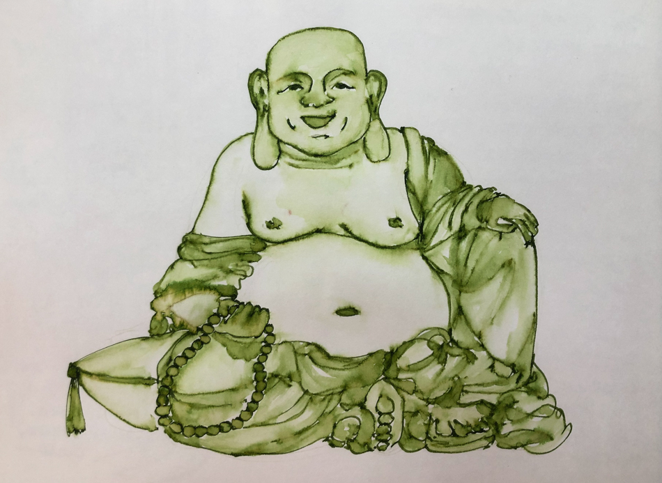
Compare the Hotei above with the one below, which was carefully layered.
See how the beads float into the edges of his robe?

In my journal I tried a second image, as Jade is not a color I’ve used by itself:

On smooth  Hahnemühle paper (my Nostalgie journal)
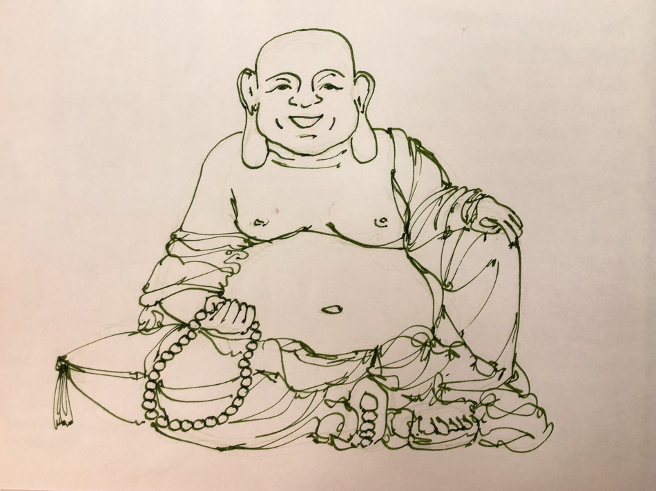
I sketched a second Hotei Buddha.


Penciled lightly with a watercolor pencil.
Sketched the loose lines of Hotei Buddha in Robert Oster Jade ink.
Erased most of the lines.


This time I slowed down when touching the waterbrush to the lines
in order to develop the layers.
I was careful to wet select areas at one time so wet ink did not migrate too far.
I started with the beads and his feet and part of his face first…
Separating these gave me a little bit of control,
but the lines still disappeared in many places.
Next I did the pillow, the rest of his face, soem folds on the robe
and his body and hands, letting those dry.
Finally I placed water on the robe layers.
Letting watery ink dry between layers takes about an hour on a 5×8 sketch.

I like it like this and sometimes stop here,
as I did above in the smaller cold press version.


Finally I come back and selectively add lines again.
I am not trying to go over the lines I did the first time
(that tends to come off stilted not flowing or spontaneous)
but just find my new way with the folds and details of his body.

If you want to know why I am doing this series, read yesterday’s post.
I will also do some videos to accompany the sketches.

Disclosure, this ink was a gift… what an amazing gift!
It was not given to me to review, however, just a gift.

To hear about classes, follow me on Facebook
or check out my new, improved dkatiepowellart.com

Posted in art journal, creativity, drawing, ink painting, journal, painting, pen & ink, process, sketchbook, watercolor, writing | Tagged , , , , , , , , , , | 9 Comments