


Bottles matter!
The right bottle helps sell your ink!
A nice shape, brown preferably because it helps protect the ink inside.
A not too tall bottle or pear shaped is ideal so it doesn’t tip.
And of course, a beautiful bottle is amazing.
I am not sure why Diamine changed their old bottle, as it was lovely.
Simple, nice shape, proportional, and the lid was a nice lid that fit well
and looked as if it belonged to the bottle, not borrowed from another bottle.
The new bottle is not bad, a bit taller proportionally.
But, it has an ugly gold lid that doesn’t work!
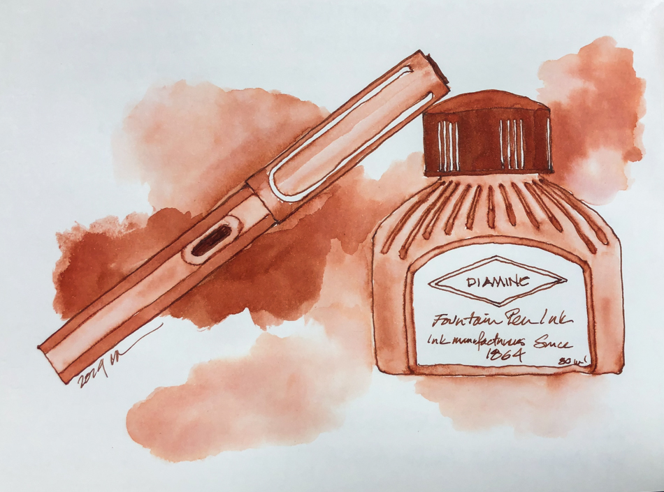
The older bottle, above, of Diamine Ancient Copper ink.
 The top, and the way the
top seals is critical because
if the bottle tips with the top on tight and ink spills,
you lose ink, you stain things, and no one likes to clean up ink… But there is more —
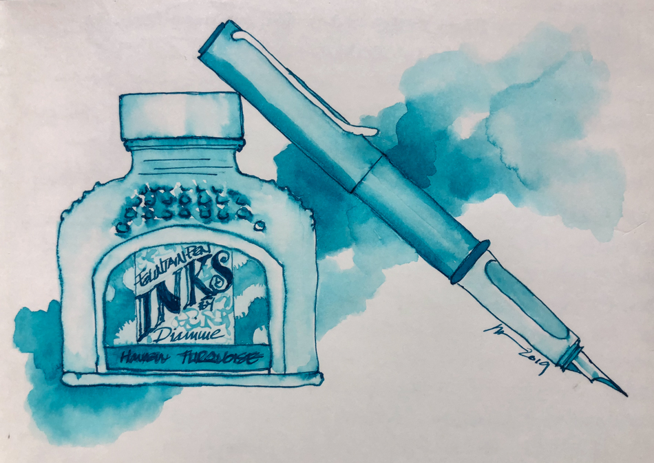
If you have your top screwed on tight and it leaks then
air is also getting into the bottle which means it is evaporating… And this is exactly what the new gold
tops from Diamine do,
they leak even when on tight. Right, the leakage with the
top screwed on TIGHT…
The newer bottle, below, of Diamine Havasu Turquoise ink.
 Understand, I LOVE Diamine inks.
I just don’t love the new bottles…
 To hear about classes, follow me on Facebook
or check out my new, improved dkatiepowellart.com
“Memory is more indelible than ink.”
Anita Loos, Gentlemen Prefer Blondes.
“I think not….”
Me… why I journal!
Hahnemühle journal, Pentel Aquash waterbrush,
Lamy Al-Star with Diamine Ancient Copper ink,
Lamy Al-Star with Diamine Havasu Turquoise ink.


©D. Katie Powell.
My images/blog posts may be reposted; please link back to dkatiepowellart.
☾
 As my Patreon supporter, you will have
access to some content not on this website,
sneak previews, goodies, discounts on classes.
I teach architectural sketching,
art journaling (art+writing), creativity, watercolors.
That annoying loud-mouth editor/critic in your head? GONE! How great would that be?


Your illustrations are lovely. I agree with you about ink bottle design being an important factor in the appeal of the ink.
LikeLike
🙂
LikeLiked by 1 person
Bummer. Hopefully they’ll get feedback and revert!
LikeLike
Probably not until they go through their stick, but maybe then. It is great ink!
LikeLike