Eva


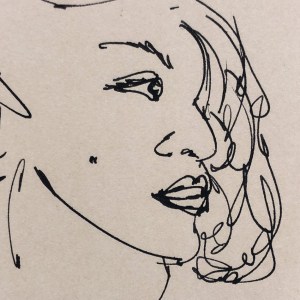
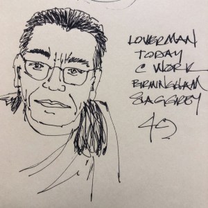
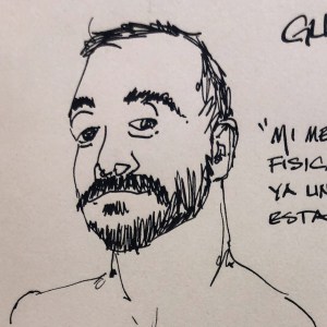
I sketched our tax gal… pretty good likeness!
Edison Nouveau 1.1 stub nib with Pilot Kiri-same ink

I am working in the Hahnemühle Cappuccino Sketchbook …
dedicating it to People sketches!
I did the 1Week100People. and decided to continue the process through this book!
When I am completed I will review!

To hear about classes, follow me on Facebook
or check out my new, improved dkatiepowellart.com

Posted in art journal, challenge, creativity, drawing, ink painting, journal, pen & ink, sketchbook | Tagged , , , , , , , , , , , , , , | Leave a comment

Fright Night


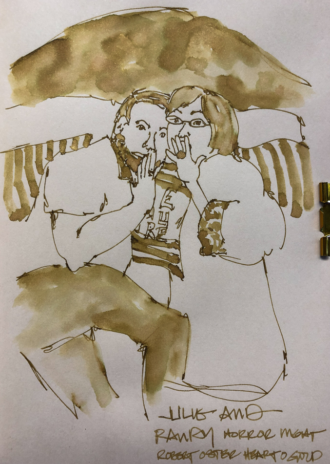
Two high school friends watching a horror show!
*i told you i’d complete my challenge of 100 peeps!*

 Robert Oster Heart of Gold… The ink color is as pretty as the sparkly stuff.
I know, I am not fond of glitter inks, but this one behaves surprisingly well!
Mitchell has it in his Lamy, and it is working fine;
I have it in my Jinhao with a medium nib and it is also working fine, no clogs!

I am working in the Hahnemühle Cappuccino Sketchbook …
dedicating it to People sketches!
I did the 1Week100People. and decided to continue the process through this book!
When I am completed I will review!

To hear about classes, follow me on Facebook
or check out my new, improved dkatiepowellart.com

Posted in art journal, creativity, drawing, ink painting, journal, pen & ink, process, sketchbook, writing | Tagged , , , , , , , , , , , | 2 Comments

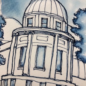
VSW: Sacré-Cœur Basilica, Paris


The Sacré-Cœur Basilica from a great distance.
20-minutes sketch… Maybe I need to set timers more often.
It really loosens me up!

To hear about classes, follow me on Facebook
or check out my new, improved dkatiepowellart.com

Posted in architecture, art journal, creativity, drawing, ink painting, journal, painting, pen & ink, process, sketchbook, watercolor, writing | Tagged , , , , , , , , , , , , , | Leave a comment

Inky Thots: Robert Oster Thunderstorm

Robert Oster comes in 50ml plastic bottles
that are environmentally friendly.
They can be tippy, so I usually put them in
a more solid container to decant.  All my pens fit
easily into the bottle opening to fill.

I have more Robert Oster inks than any other ink brand.
Why?  Because no other brand has the spectacular mix of pigments within a color, which gives even his simplest inks such beauty that it is a shame to waste them only writing!  Ink-painting brings out the complexity of the color.

I was given RO inks as a gift; up until then I used only waterPROOf inks, which I used under watercolors.
I loved the beautiful colors I was given — Jade, African Gold, and Blue Moon, a shimmer ink.  I had to have MORE.

When I first started buying RO inks, I went for the beautiful blues;
at the time I was not a lover of blue ink, but his amazing blue inks reminded me of home —  the Pacific Ocean of Southern California.


Imagine my surprise when I tried a dark blue ink, Thunderstorm,
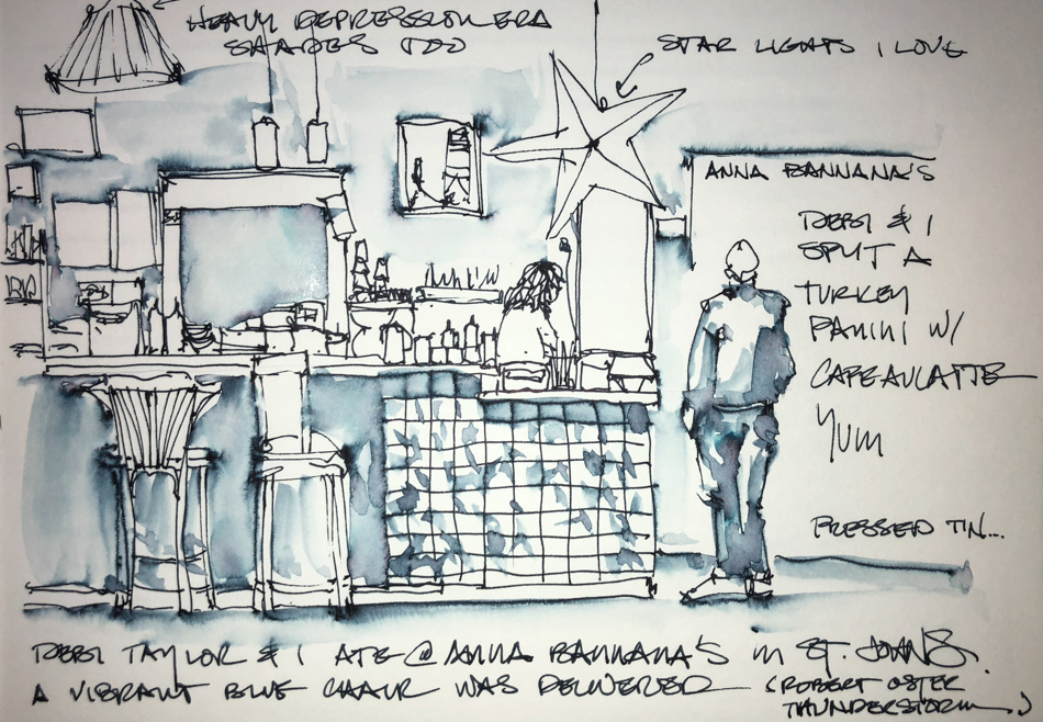
and saw a world of colors erupt from them when I first tried moving the color with a waterbrush when sketching with a visiting Aussie friend, Debi Taylor, above, my first.
The hint of a subtle world of colors lived in RO’s unassuming dark inks
opened up for me — and I was hooked on ink painting!

Remember that others review these inks just for writing;
I am also interested in how they are used for ink-painting!


Properties of  Robert Oster Thunderstorm:

One of my all-time favorite sketching inks (gads how many times will I say that in these reviews?) This juicy ink is well-behaved:  no feathering on any of the papers I normally use, even Post-its, and moves easily with no resistance when touched with water.  Though what I consider a wet ink, it evaporates quickly with a wet stub nib and has never smeared on me during a sketch.
It has a hint of a red sheen, above.  I think of thunderstorm as a
denim blue with a secret!

His inks are non-toxic; his bottles are environmentally friendly.
These things matter to me.

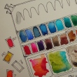
*Above, watercolors, from Daniel Smith, QoR, and Sennelier.*

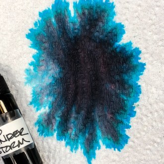
When the ink is dispersed on a
paper towel with water, a surprisingly strong turquoise seeps through!
In watercolor comparisons, the colors range from Indigo (PB15:3/PBk7/PV19) to Phthalo Blue (PB15:3) to
Cobalt Teal (PB28) and the mineral paints Lapis and Amethyst.
(Munsell ratings in () behind the
paint color. *For more info on the
Munsell system, go to this page.  Knowing the pigments can help you
not to duplicate watercolors made
of the same pigments.*

RO is experimenting and testing lightfast properties…
MOST water soluble ink companies do not pay attention to these things
because most artists who use ink are making prints of their work.


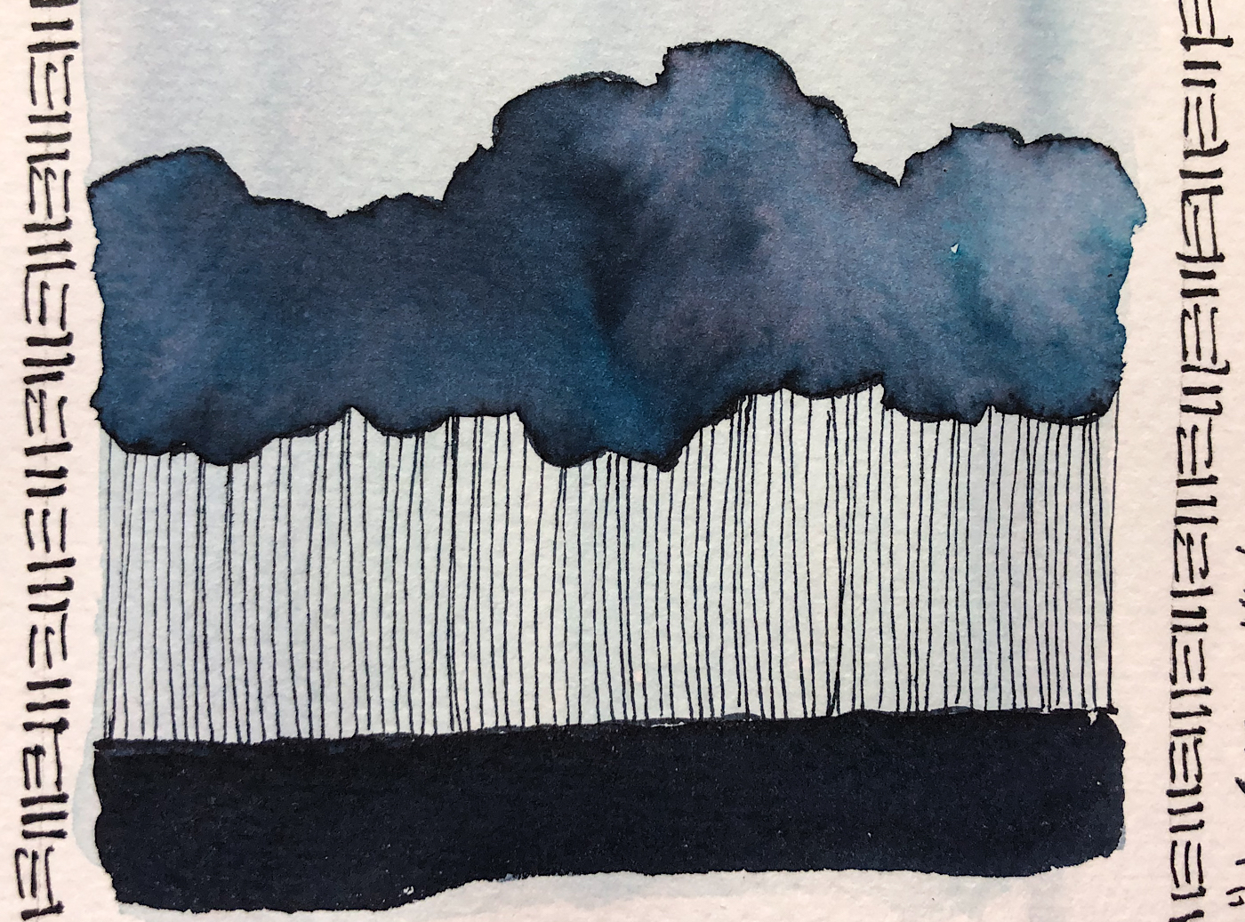
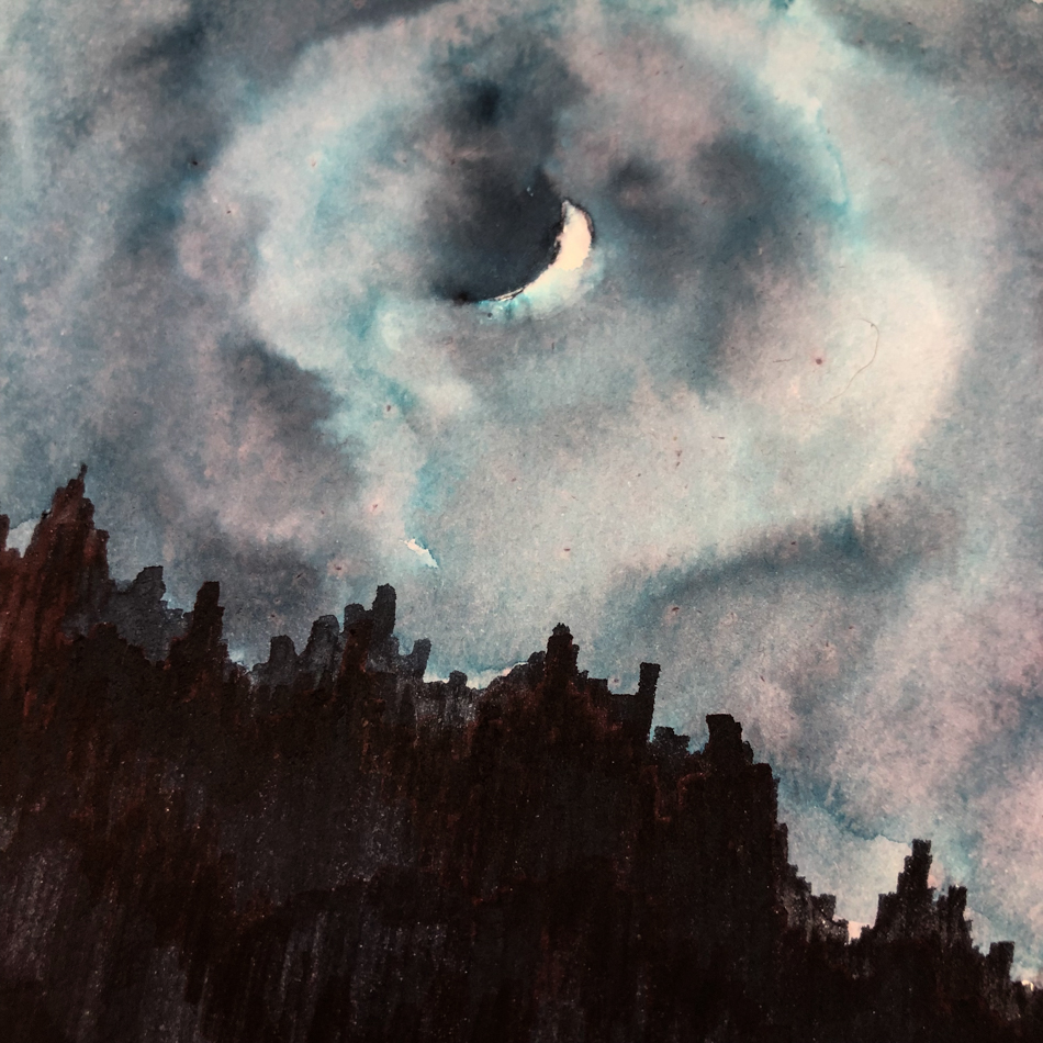
My “thunderstorm” was drawn with a  Lamy Vista with a 1.1 stub nib, on cold press watercolor paper.  The cloud edges were touched with water using a Pentel Aquash waterbrush.  The lines  quickly lose themselves in wet color;
The lines were added back in after the water moved the ink and dried!


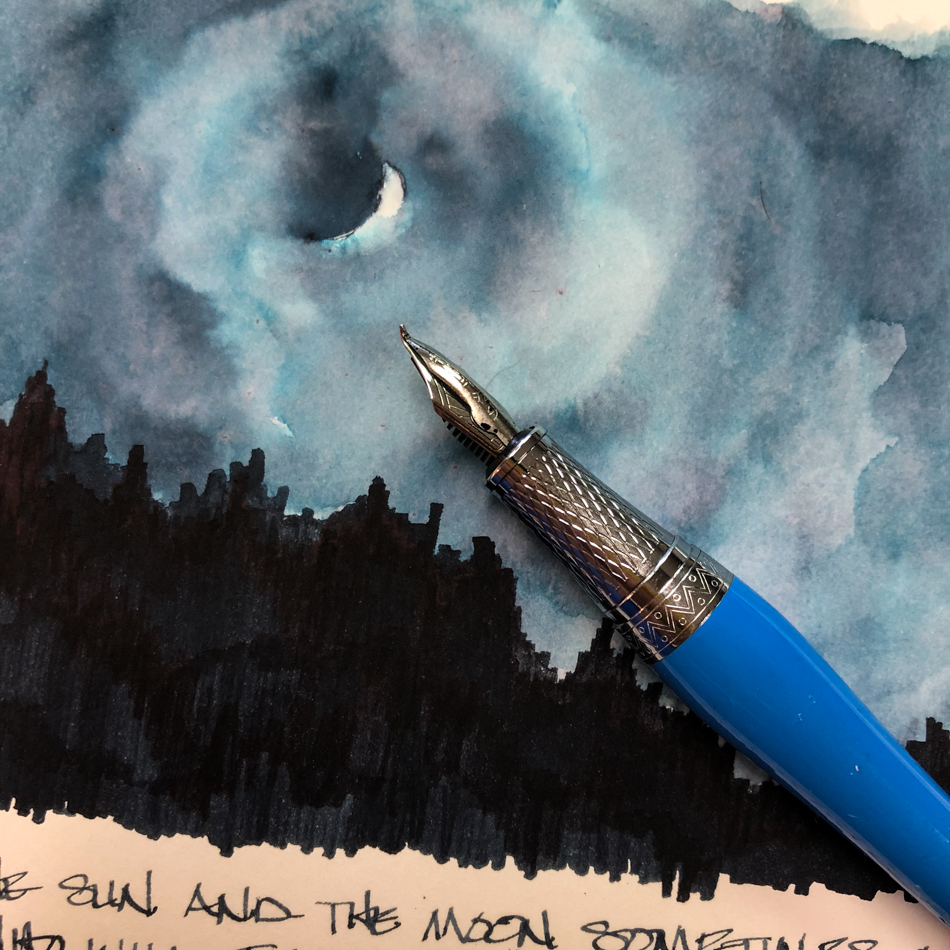
On smooth Hahnemühle Nostalgie Sketchbook paper
I painted (with a watercolor brush) the sky, and was able to move the sky away
to achieve some brightness around the crescent moon.
I sketched the tree line of the hills with
Duke Fude (Bent) Nib with a Fine to Broad nib with Robert Oster Thunderstorm ink.


I tried Thunderstorm in my Hahnemühle Cappuccino Sketchbook of
people sketches (pen people!) with a  Lamy Vista with a 1.1 stub nib;
the ink behaved wonderfully on the coffee-colored sketch paper.

 Thunderstorm is an everyday ink, and I have quickly finished half a bottle…
I write with it daily in my journal and calendar, and drop it into my sketching bag when I know I am going ot be waiting somewhere… a favorite ink!.

I bought Robert Oster Thunderstorm at Goulet; it is also sold at Vanness.

Inks by Maker and by Color will be published soon… Building pages.

To hear about classes, follow me on Facebook
or check out my new, improved dkatiepowellart.com

Posted in art journal, creativity, drawing, ink painting, journal, painting, pen & ink, process, review, sketchbook, writing | Tagged , , , , , , , , , , | 7 Comments

Crescent Moon


Fast ink sketch of Rosh Chodesh, the first night we saw the crescent moon.
All those colors came out of Robert Oster Thunderstorm ink!
I am still finding the ink to have a life of it’s own…
so the idea is to use it when you can let go and allow it to do its thing!

I used the Duke Fude
(Bent) Nib
(right)
for the sketch and the writing at the edge, and my Lamy Vista
with the 1.1 stub for the
other writing.  The fude nib
is juicy and lays down
a ton of ink with its
broad bent nib.  Also, this
is the nib laid on the
back of the Hahnemühle Nostalgie Sketchbook page with that thick ink and
water-washed ink on
the other side…
The page held up with
no bleed through!

To hear about classes, follow me on Facebook
or check out my new, improved dkatiepowellart.com

Posted in art journal, creativity, drawing, ink painting, journal, painting, pen & ink, process, sketchbook, watercolor, writing | Tagged , , , , , , , , , , , | Leave a comment

How I Test My Inks for Watercolor

I’ve gotten questions about how I run these tests for watercolors —
besides using the ink in a variety of situations!

Pure ink waiting to dry.

I place a good amount of ink on watercolor paper, and let it dry>
I use brushes that I dedicate to ink, because it is hard to get the ink out,
and I don’t want it to mix with my watercolors.

This is Robert Oster Motor Oil, a favorite sketch ink.

After the ink dries, I imagine a rough square and place a good amount of water
into that space, but try not to touch the edges of the dry ink.
When I begin to touch the edges, I start at the left and move up,
and just touch the dry ink —
I want to see it pull down into the water on its own.
BUT, at the far right high end, I scrub the dry ink with my watercolor brush,
and may pull it down a bit to spread it out — it depends on how it is moving on its own.

I let that dry… a miracle of color!

To hear about classes, follow me on Facebook
or check out my new, improved dkatiepowellart.com

Posted in art journal, ink painting, journal, pen & ink, process | Tagged , , , , , , | Leave a comment

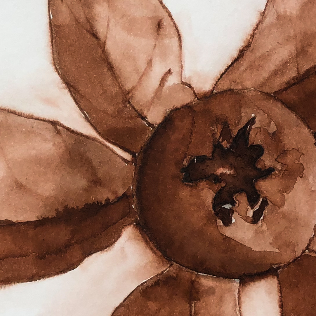
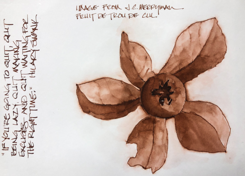
VSW: Fruit de Trou de Cul


A sketch after the photo by JC Merryman.
Robert Oster Aussie Brown ink.

So much ink is laid into the middle it is actually raised!

To hear about classes, follow me on Facebook
or check out my new, improved dkatiepowellart.com

Posted in architecture, art journal, creativity, drawing, ink painting, journal, painting, pen & ink, process, sketchbook, writing | Tagged , , , , , , , , , , | 4 Comments

Preserving Our Small Art Stores

I support our local small art stores
99% of the time;

This week reminded me of WHY I shop small business,
and why YOU SHOULD TOO.

I have used Golden Gesso many times in my life,
but never paid attention to how much a tub covered.
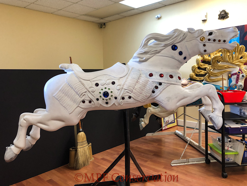
And I had to cover a carousel horse, not a canvas!
And I needed it pronto — I thought I had it, but I was looking a tubs of Black Gesso,
not usable for my white carousel horse.

So I went to the amazon of art supplies.  WHY?
Because they took over the lovely smaller art store that had artists for employees,
and my closest really good art store that carries larger containers (Merriartist)
is about 1 1/2 hours away… I am on a time crunch!
The weekend was upon us so I could not wait the one day for shipping from Merriartist — it would have been three days, not one, and again, time crunch!

I asked the woman at the big box store if she knew Acrylic gesso… she said yes.
I asked her how much I should buy to cover a large wooden horse — she didn’t know.
She didn’t even think about it.
I asked if she thought the largest tub, 128oz — really, we are talking a gallon of gesso here — was enough.  She had no idea.  She could not even begin to think about this.

No one else at the big box store knew either.

I’d like to say this was an anomaly, but mostly when I ask questions there employees
walk over and read the information on the package.  Like I can’t read.

Now I know that Sally at Merriartist would be stumped by my question to some extent
— she is also not in the habit of painting carousel horses to my knowledge…
but Sally knows gesso.  She would have really considered this and given me her best shot.  And I am sure I would not have bought TWO GALLONS of white gesso!
The coverage for this horse is under 32 oz… closer to 12oz but buying 32oz
would have been fine — having some left over for insurance.
Or I might have bought two 32 oz jars and taken one back, still less $$$.

So what is my point?

I know the big  box stores seem cheaper, but a lot of that is hype.
The biggest one I am thinking of is always having sales but check the fine print!
The sale coupon can’t be applied to anything already discounted and folks,
most items are already discounted…
I know for a fact Merriartist matches and sometimes beats their prices
as I’ve done pricing comparisons for studio projects.

Some of the big box stores that are craft stores sell inferior brands —
and this means you get inferior paper and paint and brushes and you didn’t even know.
Some folks have to buy cheap because they can’t afford it,
but even there, small art stores may have a better selection of student grade brands.

And frankly, I’m willing to pay a few pennies more (and it is just a few pennies more)
to have people save me money by knowing product.
Yes I can return unopened product, but most of the time I’ve opened it and it is all wrong!
The employees at the big box stores do not know anything about art supplies.

If you don’t support the small art stores,
they will disappear.

I have to buy and ship most of my supplies, as THE big box store
has a stranglehold on Portland, owning two stores here.
I use the two small online stores below for 99% of my art supplies,
and do not prefer one to the other —
They both don’t carry everything I want… so I spread the love around.
I just keep throwing things in my cart until I reach the minimum…
and occasionally I have to pay shipping.
Merriartist ships free at $90
(that number is so easy to reach
with art supplies, and I buy most
of my paint from them).
Sally is almost always there
to answer questions and if not,
employees either know product
(Yay!) or tell you if they don’t
(which I appreciate) — and they will call
you back! Merriartist usually can
get supplies to me in one day.

WetPaintArt ships free at $99,
also an easy $$ to reach!
They carry Hahnemuhle journals,
and fountain pens and ink,
so they always get one
order a year from me for sure.
Their employees also know stuff
(Yay!) and if not, will tell you!
Shipping take a few days from the midwest.

What are your favorite small art stores?
Do you still have one?

To hear about classes, follow me on Facebook
or check out my new, improved dkatiepowellart.com

Posted in acrylic, creativity, oil paint, painting, pastel, sketchbook, watercolor | Tagged , , , , , , , , , , | 8 Comments

VSW: Sacré-Cœur Basilica, Paris


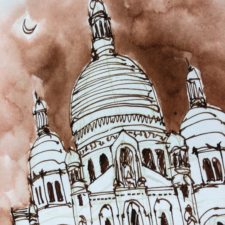
I managed to squeeze in a sketch of the Sacré-Cœur Basilica.  I love this beautiful church, quite different from other churches in Paris.  It was designed by architect Paul Abadie.

I’ve been in search for another great brown ink, my other favorite being DeAtramentis Tobacco.   Diamine Chocolate is just sooooo dark (like a rich dark chocolate.
In Aussie Brown Robert Oster came up with a lovely rich brown that shades nicely;
I can use it at work then take it out for a sketch!

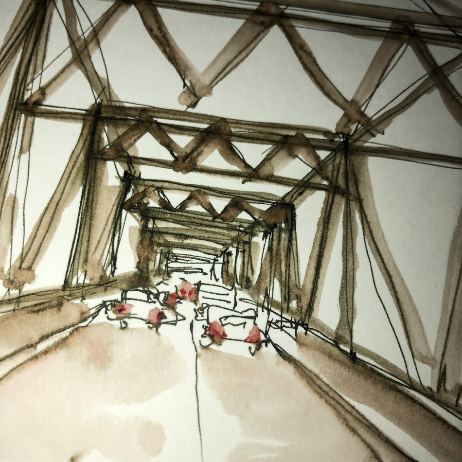
Someone commented that architects keep proportions correct,
so here is my secret — guidelines.
You can see them in the blowup above!
I do a line of site set of lines that help me stack
and line up the little things by placing the big pieces.
I also make my mistakes in pencil — as you can see above.

To hear about classes, follow me on Facebook
or check out my new, improved dkatiepowellart.com

Posted in architecture, art journal, creativity, drawing, ink painting, journal, painting, pen & ink, process, sketchbook, writing | Tagged , , , , , , , , , , , , , | 2 Comments

SoCS: Fourth of July

I  journal and do morning stream of consciousness exercises, and
I’m again participating in Linda Hill’s Stream of Consciousness Saturday. 
I write to a timer, 15-20 minutes, no editing except spelling, and of course I add my art!
You can do it too!
The Friday prompt for Stream of Consciousness Saturday is “for/fore/four.”

Four holidays that are excuses for irresponsible behavior:
New Year’s Eve, St. Patrick’s, Cinco de Mayo, and
the Fourth of July, Independence Day.

The first three you can generally avoid the idiots,
which I call amateur night for drunks —
stay away from bars and don’t drive the streets.

But the Fourth is my least favorite holiday.
We have massive fire issues and our stupid stupid state is a forest fire waiting to happen.
*oh wait, that already did, with lives lost in the Multnomah fire*
For almost a decade we’ve stood vigil over museum artifacts.
In our neighborhood, everyone leaves and it becomes a place for dragsters and fireworks.
Two years running we stayed up all night at the business,
watching skyrockets fired on the corner by drunk assholes…
Calling the police all night did no good.  They don’t show up, ever…

Last night at 7pm as we were leaving a cherry bomb exploded, foreshadowing the mess.

I don’t think this is what our forefathers envisioned…
So I hate it.  Hate it.

We have so much to lose, between our forests
(which provide a good dose of oxygen to everyone) and our business
and the lives of those who have to clean up after these irresponsible assholes.

Rant for the day.

For the rules, go to Linda’s blog;  feel free to join the fun!

Posted in art journal, creativity, journal, pen & ink, sketchbook, writing | Tagged , , , , , , | 12 Comments

Inky Thots: Krishna Ghat Green

This is my third Krishna ink:
my first two were Krishna colors
(the Indian God of Love and Compassion), which is appropriate for the name of the ink!
*I will review them later!*

Krishna Green Ghat ink is my favorite
so far — I am in love with this amazing ink and ready to buy a second bottle…
So let’s talk about the tiny bottle.
Simple, squatty body, nice shape
for filling pens, does not tip easily —
but too little ink for me!
On the other hand, you can try the
hand-made inks for almost the cost of a sample in some other higher priced inks — so that allows many bottle to be bought!

From their website:
“Krishna Inks is the brainchild of Dr. Sreekumar, a medical professional by day.
He brings his passion from his younger days, when he would grind and turn fountain pens.  Dr. Sreekumar, a believer of the “Make in India” campaign, hand makes these inks at his workshop in Kerala, India also known as God’s own country!”

Remember that others review these inks just for writing;
I am also interested in how they are used for ink-painting!


Properties of Krishna Green Ghat ink:

Krishna Green Ghat ink is crisp on all my papers, even Post-its, no feathering, but dries slowly.  I have it in a wet nibbed pen, but you can see the smear after about 30 seconds, right.  Be ready to blot it if you are in a hurry.  It leaves just a trace of a line when brushed with water;
I consider this a soluble ink, no water resistant.  The brush moves the color, easily, and when scrubbed/rewet it shows all the lovely colors — it is in fact a great shader.  The shading properties make it lovely with which to paint!

I could produce no sheen, but that is okay by me —
Sheen is a fun by product but not the reason I buy an ink.

*Above, watercolors from Daniel Smith.*

When the ink is dispersed on paper towel and water added, the electric yellow come through stronger!

When painting, it first goes on the paper with looking like Sap Green or Green Apatite, above.  When thinned by a watery wash, however, the watercolor comparisons run from brght clear yellow to Green Gold to Sap, my favorite colors!  In watercolors that puts the pigments in the Munsell ranges: From PG36/PY150/Py3 to PG7/PO49; Serpentine and Green Apatite are mineral or Primatek paints.

*For more info on the munsell system, go to this page.  Knowing the pigments can help you not to duplicate watercolors made of the same pigments.*

I was unable to find out if the inks are lightfast, and have not performed my own tests.
Most artists who use ink are making prints of their work —
But ink-painting is becoming more popular so maybe it is time!


Ghat ( घाट ghaat?) are the steps leading to the water’s edge, such as a river or lake.
I am enjoying finding out about the origination of our inky names —
Burning ghats are where cremations occur in India, which I knew,
but I also learned the name “ghati” for stepped hills,
and so I think ghaat घाट itself means stepped, though I could not find corroboration.

My ghati includes steps (ghat) to the water’s edge,
drawn withe a FPR mufti pen (often free with a certain $$ spent at FPR),
to which I added an ultraflex nib!
A waterbrush touched the lines selectively and added color from the nib.


My squirrely friend shows the varying shades of this amazing ink!
I was able to layer a bit if I did it quite fast!
I was a little more patient about allowing layers to dry before adding second layers,
but still had some unplanned blooms on Squirrel.
*I keep hearing “Moose and Squirrel” whenever I write about Squirrel!*

Disclaimer, I bought this ink from Vanness:
no one is paying me to write these reviews.

To hear about classes, follow me on Facebook
or check out my new, improved dkatiepowellart.com

Posted in art journal, creativity, drawing, ink painting, journal, pen & ink, process, sketchbook, writing | Tagged , , , , , , , , , , , , | 2 Comments

Tools: Tilt-Well Tilted Ink Bottle Stand


Recently I finished a bottle of DeAtramentis Document Black ink.
To get my syringe full, I had to hold it precariously in one hand while trying to pull the syringe up.  That didn’t work.  So I ended up putting it in a ceramic pot and tilting it with pads to get it to a place where I could use the syringe without losing it.

Tilt-Well solves that problem.
This inexpensive little doo-dah safely and securely holds your inks
at an angle so you can get to the bottom of the inkwell!
I’ve played with it and all my bottles, and various bottles can fit in different ways
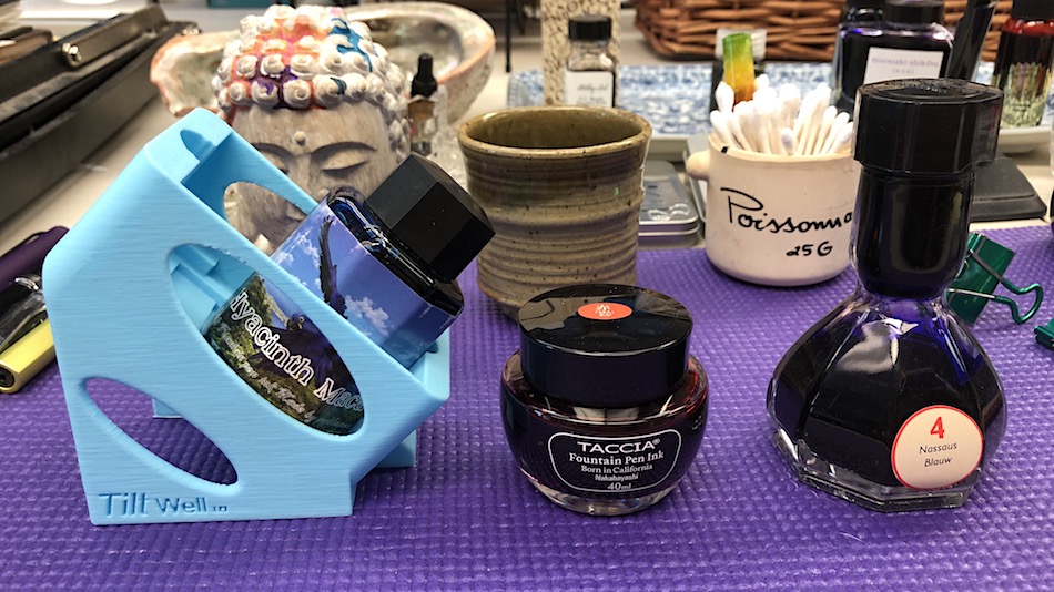
(that is what the side holes are for).  Even the fat PenBBS ink bottle fits!
Only two bottles don’t fit — the large round Taccia bottle,
and the Akkerman bottle — the latter of course has the last bits covered.

Comes in various colors;
I wish I could remember who suggested it!  Thank you thank you!

To hear about classes, follow me on Facebook
or check out my new, improved dkatiepowellart.com

Posted in pen & ink, review, tools | Tagged , | 2 Comments

Ghat Green Tea Squirrel

A FPR mufti pen with an ultraflex nib drew my squirrely friend
(a tea infuser — shouldn’t everything be this delightful?) in Krishna Green Ghat ink;
a waterbrush touched the lines selectively and added color from the nib.
I was a little more patient about adding second layers of darker color this time,
but still had some unplanned blooms on Squirrel.

As i try to work with ink painting, I am paying attention to quick sketches;
this one took about a half hour (dry time included).

I added some white touches with pens and crayons…
I’m never happy with the tools themselves.  They don’t start or skip, argh.

Truth?  The fiestaware cup is green but Squirrel is orange.

To hear about classes, follow me on Facebook
or check out my new, improved dkatiepowellart.com

Posted in art journal, creativity, drawing, ink painting, journal, pen & ink, process, sketchbook, writing | Tagged , , , , , , , , , , , , | 1 Comment

Journal Editing

I was just talking about how I have to edit, and
here is a journal entry which I can’t post… with a
quickie sketch of a polychrome chair I am working on this weekend.
This sketch is in Robert Oster Charcoal ink, really a dark purple-grey.

To hear about classes, follow me on Facebook
or check out my new, improved dkatiepowellart.com

Posted in architecture, art journal, creativity, drawing, ink painting, journal, painting, pen & ink, process, sketchbook, writing | Tagged , , , , , , , , , , | 3 Comments

Creating Journal Pages

I am writing more in my journal,
so it has become less of a strict art journal and back to my
everything journal but with watercolors throughout!
From college forward, I wrote and sketched all the time.
First in my cheap Chinese red and kraft-paper lined journals,
then later in my perfect Okina or Cadic journals (above, and it has pockets too!)
Architectural design ideas, classes, my zen studies, all things of interest,
and angry rants about baaaad boyfriends!

For the first years as I learned about watercolors,
my watercolor journals were all about the images.
Now I am comfortable with watercolor and with ink painting,
and am again using my art journal as my writing journal —
I want everything in one place, somewhat chronologically.

It changed what I feel I can share…
I have to make decisions about sharing everything —
which I would do if I was not still doing business with clients who may find me here…
It is always in thee back of my mind, not when I am writing —
I write everything I want to write — but when I think about sharing —
especially when some of my issues may be client issues!

It is hard for me to do a flip-through now!


One of the things I find myself doing these days is creating “blank” pages
from doodles or bits of a virtual sketchwalk or a lovely memory and
going back and picking them when I am ready to write.
This means the journal is not linear… exactly.  But is is within a few weeks.

I have questions:

Is a true time line important to you?
Are you meticulous about the date/time stamp?


Do many of your use your art in a writing journals,
(Hobonichi or Travelers, and so art goes over the dot or graph grids)
or write in your blank art journals,
(Hahnemühle or blank Archer & Olive)?
Or, do you keep a separate writing journal?

Is it a secret?  Like a diary?
Does it have a lock?  Do you hide it?

How would you feel if a family member or close friend read it?


Would a workshop on this be helpful to you?
Formats or layouts in blank journals?

How to get going?
How not to feel like a failure if you don’t write daily?

Issues around journaling itself?
How to grease the writing wheel… be ready to go when the mood strikes?
What to write about?

I would love your feedback!

To hear about classes, follow me on Facebook
or check out my new, improved dkatiepowellart.com

Posted in art journal, creativity, drawing, ink painting, journal, painting, pen & ink, process, sketchbook, watercolor, writing | Tagged , , , , , , , , , , , , , , , , , , , , , | 10 Comments

SoCS: Leaves

I  journal and do morning stream of consciousness exercises, and
I’m again participating in Linda Hill’s Stream of Consciousness Saturday. 
I write to a timer, 15-20 minutes, no editing except spelling, and of course I add my art!
You can do it too!

The Friday prompt for Stream of Consciousness Saturday is “leaves.” Write about the first thing that comes to mind when you think of the word “leaves.”


Hard physical labor and little catch up sleep leaves me with nothing to say.

Seriously.  I can’t form a thought not a coherent thought!

I tried, and thought looking for leaves I’ve painted might summon a topic slant but nope.
The image I painted is from Sharukh Bamboat, and seeing it reminded me
of the joy of many people I’ve met though blogging.


For the rules, go to Linda’s blog;  feel free to join the fun!

Posted in art journal, creativity, journal, pen & ink, sketchbook, writing | Tagged , , , , , , , | 6 Comments

Pilot Iroshizuku Bottles


Pilot Iroshizuku are the most beautiful bottles of any ink I’ve seen…
Not as inventive as Akkerman, but stunning…
Think Tiffany!  To see the ink sloshing in them is exciting!

And btw, the inks are beautiful.  But more on that later!

To hear about classes, follow me on Facebook
or check out my new, improved dkatiepowellart.com

Posted in art journal, drawing, ink painting, painting, pen & ink, sketchbook, waterbrush, writing | Tagged , , , , , , , , , , , , , , | Leave a comment

VSW: Cathédrale de la Sainte Trinité, Paris

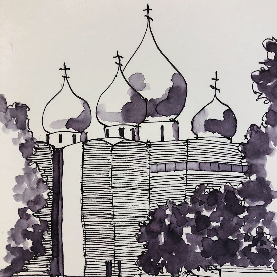
The very modern Cathédrale de la Sainte Trinité, from a Google image
on Virtual Sketchwalk (yes I wish I was in Paris!)
Designed by architect Jean-Michel Wilmotte.

I love greys; few are what I call a straight grey, neither blue nor brown.
This sketch is in Robert Oster Charcoal ink, really a dark purple,
though you can see why it is thought to be grey in the deep tones and writing,
whereas Robert Oster Graphite ink goes into warm green!
Painting with inks is challenging because, unlike watercolors, they tend to bloom easily.
The tree “blooms” were caused by me dropping inks over almost dry ink.
But the bloom in the temple tops just happened as it dried.
I am going to keep trying, seeing if I can
catch a technique whereby I can control the blooms.

To hear about classes, follow me on Facebook
or check out my new, improved dkatiepowellart.com

Posted in architecture, art journal, creativity, drawing, ink painting, journal, painting, pen & ink, process, sketchbook, writing | Tagged , , , , , , , , , , , , , , | 2 Comments