Tools: Sheaffer’s Skrip Red Ink 02


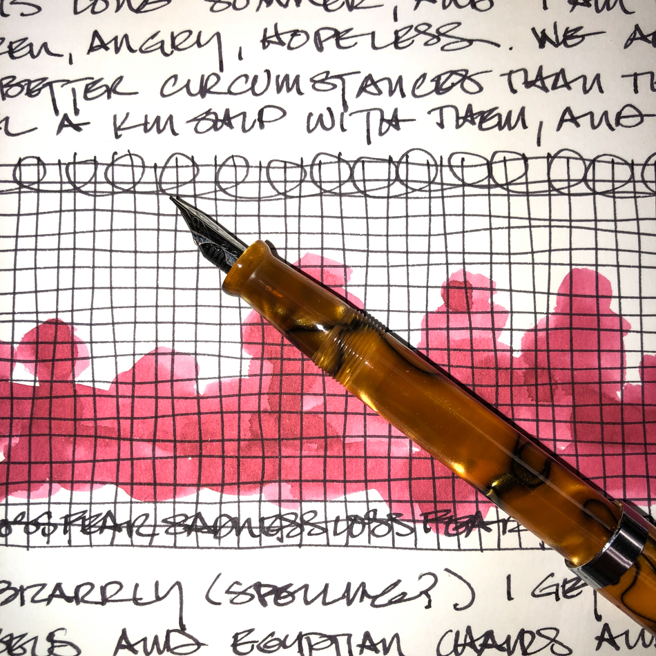
I found a great deal on a vintage ink, and have read that they often are still good.
I bought it because the very cool jar it comes in has an inkwell to the side,
and figured I could always use the bottle if the ink was bad.

Used a Moonman Glass Dip pen (comes in many colors) to write for testing;
but I think it is fine!  I am cleaning pens today and will try out the red ink in a Jinhao Shark pen… A chomping grey or great white shark!

Meanwhile, love the packaging too… a box I will save!

To hear about classes, follow me on Facebook
or check out my new, improved dkatiepowellart.com

Posted in journal, pen & ink, review, tools | Tagged , , , | 4 Comments

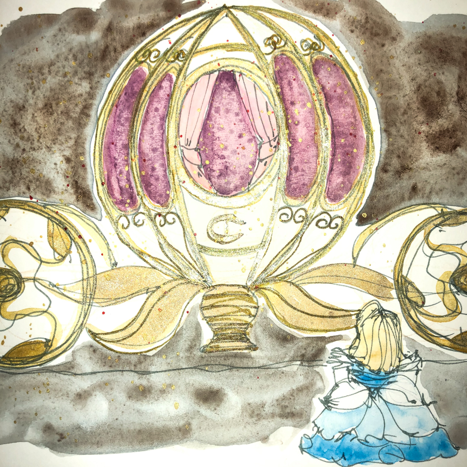
VSW: Cinderella’s Chariot

Magic!  Remember when you believed in magic!

I did, then I didn’t — there were explanations for everything and it was all very scientific.

Then, like the Buddhist saying, “Mountain, no mountain, mountain,”
I found magic again… but that is a longer story!


This image was based on a photo for use in the public domain.

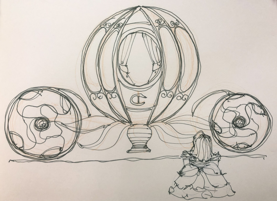
I sketched an imaginative version using a watercolor pencil to think
then a Pilot Metropolitan with Super5 Frankfurt ink to line.


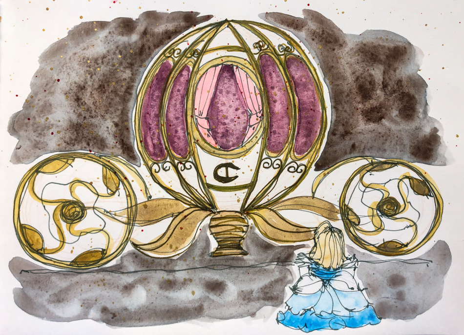
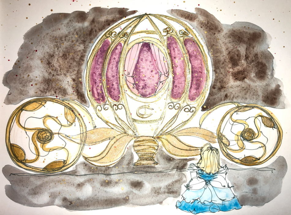
Watercolors over ink, and what is unusual is that I used metallic gold watercolor
(maybe a QoR sample?) and topped it with Robert Oster Heart of Gold ink…
I think I need to play with the metallics a bit more to get the hang of them!


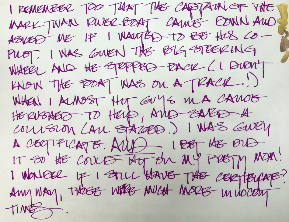
A memory of being chosen to pilot the Mark Twain Riverboat.
I think the captain liked my pretty mom!

To hear about classes, follow me on Facebook
or check out my new, improved dkatiepowellart.com

☾

Posted in art journal, challenge, memory, pen & ink, virtual sketching, watercolor | Tagged , , , , , , , , , , , , , , , , , , , , , | 4 Comments

Inky Thots: Robert Oster Fire Engine Red

A couple of years ago I went on a hunt for a perfect red.

Being a primary color, a “perfect red” needs to be neither leaning yellow-orange,
nor to purple-blue… it needs to be that lovely middle color!

My favorite color…
Okay, one of them!

This is one of those perfect reds, and they are a rarity,
because while a light spectrum can make that wonderful color,
inks (like watercolors and other forms of mark-making products) are made of dyes (usually but sometimes pigments) suspended in a carrier or vehicle.
In fountain pens, that carrier is water, though other solvents may be added
to slow drying, change the PH, or to retard bacterial growth.
A good chemist can produce a perfect red, but it must be difficult,
because most “reds” are red-orange, or very pink, leaning blue!
The amazing Robert Oster has done exactly that!

Remember that others review these inks just for writing;
I am also interested in how they are used for ink-painting!


Properties of Robert Oster Fire Engine Red ink:

I am making up my own definitions, and I have been referring to pure colors
like Fire Engine Red as simple colors, versus the complex colors
we’ve seen where the ink separates into many different hues when wet.
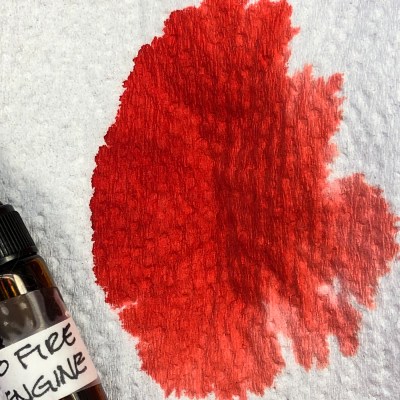
Fire Engine Red dilutes into lighter versions of the same beautiful red.
I see no real sheen, just a dense version of the dye…
Looking at watercolor comparisons for Fire Engine Red, in my palette the colors range from Quinacridone Red (Sennelier), Perylene Red or Scarlet (Daniel Smith).  In watercolors that puts the pigments in the following Munsell ranges:
PR209 / PR178 / PR149.
To understand more about the Munsell system and others,
go to these two wonderful references pages; knowing the pigments can help you not to duplicate watercolors made of the same pigment:

https://www.handprint.com/HP/WCL/vismixmap.html
https://www.handprint.com/HP/WCL/color7.html#munsell
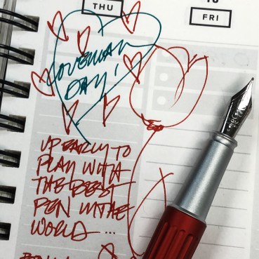
Fire Engine Red ink is
well-behaved.  It is neither
wet nor dry, and does not
feather on any of the papers I
normally use, even Post-its.
It evaporates quickly
with a wet nib; I’ve not
had smears even with
the wettest sketch, below.
When hit with water it
moves easily with no
resistance or ghosting,
so is not water resistant.
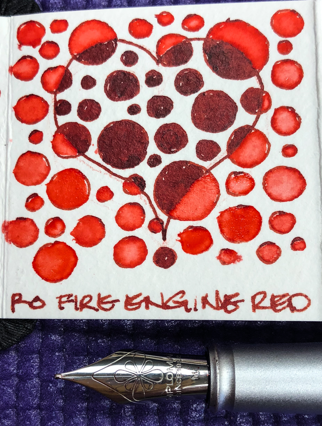
It has a permanent home in
my lovely  Diplomat Aero
with a Medium nib, right.

RO is experimenting and testing light-fast properties…
MOST water soluble ink companies do not pay attention to these things
because most artists who use ink are making prints of their work.


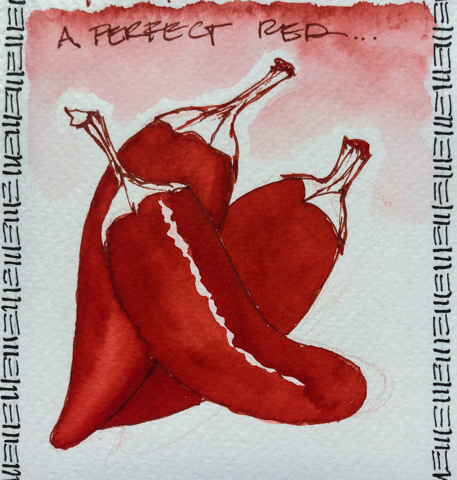
Fire Engine Red is a lovely ink with which to paint.  My chili peppers
were drawn with a Diplomat Aero with a Medium nib on cold press watercolor paper.
In this case I dipped my Pentel Aquash waterbrush into a test vial with the
undiluted Fire Engine Red, and where I wanted a bit lighter red for highlights
I squeezed a little water into the mix.  If you want to try ink painting,
do lots of tests with the inks you want to use to see how they perform.
Inks dry quickly compared to watercolors, so once you start you have to move fast,
or you get blooms each time you go back into the image with ink!  I also have to
think a bit more about how I want to paint an image, in what order… again, they dry fast.  Sometimes it helps to get the paper wet before you start inking,
but know that the ink make creep outside the lines you’ve drawn
(I did not do that in the images above or below).
The lines drawn with Fire Engine Red did not stay visible;
they quickly lose themselves in wet color.
The lines were added back in after the water moved the ink and dried!

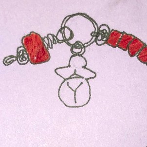
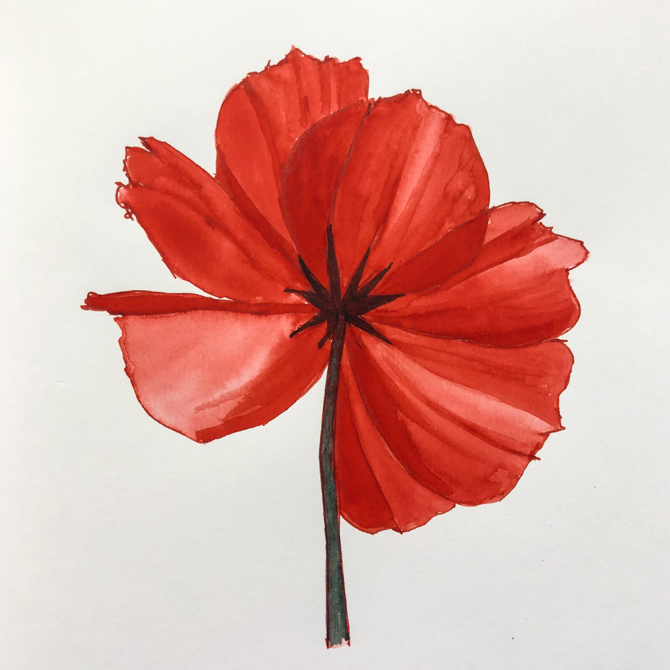
On smooth Hahnemühle Nostalgie
sketchbook
paper I sketched
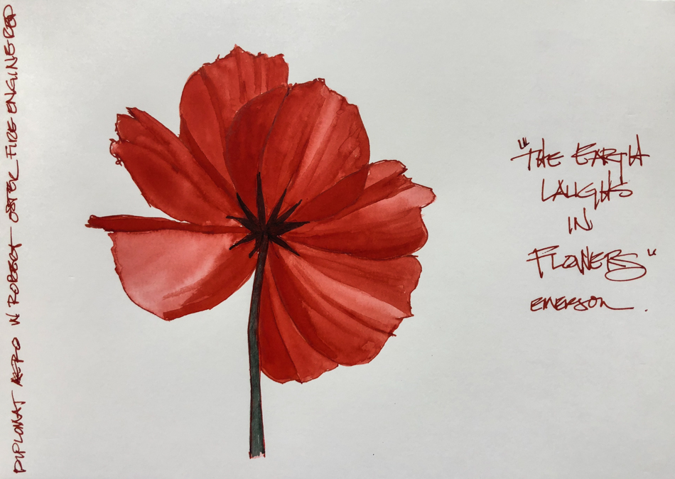
this bright red flower, above, then
touched the waterbrush to the lines,
sometimes dipping back into
the ink in the fountain pen tip…
such a well-behaved ink
even on smooth paper.

On the very poor quality (but fun)
Bright Ideas multi-color journal pages,
the red ink performed well.
NO feathering even when laying it on thick.
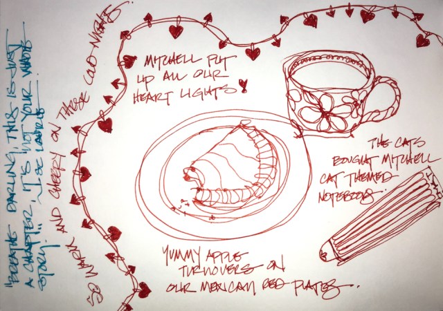
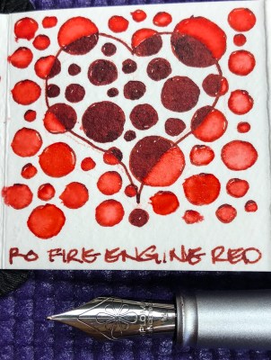
Our Valentines breakfast doodle,
above, drawn on the smooth Hahnemühle Nostalgie Sketchbook  Many hearts drawn on watercolor paper in the Hahnemühle ZigZag Journal for Inktober, right!
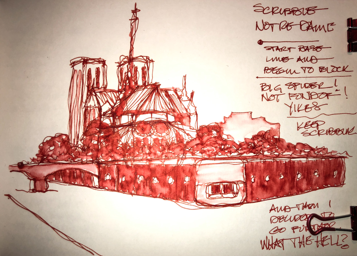
Below, Notre Dame was a demo scribble sketch in the Nostalgie, and just touching lines moved the ink beautifully. A thicker line will lay down more color when wet.

His inks are non-toxic.
I have more Robert Oster inks than
any other maker of ink.  Why?  Because no other brand has the spectacular pigmentation within a color, which gives even his simplest inks such beauty that it is a shame to waste them only writing!


BTW, never ever use any ink that is not meant for fountain pens in your pen.
Dip pens can use just about anything, so make absolutely sure
the bottle says that it is for fountain pens!
Do not listen to the big box sales person, read the bottle or if in doubt, don’t do it!

I bought Robert Oster Fire Engine Red at Vanness;
Jetpens also carries it.

Other Robert Oster Inks reviewed in this manner:
Robert Oster Jade
Robert Oster Thunderstorm

To hear about classes, follow me on Facebook
or check out my new, improved dkatiepowellart.com

Posted in art journal, color, creativity, drawing, ink painting, journal, painting, pen & ink, process, review, sketchbook, watercolor, writing | Tagged , , , , , , , , , , , , , , | 6 Comments

Fire Engine Red Posie

On smooth  Hahnemühle Nostalgie sketchbook paper
I sketched this bright red flower, then touched the waterbrush to the lines,
sometimes dipping back into the ink.

I may be getting the hang of working with ink with fewer blooms>.
*as in watercolor blooms, not posies!*
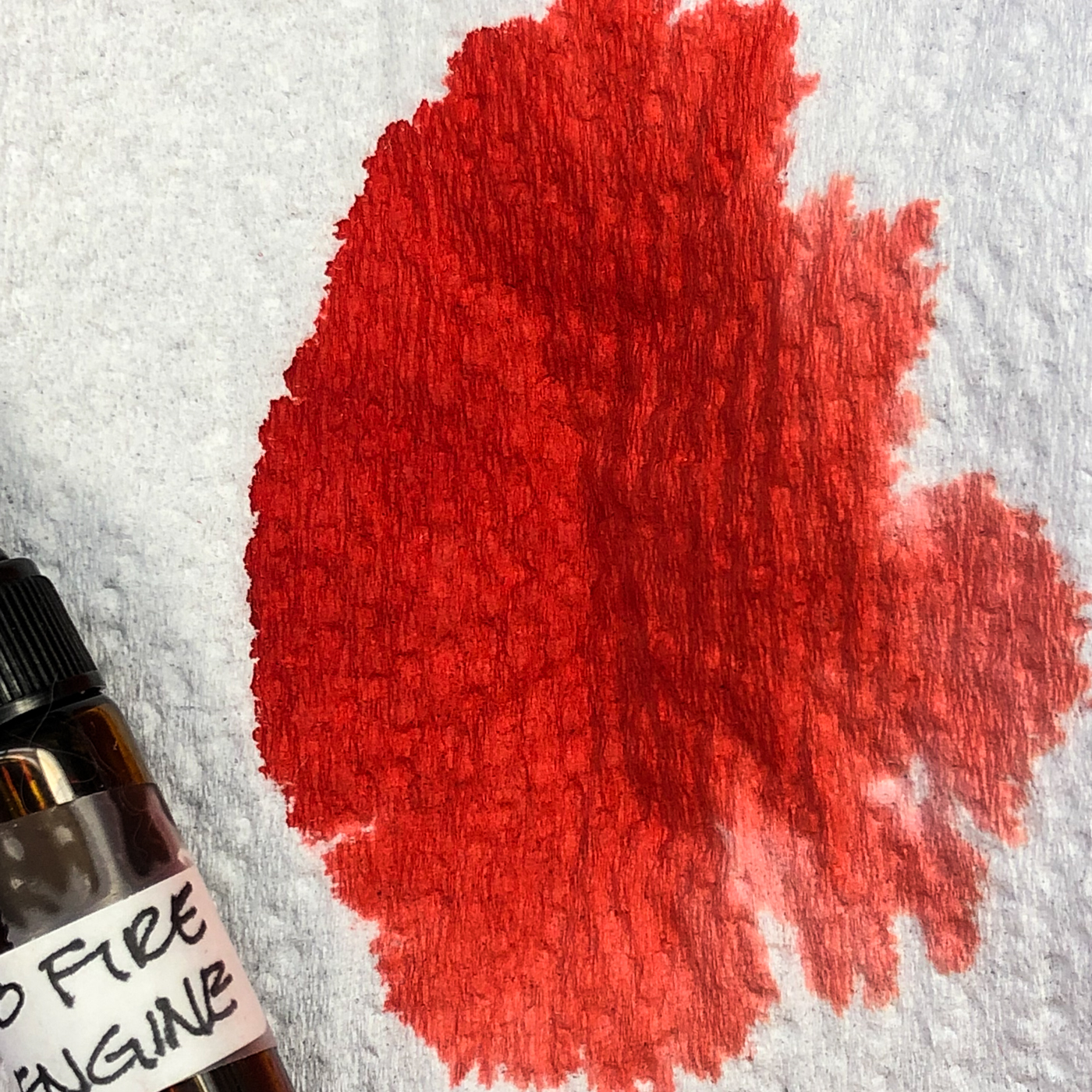
Second picture is for you to see the brilliance of the incredible red
that is Robert Oster Fire Engine Red ink.

To hear about classes, follow me on Facebook
or check out my new, improved dkatiepowellart.com

Posted in art journal, creativity, drawing, ink painting, journal, painting, pen & ink, process, sketchbook, watercolor, writing | Tagged , , , , , , , , , | 6 Comments

VSW: Sleeping Beauty’s Castle


In our Virtual Sketchwalk group we are walking Disneyland —
and many of the pics I found are from the Orange County archives from 1959.

For me, Disneyland has many phases of memories.

In grades 7-12 in So cal, if you got very good grads, they bused you in for a day at Disneyland on the house.  The park was closed but for So Cal kids — and it was a fun day, especially for kids who didn’t have money, like me.

When I was dating, we used to go to Disneyland to dance.
$5/head got you in, and that meant some free rides (and the kiddy rides were free but good neckin’ spots) and good bands.

Then there was seeing Disney through the eyes of my nieces and nephews.

But my favorite memories are from the first time I went.
My mom took me at 5 (maybe for my birthday) and that was a big deal.
Big deal because we didn’t have money, and big deal because I had glitter in my eyes.
The world was a magical place, and I didn’t know how things worked.
I remember seeing Sleeping beauty’s Castle and I was visiting HER home,
after my mom and brother’s reading me the story.
She became real!

To hear about classes, follow me on Facebook
or check out my new, improved dkatiepowellart.com

☾

Posted in architecture, art journal, challenge, memory, pen & ink, virtual sketching, watercolor | Tagged , , , , , , , , , , , , , , , , , , , , | Leave a comment

USk: Quimby UHaul


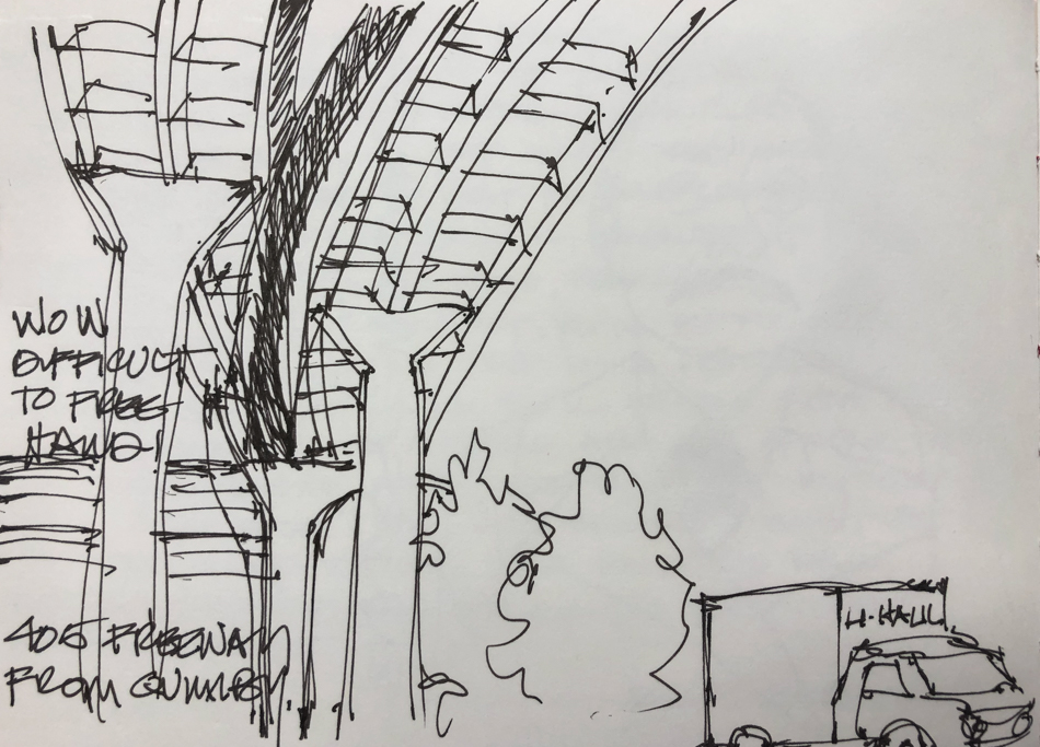
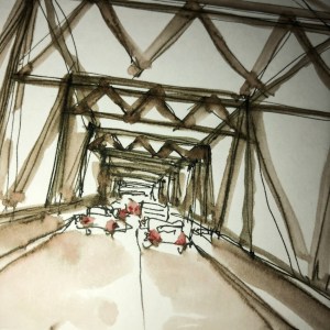
Every time I am sitting under the 405 freeway waiting to pick up Mitchell at UHaul,
I think about trying to sketch the freeway overhead.  ARGH!  Not easy…

So my first page was the drawing above…


I usually sit facing this view, so after frustrating myself I made life easy.
Sketched on site, watercolors added later.

To hear about classes, follow me on Facebook
or check out my new, improved dkatiepowellart.com


©D. Katie Powell.
My images/blog posts may be reposted; please link back  to dkatiepowellart.

Posted in architecture, art journal, drawing, journal, process, sketchcrawl, urban sketchers, watercolor | Tagged , , , , , , , , , , , , , , , , , , , , | Leave a comment

Summer Berries


Every year I do a couple berry images…
They are so so beautiful and tasty in the bowls!

This year the berries are big and still plentiful in August because of the mild summer we are having…. Heaven for us humans too, as July is usually a scorcher.

This beautiful berry color is coming to you from Holbein’s Bright Violet,
one of the paints I am trying out in my travel palette.
the other is MGraham’s Ultramarine Violet — best blueberry colors!
I kinda love them!

Having my brilliant bright clear (not muddy or opaque) colors makes me so happy.

To hear about classes, follow me on Facebook
or check out my new, improved dkatiepowellart.com

Posted in cards, creativity, drawing, ink painting, memory, painting, pen & ink, watercolor | Tagged , , , , , , , , , | Leave a comment

SoCS: Astronomical

I  journal and do morning stream of consciousness exercises, and
I’m again participating in Linda Hill’s Stream of Consciousness Saturday. 
I write to a timer, 15-20 minutes, no editing except spelling, and of course I add my art!
You can do it too!
The Friday prompt for Stream of Consciousness Saturday is “astronomical.”


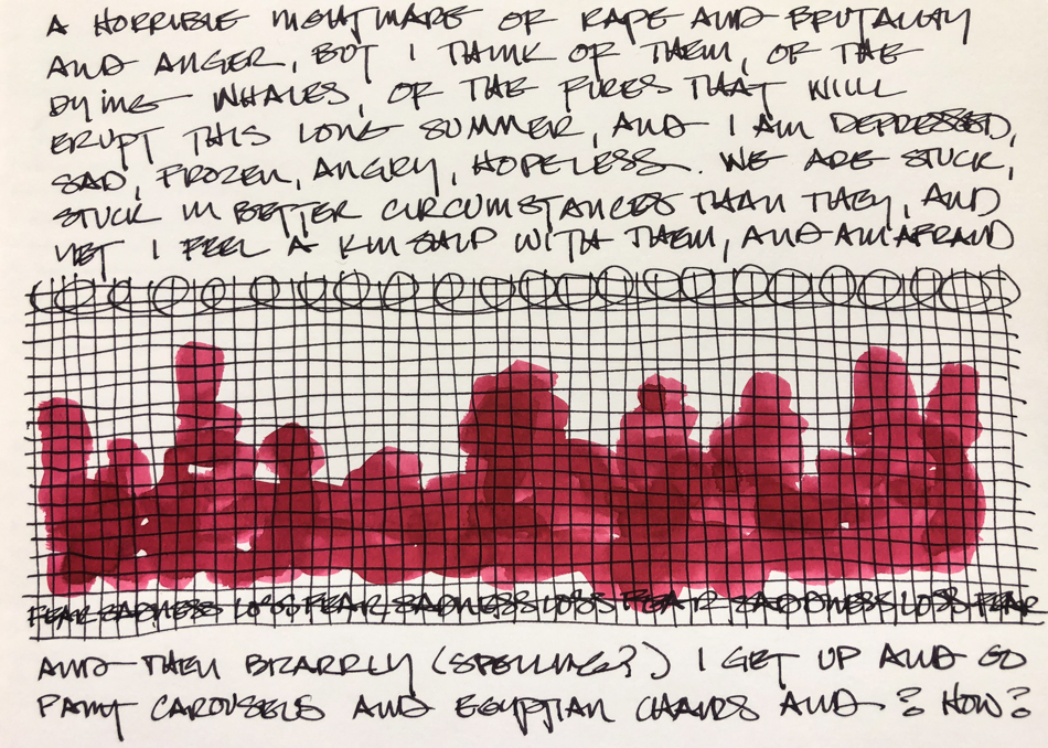
Astronomical?  I got nothing.  Seriously, writing from stream of consciousness with this word I got nothing because it just happens to be a word I don’t use.  Big?  Sky bound?  Okay, big…  The DNC is making a HUGE,  let’s say astronomical mistake in messing again with what the voters seem to want.  They want progressive, not Republican light.  Understand I would vote for a good old-fashioned Republican instead of the the nutjob currently in the White House but I yearn for the balance of progressive versus conservative — olde-tyme conservative, where we were not in living terror of what the hell they’d do.  But the DNC is now Republican light and corporate tied and so they are serving us that again.  And it is making me depressed and frightened for our future.

That’s all I got.  It is on my mind all the time now.

For the rules, go to Linda’s blog;  feel free to join the fun!

Posted in art journal, creativity, journal, pen & ink, sketchbook, writing | Tagged , , , , , | Leave a comment

Tools: My Favorite Travel Palette, Updated


Some of you may know that recently I thought I had lost my favorite travel palette.

*heartbroken*

Those who have a worn old tool you love will understand…
All of it was replaceable, but I wanted my tool that started my watercolor journey!
It once held all my watercolors!

FOUND!  I had set it aside to wash it!

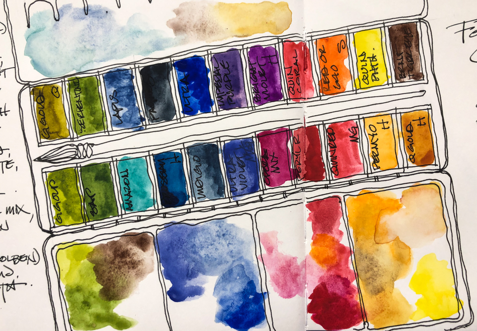
I made some changes — wanting to try a few different colors to see if I liked them more.
I dropped Hematite, Peimonite (such a lovely versatile paint),
and Yavapei, (they will be back though… I love them too much) and a purple for
Burnt Tiger Eye (a bit darker Primatek color), Ultramarine Violet from MGraham,
Bright Violet from Holbein, Perylene Red (may be too muddy as I love bright clear colors
like Quin Red from MGraham), and swapped for
what may be a better orange, the Red-Orange 640 from Sennelier.

Also, I think going forward I will be buying more Sennelier 21ml tubes.
They are amazing paints, and I had not tried their tubes merely because the places
I shop don’t carry them — but wow, great prices — better prices — than Daniel Smith
and better product than Da Vinci… though I do like buying local!
I would travel with more MGraham (love their Quin Red) but as it is,
all my pans filled from their tubes are sticky!
They never quite dry, but the colors are scrumptious and heavenly!


So here is my new palette for at least a bit —
Eventually I will get rid one one of the reds, one of the pinks, one purple,
and maybe one blue — to bring back more primateks.  We’ll see.
I have Quin Gold from every maker and the reason I love
Holbein’s is it makes a creamy flesh color for all flesh types… Always in my palette.
And Quinaphthalone Yellow will always be in my palette!  Brilliant clear yellow!
I have a couple of travel palettes —
one with watercolors specifically for the Victorians around Portland,
one with premixed cat colors — grey tabby, black panther, and Siamese —
and I have one where all the Da Vinci paints I was offered reside.

If I had to pick five Primateks (Daniel Smith) I want all the time,
I would choose the ones I have purchased several times:
Serpentine, Amazonite, Lapis, Hematite, Yavapei, and Peimonite…

To hear about classes, follow me on Facebook
or check out my new, improved dkatiepowellart.com

Posted in art journal, color, creativity, drawing, journal, painting, process, sketchbook, watercolor, writing | Tagged , , , , , , , , , , , , , , , , | 4 Comments

Inks: SketchInks versus Super5


Just a quick review of SketchINKs versus Super5 inks… WATERPROOF!
Not at all scientific as I’ve not bought ALL the SketchINKs and so cannot comment on them all… but in my limited experience with the two SketchINKs I have bought,
they are not as good as Super5 or DeAtramentis Document.

Long ago Super5 inks were made by Rohrer&Klingner, maker of SketchINK.
I don’t know why, but Super5 went their way, and then SketchINK was born.

I bought Marlene first because no one had what appeared to be as clear a blue
(see below).  While I love the slightly off and interesting colors of Super5 inks,
sometimes you want a clear blue, and nobody makes one.  Marlene is a great color and I am glad to have it in my arsenal!  What I didn’t like was the chemical smell, distinct.
I’m not sure why they did this as Super5 inks have none of that!


So loving this autumn green, I decided to try one more bottle
(they are well priced at $12 from Vanness).
I bought Emma, and compared it in my Nostaglie sketchbook with Super5 Dublin.
Super5 is a tad richer in color, both are waterproof, and then there is that smell.
I will use my SketchINKs up — it is not a bad ink —
and may keep a bottle of Marlene around for the nice blue,
but I will go back to my beloved Super5 inks… Beautiful colors and no smell!

To hear about classes, follow me on Facebook
or check out my new, improved dkatiepowellart.com

Posted in art journal, ink painting, pen & ink, review, sketchbook | Tagged , , , , , , , , | Leave a comment

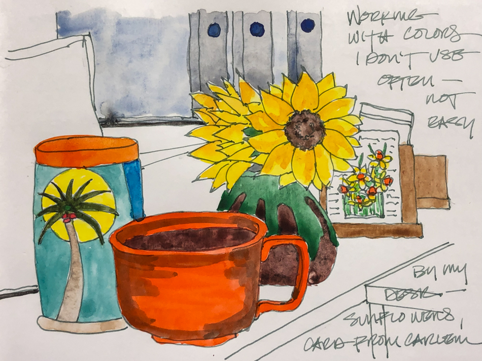
By My Desk


Still working with strange colors that has oddities from not-my-favorite palette!
Opaque watercolors, and I have issues with those.   Still I like!
I may try out the darker Burnt Tiger Eye (brown) I used here!

To hear about classes, follow me on Facebook
or check out my new, improved dkatiepowellart.com

Posted in art journal, creativity, journal, painting, sketchbook, watercolor | Tagged , , , , , , , , , , , , | 4 Comments

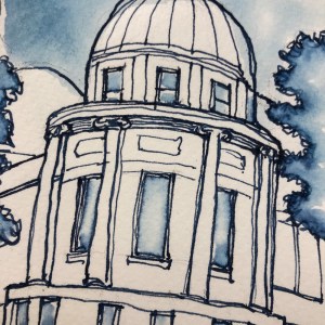
AAA Los Angeles


AAA Los Angeles was always one of my favorite buildings.
It was drawn with a FPR Himalayan with an ultra-flex nib
in a smooth Hahnemühle Nostalgie Sketchbook with Robert Oster Graphite ink.

I had lots of help smearing this from a sneaky Siamese cat…

To hear about classes, follow me on Facebook
or check out my new, improved dkatiepowellart.com

Posted in architecture, art journal, creativity, drawing, ink painting, journal, memory, pen & ink, sketchbook | Tagged , , , , , , , , , , , , | 2 Comments

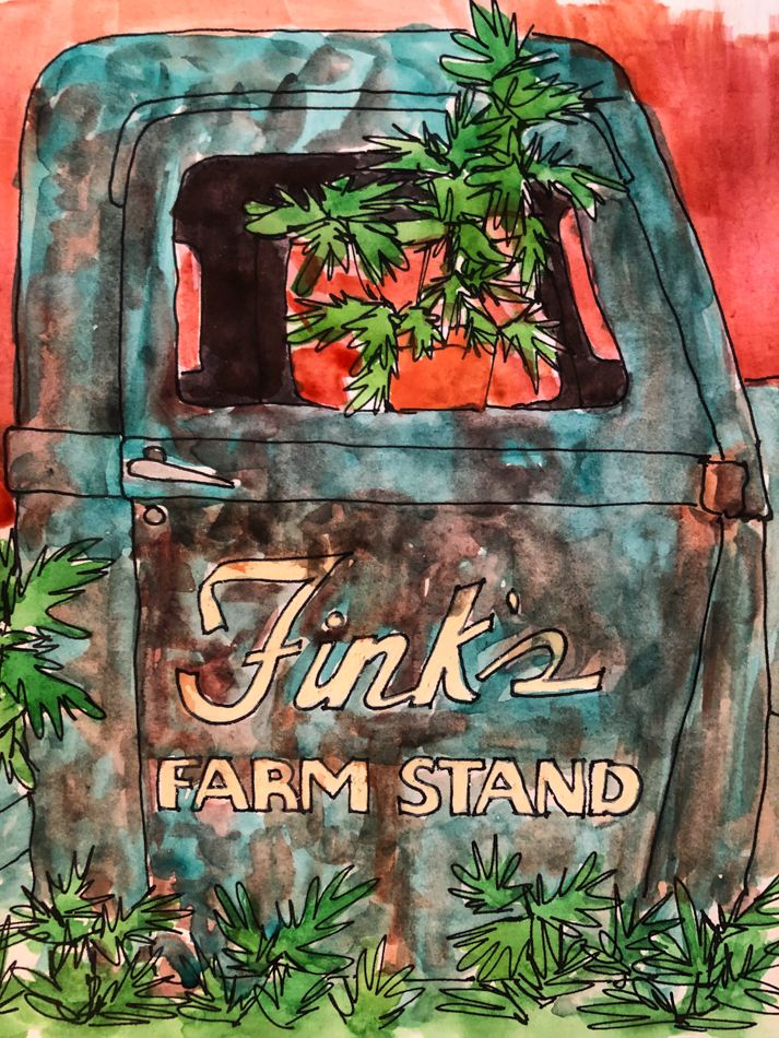
VSW Elizabeth’s Photograph: Fink’s Farm Stand


Elizabeth Muether shared some fun images to the Virtual Sketchwalk
group this month!  Loved this one…I lost my favorite travel palette,
and pulled a strange palette that has oddities and worked with them for this image…
some opaque watercolors, and I have issues with those.   Still I like!

To hear about classes, follow me on Facebook
or check out my new, improved dkatiepowellart.com

Posted in art journal, creativity, journal, painting, sketchbook, virtual sketching, watercolor | Tagged , , , , , , , , , , , , , , , | 2 Comments

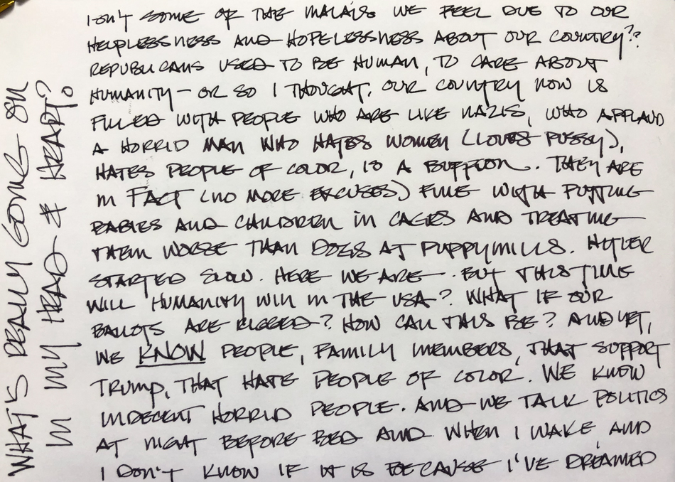
Depression and Politics


Listening to the Mueller testimony.
I think posting this journal entry is appropriate today.
This sketch is in Robert Oster Graphite ink.


To hear about classes, follow me on Facebook
or check out my new, improved dkatiepowellart.com

Posted in architecture, art journal, drawing, ink painting, journal, pen & ink, process, writing | Tagged , , , , , , , , | 6 Comments

Inky Thots: Robert Oster Melon Tea

I LOVE complex colors —
Inks (or watercolors) that are just a little unpredictable in that they change
and do their own thing when touched by water!
Some all it shading, but it rarely happens except in wide nibbed pens.

Remember that others review these inks just for writing;
I am also interested in how they are used for ink-painting!


Properties of Robert Oster’s Melon Tea:

This ink is well-behaved, and does not feather on any of the papers I normally use, even Post-its.  I consider it on the wet side, though it evaporates quickly enough with a wet nib such as the ultraflex, right.  It has never smeared on me during a sketch. It has a hint of a graphite sheen, barely seen above, and When hit with water it moves easily with no resistance or ghosting, so is not water resistant. It has a permanent home
in my lovely FPR Himalayan
with an ultra-flex nib

*Above, watercolors, from Daniel Smith, QoR, and Sennelier.*

When the edge is touched
with water it moves easily
with no resistance into yellow and rust tones, and the bright turquoise is where he pulls the touches of green in the image above. Looking at watercolor comparisons and the Munsell ranges, the colors range from Bohemian, a Green-gold (PY42/PBk7/PG7/PR101) to Sepia (Pbk7/Pbk9) and a murky Green called Undersea (PB29/PO49).  It includes the mineral paints Raw Umber, Sicklerite, and Tiger’s Eye.

*For more info on the munsell system, go to this page.  Knowing the pigments can help you not to duplicate watercolors made of the same pigments.*

RO is experimenting and testing lightfast properties…
MOST water soluble ink companies do not pay attention to these things
because most artists who use ink are making prints of their work.

 
My ®teaspot tea bag was drawn with a FPR Himalayan
with an ultra-flex nib on cold press watercolor paper,
then the lines were touched with water using a Pentel Aquash waterbrush.
The lines do not stay visible but quickly lose themselves in wet color;
The lines were added back in after the water moved the ink and dried!


On smooth Hahnemühle Nostalgie Sketchbook (white, but the lighting was poor)
paper I sketched Église Saint Germain l’Auxerrois; I let the lines completely dry.


I came back and touched the lines, only adding color on my waterbrush
in the sky and the street line and a little in the trees.
I was able to have a little bit of control,
though the lines disappeared in many places.

Howling Coyote (Hahnemühle Nostalgie Sketchbook),
is a matter of just touching lines with water, as are the faces below on Hahnemühle Cappuccino Sketchbook coffee-colored paper.
One thing to note is a thicker line will lay down a lot more color when touched.
With the FPR Himalayan with an ultra-flex nib a lot of ink can be laid onto the paper.

I bought Robert Oster Melon Tea at Vanness:
It is also sold at Goulet.

To hear about classes, follow me on Facebook
or check out my new, improved dkatiepowellart.com

Posted in architecture, art journal, creativity, drawing, ink painting, journal, pen & ink, process, review, sketchbook | Tagged , , , , , , , , , , , | 1 Comment

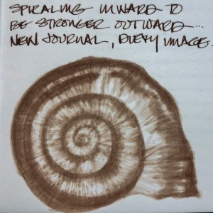
Patrick’s Shells


My brother used to bring me shells.
He knew what I LOVED.
Several of the shells in this old scallop,
and the scallop itself, came from him.

To hear about classes, follow me on Facebook
or check out my new, improved dkatiepowellart.com

Posted in art journal, creativity, drawing, ink painting, journal, memory, pen & ink, sketchbook, writing | Tagged , , , , , | Leave a comment

Quill Pens and Writing!

Too too fun!

Posted in art journal | 2 Comments

Mitchell in His Twenties


Two pictures of Mitchell in his twenties made for good practice.

One of him looking out over the Sierras…
Another of him hamming for the camera (he didn’t smoke.)

I am working in the Hahnemühle Cappuccino Sketchbook …
dedicating it to People sketches!
I did the 1Week100People. and decided to continue the process through this book!
When I am completed I will review!

To hear about classes, follow me on Facebook
or check out my new, improved dkatiepowellart.com

Posted in art journal, creativity, drawing, ink painting, journal, pen & ink, sketchbook, writing | Tagged , , , , , , , , , , , | Leave a comment