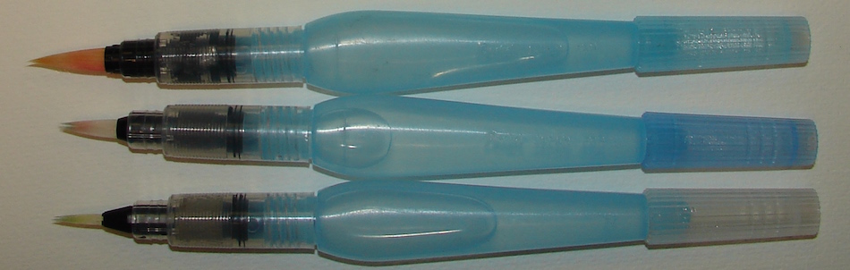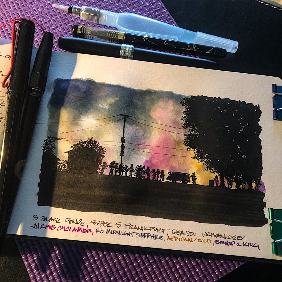
My middle of the night sketching setup.
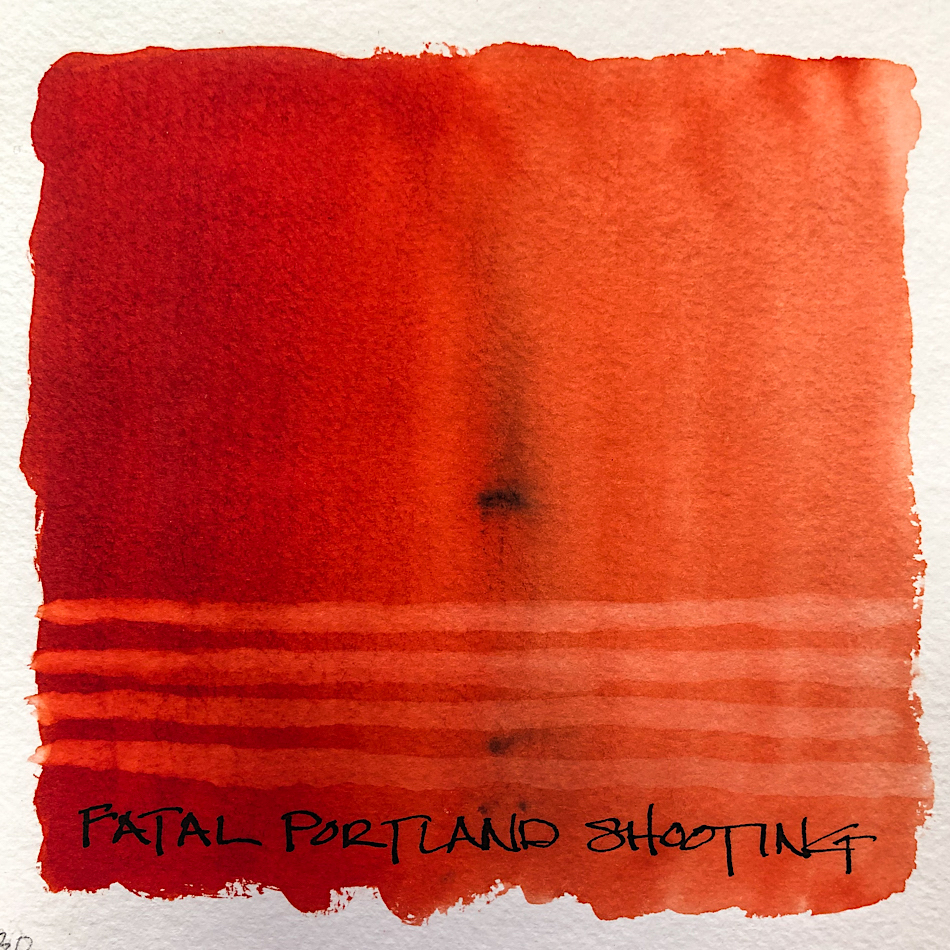
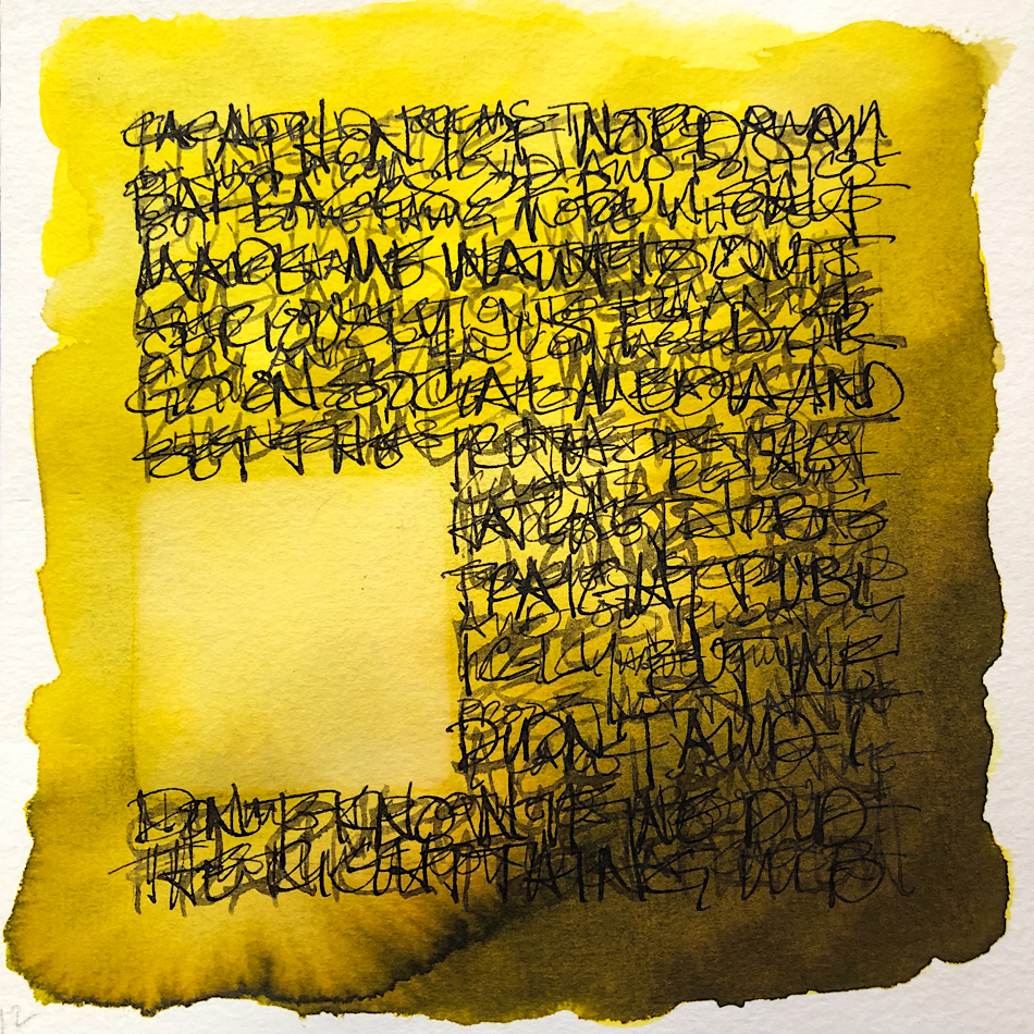
Each night I spend 1-2 hours watching raw and live videos of what is happening in Portland to the protesters.
Yes, TO the protesters.
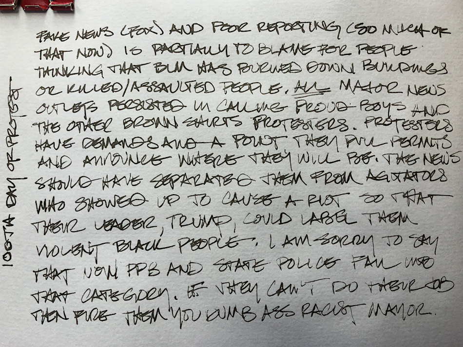
Fake News and simply poor reporting is partially to blame for people thinking that BLM protesters in Portland have burned down buildings and killed/assaulted people.
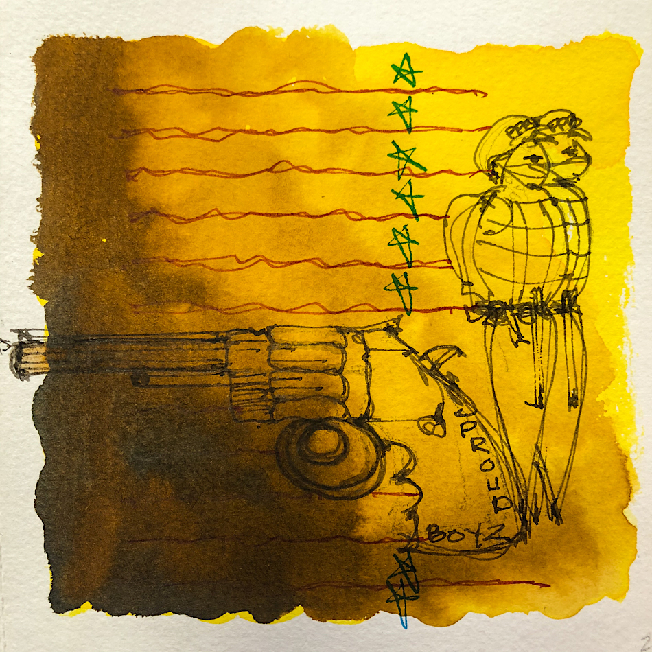
ALL major news outlets persisted for months in calling Proud Boys and other
brown shirt (Nazi or Trump supporter groups) protesters. They are not.
Protesters have agendas and demands, an end goal, though it may be difficult to achieve. They let people know where they are gathering, openly invite anyone interested,
and pull permits to assemble. They do not carry weapons (or if they do they are not brandishing them). They do not threaten those around them — no locals who happen
to be passing by. They do not bully, or intimidate other than their sheer size in numbers.
They have painted graffiti, and lit trashcans on fire; not punishable by violence.
IF one of them (of the thousands who are protesting) did anything violent it was not part of the plan, and they acted alone. I say IF, as I am giving them that possibility.
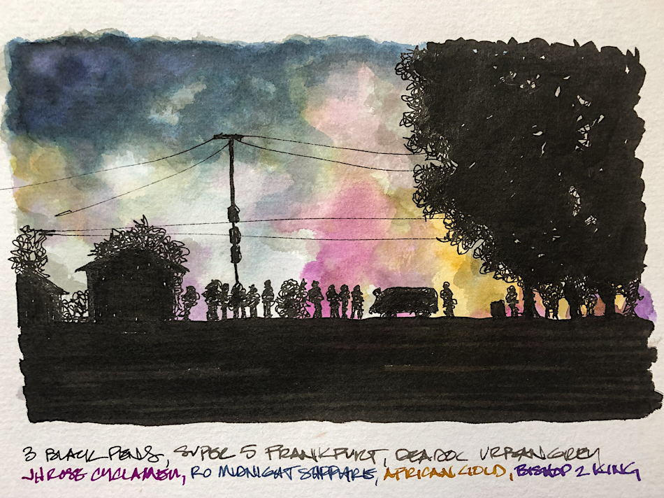
Many independent news people took this image last night.
The news should have separated them (they were told repeatedly by locals)
from the agitators, because we’ve seen them before.
I first saw them in the last election braking windows of shops in the Pearl…
They come to Portland, usually from out of state or from hours away,
and they are here to cause trouble.
They are violent, carry weapons (bully everyone in their wake,
scream obscenities at passerbys who are not part of their troop
(and it is a small militia of sorts). They are bigots, racists, etc.,
and they are Trump supporters, inspired to do his bidding.
Now, sadly, and it layers a whole new horror for me,
the Portland Police (and their new buddies in crime, the State Police and DHS)
definitely are violent nightly. They enter a peaceful but noisy protest,
bully and prance around, then declare it a riot.
(If these “law enforcement” officials saw a real riot —
like Watts in the sixties — they might pee in their pants.)
I see no riot but what follows… they ask for them to do conflicting things
(on or off the sidewalk?) and when people ask for clarification they grab them
and throw them to the ground and arrest them. The protestors are noisy (they scream their names and phone numbers to others around them) but docile as they don’t want to be beaten, but they are often beaten anyway — broken bones and bloody faces
Remember that this is not a Judge Dredd state;
The police are STILL not allowed BY LAW
to judge and dispense punishment.
No one can blame this one on Trump.
This is Oregon State and the City of Portland…


 To hear about classes, follow me on Instagram, Facebook
or check out my new, improved dkatiepowellart.com
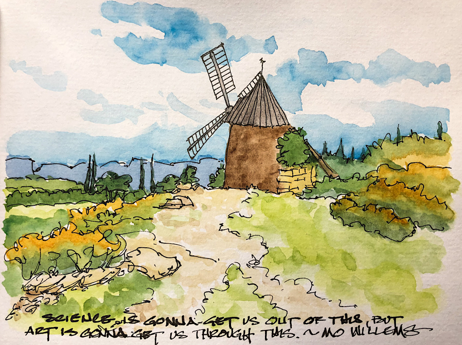
“Memory is more indelible than ink.”
Anita Loos, Gentlemen Prefer Blondes.
“I think not….”
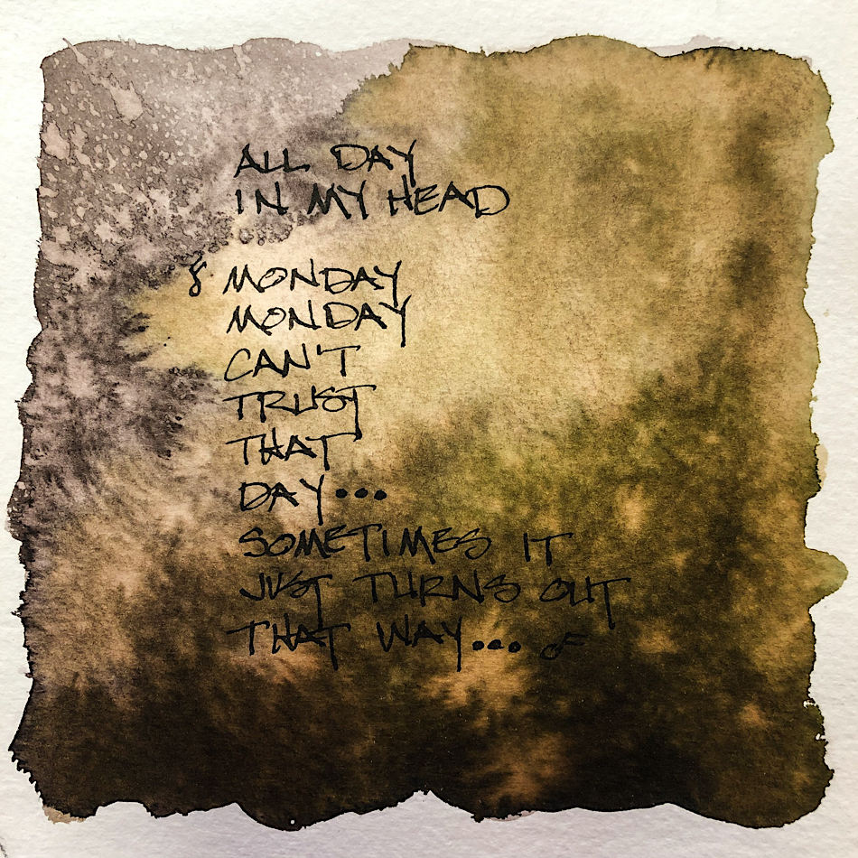
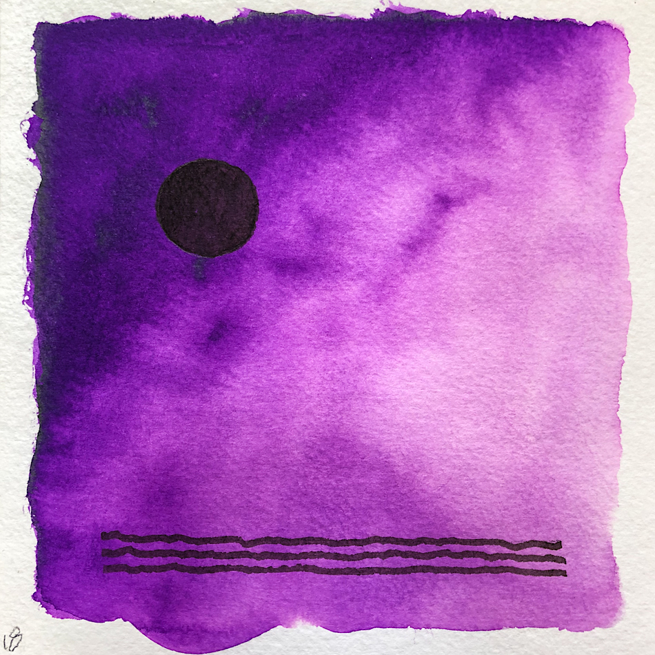
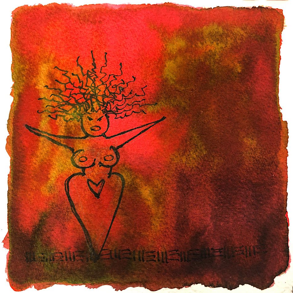
Me… why I journal!
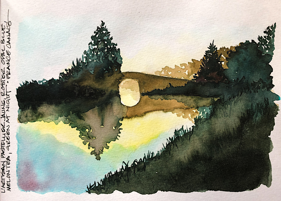
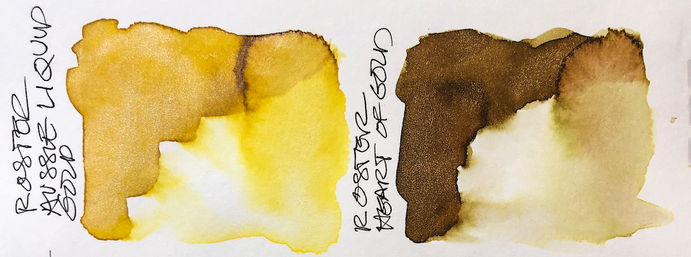
Hahnemühle Toned Watercolour Book, Pentel Aquash waterbrushes,
Platinum Plaiser pen with DeAtramentis Document Urban Grey ink,
Lamy Joy with De Atramentis Document Black ink,
Platinum Carbon Pen with Platinum Carbon ink waterproof cartridges,
Platinum Japanese Art Pocket Brush Pen, with
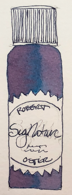
Robert Oster Green at Night ink, Robert Oster Midnight Sapphire ink,
with Birmingham Tarnished Nickel ink, with Robert Oster Bishop to King ink,
Robert Oster African Gold ink, J.Herbin Rose Cyclamen ink.


©D. Katie Powell.
My images/blog posts may be reposted; please link back to dkatiepowellart.
Note: As an Amazon Associate I earn from qualifying purchases.
☾
 As my Patreon supporter, you will have
access to some content not on this website,
sneak previews, goodies, discounts on classes.
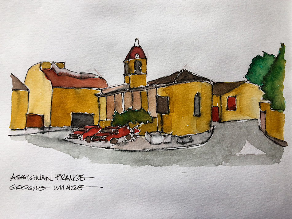
I teach architectural sketching,
art journaling (art+writing), creativity, watercolors.
That annoying loud-mouth editor/critic in your head? GONE! How great would that be?