
Taking a break from posting World Watercolor Month images
for a review of a great grey ink from Birmingham.
NOTE: I just realized this ink is nowhere in their new colors, and so, I apologize.
I picked up one of my favorite greys to review!
Birmingham, I think this needs to return!!!! I LOVE this color!
It appears to be between Burnt Charcoal and Corroded Tin.
I love sketching with soluble grey inks, and touching them with a waterbrush
to move the inky colors in interesting directions. Greys are rarely neutral,
leaning toward warm or cool, and often filled with hidden colors.
One of my favorite grey inks is
Birmingham’s G. C Murphy Tarnished Nickel ink.

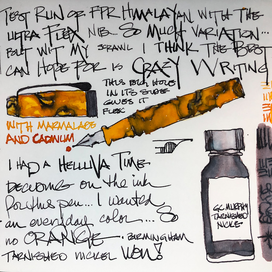
 Properties of Birmingham Tarnished Nickel ink:
Tarnished Nickel is well behaved gorgeous ink, though it feathers slightly on Post-its, and no other paper on which it has been tested. It performs well on the smooth paper in my Hahnemühle Nostalgie journal. When scrubbed it has some water resistance, above and note the central dot, right. Further test sketches in my journals show it to leave a imprint of water resistant ink lines when hit with water. It has no sheen that I could produce.
Remember that others review these inks just for writing;
I am also interested in how they are used for ink-painting!
It is a complex grey ink!
This is why I love it so much for sketching — hit with even the slightest water
it begins to move and do such interesting color changes, above.
From their website, the naming of this ink:
Originally opened in Pittsburgh in 1906, G.C. Murphy was a five & dime
variety store founded by George Clinton Murphy in the suburb of McKeesport.
The chain grew to 529 stores around the country by 1976.
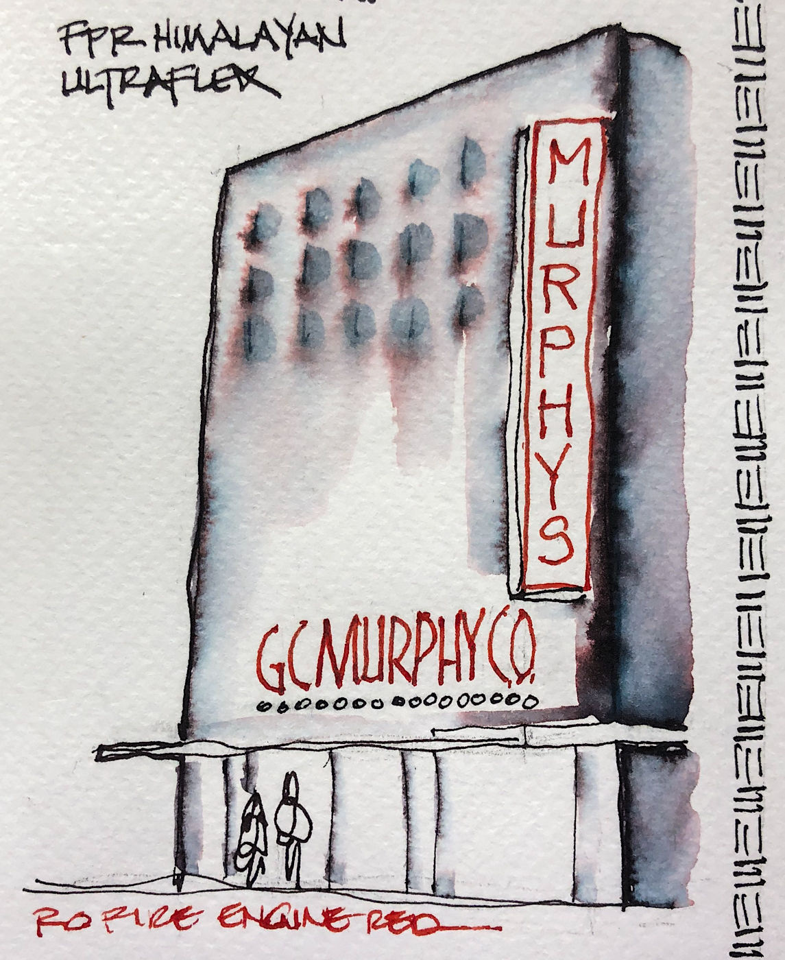
I drew the GC Murphy five and dime on my test page with a FPR Himalayan pen with
and touched the lines with water using a Pentel Aquash waterbrush.
This was a 30 minute sketch with water movement…
The lines stay slightly visible but also release ink; which means slight water resistance.
I did not add linework in, but left some lines untouched.
Yes, I added a bit of red ink to the drawing, but only for the signs!


*Above, watercolors from Daniel Smith.*
When painting, it first goes on the paper with a charcoal-blue blue cast, then deepens.
Looking at watercolor comparisons, when hit with enough water to separate,
the colors fall in the Phthalo Blue-Green, amethyst, and pinker ranges.
In watercolors that puts the pigments in the following Munsell ranges:
PBk10 / PR209 / PB29 / PB15:3 / PG7.
*For more info go to this page.*
 In my Hahnemühle Nostalgie journal, with the pen that is currently hosting it!


 From 1 week 100 people, From line to wash with a water-brush. I drew Guly Gus from Sktchy; Love the rich dark grey ink!
I also drew a baby picture from a friend.
MOST water soluble ink companies do not pay attention to lightfast qualities and Birmingham is no different. Most artists who use ink are making prints of their work — But ink-painting is becoming more interesting so maybe it is time!
Disclosure, I bought my own ink from Birmingham.
 Birmingham’s bottles are glass, and functional,
even in the small sizes. I like glass bottles;
they feel like they will last longer.
From their website: “We started Birmingham Pen Co. in 2012 in the Southside of Pittsburgh, Pennsylvania, with the doors of our first retail shop opening to the public in 2016. The region of Pittsburgh where we began once called “Little Birmingham” due to the area’s prolific manufacturing industry in the early 1900’s. The Birmingham moniker was derived from Birmingham, UK – a manufacturing hub that specialized in, among other things, pen and nib manufacturing with thousands of craftspeople employed in the industry. We chose the name Birmingham Pen Company to share this little known piece of history and continue in the traditions behind the name.”
A small family business started by the brothers, Nick and Josh,
Dad is the chief pen machinist (I own one of their lovely pens!),
and Mom does one of the coolest things about Birmingham, their historic names!


 To hear about classes, follow me on Facebook
or check out my new, improved dkatiepowellart.com
“Memory is more indelible than ink.”
Anita Loos, Gentlemen Prefer Blondes.
“I think not….”
Me… why I journal!
Hahnemühle journal, Pentel Aquash waterbrush,
Birmingham Tarnished Nickel ink lived in my Himalayan
for a long time, and now lives permanently in my white TWSBI Eco 1.1.


©D. Katie Powell.
My images/blog posts may be reposted; please link back to dkatiepowellart.
☾
 As my Patreon supporter, you will have
access to some content not on this website,
sneak previews, goodies, discounts on classes.
I teach architectural sketching,
art journaling (art+writing), creativity, watercolors.
That annoying loud-mouth editor/critic in your head? GONE! How great would that be?


