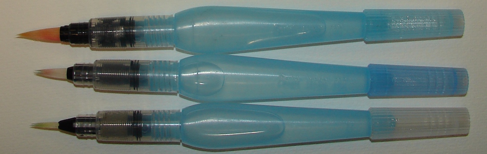
I don’t use water brushes except in two places —
I keep them by the side of the bed (I am an insomniac, so also have a sketch pad
and travel watercolors) and when in the field.
Don’t forget, these brushes are not the greatest but still, I want:
a) a brush that holds a point (if it is pointed)
and
b) want the water to flow OUT not dirty watercolor paint to flow in (when doing a wash) and
c) finally, how is it filled with water? I know, some are designed to SQUEEZE
but frankly I’ve not found that effective because sometimes if there is a bit of paint left it gets squeezed into the water tube and I am fussy about clean palettes.
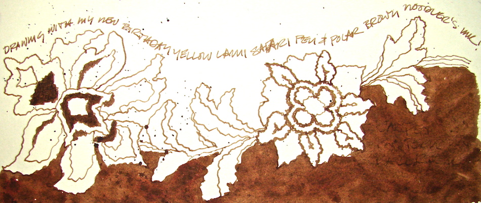
I want my yellow to be yellow!
PS: DO take a look at the comments below, because everyone’s experience
may be different! It is a good point,and true, especially on items like this,
which are, in fact, rather cheap tools. I welcome other viewpoints!
The line-up:
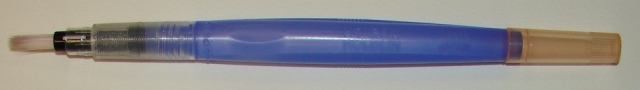
I’m not a Holbein Water Brush fan. The good news is it holds the most water, and has an
easy-pour way of filling without losing a stopper-thangy (a highly technical term),
shown above. BUT, The points don’t hold — so it is a stubby brush.
They also suck water up into the tank too easily which I don’t like.
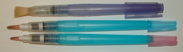
I like Kuratake’s Yasutomo Niji Water Brush second best.
(There is the whole name confusion thing — Niji or Kuratake?
I don’t see Niji written anywhere but this is the brush!)
They have a flat which is nice. However, the flat twisted almost immediately (see the twist?) and I don’t think that says much for the brush, plus it sucks dirty washes into it!.
They also don’t hold their point (not that any water brush is a great brush.)
I also don’t see much of a difference between the two sizes except one is shorter.
You can fill them with a suction motion but as I said, I don’t like that and so,
the little stopper-thangy gets removed. I’ve lost one already.
I will buy another flat sometime, however.
They hold their points better (these are not new brushes and look at those nice points!), have various sizes that are very different, and they are easy to fill —
no thangy to remove and LOSE in the field.
I have rarely had them suck a dirty wash back up into the water. They are shaped
so they don’t easily roll! When I see them on sale I buy several because
I also fill them (below) with liquid watercolors!
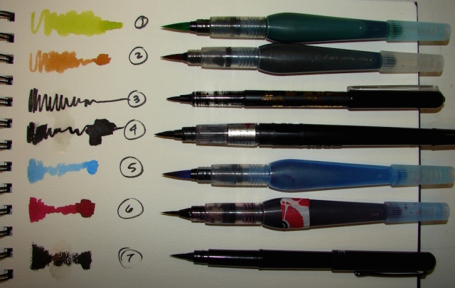
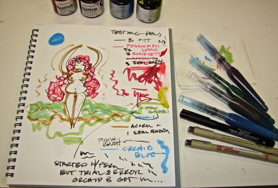
There are companies that make inked brushes. My favorites, above, of
company-filled brushes are #3, #4, and #7; all the inks are waterproof. In order of preference (and not a dog in the stack):
#3, my favorite, is not really a brush, the Platinum Japanese Art Pocket Brush Pen. It is not really a brush but a felt tip, and is wonderfully wet and lasts and is strong and waterproof and has cartridges. I’ve not had mine flatten yet, and I use a a lot.
I show it here because I always reach for it instead of my black brush pens.
What does that say about me, I don’t know!
#4, the Kuretake Zig Cartoonist Brush Pen No. 22 (Black), is okay, and can drop lots of black with a squeeze ( see that big blob?), but somehow I just don’t reach for it. It doesn’t fit as comfortably in my hand, and I don’t feel like I have the control as I do with others.
#7, the Pentel Pocket Brush Pen for Calligraphy I like, but oddly, it is rather dry.
Maybe it is just mine. Does have refills. I may begin to love it when I pop a fresh refill in!
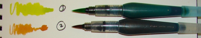
Sometimes I fill my Pentel water brushes with liquid watercolors, shown below and #1, #2, #5, and #6, above. They can make teeny lines then drop lots of watercolor in a big blob and they have more control than the commercial pens. And better color. NOT waterproof, mine all use liquid watercolors and become custom color brush pens!
But once filled, I can’t imagine they can go back to being clean water brushes!

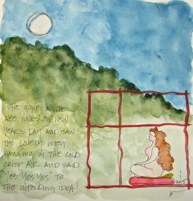
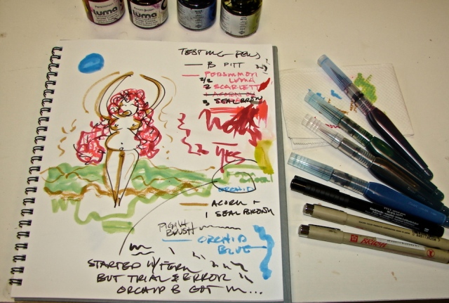
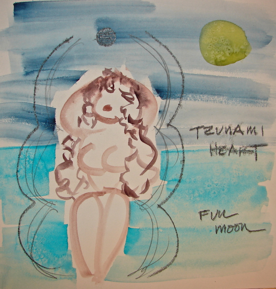
The Booby Gurls are all mine, copyright dkatiepowellart!

I agree to Creative Commons Attribution-Non-Commercial 4.0 International License, which you can learn more about by visiting the site, or,
visit my web page for a more user-friendly summary on my terms.
My images/blog posts may be reposted;
please link back to dkatiepowellart and give credit.
I'd love it if you shared this; please mention my blog name!

 My favorite pens are Platinum Carbon Pen (best pen ever), Pilot Parallel


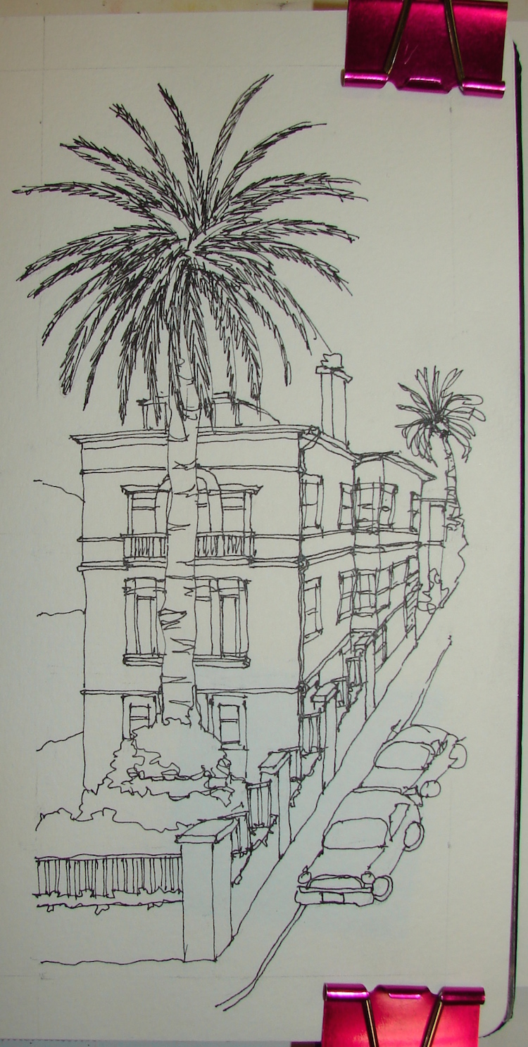


VSW: Haight-Ashbury, San Francisco
The inspiration for this virtual walk came from a Preservation Leadership blog on
Early San Francisco Parking Garages. I love funky old buildings, and these are anonymously designed (in some cases) and I don’t want them torn down!
To see the walk we took, from Haight and Schrader
to Frederick to the Richard Gamble Memorial Dog Park, go here!
I wanted to convey a bit of whimsy,
and to also remember the counter-culture
that I really was not able to experience,
being either too young (teens) or too responsible (I practiced architecture there for IBM).
I was in love with San Francisco as a kid,
when my mom and I would go and explore the wharf, eat crab in front of Alioto’s, dink around in Chinatown and Christmas shop. In my teens and twenties, when it was the city of love, and the culture defined the meaning of colorful.
lost in heaven, then eat at the street vendors in Chinatown.
If I was eating after work I went to the Tadich Grill, where a woman could sit at the bar, talk with others, and it was cool without being weird. Breakfast was at Cafe Trieste
or Buena Vista if I had time and a friend with me. I’d shop across the street at the Pier stores and found my first Mei Fa Stix in the Haight.
I spent many weekends in San Francisco alone, and if my career teaching had taken a different turn might have moved there, but I
ended up teaching at UCLA.
As a Californian Gurl, I also wanted to make sure to include my beloved palms, which are everywhere in the city, and range from scruffy short stubs to majestic anchors.
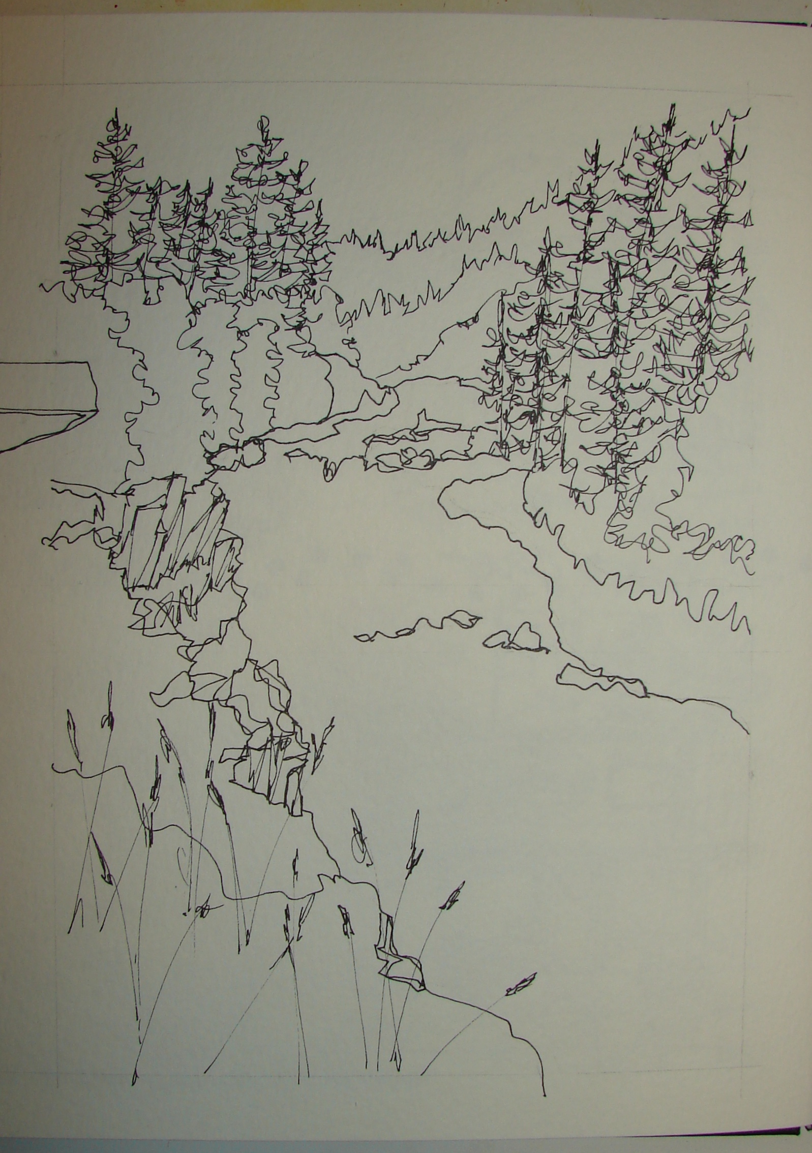
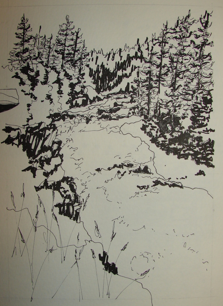
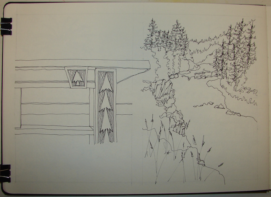
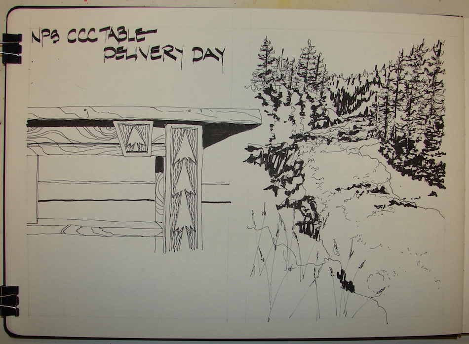
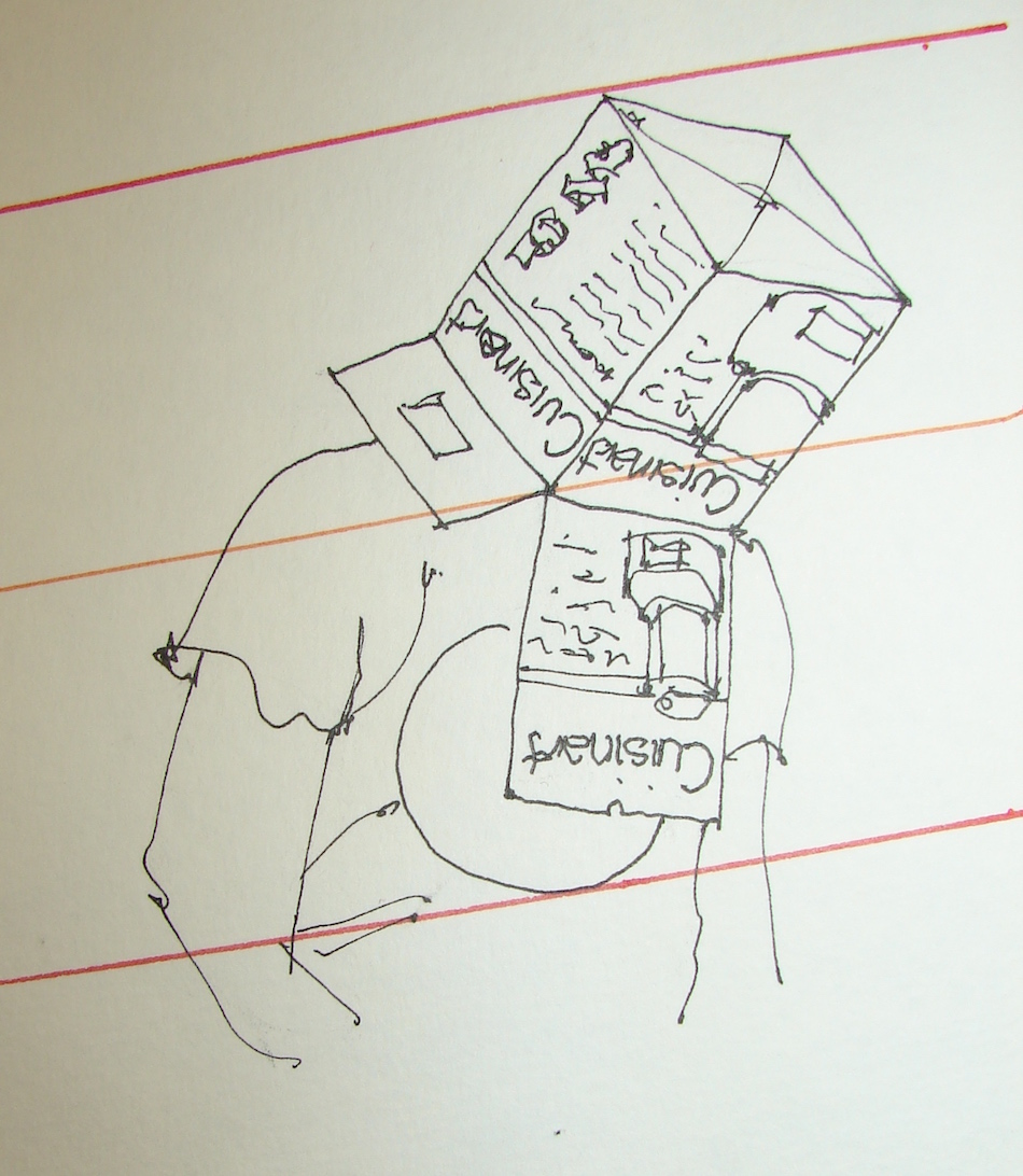
I did the two-page layout in pencil, and sketched rough guidelines before inking
using a Platinum Carbon Pen for all the black inks except the lettering.
These simple penciled guidelines allow me to remain truer to the perspective,
but also are a way of me getting to know the way the buildings are built.
Do the windows line up? Are the floors level or split level?
Is the street level or going up or down?
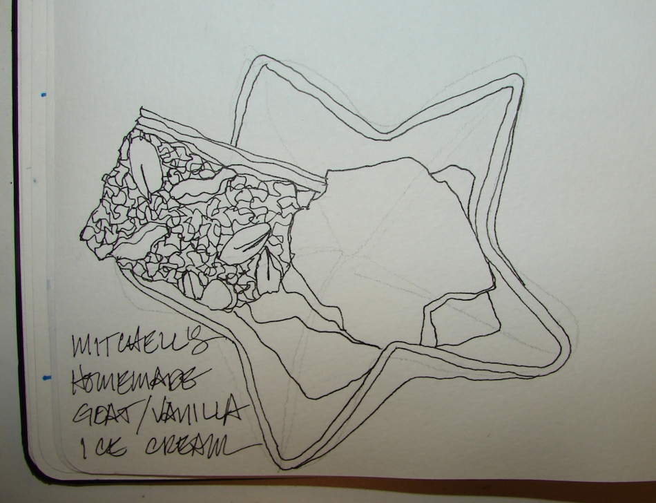
I liked the clean inked version of this layout so much I decided not to use
colored inks or watercolors. I’ve always loved inked drawings,
and was never happier than when I was inking a large formal drawing at school.
Plus, it is INKTOBER!
The walk:
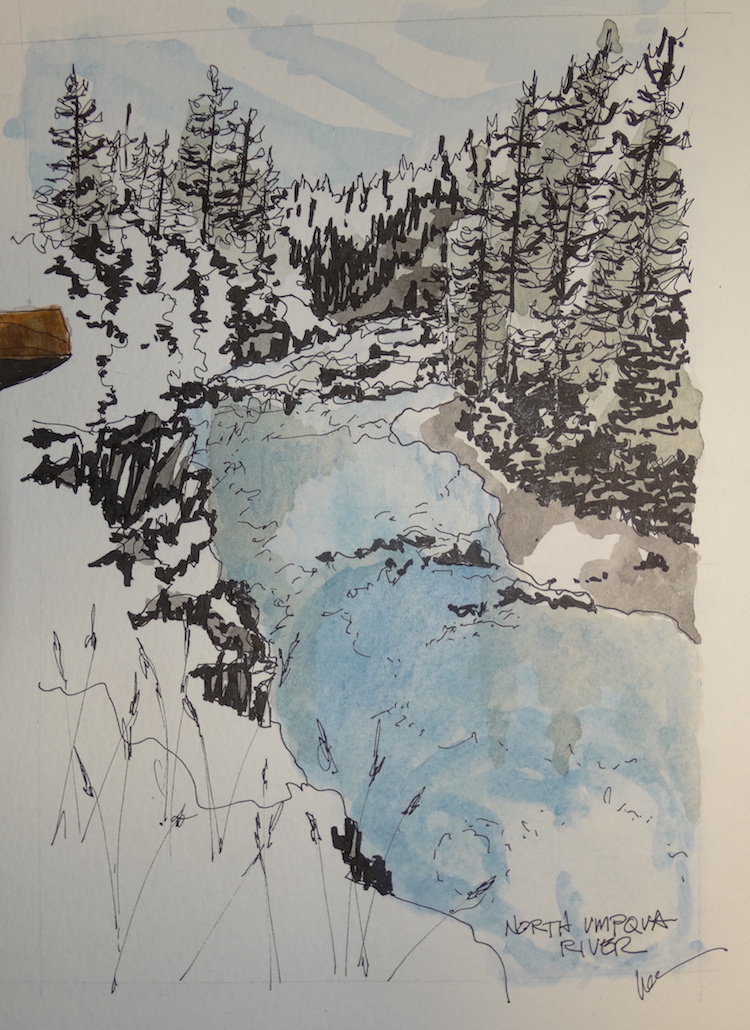
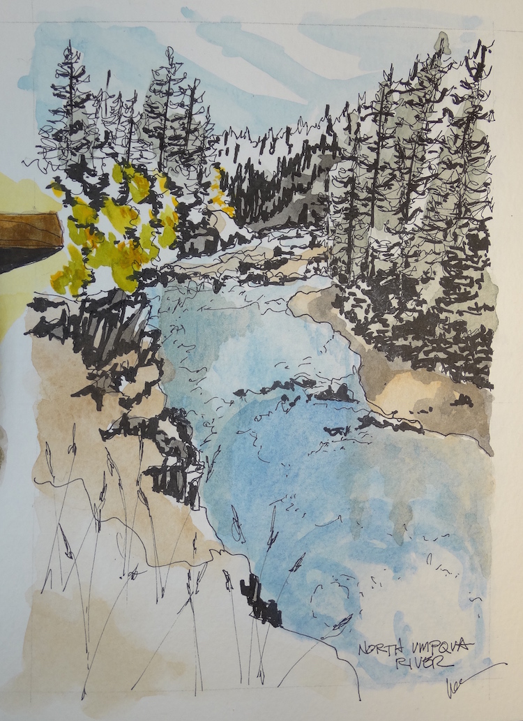
Moleskin 8×11 watercolor journal,
Pentalic HB woodless pencil, Platinum Carbon pen.
I started a closed Facebook group page (you must join to view) to allow everyone
to comfortably post their virtual sketches, and also where we will,
from time to time, take virtual sketch walks together.
If you want to know more about what a virtual sketchwalk is review my first post.
I also created an accompanying Flickr group!
Don’t forget you can also post your images on Flickr!
Come join us On Facebook if you are inclined!
There are a few more notes/pointers on our first walk through Laguna Beach, California.
I agree to Creative Commons Attribution-Non-Commercial 4.0 International License, which you can learn more about by visiting the site, or,
visit my web page for a more user-friendly summary on my terms.
My images/blog posts may be reposted; please link back to dkatiepowellart.
I'd love it if you shared this; please mention my blog name!