
Back to the holiday season,
Arlo sings about Santa:


If anyone is ordering from my site this holiday season, I apologize for the message that Redbubble is sending about being a thoughtless jerk while showing they are illiterate.
Also, the sticker they send with the crying woman (or god forbid, bleeding-from-her-eyes woman) is pretty disgusting. Or maybe the message is on track, and the woman holding the Redbubble is sad over the product? It is not good in any case.
Know that none of this is from me, and I have already written to them. I don’t know who is in charge of messages, but they need to know that not everyone wants to be called names or see that garbage at the holidays.


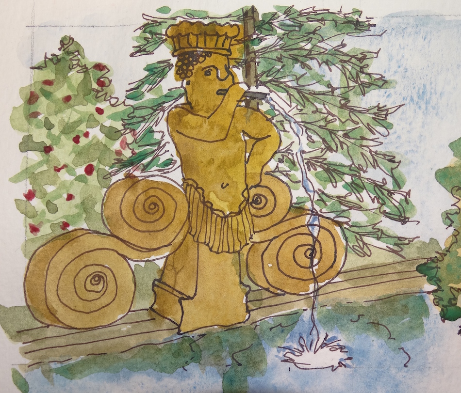
 Inked sketches on a handmade Arches Journal with a
Pentalic HB woodless pencil, Platinum Carbon pen, and Greenleaf & Blueberry,
Holbein and and Daniel Smith watercolors.

I agree to Creative Commons Attribution-Non-Commercial 4.0 International License, which you can learn more about by visiting the site, or,
visit my web page for a more user-friendly summary on my terms.
My images/blog posts may be reposted;
please link back to dkatiepowellart and give credit.
 My mom is housebound.
She hates it.
I decided to make a card for her
of her giant Santa
(given to her by friends in Laguna Beach)
which she often used to hold
presents on her rattan chair.
Turned out nice enough that
I put it up for sale on Redbubble
with a few others.
Inked sketch on a handmade Arches Journal
with a Pentalic HB woodless pencil,
Platinum Carbon pen,
and Daniel Smith watercolors.
Copyright 2015 D. Katie Powell, however, my images/blog posts
may be reposted; please link back to dkatiepowellart.
 This is part of a series for Restore Oregon.
Thanks to Drew Nasto, Craig Powell, and for the various locations for allowing me to use historic images to place into sketch format to commemorate the projects!
This post shows the changes adding color to the folding journal.
I’ve always been a fan of line sketching, but the color adds a lot to this series.
Working small is hard for me — you know, I love my A4 Moleskins!
This handmade folded journal is only about 5×7-inches folded up; this feels so teeny!
Yet I love the idea of a folded journal and watching things go by.
A design challenge, as I no longer have walls to paint!
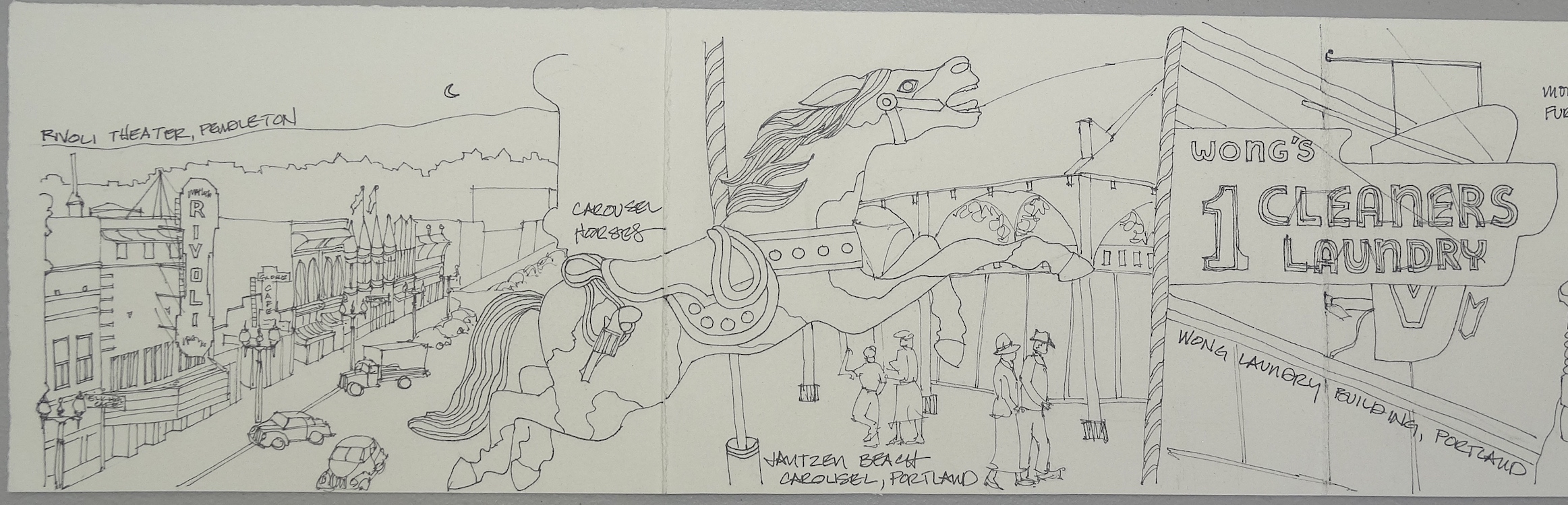


 The following locations are shown in this set:
the Rivoli Theater; the Jantzen Beach Carousel; the Wong Laundry Building;
the Chateau at the Oregon Caves NM; and the Fort Rock Homestead Museum.
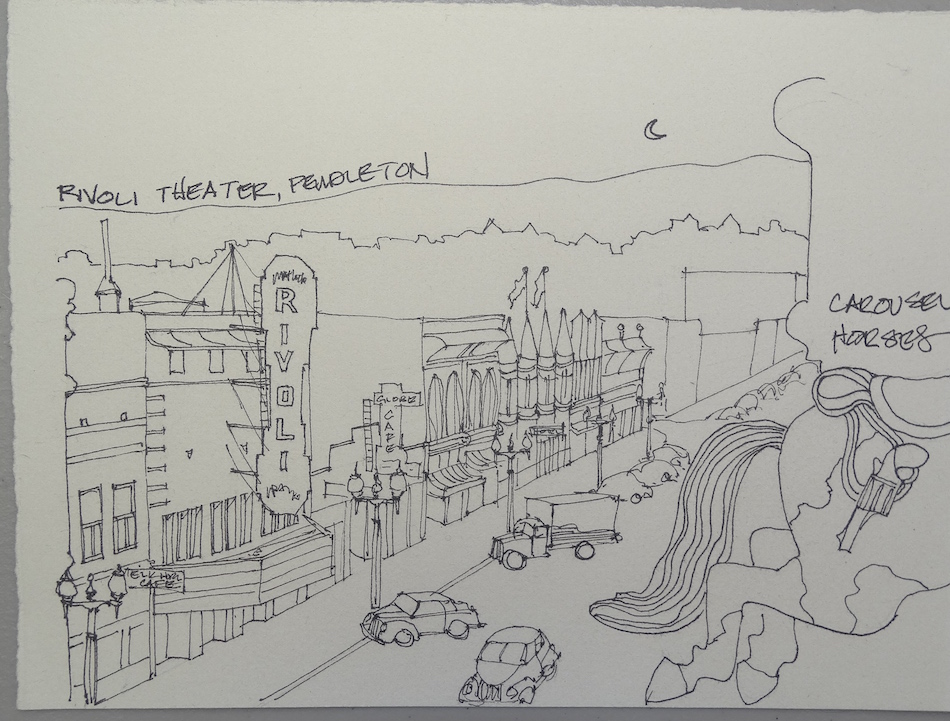
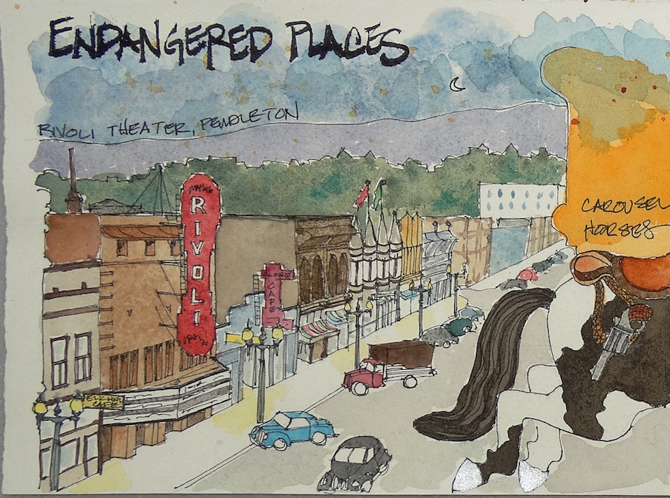
 The Rivoli Theater images were mostly in black+white or sepia tones; I had to play with color and use the teeny color images as reference! The photograph used was taken possibly over a roof line, and the edges of signs were my stopping point, and they played well into the edge of
the horses tail and feet.

 The Jantzen Beach Carousel was invented from many images, both historical
and recent coverage in newspapers and blog posts.
So many photographs have been taken of the exterior horses.
Still, I had no images showing the colors on the outside of the carousel.
I chose to draw the horse I would want to ride!
I hope to do so someday — I love merry-go-rounds!


 The Wong Laundry Building was
also a guess in colors.
I looked to the current buildings
in Chinatown for clues, finding many
deep greens, golden yellows and reds
on buildings — the colors of prosperity!
I focused on the old neon sign,
which is much more compelling
than the run-down facade which is
the reality of the building today.


 MPF Conservation has a long history with
the Chateau at the Oregon Caves NM.
Having treated thirty pieces of Mason Monterey furniture and having lived nearby for many years, we know and love the Chateau.
The image of the decks (destroyed by
snow loads) was a black and white historical
photo, and Kate laid color in as we know it.
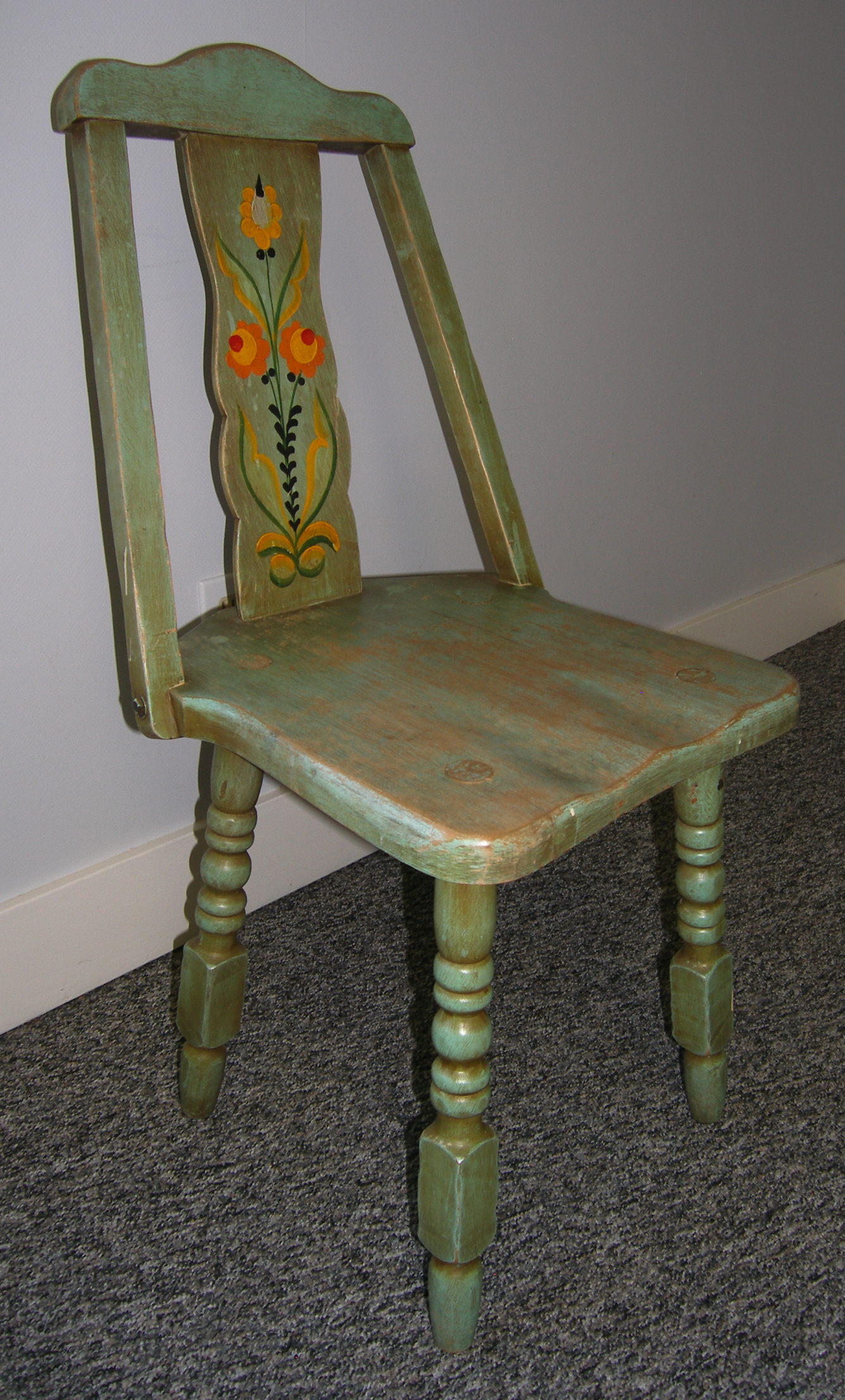
The A-frame chair shown is the one
historic A-frame with original paint which survived
the flood of 1964, probably because a guest had
taken it from the dining room to their bedroom.
MPF Conservation used the lovely A-frame as the model
for the design of the stripped broken A-frames,
and did diligence to determine the colors used on the others.
We repaired the original, and it is now part of the museum collection. Kate used the chair to balance the horse in the layout.


 The Fort Rock Homestead Museum. derives from
Craig Powell’s image. It shows the historic
General Store, moved to be part of the Fort Rock village.
In all, I think if I am to do more of these, the paper needs to change. This is good watercolor paper, and the format is small, only 5-inches high. It is so absorbent it doesn’t always take what I am throwing at it, especially my mix of inks and watercolors. This causes bleed even when perfectly dry between layers, so when a stroke should be tiny and clear it wobbles (bleeds) into the next image.
Inked sketches on a handmade Arches Journal with (mostly)
Platinum Carbon pen, Pentel Brush Pen, or Pilot Parallel pen 1.5;
Super5 or De Artramentis Document inks;
Daniel Smith, QoR, Holbien and Greenleaf & Blueberry Watercolors.

I agree to Creative Commons Attribution-Non-Commercial 4.0 International License, which you can learn more about by visiting the site, or,
visit my web page for a more user-friendly summary on my terms.
My images/blog posts may be reposted; please link back to dkatiepowellart.
Photographic images by known photographers Drew Nasto and Craig Powell.
This is part of a series for Restore Oregon.Thanks to photographers Drew Nasto and Craig Powell,
and for the various locations for allowing me to use historic images to place
into sketch format to commemorate the projects!
I hope to have time to do two of these to cover many of
Oregon’s Most Endangered Places for 2016.


I started with the following locations:
the Rivoli Theater; the Jantzen Beach Carousel; the Wong Laundry Building;
the Chateau at the Oregon Caves NM; and the Fort Rock Homestead Museum.
I used the images above, some of my own, and took great liberties with imagination.
The design issue is how to layout the images so that they flow
but hold prominence on their own. That challenge is fun for me!
The Rivoli Theater was built as a brick commercial storefront in 1900.
It opened as a theater in 1922, and became an important gathering and entertainment center in downtown Pendleton. Vaudeville and silent movies and talking Hollywood films played into the 1940s. Television’s popularity in the 1950’s took a toll on the Rivoli, but there are now plans to turn it into a cultural center once again.The Jantzen Beach Carousel was built by the Charles Wallace Parker Company in Leavenworth, Kansas, in 1921. C.W. Parker, the “American Amusement King,” built only three or four carousels the size of the Jantzen Beach Carousel. It lived for a short time in California before moving to the amusement park built by the swimsuit family in 1927.
The horses are spectacular, and many were hand-carved by inmates of the Leavenworth Penitentiary. The amusement park’s popularity peaked during the 1940s, and it was largely dismantled, but the merry-go-round was in use until recently. Portlanders have fond memories of the carousels, and when posting updates to friends, many remember riding the horses or have memories of their parents talking about trips to visit the horses on the merry-go-round. The Merry-Go-Round is no longer present on site.
Restore Oregon working with local partners to find strategy to restore and relocate.The Wong Laundry Building, located at 239 N.W. Third Ave, Portland,
was built in 1908 by Alexander Ewart. It is symbolic of immigrant struggles and work ethic in Portland’s Chinatown and Nihonmachi, or Japan-town. Vacant and water-damaged since a fire in 1970, members of the community hope to restore it as a combined commercial space, event space, and interactive museum.The six-story Chateau at the Oregon Caves NM was built in 1934.
It has been featured in the Great Lodges of the National Parks, and is part of a larger development that includes a chalet, several employee and rental cottages, and a visitor’s center, all under consideration for National Register status as part of a district.
The buildings were all constructed between 1923 and 1941. The Chateau is the most outstanding of these structures. The building also holds one of the largest collections of Mason Monterey furniture, also in need of expert conservation. The Fort Rock Homestead Museum is located in Fort Rock, Oregon.
The Fort Rock Valley Historical Society conceived and promoted the development of a homestead museum to preserve the Fort Rock Valley’s pioneer heritage. As a result of the society’s efforts, the Fort Rock Valley Historical Homestead Museum was opened in 1988. It is a collection of original homestead era buildings assembled in a village setting, including the Fort Rock General Store. Most of the buildings contain historic items used by local homesteaders including furniture, dishes, household products, and tools.
Inked sketches on a handmade Arches Journal with a Platinum Carbon pen.
I agree to Creative Commons Attribution-Non-Commercial 4.0 International License, which you can learn more about by visiting the site, or,
visit my web page for a more user-friendly summary on my terms.
My images/blog posts may be reposted; please link back to dkatiepowellart.
Photographic images (if known and not historic)
by photographers Drew Nasto and Craig Powell.
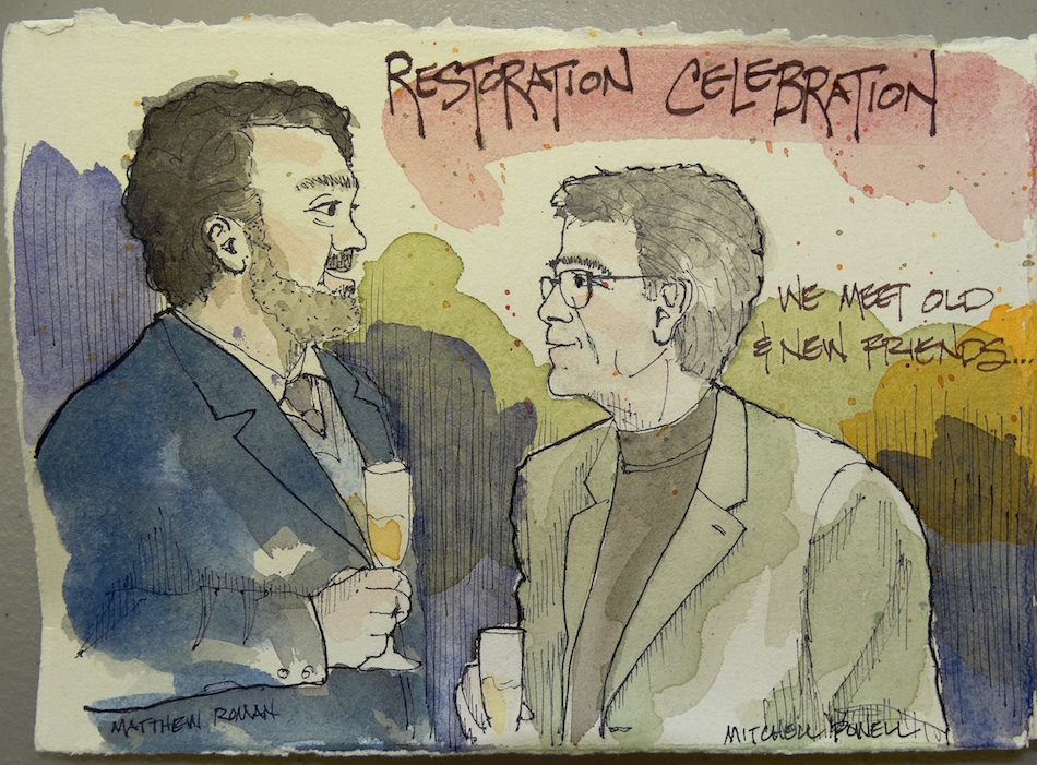
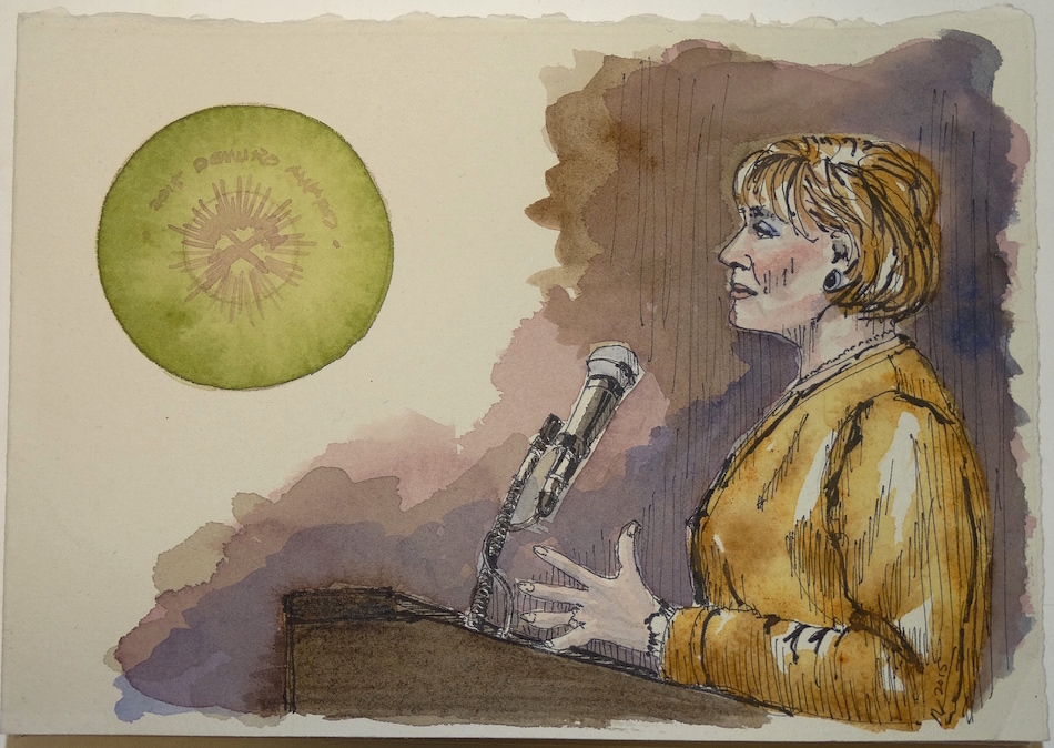
Mitchell and I attended the Restoration Celebration to raise money for the
the 2016 Most Endangered Places, and to hear the winners of the 2015 Demuro Awards,
as the guest of one of our clients, Karla Pearlstein of Restoring History.
Thanks to Drew Nasto for letting me use his images
to place into sketch format to commemorate the night!
 When we draw, we remember.
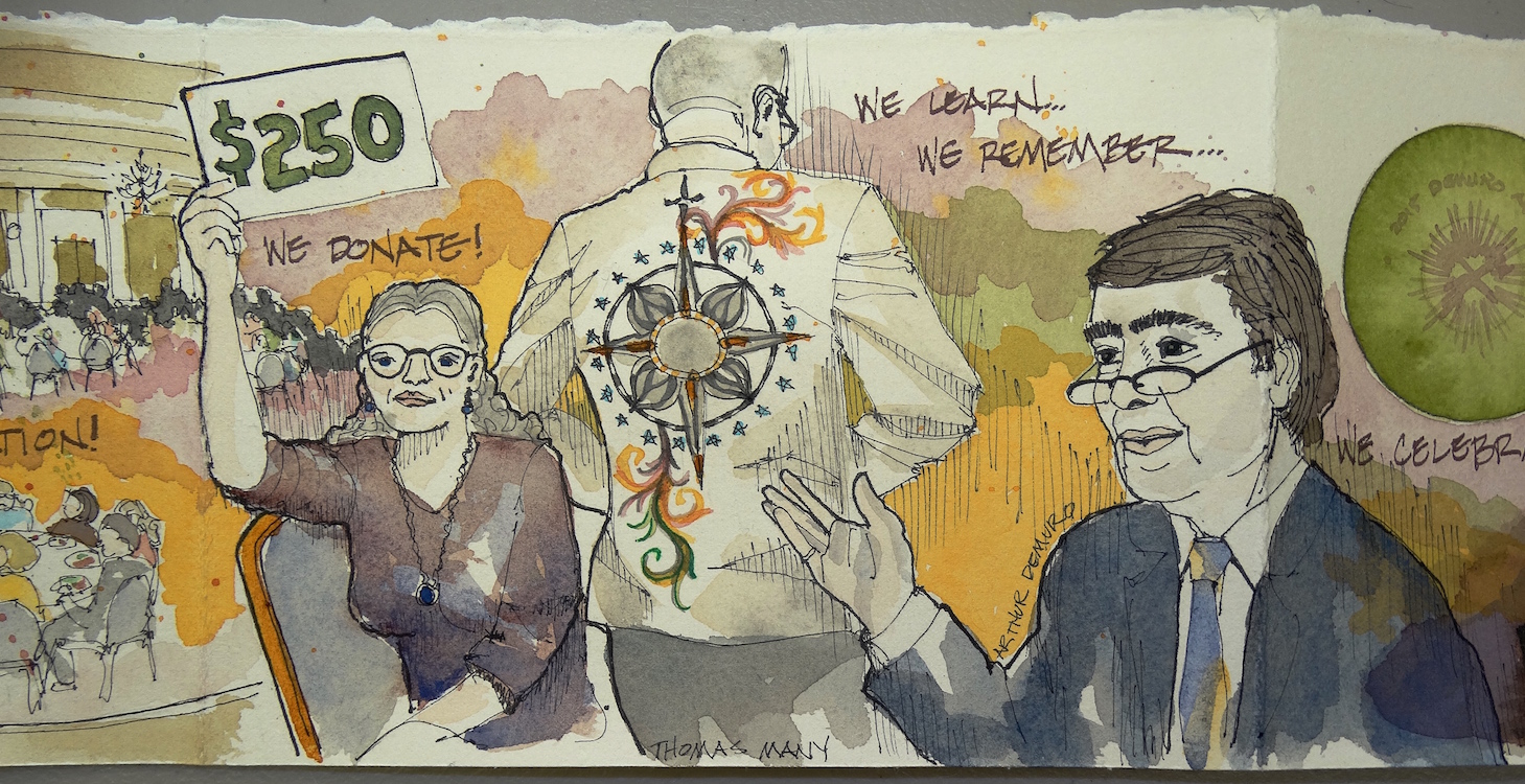 I understand the decorative details of the ballroom design
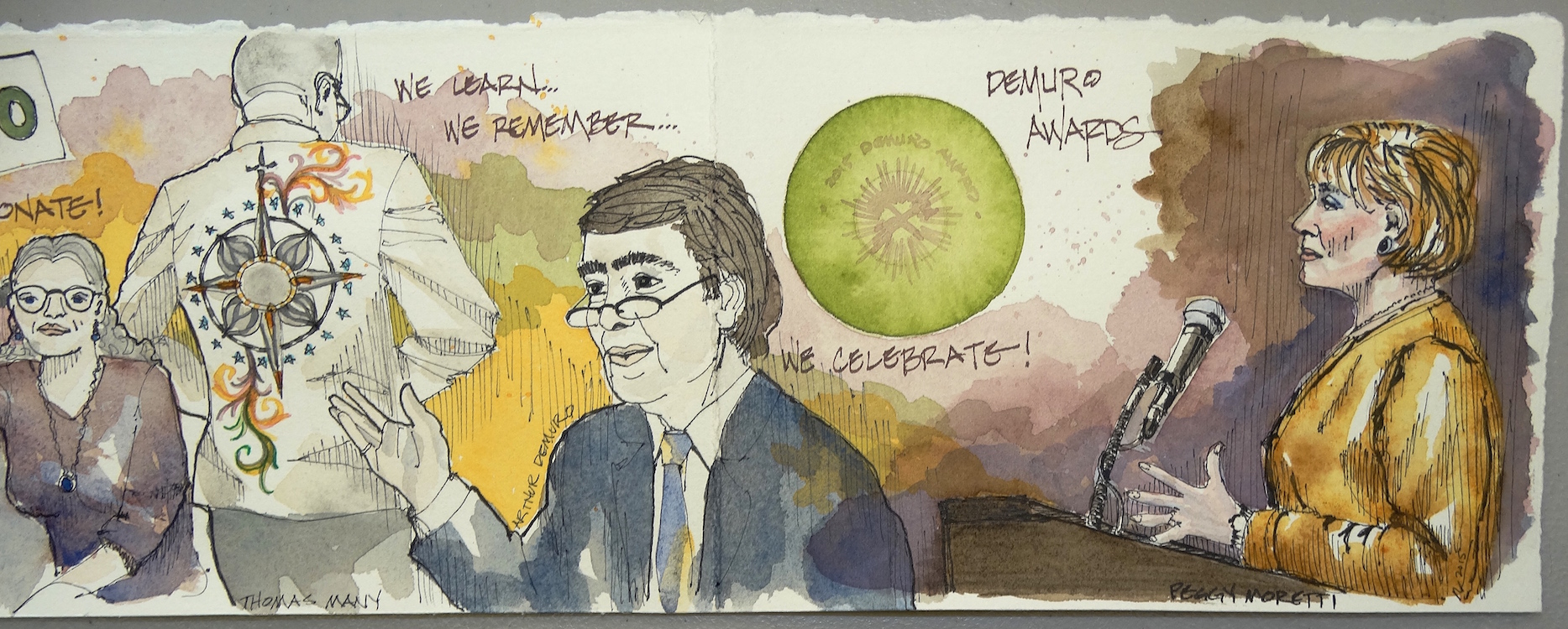 With the promise of more buildings to be saved,
 Artist commentary below, on process!
 I thought to take the evening through from start to finish.

I tied the various sketches together with background waterproof inks
which allowed me to add to them, deepen the colors, splatter watercolors.
Super5 inks: Delhi, Dublin, Australia.
This was true tying in the Quin Gold and Quin Brunt Orange of
Istvan Roman’s guitar to Delhi’s saffron yellow ink.
Matthew and Arthur’s suites were almost black;
I made them deep purple blue instead.


 I used artistic license to make the scene work.
I didn’t want to draw every last person in Drew’s amazing wide-angle photograph,
but wanted to give a feel for the activity in the room
and the spirited feel of the evening!
The woman I drew may have given much more, I don’t know:
I used our bidding cards to show a monetary amount
because I think a lot of folks gave $250.


 The jacket Thomas Mann wore
from a student at the
Pacific Northwest College of Art
(still trying to get the artist name!) was stunning!
How could I not show another artist’s work?
Mitchell would totally wear a jacket like that!
I drew some of the mandala in the
Platinum Carbon pen, and used
Noodler’s Lexington Grey ink and Super5 Delhi
so it would not mix with the watercolors on top.
Then I free-handed the lovely scroll work.
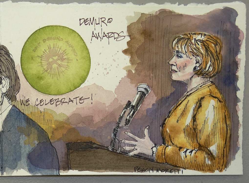
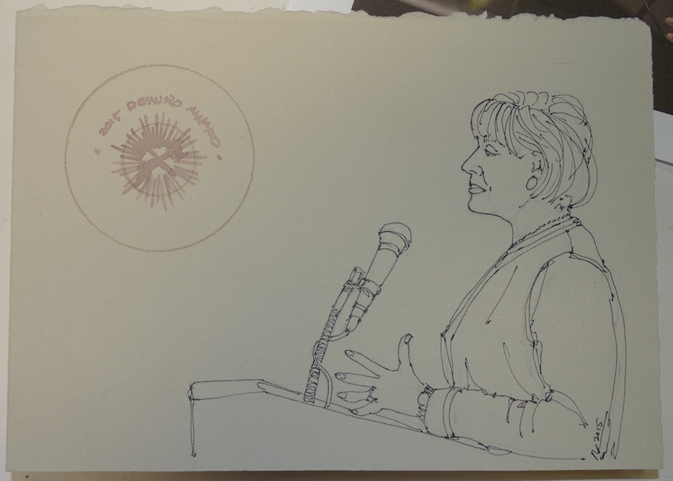
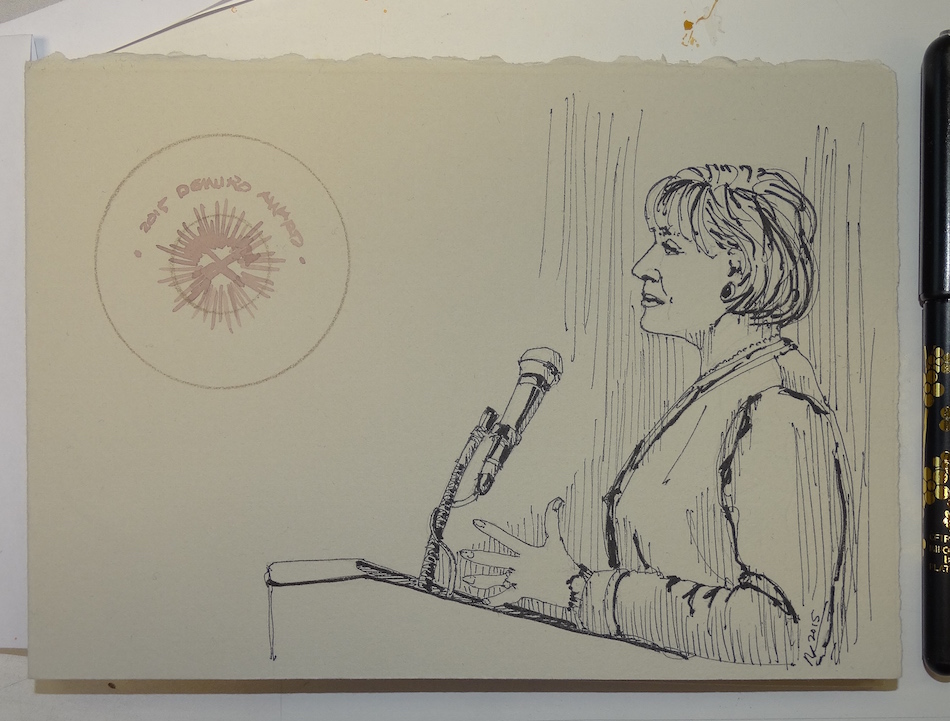
I started with Peggy Moretti’s image because I had her photo first,
along with the Demuro Award plates.
I left space on the folded journal for other items as they came, watching the story play out.
I wanted an image of Arthur Demuro because the award
was named for him and so many told stories of him.
His was the last image to come to me.
 Stay tuned for the Buildings, coming soon!
Inked sketches on a handmade Arches Journal with (mostly)
Platinum Carbon pen, Pentel Brush Pen, or Pilot Parallel pen 1.5;
Super5 or De Artramentis Document inks;
Daniel Smith, QoR, Holbien and Greenleaf & Blueberry Watercolors.
I agree to Creative Commons Attribution-Non-Commercial 4.0 International License, which you can learn more about by visiting the site, or,
visit my web page for a more user-friendly summary on my terms.
My images/blog posts may be reposted; please link back to dkatiepowellart.
Photographic images by Drew Nasto.
Mitchell and I attended the Restoration Celebration to raise money for the
the 2016 Most Endangered Places, and to hear the winners of the 2015 Demuro Awards,
as the guest of one of our clients, Karla Pearlstein of Restoring History.
I teamed up with Drew Nasto (photographer) and Denise Bartlett (Restore Oregon)
to collect great images to place into sketch format to commemorate the night!
Drew’s images were edited for my purposes.


Inked sketches on a handmade Arches Journal with (mostly) Platinum Carbon pen.
Last image used Pentel Brush Pen, or Pilot Parallel pen 1.5;
Super5 or De Atramentis Document inks;
Daniel Smith, QoR, Holbien and Greenleaf & Blueberry Watercolors.
I agree to Creative Commons Attribution-Non-Commercial 4.0 International License, which you can learn more about by visiting the site, or,
visit my web page for a more user-friendly summary on my terms.
My images/blog posts may be reposted; please link back to dkatiepowellart.
Photographs by Drew Nasto or others as noted, with permission.
Mitchell and I attended the Restoration Celebration to raise money for the
the 2016 Most Endangered Places, and to hear the winners of the 2015 Demuro Awards,
as the guest of one of our clients, Karla Pearlstein of Restoring History.
Restore Oregon is an excellent place to put your time and dollars toward preservation.
I teamed up with Drew Nasto (photographer) and Denise Bartlett (Restore Oregon)
to collect great images to place into sketch format to commemorate the night!
This post is a teaser, to show the process of moving from great pictures to sketch.


In this instance, I started with Drew’s excellent images of the Demuro Award plates
and lovely image of Peggy Moretti, Executive Director, Restore Oregon.
 Pencil first, both watercolor and graphite.
(If you use pencil first, and erase some or all of it, use a clean eraser!
If it is a knead-able eraser then pull it into a clean place!)
Moving to a fine point fountain pen, then a Japanese brush pen.
 I laid in ink to unify the background, Super5 Dublin and Australia.
It is so different working on really nice watercolor paper;
I am usually in a Moleskin or Stillman & Birn journal:
great journals but obviously not like good watercolor paper!


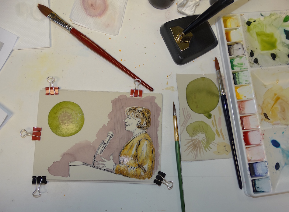 I began layering washes,
Quinacridone Gold and Yavapei and Piemonite and Sepia,
Sap Green, and Imperial Purple. I tested colors on a piece of the good paper, to see how the inks reacted to the good watercolor paper and to watch the colors build to the deep colored piece I ended with. (The glittery shimmer in the images is wet paint. No sparkles were added).
I am no portraitist, so it is nerve-wracking to do someone’s portrait.
But I’m learning! Finished piece: 1/4 of the folded journal, sans writing, below.
Inked sketches on a handmade Arches Journal with (mostly)
Platinum Carbon pen, Pentel Brush Pen, or Pilot Parallel pen 1.5;
Super5 or De Atramentis Document inks;
Daniel Smith, QoR, Holbien and Greenleaf & Blueberry Watercolors.
I agree to Creative Commons Attribution-Non-Commercial 4.0 International License, which you can learn more about by visiting the site, or,
visit my web page for a more user-friendly summary on my terms.
My images/blog posts may be reposted; please link back to dkatiepowellart.
Photographs by Drew Nasto or others as noted, with permission.
 My beloved Jai has been ill. Terrible diarrhea and finally diagnosed with IBS — irritable bowel syndrome. This is a TERRIBLE ordeal for the little guy — Montezuma’s revenge 8-12 times a day, always hungry (it masks as hunger), losing weight, and miserable. We have a GREAT vet, Dr. Prull, who helped us move slowly to find how to stabilize him.
 It was one reason we didn’t go anywhere on our vacation; we wanted
to be close. He, also, snuggled in more than normal and frankly,
he stunk to high heaven so it was a test of our love, and his patience
(he seems to know when  we are helping him but the tushi washing was not something he tolerated, which meant both of us waiting outside the kitty littler to ambush him.)
He tolerated (and
still does) needles and water, and the steroid.
Hates the bitter antibiotic.
Why him and not the others? He has had teeth problems and so eats mostly a soft diet, canned food, and we used Newman’s own Organics. Unfortunately, according to the vet from Newman’s Own, they added carrageenan in 2006 and decided to use up all their old labels, and so, while we carefully screened our foods and looked for carrageenan, we were duped by false labeling. We called to find our when they added it and found out the lie. (BTW, I will no longer buy any Newman’s product. Fool me once, ONLY, when it comes to our health.)
He is now stabilized, but he has not gotten the memo on how
we are no longer trying to keep his weight up and so he comes to
find us several times a day and turns up his nose if the food is not gourmet! He wants fresh chicken, shrimp, swordfish, bacon —
gads we don’t even eat the last three often! Loves his yogurt!
 Drawing my loved ones is not easy for me —
I’m not a realist, and so, trying to capture any of my loved ones is so hard!
I tried colored pencils this time, which I’ve not used since I practiced architecture!
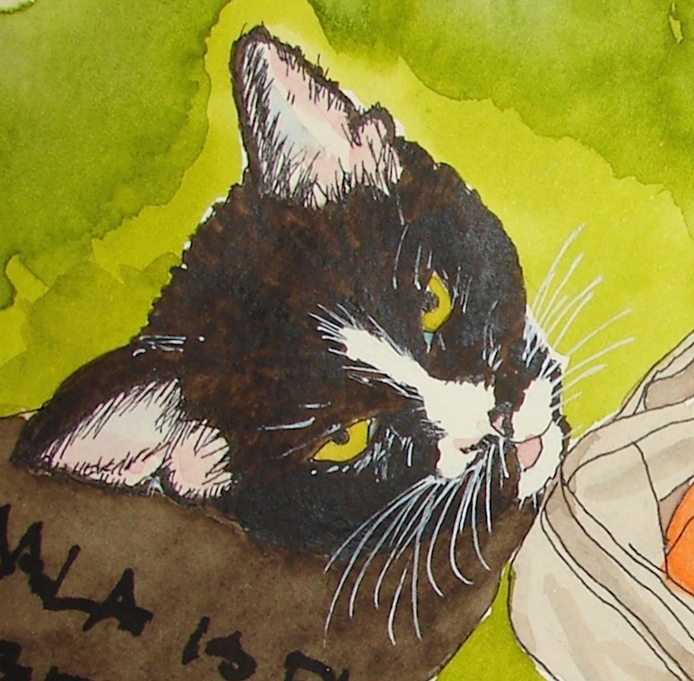
The waxed paper tip-in is to keep the pencil from smearing on Kamala, opposite.
 Inked sketches in a Stillman & Birn Delta Journal with (mostly) Platinum Carbon pen or Pilot Parallel pen 1.5, Caran D’Ache Supracolor, Pentalic HB, Prismacolor pencil.
Super5 or De Artramentis Document inks, Daniel Smith Watercolors.

I agree to Creative Commons Attribution-Non-Commercial 4.0 International License, which you can learn more about by visiting the site, or,
visit my web page for a more user-friendly summary on my terms.
My images/blog posts may be reposted; please link back to dkatiepowellart.
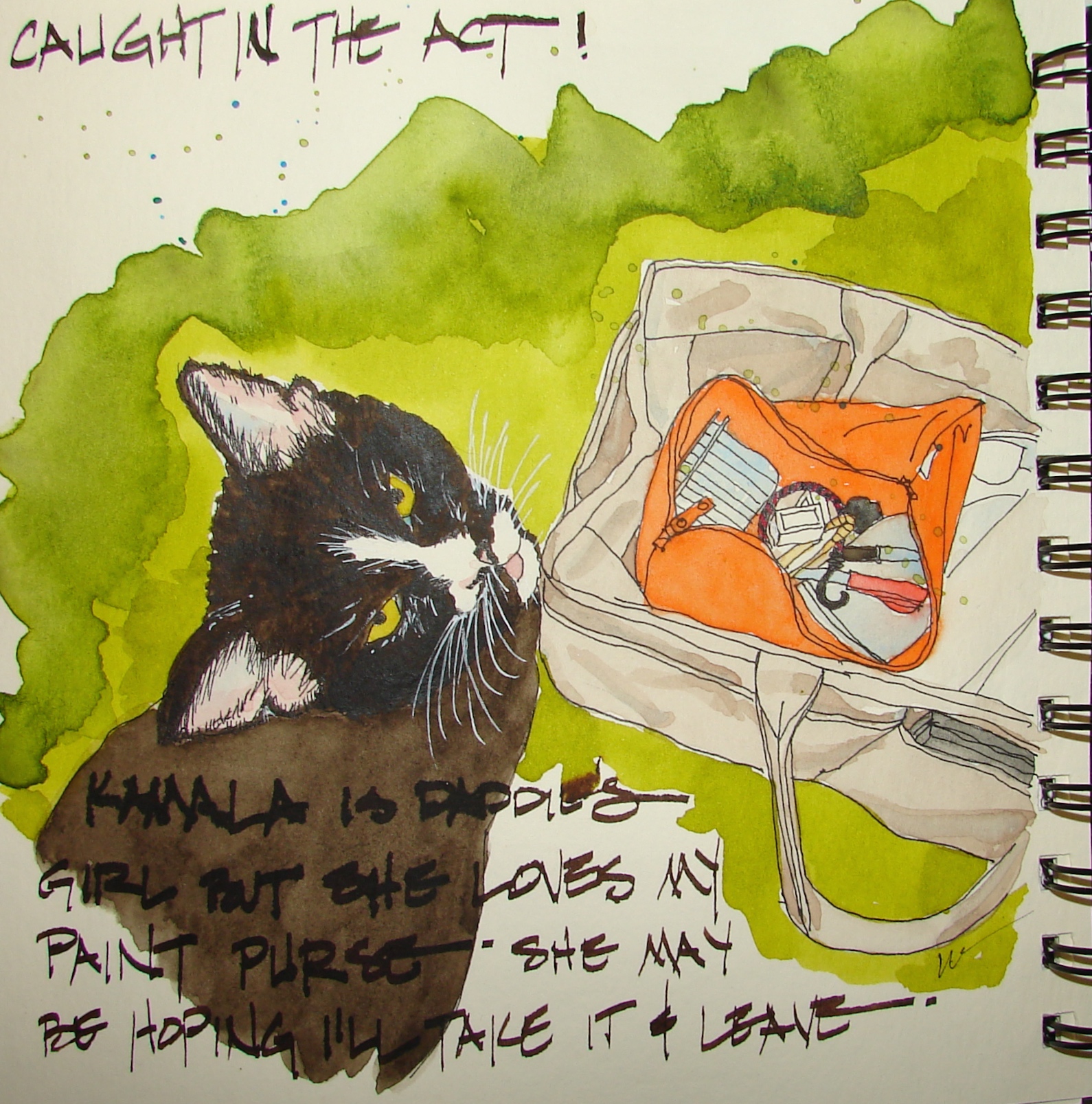 Kamala is her daddy’s girl. She’d like to see me gone, and makes that known.
She also has a huge fascination with my sketch bag,
and sticks her head in it whenever she can.
I’m not happy with the overall image, but here it is. I wish I’d made her body darker.
I’m happy with her face, as I captured her in both stance and appearance.
On the other hand, Kamala is so difficult a subject, black (not really brown) on black with white, a fat pampered tuxedo cat. And suspicious, of cameras and paint brushes.
Or maybe it is anything having to do with me.
See, the thing is, that we moved into a rental many years ago.
after a year of traveling, and one of our cats had not had all their shots yet.
Summer, he was sitting at the screen door calling to her.
(BTW, they hate each other now and we frequently remind him he called her to us.)
I LOVE animals, and simply stepped out onto the deck to tell her she had to go home, using my had to say,
I had no idea, especially as she was a fatty then,
that she had been dumped by the previous renters.
(People who dump animals in the country are second
only to those that actually physically abuse.)
When we found out (talking to new neighbors) she had made her decision.
For several years we made sure she had fresh water and in the winter we put food up way high in the carport (hoping the raccoons would not get it) near a cozy bed.
In summer we watched her be the best mouser ever.
We were getting ready to move, coming up and down looking for places in Portland,
and I often told her we were moving
(of course I had no idea of she heard me because she would not show her face to me.)
One day Mitchell walked out on the deck and she jumped into his arms.
And now she is ours. Well, his. It took another year before she would warm to me. Gads never cross a smart feline female. I love her as I can, when I can!
 Inked sketches in a Stillman & Birn Delta Journal with (mostly) Platinum Carbon pen
or Pilot Parallel pen 1.5 and white Uniball Signo. Goulet’s sample inks, and Super5 or
De Artramentis Document inks, Daniel Smith, QoR, Holbien and
Greenleaf & Blueberry Watercolors.
I agree to Creative Commons Attribution-Non-Commercial 4.0 International License, which you can learn more about by visiting the site, or,
visit my web page for a more user-friendly summary on my terms.
My images/blog posts may be reposted; please link back to dkatiepowellart.


Mitchell brought me a leaf that caught his eye. It was wet and bright, and I took a picture to paint it later. Then I liked the look as it aged a bit and had a grey dappled cast.
I painted that instead.
 Inked sketches in a Stillman & Birn Delta Journal with (mostly)
Platinum Carbon pen, Goulet’s sample inks, and Super5 Australian and De Artramentis Document Red inks, with Daniel Smith and Greenleaf & Blueberry watercolors.
I agree to Creative Commons Attribution-Non-Commercial 4.0 International License, which you can learn more about by visiting the site, or,
visit my web page for a more user-friendly summary on my terms.
My images/blog posts may be reposted; please link back to dkatiepowellart.
I love painting to this kind of energy!
What’s your favorite music?
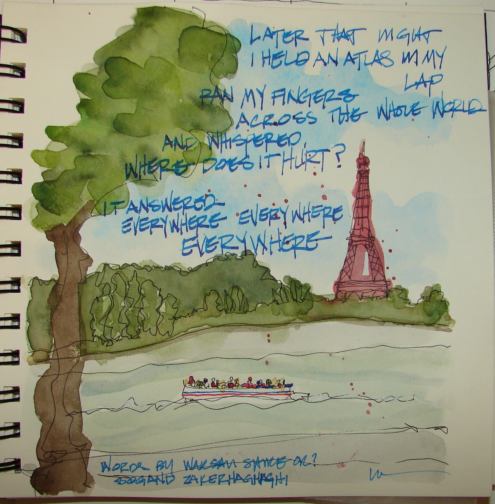 What happened in Beirut and Paris is horrifying, and then,
how the USA politicians ran with it even before
bodies had been counted was disgusting.
These words by Warsan Shire moved me, and
I hope she is fine with me putting them into my sketchbook then sharing them.
It hurts everywhere.
I am happy that France has a brain and realizes that the terrorists were not refugees.
I don’t consider this politics. I consider this humanities.
I spent a Christmas Eve and Day with my then best girlfriend
on the Île-de-France snuggled into a B&B during a snowy two days,
with our foods for our feasts on a windowsill (our fridge)
and non-stop reading for two days, walks, and eating.
It was delightful.
I came close to staying there permanently, I loved the French so much.
Inked sketches in a Stillman & Birn Delta Journal with (mostly) Platinum Carbon pen or Pilot Parallel pen 1.5. Goulet’s sample inks, and Super5 or De Artramentis Document inks, Daniel Smith, QoR, Holbien and Greenleaf & Blueberry Watercolors.
I agree to Creative Commons Attribution-Non-Commercial 4.0 International License, which you can learn more about by visiting the site, or,
visit my web page for a more user-friendly summary on my terms.
My images/blog posts may be reposted; please link back to dkatiepowellart.
 A lot of my journal about our time off are simple pages that form a
background for my journaling; many are private, but some are like this,
simple sweet memories of us watching the crows fly home at night.
Inked sketches in a Stillman & Birn Delta Journal with (mostly) Platinum Carbon pen or Pilot Parallel pen 1.5. Goulet’s sample inks, and Super5 or De Artramentis Document inks, Daniel Smith, QoR, Holbien and Greenleaf & Blueberry Watercolors.
I agree to Creative Commons Attribution-Non-Commercial 4.0 International License, which you can learn more about by visiting the site, or,
visit my web page for a more user-friendly summary on my terms.
My images/blog posts may be reposted; please link back to dkatiepowellart.
I’ve been experimenting painting with inks, waterproof inks as underlayers with watercolors (below left) and all sorts of inks on entire pieces of art with no watercolors below right). In these cases I was playing it pretty safe, and using the inks lightly.


 Recently, though, I’ve really
pushed the boundaries,
becoming bolder and layering on more and more ink and
watercolor. I thought I was
getting the hang of it, then had DISASTERS. The first were small, like what I thought was a leaky pen
(which it was leaking), above,
then my trusty Platinum Carbon pen saved the feathering to
make it readable when the
ink in my Pilot Parallel pen feathered horribly, right!


I thought it might be that I created a grey-green-brown color using
two different ink brands. Then when I popped the grey on top, I thought it might have pushed the undertones around, and FEATHERED. This happened with the
dark grey in the church arches, above. Maybe, but now I don’t think so.
Then I had a real disaster. I don’t like it and want it to stop.


I decided to see what happens when I saturate a page using all the same inks,
letting them dry in between. Above, the inks behaving nicely, not feathering,
and they are Noodler’s, Super5, and De Atramentis Document ink.
The detail on the right has watercolor added.
 And here is the real disaster.

You can see the nice grey field, left, and then I used the Pilot Parallel pen with De Atramentis Document Brown ink. COMPLETELY DRY PAGE. And it feathered into a blob. I first tried adding water to move it out before it dried. It already stained. I let it dry then used Noodler’s Polar Brown in a Preppie to try to disguise it as best I could.
It was fine with the Preppie, but the Pilot may have put down much more ink.
Hard to believe it is the Moleskin . . . But what else? Then, I did the unthinkable.
I have always been someone who just got in and did this or that.
There was the time I decided to mix my own acrylic colors and found a bunch
of unusual ground pigments. Thinking that this might end up being quite like
Golden’s Hematite, I bright them back to the RV (I was on a retreat, painting, with two cats and two dogs) and mixed them in baby jars with screw lids. I went to bed thinking this was going to be so cool to experiment with the next morning.
POP! BAM!
Fortunately everyone was in the back sleeping on the bed with me.
The combinations I used caused an expansive chemical reaction and literally
unscrewed the tops then burst all over the side of the RV.
(This did wonders for our resale value.)
So it was a huge admission of I-don’t-know to go onto Goulet’s site and listen to Brian’s videos on Fountain Pens 101 (a cool series) trying to find the answer. And I think I did.
It IS the Moleskin paper, quite possibly, and it is not that the paper is bad, it is that the paper is thick and absorbent and not intended for fountain pen ink (starts at :53 seconds, below). Why did some perform better than others? Formulas, I think. Some formulas tolerated what I was doing, and some didn’t. Unfortunately I haven’t written down what did and didn’t, so I must try the inks out in a test on a back page of the Moleskin.
When I write about my experiments, I will do a whole post.
In the meantime, I think a good rule to start is to only mix the same brands.
I might also say that in future, I will mix pure colors in a small vial and watch them for
24 hours to see if they react to each other before I add water to make a wash.
I think I need to learn a bit more about my materials,
and not always experiment on a page I kinda like . . .
Listening to the FP 101 series today, and thanking Goulet Pens.
If the video won’t load go here.

I agree to Creative Commons Attribution-Non-Commercial 4.0 International License, which you can learn more about by visiting the site, or,
visit my web page for a more user-friendly summary on my terms.
My images/blog posts may be reposted;
please link back to dkatiepowellart and give credit.
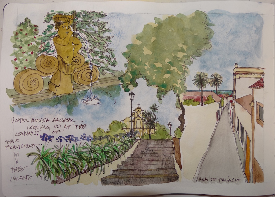
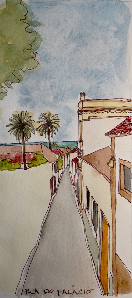
Our Virtual Sketching group was led this month by Toni,
who took us to the island of Angra do Heroísmo.
 I went back to push the boundaries of using inks and watercolors,
wanting to sketch impressions of Angra do Heroísmo.
Saturated colors, palms and monkey pines, lots of trees in a beach community,
which reminded me a lot of home, So Cal.
To relieve the problems I was having with some of my inks feathering, I decided to stick to just one ink, no mixed inks, and let them completely dry between applications. I had another disaster, and published, finally why, and how I found out about that!
 Pencil sketch to loosely figure out where I would put my impressions.
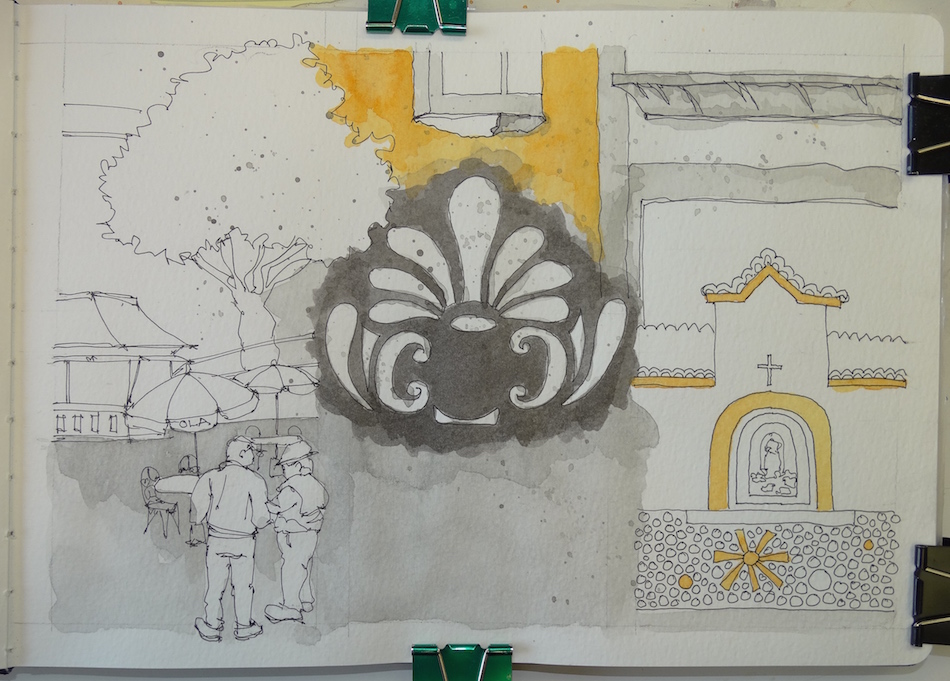 Laying in Noodler’s Lexington Grey and Super5 Delhi.
The grey figure is from a street corner, and I think it looks like a headdress on a dancer!
 De Atramentis Document Turquoise added.
 Super5 Dublin and Australia, De Atramentis Document Red and Green,
ALL laid in separately and full drying time in between layers.
Note the double layers of Super5 Delhi around the window above,
and then below, when I add watercolors.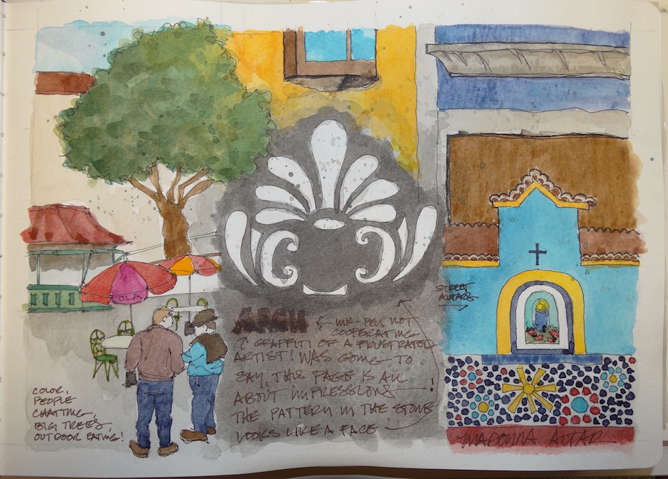 Inks done, I began topping with watercolors. One thing I see after all this is that the watercolors are infinitely more vibrant than the inks. Above, the yellow of the window pops with DS Hansa Medium. The blues saturate with DS Cerulean, and
Greenleaf & Blueberry Mayan violet. In each case, I was able to really saturate the colors to the bold I saw on the streets. I don’t know if I will ever be able to do that with inks.
But I will keep playing with them because I love their effects for some things. It is all about knowing what you want, I think, and when to choose what medium.

 Moleskin 8×11 watercolor journal, Pentalic HB woodless pencil, Platinum Carbon pen
AND Noodler’s, De Atramentis Document, and Super5 inks, behaving well until the end.
Daniel Smith and Greenleaf & Blueberry Watercolors, .

I started a Facebook group page (you must join to view) to allow everyone to share their virtual sketches, and also where we will, from time to time, take virtual sketch walks together. Come join us On Facebook if you are inclined!
If you want to know more about what a virtual sketchwalk is review my first post.
There are a few more notes/pointers on our first walk through Laguna Beach, California.
I also created an accompanying Flickr group!
I agree to Creative Commons Attribution-Non-Commercial 4.0 International License, which you can learn more about by visiting the site, or,
visit my web page for a more user-friendly summary on my terms.
My images/blog posts may be reposted; please link back to dkatiepowellart.
Our Virtual Sketching group was led this
month by Toni, who took us to the
island of Angra do Heroísmo.
 This new way of creating layouts works better
on this page, with the
tree dividing and blending the three images.
Yes, there were trees in approximately the areas on each individual photo,
but I took liberties.
Angra do Heroísmo’s
tight streets with the courtyard housing and winding roads fascinates me. I like living that way, and saw it growing up in parts of So Cal and Mexico, yet here in Oregon it is taken as an indication that you are not open to company, that you don’t like people. (I know this
from 20 years ago when I wanted to build a home like this in Oregon.)
Different cultures see these things differently.
I removed the cars from this image to see the path.
I can’t imagine living on
an island — the driver Southern California gurl wants to imagine that
I can drive 10,000 miles
if I want to take off but on an island you just go round and round. Still, this
island is my kinda place!
 Moleskin 8×11 watercolor journal, Pentalic HB woodless pencil, Platinum Carbon pen
inks that behaved, thank the gods (not many of them, mostly sketching in pens, whew): Noodler’s, De Atramentis Document, and Super5,
and Daniel Smith , Holbien, and QoR watercolors.
I started a Facebook group page (you must join to view) to allow everyone to share their virtual sketches, and also where we will, from time to time, take virtual sketch walks together. Come join us On Facebook if you are inclined!
If you want to know more about what a virtual sketchwalk is review my first post.
There are a few more notes/pointers on our first walk through Laguna Beach, California.
I also created an accompanying Flickr group!
I agree to Creative Commons Attribution-Non-Commercial 4.0 International License, which you can learn more about by visiting the site, or,
visit my web page for a more user-friendly summary on my terms.
My images/blog posts may be reposted; please link back to dkatiepowellart.


