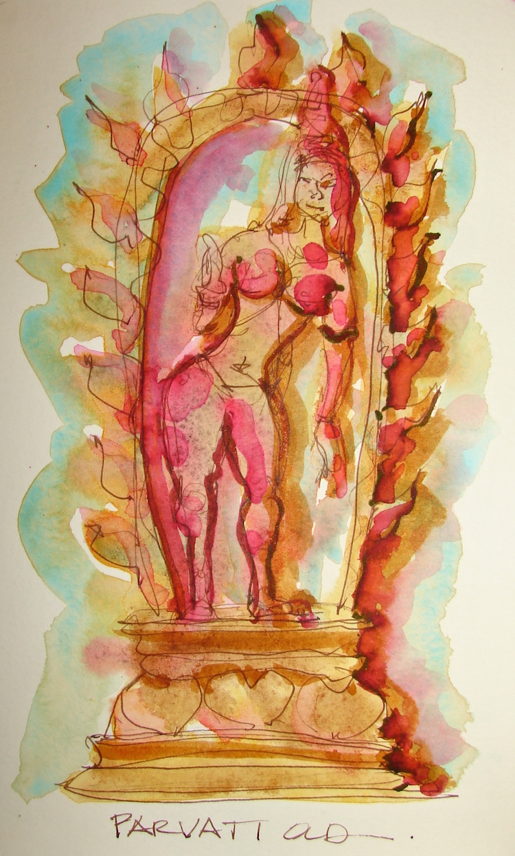
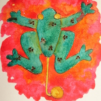
She is Shiva’s consort or wife, and daughter of Himavan and Mena.
I know her best as the mother of Ganesha and Kartikeya.
She is the goddess of love and devotion, as well as fertility, part of the trinity of Hindu goddesses, along with Lakshmi (prosperity) and Sarasvati (knowledge).
Our Parvati appears to have her left hand in the Abhaya mudra (fear not, in both Hindu and Buddhist iconography) and her right hand is dispensing boons in the Varada mudra.
Pentalic Aqua Journal, Platinum Preppie Pen, De Atramentis Document brown ink,
and Luma, Sennelier, Holbein, QoR and Daniel Smith watercolors.
What object do you cherish?
Paint it and enter it in Cherished Blogfest July 29, 30, 31!
Tell us the story you tell about one of your cherished objects. Tell us what your object is, post a painting / drawing / photo, and tell us why you cherish it. 500 words, pictures, posted on the July 29th, 30th or 31st. Help us spread the word: save (right-click, save image) the badge, right, and place it on your sidebar. Tell your friends on social media. Hashtag: #cherishedblogfest.
When the Cherished Blogfest goes live on the 29th, enter your blog post entry into the Linky List.
I'd love it if you shared this; please mention my blog name!
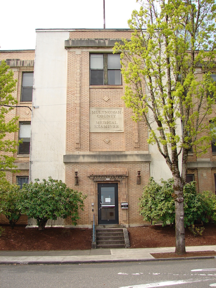
26th Avenue, two doors within throwing distance of our studio.
Above, on the historic American Canning Company, which then became
the Multnomah County Medical Examiners offices
(and then, how apropos) became the door to Grimm’s studio costuming annex.
(Sitting across from Costuming and an experiment with tobacco ink gone a bit wrong…
I tried to save the sketch…. getting used to non-waterproof inks!)
Across the street was once the local ballpark, not ESCO corporation.
From a walk in spring; now the trees block out the building.
Below, the cheery bright green metal door to
Impact Jiu Jitzu workout room in an old warehouse.
Both of these buildings will be bulldozed if City Planners get their way.
For Thursday Doors, a blog round robin open to anyone!
If you love drawing doors, consider joining the blogfest!
Pentalic Aqua Journal, Platinum Carbon pen,
Noodler’s pen with De Atramentis Document Tobacco Ink,
and Sennelier, Holbein and Daniel Smith watercolors.
What object do you cherish?
Paint it and enter it in Cherished Blogfest July 29, 30, 31!
Tell us the story you tell about one of your cherished objects. Tell us what your object is, post a painting / drawing / photo, and tell us why you cherish it. 500 words, pictures, posted on the July 29th, 30th or 31st. Help us spread the word: save (right-click, save image) the badge, right, and place it on your sidebar. Tell your friends on social media. Hashtag: #cherishedblogfest.
When the Cherished Blogfest goes live on the 29th, enter your blog post entry into the Linky List.
I'd love it if you shared this; please mention my blog name!
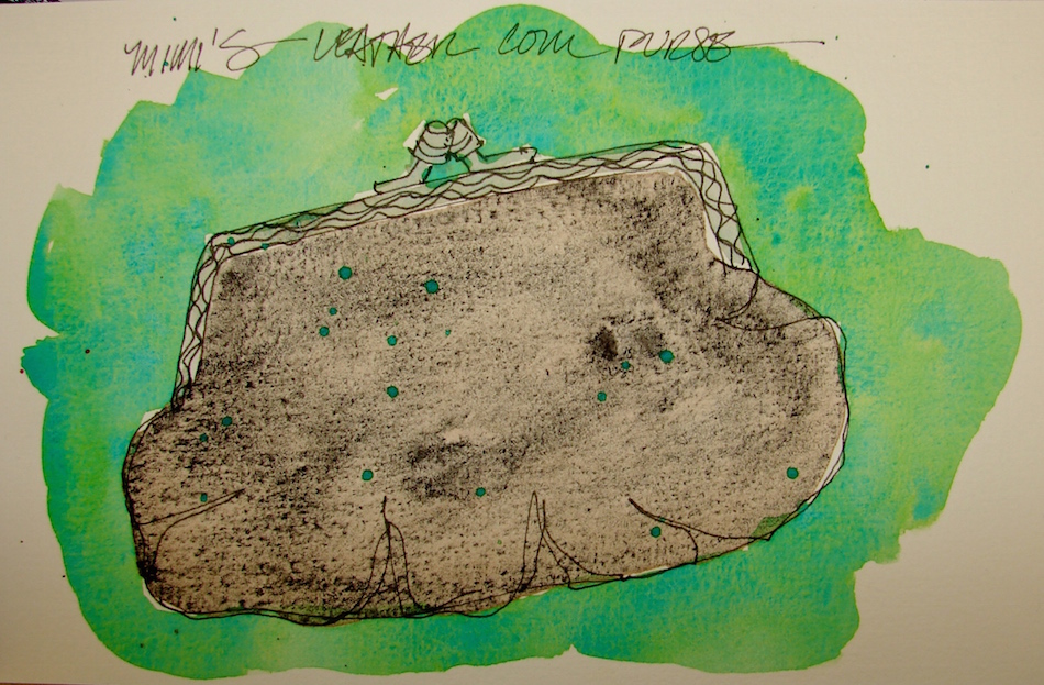
I have these odd things of my grandmothers. Her dime bank, and this, her coin purse.
She was a simple woman and the simple items
I have from her are precious memories.
Pentalic Aqua Journal, Platinum Carbon pen,
and Sennelier, Holbein and Daniel Smith watercolors.
What object do you cherish?
Paint it and enter it in Cherished Blogfest July 29, 30, 31!
Tell us the story you tell about one of your cherished objects. Tell us what your object is, post a painting / drawing / photo, and tell us why you cherish it. 500 words, pictures, posted on the July 29th, 30th or 31st. Help us spread the word: save (right-click, save image) the badge, right, and place it on your sidebar. Tell your friends on social media. Hashtag: #cherishedblogfest.
When the Cherished Blogfest goes live on the 29th, enter your blog post entry into the Linky List.
I'd love it if you shared this; please mention my blog name!
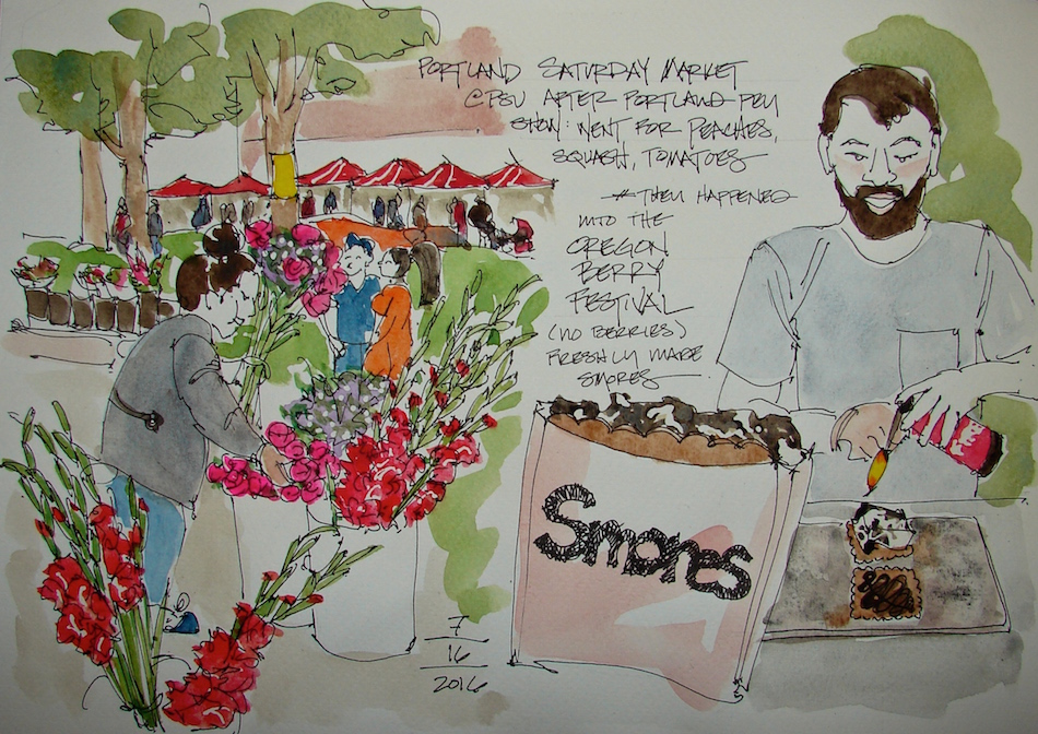
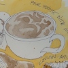
Memory of a lovely day with Mitchell. Started with the Pen Show,
then on to the more normal Saturday activity for us:
Going to the Portland Saturday Market for peaches and squash and other yummy things. We also happened upon the Oregon Berry Festival, where there were few berries (?).
We tried a simple s’more from Nineteen27 S’mores.
Sugar rush, excellent, messy, good… this is James Kelly making our yummy s’more.
Colors added in studio.
Fabriano A4 Watercolor journal, Pentalic HB woodless pencil,
Platinum Carbon pen, Lamy pen with De Atramentis Document Black ink,
and Greenleaf & Blueberry, Sennelier, Holbein, QoR and Daniel Smith watercolors.
No longer a Pen Show Virgin. I’ve been to our little Portland Pen Show.
It was fun being in that geeky collecting environment. Dealers were friendlier than I thought they would be, and it was so cool to be able to hold pens I want. Mitchell bought me this lovely Jinhao that was completely reworked by a Canadian dealer so as to
make it a wonderful writing instrument. Cobalt violet, amazingly beautiful.
Tried it out last night. He inked it with a Diamine purple ink of some sort, and so,
grapes came to mind. Watercolor painted in the “dark” late at night, a bit overworked.
Pentalic Aqua Journal, Platinum Carbon pen, Lamy Al-Star,
Platinum Preppie Pen, Noodler’s, De Atramentis Document, and Super5,
and Greenleaf & Blueberry, Sennelier, Holbein, QoR and Daniel Smith watercolors.
What object do you cherish?
Paint it and enter it in Cherished Blogfest July 29, 30, 31!
Tell us the story you tell about one of your cherished objects. Tell us what your object is, post a painting / drawing / photo, and tell us why you cherish it. 500 words, pictures, posted on the July 29th, 30th or 31st. Help us spread the word: save (right-click, save image) the badge, right, and place it on your sidebar. Tell your friends on social media. Hashtag: #cherishedblogfest.
When the Cherished Blogfest goes live on the 29th, enter your blog post entry into the Linky List.
I'd love it if you shared this; please mention my blog name!
White in included in this post.
How do you paint with white except as an absence or gouache?
I decided to try my new De Atramentis Document white ink
on a page primed with De Atramentis Document blue ink.
A total experiment, first time.
I tried to draw but DeA Doc white ink clogged the JinHao pen within two days,
but then , it is a Jinhao and they seem to clog easily. (Hate. Them.)
So I brushed it on, and this is going in for my entry today on World Watercolor Day!
Reminds me of old time blueprints…. I will play more with this!
In white “watercolors” I have M. Graham white gouache, and like it just fine….
Nuff said about white.
NOTE: All paints Daniel Smith (DS) unless it says otherwise — including the Primatek colors.
Ignore the bit of purple above.
First, let’s talk colors that look the same, have the same pigment structure, or are called by the same name out of the way:
PAYNES GREY
Yarka (by Nevskaya Palitra) Paynes Grey is very blue against QoR Paynes Grey, Copper Phthalocyanine, Amorphous Carbon, Quinacridone, PB15:3 / PBk7 / PV19.
I don’t have the pigment configuration for Yarka because it was not on the wrapper.
Then by chance, because of coming in sets, I have Sennelier’s 755 Ivory Black PBk9.
Both were in pans when I wet them, one is a pan watercolor (left.)
The tube dropped into my pan wets better and comes across darker than the pan version.
To see references on BLACK/WHITE/GREY from handprint, click through.
The Keepers:
In the Black/Grey palette: QoR Ardoise Gray,
Hydrated Aluminum Silicate, PBk19,
is a keeper. I use it a lot in buildings and mixes.
Tracey Fletcher King has gone all
a-twitter about Paynes Grey,
one of her favorite colors —
shadows, etc. — and I like QoR Paynes Grey,
shown right from their site,
best because it is not so very blue —
so many of them are greyed indigos —
with Copper Phthalocyanine /
Amorphous Carbon / Quinacridone,
PB15:3 / PBk7 / PV19.
I might try DS next time just
to see if theirs is better.
Oh, I am nuts for grey.
Charcoal, graphite, you name it.
I am keeping all of these for their various obvious characteristics
— some creamy and smooth, some gritty: Graphite Gray, PBk10; Greenleaf & Blueberry Magnatite;
Greenleaf & Blueberry Shungite. If only I could get
Greenleaf & Blueberry to sell their colors in tubes.
I hate the way they load their pans to the tippy-top,
and they slosh over the sides into the pans as you wet them.
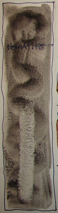
I can’t get enough of Primatek Hematite, left.
I use it all the time and am in love with its gritty reddish-grey.
Finally, even though I never use it, I will keep Sennelier Ivory Black 755, PBk9, which came in a set,
and M.Graham Titanium White Gouache, PW6,
which I am enjoying.
The Rarely or Never Agains:
PAYNES GREY
Yarka Paynes Grey, because, very blue; Sennelier Ivory Black 755 PAN, meh.
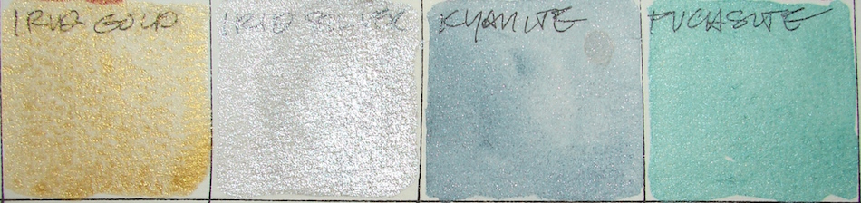
Iridescent is not my thing. They come off too sparkly in a painting.
Especially QoR Iridescent Silver (Fine), PBk7 (Qor makes the best metallics) and Iridescent Gold, Mica & Iron Oxides, PW20. I need them for the rare time I use them, and will buy QoR only from now on. However, Primatek Kyanite and Primatek Fuchsite I bought not knowing they had an iridescent shimmer, and I have used them for cars occasionally. Still, they have that sparkle quality I always end up regretting.
Below Teoh Yi Chie of Parkablogs reviewing water-soluble Graphites from YouTube.
Pentalic Field Journal, Platinum Carbon pen, and Greenleaf & Blueberry,
Sennelier, Holbein, QoR, M.Graham and Daniel Smith watercolors.
What object do you cherish? Paint it and enter it in Cherished Blogfest July 29, 30, 31!
Tell us the story you tell about one of your cherished objects. Tell us what your object is, post a painting / drawing / photo, and tell us why you cherish it. 500 words, pictures, posted on the July 29th, 30th or 31st. Help us spread the word: save (right-click, save image) the badge, right, and place it on your sidebar. Tell your friends on social media. Hashtag: #cherishedblogfest.
When the Cherished Blogfest goes live on the 29th, enter your blog post entry into the Linky List.
I'd love it if you shared this; please mention my blog name!
My Zen brother gave me my raku giraffe. I think of him as my painterly Zenny Oriental giraffe, a cool dude.
He is a cherished object, but not THE cherished object.
To find out what object I cherish more than my Zenny giraffe, you’ll have to read my post during the three days of Cherished Blogfest! You should share yours too!
What object do you cherish?
Paint it and enter it in Cherished Blogfest July 29, 30, 31!
Tell us the story of your cherished object: post a painting/drawing/photo, and no more than 500 words, posted on the July 29th, 30th or 31st. Help us spread the word: save (right-click, save image) the badge, right, and place it on your sidebar. Tell your friends on social media. Hashtag: #CBF16 or #cherishedblogfest.
When the Cherished Blogfest goes live on the 29th,
enter your blog post entry into the Linky List.
Pentalic Aqua Journal, Lexington Grey Noodler’s ink (brushed),
and M. Graham, Sennelier, Holbein, QoR and Daniel Smith watercolors.
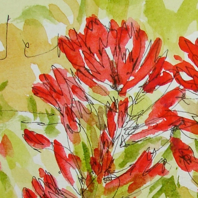
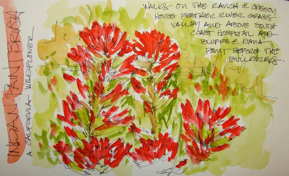
California wildflowers are deeply connected to memories of my childhood.
Until World Watercolor Month I had only a fleeting understanding of that,
but the more I choose to paint California wildflowers, the more I am aware!
Somehow, when you draw or paint something, it enters your being on a different level.
Walking our dog Cindy with my Mom behind South Coast Hospital,
we looked for the bright orange brushes. They also were on the walks east away
from the barn on my grandparents ranch.
You have to have wild spaces, something California has largely lost,
and wild is endangered in Oregon as well.
My drafting teacher in high school was from Hawaii.
Ed Bowen never went back, because what he saw in pictures
was ruined from his memories.
In many ways it is that way for me — there was still lots of wild
and safe and friendly and small town when I was a kid in So Cal.
Pentalic Aqua Journal, Platinum Carbon pen,
Lamy Joy with De Atramentis Document ink,
and Sennelier, Holbein, and Daniel Smith watercolors.
What object do you cherish?
Paint it and enter it in Cherished Blogfest July 29, 30, 31!
Tell us the story you tell about one of your cherished objects. Tell us what your object is, post a painting / drawing / photo, and tell us why you cherish it. 500 words, pictures, posted on the July 29th, 30th or 31st. Help us spread the word: save (right-click, save image) the badge, right, and place it on your sidebar. Tell your friends on social media. Hashtag: #cherishedblogfest.
When the Cherished Blogfest goes live on the 29th, enter your blog post entry into the Linky List.
I'd love it if you shared this; please mention my blog name!
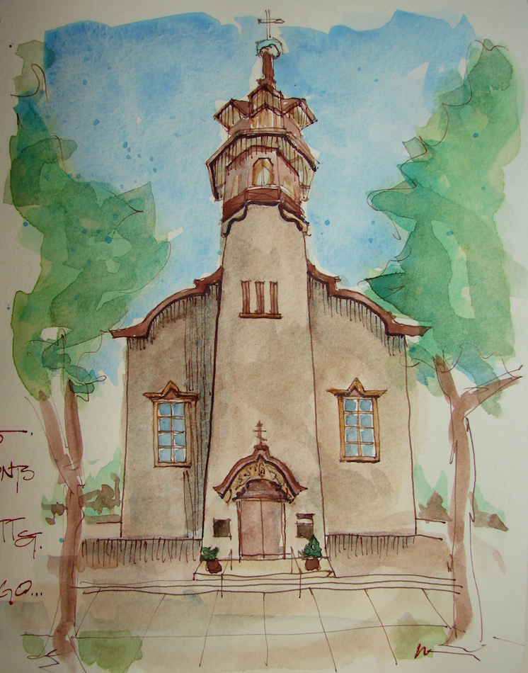
Okay, I had to pull up an old sketch for Thursday Doors!
A wonky urban sketch of the side doors, which is nicer than the front doors, of the Monastery of the Precious Blood in the Mount Tabor neighborhood of Portland.
I love the pale green with the pop of bright red.
Stillman & Birn Journal, with a Pentalic 2B woodless pencil, Preppie Pen,
Noodler’s ink, and Daniel Smith watercolors.
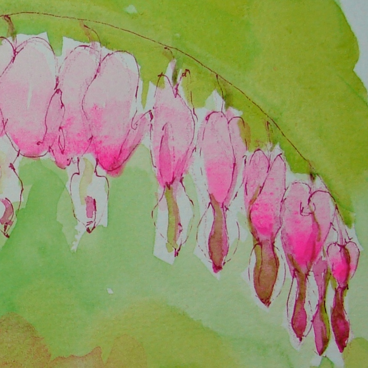
As of today this reminds me not only of family,
but of this incredibly awful political season and the vitriol
among people on the “same side.”
I am told I am a bleedin’ heart liberal.
I wear it proudly.
And, I am shocked at how much Opera Pink and Quin pink I am using.
Choosing to paint flowers certainly changes one’s palette!
Pentalic Aqua Journal, Platinum Preppie Pen, De Atramentis Document Fuchsia ink,
and Sennelier, Holbein, and Daniel Smith watercolors.
What object do you cherish?
Paint it and enter it in Cherished Blogfest July 29, 30, 31!
Tell us the story you tell about one of your cherished objects. Tell us what your object is, post a painting / drawing / photo, and tell us why you cherish it. 500 words, pictures, posted on the July 29th, 30th or 31st. Help us spread the word: save (right-click, save image) the badge, right, and place it on your sidebar. Tell your friends on social media. Hashtag: #cherishedblogfest.
When the Cherished Blogfest goes live on the 29th, enter your blog post entry into the Linky List.
I'd love it if you shared this; please mention my blog name!
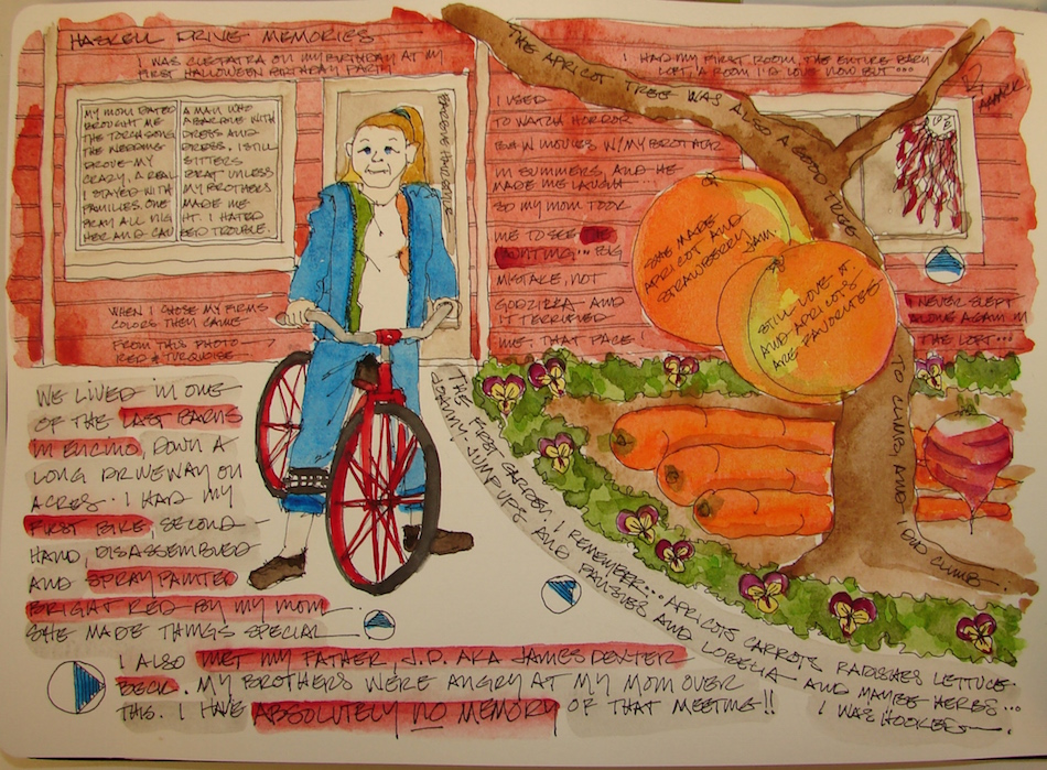
I had a good childhood, raised by a single mom with an alcoholic dad who skipped,
and three much older brothers who loved me dearly.
I am GRATEFUL because I wasn’t around JD (what they called my dad),
because he caused a lot of grief to my brothers, really, a bit nutty.
I had three amazing older brothers. Who needed a dad?
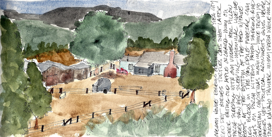
We lived in one of the last barns on
Haskell Avenue in Encino, California.
This may have made me love barns,
or maybe it was the ranch, or my DNA.
The owners converted it into a giant guest house.
I had many firsts here: first skates, first Barbie,
first Barbie’s wedding dress *swoon*,
first costume birthday party where I went as a
a girl in a bikini and hula skirt wishing she was Cleopatra.
Hollywood had a big effect on me though
I was not interested in acting.
I just wanted to marry James Bond.
My first bike was second hand, but you’d never had known it.
My mom (with the help of what brother?) took it apart,
rattle-canned it with bright red paint, and it was the prettiest thing!
I road that bike up and down the long driveway that led to the house with
Cinderella Lou-Lou Bell aka Cindy (never let the kid name the dog) next to me biting
at the tires. Mom would not let me leave the property in Los Angeles.
It was the first time I really participated in a garden, though we may have had them before. Carrots, radishes (meh), lettuce and johnny jump-ups.
We had a wonderful apricot tree that I wish was outside our door about now.
I climbed it many times, munching apricots straight off the tree.
My mom made jam.
I continued to be a brat to the babysitters I didn’t like.
One of them was George Putman’s (KTTV news anchor) daughter.
She would have makeout parties outside when she sat for me.
I finally threw such a fit that she chased me, banged into a mirror which
came crashing down and cut the tip of her toe off!
Mrs. See-You-At-Ten came to take her daughter to the hospital, someone took me to their house, and I was forced to read bible passages until my mom picked me up.
Mom was furious, at them more than at me, though she wasn’t happy with me.
I had my own first bedroom, an entire loft with great windows and views.
(I would love it today as a studio).
THEN….
My mom took me to see The Haunting.
The original, terrifying movie. (See the face in the window?)
Now that seems like a stupid thing for a mom to do but you have to understand that
all summer long and not just for one summer my oldest brother Stephen and I watched horror and sci-fi movies, and yes, even ghost movies. He explained how they made Godzilla and we ate grilled cheese sandwiches and laughed at horror movies. SHE THOUGHT THIS WOULD BE FINE.
Then she stayed because she thought there might be an explanation,
so finishing the movie might be best. It wasn’t. I never went upstairs again,
and slept on the red sofa or in my mom’s bed until we moved.
I kept seeing that damn face popping out of the stairs to the loft.
I was terrified. She thought she was the worst mom ever.
I knew there was a mad woman in the attic.
*years later I looked at the metaphor; another post*
Thanks to bikerchick for bringing
the memory to mind. I have another for next year!
Moleskin 8×11 watercolor journal, Pentalic HB
woodless pencil, Platinum Carbon pen,
Lamy Al-Star, De Atramentis Document ink,
and Daniel Smith, Holbein, and QoR watercolors.
What object do you cherish?
Paint it and enter it in Cherished Blogfest July 29, 30, 31!
Tell us the story you tell about one of your cherished objects. Tell us what your object is, post a painting / drawing / photo, and tell us why you cherish it. 500 words, pictures, posted on the July 29th, 30th or 31st. Help us spread the word: save (right-click, save image) the badge, right, and place it on your sidebar. Tell your friends on social media. Hashtag: #cherishedblogfest.
When the Cherished Blogfest goes live on the 29th, enter your blog post entry into the Linky List.
I'd love it if you shared this; please mention my blog name!
I’ve been asking myself, “What object do I cherish the most?
What object has the most memories attached?
What is my most useful object no, irreplaceable object?
If I could only take one thing (not including loved ones) with me in a pinch,
what would I take if the place were on fire?” Let’s pretend I’m Superwoman…
nah, that won’t do because (I’m sure comic fans will know) Superwoman wound
back into time so she didn’t have to decide, you, know, in THE pinch.
Anywho, I’ve found my cherished object!
um-hmmmm, like i own a monet. you guys are easy.
Paint or sketch (if you are an artist),
photograph, and ‘splain your cherished object.
(Wow, a painter can get away with
less than 500 words… show don’t tell!)
We’ll be captivated!
Read what others say about theirs.
Plus, this year I’m going to be a bloggy-reader-gal
(aka co-host) and visit participant’s pages!
Make me busy, reading until the wee hours!
Don’t say I didn’t warn you; you’ve had enough time.
In seventeen days tell the world about your favorite object and the story behind it.
I double-dog-dare you…
When the Cherished Blogfest goes live on the 29th,
enter your blog post entry into the Linky List. July 29th, 30th or 31st 2016!
Pass the word!
#CBF16 (for you twits on twitter) or #cherishedblogfest!
Pentalic Aqua Journal, Lamy Al-Star, De Atramentis Tobacco ink,
and Holbein, QoR and Daniel Smith watercolors.
I had to paint vetch after the lupines:
equal time for Pa after Mimi!
After my memory jog in California Lupines,
I kept wondering why Pa warned me
not to feed the horses vetch whenever I visited the ranch.
There was some vetch around the ranch, but not much,
and mostly in the lane leading to their Oregon House ranch.
I’ve seen much more of it in Southern Oregon hills,
where the hills around the valley are streaked with green and violet.
Watercolor
I looked it up!
Seems vetch contains nitroglycosides, which cattle and
any animal that chews their cud can process, but for horses, it is poisonous.
Weight loss, depression (how can they tell this? something else for me to inquire about…),
loss of muscle coordination, and eventually death of the horse.
All good reasons! Seems horses don’t care for it much (okay, they are smart)
but if there is nothing else around they will go for it.
Tom Philpott, one of my favorite writers at Mother Jones,
wrote an article a few years aback about hairy vetch used as a cover crop
and how it was an amazing way to up the nitrogen in the soil. It is also an excellent companion plant for tomatoes, as it provides both nitrogen
and an instant mulch that preserves moisture and keeps weeds from sprouting.
If you are a gardener and do not know about companion planting, google it.
John Jeavons introduced me to French bio-intensive gardening in his book How to Grow More Vegetables, and my little organic plot put out TONS of the sweetest strawberries, along with vast quantities of onions, garlic, tomatoes, carrots,
basil, lettuce (unless the Italian rabbit ate the last two).
I cut the number of pests in half, and my yield became nearly unmanageable.
I continue to churn out watercolors
for World Watercolor Month,
loosening my thoughts to a “just do it” mentality.
I played again with Opera Pink and various purples.
The blue you see above is the Fineline
masking fluid when it is on the piece.
Once removed, the blue areas stay white.
At the very end I came in with a bit of lavender-grey.
Pentalic Aqua Journal, Platinum Carbon pen,
Lamy Al-Star, De Atramentis Document black ink;
Fineline masking fluid and Holbein, QoR, and Daniel Smith watercolors.
What object do you cherish?
Paint it and enter it in Cherished Blogfest July 29, 30, 31!
Tell us the story you tell about one of your cherished objects. Tell us what your object is, post a painting / drawing / photo, and tell us why you cherish it. 500 words, pictures, posted on the July 29th, 30th or 31st. Help us spread the word: save (right-click, save image) the badge, right, and place it on your sidebar. Tell your friends on social media. Hashtag: #cherishedblogfest.
When the Cherished Blogfest goes live on the 29th, enter your blog post entry into the Linky List.
I'd love it if you shared this; please mention my blog name!
Our happy plate, a lovely Italian plate with six roosters, is our go-to plate for special occasions. This one was created for World Watercolor Month, and timed to work today with my
post on colors for our lovely desserts.
Another way we get swayed
is by the excitement of other
artists about favorite colors.
Jane Blundell, who loves exploring paint colors,
I admire. She raved about Buff Titanium, PW6:1,
as an essential and I finally bought it.
Meh. It’s fine but I like my other
two coffee-milk greys and beiges better:
especially QoR Ardoise Gray, PBk19,
and Sennelier Warm Grey 705,
W6 / PY42 / PBk / PR101.
And then there are favorite pigments. Mine is Quinacridone, and I have more
quin golds and red-pinks than any other pigment and am totally admitting
that I will probably try every last one of them until I’ve tried them all!
Moral of the story, and this applies to all I’ve written:
Think about how you use your paints, what you like to paint and
what you already have that might do this or that trick before buying…
or try someone’s if you are sketching next to them!
NOTE: All paints Daniel Smith (DS) unless it says otherwise — including the Primatek colors.
First, let’s talk colors that look the same,
have the same pigment structure,
or are called by the same name out of the way:
We’ve discussed Caput Mortem / Cote D’Azur, (natural light Caput Mortem),
and the Daniel Smith version is by far my favorite and Yes, I will make another impassioned plea that if anyone want to sell or donate theirs to me I’d be grateful! Greenleaf & Blueberry Caput Mortem or Windsor Newton Caput Mortem,
are just not good substitutes for this lovely slightly cool brown!
Sharing names and/or pigment structures: Quinacridone Gold, Quinacridone, PO49 and my favorite quin, Holbein Quinacridone Gold. Quinacridone + Nickel, PO48 / PY150 have the same name, and M.Graham Nickel Quinacridone Gold, Quinacridone + Nickel, PO48 / PY150 shares the same pigment structure with the latter. The first two are close in value, but Holbein is so creamy, making wonderful
skin tones, that I prefer it. The latter two appear completely different,
and it is my own fault I tried M.Graham’s color because I didn’t have my list with me…
I hardly need that addition to my palette and at the time knew I was not fond of
M.Graham paints for my set-ups: M.Graham doesn’t easily dry in humid climates.
Sharing pigment structures:QoR Quinacridone Gold Deep, Quinacridone, PO48,
and Quinacridone Gold Burnt Orange, Quinacridone, PO48. I
so rarely use these two I’m not sure which I’d keep; QoR has depth of color and DS’s is a bit light in the juicy pigment department. Now I have to talk about two more I will probably buy in order to finally decide what “quins” I want to keep: Quinacridone Deep Gold, PO48 / PY150 — same as M.Graham Nickel Quinacridone Gold, above, and I will probably love it because DS dries faster and is less streaky generally, and QoR Quinacridone Burnt Orange, PR206, a completely different structure. In the latter, it has a blue cast? Or is that the monitor?
(*wait while I break here to put them in my shopping cart*) (*yes i am a member of PA — pigments anonymous*)
I love sepia brown, in pants and inks. However, the first two I probably won’t buy again: Blick Sepia, and Yarka Sepia, because they are inferior paints, Blick being very flat
and without nuance. Yarka is a bit better, and sennelier sings. I may end up with the
tube version of Sennelier Warm Sepia 440 PAN, PBR7 / PBk7.
The next series of 3-4 color batches tells me I need to understand
another layer to why the same pigments can create such different colors to our eyes. I know part of it is that they burn them or keep them raw,
but there has to be more to it than that…. right?
Sharing pigment structures: Sennelier Burnt Sienna 211 PAN, PBr7, Pompeii Red, PBr7, Monte Amiata Natural Sienna, PBr7, Sennelier Raw Umber 205, PBr7,
and Sennelier Raw Umber 205 PAN, PBr7. The latter two blow me away and
I double checked them because really, these are both Sennelier, same color, same pigments!!! Monte Amiata Natural Sienna was one of those fell-in-love-with-the-name purchases, and it is a lovely color, but not quite the hype…
I don’t feel transported to Italy when I open the tube.
Sharing pigment structures: Sennelier Venetian Red 623, Iron Oxide, PR101, Sennelier Venetian Red 623 PAN, Iron Oxide, PR101, Transparent Red Oxide, Burnt Sienna, PR101 and QoR Van Dyke Brown, Synthetic Iron Oxide, PR101.
I will always have a Van Dyke Brown but not sure it will be QoR.
Yellow Iron Oxide, Recycled Iron Oxide, PBr6 and Brown Iron Oxide, Recycled Iron Oxide, PBr6,
BOTH the same, Really? I don’t think so!
Today I printed 150 pages from handprint in order to understand
more about paint pigments and how they produce those colors!
Primateks
Oh, lovely Primateks. I may have cut my teeth on Hematite
(one of my first watercolor paints, and btw I cut my teeth on Golden’s
Ground Hematite acrylic paint). I tried the Lapis and quickly realized I was addicted
as I moved to the greens. The natural browns are incredibly beautiful.
I included Piemonite in this grouping though I forgot to add it to the graph colors.
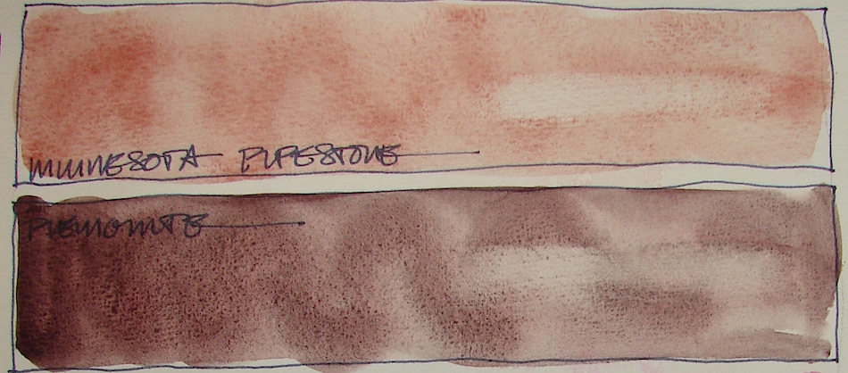
Of them all, the only one (surprisingly, as I love the stone) I may not buy again is Primatek Minnesota Pipestone, because it simply is too pale. I’d have to lay it on my brush out of the tube to make it work for the applications I’d use it for. Keepers
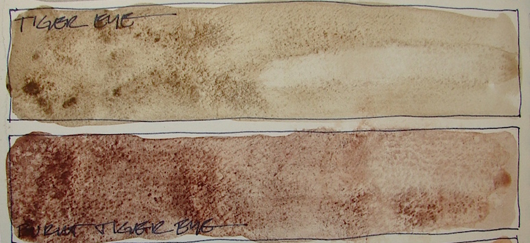
(favorites indicated by **) to be used in landscapes and buildings, especially: **Primatek Piemonite, Primatek Sicklerite, **Primatek Goethite, **Primatek Yavapei, **Primatek Tiger Eye, and Primatek Burnt Tiger Eye,
The Keepers, a round-up:
Which are keepers? A surprisingly small palette, though I will explore the two
“new” quins I discussed above, and keep ALL of the Primateks with the exception of Primatek Minnesota Pipestone. Holbein Quinacridone Gold. Quinacridone + Nickel, PO48 / PY150, sooooo lovely and creamy; and basic Quinacridone Gold, Quinacridone, PO49, both used so that I replace their tubes every year or more. Caput Mortem / Cote D’Azur, (Natural light Caput Mortem — plea number four, if I could only get more). I will buy another Sennelier Warm Grey 705, PW6 / PY42 / PBk / PR101 because I use it in mixing a good deal. Sennelier Raw Umber 205, PBr7, is good in landscapes and even in shadows of trees. The last three are the best of the true “browns” and I like them for convenience, though they don’t travel with me ever: Brown Iron Oxide, Recycled Iron Oxide, PBr6, QoR Van Dyke Brown, Synthetic Iron Oxide, PR101, and Sennelier Warm Sepia 440 PAN, PBR7 / PBk7.
The Rarely or Never Agains:
For all of these, they are either too opaque, don’t wow me for what they bring to my
palette for the price and the space on my desk. I may continue to search, by taking this article to Merriartist, where they know colors and they know their paints. Some are cheap brands I wouldn’t buy again, like Blick — to me, student grade paint. Yarka is not a bad brand but I really don’t like pan paints — I don’t want them filled to the brim and …
I might buy a yellow ochre again… Daniel Smith or Sennelier.
It may have its place as I continue to work with it.
QoR Quinacridone Gold Deep, Quinacridone, PO48, Quinacridone Gold Burnt Orange, Quinacridone, PO48, M.Graham Nickel Quinacridone Gold, Quinacridone + Nickel, PO48 / PY150, Yellow Iron Oxide, Recycled Iron Oxide, PBr6, QoR Yellow Ochre, Natural Hydrated Iron Oxide, PY43, Primatek Minnesota Pipestone, Terre Ecolano, PBr7 PR101, Sennelier Burnt Sienna 211 PAN, PBr7, Sennelier Venetian Red 623, Iron Oxide, PR101, Sennelier Venetian Red 623 PAN, Iron Oxide, PR101, Transparent Red Oxide, Burnt Sienna, PR101, Pompeii Red, PBr7, Buff Titanium, PW6:1, Monte Amiata Natural Sienna, PBr7, Sennelier Raw Umber 205 PAN, PBr7, Blick Sepia, Yarka Sepia, and Yarka Burnt Umber.
In a next post I will talk about the Mayan Colors…
What they are, what I like and dislike about them.
MAYAN BLUE
MAYAN VIOLET
Pentalic Field Journal, Platinum Carbon pen, and Greenleaf & Blueberry,
Sennelier, Holbein, QoR, M.Graham and Daniel Smith watercolors.
What object do you cherish?
Paint it and enter it in Cherished Blogfest July 29, 30, 31!
Tell us the story you tell about one of your cherished objects. Tell us what your object is, post a painting / drawing / photo, and tell us why you cherish it. 500 words, pictures, posted on the July 29th, 30th or 31st. Help us spread the word: save (right-click, save image) the badge, right, and place it on your sidebar. Tell your friends on social media. Hashtag: #cherishedblogfest.
When the Cherished Blogfest goes live on the 29th, enter your blog post entry into the Linky List.
I'd love it if you shared this; please mention my blog name!
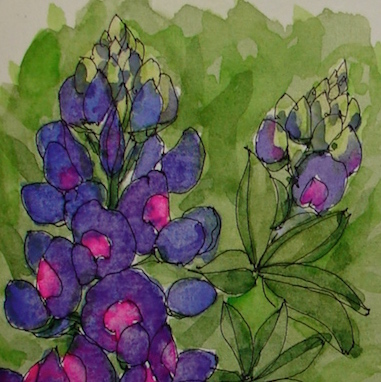
Lupines are a wild California flower — hillsides in Southern California turn deep violet
with hues of magenta-purple vetch running through them.
Both remind me of my grandparents.
My grandfather used to tell me not to feed the horses vetch.
I was too young to remember why — just don’t do it!
(A post coming will tell you why.)
I am happy that lupines followed me to Oregon.
The roadsides between Ashland Oregon and Mount Shasta California
are covered with them, and the high plateau around Yreka California
sometimes turns a deep lavender color.
The further north, the less lupines, and here in Portland you see very few of them.
Mimi loved their color, and so does my mom. There is a yellow lupine in the Monterey area. My mom and my grandmother took pictures of a hillside possibly heading into the Big Sur area. I’ve not seen wild yellow lupines, but yellow flowers are my favorites — Johnnie Jump-ups, Black Eyed Susans, and of course, any type of Sunflower.
World Watercolor Month is giving me a push to experiment again!
Very fast vignettes of this or that with the goal to deepen colors, mix on paper,
work with masking fluid, play with line and color.
In this one I kept piling on color, sometimes wet on wet, sometimes wet on dry.
IMPERIAL PURPLE
Pentalic Aqua Journal, Platinum Carbon pen,
Lamy Al-Star, De Atramentis Document black ink;
and Sennelier, Holbein, and Daniel Smith watercolors.
What object do you cherish?
Paint it and enter it in Cherished Blogfest July 29, 30, 31!
Tell us the story you tell about one of your cherished objects. Tell us what your object is, post a painting / drawing / photo, and tell us why you cherish it. 500 words, pictures, posted on the July 29th, 30th or 31st. Help us spread the word: save (right-click, save image) the badge, right, and place it on your sidebar. Tell your friends on social media. Hashtag: #cherishedblogfest.
When the Cherished Blogfest goes live on the 29th, enter your blog post entry into the Linky List.
I'd love it if you shared this; please mention my blog name!
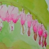
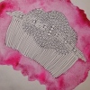
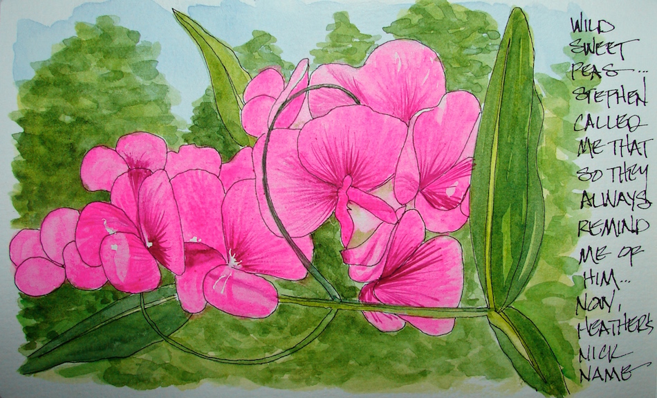
I was called Sweetpea by my brother growing up;
I didn’t see a wild sweetpea until I moved to Oregon, and now they greet me in early summer and sometimes have a second blooming in autumn.
I hear my brother call my niece by my nickname;
if I didn’t love her so much it’d drive me crazy to share that memory.
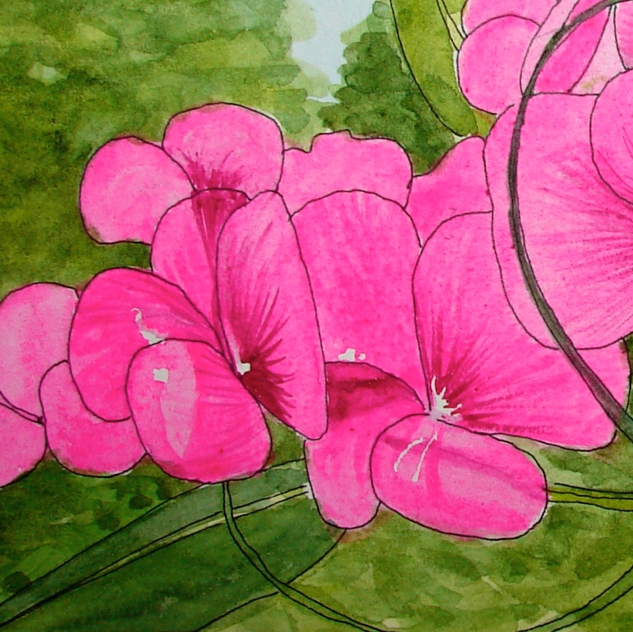
Totally fugitive (meaning
it will fade fast as a
pigment) Opera Pink
was the perfect color for the base of the sweetpea, layered over Fineline masking fluid to pop the whites.
I used QoR
Quin Magenta for the
deep lines, and after removing the masking
fluid I softened
some of the too-crisp
white spots with water.
Getting the hang of
deep color and playing
with masking fluids.
Thanks Tracey!
Pentalic Aqua Journal, Platinum Carbon pen,
Lamy Al-Star, De Atramentis Document black ink;
and Holbein, QoR, and Daniel Smith watercolors.
What object do you cherish?
Paint it and enter it in Cherished Blogfest July 29, 30, 31!
Tell us the story you tell about one of your cherished objects. Tell us what your object is, post a painting / drawing / photo, and tell us why you cherish it. 500 words, pictures, posted on the July 29th, 30th or 31st. Help us spread the word: save (right-click, save image) the badge, right, and place it on your sidebar. Tell your friends on social media. Hashtag: #cherishedblogfest.
When the Cherished Blogfest goes live on the 29th, enter your blog post entry into the Linky List.
I'd love it if you shared this; please mention my blog name!
For Thursday Doors, I am looking at the Washington State Capitol
Justice Building interior is more pink-mauve than the Legislative building
(see the top shell scroll), and perhaps it is because it was painted at a later date.
This detracts just a bit from the beauty of this lovely building,
but that may be just me — I am not a lover of these colors.
The front door is lovely, and the building is so dark it was hard to get a picture,
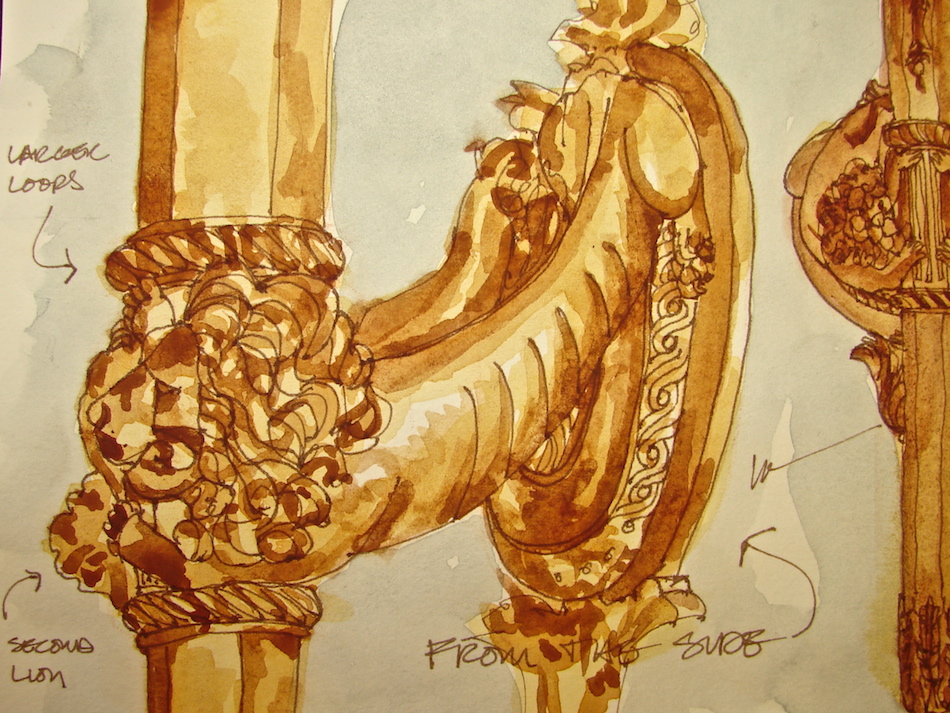
but I drew some of the decorative brass detailing, below. As you approach the doors, the torchéres which flank the outside are perhaps the scariest lights I’ve ever seen (below).
On the inside, the most beautiful brass lion torchéres flank the doors (below).
The Torchéres of Mordor (my name for them!)
Lion Torchéres
Stillman & Birn Delta Journal, with a Pentalic 2B woodless pencil, Platinum Preppie Pen,
Noodler’s ink, and Daniel Smith, Sennelier, and Holbein watercolors.


