Anytime I’ve not finished the writing to post publicly it is either too personal
or about people who are still living, or both!
Anyone reading any of these posting know that you can always use this code, “50OFF,”
for 50% off any purchase through 2017, when I am going stop posting to sell on my etsy site. Then it is all about art and not about jewelry anymore!
Bright Ideas multi-color journal, with Platinum Carbon pen with Platinum Carbon cartridges and Lamy Joy with De Atramentis Document black ink.
As my Patreon supporter, you will have
access to some content not on this website,
sneak previews, goodies, discounts on classes.
I will teach architectural sketching,
art journaling (art+writing), creativity, watercolors.
That annoying loud-mouth editor/critic in your head? GONE! How great would that be?
I'd love it if you shared this; please mention my blog name!
When King Tut came to Lalaland,
I managed to obtain tickets.
I was unimpressed by the viewing, but
loved the hype and design elements all around the exhibit. The powder coated
metal costume jewelry was the best.
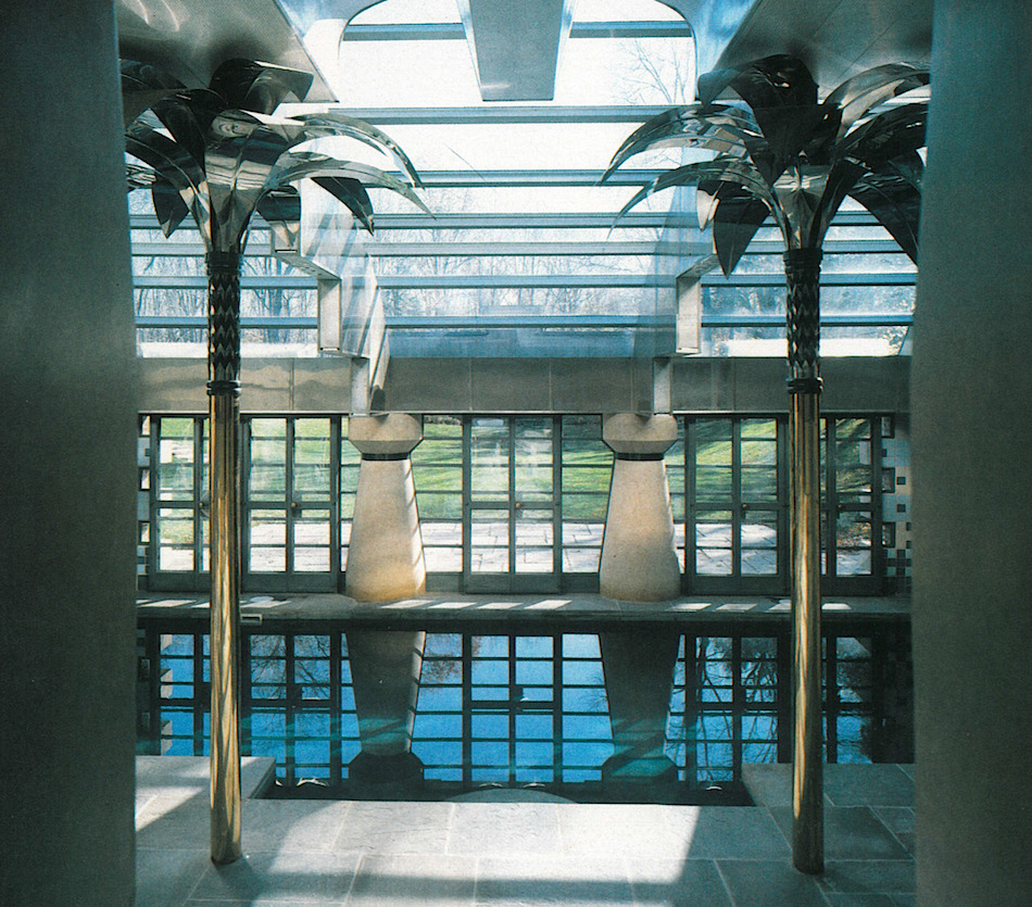
From the LACMA I was able to pick up Robert Stern looking palm tree designer earrings, and an amazing flirtatious bracelet. Eventually in Venice I also found a pair of architectural pyramid clip earrings.
And now I’ve drawn them and can let go!
Maybe I have to keep the palm trees?
Bright Ideas multi-color journal, with Platinum Carbon pen with Platinum Carbon cartridges and Lamy Joy with De Atramentis Document black ink.
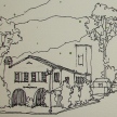
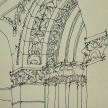
Luigi Donatello’s image of the Robert Stern Pool House; no copyright notice found.
☾
As my Patreon supporter, you will have
access to some content not on this website,
sneak previews, goodies, discounts on classes.
I will teach architectural sketching,
art journaling (art+writing), creativity, watercolors.
That annoying loud-mouth editor/critic in your head? GONE! How great would that be?
I'd love it if you shared this; please mention my blog name!
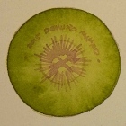
We had a bit of a storm and some blackouts here and I was not able to take progress pics. This beautiful very strange fruit, a Purple Mangosteen, was an experience.
Inked in De Atramentis Document brown ink.
Brunaille in De Atramentis Document brown ink and Super5 Australia inks.
Watercolors: mostly Daniel Smith Primateks with touches of White Uniball Signo pen.
Pentalic Aqua Journal, with Platinum Carbon pen with De Atramentis Document brown ink and Lamy Al-Star with Diamine Ancient Copper; painted with De Atramentis Document brown ink and Super5 Australia, watercolors, .
As my Patreon supporter, you will have
access to some content not on this website,
sneak previews, goodies, discounts on classes.
I will teach architectural sketching,
art journaling (art+writing), creativity, watercolors.
That annoying loud-mouth editor/critic in your head? GONE! How great would that be?
I'd love it if you shared this; please mention my blog name!
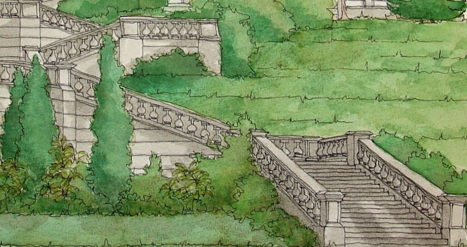
Eastern Oregon University’s Inlow Hall’s original grand staircase
has fallen into disrepair, below, and Restore Oregon is assisting with the
restoration efforts of this once beautiful and important grand staircase.
It was used in many ways for formal and informal gatherings over the years.
In the spirit of Inktober, the inking, and most of the coloring, was done with
waterproof inks. Noodler’s Lexington Grey provided the stonework (grisaille) and shadows were a mix of that and De Atramentis Document Brown, which was also mixed with De Atramentis Document Green and Super5 Dublin to greate the various greens. Paintings executed in brown are referred to as brunaille, and paintings executed in green are called verdaille.Final touches of Primatek watercolors were added to pop the greens.
I support Restore Oregon because they gift monies each year toward projects to restore our historical places.
Eastern Oregon University (EOU) in La Grande was established in 1929 as The Eastern Oregon Normal School, a teachers college. The original campus building, Inlow Hall, was designed by Portland architect John Bennes. It is perched on top of a natural ridgeline overlooking downtown La Grande. Inlow Hall was distinguished by a highly developed set of terraces and balustrades. The terraces along the southwest portion of the site were removed decades ago, and today the Grand Staircase is the sole remaining element of what was originally an elaborate set of landscape features. The Grand Staircase features five tiers that climb up the hillside on the northern edge of the EOU campus. The staircase is connected to Inlow Hall by a formal view terrace. Italian Renaissance Revival style, both were listed on the National Register of Historic Places in 1979.
Cold Press watercolor paper, with a Pentalic 2B woodless pencil,
Lamy Al-Star and Pilot Parallel pen with De Atramentis Document black ink
and Platinum Carbon pen with Platinum Carbon ink;
White Uniball Signo pen, Fineline Masking;
Sennelier, Holbein, QoR, M.Graham, and Daniel Smith watercolors.
As my Patreon supporter, you will have
access to some content not on this website,
sneak previews, goodies, discounts on classes.
I teach architectural sketching,
art journaling (art+writing), creativity, watercolors.
That annoying loud-mouth editor/critic in your head? GONE! How great would that be?
I'd love it if you shared this; please mention my blog name!
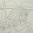
Green Tara illustrates nicely the upsides and downsides of metallic pens.
Depending upon how the light hits them, or how you reproduce them,
the shimmer is highlighted or becomes almost another gold color.
Above, she had gold pen not only where it sparkles, but also all over her crown.
Seeing the exact same shots side by side also shows the change due to lighting.
That said, I sometimes use them, but try never to have more than one on hand because they are more likely to dry up before I use them up!
Favorite pens, top to bottom:
My favorite pens are Winks of Luna, and I need to purchase the copper-color too.
They are juicy, they have amazing coverage, and unlike the others, they are a brush pen so you can get a little itty-bitty thin line or a fat line and create a wave!
The gold is a very yellow gold, and so I hope I like the color of the copper better.
No toxic smell — in fact, almost no smell at all! Waterproof in my tests!
I love Pilot metallic markers BUT they are very old school, from the shaking of the ball to mix the inks inside, to the noxious smell which gives me headaches if I use it too long.
However, their gold is a rosy gold which I prefer. Waterproof in my tests!
Finally, the PITT metallic pens.
They write like a dream, their colors are nicely metallic (the gold is also a yellow gold) but they seem to have little ink in them — in fact,
the level of pen tossing due to loss of ink in
PITT pens in general is what moved me to try a fountain pen again… just so much waste
and dollars spent in plastic.
Waterproof in my tests!
Which brings us to Fountain Pen Shimmering Inks in all their forms. I admit to not trying many — you need to clean your pens out frequently when using them. However,
I tried all five of the J. Herbin 1670 series,
and they are gorgeous! Their ink changes colors as it is watered down — see below —
so you not only have stars-at-night beauty,
but the ink color itself is beautiful. I ended up buying the green, and may break down and buy the red/hematite as well. I put them
into a Platinum Preppy 05 pen so they are less likely to clog and if they do, I don’t lose
a pen worth many dollars. None of the shimmering inks I’ve found are waterproof, which is a big plus to the pens, above.
I leave you with Green Tārā, (Syamatara), the Buddha of enlightened activity. Her mantra is “Om tare tuttare ture soha.“
As my Patreon supporter, you will have
access to some content not on this website,
sneak previews, goodies, discounts on classes.
I will teach architectural sketching,
art journaling (art+writing), creativity, watercolors.
That annoying loud-mouth editor/critic in your head? GONE! How great would that be?
I'd love it if you shared this; please mention my blog name!
Bright Ideas multi-color journal, with Platinum Carbon pen with Platinum Carbon cartridges and Lamy Joy with 1.1 stub and De Atramentis Document black ink.
As my Patreon supporter, you will have
access to some content not on this website,
sneak previews, goodies, discounts on classes.
I will teach architectural sketching,
art journaling (art+writing), creativity, watercolors.
That annoying loud-mouth editor/critic in your head? GONE! How great would that be?
I'd love it if you shared this; please mention my blog name!
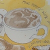
My mom had red hair and wore copper jewelry;
it may account for my love of coppery colored items.
I remember her wearing this bracelet and a copper belt.
She was in the hospital when I drew this. 94.
She is better now; back home.
Bright Ideas multi-color journal, with Platinum Carbon pen with Platinum Carbon cartridges and Lamy Al-Star with De Atramentis Document black ink,
White Uniball Signo pen, Fat white Pitt pen, and colored pencils.
As my Patreon supporter, you will have
access to some content not on this website,
sneak previews, goodies, discounts on classes.
I will teach architectural sketching,
art journaling (art+writing), creativity, watercolors.
That annoying loud-mouth editor/critic in your head? GONE! How great would that be?
I'd love it if you shared this; please mention my blog name!
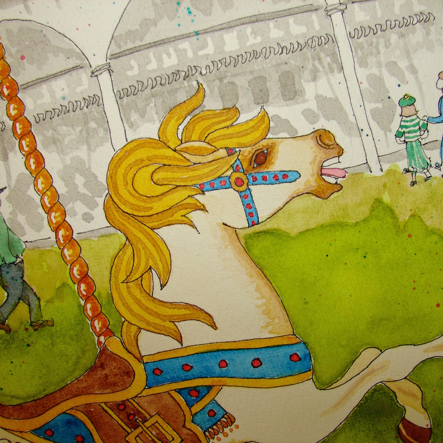
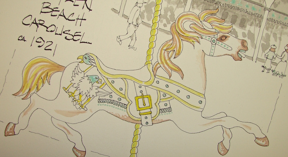
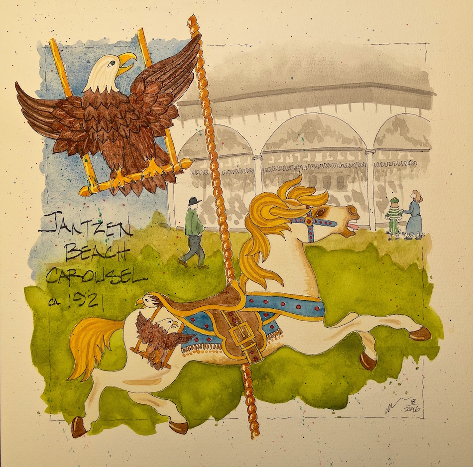
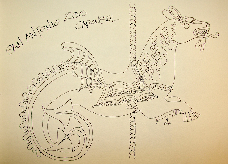
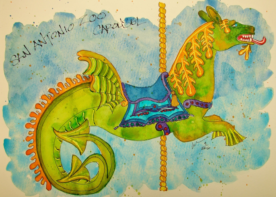
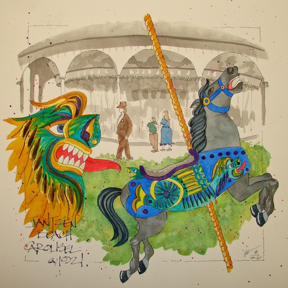
Jantzen Beach Carousel is a series, and this is the sixth and last of this set.
(Below are links to others previously posted.)
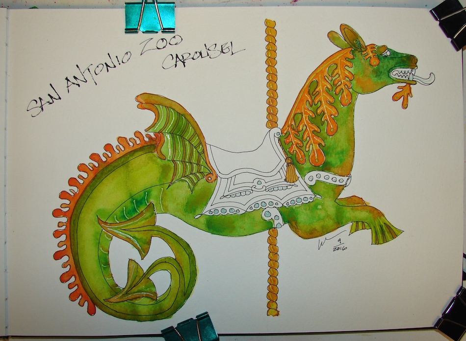
The many layers, above.
1) I began with a sketch in pencil, and moved to ink.
I have a greyed version of the carousel, plus a detail of some aspect of the horses,
and the horse itself. The layout takes time; I play with it.
2) I laid in the Fineline masking fluid (blue) the bits I want to stay clean and white.
3) Grisaille underpainting, using layers of waterproof grey ink in both line and wash to evoke an older time and set shadows. By using the same grey value ink, I can guarantee
(as much as there are any guarantees in this crazy medium) that the inked carousel background will stay looking the same from image to image in the series.
4) My under-painting begins, bright yellow,
to provide a *pop* and variation of some of my top colors.
5) Layering the final colors begins, being careful not to rush the process, let each layer of watercolor dry completely, and not to layer too much or it gets muddy.
6) All bits of masking fluid were removed, and final details finalized.
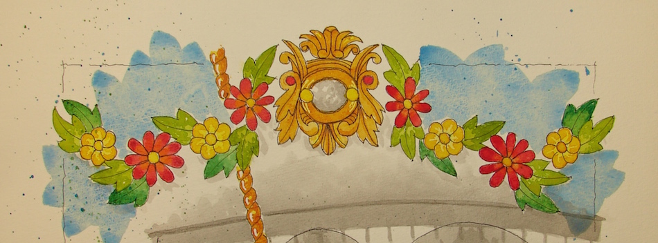
The garland motif overhead is reminiscent of the garland motif over the
inside upper scenic panel: mirror /shield, and raised carved flower patterns.
On the carousel the centers of the flowers were light bulbs.
One of the armored horses (which I am calling my amalgamation Roman Horse)
was given as a gift to owners; I recently was saddened to see it selling on a dealers site. I hope there are more than one on the carousel.
I guarantee that I will continue to paint more in the series; I’ve loved creating these images.
These images are donated to raise money for the restoration of the carousel!
Cold Press watercolor paper, with a Pentalic 2B woodless pencil,
Platinum Carbon pen with Platinum Carbon ink and Pilot Parallel pen with
De Atramentis Document black ink; Fineline Masking fluid;
Sennelier, Holbein, QoR, M.Graham, and Daniel Smith watercolors.
As my Patreon supporter, you will have
access to some content not on this website,
sneak previews, goodies, discounts on classes.
I will teach architectural sketching,
art journaling (art+writing), creativity, watercolors.
That annoying loud-mouth editor/critic in your head? GONE! How great would that be?
I'd love it if you shared this; please mention my blog name!
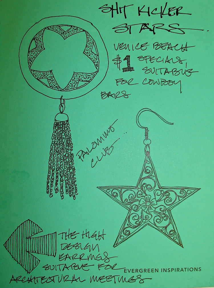
Trust me you will be seeing more of them as I am having fun drawing my earrings
from the sell basket! For awhile, verdigris was in style, and I loved it — copper and turquoise green in one piece of jewelry. In all of these, I can hear the skaters and
the ocean as I bought all of them while walking the Venice boardwalk!
A more Calder-esque six-pointed star on a rotating disc was loved but not worn as often: Texas stars went better with cowboy boots, and I lived in mine when not barefoot.
The sun (is a star too) is bright purple smooth metal, and is very post-modern.
Bright Ideas multi-color journal, with Platinum Carbon pen with Platinum Carbon cartridges and Lamy Al-Star with De Atramentis Document black ink,
White Uniball Signo pen, Fat white Pitt pen, and colored pencils.
As my Patreon supporter, you will have
access to some content not on this website,
sneak previews, goodies, discounts on classes.
I will teach architectural sketching,
art journaling (art+writing), creativity, watercolors.
That annoying loud-mouth editor/critic in your head? GONE! How great would that be?
I'd love it if you shared this; please mention my blog name!
Jantzen Beach Carousel is a series, and this is the fifth in the set.
(Below are links to others previously posted.)
De Atramentis Document brown (brunaille) and Noodler’s Lexington grey (grisaille) worked the undertones. A video on how to work with inks is coming soon!
Holbein’s Quinacridone Gold made for a creamy golden reverse Palomino-ish horse!
The layers, above.
The Bald Eagle was a bit tricky, and I did something I rarely do to solve the problem.
First, I wanted to be sure that as I created sky washes and brown feathers, none of the bald eagle white head was compromised, so I used an unusual amount of masking fluid.
As I built up the wings, the brown became muddy. I was happy with graphite in the underside of the wing, but the brown did not look right. I removed paint with a brush, lifting color in small strokes until I had the relief I wanted in the feathers. Masking was removed. I used De Atramentis Document brown ink to color the head contours.
These images are donated to raise money for the restoration of the carousel!
Cold Press watercolor paper, with a Pentalic 2B woodless pencil,
Lamy Al-Star and Pilot Parallel pen with De Atramentis Document black ink
and Platinum Carbon pen with Platinum Carbon ink; Fineline Masking;
Sennelier, Holbein, M.Graham, and Daniel Smith watercolors.
As my Patreon supporter, you will have
access to some content not on this website,
sneak previews, goodies, discounts on classes.
I teach architectural sketching,
art journaling (art+writing), creativity, watercolors.
That annoying loud-mouth editor/critic in your head? GONE! How great would that be?
I'd love it if you shared this; please mention my blog name!
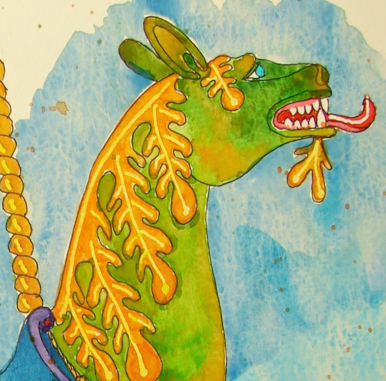
This is part of an older virtual sketchwalk (see below) and I kept meaning to get to it.
I love this gorgeous dragon/ I saw it painted in Daniel Smith Serpentine Primatek!
*how perfect is that name?*
One of my middle-of-the-night sketches a few days ago, I started.
I learned all about how important a great brush is in this painting. Mind you,
my “great brush” was an inexpensive old watercolor brush with synthetic bristles that
long ago lost its name. And it finally gave up the ghost, after 10 years, and so I moved to similar brushes, thinking nothing of it — I mean, how special could a cheap brush be?
*special*
The body was critical. I started with an under-painting of brilliant clear DS Quinophthalone Yellow. I added Fineline Masking Fluid to a few areas.
An orange mix was applied, and I deliberately pushed it into the areas I planned
to paint with DS Serpentine Primatek. This is when I noticed how unruly
my ability to lay down paint within the lines was becoming.
*was i tired? what the hell?*
The messy palette of the dragon’s body, above.
The Serpentine mix is largely in the top center, but I dipped into all of the colors in
these squares before I finished, especially Diopside, Phthalo Green, and Quin Gold.
The Serpentine had to be painted quickly, because while wet I wanted to drop the other greens, oranges, yellows in an effort to mimick the shimmery body of the dragon without adding actual metallic colors (not fond of them.) Primateks accept and play well with other watercolors, letting you move them and create wonderful colorful textures.
*i will be releasing a video on playing with primateks soon*
THIS was when I realized it was the brush!!! Brushes so make a difference!!!
My new brushes didn’t allow the point to let loose of the watercolor without bouncing
paint around as if I was dancing at the edges of the lines. AAAACK!
I tried everything before realizing it was the brush, not my state of mind.
Messy messy painting became the rule of the day…
*sigh… go with the flow, keep painting*
I removed the masking fluid and added the details.
Messily, as the brushes I have are all relatively new and by the same company. Done!
*that’s my story and i’m sticking to it!*
Moleskin 8×11 watercolor journal, with a Pentalic 2B woodless pencil,
Pilot Parallel pen and Platinum Carbon pen with Platinum Carbon ink;
Fineline Masking Fluid; Sennelier, Holbein, QoR and Daniel Smith watercolors.
As my Patreon supporter, you will have
access to some content not on this website,
sneak previews, goodies, discounts on classes.
I will teach architectural sketching,
art journaling (art+writing), creativity, watercolors.
That annoying loud-mouth editor/critic in your head? GONE! How great would that be?
I'd love it if you shared this; please mention my blog name!
I wanted white ink for my fountain pen. I wanted to use a stub nib on a fountain pen for beautiful white writing, and also reduce waste (most of these you toss into the landfill.)
I wanted a waterproof ink…
Imagine my delight when I found De Atramentis Document waterproof white ink!
I popped it directly into my Jinhao (not my beloved Jinhao, but my hated Jinhao)…
And began drawing my heart out on colored paper!
The next day, completely clogged Jinhao. No jump-start! CLOGGED!
I popped the pen in to soak and assumed it was the pen; it is why I hate them —
they clog easily with both my favorite ink brands.
I put it into one of the most dependable fountain pens, a Platinum Preppy 05 or Medium Nib. I’ve never had one clog even if I left it for a month — and enjoyed writing over De Atramentis Document Blue for a little test run, right. I intended to draw more with the white that day. I capped my pen. IT CLOGGED WITHIN TEN MINUTES… whew, okay, I was able to jump start it with a few drops of water.
I stored it tip down. I even put a drop of water into the cap I was so paranoid. Next day, COMPLETELY CLOGGED, dead pen.
*BTW, I am still soaking it just to see if it cleans, but so far, itsa goner*
So let’s just say I would never ever put this ink into even a cheap
$4 fountain pen unless you want to toss it within the day. EVER.
*you’ve been warned*
I’ll be using it with brush and dip pen, thank you, and may not buy it again
unless I become very enthusiastic about painting with white ink.
*another aside — I adore De Atramentis Document inks and
have no trouble with them clogging any of the pens I use —
unless I am abusive and leave the pen uncapped!*
So let’s talk about the properties of this ink along with the non-clogging ink pens I own — and I am putting marker and ball-point together. The ink itself is medium quality for coverage. I had to double back twice in the white on blue image above, and you can see it on the number one spot on the black paper, below, which has great tooth. It is 100% waterproof, as you can see in the washed image area to the right of the dip pen.
Next up, the PITT pen, White 101*** (Yes, it has all those stars.)
I love the pen, though it is not the
whitest of the four inks, but they
only make it in a broad marker,
which means it is a fat white line!
(Please make a thin line PITT!)
I love using it to shade clouds
and fluffy white Santa beards.
It layers nicely, and it is waterproof
from my scrubbing-it-repeatedly-with-water-test, above.
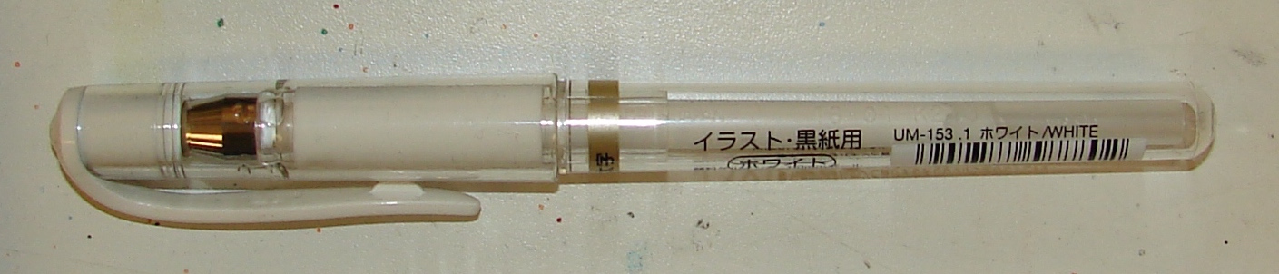
My favorite of the white gel pens is
easily the Uni Signo UM 153.1, above.
It lays down a nice clean bright
medium line with no need to double back, and without leaving the track of the ball-point in the middle, like the Uni 120AC, below. While it is a medium, it is not a
terribly fat pen, and also lays down color
nicely over watercolors, shown above.
However, if scrubbed with water,
a bit of the ink will eventually move.
I use it mostly for highlights, and occasionally drawing on colored papers.
The Uni 120AC.
I throw it in my sketching kit in case someone wants a white pen.
*I’m kind of hoping to lose it… I have TWO*
Yes, it is thin, but look at the track the ball-point lays into the white!
(Expand the image above.) I don’t want that. And like my favorite, the Uniball 153.1,
if scrubbed with water it will release a bit of white cloudy ink.
As my Patreon supporter, you will have
access to some content not on this website,
sneak previews, goodies, discounts on classes.
I will teach architectural sketching,
art journaling (art+writing), creativity, watercolors.
That annoying loud-mouth editor/critic in your head? GONE! How great would that be?
I'd love it if you shared this; please mention my blog name!
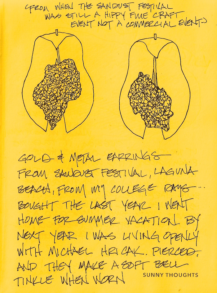
The Sawdust Festival in Laguna Beach was once a truly great craft festival,
no commercialism, and cost nothing, then pennies, to enter.
I bought these wonderful organic burnished metal earrings with pounded gold
which tinkled softly when worn the last time I was home to live in the summer.
Bright Ideas multi-color journal, with Platinum Carbon pen with Platinum Carbon cartridges and Lamy Al-Star with De Atramentis Document black ink,
White Uniball Signo pen, Fat white Pitt pen, and colored pencils.
As my Patreon supporter, you will have
access to some content not on this website,
sneak previews, goodies, discounts on classes.
I will teach architectural sketching,
art journaling (art+writing), creativity, watercolors.
That annoying loud-mouth editor/critic in your head? GONE! How great would that be?
I'd love it if you shared this; please mention my blog name!
Pentalic Aqua Journal, Platinum Carbon pen with Platinum Carbon ink;
Noodler’s Lexington Grey, De Atramentis Document inks;
White Uniball Signo pen 153; Sennelier, Holbein, and Daniel Smith watercolors.
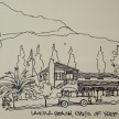
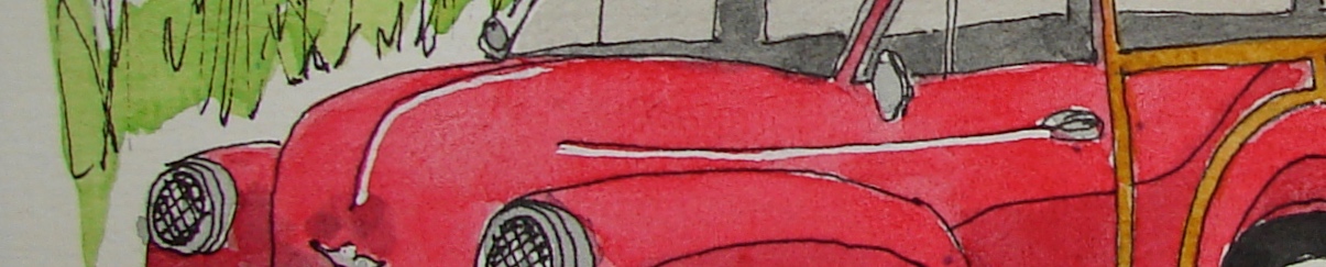
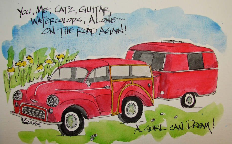
1959 Morris Woody Wagon and trailer image used as source found on Pinterest;
no other traceable contact known.
As my Patreon supporter, you will have
access to some content not on this website,
sneak previews, goodies, discounts on classes.
I will teach architectural sketching,
art journaling (art+writing), creativity, watercolors.
That annoying loud-mouth editor/critic in your head? GONE! How great would that be?
I'd love it if you shared this; please mention my blog name!
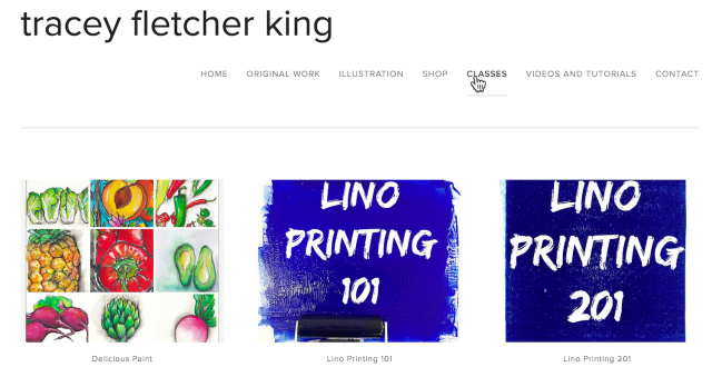
I am SO excited: I am taking Tracey Fletcher King’s Lino Printing classes!
She is informed, fun, silly, and talented, and is teaching TWO levels,
and as I’ve never tried this whole lino-printing thang
I am excited to learn from her — she is an amazing teacher!
I am dying to make my own from my Buddhas, palms, horses, and bulls! Come play with me in her classes (I payed for the bundle of two classes for a better price), and belong to a secret FB club. (It could only be better if it was in a treehouse in her neighborhood.)
From Tracey: “Is a great beginners course.
I have designed it to be suitable for people
who haven’t tried lino before, or perhaps
they did it many moons ago and can only
half remember it… or perhaps you just
want to dip your toe in. Of course it is
also great if you want to make sure you
have great basics… This is a self paced
course, with lifetime access for as long as coursecraft is available as a platform and
I will be checking in regularly so you still
have plenty of access to me as a teacher… “
BTW, Tracey continues to be available and comment to those signing up for classes she started last year — plus because her students love her and continue to value her input they visit class pages long after they are through!
From Tracey: “It is a more advanced version leading on from 101 though you don’t need to have done 101 if you have experience in lino printing. In 201 we get into the nitty gritty, extend people’s skills and get them exploring lino printing in a more fine art oriented way. I didn’t want to bog people down with the basics if they had some experience, and I didn’t want to overwhelm those without a lot of experience by getting into it all… Two classes seemed like a perfect way to do it.”
If you think you are going to want to do both then
you would be crazy not to bundle them…
the bundle price is just $80AUD which is 20% off already… and with the early bird discount that comes down to a further 5%… that is a bargain if ever I saw one! Click here to be taken to the bundle page…
I aspire to this expertise with my own designs!
I do this freely with no payback from King’s enterprises…
I'd love it if you shared this; please mention my blog name!
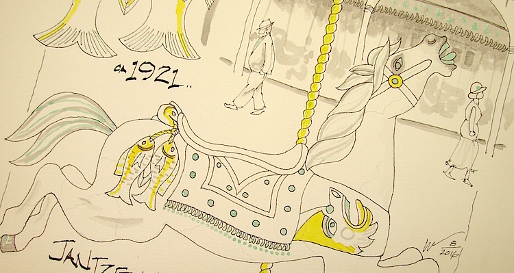
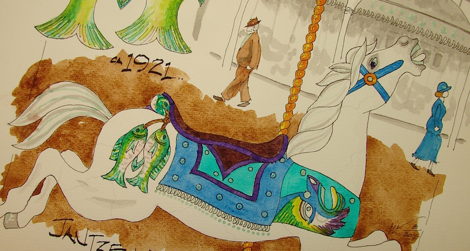
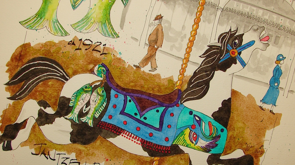
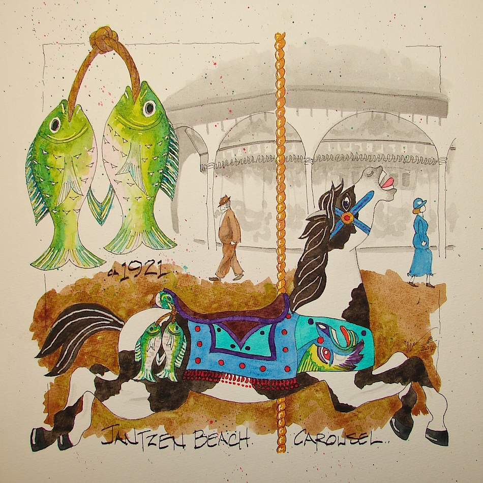
Jantzen Beach Carousel is a series, and this is the fourth in the set.
(Below are links to others previously posted.)
The many layers, above and below.
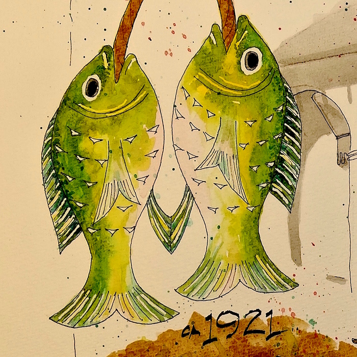
I think the fish, below, show the layers in a microcosm.
Under-painting helps to make the fish glow, and Daniel Smith Primateks
(on the fish, Serpentine and Diopside greens) assist with that wonderful texture.
Pinto Fishing Horse is his name.
These horses are akin, it seems,
to the Water Serpent horses, right,
in that they too have some sort of very Tibetan or totem-pole looking fierce
faces on them which I see as water serpents. In this one, however,
the two fish are tied to his side and
another strapped across the back of
his saddle, and the serpent’s face is
looking up at the horse and
is without his fish-like tail.
Hard to let this one go…
Fishing Horse made me decide to scan and create art prints to sell.
This slideshow requires JavaScript.
These images are donated to raise money for the restoration of the carousel!
Cold Press watercolor paper, with a Pentalic 2B woodless pencil,
Lamy Al-Star and Pilot Parallel pen with De Atramentis Document black ink
and Platinum Carbon pen with Platinum Carbon ink;
Noodler’s Lexington Grey ink; Fineline Masking fluid;
Sennelier, Holbein, QoR, M.Graham, and Daniel Smith watercolors.
As my Patreon supporter, you will have
access to some content not on this website,
sneak previews, goodies, discounts on classes.
I will teach architectural sketching,
art journaling (art+writing), creativity, watercolors.
That annoying loud-mouth editor/critic in your head? GONE! How great would that be?
I'd love it if you shared this; please mention my blog name!
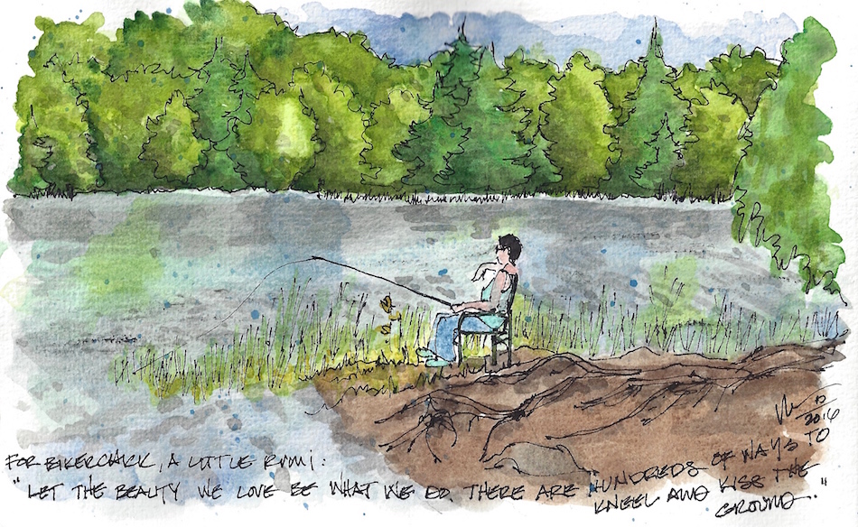
Mary J. Melange blogger friend and lover of photography,
shared wonderful images and I stole a few (with her permission),
and this one caught my eye last night.
I think I was needing some peaceful fishing energy…
As it is Inktober, I started with an inked drawing then added colored inks.
More success this time, especially with the grisaille, but even the blues and greens.
Watercolors, some blotting to varigate, splatters and wa-lah!
Middle of the night, Inktober.
Pentalic Aqua Journal, Platinum Carbon pen with Platinum Carbon ink;
Noodler’s, De Atramentis Document inks;
Sennelier, Holbein, and Daniel Smith watercolors.
As my Patreon supporter, you will have
access to some content not on this website,
sneak previews, goodies, discounts on classes.
I will teach architectural sketching,
art journaling (art+writing), creativity, watercolors.
That annoying loud-mouth editor/critic in your head? GONE! How great would that be?
I'd love it if you shared this; please mention my blog name!
Randy Boyd is letting me use some of his Laguna Beach *home home home* images for Inktober.
It started out okay, then I tried adding colored inks to it.
For some reason they got darker and more *aaack* until I was fed up.
I took a spray bottle to it and sang “MacArthur Park is melting in the rain…”
(I apologize for putting that into your head…)
BTW if you decide to do that clip the paper down and put towels underneath.
*geesh what a mess but I saved Sammy’s image thankfully*
Here, in all honesty, is my inky weird experiment gone wrong!
Pentalic Aqua Journal, Lamy Joy with De Atramentis Document black ink
and Platinum Carbon pen with Platinum Carbon ink;
Noodler’s, De Atramentis Document, Diamine and Super5 inks.


 As my Patreon supporter, you will have


 Mary J. Melange