Motherwell, Must Read

web zenSometimes someone offers something to you that you read over and over.
Liz Doyle offered this interview by Motherwell, and whether it came at the right time as I turn back into myself for my work, or if it is just brilliant I don’t know… but I’ve read it several times, and it keeps coming up for me as I lead groups where people are
not happy with their work, where they compare themselves to the millions of great
paint technicians out there, where they don’t trust their scribbles and their mistakes.
A sample below, of the passages that keep whirling for me.

motherwell-reconciliation

An Interview with Robert Motherwell by Barbara Flug Colin

*edited excerpt… must read!*

Robert Motherwell: … Stanley Kunitz, the Pulitzer Prize poet, [said] there are more good poets now than there ever were … But among the younger ones there are no masters, there are no outstanding ones… I have very much the same take.  The level of competency in the arts is infinitely higher than it was fifteen years ago, but it is almost never that you come across a powerful personality, in the sense of a Pollock, or I don’t know… a Francis Bacon… or whatever.  


Barbara Flug Colin: Is it something about our present culture?


Robert Motherwell: I think it is partly because everybody is now so well taught.  The United States is the only place in the world where major universities have numerous courses in “Twentieth Century Art History,” and also actual studio practice.  I mean Heidelberg or Oxford or the Sorbonne would drop dead at the idea.  And since the war, our universities have increasingly absorbed very good painters … The only way [an artist] can make a living is by lecturing in the universities; in that sense, I don’t suppose there has even been, in the last 150 years, a system set up where some of the best practitioners of the various arts are directly addressing thousands of students of those arts, and that is bound to make some students more sophisticated.  But at the same time, they are being spoon-fed what earlier artists had to seek out, in any nook or cranny, because it didn’t exist to be presented to you.  


Barbara Flug Colin: What I am hearing you say has to do with an earning of the self.


Robert Motherwell: Exactly.  There is so much … superbly educated skill.  But there is very little confrontation with selfhood . . .  I think it also has to do with a lack of innocence, a lack of belief in civilization that people born early in the century still have.  Kunitz has it.  I have it.  It is marvelous to discover this stuff and make it your own, to be a part of it.

… In a sense, education, in the broadest sense, is to socialize people. Most people want to be socialized, and are embarrassed at not knowing the conventions.  So not only is the teacher teaching conventions, the student really wants to learn the conventions, and to be one of the boys.  And it is obvious that, if there are many types of human characters, the convention becomes artificial basically for the majority of them, even if it is necessary socially.  But I would think one of the functions of modern art is to break through conventions to what is the ultimate truth of a given person’s beingness. 

Art is not made by one of the boyz.
Art comes from your soul’s expression, and for that to happen,

YOU HAVE TO TRUST YOUR SOUL.

Make your marks, play, have a doodle, experiment, see where it takes you.
Don’t compare yourself to the next guy, because the next guy might just want to be technically correct, and that means you end up a good draughtswoman.
Nothing wrong with a wanting to be a good draughtswoman,
just understand that MOST renderings are not art, but pretty pictures.
*Nothing wrong with pretty pictures; I love to look at them.  They rarely move me.*

Two years ago, for the first time, I steeped myself in learning technique as a shortcut
with watercolor.  My editor soon became in charge of my paintbrush.

When I first wanted to paint, over breakfast at the West Beach Cafe I asked
Billy Al Bengston whether I should go back to school for a MFA.  He said, “Do you want to paint or teach?” and advised me to take the money I’d spend on college and take the
time off and buy cheap paint and canvas and go to it.  I took his advice at 29.

Now at 60 it is time to unlearn and go back to my own screwy sense of whatever I want to play with and not think about being technically correct.  It took me two years to undo what technical drawing did to me as a artist.  Let’s hope this time I remember the path.  Its not throwing the baby out with the bathwater, just taking the baby for a spin in the mud.

Who do I look at, when it comes to Urban Sketchers?
Kiah Kiean Ch’ng
Jose Maria Lerdo de Tejada
reuven DATTNER
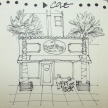
Pat Southern-Pearce (below)
Marc Taro Holmes

11921875_10203715736208932_5670454322822253302_o

w16-9-22-pentalic-laguna-beach-days-of-yore-05-sq w15-10-haight-sq w16-8-rp-trojan-horse-sq w16-4-1-newberry-library-sq w16-9-22-pentalic-laguna-beach-days-of-yore-04-sq

I agree to Creative Commons Attribution-Non-Commercial 4.0 International License, which you can learn more about by visiting the site, or,
visit my web page for a more user-friendly summary on my terms.
My images/blog posts may be reposted; please link back  to dkatiepowellart.

Posted in art, commentary, creativity, meditation, memory, process | Tagged , | 2 Comments

VSW: Buffalo Cemetary, 2

w16-vsw-buffalo-cemetary-06Having put a body of work behind me
at Restore Oregon, shown and sold, and
also in anticipation of that coming to a close, I’ve been turning to my next interest.

I am a teacher.  I wanted to be one at 16 and my Aunt Elsa May Smith told me to learn something that interested me then teach THAT — and she was in higher education and headed up the first Gerontology Studies department in the country.  I think it is good advice.  I taught architectural and interior design at University, then writing and painting in the Oregon schools.

I will teach architectural drawing
through video (working on that now) and locally by taking out groups in our area.
I will continue to teach or share things I learn through my explorations.  Teachers teach what they know and sometimes what they are playing with… which is what you will get from me.  I will also share great teachers and products I love, and tell you if others love a product even if I hate it!

w16-vsw-buffalo-cemetary-07I am by nature not a painter of realism.
I’m not trying to make my paintings and sketches look exactly or photographically like the scene in front of me…  I’ve been painting that way for two years because I’m learning watercolors, and
being taught largely by realistic painters.

I am an emotional body painter.  I journal: sometimes light-hearted sweet things that
touch me, cats and husband and friends, and blogging friends who lift us up, and sometimes
raw — if there are emotional events that turn my heart toward sadness or introspection.
The state of our environment and our political scene indicates there may be more of the latter.  I will consciously turn my heart toward light through gratitude postings in my journal, and perhaps you will find an antidote to a heavy heart through gratitude.  So you may start seeing more emotional journal images and entrees as I process in paint and words, and share — because it is my nature to expose and express the emotional body, the messy stuff alongside the sweet stuff — as in art, like life.

By the way, I find it interesting, as I rarely paint angels, that throughout this crazy political upheaval I was painting Arcángel Miguel (how I knew him growing up attending the Mission San Juan Capistrano for Latin and Spanish masses.)  It was a coincidence, if you believe in them, because I was merely painting a cemetery!  BUT, I also coincidentally spent time in front of his image on my recent trip visiting California missions.  He is a the prince who stands up for the innocent and downtrodden, and was seen as a healer as well.

Moleskin A4 Watercolor Journal, Platinum Carbon pen with De Atramentis Tobacco ink, Lamy Al-Star with Diamine Ancient Copper ink, Metropolitan with KWZ Foggy Green ink.
NELIPOT IFJM NELIPOT IFJM NELIPOT IFJM

I started a Facebook group page (you must join to view) to allow everyone to share their virtual sketches, and also where we will, from time to time, take virtual sketch walks together.  Come join us On Facebook if you are inclined!
If you want to know more about what a virtual sketchwalk is review my first post.
There are a few more notes/pointers on our first walk through Laguna Beach, California.

I also created an accompanying Flickr group!

NELIPOT IFJM NELIPOT IFJM NELIPOT IFJM

 ©D. Katie Powell.
My images/blog posts may be reposted; please link back  to dkatiepowellart.

☾

W14 4 27 WC PALMS PAT SQAs my Patreon supporter, you will have
access to some content not on this website,
sneak previews, goodies, discounts on classes.

I will teach architectural sketching,
art journaling (art+writing), creativity, watercolors.
That annoying loud-mouth editor/critic in your head?  GONE!  How great would that be?

Posted in architecture, art journal, drawing, gods and goddesses, ink painting, pen & ink, sketchbook, virtual sketching | Tagged , , , , , , , , , , , , , , , , , , , | 8 Comments

Restore Oregon Endangered Places 2016

The series for Restore Oregon Endangered Places 2016, is now on one page.

w16-9-24-ro-invite-1Restore Oregon is a cause I can support.
Drawing old buildings is always fun for me,
as I began life as an architect.
Restoration is my passion, though we practice
it as object conservators
(and in buildings for
interior applications).  I believe in saving the
buildings on the Endangered Places list,
and others that didn’t make it to that list!

Last night was the 2016 DeMuro Award dinner, and all my images sold… My babies flew to happy buyers and it also raised money for Restore Oregon.  I am placing all the images with their prospective pages here.

To view all the images, with links to posts
about the individual images, click here.

☾

W15 11 26 RO Peggy Plate 024 BANNER 300 W15 11 26 RO Peggy Plate 024 BANNER 300 W15 11 26 RO Peggy Plate 024 BANNER 300 W15 11 26 RO Peggy Plate 024 BANNER 300

 ©D. Katie Powell.
My images/blog posts may be reposted; please link back  to dkatiepowellart.

☾

W14 4 27 WC PALMS PAT SQAs my Patreon supporter, you will have
access to some content not on this website,
sneak previews, goodies, discounts on classes.

I will teach architectural sketching,
art journaling (art+writing), creativity, watercolors.
That annoying loud-mouth editor/critic in your head?  GONE!  How great would that be?
Posted in architecture, commission, creativity, urban sketchers, virtual sketching, watercolor | Tagged , , , , , , , , , , , , , , , , | 2 Comments

VSW: Buffalo Cemetary, 1

Fran offered great images of the Buffalo Cemetery for our November virtual walk as a group.  I especially  loved the graceful angel which I think has swans around her base.

I played mostly with non-waterproof inks, laying them down in linework, several colors
all at once, then using Noodler’s Lexington grey and/or De Atramentis Document Brown ink for a few waterproof lines.  Then I began working fast with water and/or grisaille to move the colors around, and added only a bit of blues for the skies.  You have to work very fast or the lines completely blur and you get a blob of color (see the oranges in the large angel?), versus movement with a marks leftover, seen in the angel.

w16-vsw-buffalo-cemetary-01-sqMoleskin A4 Watercolor Journal, Platinum Carbon pen with De Atramentis Tobacco ink, Preppy pen with Lexington Grey Noodlers ink,  Lamy Al-Star with Diamine Ancient Copper ink, Metropolitan with KWZ Foggy Green ink, Platinum Carbon pen with De Atramentis Document Brown ink, Sennelier and Daniel Smith Watercolors.

NELIPOT IFJM NELIPOT IFJM NELIPOT IFJM

I started a Facebook group page (you must join to view) to allow everyone to share their virtual sketches, and also where we will, from time to time, take virtual sketch walks together.  Come join us On Facebook if you are inclined!
If you want to know more about what a virtual sketchwalk is review my first post.
There are a few more notes/pointers on our first walk through Laguna Beach, California.

I also created an accompanying Flickr group!

NELIPOT IFJM NELIPOT IFJM NELIPOT IFJM

 ©D. Katie Powell.
My images/blog posts may be reposted; please link back  to dkatiepowellart.

☾

W14 4 27 WC PALMS PAT SQAs my Patreon supporter, you will have
access to some content not on this website,
sneak previews, goodies, discounts on classes.

I will teach architectural sketching,
art journaling (art+writing), creativity, watercolors.
That annoying loud-mouth editor/critic in your head?  GONE!  How great would that be?

Posted in art journal, pen & ink, sketchbook, virtual sketching, waterbrush | Tagged , , , , , , , , , , , , , , , , , | 10 Comments

From a Sketcher Friend

I have no words.
However, has drawings….

Looking (very hard) for a silver lining

I’m looking very hard for a silver lining today. If this post is a bit jumbled and rambling, it’s because I feel that way. I volunteered to be clerk at the Presidential Elections yesterday. A day that started with leaving home at 5:45 am and getting back home at 9:45 pm. You’ve seen how the day turned out on news channels and social media everywhere.

But I looked at my sketchbook early this morning (Yes, I drew in every little bit of downtime. Drawing keeps me sane.) and it tells a very different story. Of people coming out to vote in a democracy. Of older people (our polling station was at a Senior Living Center) with really serious disabilities determined to vote.

Pictures are my first language, words don’t work so well, especially today. So here goes.

voting_spread1

A voter remembers volunteering many years ago, stops to share a story and say thank you.

PLEASE, go visit her site, finish reading and look at all the images
and read the comments and stories.  It is therapeutic.

Posted in art journal | Tagged , | Leave a comment

USk: Pepso-Cola Building

w16-10-1-usk-pepsi-cola-bldg-04I love this loopy building, and now I get to see it whenever I meet my tax gal.

Fabriano A4 Watercolor journal, Lamy Joy with De Atramentis Document black ink and Platinum Carbon pen with Platinum Carbon ink;
Noodler’s Lexington Grey; Sennelier, Holbein, and Daniel Smith watercolors.

W15 10 MPR DKP STAYCATION OM SQUARE SMALL W16 8 RO ASTORIA NET LOFT2 014B SQ W16 4 14 VSW GETTY TOMB CHICAGO 12 SQ W16 8 6 PENTALIC MARIPOSA LILY 03 SQ W16 7 31 PENTALIC MINERVA'S HOLLYHOCK 03 SQ

©D. Katie Powell.
My images/blog posts may be reposted; please link back  to dkatiepowellart.

Posted in architecture, art journal, landscape, painting, pen & ink, sketchbook, urban sketchers, watercolor | Tagged , , , , , , , , , , , , , | Leave a comment

Tools: Painting with Ink

w16-ink-01Inktober and two new purchases pushed me even further into playing with just inks, or mostly inks, instead of watercolor. Today I write about my first month of using inks in a painterly way… and that means I am moving away, for now, from waterproof inks.  I have my favorites and am happy with them, and really, in black you’d not get me to budge from De Atramentis Document Black ink.  If it came in cartridges I’d not reach for my Platinum Carbon Pen and ink — but that is my second favorite.  It would be first but for the way it photographs — shiny carbon reflections.   Favorite waterproof colored inks are here.

Before I go too much further, other than sketchbooks, I am concerned about
the light-fast properties of inks.  I am in the middle of my own tests, and so far have nothing to report.  Goulet had Jamie Grossman test his Noodler’s line,
and the news is good for many colors IF you are a Noodler’s fan.

I now use under-painting with waterproof inks regularly to influence watercolors
or non-waterproof inks placed on top: grisaille (grey, and mine is Noodler’s Lexington Grey), brunaille (mine is usually De Atramentis Document Brown ink) and
verdaille (usually De Atramentis Document Green ink or
Super5 Dublin (Amazon when they have it or buy from Europe).

But my real love is learning to paint with runny inks!
I’ve tried it two ways: Painting straight out of the bottle or straight out of a diluted bottle, which is good for precise and controlled color  — above two pieces using pen and brush with Super5 Australia (Amazon when they have it or buy from Europe),
which happens to be waterproof.

OR, sketching then using a waterbrush or wet brush to move the inks (above).
I have to be very fast, because there is little room to move them again after they dry,
so the zen experience of watercolor is even more pronounced with this method.
When it is good, the results are lovely!

A few favorites, and a dog….

w16-ink-kwz-foggy-green-02
My newest favorite is KWZ Ink’s Foggy Green.  Above it is mixed with Lexington Grey in brushwork over lines drawn with a Pilot Metropolitan, but below that is pure Foggy Green, even in the areas where it separates into blues and pinks — almost the pink color of Super5 Australia.  The ink causes NO problems in my Metropolitan.  Lovely lovely lovely!

w16-10-25-pentalic-san-louis-obispo-wine-01-dtl-kwzw16-ink-diamine-ancient-copper-002
Diamine Ancient Copper is in my Lamy Al-Star, and it is close to a Quin Gold but with more  bite.  I love it for fall colors, above.  I am anxious to see if it has light-fast properties.

w16-ink-dea-tobacco-004De Atramentis Tobacco ink (scented) is a lovely earthy dark brown with charcoal overtones at its deepest (the inside of the pot) moving to a reddish brown when diluted.  The smell of it takes me back to Pa’s pipe and Christmas at the ranch.
I’ve not had any problem with it in either the Pilot Desk Fountain Pen – DPN-70 – Red – Extra Fine Nib (their version of a Platinum Carbon pen nor my new Lamy LX pen.

And now, a dog.  Daniel Smith Walnut ink just doesn’t measure up,
so perhaps they need to stick to the watercolor business.
One huge problem I have is the container.  This is ink meant for a dip pen but I
guarantee you will tip it quickly unless you decant it in another jar (a hassle) or set it permanently in a small glass shooter (empty tequila first.)  I’ve only had plastic containers when trying samples — which is understand able — but that alone would make me stay away.  Plus the color is no big deal.  I’ve heard it is light-fast, so that is a plus —
but then so are many of the brown in Noodler’s line.

This slideshow requires JavaScript.

Pentalic Aqua Journal or Moleskin A4 Watercolor Journal,
Pilot Desk Fountain Pen – DPN-70 or Lamy LX pen with De Atramentis Tobacco ink,
Pilot Preppy pen with Noodler’s Lexington Grey Ink,
Lamy Al-Star with Diamine Ancient Copper ink,
Pilot Metropolitan with KWZ Ink’s Foggy Green,
Platinum Carbon pen in medium and fine with De Atramentis Document Brown ink,
Pilot Metropolitan with Super5 Australia (Amazon when they have it or buy from Europe),
dip pen with Daniel Smith Walnut ink,
Sennelier and Daniel Smith Watercolors.

  w16-10-31-pentalic-buddha-03-sq w16-vsw-buffalo-cemetary-01-sq W16 8 RO Upper Sandy Guard Station 009 SQ w16-10-25-pentalic-san-louis-obispo-wine-02-SQ w16-8-10-pentalic-middle-night-03-sq

 ©D. Katie Powell.
My images/blog posts may be reposted; please link back  to dkatiepowellart.

☾

W14 4 27 WC PALMS PAT SQAs my Patreon supporter, you will have
access to some content not on this website,
sneak previews, goodies, discounts on classes.

I will teach architectural sketching,
art journaling (art+writing), creativity, watercolors.
That annoying loud-mouth editor/critic in your head?  GONE!  How great would that be?

Posted in color, drawing, paint brush, painting, pen & ink, process, review, sketchbook, waterbrush | Tagged , , , , , , , , , , , , , , , , , , , , , , , , | 2 Comments

VSW: Buddha

w16-10-31-pentalic-buddha-01

From an image offered up in my Virtual Sketchwalk group by Dee Ludwig!

Pentalic Aqua Journal, Platinum Carbon pen with De Atramentis Tobacco ink, ;
De Atramentis Tobacco ink, De Atramentis Document Brown ink.

NELIPOT IFJM NELIPOT IFJM NELIPOT IFJM

I started a Facebook group page (you must join to view) to allow everyone to share their virtual sketches, and also where we will, from time to time, take virtual sketch walks together.  Come join us On Facebook if you are inclined!
If you want to know more about what a virtual sketchwalk is review my first post.
There are a few more notes/pointers on our first walk through Laguna Beach, California.

I also created an accompanying Flickr group!

NELIPOT IFJM NELIPOT IFJM NELIPOT IFJM

I agree to Creative Commons Attribution-Non-Commercial 4.0 International License, which you can learn more about by visiting the site, or,
visit my web page for a more user-friendly summary on my terms.
My images/blog posts may be reposted; please link back to dkatiepowellart.

☾

W14 4 27 WC PALMS PAT SQAs my Patreon supporter, you will have
access to some content not on this website,
sneak previews, goodies, discounts on classes.

I will teach architectural sketching,
art journaling (art+writing), creativity, watercolors.
That annoying loud-mouth editor/critic in your head?  GONE!  How great would that be?

Posted in art journal, Buddha, pen & ink, sketchbook, virtual sketching | Tagged , , , , , | Leave a comment

USk: Thurman “Thursday” Garage Doors

w16-10-15-usk-thurman-garages-07 w16-10-15-usk-thurman-garages-09w16-10-15-usk-thurman-garages-14Mitchell and I like to walk up
Thurman Street sometimes (and should do it more!).  So many old garages and
oddities and lovely gardens.  Some of
the old garages look like
they are never used; the vines cover the doors.

I created this sketch before inktober,
but had no time to finish it.

Grisaille in Lexington Grey and brunaille in DeAtramentis Document Brown and Super5 Australia created the under-painting.

w16-10-15-usk-thurman-garages-16 w16-10-15-usk-thurman-garages-17
Yes, iron rings for horse ties still line the streets.
And a bit of a wicked looking address marker!

w16-10-15-usk-thurman-garages-02 w16-10-15-usk-thurman-garages-06

I am playing in the group Thursday Doors, led by Norm 2.0, with others, here!

Have you got a door in your sketchbook?

Fabriano A4 Watercolor journal, Pentalic 2B woodless pencil,
Lamy Al-Star with De Atramentis Document black ink,
and Platinum Carbon pen with Platinum Carbon ink;
Noodler’s Lexington Grey, De Atramentis Document Brown, and Super5 Australia ink;
Sennelier, Holbein, M.Graham, Greenleaf & Blueberry, and Daniel Smith watercolors.

W16 THURSDAY DOORS SQ  W16 THURSDAY DOORS SQ  W16 THURSDAY DOORS SQ  W16 THURSDAY DOORS SQ

©D. Katie Powell.
My images/blog posts may be reposted; please link back  to dkatiepowellart.

Posted in architecture, art journal, drawing, journal, memory, pen & ink, process, sketchbook, urban sketchers, watercolor | Tagged , , , , , , , , , , , , , , , , , | 18 Comments

VSW: “Red” Barn

w16-10-29-pentalic-vsw-barn-01An image from the Virtual Sketchwalk group
(gads I cannot remember whose someone remind me and I will correct)
done in mostly ink.  I tried to work wet-on-wet with the inks, so they moved a bit…
I pulled the inks off the tips of my fountain pens and placed them into water.  I added a bit of color at the end because I didn’t have enough inks with me to play the colors deeply.

Pentalic Aqua Journal, Platinum Carbon pen with De Atramentis Document Brown ink;
KWZ Foggy Green, Diamine Blue, and Super5 inks; Daniel Smith watercolors.

NELIPOT IFJM NELIPOT IFJM NELIPOT IFJM

I started a Facebook group page (you must join to view) to allow everyone to share their virtual sketches, and also where we will, from time to time, take virtual sketch walks together.  Come join us On Facebook if you are inclined!
If you want to know more about what a virtual sketchwalk is review my first post.
There are a few more notes/pointers on our first walk through Laguna Beach, California.

I also created an accompanying Flickr group!

NELIPOT IFJM NELIPOT IFJM NELIPOT IFJM

©D. Katie Powell.
My images/blog posts may be reposted; please link back  to dkatiepowellart.

☾

W14 4 27 WC PALMS PAT SQAs my Patreon supporter, you will have
access to some content not on this website,
sneak previews, goodies, discounts on classes.

I will teach architectural sketching,
art journaling (art+writing), creativity, watercolors.
That annoying loud-mouth editor/critic in your head?  GONE!  How great would that be?

Posted in architecture, art journal, landscape, pen & ink, virtual sketching, watercolor | Tagged , , , , , , , , , , , | Leave a comment

VSW: Boyd’s Beach Too

w16-10-20-pentalic-boyds-beach-too-01home home home, image taken by Randy Boyd….

Pentalic Aqua Journal, Platinum Carbon pen with Platinum Carbon ink;
Sennelier, Holbein, and Daniel Smith watercolors.

W15 10 MPR DKP STAYCATION OM SQUARE SMALL W16 8 RO ASTORIA NET LOFT2 014B SQ W16 4 14 VSW GETTY TOMB CHICAGO 12 SQ W16 8 6 PENTALIC MARIPOSA LILY 03 SQ W16 7 31 PENTALIC MINERVA'S HOLLYHOCK 03 SQ

©D. Katie Powell.
My images/blog posts may be reposted; please link back  to dkatiepowellart.

☾

W14 4 27 WC PALMS PAT SQAs my Patreon supporter, you will have
access to some content not on this website,
sneak previews, goodies, discounts on classes.

I will teach architectural sketching,
art journaling (art+writing), creativity, watercolors.
That annoying loud-mouth editor/critic in your head?  GONE!  How great would that be?

Posted in art journal, challenge, memory, pen & ink, virtual sketching, watercolor | Tagged , , , , , , , , , , , , , | 2 Comments

San Louis Obispo Wine Fields

w16-10-25-pentalic-san-louis-obispo-wine-01Another “urban” sketch of wine fields around the central California area.
I created a loose pencil sketch, and came in hard with pencil for shadow in the vineyards.
No pen work.
I was able to use my new KWZ Foggy Green ink — not waterproof —
and it moves and changes colors at the edges in an amazing way, pink and grey-blue.
De Atramentis Tobacco ink worked the mountains.

Home.

w16-10-25-pentalic-san-louis-obispo-wine-02Pentalic Aqua Journal; Pentalic HB pencil,
KWZ Foggy Green, Diamine Regency Blue, De Atramentis Document and Super5 inks.

W15 10 MPR DKP STAYCATION OM SQUARE SMALL W16 8 RO ASTORIA NET LOFT2 014B SQ W16 4 14 VSW GETTY TOMB CHICAGO 12 SQ W16 8 6 PENTALIC MARIPOSA LILY 03 SQ W16 7 31 PENTALIC MINERVA'S HOLLYHOCK 03 SQ

©D. Katie Powell.
My images/blog posts may be reposted; please link back  to dkatiepowellart.

☾

W14 4 27 WC PALMS PAT SQAs my Patreon supporter, you will have
access to some content not on this website,
sneak previews, goodies, discounts on classes.

I will teach architectural sketching,
art journaling (art+writing), creativity, watercolors.
That annoying loud-mouth editor/critic in your head?  GONE!  How great would that be?
Posted in art journal, challenge, drawing, landscape, memory, pen & ink, pencil, urban sketchers | Tagged , , , , , , , , , , , , , , , , , , , | 2 Comments

Mitchell’s Birthday

w16-10-26-pentalic-la-cuesta-inn-01We had a mixed trip, both good and harried horrendous crazy-making.

Our client loved our delivery.  Always good.
I’ve forgotten about California traffic (Portlanders, hear me now, you have NO right to complain!) and now they are also crazy as loons.  Add rain to that and it is lethal!

Coming back we had the fortune to find the La Cuesta Inn
in San Louis Obispo in time for Mitchell’s 65th birthday.
It salved the soul, with an affordable room with a small balcony and we could throw the doors open to the night air with sea smells and Pinon trees and eucalyptus.
We ate the best sushi ever, at the Naked Fish,
and spent time in our favorite haunt, the Phoenix Bookstore.

As it is Inktober, I am posting a few ink drawings from the trip.
I have lots to finish up and will eventually post the journal.

The drawing is all ink, with a little bitty smudge of yellow paint.

w16-10-26-pentalic-la-cuesta-inn-sqPentalic Aqua Journal, Platinum Carbon pen with Platinum Carbon ink;
Noodler’s, De Atramentis Document and Super5 inks.

w16-9-22-pentalic-laguna-beach-days-of-yore-05-sq w15-10-haight-sq w16-8-rp-trojan-horse-sq w16-4-1-newberry-library-sq w16-9-22-pentalic-laguna-beach-days-of-yore-04-sq

 ©D. Katie Powell.
My images/blog posts may be reposted; please link back  to dkatiepowellart.

☾

W14 4 27 WC PALMS PAT SQAs my Patreon supporter, you will have
access to some content not on this website,
sneak previews, goodies, discounts on classes.

I will teach architectural sketching,
art journaling (art+writing), creativity, watercolors.
That annoying loud-mouth editor/critic in your head?  GONE!  How great would that be?

Posted in architecture, art journal, furniture, journal, memory, pen & ink, urban sketchers | Tagged , , , , , , , , , , , , , , | 12 Comments

Restore Oregon: The Oregon Caves Historic District

w16-10-10-ro-orca-chateau-06-sqThe Oregon Caves Historic District covers six acres of the Oregon Caves National Monument and Preserve (OCNMP) in the Siskiyou National Forest,
which is accessed through Cave Junction in southwestern Oregon.

The historic district includes four primary buildings:
the Chalet, built in 1924 and reconstructed in 1942 (second, above):
the Guide Dormitory, built in 1927 with major additions in 1940 and 1972 (first, above);
the Oregon Caves Chateau built in 1934, (third above;
and the ranger residence built in 1936.
Having been in several of the buildings not open to visitors, they are spectacular,
but have grown into disrepair though structurally intact.  Because of the unique rustic architecture of these National Park Service buildings and the surrounding park landscape, the area was listed on the National Register of Historic Places in 1992.
The Oregon Caves Chateau is listed as a National Historic Landmark.

From the NPS site:  “Landscape architect Arthur Peck suggested the traditional
look of the district, and Grants Pass carpenter and self-taught architect
Gust Lium followed suit when he designed and built the Chateau.
The rocks are the same marble as that which comprised the cave and the bark
which covers the structures is from native Port Orford Cedar trees.
The rustic design of the cave’s historic district set a precedent which was followed in constructing other buildings in several state parks and the Siskiyou National Forest.”

w16-10-10-ro-orca-chateau-02I began with a loose sketch in a Platinum Carbon fountain pen,
and worked brunaille in De Atramentis Document ink (watered down)
to provide shadows and variation under the watercolor.

w16-10-10-ro-orca-chateau-03Watercolors were added, and linework with a small liner added to effect the cedar siding.

The district is an overlooked gem in our nation’s parks.  The Chateau, only one of several structures in need of assistance, is known for its rustic Port Orford Cedar exterior, huge open fireplace, female ghost who walks the halls, and most importantly, one of the finest collections of Mason Monterey furniture, some of which is available to use throughout the Chateau, above, shown with one of the conservators for the first batch of two dozen pieces, Mitchell Powell, responsible for woodworking and upholstery treatment.

w11-114a-horsehshoe-back-after-mpfcw10-10-440-b4-old-wood-mpfcThe Horseshoe-back shown in the watercolor image is a rare Native American pattern atypical of the patterns in the Monterey line.  The chair is in what I loosely refer to as the Museum Collection (at present a state-of-the-art treatment room) and unable to be viewed at this time.  All painted conservation treatment was performed by yours truly, with a very abbreviated slideshow below, to give you an idea of the care that goes into preserving anything, from buildings to furniture to artworks.  For those interested, we have an additional page on the dozen A-Frame chairs which suffered extreme losses and stripping in the 1964 flood through the dining room,
mostly to show the amazing color in the line!

This slideshow requires JavaScript.

The National Park Service’ excellent administrators have prepared restoration plans,
but both Federal financial assistance and individual donations are needed to fund this restoration.  I recommend they be made directly to the NPS with the project you are interested in funding earmarked, instead of to various external entities to ensure that the monies are dispersed to proper conservation efforts which follow NPS protocol.  The Chateau has been placed as a higher priority for National Park Service funding, which should assist in driving more guests and awareness to the beautiful park,
thereby generating more funding.

The images donated will
raise money for
Restore Oregon at the
Restoration Celebration, November 11th, 2016.

☾

Previous Building Images Completed:  Upper Sandy Guard Station;  Wong Laundry Building; Uppertown Net Loft; Rivoli Theater;  Fort Rock;  Jantzen Beach Carousel 1 Chinese Water Serpent; Jantzen Beach Carousel 2, Grapes; Jantzen Beach Carousel 3, Floral; Jantzen Beach Carousel 4, Pinto Fishing; Jantzen Beach Carousel 5, Eagle; Jantzen Beach Carousel 6, Trojan; EOU Inlow Hall Grand Staircase; Lindberg House.

Cold Press watercolor paper, with a Pentalic 2B woodless pencil,
Lamy Al-Star and Pilot Parallel pen with De Atramentis Document black ink
and Platinum Carbon pen with Platinum Carbon ink;  Fineline Masking;
Sennelier, Holbein, QoR, M.Graham, and Daniel Smith watercolors.

W15 11 26 RO Peggy Plate 024 BANNER 300 W15 11 26 RO Peggy Plate 024 BANNER 300 W15 11 26 RO Peggy Plate 024 BANNER 300 W15 11 26 RO Peggy Plate 024 BANNER 300

 ©D. Katie Powell.
My images/blog posts may be reposted; please link back  to dkatiepowellart.

☾

W14 4 27 WC PALMS PAT SQAs my Patreon supporter, you will have
access to some content not on this website,
sneak previews, goodies, discounts on classes.

I teach architectural sketching,
art journaling (art+writing), creativity, watercolors.
That annoying loud-mouth editor/critic in your head?  GONE!  How great would that be?

Posted in architecture, art, commission, furniture | Tagged , , , , , , , , , , , , , , , , , , , , , , , , , , | 12 Comments

Bright Ideas: Inktober 27, Pa’s Bolo

w16-10-12-bi-pas-bolo-01
This Official Boy Scout Eagle Bolo was my grandfather’s.
Pa would be about 116 now, which dates the bolo to the beginning of the scout’s era,
circa 1910.  It has the eagle with the two stars flanking the sides, sitting on a knot.

Bright Ideas multi-color journal, with Platinum Carbon pen with Platinum Carbon cartridges and Lamy Joy with De Atramentis Document black ink.

W16 3 30 GRATITUDE JOURNAL 001 SQ W15 10 MAY SKETCHBOOK 001 SQ W16 4 21 BI STUPID PHONE 01 SQ MITCHELL'S BUNNY SQ W15 10 MPR DKP STAYCATION OM SQUARE SMALL W15 11 MAY HAIR SQ

 ©D. Katie Powell.
My images/blog posts may be reposted; please link back  to dkatiepowellart.

☾

W14 4 27 WC PALMS PAT SQAs my Patreon supporter, you will have
access to some content not on this website,
sneak previews, goodies, discounts on classes.

I teach architectural sketching,
art journaling (art+writing), creativity, watercolors.
That annoying loud-mouth editor/critic in your head?  GONE!  How great would that be?

Posted in art journal, challenge, drawing, memory, pen & ink, sketchbook | Tagged , , , , , , , , | 2 Comments

Bright Ideas: Inktober 26, Cal Powell’s Cufflinks

w16-10-16-bi-cal-powells-jade-buddha-cufflinks-03
Mid-Century Jade Buddha Swank Cufflinks belonged to Mitchell’s Dad.
Swank was popular and now is popular with collectors.
Now he will be remembered in my book of all our memories!

w16-10-16-bi-cal-powells-jade-buddha-cufflinks-01-SQBright Ideas multi-color journal, with Platinum Carbon pen with Platinum Carbon cartridges and Lamy Joy with De Atramentis Document black ink.

W16 3 30 GRATITUDE JOURNAL 001 SQ W15 10 MAY SKETCHBOOK 001 SQ W16 4 21 BI STUPID PHONE 01 SQ MITCHELL'S BUNNY SQ W15 10 MPR DKP STAYCATION OM SQUARE SMALL W15 11 MAY HAIR SQ

 ©D. Katie Powell.
My images/blog posts may be reposted; please link back  to dkatiepowellart.

☾

W14 4 27 WC PALMS PAT SQAs my Patreon supporter, you will have
access to some content not on this website,
sneak previews, goodies, discounts on classes.

I will teach architectural sketching,
art journaling (art+writing), creativity, watercolors.
That annoying loud-mouth editor/critic in your head?  GONE!  How great would that be?
Posted in art, challenge, drawing, memory, pen & ink, sketchbook | Tagged , , , , , , , , , , | Leave a comment

Bright Ideas: Inktober 25, Bows

w16-bi-sterling-bow-earrings-02

Sterling bow earrings are not quite cute, but awfully playful.
Wore them to work — I can barely believe that now!

Yes I cut the writing out.  Too personal!

Bright Ideas multi-color journal, with Platinum Carbon pen with Platinum Carbon cartridges and Lamy Al-Star with De Atramentis Document black ink,
White Uniball Signo pen, Fat white Pitt pen, and colored pencils.

W16 3 30 GRATITUDE JOURNAL 001 SQ W15 10 MAY SKETCHBOOK 001 SQ W16 4 21 BI STUPID PHONE 01 SQ MITCHELL'S BUNNY SQ W15 10 MPR DKP STAYCATION OM SQUARE SMALL W15 11 MAY HAIR SQ

 ©D. Katie Powell.
My images/blog posts may be reposted; please link back  to dkatiepowellart.

☾

W14 4 27 WC PALMS PAT SQAs my Patreon supporter, you will have
access to some content not on this website,
sneak previews, goodies, discounts on classes.

I will teach architectural sketching,
art journaling (art+writing), creativity, watercolors.
That annoying loud-mouth editor/critic in your head?  GONE!  How great would that be?

Posted in art journal, challenge, drawing, journal, memory, pen & ink, sketchbook | Tagged , , , , , , , , , , | 4 Comments

Restore Oregon: Lindberg House

w16-9-6-ro-lindberg-house-02-dtl
Peter (Pehr) John Lindberg house, located in the small coastal town of Port Orford,
was built over a four-year period from 1892 to 1896.   The home was designed and constructed in the Queen Anne style by Mr. Lindberg, who was significant to Port Orford after relocating to the village in 1882.  The number of Lindberg-built structures— an important part of Port Orford’s history— is dwindling, making the Lindberg family house with all its decorative elements important to preserve.

w16-9-6-ro-lindberg-house-01 w16-9-6-ro-lindberg-house-02My sketch to watercolor was a straight process, no under-painting in ink.
I pulled from an old image of what appears to be Pehr Lindberg and his horse,
and placed him in front of the home as it is today.

Restore Oregon has a lovely article on the house.  I
wish I’d had access to these details when I sketched mine — beautiful!

“The artistry shown by Mr. Lindberg in his shingle work is outstanding, incorporating
at least three different shapes into his patterns.  The stunning shingle work is
original to the home, with some maintenance and replacement work having been
done very well to maintain the character of the original detailing.
Extensive use of unpainted Port Orford Cedar allows the raw wood
craftsmanship to become the focal point of the exterior, contributing to its
significance as an example of vernacular Queen Anne architecture.”

lindberg-home-1972-aImages by Sarah Heath

The images donated will
raise money for
Restore Oregon at the
Restoration Celebration, November 11th, 2016.

☾

Previous Building Images Completed:  Upper Sandy Guard Station;  Wong Laundry Building; Uppertown Net Loft; Rivoli Theater;  Fort Rock;  Jantzen Beach Carousel 1 Chinese Water Serpent; Jantzen Beach Carousel 2, Grapes; Jantzen Beach Carousel 3, Floral; Jantzen Beach Carousel 4, Pinto Fishing; Jantzen Beach Carousel 5, Eagle; Jantzen Beach Carousel 6, Trojan;  EOU Inlow Hall Grand Staircase.

Cold Press watercolor paper, with a Pentalic 2B woodless pencil,
Lamy Al-Star and Pilot Parallel pen with De Atramentis Document black ink
and Platinum Carbon pen with Platinum Carbon ink;  Fineline Masking;
Sennelier, Holbein, QoR, M.Graham, and Daniel Smith watercolors.

W15 11 26 RO Peggy Plate 024 BANNER 300 W15 11 26 RO Peggy Plate 024 BANNER 300 W15 11 26 RO Peggy Plate 024 BANNER 300 W15 11 26 RO Peggy Plate 024 BANNER 300

 ©D. Katie Powell.
My images/blog posts may be reposted; please link back  to dkatiepowellart.

☾

W14 4 27 WC PALMS PAT SQAs my Patreon supporter, you will have
access to some content not on this website,
sneak previews, goodies, discounts on classes.

I teach architectural sketching,
art journaling (art+writing), creativity, watercolors.
That annoying loud-mouth editor/critic in your head?  GONE!  How great would that be?

Posted in architecture, art, commission, drawing, history, painting, pen & ink, virtual sketching, watercolor | Tagged , , , , , , , , , , , , , , , , , , , , , , | 2 Comments