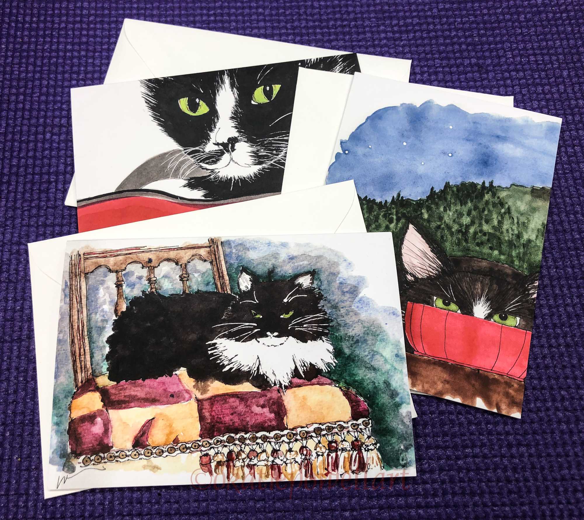
Hand-Mind Creative Connections

W00 BECK DESIGN JOURNALS 10

Liz Steel asked this morning if the architects she knows who draw needed to learn observational skills in order to sketch as artists.

I sketch, practiced architecture until I left it to pursue art, and am an artist.  Most of us drew going into architecture, but a few learned in an immersion course of a few weeks.  I’d say no, I had that skill.  I understand when artists who were not immersed in the craziness that is architectural school struggle with perspective and other forms of drawings, but for architects. I don’t understand it.

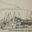
web-ixtapa-parachute
I think the reliance on computers to see and think during design have hurt younger crops of architects in the way they think and create, and in turn have led to even more boring and mundane architects in general.  ALL of us drew, none of us had trouble drawing and understanding complex ways of drawing.  Frankly the whole issue — for an architect —  about not getting perspective is a bit odd coming from my background and thinking about my fellow classmates.  I hear about how hard it is for art teachers to teach perspective — but we all learned or knew it within a few weeks.  Immersion, not unlike being dropped into a foreign country and having to pick up the language.  Some architects had a flair for the artistic, but ALL grokked all of the basics and more.  We were weaned on Frank Ching!  You could not get through school without making the connection between drawing and thinking and seeing — and the act of drawing was/IS an extension of seeing/thinking/being creative.  So the idea of needing to learn new observational skills — unless you are literally a month or two into being a first year architectural student — is a non-compute for me.  Like being a mathematician and not adding… A writer and not spelling or understanding grammar so you can communicate….

Don’t get me wrong.  I think CAD is a great tool because who wants to draw the same high-rise floor 20 times…. but to think, to design… all was better when our hands/drawing skills were part of the way we engaged the world.

And for Norm, here are a few entries, or doors! 

Have you got a door in your sketchbook?

web-dkp-arch-portfolio-07 web-dkp-arch-portfolio-01

web-dkp-arch-portfolio-06

w16-9-22-pentalic-laguna-beach-days-of-yore-05-sq w15-10-haight-sq w16-8-rp-trojan-horse-sq w16-4-1-newberry-library-sq w16-9-22-pentalic-laguna-beach-days-of-yore-04-sq

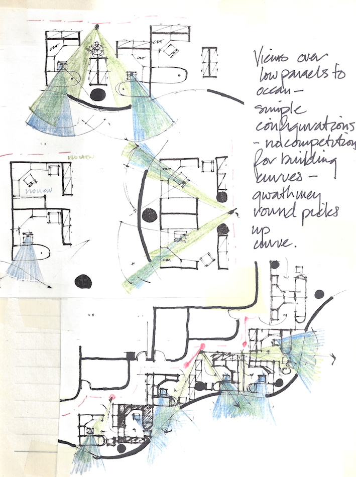
Ixtapa proposal created as group effort with four design groups.

Posted in architecture, art journal, creativity, making a living, memory, process | Tagged , , , , , | 4 Comments

A Holiday Musical

To get you into the holiday PEN spirit.

BTW, if you want to know everything about fountain pens and why I support them, start following their blog! 

Posted in art journal | 2 Comments

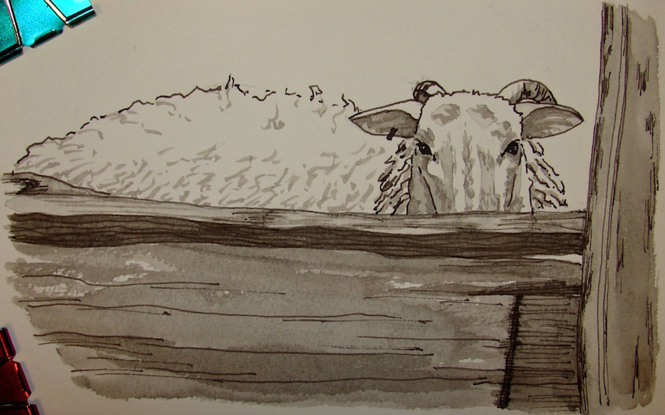
Pentalic: Grisaille Peek-a-boo Sheep

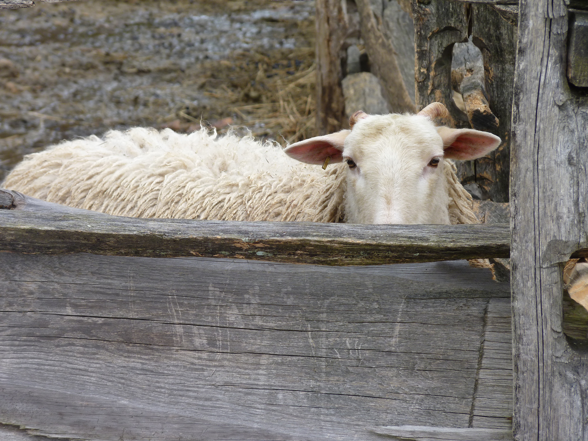
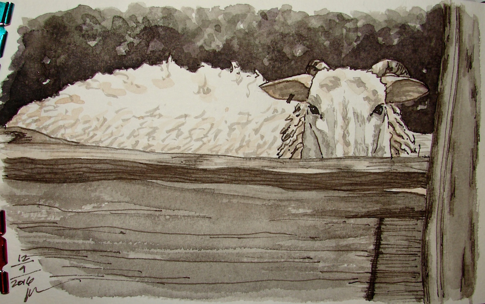
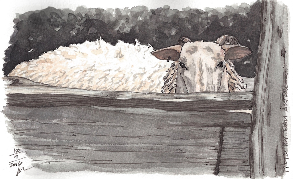
dan-critter-02Dan Antion provided a compelling image for middle of the night insomnia painting.
I love his peeking-at-you sheep.  Next to the bed, I had two mark-making items and frankly it was pretty cold, and I didn’t want to get out to get my travel paints.

w16-12-11-pentalic-dans-sheep-05Both of these were filled with Super5 Frankfurt
(Amazon when they have it or buy from Europe).

w16-12-11-pentalic-dans-sheep-01Layering up with only that lovely grey, I laid in the underpainting.   Then the underpainting began to look like the finished sketch — so I decided to stick with
various greys and a touch of De Atramentis Document Brown ink.

w16-12-11-pentalic-dans-sheep-04The background was in Noodler’s Lexington Grey Ink and Pilot Kiri-Same.

w16-12-11-pentalic-dans-sheep-300Finally, to put the creamy color and the slightly pink ears,
I added the Daniel Smith watercolors.
Final image is scanned, which is why it has a slight change in color.

Posted in animals, art journal, color, ink painting, pen & ink, process, sketchbook, virtual sketching, waterbrush | Tagged , , , , , , , , , , , | 19 Comments

Tools: Grey Inks for Grisaille

“Grisaille (/ɡrᵻˈzaɪ/ or /ɡrᵻˈzeɪl/; French: gris [ɡʁizaj] ‘grey’) is a term for a painting executed entirely in shades of grey or of another neutral greyish colour… A grisaille may be executed for its own sake, [or] as underpainting … working in grisaille was often chosen as being quicker and cheaper, although the effect was sometimes deliberately chosen for aesthetic reasons. Grisaille paintings resemble the drawings, normally in monochrome, that artists from the Renaissance on were trained to produce.”   WIKIPEDIA

W16 8 25 RO Jantzen Carousel Chinese 014W16 8 25 RO Jantzen Carousel Chinese 050

Examples of grisaille underpainting above.
In all these paintings watercolors were eventually applied over the grey ink.

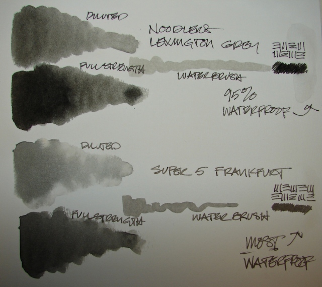
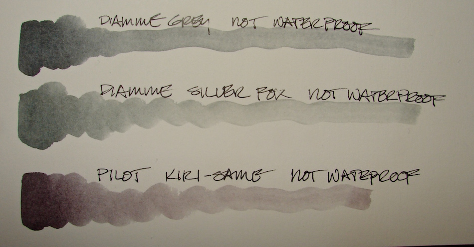
w16-12-grey-ink-1For grisaille I want a neutral grey that is truly waterproof.  To date there has been only
one that I really liked, and that is Noodler’s Lexington Grey.
*btw, i’ve sent you to the large size with the inkdropper + free pen*

All that has changed!  (My tests above.)

w16-12-grey-ink-2A friend from Europe has been painting with this yummy grey.
Super5 is my favorite brand, and the grey is Super5 Frankfurt ink.
Understand that is is selling on Amazon right now as a BROWN — NOT!
*those of you in Europe and AU can buy Super5 easily, not so in the states*
Update: You can also get it at Blue Rooster!
It has a superfine granulation (as opposed to Lexington, above it) and
is a gorgeous warm grey.  Unlike Lexington (and Noodler’s waterproof inks in general)
it does not bleed at all on any paper I’ve tried it on, whereas, as you can see from the waterwash over the pen ink marks, the Lex will bleed slightly on many papers.
The Lexington Grey bleed is not enough to stop me from using it MOST times,
but I always test it at the back of any new journal.

UPDATE: Now I paint a lot with many inks and like the effect of both!

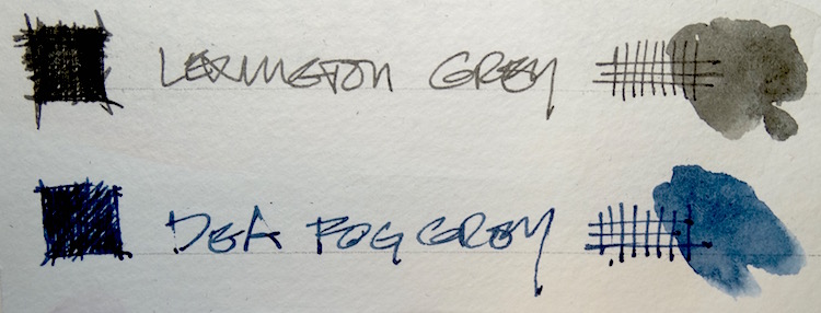
W15 7 14 PEN INKS 003I’ve come a long way from an earlier article on favorite inks especially in terms of how I use them.  Now I paint with them like crazy, and buy sample sizes from Goulet on a regular basis.  Because I love De Atramentis inks I want to comment about their
Document Fog Grey ink, above.  It is simply too blue to be called a grey.
Look at it compared to their Document Blue.

w16-12-grey-ink-3I have a confession to make.  I love buying ink samples from Goulet, but lately I’ve bought the same three over and over (duh!) exploring non-waterproof gorgeous grey inks.
These are the three I’ve purchased in tiny ink samples.
I doubt I will buy them full size.
The Diamine inks, while pretty, are not interesting enough considering they are not waterproof.  And I can mix Pilot tone with Super5 Frankfurt and Australia mixed…

UPDATE: I bought the Diamine Grey… I love it and play with it as
I now paint with many inks, not just waterproof inks.  Sketchbook only though,
as only two inks I know of are tested for lightfastness, De Atramentis and Super5.

w16-watercolor-sq   w15-inks-sq  w16-8-10-pentalic-middle-night-03-sq  w16-9-24-pens-color-3-sq  w15-ds-paints-sq

©D. Katie Powell.
My images/blog posts may be reposted; please link back  to dkatiepowellart.

Posted in color, pen & ink, review, tools | Tagged , , , , , , , , , , , , , , | 6 Comments

VSW: Alamo, a Fast Study

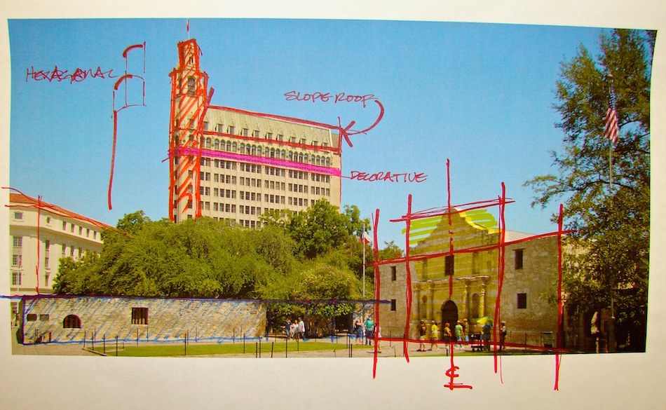
w16-10-15-vsw-alamo-01In an effort to begin to discuss how I look at buildings in order to begin to draw them,
I took an image of the Alamo and dissected it.  Most of this I do by simply looking, but what helps is I know what I am looking at.  The exercise of doing this on paper by studying photographed buildings is a good one, and occasionally if I am drawing a building I’ve never seen which is extremely complicated I will also do this because I see best when I am drawing or taking notes.  (For that matter, I hear lectures best when I am drawing….)

I studied the whole image, but am discussing two parts.

w16-10-15-vsw-alamo-02w16-10-15-vsw-alamo-03Take the face of the Alamo in this picture.  The building is divided into three parts:
a center area with columns and niches — and what appears to be the entrance —
and a mission style Italianate roofline,
and two flanking areas that appear at
first glance to be symmetrical. Further,
the building appears to be two stories
with a decorative third element on top.

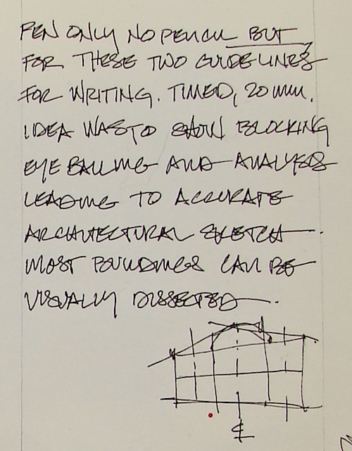
If I were going to draw this information,
it might look like the diagram right.  The notation that looks like a C intersecting an L means center-line, and center-lines can be for the whole building or for a door or window motif.  Here it indicates that it is roughly symmetrical from that center line.

By drawing over the photo you can also get a feel for the perspective.
Notice how much smaller the windows on the left are, and how the edges of
the windows align with the top and bottom overall perspective lines.

w16-10-15-vsw-alamo-04From there I can begin to draw in the shapes of windows and doors and details.
Darken actual open window or holes.  Rough in the shapes of the columns
and what appears to be either niches or filled in windows.
A fast study sketch can be a nice looking sketch once you get the hang of it — and yet you see I’ve not drawn the spiraling detail of the columns or the carved decorative tops.

Obviously in the field you can’t do this.
And of course you can take a couple years and learn to create technical drawings.
Or you can take a couple of photos and begin to analyze or dissect the buildings
you see like this, and by doing that begin to get a feel for or a
visual understanding of the building in front of you.

w16-10-15-vsw-alamo-05And then watercolor makes it all seem like I know what I am doing!

w16-10-15-vsw-alamo-01-dtlSo let’s look at another.
This is a complicated building with a strange roofline — a mansard roof,
but more than that, it connects strangely to the front of the flatiron building.
Is it circular or… nope, it is hexagonal.  The windows, which architects call fenestration, change shape as they move up the main part of the building.  Why did they so this?
The pattern suggests to me that the floors which match and march along are probably fairly common in their similarities (offices?  hotel rooms?),
while the arched windows toward the top suggest formal rooms of some sort —
ballrooms, fancy suites — all this without me knowing anything about this building.
There is a band of decorative molding below those windows (colored pink.)
Finally, there is yet another change in the windows of the mansard roof.  Apartments?  Whether you know the story or not you can begin to read the patterns.

At the top of the hexagonal corner there is a lookout of some sort.

And while you wouldn’t know it, I can bet there is a fire escape at the right
where there are no windows.  Perhaps even an addition, perhaps not.

w16-10-15-vsw-alamo-10w16-10-15-vsw-alamo-07-dtlIf you look closely at the sketch
right and  above you can see that
I also looked at the three parts
of the tall building:
the hexagonal left piece,
and the top of the right versus
the bottom, which is repetitive.
I imagine that the tall piece on the left
is full of gathering places and viewing places, public rooms, reception.

Notice how loose the indication of my decorative molding is?
Because my focus is not to spend time on the tall building, I also loosely
blocked in ganged windows in the body of the high-rise.
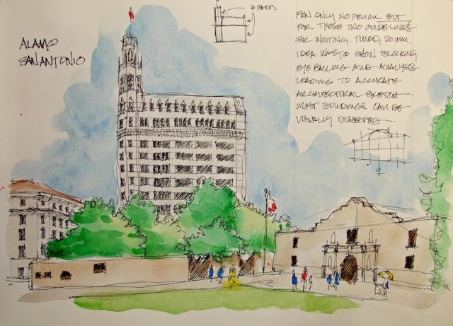
w16-10-15-vsw-alamo-12Further, when I added watercolor I wanted to draw the eye down to the Alamo, not really up to the building behind… and so, I did not color the building except for the flag.

These are the types of tips and lessons my videos will cover!

Moleskin 8×11 watercolor journal,
Lamy Al-Star with De Atramentis Document Black ink,
Platinum Carbon Pen with Platinum Carbon ink waterproof cartridges,
Sennelier, Holbein, and DS Primatek watercolors, and Daniel Smith Watercolors.
w16-9-22-pentalic-laguna-beach-days-of-yore-05-sq w15-10-haight-sq w16-8-rp-trojan-horse-sq w16-4-1-newberry-library-sq w16-9-22-pentalic-laguna-beach-days-of-yore-04-sq

Posted in architecture, art journal, class, drawing, pen & ink, process, sketchbook, timed painting, urban sketchers, virtual sketching, watercolor | Tagged , , , , , , , , , , , , , , , , | 13 Comments

VSW: Cheryl’s Turtles

w16-12-4-pentalic-vsw-ch-turtle-02Okay, not Cheryl‘s pet turtles but she fed them and they recognized a kindred spirit!
Inked (with a healthy splat) then painted with grisaille, followed by watercolors.

I agree to Creative Commons Attribution-Non-Commercial 4.0 International License, which you can learn more about by visiting the site, or,
visit my web page for a more user-friendly summary on my terms.
My images/blog posts may be reposted; please link back  to dkatiepowellart.

Posted in animals, art journal, ink painting, pen & ink, sketchbook, virtual sketching | Tagged , , , , , , , , , , , , | 2 Comments

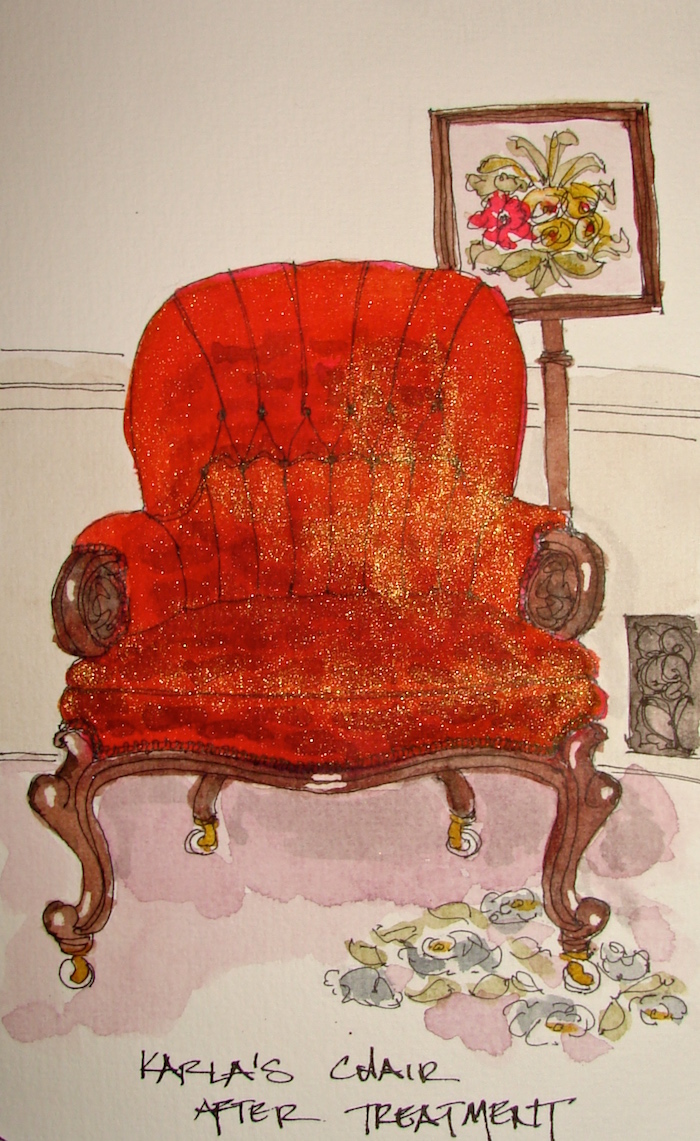
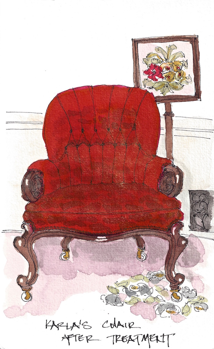
Karla’s Chair after Treatment

w16-12-3-kp-chair-sammy-300Shared the before picture of Sammy on Karla’s chair yesterday…
We (MPF Conservation) took the lovely old chair apart, repaired the frame joints,
rebuilt the innards using the original parts, and reupholstered it in the loveliest fabric.
Sammy was not allowed on it after — though Karla’s snuggle in!

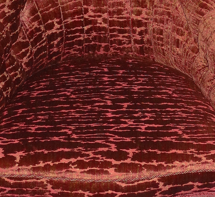
fabricI penciled and inked the basic chair, and
added grisaille to begin to define the shadows,
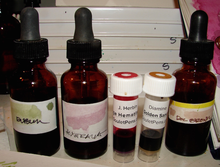
and an undertone of Super5 Australia.
The chair is a deep beautiful color that can
range from dark blood red to pink to maroon
and has an iridescent gold running through it.
I threw down a bright ink with J.Herbin Rouge Hematite, above, and topped it with Diamine Golden Sand, which allowed it to shimmer and toned it by adding a layer of golden-brown.

w16-12-3-kp-chair-7Above, the photographed final image.  You can see why I don’t use
shimmery colors often to paint with — they won’t photograph!

w16-12-3-kp-chair-300

And the scanned image, much more realistic!
All ink, no watercolor!

Posted in art journal, furniture, journal, pen & ink, process, sketchbook, virtual sketching | Tagged , , , , , , , , , , , , , | 8 Comments

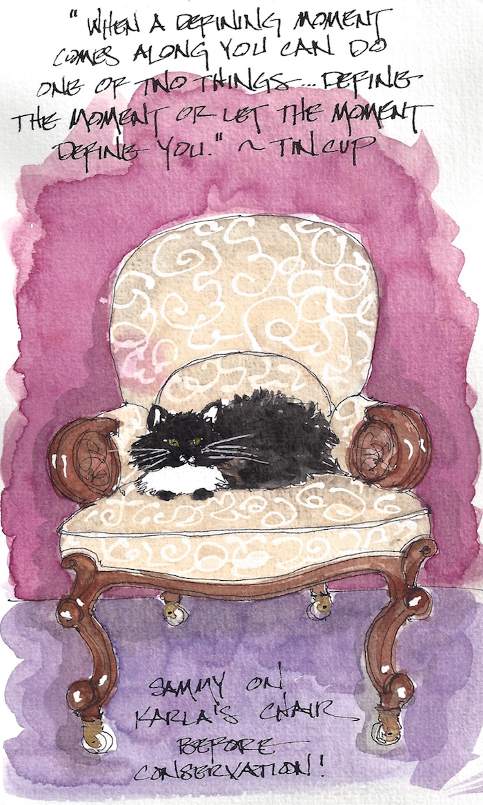
Sammy on Karla’s Chair

w16-12-3-kp-chair-sammy-300 Sammy is allowed to curl into the chairs from cat lovers
before we begin restoration (with permission from cat-loving clients).
They travel back and forth from home to studio depending upon what is in the studio.

This is Karla’s before chair…
After to follow!

W16 8 5 PENTALIC JOHNNY JUMP-UP 03 SQ W16 7 14 PENTALIC INDIAN PAINTBRUSH 03 SQ W16 7 21 USK PSU BERRY FESTIVAL 02 SQ W16 7 7 PENTALIC LUPINES 03 SQ W16 7 15 PENTALIC BLEEDING HEARTS 01 SQ

Posted in animals, art journal, furniture, journal, pen & ink, sketchbook, virtual sketching, watercolor | Tagged , , , , , , , , , , , , , , , | 8 Comments

Tools: Brush Pens

W14 12 19 BOOBY GURL MIRROR OLD 2I don’t sketch with brush pens often,
because I like a juicy wash and/or pen and ink — BUT I do occasionally, and so, here is my take on them. They are great on the go for quick sketches, thinking sketches.
*But then so is a fountain pen… * 
I use them to add a bit of color (see waterbrushes filled with liquid watercolor
or ink, below) when you can’t pull out your watercolors at all — not even with waterbrushes!  As in, on the sly, like sneaking candy into the movies.

I wrote a critique of my favorite waterbrushes when I was using them all the time.  Bottom line, I still prefer Pentel Aquash because their point stays pointy longer.  The downside is they don’t hold much water.  Upside is they are a bit shorter, hold a point, and will fit into a small pack.  And they are easy to refill!

When capping brush pens, be careful about the brush filaments
lining up as you put your brushes away.  I store waterbrushes filled
with water cap-less unless traveling; they stay fresher.

w16-waterbrush-03I’ve filled several with liquid watercolors (here I am using the last of my
discontinued Luma liquid watercolors), and pop them into my purse in a plastic bag (leaks?? aaack!)  Before I fill them with anything staining, I test them because many Pentels leak!  And yes, you can fill them with INK!  Yay!

Make sure you are using liquid watercolors and nto liquid acrylics, which will clog.  Finally, cap carefully as bits of watercolor or ink can spray.

dilution-solutionA note about ink dilution.
I use distilled water to dilute my inks when
I am painting, but am uncomfortable
putting them into a waterbrush as they go bad
(inks smell when they go bad, fortunately).
I have De Atramentis Dilution Liquid
for Document Inks
in my cart.  I want to
try it in my waterbrushes to see if the
ink stays fresh longer.  And report, of course.

I like making my own colored pens because they
are refillable, so less landfill issues.  Every little bit helps.

Jetpens, has four of various sizes for $24.50 (free shipping at $25.)
I do not recommend the one filled with black ink, because it is a pale black, though waterproof (see below).  And while I like to support my favorite stores, but I sometimes find a bundle on Amazon and use it to top off an order for free shipping.
I’d rather spend the $$$ on supplies than shipping!

W16 6 21 PENT BLACK EYED SUSANS 01

What about manufacturer’s inked brush pens?

We discussed the Pentel filled with black ink, above.

The pre-inked pen I use the most is the Platinum Japanese Art Pocket Brush Pen.
*It is not an actual brush pen but a felt tip; why do they call it brush tip?*
I drew the piece above with it and added watercolor, nice, easy drawing!  I buy them again and again, and keep one in my purse.  They are pretty.  Nice point, though the point does wear down, eventually, unfortunately, and then off to the landfill.  This bothers me.Platinum Japanese Art Pocket Brush Pen 4475W16 7 5 PENTALIC Ucluelet BC 03

MANY artists swear by the Kuretake Zig Cartoonist Brush Pen No. 22.
It worked nicely for the image above but I don’t like them.
I’ve bought three of the same brush pens from Jetpens, two of which are shown below.
The one on top and the middle below, are the same pen,
bought at different times from
JetPens, which says they are water-resistant.
One is clearly not water-resistant, and the other is.  Both say 22 on them, one in Japanese.  The quality of the ink is inconsistent!  It drives me crazy to not know what I am buying, however, if you don’t care about waterproof, then it makes no difference.

w16-waterbrush-02Lastly, while we are talking about landfills and reusable pens, while not perfect, Preppy is making two more pens I love and give away, though I rarely use sketching.

Preppy makes a refillable eye dropper highlighter!!!!  Yay!  I now have ONE highlighter,  and no more landfill.  The ink above is  Noodler’s Firefly Ink.
I highly recommend the 4.5 oz Bottle with the eyedropper for this application!

Preppy also makes a refillable eyedropper felt tip pen.  I wish it was a finer tip, which is why I haven’t bought more.  I can fill them with my favorite inks (these are DeAtramentis Documents inks)!  You can, of course, use their cartridges — but seems to defeat the purpose for me.  I make them both eyedropper pens.
Goulet sells them too.  See their video on eyedropper conversion below.

w16-watercolor-sq   w16-8-10-pentalic-middle-night-03-sq  w15-inks-sq  w16-9-24-pens-color-3-sq  w15-ds-paints-sq

©D. Katie Powell.
My images/blog posts may be reposted; please link back  to dkatiepowellart.

Posted in color, drawing, ink painting, painting, review, tools, waterbrush | Tagged , , , , , , , , , , , , | 8 Comments

NaSkeFiMo, or Fill Up The Journal and Be Done with It!

w16-11-15-naskefimo-01Working to finish up a journal I don’t like.
Not because of the paper — Strathmore paper is good paper.
The journal is not falling apart (I’ve stuck with THOSE.)
No, this is because the Strathmore Journal has a strange feeling cover,
and the pages don’t lay flat so I am always fighting them.
This was an early journal, so I didn’t know what I liked.
I gave all the others away, BUT I had some nice images in this one
and a couple of memories, Nicks in McMinnville and the Catholic Church and
when Mitchell split his thumb on the saw.  I just could not toss it.

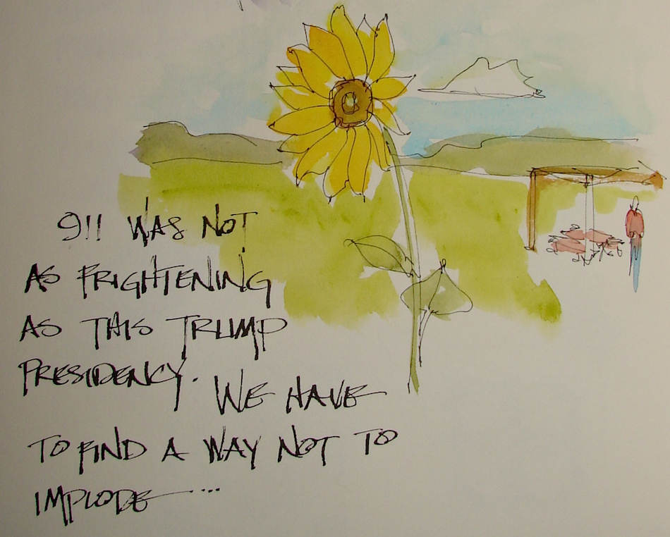
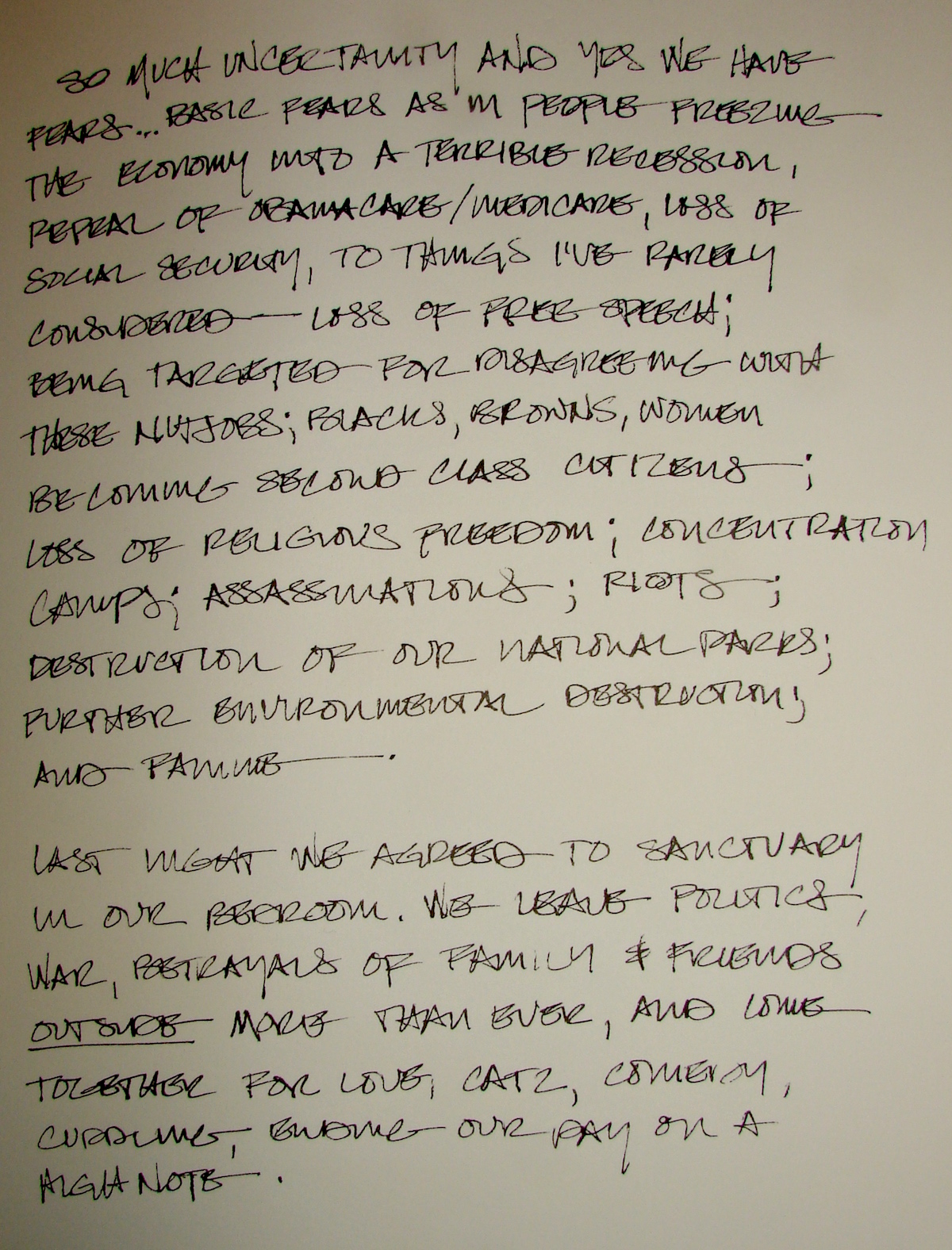
Then there is this, below.  Seriously, I’ve had nightmares.
I didn’t have them with Bush, and I didn’t like him… but he was not Trump.
I didn’t have them with 911… I sobbed at the deaths, but was not afraid for my own life
despite what the media was trying to do to us daily.
Trump and his large band of inciting-to-riot cohorts are scaring the shit out of me.

w16-11-20-naskefimo-02 w16-11-20-naskefimo-03Flip video below…

https://vimeo.com/193934458

Strathmore Journal,  Jinhao pen with Diamine Regency Blue ink,
Noodler’s pen with De Atramentis Tobacco ink,
Lamy Al-Star with Diamine Ancient Copper,
Platinum Carbon pen with De Atramentis Document Brown ink,
Noodler’s, De Atramentis Document, Diamine Ancient Copper Ink, De Atramentis Tobacco, and Super5 ink.  Okay, some watercolors.  And the kitchen sink.

w16-9-22-pentalic-laguna-beach-days-of-yore-05-sq w15-10-haight-sq w16-8-rp-trojan-horse-sq w16-4-1-newberry-library-sq w16-9-22-pentalic-laguna-beach-days-of-yore-04-sq

I agree to Creative Commons Attribution-Non-Commercial 4.0 International License, which you can learn more about by visiting the site, or,
visit my web page for a more user-friendly summary on my terms.
My images/blog posts may be reposted; please link back to dkatiepowellart.

Posted in architecture, art journal | Tagged , , , , , , , , , , , , , , , , , | 10 Comments

USk: Alphabet Tile Home

w16-11-17-naskefimo-02You might remember the sketch
I did of this door and “blue” tiles
at a home the other day >>  It wasn’t the first time I’d drawn the house.  I’m drawn to it: it is close to the studio, the form reminds me of so many homes in Los Angeles, and because of the tiles…

I’d studied the house’s form early on a walk with Mitchell.  First studies were about the building, notes to myself in case I didn’t finish it onsite (I didn’t.)  Studying a building helps me but it can
also help someone who doesn’t have the architecturally trained eyes to catch perhaps quickly the language the building is using towards it grace or grandeur.

w16-10-1-usk-tile-house-001Human scale noted.  The steps were eye level —
this reminds me about the angles up and down (video coming),
and what I am seeing on shadows and balcony ceilings and lighting.
I look for symmetry and exceptions, though in this case, exceptions only in landscaping.
I discovered, by putting pencil to paper, what was so versus what I had assumed about the roof in this building!  Sketching-thinking allowed me to study what I think I am looking at then check it to the actual building.  You can see my initial block, which is higher than the actual roof, which is a bit oriental and steps down due to our viewpoint.
I then blocked it in brown pencil.  These sketches in an Aquabee sketchbook.

w16-10-1-usk-tile-house-004When I went back my point of view changed a bit (higher) and I finished a pencil sketch in the moleskin.  This is about as detailed as I get in a sketch before inking, below

w16-10-1-usk-tile-house-013Inked.  At this point in my moleskin journal I went home to paint —
but not before taking pics for color.

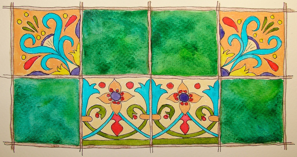
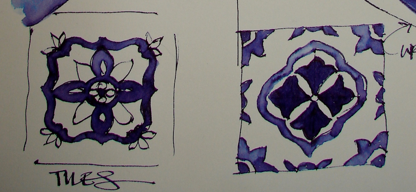
w16-10-1-usk-tile-house-015Art Nouveau Tiles!

w16-10-1-usk-tile-house-019The steps leading up to the doors in this and the buildings next door (matching, built by the same architect) have the most gorgeous Art Nouveau tiles!  The “plain green” is multi-hued, jewel-tone emerald- green but moving in lime and blue directions;
there is an amazing watercolor-glazed effect.

I used the tiles patterns creatively in the
page layout for the building.  I still have space
on the opposing page and have not decided what
I want to place there — perhaps lamp details or notes from our walk or some other discovery.  I drew them initially in a sketch book onsite but then I wanted
this cool border (below) to frame the layout.w16-10-1-usk-tile-house-014

Finally without my writing, below!

w16-10-1-usk-tile-house-024w16-10-1-usk-tile-house-016w16-10-1-usk-tile-house-027The lovely green is Diopside Green by Daniel Smith with touches of Spring green, if I remember.  I also used some of the cheapy Prima colors for the first time…
Not terrible.  I have no idea if they are lightfast — no rating — SO, only in sketchbooks.

I am playing in the group Thursday Doors, led by Norm 2.0, with others, here!

Have you got a door in your sketchbook?

   Moleskin 8×11 watercolor journal, with a Pentalic HB woodless pencil,
Lamy Al-Star with De Atramentis Document Black ink,
Platinum Carbon Pen with Platinum Carbon ink waterproof cartridges,
Sennelier, Holbein, Prima, DS Primatek watercolors, and Daniel Smith Watercolors.
W16 THURSDAY DOORS SQ  W16 THURSDAY DOORS SQ  W16 THURSDAY DOORS SQ  W16 THURSDAY DOORS SQ

©D. Katie Powell.
My images/blog posts may be reposted; please link back  to dkatiepowellart.

Posted in architecture, art journal, drawing, journal, process, sketchcrawl, urban sketchers, watercolor | Tagged , , , , , , , , , , , , , , , , | 17 Comments

VSW: Boyd’s Bread

w16-11-1-pentalic-boyds-bread-03Sketch to watercolor…

w16-11-1-pentalic-boyds-bread-04

Thanks to Randy for this image… Middle of the night drawing.

Pentalic Aqua Journal
Pilot Desk Fountain Pen – DPN-70 with De Atramentis Tobacco ink,
Sennelier, Holbein, and DS Primatek watercolors, and Daniel Smith Watercolors.
☾

Posted in architecture, art journal, challenge, pen & ink, virtual sketching | Tagged , , , , , , , , , , | Leave a comment

Tools: Favorite Journals

NOTE: This is about my preferences and why.
Other artists will have other preferences, so reading what they like and
what they say about this or that journal is good.
The only negatives I will write are very bad experiences….
and note I am mostly an
ink (sketched and painted) and watercolor artist.

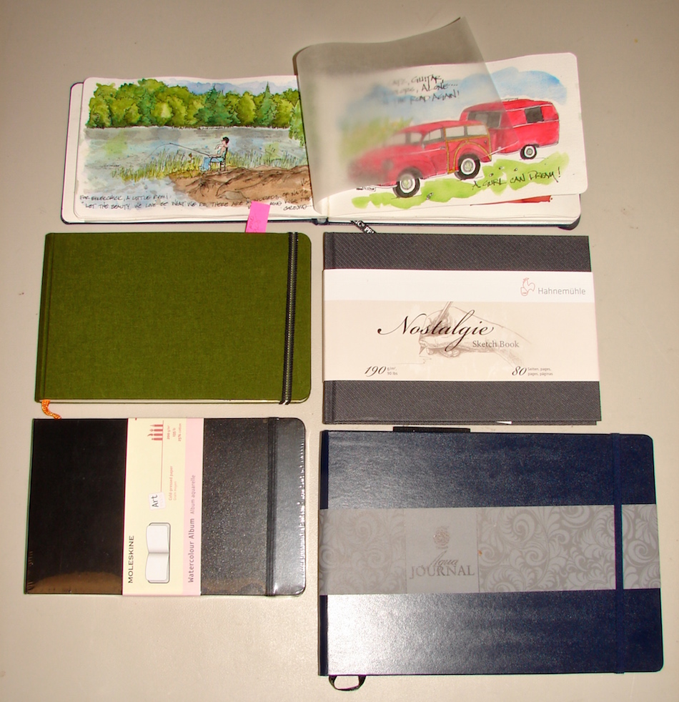
Okay, so cutting to the chase, my favorite journal is STILL the A4 Moleskin
Folio Watercolor Landscape journal
, above. Closer to 8.5 x 11.5-inches,
I can sketch one large drawing, many smaller drawings, or I can cross over the pages.
I can divide the pages up graphically or run the images over each other willy-nilly.
I like the 200g/m or 135lb  paper: it can take a huge amount of wet thrown at it and no bleeding, and the texture is nice on both sides, consistently.
I can also lift color without pilling.
I prefer clipping the pages to keep them from blowing; no clip marks.
The BIG PAPER envelope at the back is mighty nice too.

W16 5 20 USk PORTLAND UNION STATION 005W16 5 20 USk PORTLAND UNION STATION 006w16 5 fabriano sketchbookSadly, I have SIX Fabriano A4 Landscape, 200g/m. The paper has more tooth, so not as smooth as Moleskin.  It doesn’t have the rubber band to close the book nor the nifty flap to store bits of this or that, yet is priced comparatively.  The most important item is the paper.  Meh.  Inks feathered.  Watercolors floated due to sizing,
I assume.  The paper does not perform well if two+ layers of watercolor are applied.  I cannot lift watercolor without pilling and lifting paper even with a soft watercolor brush.  I often use a brush to lightly “scrub” skies around; this paper does not like that and pills.  THAT is a deal-breaker for me.  Great watercolorists overseas are horrified as they love Fabriano.  Could it be on this side of the pond we get an inferior paper?  Fabriano expressed and sent me replacements; unfortunately more of the same!

w16-11-journals-travel-tote-02I finally realized the big A4 journal can be unwieldy in bed at 3am,
and I like to paint in the middle of the night (insomnia), which is what made me
fall in love with the smaller A5, or 5 x 8-inch landscape journal.
I also can discretely slip the smaller journal in my purse with just a pen,
and that can be nice in hectic situations.

w16-9-30-pentalic-sammy-01I wrote a bad review of the Pentalic (above dark blue, with Jai on the cover) a while back when two journal covers fell apart within a few pages of me working in them.
I wrote them and received no answer, both times, before I wrote the bad review.
IT TAKES A LOT FOR ME TO WRITE A VERY VERY BAD REVIEW. 
My update is that out of the blue they responded to a letter from ages ago, and said they worked on the books and now feel the problem is solved, and comped me two books.
I told them they should’ve said that they realized there were problems early on and the bad review would not have been written…  The book is just a bit bigger *yay* than before
(blue book bottom right) and I have opened it fully and yes, they might have fixed it.
If so, it will be one of my favorite books, despite its conservative dark blue cover,
which I will cover with stickers.  300 g/m and 140lbs.
We will see after I move to that book.

In the meantime, I will talk about other books,
even some not yet tried.

w16-11-journals-travel-tote-01*BTW, the waxed paper tip-in (top) I use to keep paint from transferring
if I get the other side sopping wet… thin and it works!
I don’t do it all the time but if I have a bright image next to a muted image, yesh…*

Moleskin comes in the A5 size (bottom left), and I know I will be happy with it for all the reasons I love the A4.  I didn’t know that this A5 was landscape, so only just bought them.

The green book center left above is the Hand•Book Journal Trav•e•logue series.  I did my first review, and have a bit more to add.  I bought this via mail so didn’t feel the paper.
I don’t like the feel of the slightly off-white paper but my pens liked it.w16-0-handbk-review-03Hand•Book advertises it can take light watercolors, doesn’t say the weight *hmmm*
Hand•Book’s paper took a wet ink buildup shown left, without badly buckling.
However, the ink washes show the color on the revers side —
it is not quite a bleed-through but it isn’t what I want in a sketchbook.
My Aquabee Super Deluxe Journals with 150 gms paper can take watercolor.
I’ve decided to use only one side of the paper, in any event.
And, Hand•Book’s paper is ?soft? so every time I use a clip it leaves a mark —
not true on any of my other sketchbooks.
For this price I can get a Moleskin, which can take anything I throw at it.
*oh the back has a plastic flap and i hate it*
Also, note this is not Hand•Book’s 200gm book,
which I may try unless people tell me that it is the same…..

A totally virgin *exciting* book center right is the Nostalgic by Hahnemühle.
190 g/m 90 lbs, I am curious to see what it can take.  Roz Stendahl says it is a good ink journal, and with my recent intoxication with ink painting, I had to buy to try!
Smooth paper, nice feel to the cover, no envelope, no rubber-band.
Priced to compete with Moleskin.

w16-watercolor-sq   w15-inks-sq  w16-8-10-pentalic-middle-night-03-sq  w16-9-24-pens-color-3-sq  w15-ds-paints-sq

©D. Katie Powell.
My images/blog posts may be reposted; please link back  to dkatiepowellart.

Posted in acrylic, art journal, color, journal, paper, sketchbook, tools | Tagged , , , , | 16 Comments

Gratitude

w16-11-gratitude-1 w16-11-gratitude-2☾

I am also thankful for my blog and
the connections it has brought into my life.

The wonder of the new and unexpected
should be appreciated through new eyes!
Have a day filled with Gratitude…

☾

UNKNOWN Watercolor paper –scrap, and all INK!
Lamy Al-Star with Diamine Ancient Copper ink,
KWZ Ink’s Foggy Green,  J.Herbin Vert Olive ink.

  w16-10-31-pentalic-buddha-03-sq w16-vsw-buffalo-cemetary-01-sq W16 8 RO Upper Sandy Guard Station 009 SQ w16-10-25-pentalic-san-louis-obispo-wine-02-SQ w16-8-10-pentalic-middle-night-03-sq

 ©D. Katie Powell.
My images/blog posts may be reposted; please link back  to dkatiepowellart.

Posted in art, cards, ink painting, memory, painting, pen & ink | Tagged , , , , , , | 19 Comments

CA Trip, 1: Telegraph Road, Santa Paula

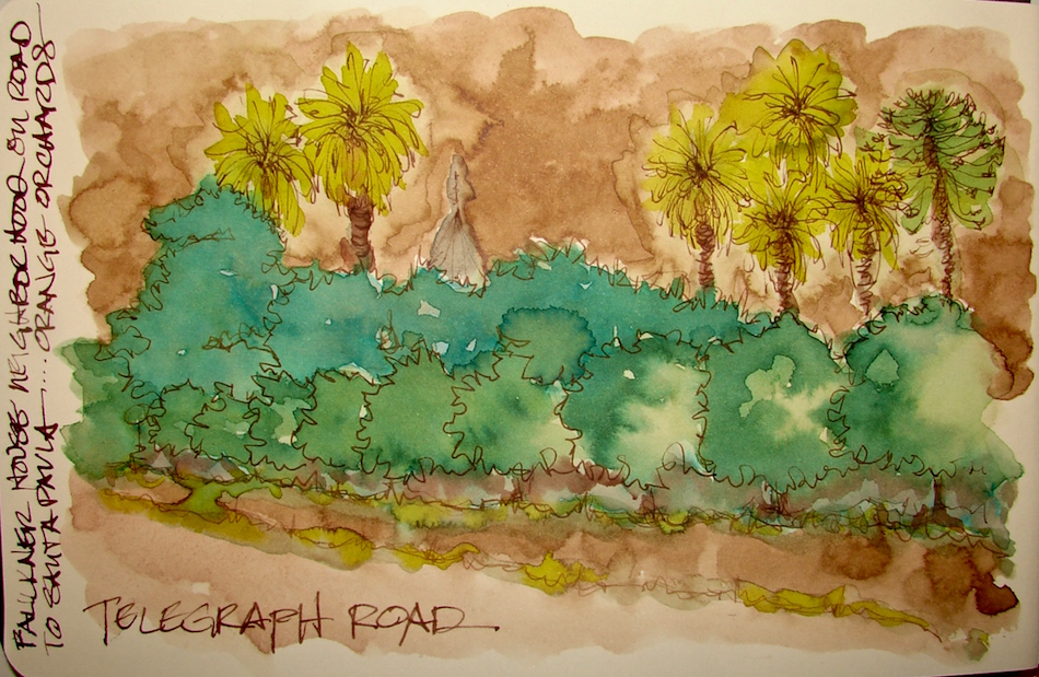
w16-16-handbk-santa-paula-01I’ve been processing a wild and woolly trip to So Cal.
I’ll be posting items out of order, that is for sure.
I’m adding color to many, and some are images from photos taken.
Starting with Tooling around Mitchell’s home town, not the first time we’ve done this,
but the first time we’ve done it alone, and we had a good time doing it.

Telegraph Rd. runs right through farming country.  The look of that area spells home to me, and is much the way Dana Point looked when I first moved (it is a couple hours south of Ventura County).  Farming is still valued.  Dana Point was orange groves and fields of strawberries and corn and the Ventura area stayed that way to a great degree.

w16-15-handbk-santa-paula-01Houses like the Faulkner House, top, are hidden behind groves and
you see the tops of palms and avocado trees (yum) and Morton bay fig trees.
Live oaks are way up in the hills, and yes, home home home to both of us.

“Memory is more indelible than ink.” Anita Loos, Gentlemen Prefer Blondes.
“I think not….”  Me… why I journal!

☾

Handbook Journal, Pentalic 2B woodless pencil,
Platinum Carbon Pen with waterproof cartridges,
Lamy Joy with De Atramentis Document Black ink,
Pilot Desk Fountain Pen – DPN-70 with De Atramentis Tobacco ink,
Pilot Metropolitan with KWZ Ink’s Foggy Green,
Platinum Carbon pen with De Atramentis Document Brown ink.

w16-15-handbk-santa-paula-01-sq  w16-16-handbk-santa-paula-03-sq  w16-10-26-pentalic-la-cuesta-inn-sq  w16-9-22-pentalic-laguna-beach-days-of-yore-05-sq  w16-10-25-pentalic-san-louis-obispo-wine-02-SQ

 ©D. Katie Powell.
My images/blog posts may be reposted; please link back  to dkatiepowellart.

Posted in architecture, art journal, drawing, ink painting, journal, landscape, memory, painting, pen & ink, watercolor | Tagged , , , , , , , , , , , , , , , , , , , , | 5 Comments

VSW: Buffalo the Town, 1

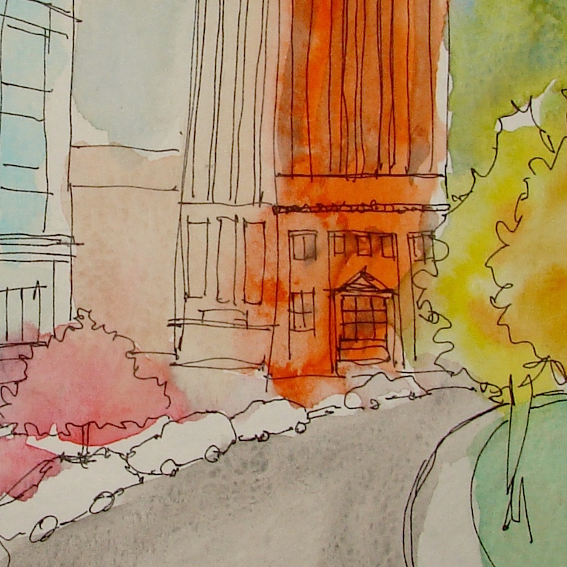
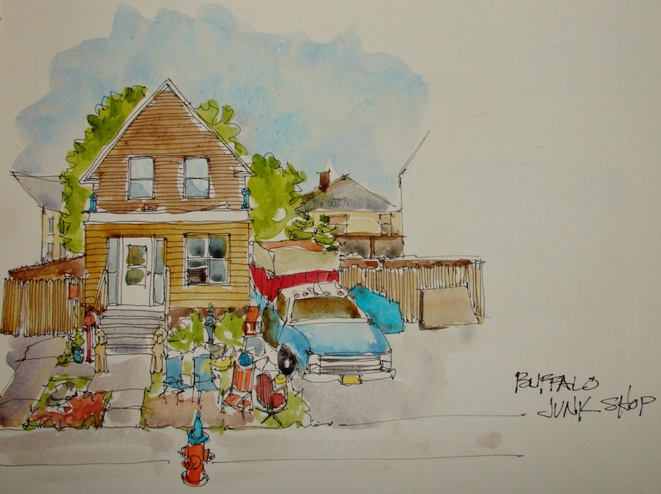
w16-11-vsw-buffalo-bldg-04-sqI want to play with color in unexpected ways.
And loosening up, always trying to loosen up.

w16-11-vsw-buffalo-junk-01

Moleskin A4 Watercolor Journal,
Lamy Al-Star with De Atramentis Document Black ink,
Platinum Carbon Pen with waterproof cartridges,
Sennelier and Daniel Smith Watercolors.

NELIPOT IFJM NELIPOT IFJM NELIPOT IFJM

I started a Facebook group page (you must join to view) to allow everyone to share their virtual sketches, and also where we will, from time to time, take virtual sketch walks together.  Come join us On Facebook if you are inclined!
If you want to know more about what a virtual sketchwalk is review my first post.
There are a few more notes/pointers on our first walk through Laguna Beach, California.

I also created an accompanying Flickr group!

NELIPOT IFJM NELIPOT IFJM NELIPOT IFJM

 ©D. Katie Powell.
My images/blog posts may be reposted; please link back  to dkatiepowellart.

☾

W14 4 27 WC PALMS PAT SQAs my Patreon supporter, you will have
access to some content not on this website,
sneak previews, goodies, discounts on classes.

I will teach architectural sketching,
art journaling (art+writing), creativity, watercolors.
That annoying loud-mouth editor/critic in your head?  GONE!  How great would that be?

Posted in architecture, art journal, color, creativity, drawing, pen & ink, sketchbook, virtual sketching, waterbrush | Tagged , , , , , , , , , , | 2 Comments

Tools: Hand•Book Journal Trav•e•logue series Review

Sketchers whose work I admire love the Hand•Book Journal Trav•e•logue series…
A few hate it.  I’m many pages in as I took it on our trip to So Cal,
So think I can safely review it now…

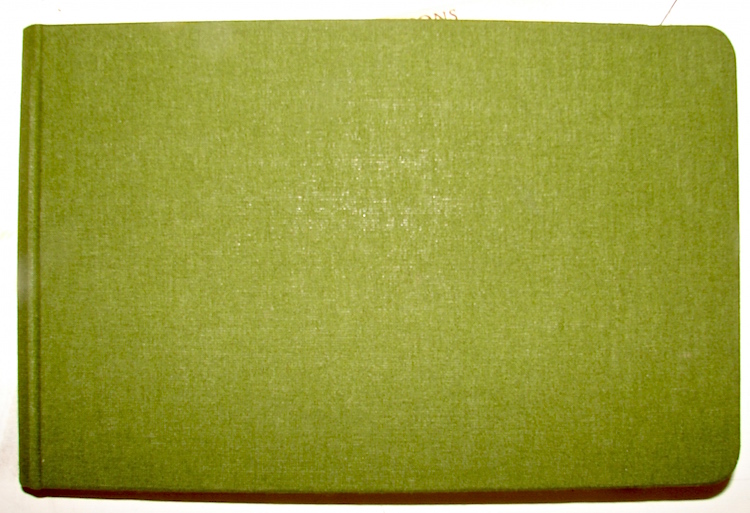
w16-0-handbk-review-01Okay, how can I not love the cover?  Nice Green cloth.

This one is roughly 5.5 x 8.5 inches, landscape format, for watercolors.

w16-0-handbk-review-02Let me tell you I cracked the back — or tried to — before I began.
It held.  It lays flat, and feel good to hold.

w16-0-handbk-review-03So we get into the heart of a journal, the paper.  I bought this via mail so didn’t feel it.
I don’t like the feel of the paper but my pens liked the paper.
I like the slightly off-white color… no problem there.
I’d prefer that this wasn’t their go-to color (Stilman & Birn have the Delta book and that is fine because you are choosing cream paper) but that would not make me stay away.
They advertise it as being able to take light watercolors, so the test left is a bit more than that, and the paper took a very wet ink buildup shown left, without buckling.

w16-0-handbk-review-04BUT BUT BUT the other side shows the watercolor and inks through the paper.  I could not make the picture show the color — it is not quite a bleed-through but it isn’t what I want in a sketchbook.  I don’t have that in my Aquabee Super Deluxe Journals with
150 gms paper (Hand•Book doesn’t say the weight.)  Aquabee buckles but doesn’t bleed.  I don’t get it.  Perhaps unknown-named-sketchers only paint on one side of their sketchbook pages… so it doesn’t bother them?  And I may start doing that in this book.

Note this is not Hand•Book’s 200gm book, so perhaps I should not be saying this, but for the price I can get a Moleskin, which can take anything I throw at it.

w16-0-handbk-review-05And the back has a plastic flap.  I hate it.  I don’t want heavy plastic at the back.

Okay, I’m picky.

I won’t buy one again but I can’t say it is a bad journal especially if you are sketching and not throwing ink and watercolors into the mix.  It’s strong, and it is a pretty color….

WEB TIP-INS 002 SQUARE  WEB TIP-INS 002 SQUARE  WEB TIP-INS 002 SQUARE  WEB TIP-INS 002 SQUARE  WEB TIP-INS 002 SQUARE

 ©D. Katie Powell.
My images/blog posts may be reposted; please link back  to dkatiepowellart.

Posted in paper, review, sketchbook, tools | Tagged , , , | 13 Comments

Thursday Doors, a day late….

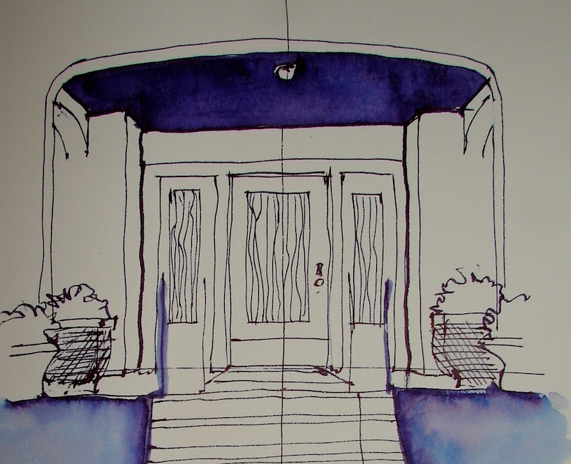
w16-11-17-naskefimo-01-jpgI took a moment yesterday late to draw the door itself in this beautiful building
that reminds me so of the Brentwood area of Southern California.  I am finishing up images of this building that I will post later, but this was a quickie in one color.
About 15 minutes.
I sat in the car, as it is finally cold here — not Canada cold, or Maine cold, but cold
enough for me — and considered what I loved about So Cal and how I cannot imagine living there again.  We were home for a few days earlier this month, and I could
not take the lack of green, the traffic, the crowds, and did I say the lack of green?

Portland has no idea….

w16-11-17-naskefimo-04I am playing in the group Thursday Doors, led by Norm 2.0, with others, here!

Have you got a door in your sketchbook?

Strathmore Journal,  Jinhao pen with Diamine Regency Blue ink…

☾

W16 THURSDAY DOORS SQ  W16 THURSDAY DOORS SQ  W16 THURSDAY DOORS SQ  W16 THURSDAY DOORS SQ

I agree to Creative Commons Attribution-Non-Commercial 4.0 International License, which you can learn more about by visiting the site, or,
visit my web page for a more user-friendly summary on my terms.
My images/blog posts may be reposted; please link back to dkatiepowellart.

Posted in architecture, art journal, drawing, ink painting, pen & ink, sketchbook, timed painting, urban sketchers | Tagged , , , , , , , , , , , | 17 Comments