As my Patreon supporter, you will have
access to some content not on this website,
sneak previews, goodies, discounts on classes.
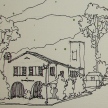
I teach architectural sketching,
art journaling (art+writing), creativity, watercolors.
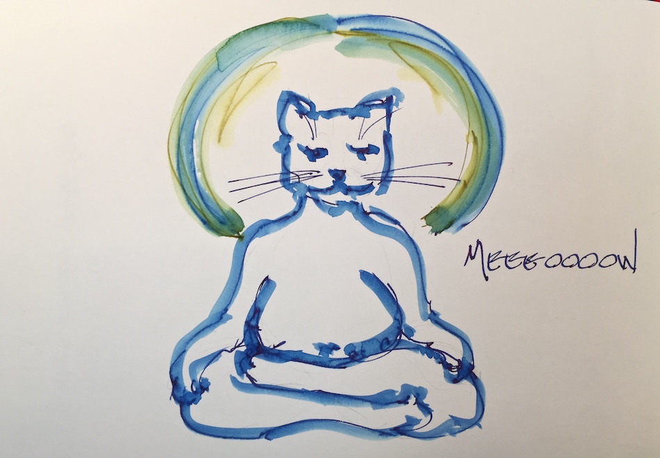
That annoying loud-mouth editor/critic in your head? GONE! How great would that be?
I'd love it if you shared this; please mention my blog name!
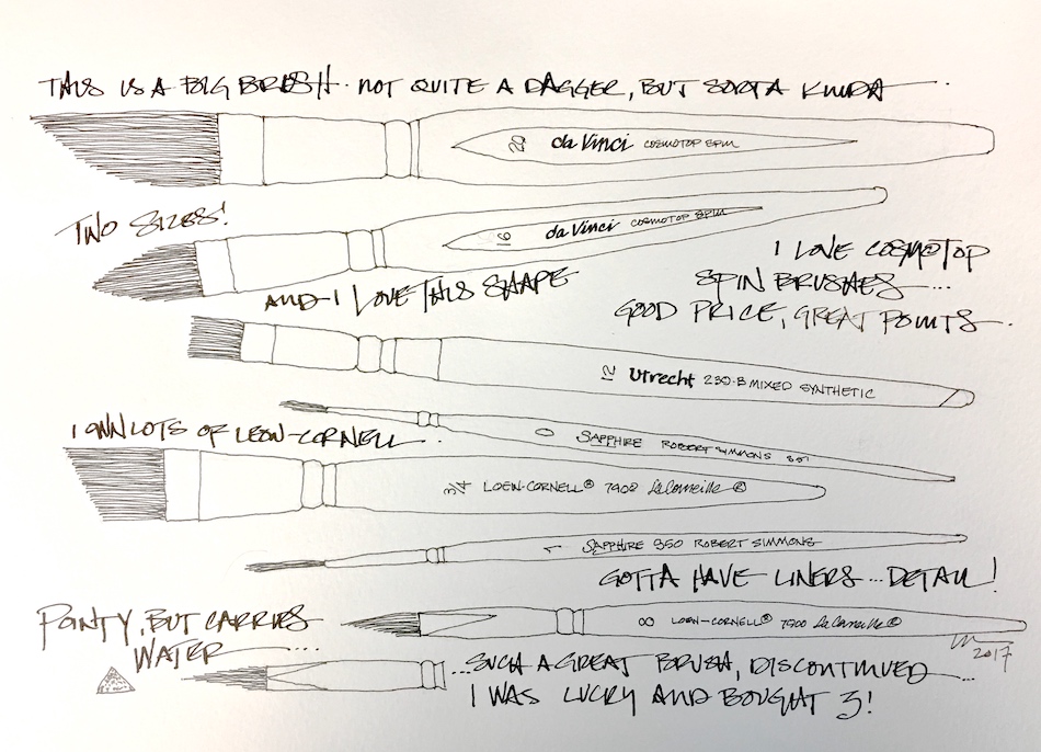
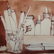
I use cheap brushes, a LOT. I don’t want to buy hair.
I’m not a vegetarian, but am particular about how what I eat (and use) is killed,
and don’t want to kill a critter for my brush — too many good alternatives.
I’ve not seen a certified humane stamp on a hair brush.
And I LOVE squirrels and goats…
But how to I end up with VERY cheap brushes?
1) I need to round out an online order for free shipping and grab a brush
(Cheap Joe’s Creative Inspirations are okay brushes for the price), or
2) I buy cheap brushes for finish work in the conservation studio and steal one!
Brushes used on furniture don’t last. The bristles break.
So after spending $75 on one and having it break down in less than a year,
I started buying packages of decent student brushes from Blicks and never looked back.
So drum roll, my brush favorites have changed.
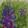
I’ve fallen in love with da Vinci’s Cosmotop
Spin Synthetic brushes,
and especially with their oval.
I’m not a stranger to ovals,
but theirs is different.
I can pick up lots of juicy washes
and move the through a sky,
then take the tip
(and it stays a tip if you want that)
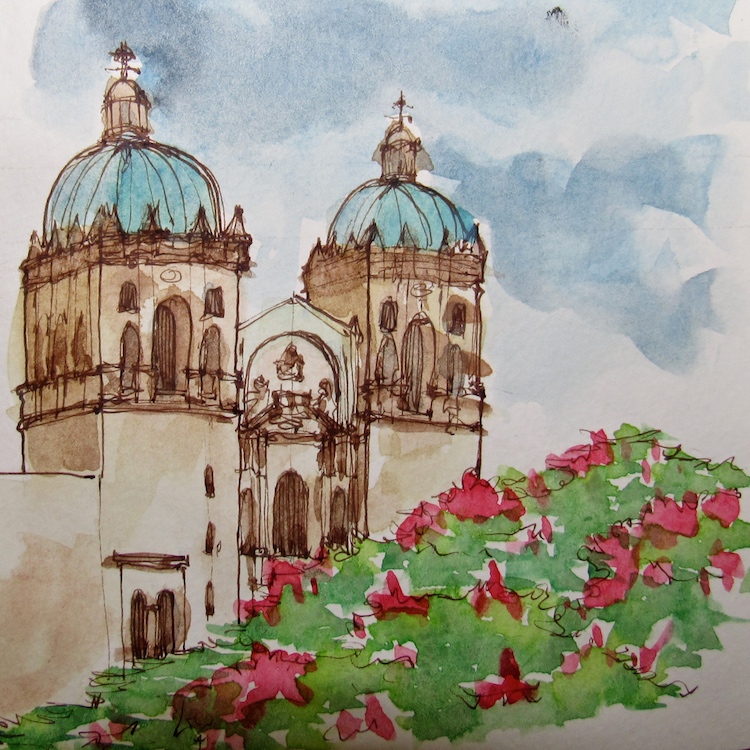
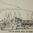
and edge a rooftop or touch a window. The sky, and the tree greens,
right, were done with
a large brush — a 20 Oval!
I love the Slanted Liner, but may try a smaller one…
I bought the Ultimate Wash on the advice of a friend and it is okay….
Leow-Cornell is my favorite cheap brush, and I have quite a few of them.
They’ve lasted from acrylics to watercolors… and keep holding up, 15 years!
The odd pointed — angular — 7900 Series they stopped making and I love that brush!
I found three at Jerry’s and bought them! It hold a lot of water and yet keeps a point,
almost like a liner, better than a round.
Robert Simmons has held up well — I have several small cheap pointed liners from him.
Ulrech, a Blick’s brand, is okay too, and of course,
Princeton is my favorite cheapo brush.
I buy them on sale in packages for the studio. They are worth the $8 for five or seven brushes, and they never lose hairs into your watercolor!
Let’s talk about the “meh” products — those I simply can’t see the hype.
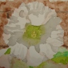
First, Quills, above.
I tried two types, one a bit pricey, because of the rave reviews of this brush.
All I can say is I like my brushes cleaner than this brush allows.
For me to use it, I would have to come to the sink and wash it every time I changed colors. The paint gets under the plastic.
Perhaps if you were using black ink only… shades of grey…
It also didn’t keep a point at all, but was a wash brush, like a mop.
I have other brushes that can be used like a wash and
have a useable point, like the Cosmotop Oval above.
If I am going to pack a brush for the road, it has to be special, or do double duty.
Finally, I an so disappointed in the Princeton Neptune, a faux squirrel line.
I bought two of their brushes, the Quill above, and the Dagger.
The dagger has to be very wet to keep its point. Very. Wet. TOO wet.
While I like Princeton, I probably would not buy the Neptune again.
I haven’t tried the Escoda brand, and will next time I am at Merriartist!
BTW, I try to shop local, or in small stores, because I want to keep them around.
They tend to have staff that knows things, not just a parttime job.
The very best how-to video on YouTube, below.
I am so sorry now I tossed some brushes!
As my Patreon supporter, you will have
access to some content not on this website,
sneak previews, goodies, discounts on classes.
I teach architectural sketching,
art journaling (art+writing), creativity, watercolors.
That annoying loud-mouth editor/critic in your head? GONE! How great would that be?
I'd love it if you shared this; please mention my blog name!
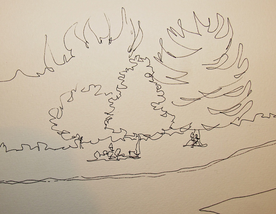
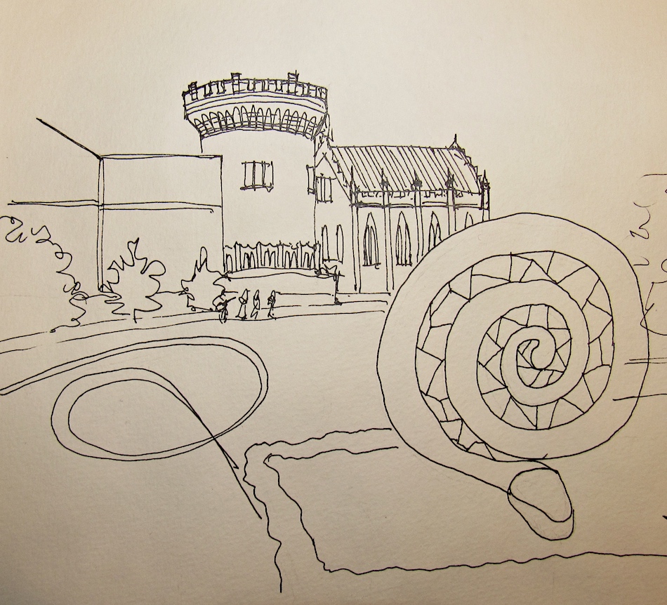
Okay, you KNOW I am not big on self-criticizing…
But gads the green got away from me.
I think this is a good lesson in not just planning from a sketching point of view,
but from a color point of view, as this became green on green on green!
Then as I moved into detail / color everywhere, I was
overwhelmed by green and dark and *ARGH* how to save??
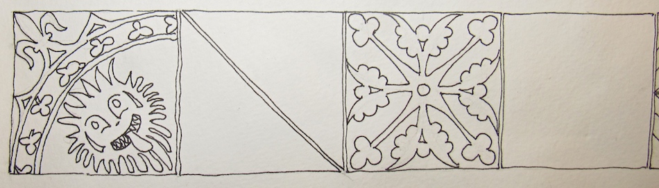
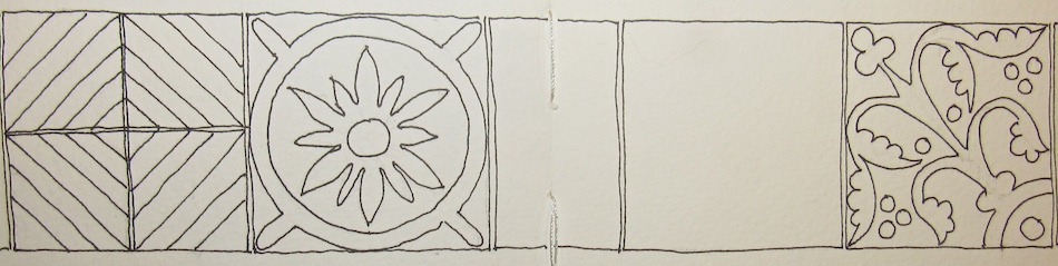
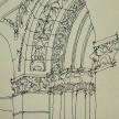
I liked the tiles from Christ Church at the bottom —
and took liberties with the color as some were black and white.
I like some of the vignettes.
And hated some of the areas where the planning was
not thought out. Lettering saved it some… It looked good in B + W!
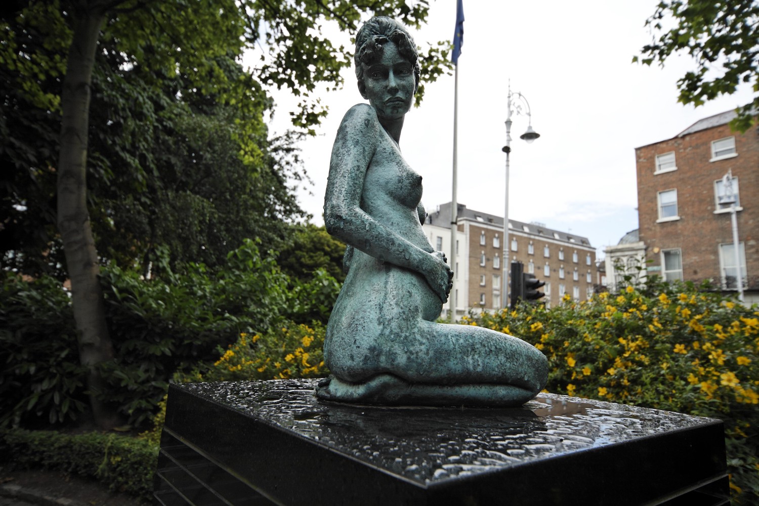
Constance Lloyd married Wilde man, and bore his children.
That was not all she was — feminist, adventurer, leader.
Well bred, well read, an author of children’s stories.
Deceptively strong, though she died at forty from a complication of surgery,
though many say she contracted a venereal disease from Oscar Wilde.
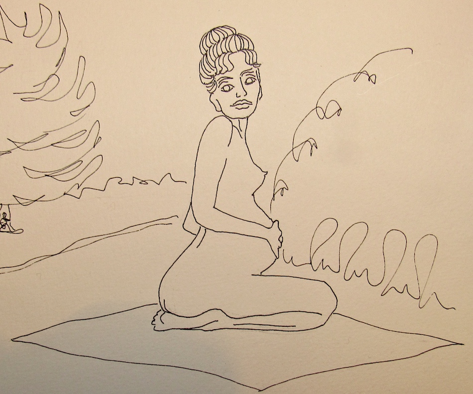
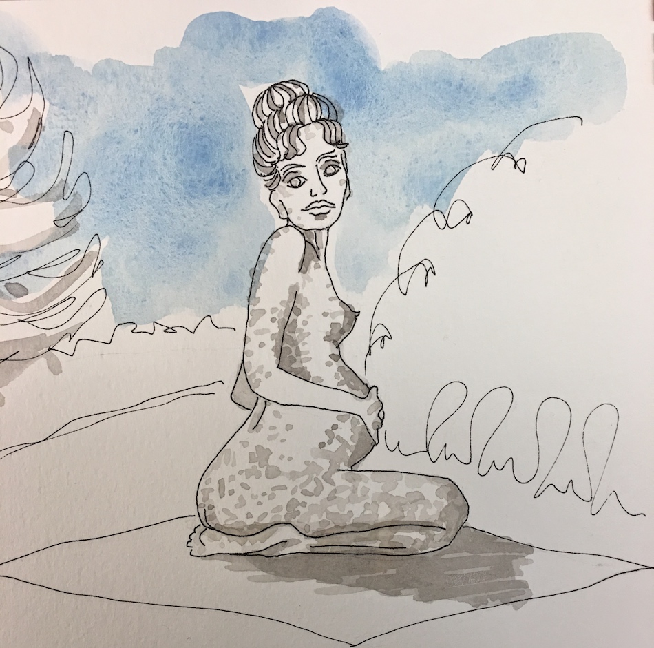
This is the statue that haunted me, especially the image I can’t show, which shows
the statue in Merrion Square looking back at Oscar Wilde’s statue over her shoulder.
I’ve had dreams about this statue.
Sorry, poor lighting turned the paper a warm cream color.
Grisaille, and the blue sky.
Not pox… just wanted more shadow/dimpling for a bronze statue!
She became a bit green on green on green… but I still like her!
I always think I am not interested in history, but at 3am I watched this entire series of
shorts on Oscar Wilde, and read for another hour… I just have to be hooked!
As my Patreon supporter, you will have
access to some content not on this website,
sneak previews, goodies, discounts on classes.
I teach architectural sketching,
art journaling (art+writing), creativity, watercolors.
That annoying loud-mouth editor/critic in your head? GONE! How great would that be?
I'd love it if you shared this; please mention my blog name!
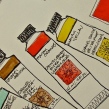
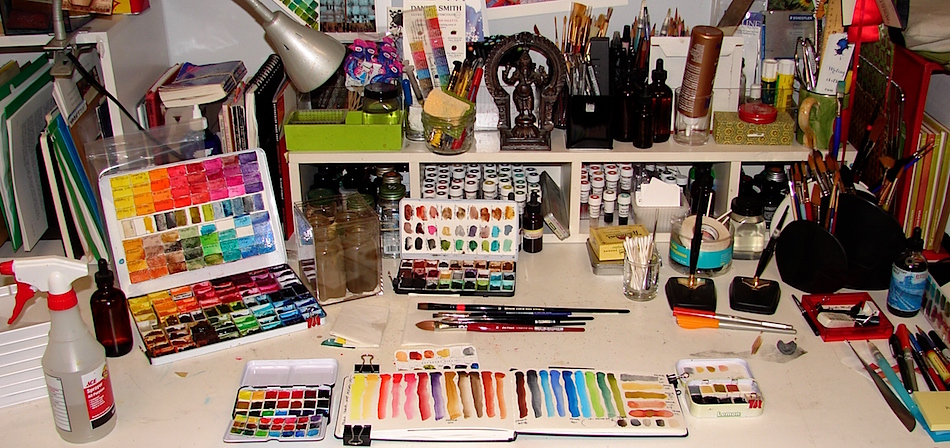
My studio paints were overflowing from my big 30-years-old Prismacolor tin
into a QoR watercolor tin. I hated the QoR tin. The rounds which you think would be great for watercolor mixing but they made the tin so it flips if you put any pressure on it.
* yes, I learned that when I had mixed two paints in the wells… flying colors *
I immediately moved my second set into lots of little tins,
and was happy with my Primateks in my 35-year-old pencil tin.
Still, it was a big pile on the desk, and I don’t use them all.
I often use my stack of Eldajon palettes with squirts of color…
What to do about my pan paints? Stop using pans? N0….
I bought the Hahnemühle Post Cards for the tins! I loved the flowers on these tins and the size.
I’ve moved most of my pan paints into two categories,
the paints I reach for all the time (right)
and a secondary set that works nicely for architecture and landscapes (left).
If one of these goes with me to paint I’ve tea tin tops to use as mixing pans for washes.
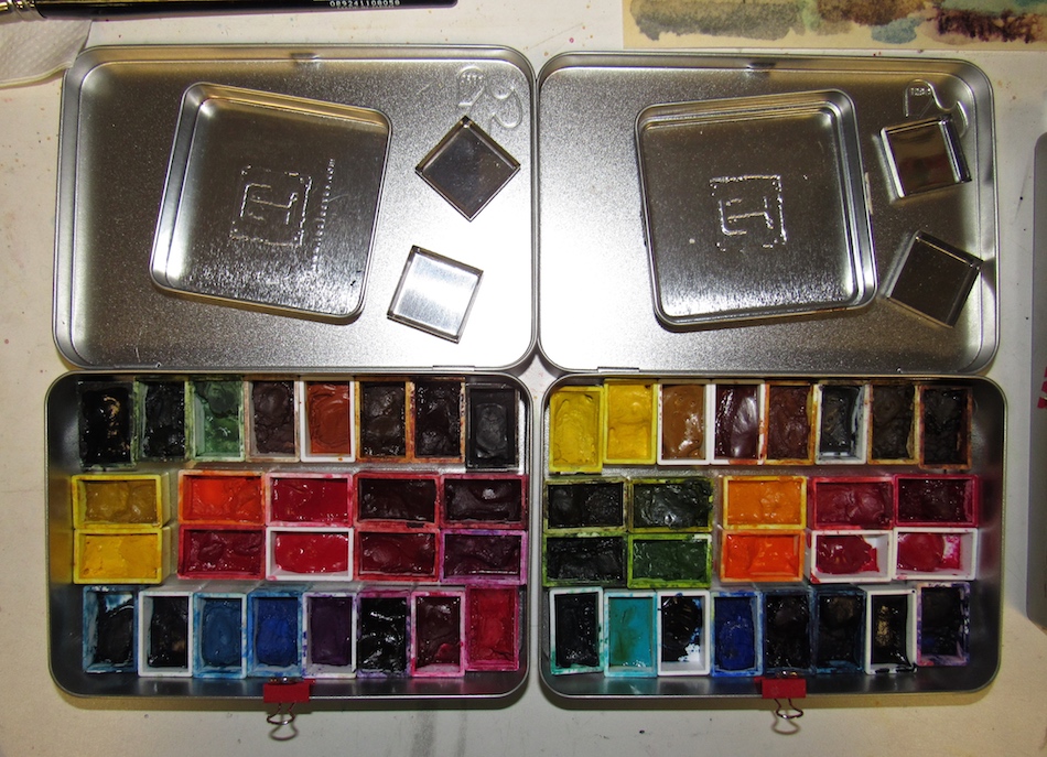
This lead to other organizing.
I placed all my pastels and a few colors that make good Victorian house paint colors
into my favorite old eyeshadow-turned-travel pan, now my Painted Ladies tin (left). * how appropriate — once held things for a lady to paint her face and now is holding the painted ladies paints! beyond that, i’ve no confessions! *
You can see the palette (below), filled with colors and
the Easter Card I’m sending my mom in the same colors!
I still have my beloved Primateks with a couple of Greenleaf & Blueberry colors added.
I love the grainy gritty texture, and the way many of the colors move on their own.
Finally I placed many dark, opaque colors I rarely use
in another pencil box from my architecture days (right).
So far, I am happy… until I buy more paints!
* gads, bought three today from matteogrilliart soon to arrive *
As my Patreon supporter, you will have
access to some content not on this website,
sneak previews, goodies, discounts on classes.
I teach architectural sketching,
art journaling (art+writing), creativity, watercolors.
That annoying loud-mouth editor/critic in your head? GONE! How great would that be?
I'd love it if you shared this; please mention my blog name!
I am picky about my journals and have tried several, only to find they came apart or I didn’t really like the paper (then they become scrap test books.) I prefer bound, A4 or A5 landscape. Moleskin has been my best go-to for my sizes and paper needs, but Moleskin’s paper has changed, with only 25% cotton fiber. It deflects watercolor a bit more than it used to when it was far more like a fine watercolour paper.
Not too terrible for a journal, but when you have better paper it is noticeable.
I’ve also not been happy with the Fabriano watercolor journals I bought here in the states.
Hahnemühle Watercolour Book’s paper is a natural white (not bright white) 200 gsm or 135 lb fine grained surface structure on both sides, acid free, 30 pages, comparable to the Moleskin in weight and number. I love the feel of the linen-like cover in my hand (I’ve already made it mine by adding an image that says a bit about the time in my life — Kamala’s gone — and the intent of the journal.) Available in the landscape formats A4, A5 and A6 (I have a couple and they are too tiny for me but I may use them during EDIM). It has a serious rubber band that will not stretch out of shape, and the only downside is no envelope — which is easily added, and I like adding my own special envelopes that have memories!
And the paper! The heart of the book…
It takes pencil well…
and erases well! A fine point pen works well…
The paper took a grisaille wash of Noodler’s Lexington Grey ink well.
And it took watercolor much nicer than Moleskin’s.
I reworked some watercolor lines, and it did not fight me…
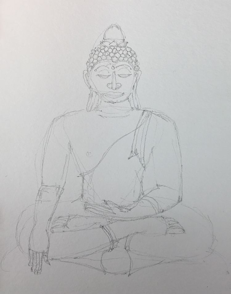
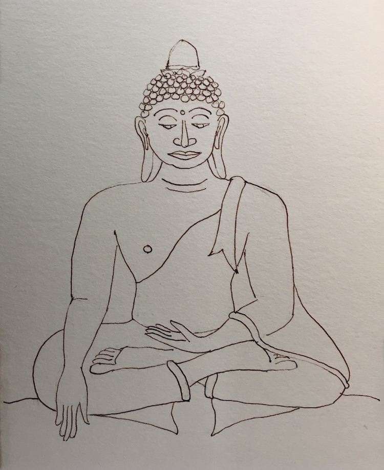
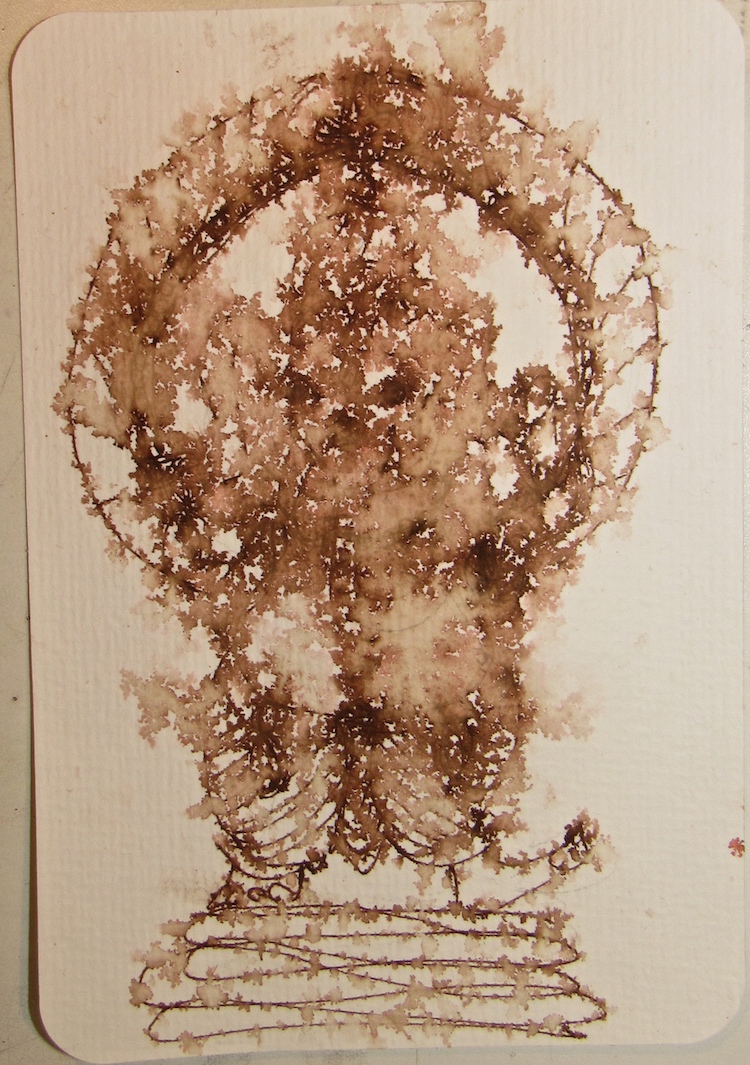
In the first test Buddha was well-behaved, but Ganesha splashed around! I layered lots of wet juicy washes, inks under and over, removed quite a lot of watercolor (gasp) and the paper is a dream.
Ganesha is a perfect image to begin this journal’s content, the scribe, clearer of obstacles and new beginnings. For Easter I offered up chocolate eggs to the God with the sweet tooth (only one tusk, because he loved chocolate a bit too much.)
☾
Now that I am getting serious about Hahnemühle’s papers in many forms, I was pleased to see thatHahnemühle has a commitment to environmental responsibility, which means a lot to me. I vote with my $$$. Just as I switched to fountain pens to reduce the waste in my ink drawing, knowing I am buying from a company that is interested in environmental stewardship is important. I am interested in theirbamboo sketchbooksand that may be my next Hahnemühle review!
I know they are working to get their product in stores across the USA. Wet Paint (one of two stores I frequent online) has the Nostalgie sketchbooks,
and will soon carry the Watercolour Book. Flax Art & Designin San Mateo, California carries many Hahnemühle products, including the Hahnemühle Watercolour Book, BUT DOES NOT SHIP. (I can see that I need to make a special stop!)
As my Patreon supporter, you will have
access to some content not on this website,
sneak previews, goodies, discounts on classes.
I teach architectural sketching,
art journaling (art+writing), creativity, watercolors.
That annoying loud-mouth editor/critic in your head? GONE! How great would that be?
I'd love it if you shared this; please mention my blog name!
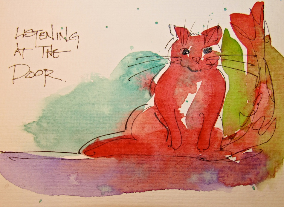
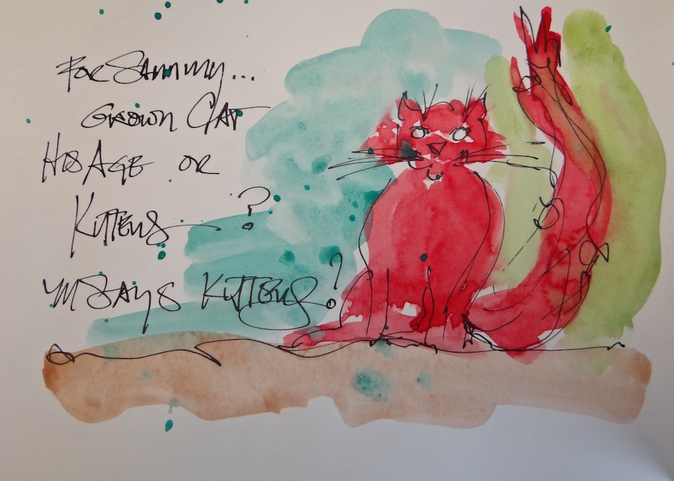
Sammy gets sent through the mail…
(Hahnemühle watercolor post cards)
Now that the other cats are gone,
when Sammy can’t be with his bestest pal in the world, Mitchell, he loosk so sad.
We ring him to the studio, but he stays in the office.
He will venture out sometimes to cry a soft kitten cry,
trying to get Mitchell or I to come into his room.
If Mitchell goes into the wood-shop, Sammy leans in to listen at the door.
What Sammy doesn’t know is he will be getting kitten friends very soon!
As my Patreon supporter, you will have
access to some content not on this website,
sneak previews, goodies, discounts on classes.
I teach architectural sketching,
art journaling (art+writing), creativity, watercolors.
That annoying loud-mouth editor/critic in your head? GONE! How great would that be?
I'd love it if you shared this; please mention my blog name!
Okay, I admit it…
I bought these for the TIN.
My studio paints are overflowing
into lots of little tins, and I loved the flowers on these tins and the size. (How I used these tins and organized my paints are for another day, but
I am liking how it worked out!)
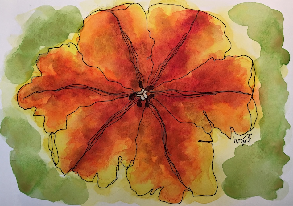
I found I loved the size/shape of the Hahnemühle Post Cards as I began playing with the paper, 250 gsm rough texture. I’m not a fan of the rough texture; I prefer Britannia 300g/m2 hot or cold pressed (review coming).
I long for cards in cold pressed instead of rough, but I like the challenge of working with texture and am starting to enjoy the texture on these.
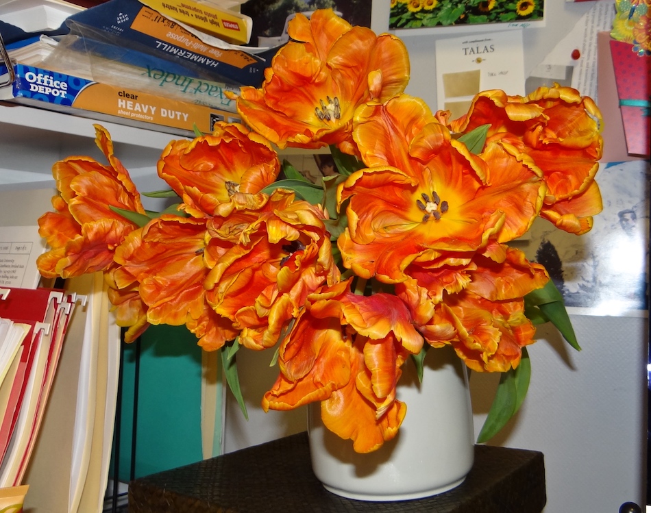
They take everything I can throw at them. IF I’d known what I was throwing at this postcard when I started the flower, I would’ve taken pics. Under layer of Viridian
and Quin Yellow, then Amazonite and a sloppy wet layer of New Gamboge… the paper started to curl! Then a layer of a mixed red, and a final layer of mixed brown.
Topped with another layer of ink and White Pitt Pen…
Paper curling IS a problem with tons of wash, but its a small one. The Ganesha above I sprayed to move the Tobacco ink sketch, and it curled. I haven’t cut a good base, but the paper behaves when it is clipped. If you don’t or can’t clip it when you are working it, AFTER it is dry, turn it over and clip then brush with water and let it dry. It straightened out the teabag art and the Easter colored tulips below, which curled!
I’ve used UHU glue for teabag art,
topped with washes, watercolor, and inks!
Looking forward to when Hahnemühle products are everywhere in the USA!
My first Hahnemühle Post Cards are ready to send for
Easter (mom gets pastels) and thank you and love notes to Mitchell!
As my Patreon supporter, you will have
access to some content not on this website,
sneak previews, goodies, discounts on classes.
I teach architectural sketching,
art journaling (art+writing), creativity, watercolors.
That annoying loud-mouth editor/critic in your head? GONE! How great would that be?
I'd love it if you shared this; please mention my blog name!
Giving art is one of my pleasures, especially as a thank you to the friends who lend me their photographs… they give me their photos without asking for anything in return, and surprise they get a gift back! The post cards are perfect for giving because they are ready to send! I like giving them to Mitchell as a surprise — I leave them on his computer during the day so he finds them when he least expects it, and gives me back a big kiss!
Late start to SoCS because I was finishing gifts!
Hahnemühle Post Card with a heavily tea-stained teabag, deeply colored.
Because I journal and do morning stream of consciousness exercises, I am again trying to participate in Linda Hill’s Stream of Consciousness Saturday. I write to a timer, 15 minutes, no editing except spelling, and of course I add my art! You can do it too!
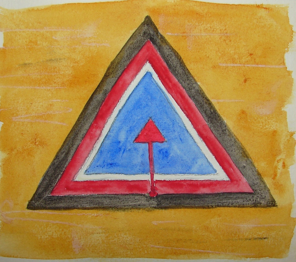
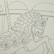
A prayer for the Feminine, above, from ancient symbols.
It is easy to point fingers at the other guys,
especially when their hatred fills the airwaves.
My encounter yesterday with a female peace activist
out of the box immediately,
screaming and showing hysteria,
all over her advertising campaign and why we didn’t find her
(this was our first few seconds with her on the phone)
because she as the world authority on dying silk
reminded me of the need to do the inner work first and then again and again and again,
always checking in to your own psyche to see what is so about your behavior and intention.
Pentalic Aqua Journal, with a Pentalic HB woodless pencil,
Holbein, and Daniel Smith watercolors.
If you are easily overwhelmed save it for when you can handle it,
because, like handprints, she is a treasure when it comes to sharing
her insights on color in a way in which that painters can relate.
Here is the beginning. Go look. Have I ever steered you wrong?
I'd love it if you shared this; please mention my blog name!
This project is a hard one for me… Because of the current state of our government I am feeling like censoring my own art in posting. NEVER have I felt like that.
As my Patreon supporter, you will have
access to some content not on this website,
sneak previews, goodies, discounts on classes.
I teach architectural sketching,
art journaling (art+writing), creativity, watercolors.
That annoying loud-mouth editor/critic in your head? GONE! How great would that be?
I'd love it if you shared this; please mention my blog name!
He’s always had a tumble-down face-licking pal to play with…
We’ve decided to let him have his own pal, but whether to
get a cat his own age or kittens to drive him crazy, and keep him young?
As my Patreon supporter, you will have
access to some content not on this website,
sneak previews, goodies, discounts on classes.
I teach architectural sketching,
art journaling (art+writing), creativity, watercolors.
That annoying loud-mouth editor/critic in your head? GONE! How great would that be?
I'd love it if you shared this; please mention my blog name!