Inktober 9, Goodbye Can Opener


I haven’t named our can openers, but the old green one (top) has memories.
I did what I could to keep it going, lubricated and all that,
but at some point, it died.  Froze.  Creaking.  Would no longer move.

We said goodbye and talked about when we bought it, on a cross-country trip in the RV.
Good memories, those.  An object from our early years, twenty years old.

The new one is white, so it was a good object for Inktober, no need for color.
I could work lines in my background!


To hear about classes, follow me on Facebook
or check out my new, improved dkatiepowellart.com

Posted in art journal, challenge, drawing, journal, pen & ink, sketchbook | Tagged , , , , , , , , , , , , , | 2 Comments

Inktober 5, USk Ross Island Bridge


It started with a sketch looking north at the Ross Island Bridge
while waiting to see a client, a beautiful fall day.
In anticipation of Inktober coming, I also had a waterbrush filled with diluted grey ink.


Watercolors back in studio… could not resist.  The Willamette was SO blue.

To hear about classes, follow me on Facebook
or check out my new, improved dkatiepowellart.com

Posted in art journal, challenge, creativity, drawing, ink painting, journal, pen & ink, process, sketchbook, virtual sketching | Tagged , , , , , , , , , , | 4 Comments

Lindsey Graham


I was so upset when I did this I could hardly letter.
Lindsey Graham said, direct quote,
“You are supposed to be Bill Cosby when you are a Junior and Senior in Hag School!”
When I heard that I could not believe it.
I backed up the video and had to listen again and again.
I am so fucking pissed I can’t see straight.

What Mr. Graham was saying was that Junior and Senior boys should be given a pass to the crimes of Bill Cosby: to drug, abuse, hold down, and rape girls:
“Cosby has been convicted of three felony counts of aggravated indecent assault:
for penetration without consent, penetration while the victim was unconscious,
and penetration after administering an intoxicant.”
  New Yorker.

I can’t get this out of my head.
Nearly every woman has assault stories, and this man, a Senator,
has the audacity to say that it is fine for high school boys to behave like Cosby…
That the GOP doesn’t want a full investigation, to hear the other witnesses.
Our hearings are a sham.

I could not make this up.
I have to assume that right-wing news outlets are not reporting on this,
and am shocked that it is not the lead story in every paper…
That a sitting senator in a hearing about a Supreme Court Judge
would endorse Bill Cosby’s behavior.

I can’t stay silent.  This bothers me too much.
I was very lucky when I told my management of my incidents.
They were supportive.
I cannot imagine what this is like for those who never tell anyone.

To hear about classes, follow me on Facebook
or check out my new, improved dkatiepowellart.com

Posted in art journal, drawing, journal, memory, pen & ink, process, virtual sketching | Tagged , , , , , , , , , | 6 Comments

Tools: Inks, Part II, Soluble Inks!

In preparation for Inktober, I am reviewing inks.
As always, these posts are about my relationship with inks, and is not definitive.
You might want to read yesterday’s post on waterproof inks!

*again, a bit of advice, especially if you are not made of money
and have to budget:  look at an artist’s work and find out the artist’s
parameters for their choices before buying their favorite products!*

To recap, I use inks in the following ways, in the order of importance:
1) Artwork, waterproof inks for both line work (see above)
and underpainting in greys (grisaille), browns (brunaille),
and occasionally, green (verdaille) and purple.
BTW, I love to use colored inks under watercolors sketches sometimes<
shown top.  Change it up!
2) Painting… yup, I do like to paint with  them,
but as they are not all lightfast those go in my sketchbook…
many of the inks below I paint with!
I can always use up samples painting!
3) Writing…  all these inks are great writing inks… 

INKS THAT MOVE WHEN WET

I have favorite brands: not in order, Robert Oster, Diamine, and Akkerman.
The brand favorites are chosen because they perform well in the pens, have a gorgeous palette, and are well-priced.  I see no reason to pay twice a much for a Japanese ink
when there are beautiful inks from Europe and Australia.
I am offering others I would consider, but these are the brands I look at first!
*the concept of “everyday carry” are inks that you have
permanently dedicated to pens that you carry every day.*

I strongly suggest buying ink samples.
Samples show you the inks vibrancy and pigment.
You can pop it into a pen and see how they perform.
One of the reasons I rarely recommend Jetpens.com as a resource for inks is
they do not offer samples, though I buy from them; Goulet and Van Ness offer samples.
Samples range in price due to the variance of the ink costs.

I love to paint with inks, whether it is by filling a water-brush,
dipping brushes directly into ink, or by wetting line-work and moving the ink lines.
I use my samples as painting colors as well.
*i do not dip my watercolor brushes directly into full bottles,
but decant inks into sample vials… don’t want to mess up a full bottle!*
*i also dedicate a couple of brushes for ink painting, because unlike watercolors,
inks are impossible to thoroughly remove from a brush!
even with soap and water… vestiges remain!*

My favorites, below, of which I own bottles (or will in a short time).
Some I wrote commentary on, some I didn’t.

Robert Oster Inks

Oh my, I have 30 samples and several bottles
and have to hold myself back from buying all of them!
Each blue is more gorgeous than the next –RO seduced me into buying blue inks!
Maybe it is because he lives surrounded by some of the most gorgeous blue seas
in the world, as colorful changing as California’s!
Motor Oil and Fire & Ice are both everyday carries.
I am patiently waiting for funds for Thunderstorm, Orange Zest, and Deep Sea.
His inks are lovely, shade well, affordable, amazing colors that perform well.
I buy them from Goulet or Van Ness — each carries a few but not all.

Diamine Inks

These are the best priced inks with the widest palette.
All I’ve tried are wet and perform well in even extra fine pens.
Three are part of my everyday carry: Ancient Copper,
Blue velvet (one of the most amazing blues ever) and Regency (purple-blue.
Make sure you buy samples, and some colors are very close to others.
I buy them from Goulet though JetPens carries some that Goulet does not.

De Atramentis Tobacco Ink

The only scented ink I adore.  Everyday carry ink.
Shades beautifully, and smells like my grandpa’s tobacco.
I wish I could say I like other De Atramentis inks,
because I LOVE the waterproof Document inks,
but have tried many samples of their non-waterproof inks and
the pigment intensity just does not compare to other inks mentioned here.

F. W. Akkerman Inks

I just discovered this
company two months ago. I have an order for more samples so I can buy more bottles.  Chinatown Red
is an everyday carry.  Amazing colors and ink.  Some are slow drying and in a wet broad pen you might have to let them set to dry, difficult for note-taking in meetings.  Their colors are painterly, especially the Dutch Master line, as they are unpredictable surprises!
I both paint and write with these amazing inks.  In the USA, they are from Van Ness.

KWZ Inks

Another favorite ink is KWZ Foggy Green.  Adore it for the odd shading!
Shades from greens into a pinky brown that is moody and gorgeous (angel above).
*btw i am finding a few more inks that may do this and will write about it later as it is a slow process… retailers do not understand what is important about this!*
Funny smell, but not perfumy and I am used to it.
Some of their other samples have had a soft perfumy smell, but they are not sold
as scented inks.  If you are sensitive to smells (I am not fond of scented inks)
buy samples!  Now that I am buying more inks,
I am branching out and trying other KWZ colors, from Van Ness.

Rohrer & Klingner Ink

I am relatively new to their inks, and many that I am attracted to are iron galls;
the last two are on my to-buy list from samples.
I will probably put them in inexpensive pens like the Platinum Preppie.
I adore the Alt Grun-Gold, love how it sloshes around in my TWSBI Eco!
I purchased the yellow early because it is named after my favorite flower, a sunflower.
I paint with it — who uses yellow ink to write with?

I will buy more as they perform beautifully!

Pelikan Ink, Krishna, and Encre Classique, New to Me:

We went to the Pelikan Hub and scored some lovely samples, above.  I can’t tell you how I’ll love them in the long run, but they are beautiful.  The names seem off to me, as Topaz, while is in blue also, most think of as a smokey quartz color, and jade is NOTHING like jade!

Krishna Orange and Encre Classique Vert Moyen are lovely inks we are trying.  We liked the samples enough to buy bottles.

INK BRANDS I TEND TO PASS OVER:

Monteverde Ink: I like these two, but they are not a go-to ink for me.
Both of these came with a pen.  I wish I could tell you why they don’t attract me.
Anyone else have a feel for Monteverde?  I tend to go to Diamine instead…
maybe the color palette, maybe the prices.

J.Herbin Inks: I have them, and would trade them in a minute if
someone else wants them. Early purchases, before I bought samples, but the ink is fine.

Nemosine Ink: These came with a pen purchase, and are lovely inks,
but haven’t a large color variety so I rarely look at the inks to purchase,
though both of these inks are beautiful and perform well.

Glittery Inks: Oh gads, I don’t like them… there are those that do, but I don’t.
They clog up the pens and I don’t get enough out of them to warrant the work!

October 1 begins Inktober!

To hear about classes, follow me on Facebook
or check out my new, improved dkatiepowellart.com

Posted in art journal, challenge, creativity, drawing, ink painting, journal, pen & ink, process, sketchbook, virtual sketching | Tagged , , , , , , , , , , | 1 Comment

Tools: Inks, Part I, Waterproof

In preparation for Inktober, I am reviewing inks.
As always, these posts are about my relationship with inks, and is not definitive.

*peeps, a bit of advice, especially if you are not made of money
and have to budget:  look at an artist’s work and find out the artist’s
parameters for their choices before buying their favorite products!*

I use inks in the following ways, in the order of importance:

1) Artwork, waterproof inks for both line work (see above)
and underpainting in greys (grisaille), browns (brunaille),
and occasionally, green (verdaille) and purple.
BTW, I love to use colored inks under watercolors sketches sometimes<
shown top.  Change it up!

2) Painting… yup, I do like to paint with  them,
but as they are not all lightfast those go in my sketchbook;

3) Writing

WATERPROOF INKS

Waterproof inks are critical to my mark-making!

There are VERY few waterproof inks.
Bulletproof, archival and water resistant are not the same.
Look it up.  Call the companies and ask them!

If you are a watercolor artist your definition of “waterproof ink” is the most rigorous.
Not rain on an envelope… submersion in a puddle!
We want to wash lots of wet water over inks and they need to stay put.
They need to work on all kinds of paper.
There are only a handful that meet that qualification, and I own every color.

BTW, test ALL “waterproof”  inks in the back of new journals or papers before using…
I still do even with my favorites!  What if a manufacturer changes formulas?
Can an ink get old?  Loose it efficacy?  I don’t know but don’t trust!

The only inks I KNOW to be waterproof, meaning they’ve never let me down
on any paper if saturated with water, are:
Platinum Carbon ink
All De Atramentis DOCUMENT inks
All Super5 inks.
Noodler’s Polar, Lexington and Heart of Darkness are hit and miss —
and so, they fail from time to time, and that doesn’t work when you want waterPROOF.

The inks below are my workhorses for linework:

Platinum pen + Platinum Carbon Ink Cartridges, above…
Platinum Carbon pens (and Goulet sells them in extra fine and medium —
no one else does to my knowledge) and the platinum carbon cartridges.
WATERPROOF!
Part of my love for them is that they travel so well.
I ALWAYS have a Platinum Carbon Pen and a box of cartridges in my purse.
And I’ve never had one clog.  I’ve had die entirely after two years.


Super5 inks can now be found in the USA at Blue Rooster in Los Angeles.
They are amazing inks.  WATERPROOF!
Their pigments are tested for lightfastness, (Yay!)
Their colors are wonderfully interesting pigments. I love them all. I use Frankfurt (a medium brown-grey) for both grisaille and linework and it is an everyday carry ink; I use
it as much as the DeADoc Black or Platinum Carbon.
And I like Darmstadt,
an almost black ink.

Super5 Australia is a surprising ink to use under watercolors, above.

I love De Atramentis Document Inks (I call them “DeADoc”).
WATERPROOF!
My favorites are DeADoc Black and DeADoc Brown, above.
Many of my colored inks are DeADoc inks.
Their colors tend to be crayola-colors, a bit predictable or uninteresting, and sometimes not vibrant, which is why the bulk of their colors are not my everyday carry inks —
but that may be what you are looking for, a predictable color.
Especially in an ink color for a pen for the office.
They have not clogged by pens with one exception:
their White ink clogged a perfectly wonderful pen in one day…
Never going in a  pen again… Dip pen only!

BLACK INKS

In terms of black ink, my favorite is De Atramentis Document Black, left.
Black, no hint of grey or brown, and no sheen.
I love Platinum Carbon, middle, also comes in bottles,
but it has a bit of a charcoal sheen to it…
I don’t mind the sheen, but it is not the blackest black!
When photographing, you can sometimes see the carbon sheen…
Super5 Darmstadt, right, is a good black, but just a hint off the darkest black,
but with no sheen, like a deep deep charcoal grey.  I love it.

Note: Noodler’s inks are NOT waterproof…
no matter if some folks have been lucky…
“Sometimes working” isn’t good news in waterproof ink and birth control!
Heart of Darkness is shown above on good paper
with a bit of water added after thorough drying.
NO Noodler’s ink has ever worked consistently waterproof —
I’ve had several sad disasters, and their inks left are never drawing inks no.
Fool me once…

Inks MUST be thoroughly dry to be waterproof.

You may want to write over watercolors too.
Know that they must be dried completely too or the ink will spread.
In any case, I find it often changes the way the inks
relate to the paper, and the inks may feather a bit over watercolor.

WATERPROOF COOL-TONED COLORS

Below are the waterproof cool-toned colors I trust, including a new one,
Rohrer and Klingner Marlene ink in a clear blue.
I’ve tested other samples of the R&K waterproof line,
but was unimpressed with them…
Marlene does stay put and the color is a strong clear blue —
I just don’t like the chemical smell.
But this one blue color I can’t get in any other waterproof brand, and it is pretty….
I have it in a pen currently and so far it is well-behaved.
I may pick up a bottle so included it here.

WATERPROOF WARM-TONED COLORS

Below are the waterproof warm-toned colors I trust.
I’d love to see some other good warm colors….
I like the DeADoc Fuchsia (sample was spilled before I could do a swab).

GRISAILLE INKS

Grisaille (/ɡrˈz/ or /ɡrˈzl/; French: gris [ɡʁizaj] ‘grey’) is a term for a painting executed entirely in shades of grey or of another neutral greyish colour… A grisaille may be executed for its own sake, [or] as underpainting … working in grisaille was often chosen as being quicker and cheaper, although the effect was sometimes deliberately chosen for aesthetic reasons. Grisaille paintings resemble the drawings, normally in monochrome, that artists from the Renaissance on were trained to produce.”   WIKIPEDIA

My favorite “grisaille” inks under watercolors, are above.
I typically have them lightly diluted in waterbrushes.

I still use Noodler’s Lexington ink or Polar Brown in these instances,
because I have a HUGE bottle and I test in each journal for waterfastness.
I use them carefully, especially the Noodler’s Polar Brown…

OTHER WATER “RESISTANT” INKS: IRON GALL INKS

Iron gall inks have a reputation of possibly ruining pens.
I heard of this after using them extensively in several Pilot Metropolitans.
I understand that they may have improved, and they are interesting inks.
I advise cleaning your pens more often with these inks.

My favorite are the Platinum Classics.

I use the extensively for writing.  Some appear to be water resistant, which is shown by the lack of a solid dot in the middle of the swabs, below, listed in order of water resistance.
I also use them in drawings where I want to wash the images after with water, and have the color move some while still retaining visibility as a line, even if a bit fuzzy.
They typically change in color, becoming blacker over time, like the two images above — those are the exact same ink, Lavender, just wet and dry.

Below are the inks I own in this category.
Of them all, I will buy the Lavender and the Cassis again.
I am so surprised at how much I love writing and sketching with these inks.

Tomorrow I will post
Tools: Inks, Part II, Soluble Inks!

To hear about classes, follow me on Facebook
or check out my new, improved dkatiepowellart.com

Posted in art journal, challenge, creativity, drawing, ink painting, journal, pen & ink, process, sketchbook, virtual sketching | Tagged , , , , , , , , , , | 6 Comments

USk: Water Towers

I’ve been getting my pens in shape for Inktober.
I had received a Goulet nib in the mail and
was out sketching the water tower in NE Portland…
The dang Conklin nib is sooooo awful, I switched it between sketches.
*yes it is that easy on some nibs*
The first sketch above is with the Conklin nib, and it skips and is scratchy…
the Goulet nib is smoooooth!  Yay!

Wow what a difference a nib makes!

I’ve had some nibs made for some of my pens now and have fallen in love with the architect’s nib (see video below for what that means…)
The first image above is the new architect’s nib in my Moonman pen.
The second image shows the two nibs in action BEFORE the changed nibs.
The third is the new cursive nib which is fine, also in my Moonman,
but I love love love the architect’s nib.


Back in studio I added color to this one with the lousy nib… saves it!


But this one I like in its inky color, Super5 Australia ink.

To hear about classes, follow me on Facebook
or check out my new, improved dkatiepowellart.com

Posted in art journal, Buddha, drawing, journal, landscape, memory, pen & ink, process, sketchbook, urban sketchers, watercolor | Tagged , , , , , , , , , , , , , , , , , , , , , , , , | 5 Comments

USk: Pelikan Hub 2018

The 2018 Pelikan Hub happened Friday night.  My first time, and wow I will never miss another.  It happened at the Lucky Lab on Hawthorne.  Oddly, my sketch while waiting for it to start (after dinner) is in Robert Oster’s Motor Oil ink, a favorite sketch ink.

There was swag, and I was unprepared for the generosity of the samples:
I came home with many Pelikan ink and paper samples,
and swapped inks with a few peeps.
I scored a bottle of a favorite ink, Pelikan Edelstein Olivine.
Next year will bring a couple of inks to share of my own!
I brought some of my pens, and sat and tried other’s pens and offered my own,
especially my Moonman with the architect’s nib.
Mitchell has also become a lover of fountain pens, and had his own
lovely night meeting other crazy pen collectors and trying pens.
He fell in love with a couple of inks, and has a collector sending him a bottle
of discontinued ink as we speak.  How cool is THAT?

I’ve found my peeps, man!  Crazy pen collectors…
Find your closest local Fountain Pen group…
Sign up to go to the Pelikan Hub — it happens around the world,
but signups happen in Spring…

To hear about classes, follow me on Facebook
or check out my new, improved dkatiepowellart.com

Posted in architecture, art journal, color, pen & ink, sketchbook, urban sketchers, watercolor | Tagged , , , , , , , , , , , | 2 Comments

USk: Broadway Bridge


Traffic has a few good points…

I added watercolor later, and after I bought a couple of new colors.
I swear I am never ever going to be seduced by a Daniel Smith color name again.
“Burgundy Yellow Ochre”??? I am an idiot… It is just plain old Ochre.
They are excellent at selling old colors under new branding and I was filling out
an order and did not go in to check the Munsell stats.  Idiot!
The Permanent Brown is fine, and the right color for the steel bridges in Portland…
I don’t buy many browns other than Primateks…
BUT, it doesn’t move well in my Nostalgie Journal… streaky.  Odd.
We will see if it was an off moment as there are other bridges to be painted.

To hear about classes, follow me on Facebook
or check out my new, improved dkatiepowellart.com

Posted in art journal, drawing, journal, landscape, pen & ink, urban sketchers, watercolor | Tagged , , , , , , , , , , , , , , , | 4 Comments

VSW: Flamingos


Love me some Flamingos.
Goes very well with that silly meme.

If you want to join a virtual sketchwalk,
all from pictures, come join us!

To hear about classes, follow me on Facebook
or check out my new, improved dkatiepowellart.com

Posted in animals, art journal, challenge, ink painting, pen & ink, sketchcrawl, virtual sketching, watercolor | Tagged , , , , , , , , , , , , , | 8 Comments

USk: Trip to Lacey Washington


Trip across the big wide Columbia to make a presentation in Lacey, Washington.  Labor day the bridge was very slow due to  traffic; this meant I could draw while Mitchell drove.

 Robert Oster’s Motor Oil ink is becoming a go-to sketch ink, especially for cities.  It holds a line while moving with water.  The heavenly brown-green with undertones of orange is such a cool color!
Like a dark mushroom,
or yup, an oil slick.

Next morning I was
up before Mitchell.
Without coffee
*gasp*
sketched the very
boring parking lot.
That little bit of purple
is our Toyota.
Without the new colors
in my Da Vinci travel pans
I would not have
painted the hotel onsite
(tho finished at home):
Davey’s Grey especially,
not my normal color,
but finding it an
interesting mixing color.

  Six new colors…
I almost didn’t buy the Da Vinci Mauve because I hated the mauve of the 80’s… but this is their purple… and it is purple, not that insipid grey-pinky-purple that is a result of mixing a lot of wrong colors!  It will not be my favorite purple though.  I’ll stick with Daniel Smith’s Imperial Purple, and I love the new Holbein’s Permanent Violet.

To hear about classes, follow me on Facebook
or check out my new, improved dkatiepowellart.com

Posted in architecture, art journal, color, pen & ink, sketchbook, urban sketchers, watercolor | Tagged , , , , , , , , , , , , , , , | 3 Comments

Our Smokey Summer


Smoke.
I’ve been sketching/journaling,
just no time to format and post.

This was a miserable summer but of course,
hard to complain because others were losing their homes, businesses and environment, we just had smoke.

Grisaille above, with watercolor topped below…

To hear about classes, follow me on Facebook
or check out my new, improved dkatiepowellart.com

Posted in art journal, ink painting, journal, painting, pen & ink, process, urban sketchers, watercolor | Tagged , , , , , , , , , | 3 Comments

I Lost the Centre for Transformative Work Design Competition

*entry not enter (end of video)…
no way was i doing this a third time with yaman driving me crazy!*

I don’t enter many competitions, but the Sketching Work competition
for the Centre for Transformative Work Design out of Perth AU was easy for me
as I sketch our lives and work quite a lot, and was thrilled
to create a pen + ink + watercolor folded journal.

I kind of didn’t want to send it; the images were sweet.
I have never had an entry returned, but thankfully, when I lost,
*sob*
they did the honorable thing and returned it!

The winning entries are lovely!

The point of the competition was to tell the story of a workplace,
what it did and what made it a joyful place to work… Instead of assuming I knew,
I took Mitchell seriously as a subject and interviewed him.

The interview was sent separately, and is below:

Mitchell and I work together in our conservation firm,
MPF Conservation. 
Mitchell bought his brother-in-law’s upholstery shop at 23. Fascinated with traditional forms (unlike his brother-in-law), he hired skilled journeymen to amend his training. Several men trained helped him to become the conservator of museum antiquities he is today. 
It was really fun interviewing Mitchell; some of the
answers surprised me!

“I love uncovering ingenious historical fiber filled structural forms (sofas + chairs). I enjoy taking soft materials (hair, cotton, coir) and turning them into structural elements with proper flex, comfort, and decorative beauty. A bit like making a cake!”

“I love that each project is completely different; unusual objects walk in the door all the time! I work on a mid-century modern piece one month and a 200-year-old piece the next, tassels and fringe one week and a leather bellow the next.”

“Sometimes I wish I occasionally worked with other talented upholsterers for the camaraderie and swapping skills. It can be lonely working every day by oneself. Having the shop cats, good friends, keeps my heart happy. It is a perk of owning the business. They can’t always be in the studio — they are banned when we have  museum projects, or if a client is allergic or if the show-cover is silk, though they have their nails trimmed weekly.”

* An aside, we are often in different rooms, and they are well-trained. *

“While projects last from 3-8 weeks, in each phase I’m doing something different. Woodworking, tailoring, hand-stitching, upholstering, and traditional finishes. The job is physically demanding, standing long hours, pulling heavy threads, hand-stitching, moving furniture, so as I get older, it can be taxing, but it also keeps me in shape!”

“Throwaway furniture has changed the demand for our skills, which means we must be competitive to obtain projects. “Average” folks don’t know that today’s “expensive” furniture is still shortly destined for the landfill. They don’t realize a lovely restored old sofa is less expensive than many they will buy & toss
out within 2 decades! Our throwaway society has also made it difficult to obtain proper supplies in the USA; items are bought from France, Germany & England.”

“My most memorable project was conserving the Flemish Sofa that resides in the Hearst Castle Library. The most challenging was the first time I conserved an original mid-century Egg Chair by Arne Jacobsen ca. 1960… An engineering feat!”

(Flemish Sofa and Egg Chair!  Guess I better sketch them soon!)

I am sending you to my page of the competition but warning you that unfortunately
the scanning process for my competition entry was incorrect.
If you look at other’s work know that this may be so for them as well!

Platinum Carbon pen and ink told the line story.
Watercolor washes added the color.
I tested everything on a side throwaway sheet as I had limited time,
sketching Mitchell from life then inking then adding color.
frankly the most nerve-wracking was adding words to it,
because I am dyslexic and gads it would ruin the journal!

I love my entry; I  wish I’d won.  Our journal now lives on in our reception space!

BTW, I am available for hire to create memories! 
Do you have an event or keepsake or place to sketch?

To hear about classes, follow me on Facebook
or check out my new, improved dkatiepowellart.com

Posted in challenge, creativity, drawing, furniture, journal, painting, pen & ink, process, sketchbook, urban sketchers, watercolor | Tagged , , , , , , , , , , , , , , , | 6 Comments

New Hahnemühle Nostalgie Journal

I reached my 1000th post and never noticed… But my friend  Dan Antion
reached his and that celebration made me look!  As I start my new journal this has
me looking back and forward, reflecting,
and the New moon is a good time to do that.

My first post was just saying hello.  Doesn’t really count.  I wasn’t even doing watercolors yet, not really.  A turning point was the A-to-Z challenge, where I “met” Dan, Cheryl, Mary, Damyanti, Sharukh, and Lois… they led to others… blogging buddies!

Friends in the virtual world have made a difference in my life, not just my blog.
That opened up to having a few other good friends on the internet,
Tracey and Jenn and Eliska and Debi and CC and Jorge (RIP) and art buddies
who don’t have blogs and some don’t even have sites.  It is a mind-changing thang
to understand that you care about peeps you’ve never met.
I am glad I did this blog thang and gladder still for what it brought into my life,
so much information and support and encouragement.

Finally, reflection about this phenomena that started without commitment, a lark so to speak, has touched me deeply and readers are a huge part of that experience.
Determining how to open and share, what to share, how much to share publicly
Has been a growing of my psyche as an artist.  Thank you for coming along for the ride.


New Journal begins, Autumn coming, and I am loving the change in weather.
this is my favorite time, and feels like it should be a Ndew year…
And of course, for some it is, Rosh Hashanah.
Started my journal, as I do, with intention and a deity…
And a happy memory of a garden Buddha from another time.

To hear about classes, follow me on Facebook
or check out my new, improved dkatiepowellart.com

Posted in art journal, Buddha, drawing, journal, pen & ink, process | Tagged , , , , , , , , , | 6 Comments

How-To: Simple Folded Journals


There are good online tutorials on fancy precise folded journals,
with hard covers at each end and measured numbers.
I can do THAT…
BUT it takes a long time to be precise, and the journal becomes quite precious!

I want to create a simple folded journal…
for my purposes at this time in my life, I am all about what is going into the art journal.
I have limited time
*partner in our conservation business working 50 hour work weeks*
and want to get to the goal:
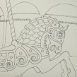
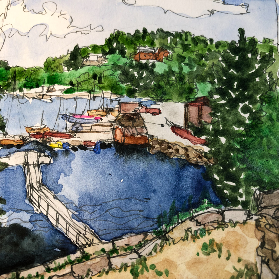
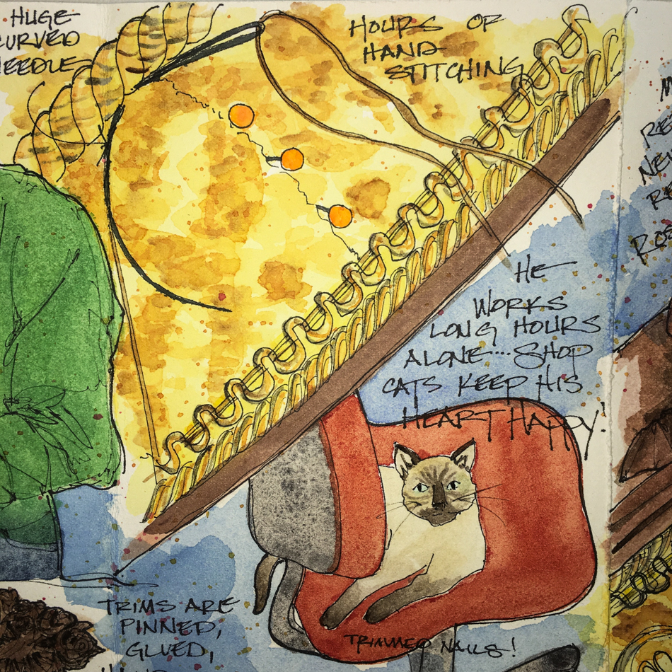
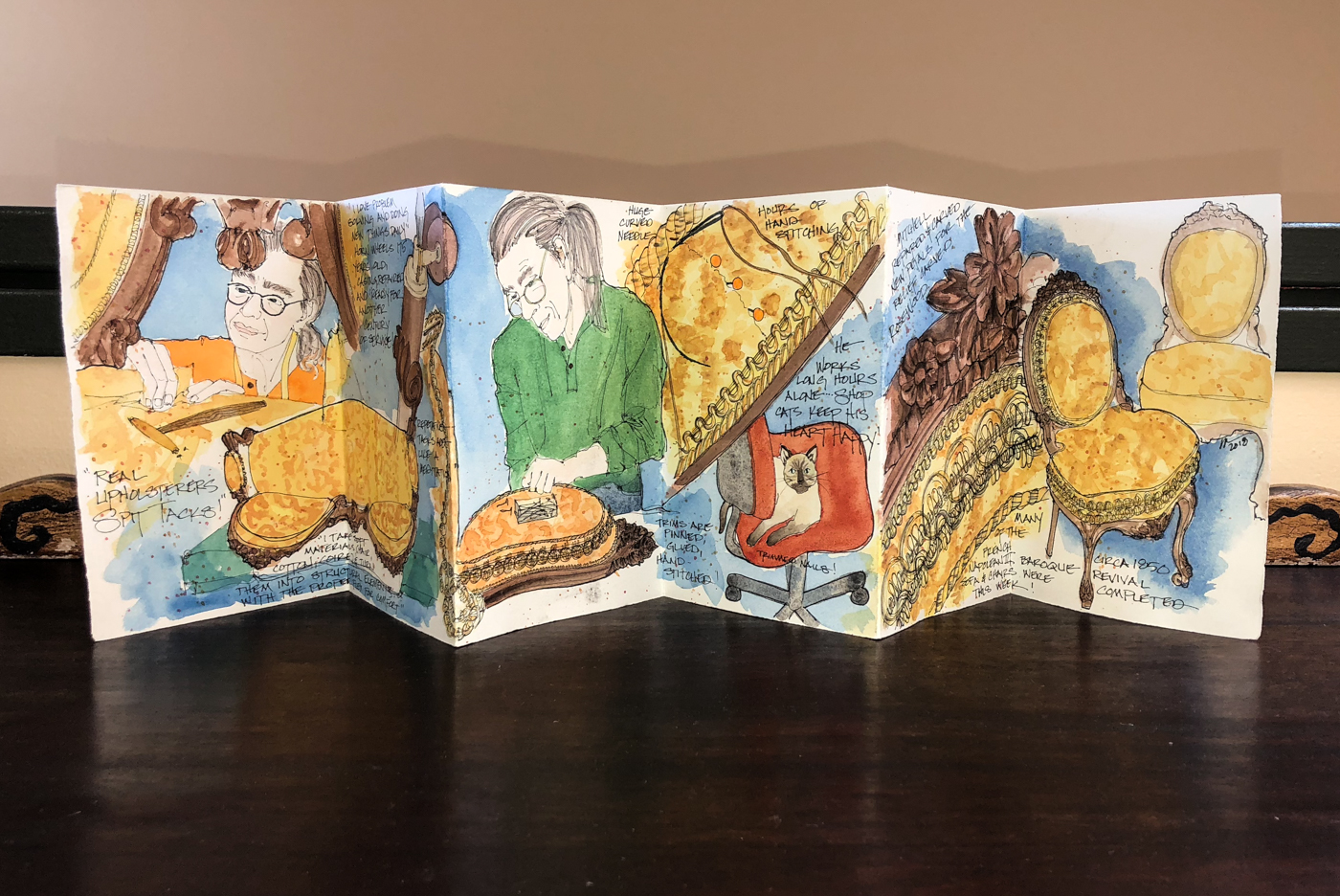
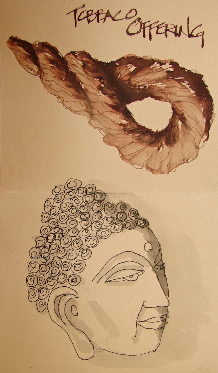
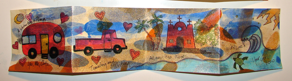
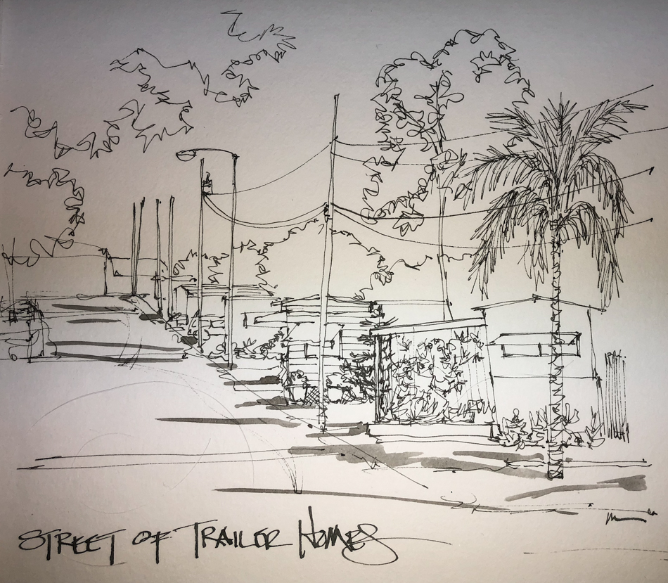
to make a card for Mitchell (above), tell a memory (Mom’s Jewelry Box),
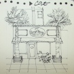
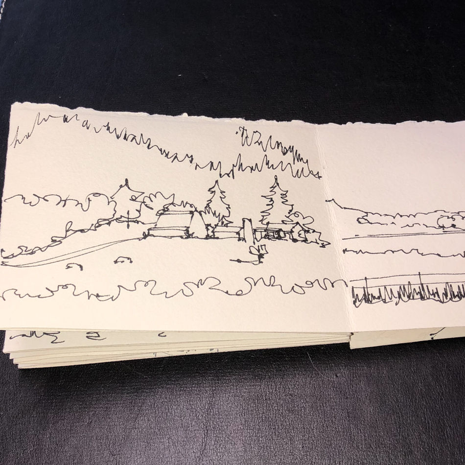
record an event (the trip to Southern Oregon), or show a slice of our life (below).


Some are very private love letters
* i hide these little gems, blushing *

I like these little journals because I’ve tried filling up a smallish journal
of 60 pages on a topic and some are STILL not finished.
It is very discouraging to slog through creating images after a trip trying hard
to complete the journal long after the inspiration is over!
A smaller story board is oh so very doable!
Take it with you!


My goal is to quickly create a folded watercolor accordion journal.
I generally have a colorful public side and a more private side…
Images on the public side, currently in watercolor, but I’ve done everything,
from acrylic to collage / mixed media.

Here is my way —
you can adapt it to work for you.

I like to start with a full sheet
of watercolor paper,
often about  20 x 30-inches,
but any larger sheet of
watercolor paper will do.
If it is a smaller sheet it will simply
make a smaller accordion journal.

Note you can also do these kinds
of journals from colored paper
for ink and colored pencil,
which is a good idea for Inktober!


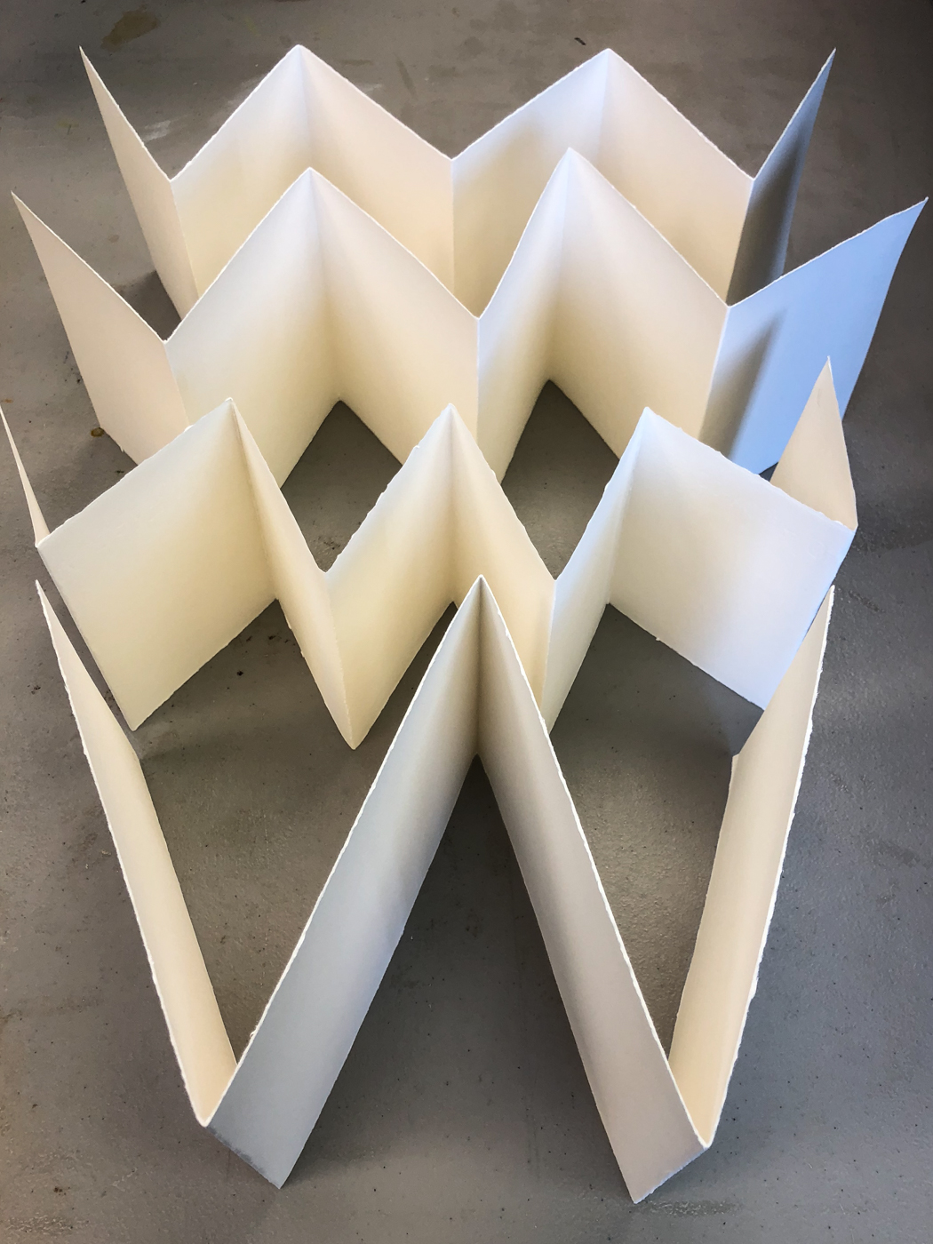
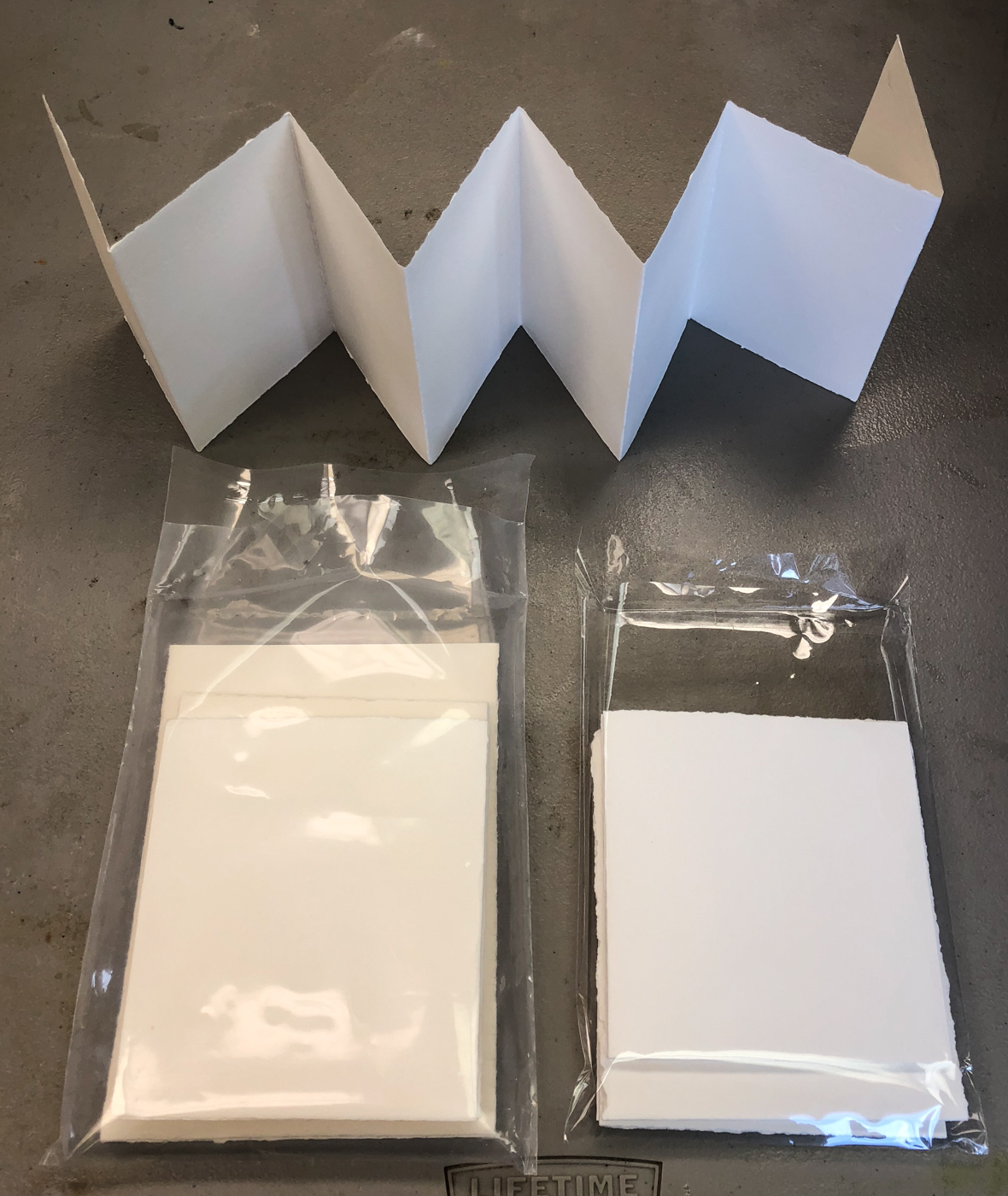
The 20×30 Fabriano sheet made four journals, above.
The sizes are off a bit because I made a mistake and saved it
* tell you later below *
and all that is fine with me as I still have four great blank journals
and it took me about 20 minutes to make them.
From bottom to top:
one 5.5 x 7.5-inch 4-panel (or 8 with each side) landscape type;
one 3.4 x 5-inch 8-paneled (or 16 with each side) portrait type;
and 2 of my favorite types,
5 x 5.5-inch 6-paneled (or 12 with each side) “square” journals.

If I wanted precise perfect journals it would take me closer to a couple hours:
to measure, double mark, draw the lines, wet and tear against a metal straightedge.
I like the organic torn edges and don’t care if all my journals are slightly different sizes.

The idea is to work with what is in front of you, size-wise,
and simply fold/flatten/flip/flatten/wet/tear.

To get a large sheet folded without bending
it is tricky a first.  Fold the sheet in half
the long way but do not come down with
a crisp fold right off… let it be a soft crease roughly in the center of the sheet
while you check your corners to see if
they are lined up, then move your hand to
the crease and begin to gently flatten,
not a hard crease, but a soft crease that
moves up and away from your body,
then come back to center and crease gently down and toward yourself.

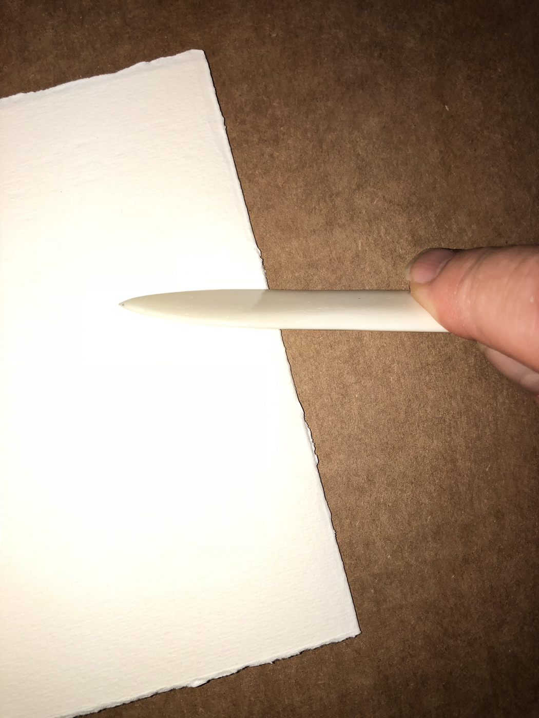
Final hard fold should be done with a bone folder, right, but if you don’t have one use the outer edge of scissors or a fat sharpie.


IF your first soft fold ends up being in the wrong place — and you get a bend — go with the placement of the fold and don’t sweat it.  That is how I ended up with two of the journals being different heights — my crease bent in the wrong place so I folded the crease there, and above, you can see it made for different sizes.  Still nice journals… and I am not crazed but relaxed and having a good time making non-judgemental little journals!


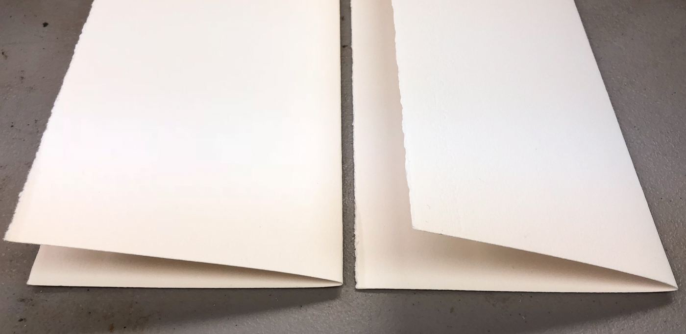
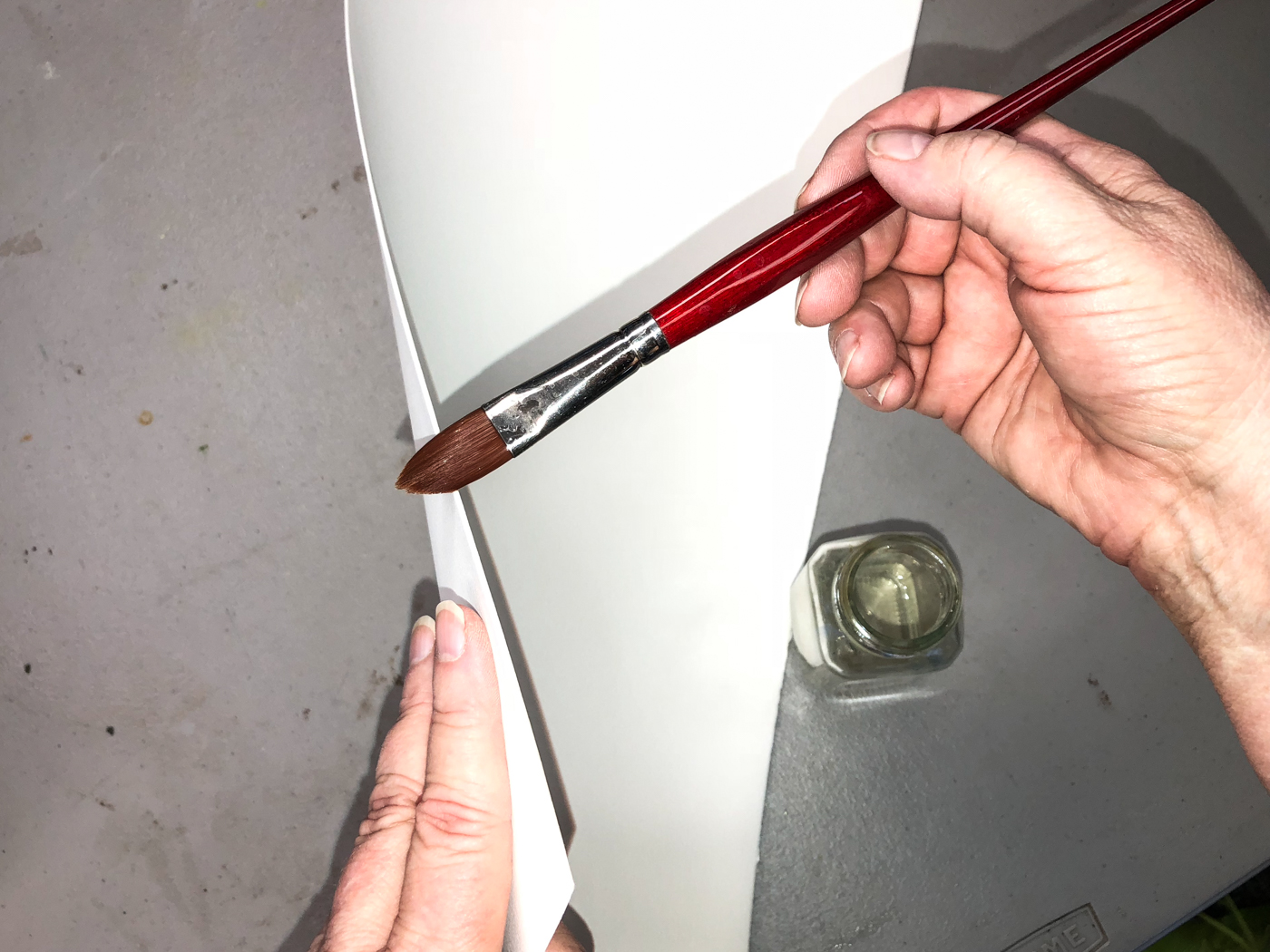
To make the tears, which are as close to a deckled edge as I can get,
I carefully wet the hard creases.  I thoroughly soak the edges.

When they are thoroughly wet (you will see a 1/8-inch wet spot),
you lay the paper flat and begin at the top,
holding the one side down flat, and gently beginning the tear.
Once it begins, it usually will go smoothly along the soaked creased line.

Before I get to far, IF it matters to you mark the side with the watermark you can read.
(I am going to usually use watercolors on both sides so it does not matter as much to me,
but there is a ‘best” side of the paper.)  I use the first letter of the name
(here is “F” for Fabriano) to remind me of the paper maker, which I do care about.

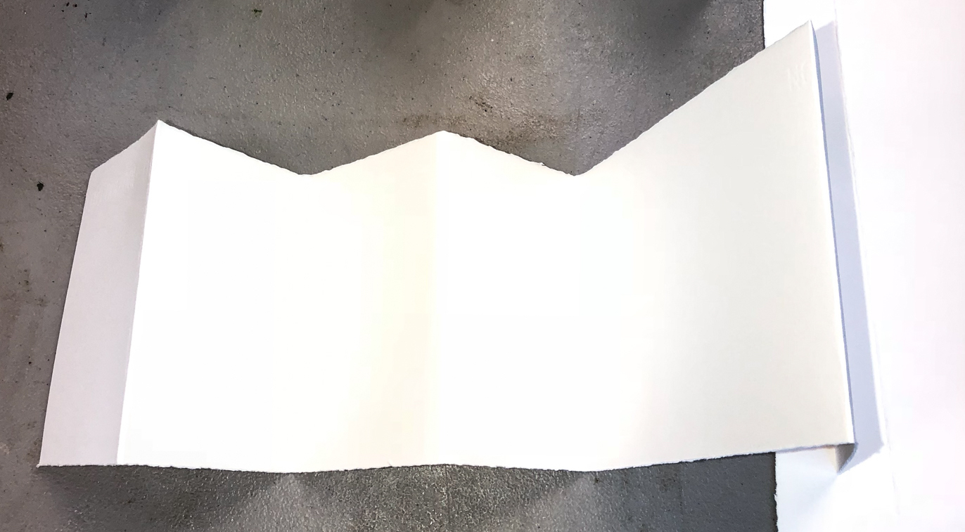
The simplest journal is to fold
the long strip in half, then fold it
again into itself.  Depending upon
the paper dimension you begin with,
and in this case it was 20×30,
it makes the 5 x 7-inch 4-panel
(or 8 with each side) landscape type
close to an A5 size (smaller if you use a smaller sheet but often will still be a landscape journal, like the one right.


If you prefer a smaller size, and portrait, take that same landscape journal
and fold each panel one more time and you have a 3.4 x 5-inch 8-paneled
(or 16 with each side) portrait type, closer to an A6 journal.

The point is, without measuring, you can fold simple journals in a few minutes.

Now, I sometimes do measure long sheets,
but I still don’t stress it and I still make make it easy.
Above, I wanted a panel closer to a square.  I folded the long sheet in half once.
Then I divided each half by three (which just happened to give me a size close to the height) and folded to the lines with a soft crease, aligning the sides before I made my final crease.  This is my favorite size journal, because i’ve always loved squares.

If I love squares so much, why not take the time to make
a perfect measured square? Because I want to get along
to the good parts I want and I am choosing not to be so persnickety about these journals.
I find charm in rough cuts.
You could, of course, measure, but that is for another day.

I save sleeves from cards and journals,
and store my little folded journals
in them for safekeeping.
I try to put same paper in each sleeve,
but sometimes I am just not that organized!

When I am completed with a journal,
if it is not on display,
I also put it in its own sleeve.

I gift them, send them (most fit in a normal envelope with extra postage),
and they delight the recipients.
No frame necessary!

Which brings us to the last bit for this post.
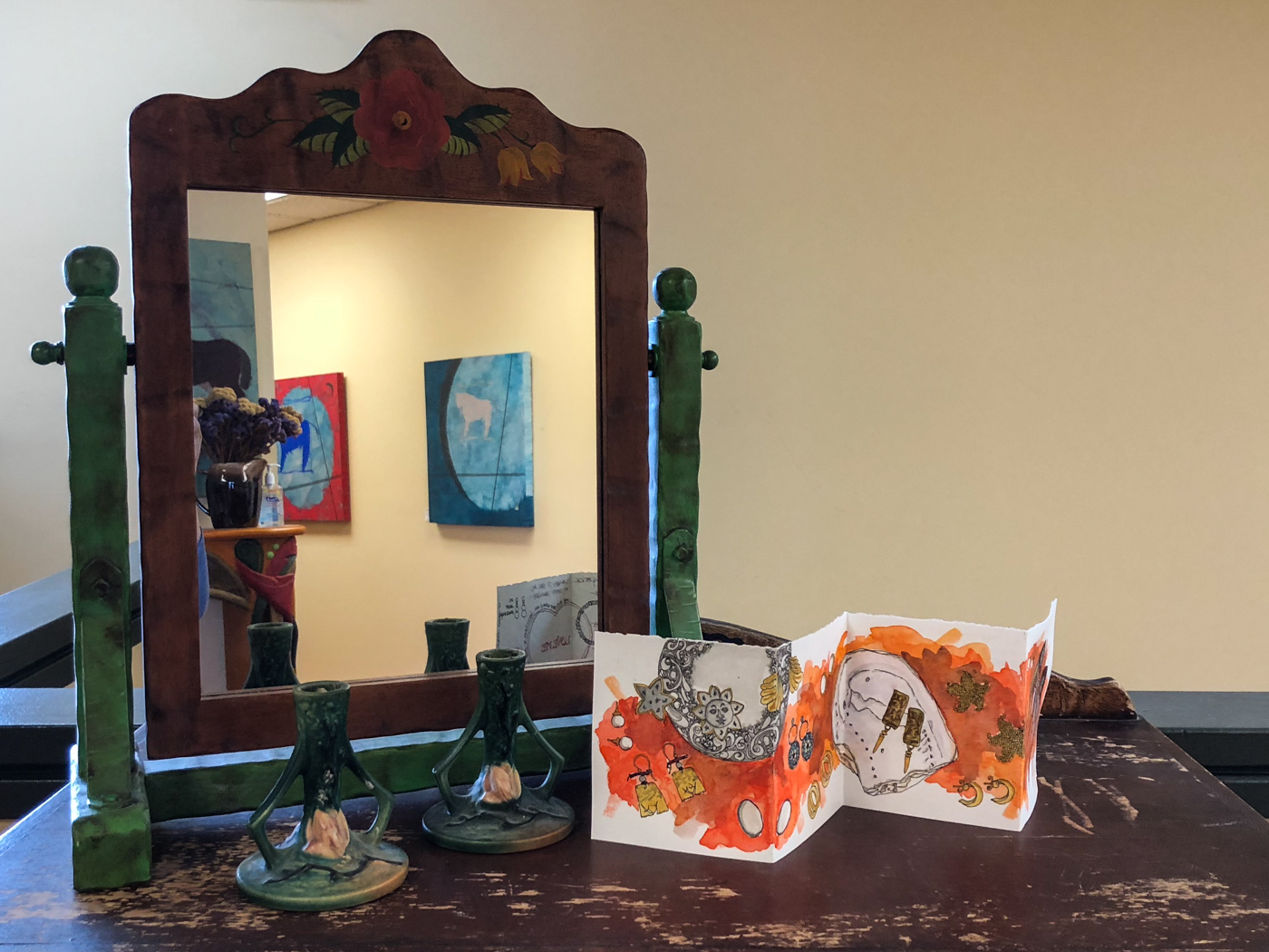
While I do tend to watercolor SOME on both sides, I find that I like having a more public side to my folded journal, and a more private side.
*this does not include journals that are
not for public consumption*

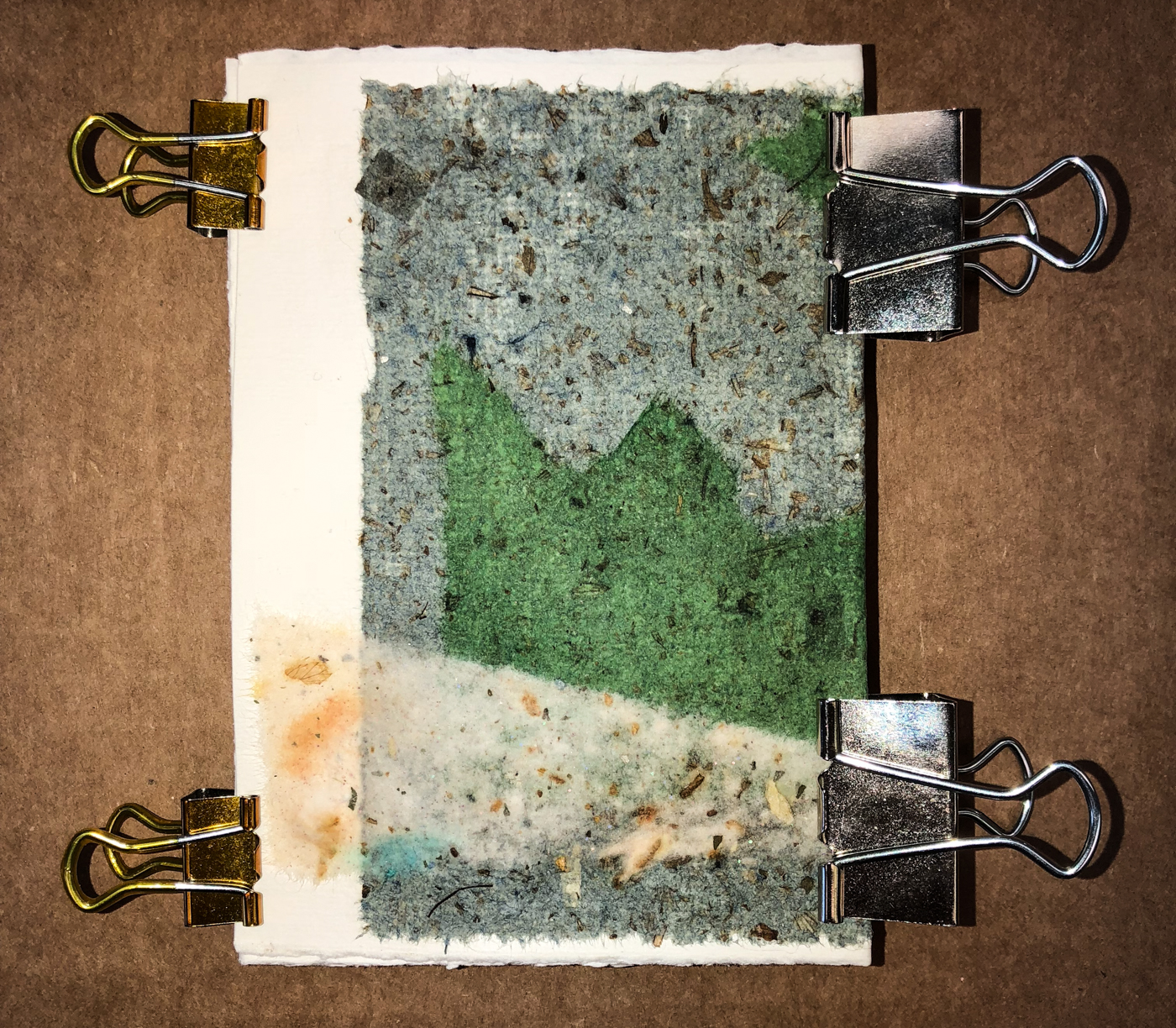
Above, a journal on display in our business
lobby, and you can see in the mirror the back
part that is more private. I played with
handmade papers on that backside, right,
and will show you what I did below.


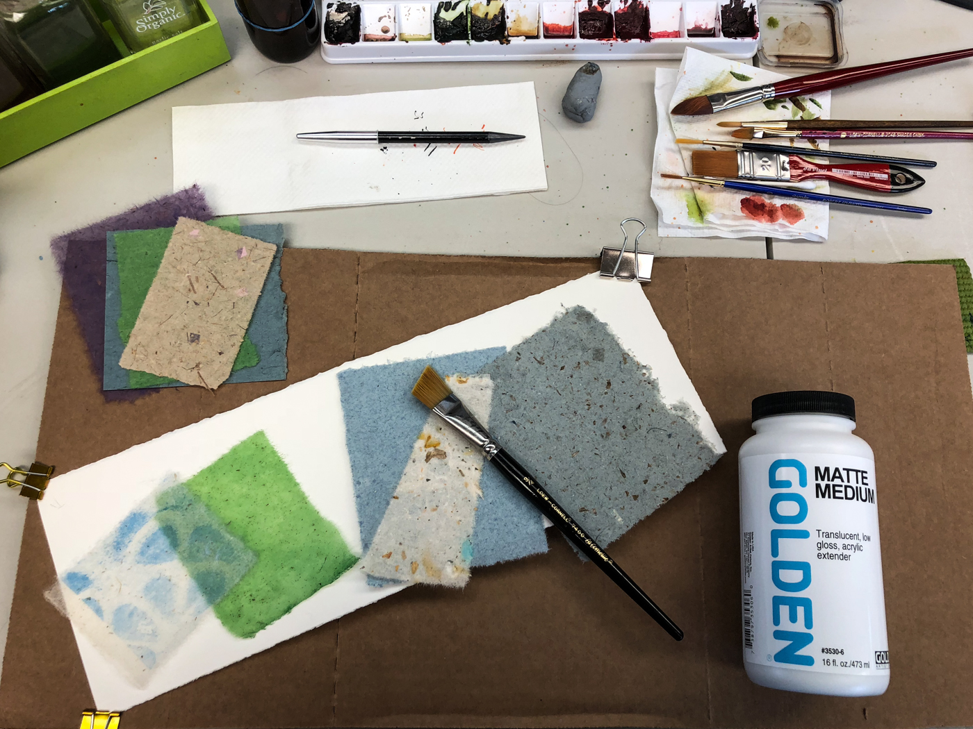
All the materials i need are laid out, above.
Some of the papers are my handmade papers, some are bought from India and Bali.

Clip the edges of the journal area you want to collage.

I get a feel for what I want to use and tear or cut the shapes and lay them out before I begin layering with medium.  I use nothing but Golden acrylic products.  ALWAYS.

Use an inexpensive brush and clean it thoroughly after use.
If you are using an older watercolor brush you no longer want,
make sure there is no watercolor residue left in the brush.

I wet the panel lightly before I begin.
Do NOT get the tissue-like paper wet, but place it on the slightly damp journal paper
in the position you want it permanently, starting with the bottom layer first.
Using the acrylic medium on a WET brush, apply the medium to
the colored paper on one edge, and begin brushing it over.
The entire surface must be wet with medium, but not thickly.
You can wait if you like, or continue layering while the first is wet.

When you’ve completed, keep the pages clipped in place for a couple of hours to dry.

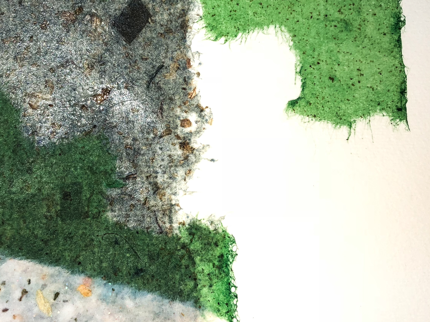
I like to feather the natural tendrils of paper out and let them read, which is more organic and suits my style.  if they are not the edge of the handmade paper, you can get those edges by wetting before tearing.
You can also use cut shapes, etc.
You must use waterproof ink on top of acrylic medium and let it thoroughly dry before touching. Wait. Then wait longer!


Finally, when it is basically dry, I release and fold it so the
layered papers wrap the edges, not fold into them as shown above.
I clip and let it sit for the day before I pack it away, letting the layers
of acrylic medium cure and helping to flatten the journal edges out!

To hear about classes, follow me on Facebook
or check out my new, improved dkatiepowellart.com

Posted in art journal, collage, creativity, handmade paper, journal, paper, process, sketchbook | Tagged , , , , , , , | 2 Comments

VSW: Florida Trailer Park 2


This sketchwalk of trailer parks in Florida,
some of which are now gone, was so much fun to draw!

I had so little time but kept coming back, and sketching fast sketches , here adding shadow with diluted Lexington Grey (waterproof) ink, then finally watercolor.


In this I combined two photos and imaginal plastic flamingo
murder storyline to make my sketch!
*no flamingos were harmed to make this sketch*

If you want to join a virtual sketchwalk,
all from pictures, come join us!

To hear about classes, follow me on Facebook
or check out my new, improved dkatiepowellart.com

Posted in animals, architecture, art journal, challenge, ink painting, pen & ink, sketchcrawl, virtual sketching, watercolor | Tagged , , , , , , , , , , , , , | 9 Comments

Hahnemühle DS Art Journal: Last Look Back


I finished my Hahnemühle D & S Sketchbook
and am well into my new Nostalgie journal;
this is a rambling last look back, at the things I had no time to post that I can share. Sometimes I can’t share, mostly because it involves someone else and
I don’t feel comfortable sharing that person’s story, and occasionally mine too.

I love raw writing, LOVE autobiography, and
am willing to share the juicy scary bits many won’t share.

I may be busy, but busy usually means that I don’t have time
to process the images to share with you…
It never means I am not journaling, writing about our life,
and sketches go hand-in-hand with that…

A cross page spread, I sketched the fiery smoke-filled skies
several times this summer.  It was a dominant part of our life in Portland.

Summertime is ending, and with that goes the summer fruits…
I like apples, but I LOVE the summer berries and peaches and nectarines and melons.
I am going to miss them terribly!

On various pen and ink or watercolor groups, I’ve noticed more people asking how to keep a journal, what to write in their journal, how not to mess up a journal, sharing how they do all these practicing sketches outside their journal! It is all about their FEAR of screwing up a finished product… their journal is their
finished product! It freezes them!
My journal is not my finished product, and I suspect that the peeps who show you magnificent journals of amazing perfected sketches aren’t showing you their thinking journals!

Besides, if you freeze every time you have an
Important Project you stifle all creativity anywho…
*that should be a word so i leave it*
best just get on with it and let the screwups be part of the handmade or redo it.
Life’s a learning thing.

I used to teach creative blocks and practices that move you through to stream of consciousness and easy comfortable writing… It may mean that sometimes incorrect spellings are inserted or tenses change, but all that is okay —
like my journal entry above.  I am going to teach again, but online.

My journal is for personal inquiry, reflection, ideas for paintings,
bits of ideas for a book I am writing, funny stories,
insecurities (such as regarding the painting of George Washington above), fears,
crappy politics, working through anger when necessary.
I have some beautiful drawings, and lots of screwy sketches some of which
I can’t decipher, like the times you were loaded in college
and wrote heavy thoughts which later were nonsense!

Here is the wrap up of strange endings from my last journal,
and a promise that soon I will have a class or group to work on easing into total comfort — or at least getting over that fear-stopping-hump of what-if-I-mess-up, for all of you.
I will post less, I think, b ut .

So I want to know,
what questions do you want to explore
about keeping a journal?

To hear about classes, follow me on Facebook
or check out my new, improved dkatiepowellart.com

Posted in art journal, color, creativity, drawing, journal, memory, painting, process, ritual, sketchbook, watercolor | Tagged , , , , , , , , , , , , , , , , , , , | 13 Comments

Giveaway: Hahnemühle YouTangle for Inktober!

I have one regret…
I didn’t find Hahnemühle’s YouTangle.art tins
before last year’s Inktober! (see bottom for video!)

I know why… I’m not a zen-tangling person so I would not be looking.
But I doodle, and these are great for that!

Included in in the Hahnemühle Giveaway are:

1 tin Hahnemühle Inktober YouTangle.art cards +
6 extra cards so there are 31 cards for the Inktober Challenge
(yes that means that your tins were opened
but what a great thing to have enough cards for the month!)
AND
1 Jinhao Shark Fountain Pen (from me! chomp chomp!) with
De Atramentis Document ink sample (waterproof ink!)

This means if you have never used a fountain pen I can convert you!
If you have, this is a totally fun good working pen!
It will bring out the kid who likes to draw!

I want the giveaway to end so the tins can be mailed in time for Inktober!
Four lucky USA peeps only (sorry friends everywhere else!!)

To enter, comment “I want to WIN!” below in this post!
Drawing will be held 10th September!

Thanking Hahnemühle for their generosity in this giveaway!

They are lovely for use with fountain pens,
and all types of micron and zebra and gelly pens.
The smooth bright white paper shows off pen and ink!
Colored Pitt pens and Tombow pens worked wonderfully on the paper.

Wet mediums also work,
but I like to pin my corners
when using wet medium on any
thinner stock.  I tried traditional watercolor but it didn’t love
the paper, and ended up a bit
washed out (probably sizing issues).
*i didn’t think that would work!*
I tried liquid watercolors and inks
in a waterbrush, and they worked
better — maybe the even delivery
of saturated color?  This was how
I added color in middle-of-the-night Inktober drawings last year.

*oooooh, then there is the tin… i popped 15 full pans in the tin…
did i say i loved to make home-made tin palettes?*

 To hear about classes, follow me on Facebook
or check out my new, improved dkatiepowellart.com

Posted in cards, creativity, drawing, ink painting, pastel, pen & ink, pencil, review, writing | Tagged , , , , , , , , , , , , , , , | 73 Comments

Sketchpack Project 2018: Pen and Ink, Week 4

This year’s theme: Pen & Ink

This year my Sketchpack is to be all inked drawings
with a bit of water to move ink color. 

I almost passed on Di’s challenge but I always have a good time!
Making it simple, and all about the ink, the mark, and water.
MOST are 10-30 minutes; if it took longer it was waiting for ink to dry.
A little watercolor pencil or graphite pencil on in the end…
aw, sue me!

I dipped into Mitchell’s stash for this one….
 
The platinum bottles are so cute, squatty bodies,
and a plastic insert that allows you to
easily fill the pens.  Cool…

I love Monteverde inks, but booooring bottles…


Whoops, that is not a pen!
Nope, Fred-for-now (what we are calling him for now)
came to live with us on the Full Moon and
upset my flow!  This is my first image of him…

OOOH, a new ink for me, and wow a great company.
Akkerman has the coolest bottle ever, very retro-chic!
the big marble stops ink up top to allow an easy fill.
I have several more samples and
will buy more ink from this company!

Days 25 and beyond of Sketching Pens!
The End.  To see all the images
altogether on one page go here!

Until next year!


.

Past years: 2015: MPF Conservation,
2016: My Practice….

   ABOUT SKETCHPACK PROJECT: The project began in 2011 to get folks to draw daily. The sketchpack is a small zigzag journal with two usable sides, allowing one to sketch on both sides of 15 ‘pages’ to complete the month of August. There was much enthusiasm and the project is now repeated yearly in August, with a Facebook page for us to share as we go along.  (The page is closed for viewing but you can join to play along!)
There is an Exhibition held in October at the Artsauce Studio in
Observatory,
Cape Town, South Africa of mostly local Sketchpacks!

w15 sketchpack openingDrawn on Pentallic folding journal
with pen and ink as named daily + water.

 ©D. Katie Powell.
My images/blog posts may be reposted; please link back  to dkatiepowellart.

Posted in animals, art journal, calligraphy, ink painting, journal, pen & ink, tools | Tagged , , , , , , , , , , , , , , , , , , , , , , , , , | 2 Comments