
Traffic has a few good points…


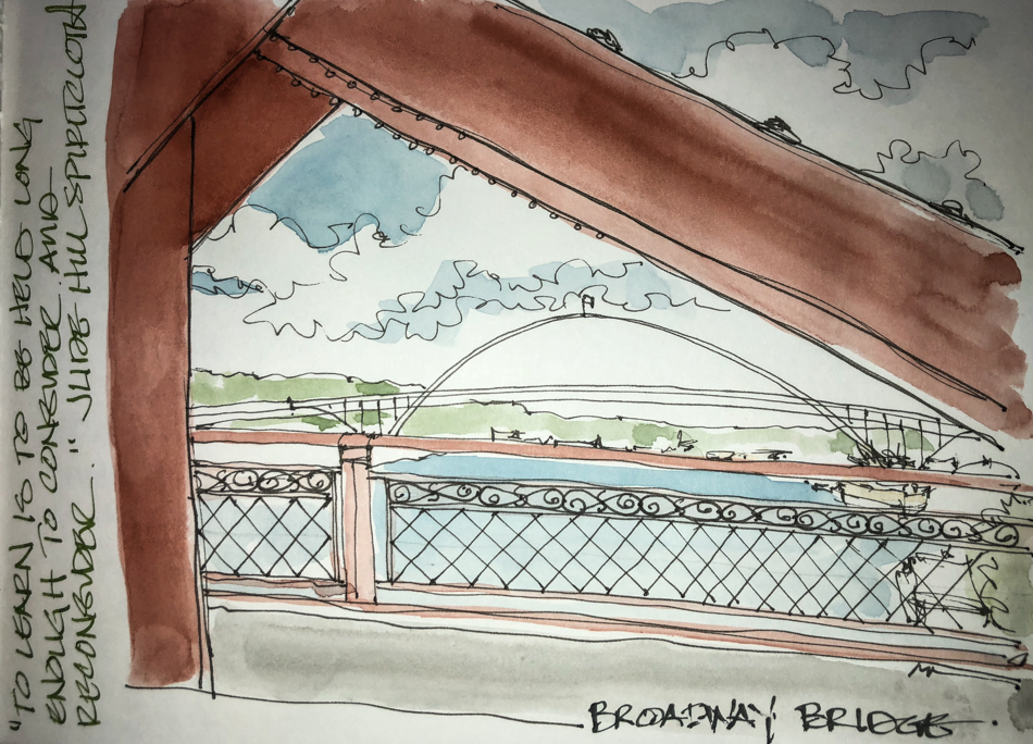
I added watercolor later, and after I bought a couple of new colors.
I swear I am never ever going to be seduced by a Daniel Smith color name again.
“Burgundy Yellow Ochre”??? I am an idiot… It is just plain old Ochre.
They are excellent at selling old colors under new branding and I was filling out
an order and did not go in to check the Munsell stats. Idiot!
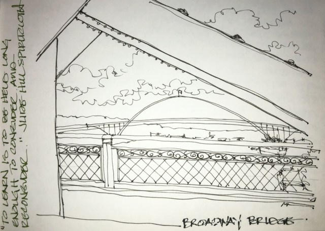
The Permanent Brown is fine, and the right color for the steel bridges in Portland…
I don’t buy many browns other than Primateks…
BUT, it doesn’t move well in my Nostalgie Journal… streaky. Odd.
We will see if it was an off moment as there are other bridges to be painted.
 To hear about classes, follow me on Facebook
or check out my new, improved dkatiepowellart.com
“Memory is more indelible than ink.”
Anita Loos, Gentlemen Prefer Blondes.
“I think not….”
Me… why I journal!


©D. Katie Powell.
My images/blog posts may be reposted; please link back to dkatiepowellart.
☾
 As my Patreon supporter, you will have
access to some content not on this website,
sneak previews, goodies, discounts on classes.
I teach architectural sketching,
art journaling (art+writing), creativity, watercolors.
That annoying loud-mouth editor/critic in your head? GONE! How great would that be?.


How well I remember crossing this bridge each morning! Nice work.
LikeLike
I like this bridge and we take a a lot! Thanks!
LikeLike
But you do like DS paints…..aside from the silly names?
LikeLike
I am disappointed in them as they’ve changed. The tube of permanent brown is full of air. Air gets into tubes when there is a poorly run mechanized setup. I think I got it al out but that is not good. I’e had tubes come with separation. This never used to happen. So i am using Da Vinci and Holbein as I find them and seeing how I feel about the DS I buy…
LikeLike