Tools: A Black and White Palette

I don’t use black, white or grey
often — or metallics.  The exception
is Daniel Smith’s Hematite, right, which I love to mix with earth
tones in city sketches.  It is too
easy to mix a color without black or grey, so I don’t want it taking up space in my travel palette.

Metallics are most often used
in studio — a little bit here and there, and mostly on deity images.

I made a small palette of these
colors, approximately 2.5×4 inches —  to take along on longer trips.

Magnatite and Shungite are made by Greenleaf & Blueberry.
The slate grey is made by Schminke.
White gouache by M.Graham.
I have a strange gold paint that works — and the rest are by Daniel Smith.

I love having two amazing metallic inks —
I use them with dip pens on painting — both by Robert Oster.


“Be Happy!  It drives people crazy!” 
~ Thomas Blanchard

To hear about classes, follow me on Facebook
or check out my new, improved dkatiepowellart.com

Posted in art journal, color, creativity, ink painting, painting, pen & ink, process, tools, watercolor | Tagged , , , , , , , | Leave a comment

VSW: Egypt, 2 Mosque of Ahmad ibn Tulun


View of the Mosque of Ahmad ibn TulunM
from a photo by Evalyn Baker.
 

Mostly inks, Taccia Kuro and Birmingham Horus Wagner Infield Brown.
The inks moved into each other and did all kind of strange separations in the shadow.
Sketched over the top with Platinum Carbon Pen with Platinum Carbon ink.

Amazing what framing an image can do…

From an image by Evalyn Baker.
If you’d like to take our virtual sketchwalks the images are posted
in this closed facebook group — come join us!

To hear about classes, follow me on Facebook
or check out my new, improved dkatiepowellart.com

Posted in architecture, art journal, creativity, drawing, ink painting, journal, landscape, pen & ink, sketchbook, virtual sketching, watercolor | Tagged , , , , , , , , , , , , , , | Leave a comment

USK: Sky at New Seasons Cedar Hills


Mitchell went to the dentist and I sat and had coffee
at New Seasons before shopping.  The sky was talking to me:
the calm before the downpour!

I am sad about Birmingham not making Tarnished Nickel ink any more
and want them to try to reproduce it.  It is a favorite grey!
They are discontinuing all their old inks because they are starting
a new line of inks made from scratch… on the other hand,
I know Nick and Josh will make amazing inks in this next phase!

To hear about classes, follow me on Facebook
or check out my new, improved dkatiepowellart.com

Posted in art journal, journal, memory, pen & ink, sketchbook, urban sketchers | Tagged , , , , , , , , , , , , , | 2 Comments

Inky Thots: Robert Oster Sterling Silver!


I’ve been asking Robert Oster to pleeeeze make a lovely silver…
I am not a gold gurl, not even a glitter gurl,
but I am a silver gurl… while I love Robert’s Heart of Gold (below)
(and it is one of Mitchell’s favorites) I wanted silver… Drumroll…

Introducing Robert Oster
Shake N’ Shimmy Sterling Silver!

(With and without flash so you can see the glitteries!)

I see a universe in this ink!

Swooning!

I have in my hands a
lovely bottle and am just starting to play… I had to give you all a preview.

Yes, it appears to be all the things you expect from
Robert Oster inks —
well behaved, doesn’t feather, nice flow!  Then there are
the lovely colors that
emanate from this
glitter ink when it is
hit with water… It is a deep charcoal grey with turquoise
and emerald and purple!

Yes, there are other new inks to talk about:
Go-Go and Taiwan Blue and Australian Opal
are also new, some are selling at Vanness!

To hear about classes, follow me on Facebook
or check out my new, improved dkatiepowellart.com

Posted in art journal, ink painting, journal, painting, pen & ink, review, sketchbook, writing | Tagged , , , , , , , , , | 7 Comments

Lojong 46: The Three Causes

I’ve studied through the slogans a dozen times in my life;
these are my musings on the slogan currently, what comes up on the day that
I am posting the slogan,
not a formal interpretation.
For that reason they are less about straight Buddhist teachings,
and I think able to be shared with most practitioners of other faiths or no faith
(unless yours doesn’t allow you to read any other tradition.)
If you have time and the inclination, I published the WHOLE  thang here!


#45: Take on the three principal causes.

I used to draw this card randomly for weeks from my slogan cards.  Drove me crazy because I did not get the translation.  Finally I abandoned the translation “causes”.

I get it.

This slogan is about setting an environment ripe for the dharma.

  1. Get a good teacher.  This one can be complicated.  There are bad teachers
    in every walk of life, so for me, this is connected to
    Maisumi Roshi’s statement, “Put no mind before your own.”
    Trust your instinct and don’t be led on by an abusive teacher or charlatan.
    A good teacher may also come in the form of a spiritual friend
    who is telling you that you are being an ass.
  2. Apply heart and mind to the dharma.
  3. Take care of the practical aspects of life efficiently and with
    an attitude of responsibility, doing the best job you can.  It is more likely
    that you can apply yourself if you are not homeless and hungry.

I think a lot of people are following false teachers today, more than ever.
Many religions are being corrupted for greed, because truthfully,
“dharma” or truthful spiritual teachings can be found in many traditions.
I had a good grounding with compassionate Catholic teachings.
But today, people have lost their way… for greed.

It is disheartening.

In this weekly commentary on the lojong, I am interested in hearing about
YOUR life or how the lojong affected you or your practice awakening in some manner.
For more info about why, go here.

 OE or OKINA NOTEBOOKS (my favorite journals, also known as Cadic)

Okina Journal, with TWSBI Eco 1.1  — started with Robert Oster Aussie Brown ink
and switched the ink to Robert Oster Golden Brown ink before I started writing.
Note: As an Amazon Associate I earn from qualifying purchases.

Posted in art, Buddha, journal, lojong, meditation, pen & ink, ritual, tonglen, watercolor | Tagged , , , , , , , , , , , | 3 Comments

Happy New Year of the Metal Rat!

YEAR OF THE METAL RAT!

New decade, and the beginning of the Chinese Zodiac!
Ink painting and notes in my new Hahnemühle 1584 Journal!

To hear about classes, follow me on Facebook
or check out my new, improved dkatiepowellart.com

Posted in art journal, creativity, drawing, ink painting, journal, painting, pen & ink, process, sketchbook, watercolor, writing | Tagged , , , , , , , , , , | Leave a comment

Purple Gurl


The holidays brought new inks (not that I need an excuse.)
A couple were gifts to me, and a couple were gifts to Mitchell
(he goes for shimmers and glitters, and I should have predicted this,
because he is also a tassel man!)

Of the lovely new colors below (and I have another couple pages coming)
I want to talk about the purple smack dab center!

I didn’t know I was a purple lover, but if you saw the inks I buy most (other than my workhorse waterproofs) they are mostly grey, green, and purple!
And I thought I’d found the absolutely only purple a gurl could ever want by Robert Oster,
Bishop to King, then at Christmas bought a second by him, Cosmic Swirl.

Omigoddess, I’ve become a purple gurl!


Obviously, they are both gorgeous.
Bishop to King (right above) has a much more blue-purple presence; when hit with water separates into beautiful blues and even turquoise.
Cosmic Swirl is an lovely sheening ink that is just a drench of pure purple.
Heaven in a box… seriously, these two colors are the colors of the heavens!

Below, on the occasion of the first full “Wolf” moon of the decade,
I painted a lovely full moon in Cosmic Swirl, and
said I imagined a world without the crap that is going on now.
We can do so much better.

Above, Full Wolf Moon (left) in Cosmic Swirl; Buddha in Bishop to King, right.

BTW, I realized I was becoming a purple gurl because even in Robert Oster,
I have several other smokey moody purples, below.

Do you know the difference
between purple and violet?

I always think of violet as being on the blue end of purple…
Purple being that balanced mix of red and blue, a purr-fect secondary color.

To hear about classes, follow me on Instagram, Facebook
or check out my new, improved dkatiepowellart.com

Posted in art journal, creativity, drawing, ink painting, journal, painting, pen & ink, process, sketchbook, writing | Tagged , , , , , , , , , , , , , , | Leave a comment

Dingbats Journal, Review


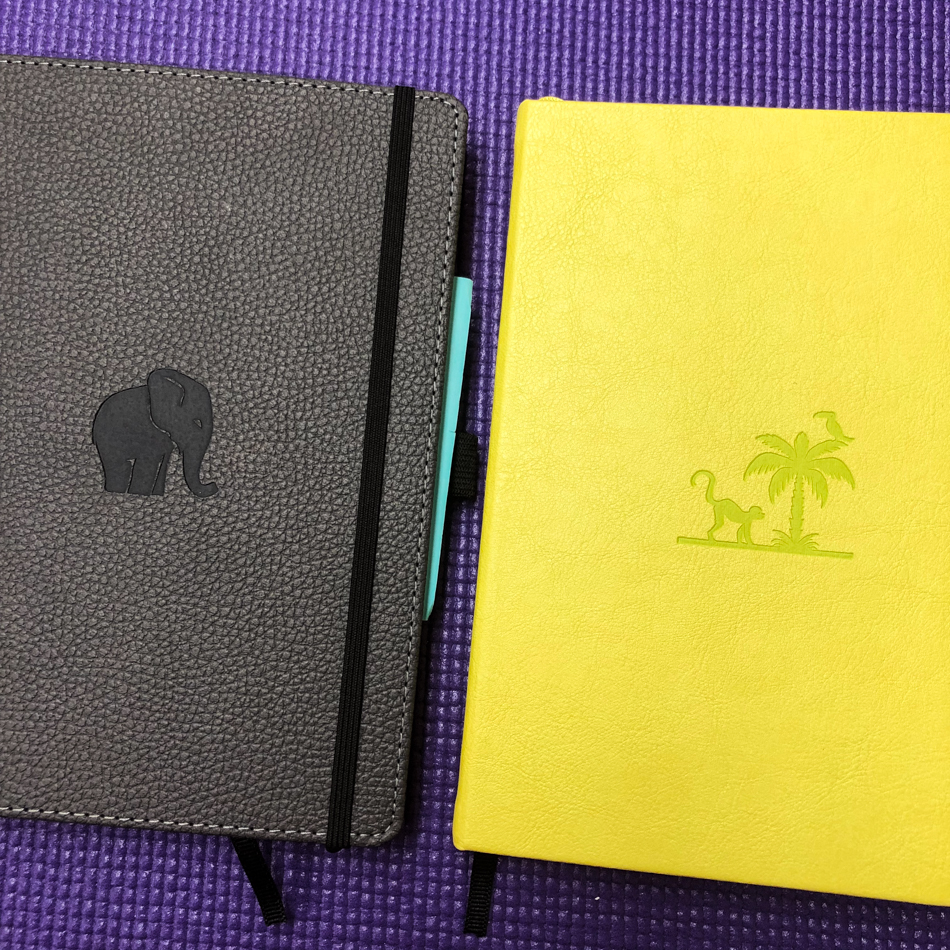
I have tried three of Dingbat’s journals, two of the Wildlife and one of the Earth series, left and right, above.  A huge reason I chose them over others was their commitment to the environment, and their pretty covers.

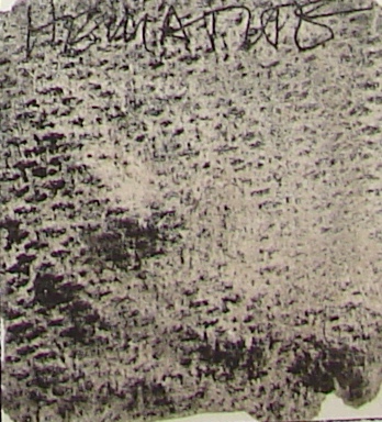
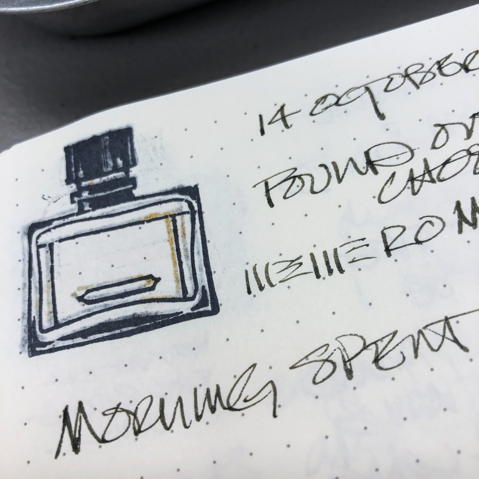
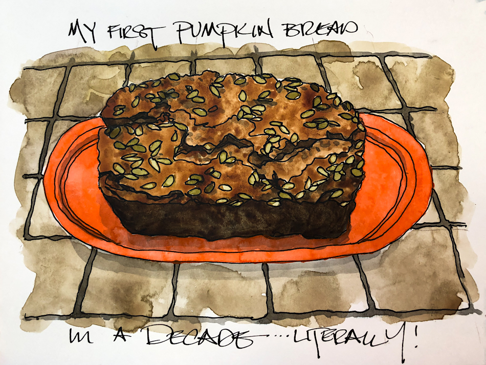
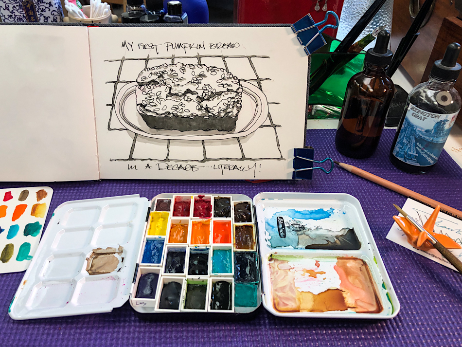
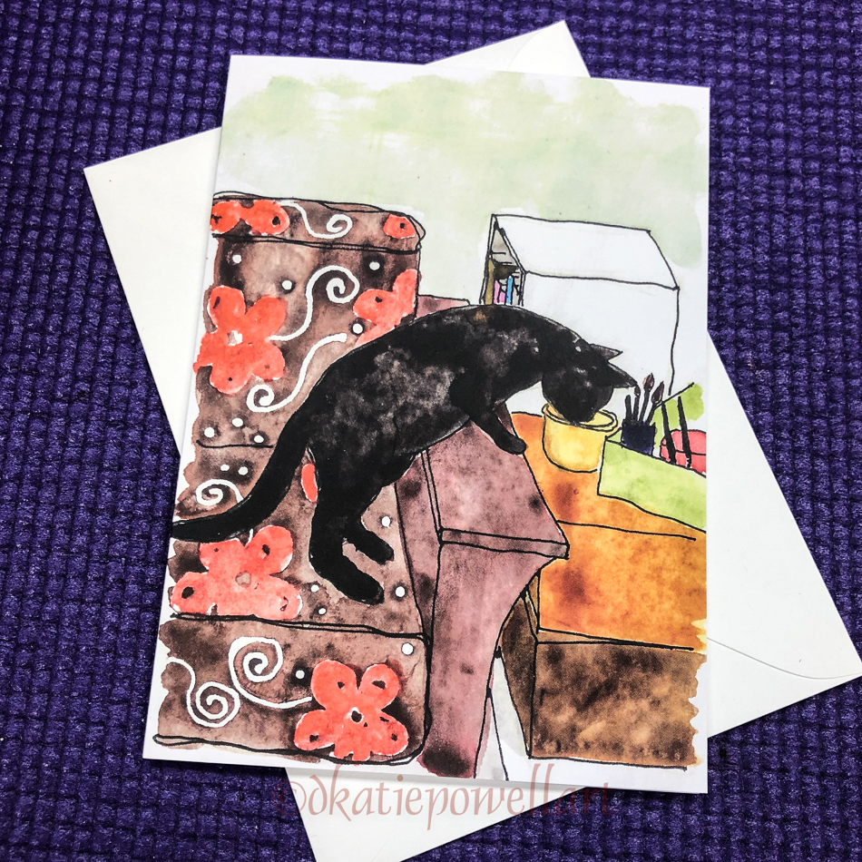
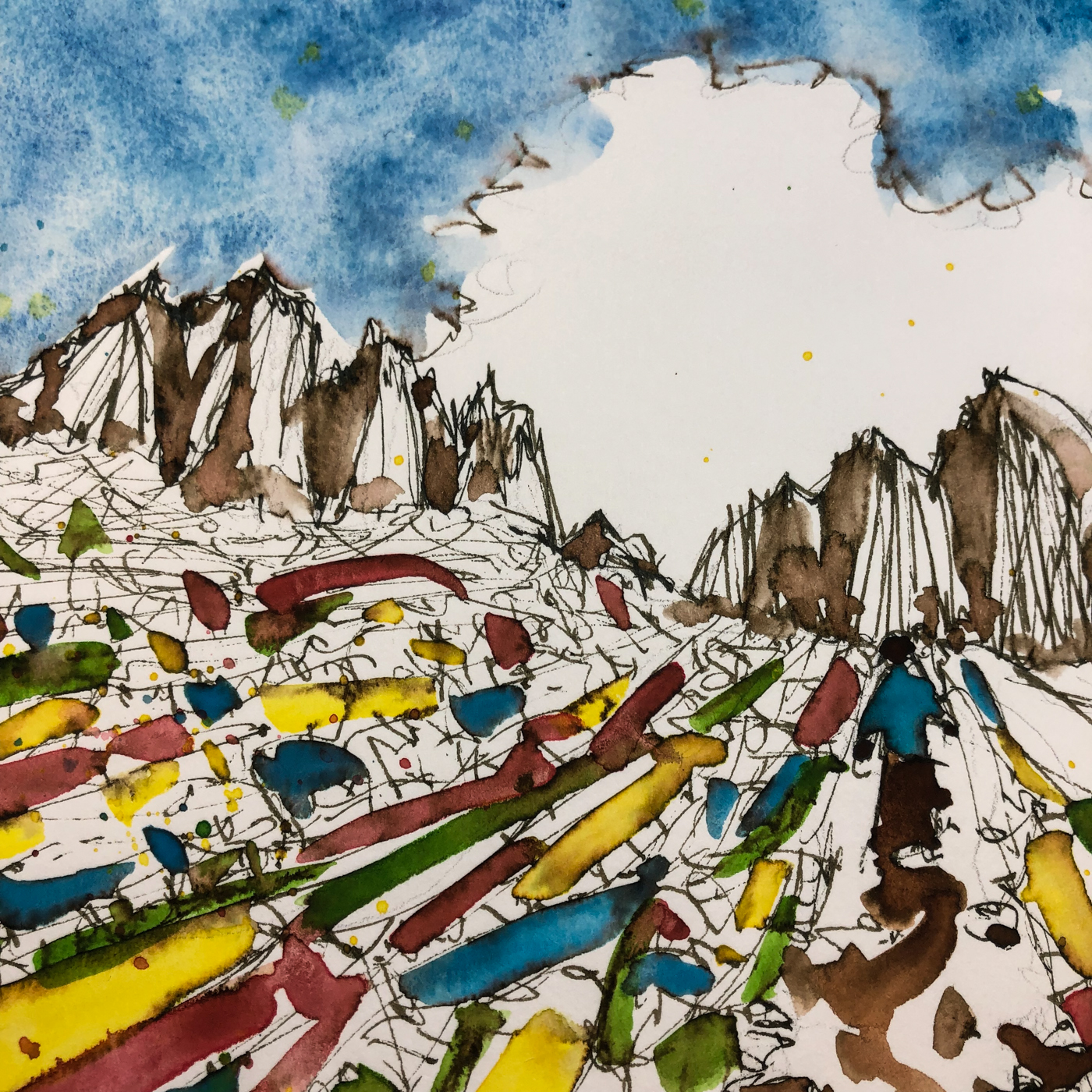
I used the elephant journal and had no issues — a really good journal.  I gave Mitchell the orange Tiger Wildlife journal; he is still enjoying it. The Wildlife paper was sturdy — light ghosting (like everyone’s), and bleed when I pushed it but then the paper is not meant to do the things I throw at it.  While the stamp I use bleeds through on ALL journals, you can see almost no bleed, right, even when I painted the ink bottle in on the other side. That is pretty good paper!

When I finished the elephant journal I moved to the monkey journal, the Earth series.
I was sorry I hadn’t paid closer attention when ordering, because
the paper was ivory
(I like to see the ink colors on white)
and the pages are all set up, numbered for indexing, etc.
I know many will like that, and it wasn’t a deal breaker for me…
I just figured next time I would make sure to buy the Wildlife series.

Then, literally the first day using it, the ribbon markers came off.
I actually use them, so that was a bummer.

But the worst was the quality of the paper.
Pen and ink combos used in the elephant journal feathered in the Wildlife journal; anything thicker than a medium fountain pen bled.
Unhappy, I contacted Dingbats to tell them and ask why the change.
The dialogue didn’t go well… I sent images, asking about
the change in the quality (I didn’t want to order more with these issues).
Mo asked me lots of questions, admitting there had been some issues.
He said he would send me a replacement, and kept asking me more and more questions.
I mean, if I sent pics, then that should do the trick (I sent many).
And I would have removed my journal pages if he had wanted to have it back
— and paid for the shipping back — but instead it was just more questions until
after a couple of days I had had enough.  They knew the paper had issues —
he’d said that in on the first email.  I finally pulled the plug on the back and forth.
I was never going to buy another Dingbat.  And I never got a replacement.

But I would not have written a bad review… figuring two out of three journals were okay.
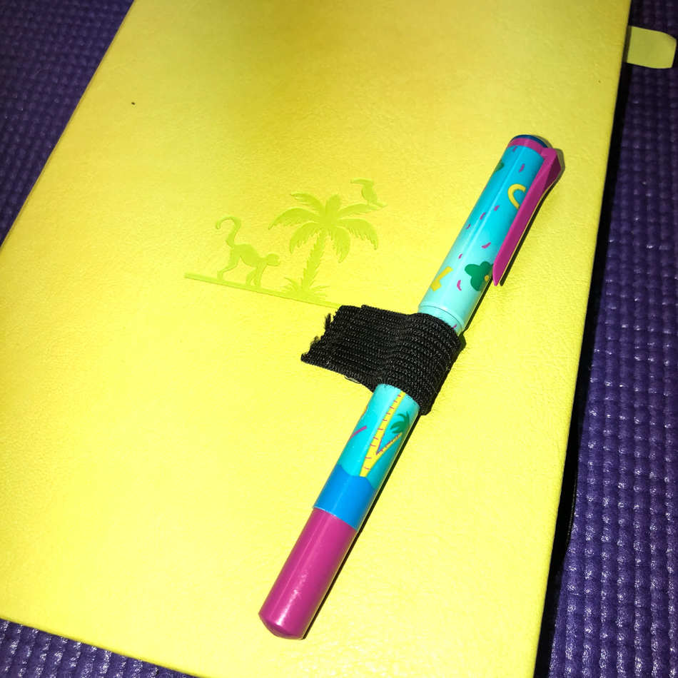
Then less than three weeks and the pen holder came off, right.  I mean really, every time I opened the dang thing
I was annoyed. I don’t like reviewers who say bad things about a company but never contact the company.  I had.  The memory of the interaction plus everything else left using the journal an unpleasurable experience. Juggling Post-its to show where I was writing… constant bleed through.

Then they came out with their version of plastic disposable marker pens
That was the last straw.
How can you say you are a company that is interested in the
environment and critters, and then go out of your way to make
PLASTIC pens that will end up in landfills and in the waters,
where they harm the critters you say you want to protect?
I wrote them again.  (BTW, me writing a company is not unusual… I now write many companies to ask them to rethink their choices.  I am working for the environment.)
This was their response (my bolding emphasis):

“Indeed we always celebrate ourselves by being one of the very few environmentally conscious brands available in the world today. Regarding the pens, we are actually the only brand looking into producing this type of dual tips pens made from 100% recycled post consumer waste plastic or 100% biodegradable plastic. In the meantime, we have done an interaction to the line of pens using a very small batch to get as much feedback from the market as possible about the quality and at the same time we have made them using #5 plastic.  #5 plastic can normally be recycled in local curbside programs; else, mail in programs are also gaining popularity such as Preserve and you can find some more from below online resources (edited out by me, not shown):

#5 plastic can be recycled into: signal lights, battery cables, brooms, brushes, auto battery cases, ice scrapers, landscape borders, bicycle racks, rakes, bins, pallets, trays.

In addition, the boxes the pens come in are made from post consumer waste so from 100% recycled materials to reduce the footprint as much as possible in this test.

Hopefully we will figure out the way to produce the pens using recycled or biodegradable plastic and we the first ones to do so!”

So it is a plastic pen made from recyclable plastic… and…
1) There are other environmentally conscious companies —
Hahnemuhle and Clairefontaine come to mind.  Both make journals.
2) The pens are not refillable.
3) They are making a non-biodegradable product that will quickly end up in the trash.  Trying to pretend that telling people they can send their plastic pens to
a special waste center is hypocritical.  FEW WILL DO THAT,
or even recycle them at all, so truth is, into the trash bucket!
4) Then there is the carbon footprint for shipping… give me a break.
5) Recycling plastic is also hard on the environment… in fact, much of what we send to recycling centers does not get used, even if it is the “right kind” of plastic.

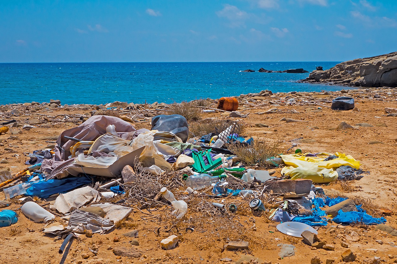
image by adege from pixabay

These pens will end up in landfills, floating on the waterways, washing up on land, ultimately harming the critters Dingbats wants to protect.

WHY IN THE WORLD WOULD A COMPANY THAT SAYS
THEY ARE DEDICATED TO THE ENVIRONMENT AND WILDLIFE
DECIDE TO MAKE A DISPOSABLE PLASTIC PEN?
Because they are only giving lip service to their “cause.”

I won’t buy from a company that doesn’t stand behind their products
and is hypocritical about their mission statement about the environment:
“We see a future in which humans live in harmony with nature and communities committed to protect wildlife, fresh waters, forests and oceans.”
They are putting profits (disposable plastic bits are profitable)
before their mission statement.  

I always finish journals… but using it is annoying the crap out of me.
I am tearing out the paper to use as scratchpads in the office and that is the end of that.  Moving on to my new “1584 by Hahnemühle” notebook, a pleasure.

To hear about classes, follow me on Facebook
or check out my new, improved dkatiepowellart.com

Posted in art journal, creativity, ink painting, journal, pen & ink, process, review, writing | Tagged , , , , , , , , , , , | Leave a comment

Pen Love

  
Who knew in 2015 I would
fall in love with fountain pens?

My sketch was of the beginnings of my pen obsession…
Done in a Moleskin and a Platinum Carbon Pen
with Platinum Carbon ink waterproof cartridges,
it helped me get to know every crevice of my pen collection.
I started with a beautiful baaaad pen… NOT drawn (I was glad to toss it!)
It was stinky and never wrote well, hard starts and I do not regret tossing it.
We don’t talk about that one….
Thankfully I bought a cheap Pilot Preppy pen from Goulet and turned it into
what they called an “eyedropper” which held so much ink!
When I placed my next order for the Platinum Carbon Pen I bought a Pilot Preppy pen
in every color, and all my waterproof colored inks had a home.

At the time I had yet to discover the world of gorgeous inks.
Inks were a means to an end, vegetables before dessert!
They secured my sketches before using watercolors.
I “painted” with the waterproof inks from Super5 and De Atramentis,
especially underpainting shadows, or grisaille.


When I wanted to make
my joyful pen sketch
colorful, I also used a few
of these waterproof inks,
namely Super5 Dublin ink
in Pentel Aquash waterbrushes
for the background, and
layering Platinum Carbon ink
for the blacks.
I augmented the inks
with watercolors.
Diving into my love affair
with inks was just
around the corner… So many inks, so little cash!

My card above, just in time for InCoWriMo
or International Correspondence Writing Month.

The full spread!

Pens shown in the image are: Lamy Al-Star, Jinhao 750 with Goulet 1.1 stub nib, Pilot Metropolitan, Platinum Carbon Pen, Pilot Preppy pen, and Pilot Parallel pen.

Announcing my new card line!

Cards can be bought singly, in multiples,
or as a package with the Morning Coffee images.
In time for International Correspondence Writing Month, or InCoWriMo.

Or visit RedBubble for the image printed on totes and tees and notebooks!
I use my own wirebound notebooks in the studio,
and they take fountain pens well enough, shown above tested with wet pens.

Yup, I am self promoting — gurls gotta make a living!
Please support a working artist!

To hear about classes, follow me on Instagram, Facebook
or check out my new, improved dkatiepowellart.com

Posted in art journal, calligraphy, cards, drawing, ink painting, journal, memory, painting, pen & ink, sketchbook, tools, watercolor, writing | Tagged , , , , , , , , , , , , , , , , , , , , , | 1 Comment

Lojong 44: Commit to real change

I’ve studied through the slogans a dozen times in my life;
these are my musings on the slogan currently, what comes up on the day that
I am posting the slogan,
not a formal interpretation.
For that reason they are less about straight Buddhist teachings,
and I think able to be shared with most practitioners of other faiths or no faith
(unless yours doesn’t allow you to read any other tradition.)
If you have time and the inclination, I published the WHOLE  thang here!


“#44: Train in the three difficulties.”

I found both Trungpa’s and Pema Chodron’s interpretations of this so hard to understand, and struggled with this slogan all the while working it without knowing it.
Literally years.
It helped when I finally looked up the meaning of the word klesha: mental poison.
Training the in the three difficulties is working to change your mental poisons.

It is simple to say and hard to do.

1) You reflect on the things that make you an ass in your life.
YOUR stuff, not their stuff.
Yes, they may have their stuff, likely do, LOTS of it, but this is not about them ever.

2) You vow to figure out how to get over it — How can I change this?
Go into therapy, notice that maybe you learned some bad patterns from your family,
stop drinking and work the Twelve Steps, or just stop some dumb damn behavior.
I can’t comment on your stuff because I am not you, but you know what it is.
Most of us start with the big stuff because it makes US uncomfortable…
But eventually you move to the small stuff.
For instance, you stop telling him/her what s/he did all wrong when
they surprise you by cleaning the kitchen.  You just stop.  Zip it.
Enjoy the gift, the win, and allow them to enjoy you being happy about it.
You begin to understand that it really doesn’t matter if it isn’t done the way
you “know” it has to be done — and you let go of being a control freak.
Yes, maybe later you might have to say something if it is REALLY important.
Don’t put metal in the microwave is an example.
But otherwise, zip it.  Watch how your lives change.
This is not easy.  It is a huge commitment on your part to chip away at the mental poisons.

3) Don’t set yourself up with situations that enforce your mental poisons.
Yes, sometimes that is just life in general, when everything goes wrong —
and then you get to practice you training.
But for many poisons, you can nip it in the bud.
Don’t buy the cake at the market (gotta lost weight?),
don’t walk into the bar (drinking makes you unbearable?),
don’t go home for Christmas (you always get into fights and maybe you are not ready for that yet?), leave your credit card at home (getting into trouble with addictive shopping?).
It is good not to tempt yourself or set yourself up until you are ready for it.
Or never.  Sometimes, you are never ready to confront some demons.

This all takes a deep commitment and there is a lot of failure along the path.
it is totally worth it to be able to look yourself in the mirror and not be the cause of pain.
Even if “they” never notice.
My family never noticed the changes.
But I am happier, and can release being the causation of pain.
I remember the feeling of watching a family fight that did not involve me at all…
I didn’t dip my toe into the fray, and while the fight still made me feel sad,
all that abandonment and lost possibility for shared joy,
I was glad not to be the center of the storm.

In this weekly commentary on the lojong, I am interested in hearing about
YOUR life or how the lojong affected you or your practice awakening in some manner.
For more info about why, go here.


 OE or OKINA NOTEBOOKS (my favorite journals, also known as Cadic)

Okina Journal, with pen and ink,
Note: As an Amazon Associate I earn from qualifying purchases.

Posted in art, Buddha, journal, lojong, meditation, pen & ink, ritual, tonglen, watercolor | Tagged , , , , , , , , , , | Leave a comment

SOSC: The Laundromat

I  journal mornings with stream of consciousness exercises,
and
participate in Linda Hill’s Stream of Consciousness Saturday  whenever I have time.  I write to a timer, 15-20 minutes, no editing except spelling, and of course I add my art!  You can join us!
Your prompt for  Stream of Consciousness Saturday is: “movie title.”
Take the title of the last movie you watched (just the title, not the premise of the movie), and base your post on that title. Have fun!

The Laundromat was the last movie we saw, amazing, sarcastic, timely, must see.
Okay got that out of the way.

Laundromat brought me quickly to doing laundry (of course)
but then that brought me to hanging laundry to dry.  We went through a stint in
Portland where we no longer had our own washing machine,
and so had to go to the laundromat with piles of dirty clothes.
I’ve always loved laundry day — it is a great job and is satisfying
when it is over, and unlike making beds, stays done for a good bit!
I hated going to a public laundromat because people are filthy.

Most of all, we hated the dryers, and so we brought it all home with us
and hung it everywhere!  On good days it hung outside — I love that,
and the smell of clean laundry that has hung in sunshine — and brought me to
memories of my grandma and mom (though she could not wait to have her own dryer) hanging laundry outside while I played in and out of sheets.

I saw a lovely photograph of a friends hanging laundry in Washington state
and did a little sketch of it, above.  That same friend bought my first watercolor,
near and dear to my heart, of prayer flags.  I have to tell you, that when people see the image I created of prayer flags hanging, tattered in the early morning light on our balcony, unless they were Buddhists, they always asked me why our laundry was so tattered!

For the rules, go to Linda’s blog;  feel free to join the fun!

Posted in art journal, creativity, journal, memory, pen & ink, sketchbook, writing | Tagged , , , , , , , , | 6 Comments

Lou Grant’s Messed With Pun’kin Bread


(Above sketch in inks with Lexington Grey diluted used for shadows.)

I was doing my own studio things and decided to surprise Mitchell with Pumpkin Bread.
I have many of my mom’s things in the studio — I just went through all her boxes —
and we are leaving many cooking things out so we don’t have to bring them
in when we want to prepare a party or lunches.  How nice!

This was an old recipe from Lou Grant out of Bon Appetit 11/1977,
one mom tore out and put into her favorite recipe books.
I began to think about what I wanted to do differently — I wa clearly going to mess with it.
As I thought to do this, I heard my mom loud and clear saying,
“Don’t mess with the baking recipes until you’ve tried it!”

Of course, now I know that it doesn’t make any difference
because I am not a good enough baker to know what I can change based
on how it feels and tastes in my mouth — I should say feels,
because my flavors are wonderful.  But I don’t bake often.

Anyway, I messed with it… doubled it — and heard mom saying that
“You can’t double all recipes”, but I thought that this one was probably okay.  It was!


This is the doubled recipe for
Lou Grant’s Messed With Pun’kin Bread

Preheat oven to 350 degrees; grease the two loaf pans with butter.

2/3 c softened butter
2 2/3 c brown (not white as it stated) sugar
Cream and set aside.

4 eggs, beaten
1/2 c water
1 1/2 c canned pumpkin (added 1/2 c to get 1 1/2)
In second mixing bowl, combine and set aside.
Add the creamed butter-sugar…

2 1/3 c All Purpose Flour (which it did not call for but I had that)
2 t baking soda
1 t salt (less salt in mine than called for, which was 1 1/2 t)
1 t baking powder
HEAPING t cinnamon (close to 2 t they called for 1)
HEAPING t powdered ginger (they did not call for at all)
1 t cloves — LEFT OUT!
Sift the dry ingredients together (don’t have mom’s sifter so didn’t) and add into the wet bowl at about  a heaping cup… my rules.  Stir well each time, duh.

1 1/2 c walnuts (doubled because everything is better with nuts; forgot to chop oh well)
1 1/2 c dried sweetened cranberries, they wanted less and raisins, but yum)
raw pumpkin seeds
Obviously add them walnuts and cranberries, stir!  Divide into the two loaves and sprinkle the tops with the raw pumpkin seeds.  They are so yummy… I grew up eating pepitas by the handful!  Bake 55-60 minutes.
I had to cook them in our small oven for the full 60 minutes.

They tell you to wait until the next day to slice and it also freezes well. HAHAHAHAHAAAAAA no way!
Maybe the second loaf will make it!

Izzee has just made a leap to being a non-biting snuggle cat…
for the longest time she constantly nibbled on everyone and everything!
Now she follows me around, getting underfoot, at desk, at computer, in the galley.
She helped, especially when it came out of the oven.
She smelled that bread and did a 180 and to see what that smell was!

In keeping with my sketch every dang day I used the image to sketch it.
The bread just went too fast; that’s a compliment to the cook!

To hear about classes, follow me on Instagram, Facebook
or check out my new, improved dkatiepowellart.com

Posted in art journal, creativity, drawing, ink painting, journal, memory, painting, pen & ink, process, recipe, sketchbook, watercolor, writing | Tagged , , , , , , , , , , , , | 4 Comments

Yamantaka and the Hairband

        
Yamantaka is THE most obsessive smart crazy cat…

He finds toys in everyday objects like no cat that has ever owned me…
He brings them to both of us for inspection which is good when it is dangerous.
Yup, dangerous.  He once found a stray pin!


One of the ways we keep him from getting in actual trouble is to give him something he can have, and tell him he can’t have it….  “This is NOT for you… You stay away from this Yamantaka!”  He understands words and when I work my magic around that-which-he-can’t-have he knows this is special and not for him and contrary cat goes for it the minute we step out of sight.

(One of my cards (Etsy)
is a capture of him and the yellow bowl of hairbands.)


Then he brings them to me.
If I don’t pay attention he wraps himself around my foot and nibbles
and scratches until I pick it up and…


ZING! It flies into the pile of paper they all love to play in!

The full spread!

Announcing my new card line!

I am available for commissioned pet portraits.

To hear about classes, follow me on Instagram, Facebook
or check out my new, improved dkatiepowellart.com

Posted in animals, art journal, ink painting, journal, memory, painting, pen & ink, sketchbook, watercolor, writing | Tagged , , , , , , , , , , , , , , , , , , , , , , , , , , , , | 2 Comments

Tools: The Saga of the M.Graham Palette


A gift of credit at Merriartist left me with $$$ to spend on watercolors…
I’ve had a few M.Graham paints and enjoyed them, but my experience was they often didn’t dry in the pans, probably because of the moist climate of Portland and
the honey which they use as a medium.  I decided I’d splurge and create a
by-the-bedside set where I didn’t have to worry about pans drying for transport.

I filled full-size pans, and put them in a Medeen tin.
The palette, above, filled with M.Graham, along with 5 Daniel Smith Primateks;
I use them frequently in painting and love how they mix with transparent colors.
All M.Graham watercolors unless stated otherwise, and transparent colors unless
I state (SO = semi opaque) or (O = opaque), not my preference:
Top Row: Sap Green, Hooker’s Green, Cobalt Turquoise (O), Manganese Blue Hue, Ultramarine, Cobalt violet (SO), Scarlet Pyrrol, Azo Orange, Nickel Quinacridone Gold, Transparent Orange Oxide, Piemonite (Primatek).
Bottom row: Olive Green, Green Apatite (Primatek),
Blue Apatite (Primatek), Prussian Blue, Anthraquinone Blue, Quinacridone Rose,
Azo Yellow (SO), Indian Yellow, Raw Umber, Hematitie (Primatek).

The only M.Graham watercolor I did not put
into my palette was Mineral Violet,
which I bought thinking it might be like a
Primatek.  It is a chalky color of no use to me!

I tucked into a bookcase near my bedside to dry.  Coincidentally I smelled fetid water and had headaches, so on summer nights, we closed the windows thinking it was coming from outdoors!

NOPE!  It was the paints!

I took them to the studio the smell followed me there!
Yeow, strong fetid smell!  Had they gone bad?
It does happen — once I had a bad batch of paint from Daniel Smith.

The original owners sold M.Graham and getting to talk to the new owners
took several days, but when I did Elke told me she doubted it was bad paint…
She herself has trouble with some M.Graham paints when they are fresh from the tube.
She suggested I let them thoroughly dry and then see if the smell lingered,
or the headaches continued — and also, to use distilled water with them when rewetting.
I find the latter a bit much and if I had to do this would not buy them — that’s just me.

28 days in, and the pans were as dry as they will get in my area.
They still smelled STRONG.  The headaches were bad and last for hours!
Elke from M.Graham suggested I isolate the paints to see which ones,
and they were willing to reimburse Merriartist for any returns.

I pulled the following pigments out of my palette I became headache free…
Sap Green, Olive, Hookers Green (*so in essence all the greens from MG*), Anthraquinone Blue, Cobalt Violet (*sob, so beautiful!*),
Raw Umber
and Transparent Orange Oxide (*sob, lovely transparent oxide!*)

I purchased Olive from Holbein (I wanted to try this mixed green in my palette),
and Cobalt Violet and Transparent Orange Oxide from Daniel Smith.

I can still recommend M.Graham paints, as they are lovely deep pigments,
but as I have never had a reaction to any other pigment in any other brand I advise trying them one by one!  I am not typically bothered by smells though I do have allergies to
a couple of molds, but according to M.Graham they had no recalls.

I often hear about peeps not being happy with product, but they don’t say
anything to the vendor or manufacturer.  It took me calling several times, but I strongly advise you to do so.  It may be bad product.  It may be something else.
In this case, seven 15ml paint tubes was a huge amount of $$$ for me to lose!


Now I have a second by-the-bed palette in a smaller Schminke palette.
All my M.Graham pigments plus a few other colors I have not played with much…
The paints which are not labeled are M.Graham:
1) Emerald (Jasper Stardust), Olive (Holbein), Green Apatite (Daniel Smith Primatek),
Blue Apatite (Daniel Smith Primatek), Manganese Blue Hue,
2) **Phthalo Green (gift from Thomas Blanchard, RIP), Cobalt Turquoise (O),
Prussian Blue, Ultramarine, Cobalt violet (DS),
3) Nickel Quinacridone Gold, Scarlet Pyrrol, Azo Orange, Indian Yellow, Azo Yellow,
4) Transparent Orange Oxide (DS), Raw Umber (DS), Quinacridone Rose, Quinacridone Red, Potter’s Pink (to try, a gift, for mixing skin pigments… horrid mauve… we’ll see.)

To hear about classes, follow me on Facebook
or check out my new, improved dkatiepowellart.com

Posted in art journal, color, creativity, drawing, journal, painting, process, sketchbook, watercolor, writing | Tagged , , , , , , , , , , , | 10 Comments

Lojong 43: Observe these even at the risk of your life, part 2

I’ve studied through the slogans a dozen times in my life;
these are my musings on the slogan currently, what comes up on the day that
I am posting the slogan,
not a formal interpretation.
For that reason they are less about straight Buddhist teachings,
and I think able to be shared with most practitioners of other faiths or no faith
(unless yours doesn’t allow you to read any other tradition.)
If you have time and the inclination, I published the WHOLE  thang here!


Continued from last week: Lojong 43 part 1.

“#43: Observe these even at the risk of your life.”

Because of my lack of physical teachers or community early on (I was book learned for years before finding a teacher), I don’t resonate completely with the Refuge Vow:
“I take refuge in the three jewels: the Buddha, the Dharma, and the Sangha.”
Especially as most apply it to taking refuge in a given teachers, and don’t think of him or her as being symbolic of the Buddha.  I am still a recovering Catholic in some ways,
and one is that I will “put no mind before your own” (Maezumi Roshi).
I don’t see teachers as inherently enlightened, and certainly the many transgressions of many many types of spiritual leaders (including Buddhist) are proof of that.

“In the Buddhist tradition, the purpose of taking refuge is to awaken from confusion
and associate oneself with wakefulness… When we take refuge,
we commit ourselves to the Buddhist path.”Chögyam Trungpa Rinpoche.

In the end I resonate with this…

I take refuge in the dharma, the truth, wherever I find it.
Sometimes it is in Buddhist teachings, sometimes in a wise writer of fiction.
Truth is truth.
I do, however, find comfort in reading a couple of Buddhist books again and again, and so I know I take refuge in those teachings, and one of them is the lojong.

I’ve had to find ways to interpret “sangha” which most consider their spiritual community.
I don’t really have one, and the communities I’ve encountered have been fraught with more problems than opportunities.  Perhaps it is because I joined later, after 15 years of sitting zazen alone, working through teachings by myself, that I came in with open eyes
and saw the longing and chaos and confusion and anger and jealously and upset.
Hard to imagine taking refuge in a “spiritual” community.

Fifteen years later I now interpret my sangha as all my many teachers on this planet,
the ones who think they are teaching me, the ones that wounded me,
the ones that loved me, the ones that didn’t love me, the ones that broke my heart,
the homeless where our eyes locked and they stayed with me days later.
And my enemies.  Thich Nhat Hanh and Chogyam Rinpoche both talk about
not being able to even see “the other” unless the other is in yourself.
So enemies and friends and spiritual teachers and everyone that touches me
are all there for an experience that plays out in my consciousness.

Certainly Mitchell and my marriage is my sangha.
Our cats and the sweetness they bestow on each other, or the clear cut ways they draw boundaries and play and their hierarchical sleeping arrangements.
With my “enemies”, I pay attention to how I handle encounters.

Pure evil is difficult to work with.  I am not there yet, and it is
becoming evident that we live in the midst of pure evil.

I leave you with inspiration, Avalokiteśvara’s mantra, an interpretation from
Thich Nhat Hanh, A New Translation of the Heart Sutra with Commentaries:
“Gate, gate, pāragate, pārasaṃgate, bodhi svāhā.
Gate means gone: gone from suffering to the liberation from suffering.
Gone from forgetfulness to mindfulness. Gone from duality to ​nonduality.
Gate, gate means gone, gone. Pāragate means gone all the way to the other shore.
So this mantra is said in a very strong way. Gone, gone, gone all the way over.
In Pārasaṃgate, saṃ means everyone, the sangha, the entire community of beings. Everyone gone over to the other shore. Bodhi is the light inside, enlightenment, or awakening. You see, and the vision of reality liberates you. Svāhā is a cry of joy and triumph, like “Eureka!” or “Hallelujah!” “Gone, gone, gone all the way over,
everyone gone to the other shore, enlightenment, svāhā!”

In this weekly commentary on the lojong, I am not open comments becoming
a debate for people to nitpick Buddhism or my interpretations of Buddhist concepts.
(There are lots of places for debates.)  I am more interested in hearing about
YOUR life or how the lojong affected you or your practice awakening in some manner.

Okina Journal, Moonman Wancai pen with special grind cursive nib
with Akkerman Chinatown Red ink.

Posted in art, Buddha, journal, lojong, meditation, pen & ink, ritual, tonglen, watercolor | Tagged , , , , , , , , , , , , , , , | Leave a comment

SoCS: Open a Book

I  journal mornings with stream of consciousness exercises, and
I’m again participating in Linda Hill’s Stream of Consciousness Saturdaywhenever I have time.  I write to a timer, 15-20 minutes, no editing except spelling, and of course I add my art!  You can do it too!
The Friday prompt for Stream of Consciousness Saturday is as follows: “This is what I want you to do: 1. Grab the closest book to you when you sit down to write your post. 2. Open it to a random page. 3. Locate the first complete sentence on that page. 4. Use the first three words of that sentence to start your post, then take it from there–write whatever comes to mind. That’s it! Have fun!


“Loneliness carries a…”

I can’t get the rest of the sentence out of my head, like a drum beat, so continuing…

“Loneliness carries a stigma that hampers efforts to help sufferers
because it implies that you are a social failure.”
I may be paraphrasing
but I’ve been thinking about that damn sentence that I read a week ago and
it opened to that page again.  I don’t know if that is always true, but I do know that it is true if you’ve been slammed hard enough and long enough and repeated rejections
make it difficult when you make the big effort to step out.  And I don’t know if it is true if you are LONELY FOR rather than LONELY.  There is a difference.

Deeply missing someone is LONELY FOR… Mitchell and I have only been apart twice for a short time and I my heart ached for him and I felt something essential missing.  I miss my baby brother but not my mother, nor other members of my family.  I miss one girlfriend from long ago who I think took some of my ability to laugh with her.  And frankly I have missed a couple of my fur friends more than some human bodies.

That kind of missing doesn’t make you think there is something fundamentally wrong with YOU.  Your heart beating a drum of longing is essential to being a loving being.

But being rejected by a community, be it the kids at school or an entire town makes you feel as if there is something wrong with you, and that hobbles you, making it harder to be relaxed enough to reach out.  It reeks like stink, making it harder to connect.

For the rules, go to Linda’s blog;  feel free to join the fun!

Posted in art journal, creativity, journal, pen & ink, sketchbook, writing | Tagged , , , , , , | 6 Comments

VSW: Egypt, 1 Cairo


View of the city of Cairo, from a photo by Evalyn Baker.
 

To hear about classes, follow me on Facebook
or check out my new, improved dkatiepowellart.com

Posted in architecture, art journal, creativity, drawing, journal, landscape, pen & ink, sketchbook, virtual sketching | Tagged , , , , , , , , , , , , | Leave a comment

Inky Thots: Akkerman 21 Chinatown Red

Paraphrased from their site:  For generations
the P.W. Akkerman store located in The Hague has been a well known fountain pen destination.

In 2010, to mark the 100th year anniversary,
PW Akkerman introduced the Akkerman inks.
Originally they ink’s came in large 150 ml bottles (now collector’s items), and due to the worldwide success of the unique bottle they continued with 60 ml bottle in 31 colors.  Akkerman inks have been given names related to The Hague. For example: KoninginneNach-Blauw, Binnenhof Blues, Shocking Blue, Parkpop Purper or/and Rood Haags Pluch.  There is another line of inks in larger bottles, that are dedicated to the great Dutch Masters
I have yet to purchase  Dutch Master ink.

There are rumors that Akkerman inks are made by Diamine,
and that may be so but no one could corroborate the partnering.
Certainly Akkerman inks are drier than most Diamine inks.

The ink bottles are beautiful and functional.  In the long-neck there is a glass marble. When the closed ink bottle is tilt slightly, the neck of the bottle fills itself with ink; when turned horizontal again the marble will stoppers the ink from flowing back into the bottle, and makes it easy to fill your pen from the neck, even when near empty!

Remember that others review these inks just for writing;
I am also interested in how they are used for ink-painting!


Properties of  Akkerman 21 Chinatown Red ink:

While the ink is well-behaved,
and does not feather on
any of the papers I normally use, even Post-its, I find it drier than most Diamine or Robert Oster inks, but not
as dry as Pelikan inks.
It evaporates quickly with a wet nib, and as a drier ink, does not smear easily.  It shades somewhat for a bright red ink, though not a lot in my stub above.  The dark to light possibilities below, with the pigment on the pink side of red, showing bubble-gum pink when hit with water.

I see no sheen and no water resistance.

I placed a few drops of ink on a paper towel and then touched it with water
to watch it move.  Usually I don’t show several images, but the variance of
color with a flash shows a different color range.

Looking at watercolor comparisons for 21 Chinatown Red, in my palette the colors range from Perylene Red or Scarlet (Daniel Smith), Quinacridone Red (Sennelier), to the pinks seen in Carmine (Sennelier) and Quinacridone Magenta (Qor) and touches of Vermillion (Daniel Smith).  In watercolors that puts the pigments in the following Munsell ranges:
PR178 / PR149 / PR209 / PR176 / / PR188 / PR122
To understand more about the Munsell system, go to these wonderful references pages:
https://www.handprint.com/HP/WCL/vismixmap.html
https://www.handprint.com/HP/WCL/color7.html#munsell

It is unlikely Chinatown is lightfast…  MOST water soluble ink is not,
because most artists who use ink are making prints of their work.


The poppies were drawn with Moonman Wancai with special grind cursive nib
on cold press watercolor paper to show the ranges of 21 Chinatown Red.
On the left the lines were touched with water using a Pentel Aquash waterbrush.
I used the waterbrush to add a second layer of ink color on the poppies to the left,
but this ink moves very quickly!  The lines do not stay visible.

21 Chinatown Red responds quite differently to papers, a testimony to finding the right ink-paper combo for the effect you want to achieve.  I try inks in the back of my regular journals to see how they perform, so when I want to do ink painting I have some idea how they might perform.  Examples in four papers: poor quality (seconds) Fabriano watercolor paper (poppy and ink tests, above), thicker watercolor Hahnemühle ZigZag Journal, with the Inktober hearts, left, and Okina Notebooks, sketching grade papers with Buddha, below, and finally, the smooth Hahnemühle Nostalgie Sketchbook, Snowman and red cardinal, below.

In my scribble drawing of Buddha I let the lines completely dry
on smooth Hahnemühle paper in my OE or Okina noebook. I came back and touched the lines, adding color on my waterbrush and the lines almost completely disappeared.
I was able to layer touches of deeper color but had to move quickly.

I painted my Christmas sketch in a Hahnemühle Nostalgie Sketchbook, and while the snowman is straightforward coloring-in pf ink, the cardinal is layered and nuanced, and the ink mottled.  This is nto bad or good, depending upon what you want to achieve. 

I think of Robert Oster Fire Engine Red ink (right) as a perfect red, and so am comparing   21 Chinatown Red ink (left).  It is harder to see in images, but Chinatown is pinker and has more variation leaning to pinks, whereas Fire Engine stays red even when wet.  Again, not bad or good, but knowing what you own is important when you want to paint with inks.
If you want an ink that stays red, go with Fire Engine.  If you want an ink that
moves into pinks and oranges when wet, then play with Chinatown.

I bought my Akkerman Chinatown Red ink at Vanness.

To hear about classes, follow me on Facebook
or check out my new, improved dkatiepowellart.com

Posted in art journal, creativity, drawing, ink painting, journal, painting, pen & ink, process, sketchbook, watercolor, writing | Tagged , , , , , , , , , , , , , , | 2 Comments