

I don’t use black, white or grey
often — or metallics. The exception
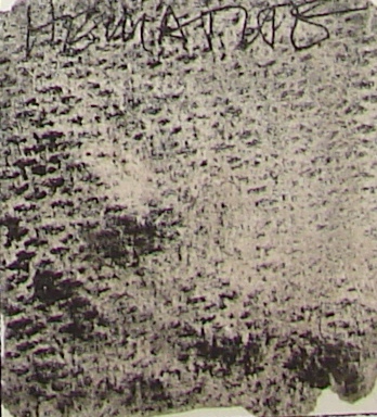
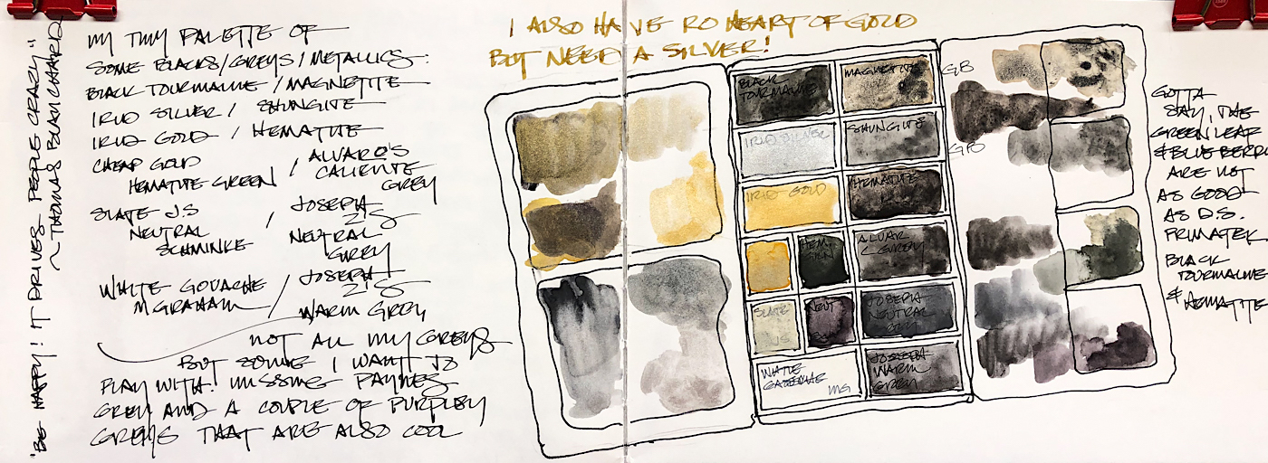
is Daniel Smith’s Hematite, right, which I love to mix with earth
tones in city sketches. It is too
easy to mix a color without black or grey, so I don’t want it taking up space in my travel palette.
Metallics are most often used
in studio — a little bit here and there, and mostly on deity images.
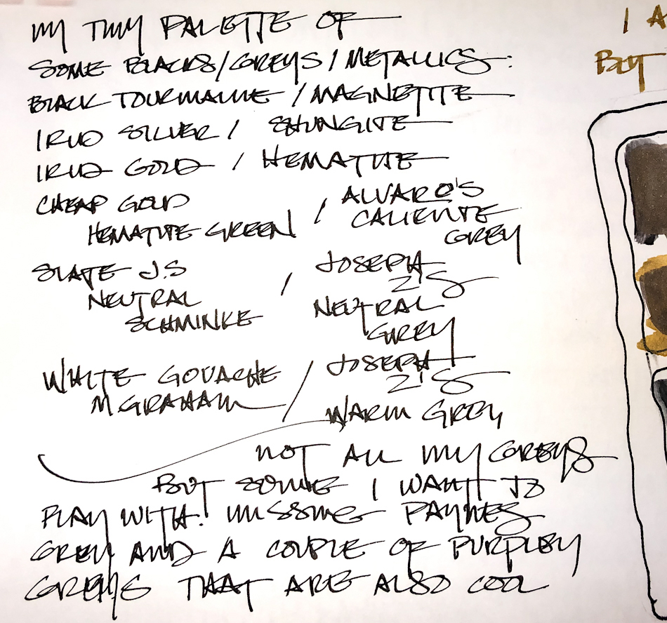
I made a small palette of these
colors, approximately 2.5×4 inches — to take along on longer trips.
Magnatite and Shungite are made by Greenleaf & Blueberry.
The slate grey is made by Schminke.
White gouache by M.Graham.
I have a strange gold paint that works — and the rest are by Daniel Smith.


I love having two amazing metallic inks —
I use them with dip pens on painting — both by Robert Oster.


“Be Happy! It drives people crazy!”
~ Thomas Blanchard
 To hear about classes, follow me on Facebook
or check out my new, improved dkatiepowellart.com
“Memory is more indelible than ink.”
Anita Loos, Gentlemen Prefer Blondes.
“I think not….”
Me… why I journal!
Greenleaf & Blueberry, DS Primatek and Daniel Smith watercolors.


©D. Katie Powell.
My images/blog posts may be reposted; please link back to dkatiepowellart.
☾
 As my Patreon supporter, you will have
access to some content not on this website,
sneak previews, goodies, discounts on classes.
I teach architectural sketching,
art journaling (art+writing), creativity, watercolors.
That annoying loud-mouth editor/critic in your head? GONE! How great would that be?


