I’ve been playing in the Rhodia Touch “Lavis Technique” journal
made for pen and ink-wash and sketching, a journal that is new to me.
I usually would do a lot more testing of a journal,
but I am ready to let this journal go — it is not for me. I like Rhodia papers,
but this journal has been a huge failure, and I will walk you through why
I am abandoning it as a inkpainting and watercolor journal below.
The paper is bright white, 90lb, and mine is A5 landscape, bound.
Positive: A beautiful sturdy journal, faux leather, nice thick band closure.
It feels good in the hand, and when opened lays flat.
The front and back inside cover pages are black, and that is fine —
I used a white gel pen and often paste mementos in those areas.
There is no back envelope, but again, that is often true in good sketchbooks,
and if I was going to continue with the journal, I’d paste an envelope into the back.
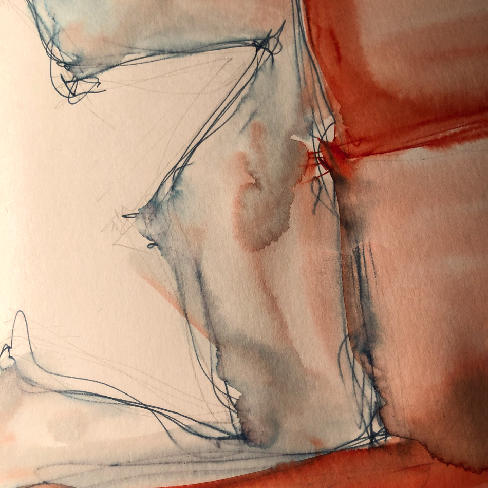
I will say that there was a somethingness that I could quite identify that bothered me, but the truth is, I also was playing with new inks, so not sure what the issues were. Pencil worked well on the smooth sheets, but I can’t show it as they were underlayers.
Then I tested the new Birmingham Everlasting inks,
below, and began to see issues clearly.


 When I test new inks in
my sketching journals, it is
often my first experience with
a new ink medium. I lay the
ink in, and let it dry. I add water and scrub the dried ink a bit
to watch it move. If you
look at the water-resistant
Birmingham Everlasting ink test above, I let those dry then dropped water to see how the inks move in various ways.
What concerned me was
how quickly the paper began
to pill… See the circle that
pilled in the middle above?
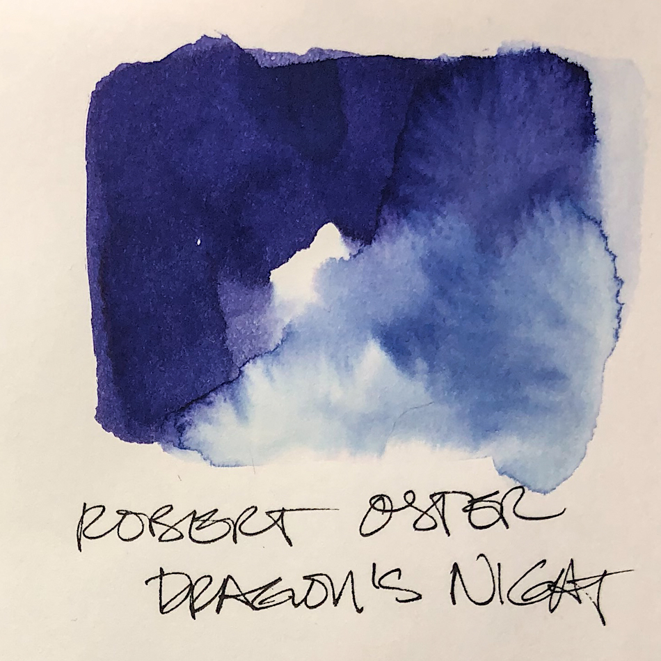
Compare it to an example in Hahnemühle Nostalgie Sketchbook, where I have performed these tests for years. Above right with Robert Oster Dragon’s Night ink,
you can see no pilling or textural change in the scrubbed areas on the right side.
This was my first solid strike on this journal.


My next and deal-breaking “test” was laying in several more test swatches,
all quite typical of what I would do in the Hahnemühle Nostalgie Sketchbook.
Each image above shows front and back in succession.
Both pages of swatching seeped through to the other side, unable to take the wet ink.
I don’t even experience much ghosting in the Hahnemühle Nostalgie Sketchbook,
as a comparison, let alone bleed-through.
This was the deal-breaker.
So in the beginning I was willing to continue to play, because of the new inks
and dip pens (I don’t usually use a dip pen), in a new journal…
but I don’t want to continue to play in the journal.
I will publish the last few images I have sketched and written, but I am moving on.
The only way I could continue to use this journal would be to use only one side
of the paper, and to place a barrier sheet between pages when using it.
Otherwise I’d risk bleed.


 To hear about classes, follow me on Instagram, Facebook
or check out my new, improved dkatiepowellart.com
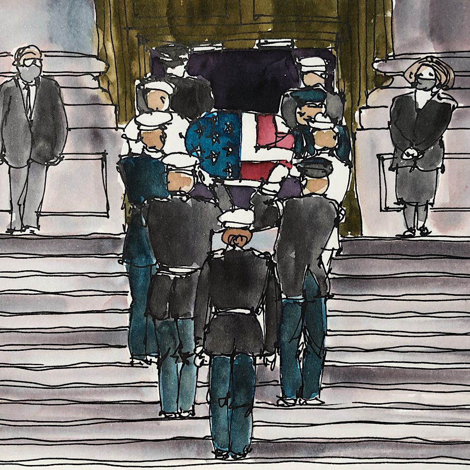
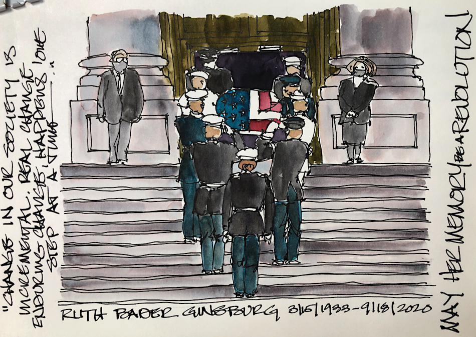
“Memory is more indelible than ink.”
Anita Loos, Gentlemen Prefer Blondes.
“I think not….”
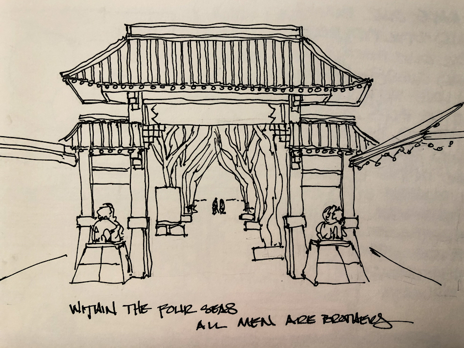
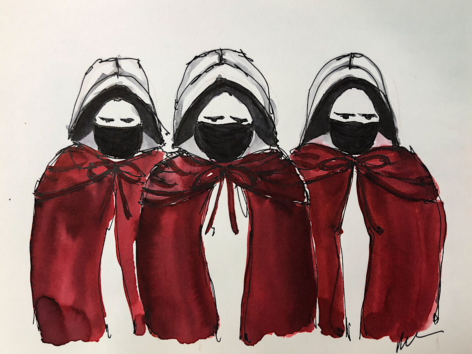
Me… why I journal!
Rhodia Touch Journal (gifted by family), Hahnemühle Nostalgie Sketchbook,
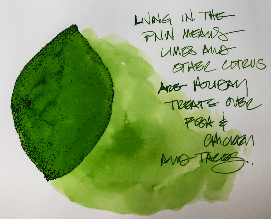
Sailor Fude De Mannen Calligraphy Navy Blue Angle 40 Degrees
with Robert Oster Mistletoe ink,
Super5 Frankfurt ink in Pentel Aquash waterbrushes,
Jinhao Shark with Birmingham Everlasting Inks,
Lamy Joy with De Atramentis Document Black ink,
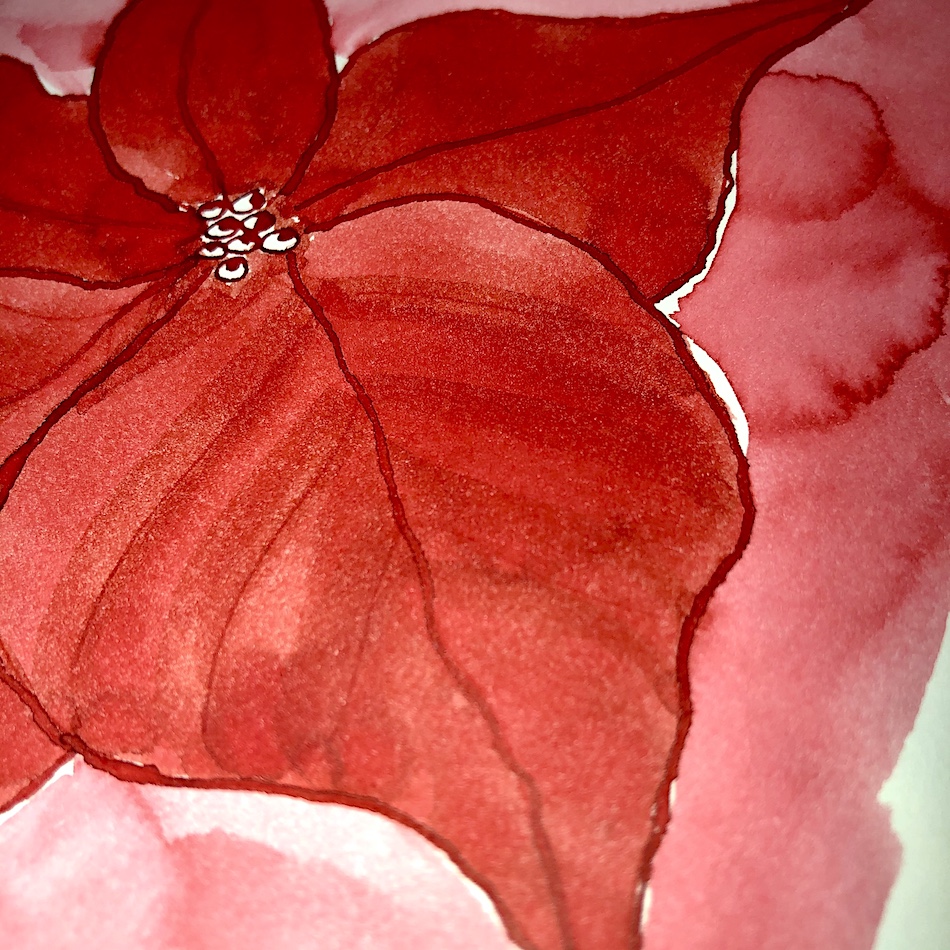
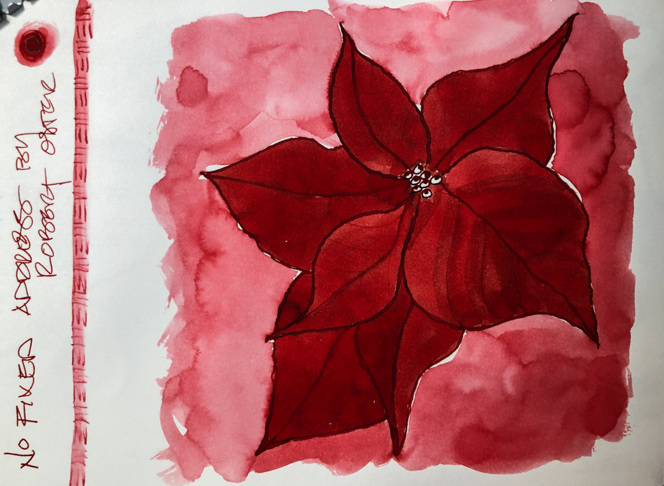
many inks from various companies (notd on images),
Platinum Carbon Pen with Platinum Carbon ink waterproof cartridges,
DS Primatek watercolors, and Daniel Smith Watercolors.


©D. Katie Powell.
My images/blog posts may be reposted; please link back to dkatiepowellart.
Note: As an Amazon Associate I earn from qualifying purchases.