
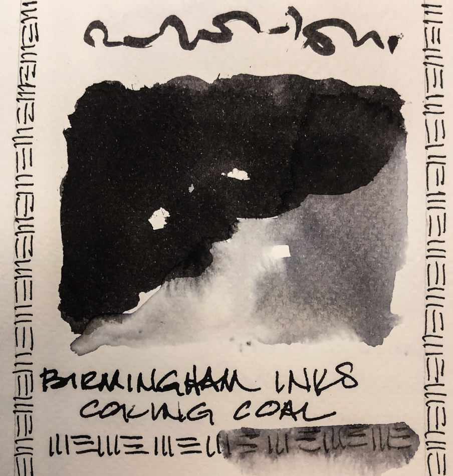
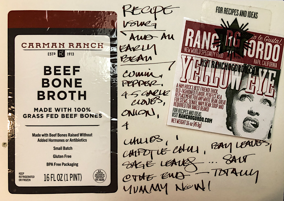
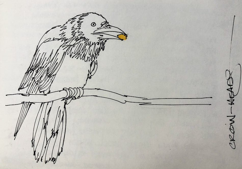
Birmingham Pen Company Coking Coal ink is named in honor of coking coal, a unique coal which “usually refers to the product derived from low-ash and low-sulphur bituminous coal by a process called coking.” Coking is “the heating of coal in the absence of oxygen to a temperature above 600 °C to drive off the volatile components of the raw coal, leaving a hard, strong, porous material of high carbon content called coke.” In this case made at and for the Edgar Thomson Steel Works, founded in Pittsburgh in 1872. (Quotes from Wikipedia.)
Remember that others review these inks just for writing;
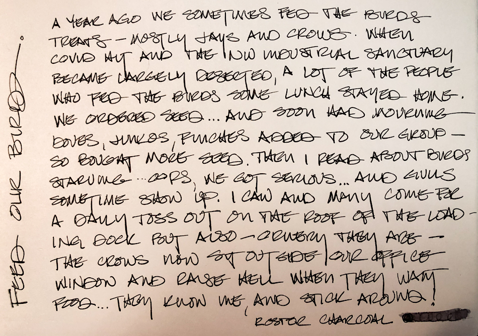
I am also interested in how they are used for ink-painting!
Also, this review shows the older version of Slag Grey ink at the bottom, and here.
 It is a well behaved ink which
dries relatively quickly.
It feathers slightly on Post-its,
and in my Hahnemühle Nostalgie journal when my dip pen drops a blob! (I need a new dip pen!) But not on watercolor paper, above, nor in a well-behaved nib.
When I scrubbed it, top, it showed quite a lot water resistance and further test sketches in my journals show it to leave a good imprint of water resistant ink lines when the waterbrush moves the color.
It has no sheen that I could produce, and is not a strong shader with my 1.1 stub nib.
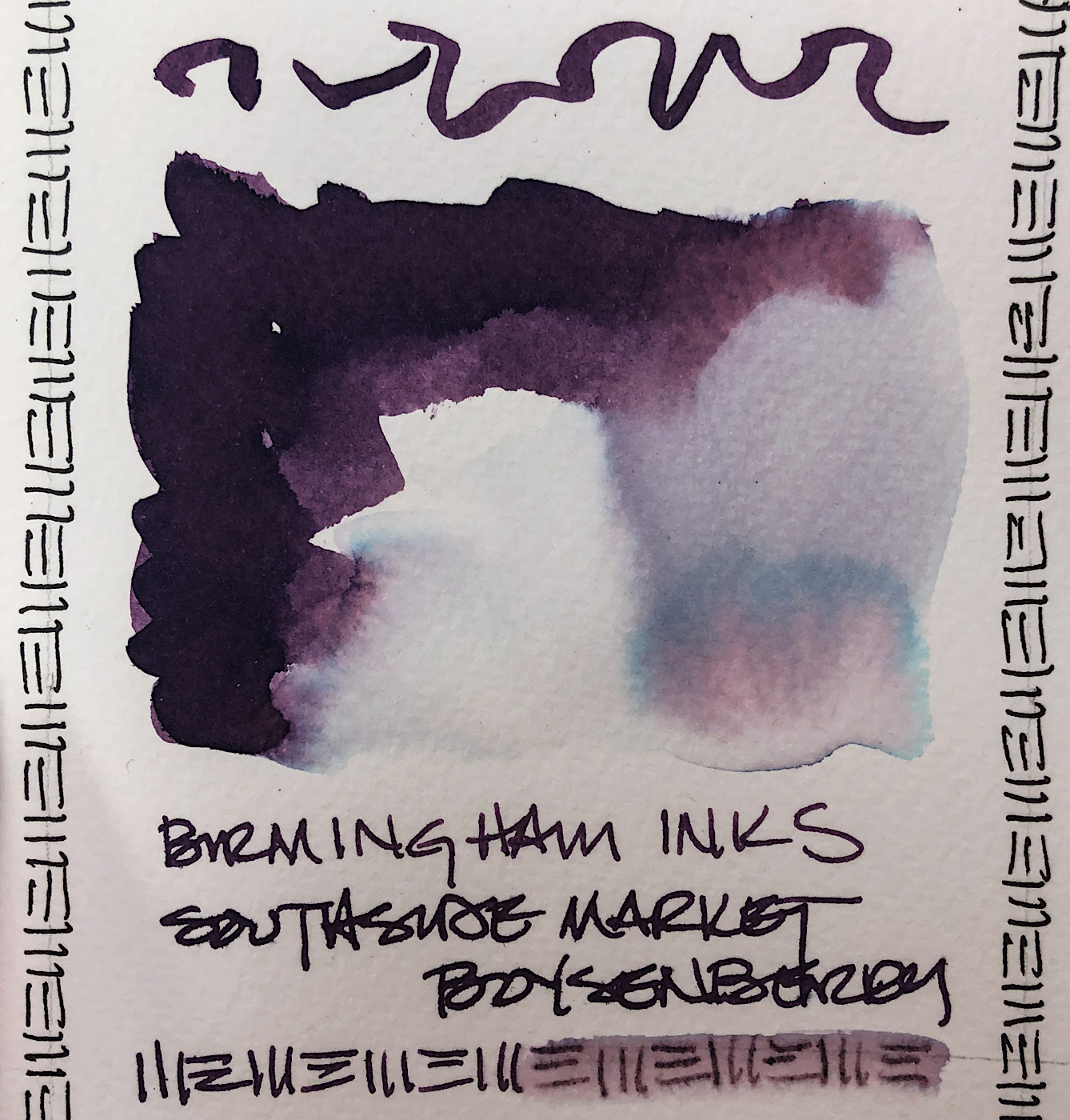
The hue? This is the first time Birmingham’s image and my visuals differ slightly.
I see a bit more blue in the ink than shown on my screen (which is calibrated),
and had me thinking it was an umber hue. On the paper towel you can see
a blue tinge that pulls out of the dark writing ink.
Looking at watercolor comparisons, I offer these colors:

SHUNGITE

TOURMALINE SENNELIER

MAYAN VIOLET

AMETHYST
MOST water soluble ink companies do not pay attention to lightfast qualities
and Birmingham is no different in this line of inks at this time.
Most artists who use ink are making prints of their work —
But ink-painting is becoming more interesting so maybe it is time!

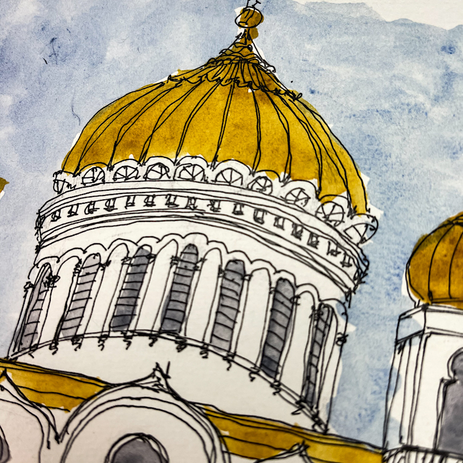
I drew the Edgar Thomson Steel Works on my test page with a dip pen —
a rather poor dip pen and so it tends to splotch out —
on cold press watercolor paper and touched the lines with water using a Pentel Aquash waterbrush. This was a 30 minute sketch with water movement…
The lines stay visible but also release ink; which means some water resistance.
I was able to layer inks which is not possible with highly soluble inks.
The smokey billows (my imagination — the clouds around the mill were white)
are both stright ink and watery ink, and the inks stayed in place quite well when dry.

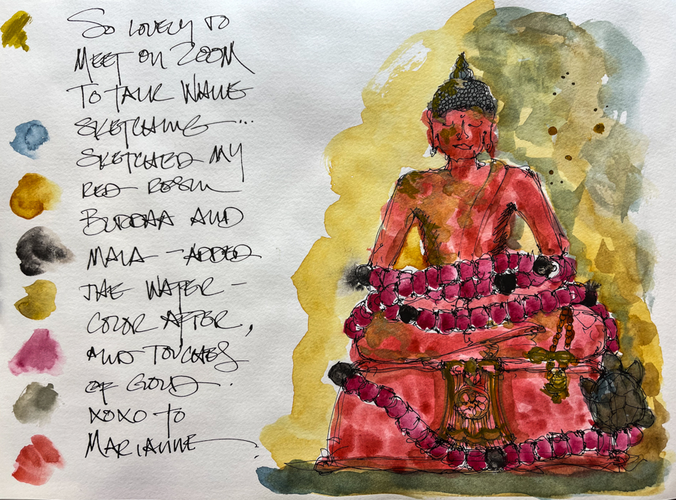
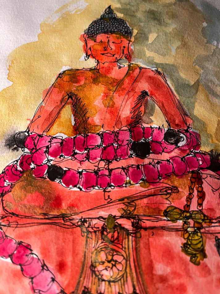
The image of a Vietnamese statue in Hué was created with a stub nib,
and the Jinhao and nib combination created a very wet flow.
I used a waterbrush to pick up color off the tip of the nib and also to move lines slightly… on the smooth Hanemuhle Nostalgie pwper the lines moved and did not offer the same resistance as on the watercolor paper.
I am glad I have this in a pen, as this is an ink with qualities I will enjoy sketching and using watercolors over. I am sure they will muddy up and move the ink,
but that will make for an interesting image with the right subject.
 From Birmingham Pen Co’s website:
“We started Birmingham Pen Co. in 2012 in
the Southside of Pittsburgh, Pennsylvania.
The region of Pittsburgh where we began once called “Little Birmingham” due to the area’s prolific manufacturing industry in the early 1900’s. The Birmingham moniker was derived from Birmingham, UK – a manufacturing hub that specialized in, among other things, pen and nib manufacturing with thousands of craftspeople employed in the industry. We chose the name Birmingham Pen Company to share this little known piece of history and continue in the traditions behind the name.”
Birmingham’s bottles are glass, and functional
even in the small sizes. I like glass bottles;
they feel like they will last longer.

Birmingham also turns their own pens,
which I’ve noticed often sell out as fast as they make them!
*I LOVE my Model-A Demonstrator, Violet Beauregarde!*
This is a small family business run by four people! The brothers, Nick and Josh;
Dad is the chief pen machinist; and Mom does one of the coolest things about Birmingham, which is their amazing historic names!
Disclosure, I was gifted with this sample ink from Birmingham.

Coking Coal
 To hear about classes, follow me on Facebook
or check out my new, improved dkatiepowellart.com
“Memory is more indelible than ink.”
Anita Loos, Gentlemen Prefer Blondes.
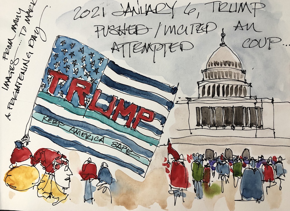
“I think not….”
Me… why I journal!
Hahnemühle journal, Pentel Aquash waterbrush,
dip pen with Birmingham Slag Grey ink,
Jinhao pen with a swapped out Nemosine Stub nib.
©D. Katie Powell.
My images/blog posts may be reposted; please link back to dkatiepowellart.
I'd love it if you shared this; please mention my blog name!

 I’ve not had much time


Inky Thots: The Maker’s Palette
I have a lot of inks… way too many to use in my lifetime even with painting.
But, really, why have a boring crayola 8-pack
when you can have the 64-pack with every color imaginable?
I’ve also found the makers that I gravitate to mostly, and know why I love them,
mostly for their complex stunning colors — though I do sample inks from others.
I have a theory now that I have played with a lot of inks from a few makers, and seen the range of their colors again and again as I place new colors on my wish lists.
I believe that the best makers are influenced by the world they see around them.
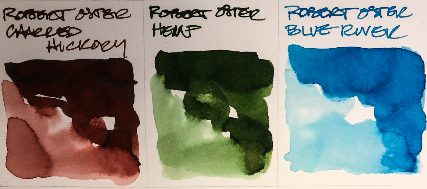
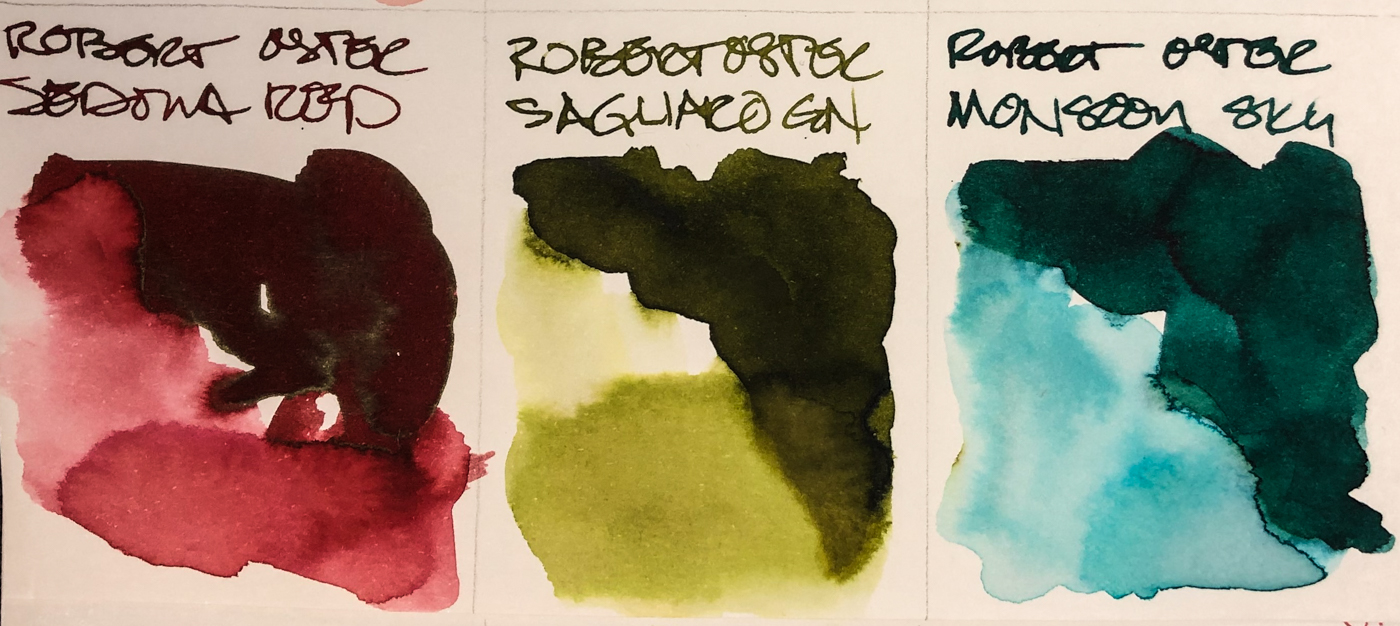
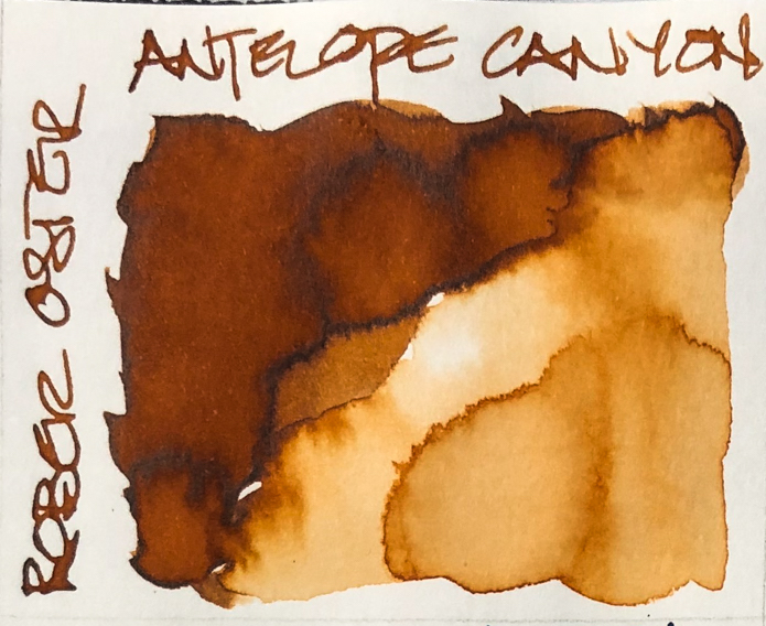
Robert Oster has the most amazing blues which is why I call him the King of Blues!
But his colors in general are the colors are the colors I imagine when I think of the huge continent of Australia and the area around his home: blue to blue-green seas all around, natural greens that range from desert to forest, and rich desert colors — I think of the huge red rock country in the north. He is not the king of greys, nor urban colors!
Coincidentally, Blackstone (now out of business) was also an Aussie company,
and carried very similar natural palette. Wonderful company, sad they are gone.
Birmingham, on the other hand, from Pittsburgh, Pennsylvania,
is the company I think of for the richest greys — and I LOVE grey inks.
I have more grey than any other single color ink!
Birmingham’s palette is a very urban palette, and I can see the colors of urban gardens with pops of color in tended greens, and the working rivers that surround them:
The Allegheny and Monongahela rivers, which come together to form the Ohio River.
I imagine the swirl of the people at work around them… Having lived in an urban environment for most of my adult life, the people compensate with brilliant and sometimes unnatural colors: Green Weenie, Salmon Hors D”Oeuvre, Parrot and Five-Cent Fuchsia are colors I wore daily when I worked in Los Angeles. When I moved to rural Oregon people stared at my brilliant colorful dress, so out of place in their natural environment.
I can’t help it: when I look at Papier Plume‘s inks I think of the
decadent, ladies-of-the-night and outlaw gentlemen I read about in my teens.
I think of late nights, parties, brunch, and rich amazing foods blended from many cultures into the place that is New Orleans! I think their palette reflects a rich mysterious culture!
I now am going forward with this theory in mind… and watching…
What do you think?
I am also interested in how they are used for ink-painting!
or check out my new, improved dkatiepowellart.com
“Memory is more indelible than ink.”
Anita Loos, Gentlemen Prefer Blondes.
“I think not….”
Me… why I journal!
Hahnemühle journal, Pentel Aquash waterbrush, dip pen with inks.
©D. Katie Powell.
My images/blog posts may be reposted; please link back to dkatiepowellart.
☾
access to some content not on this website,
sneak previews, goodies, discounts on classes.
I teach architectural sketching,
art journaling (art+writing), creativity, watercolors.
That annoying loud-mouth editor/critic in your head? GONE! How great would that be?
I'd love it if you shared this; please mention my blog name!