
Birmingham Boysenberry ink is named in honor of the fruits from
the Southside Farmer’s Market, built in 1915.
The original market house on this spot was built in 1893, burned,
and was rebuilt by architect Charles Bickel in 1915.
“According to Walter C. Kidney, “When it was rebuilt in 1915 after a fire,
the towers came off, the gable roof was brought down to the eaves on both fronts,
and a well-scaled stone cartouche was set into the south front memorializing
the new work. This cartouche is the building’s one decoration today, set off by swags and surmounted by a bull’s head. The Romanesque walls otherwise survive largely as built, industrial rather than civic architecture.”” (Wikipedia.)

Remember that others review these inks just for writing;
I am also interested in how they are used for ink-painting!
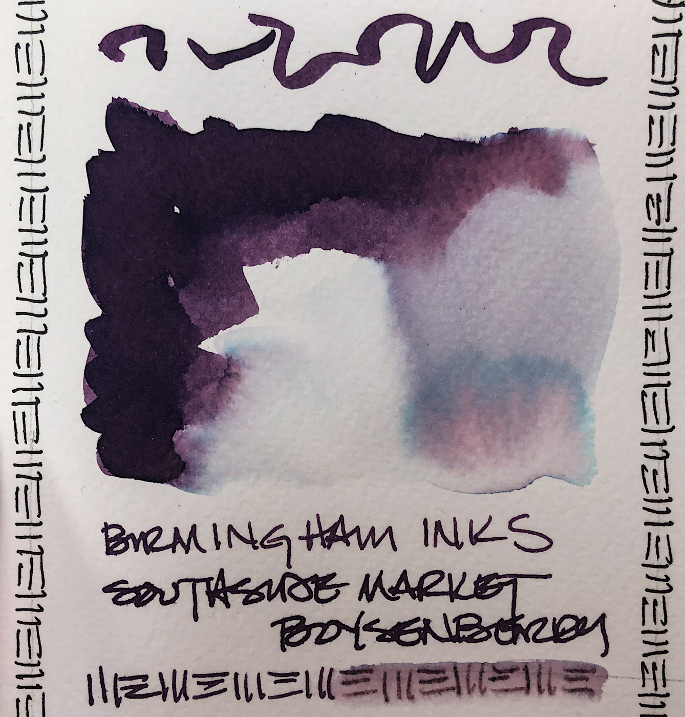
Properties of Birmingham Boysenberry ink:
 It is a well behaved ink
which dries relatively quickly.
It feathers slightly on Post-its, but not in my Hahnemühle Nostalgie journal even with a wet writer, above, nor on watercolor paper, top.
When I scrubbed it, top and below left, it showed quite a
bit of water resistance. It has
no sheen that I could produce, and is not a moderate shader
with my 1.1 stub nib… when painting it separates into
these beautiful pinks and
blues, so I consider this a complex ink color.
 Top, above and left, you
can see the pretty blue
that pulls out of the
dark writing ink.
The paper towel test
shows how many colors lay beneath the dark purple!
Aptly named Boysenberry!
When the edge is touched
with water it does not move easily into the berry stain colors. Looking at watercolor comparisons, I offer these colors:


*Above, watercolors, from Daniel Smith.*
MOST water soluble ink companies do not pay attention to lightfast qualities
and Birmingham is no different in this line of inks.
Most artists who use ink are making prints of their work —
But ink-painting is becoming more interesting so maybe it is time!

I drew the Southside Farmer’s Market on my test page with
my Model-A Demonstrator pen with a 1.1 stub nib (below)
on cold press watercolor paper, Hahnemühle Nostalgie journal,
and touched the lines with water using a Pentel Aquash waterbrush.
This was a fast sketch with water movement…
The lines stay slightly visible but also release ink; which means slight water resistance.
I added linework in, but left some lines untouched.
 I like what Birmingham says on their website:
“We started Birmingham Pen Co. in 2012
in the Southside of Pittsburgh, Pennsylvania.
The region of Pittsburgh where we began once called “Little Birmingham” due to
the area’s prolific manufacturing
industry in the early 1900’s. The
Birmingham moniker was derived from Birmingham, UK – a manufacturing hub
that specialized in, among other things, pen and nib manufacturing with thousands of craftspeople employed in the industry.“
Birmingham’s bottles are glass, and functional
even in the small sizes. I like glass bottles;
they feel like they will last longer.


Birmingham also turns their own pens,
which I’ve noticed often sell out as fast as they make them!
*I LOVE my Model-A Demonstrator, Violet Beauregarde!*
I placed the lovely Boysenberry into the pen.
This is a small family business run by four people! The brothers, Nick and Josh;
Dad is the chief pen machinist; and Mom does one of the coolest things about Birmingham, which is their amazing historic names!
Image of the South Side Market used for reference was taken by Piotrus.
Disclosure, I was gifted with this sample ink from Birmingham.


 To hear about classes, follow me on Facebook
or check out my new, improved dkatiepowellart.com
“Memory is more indelible than ink.”
Anita Loos, Gentlemen Prefer Blondes.
“I think not….”
Me… why I journal!


©D. Katie Powell.
My images/blog posts may be reposted; please link back to dkatiepowellart.
☾
 As my Patreon supporter, you will have
access to some content not on this website,
sneak previews, goodies, discounts on classes.
I teach architectural sketching,
art journaling (art+writing), creativity, watercolors.
That annoying loud-mouth editor/critic in your head? GONE! How great would that be?


I would be a bad tester–I am swayed by ink names. How can you not like a name such as ‘Boysenberry?’ It is a gorgeous color.
LikeLike
So many of us are swayed by names!
LikeLiked by 1 person