I stumbled on this and after starting, thought, why not do it as a mini class? A friend sent me a fridge magnet, and while I was popping it onto our fridge, I realized we had a couple of old calendar magnets. I decided to recycle them. (Materials list below.)
These are the flat magnetic calendars businesses hand out: one is about 3×4-inches, which became the horse, and the other is about 3-inches square, which became the fish. Sorry I didn’t get a picture of the magnets before I started. I used a 320 (any large grit will do) sandpaper to rough up the printed surface so it would accept acrylic paint. I painted layers (I used Hansa Yellow Medium) to basically cover the print, though you can see it a bit through the thin paper, above. Important tip: Until you are adept at working with collage and bits of paper, especially thin paper, let the paint dry between coats on each step!
The green paper was cut a bit larger than the magnet (makes it easier to cover the piece completely), and “glued” on using acrylic medium as the glue. With thin paper (both the green rice paper, above, and the hay paper with the horse, below) you can place it and brush it; with thicker paper it is better to brush both sides, top and bottom, for adhesion. I trimmed the edges of the green paper to fit the magnet.
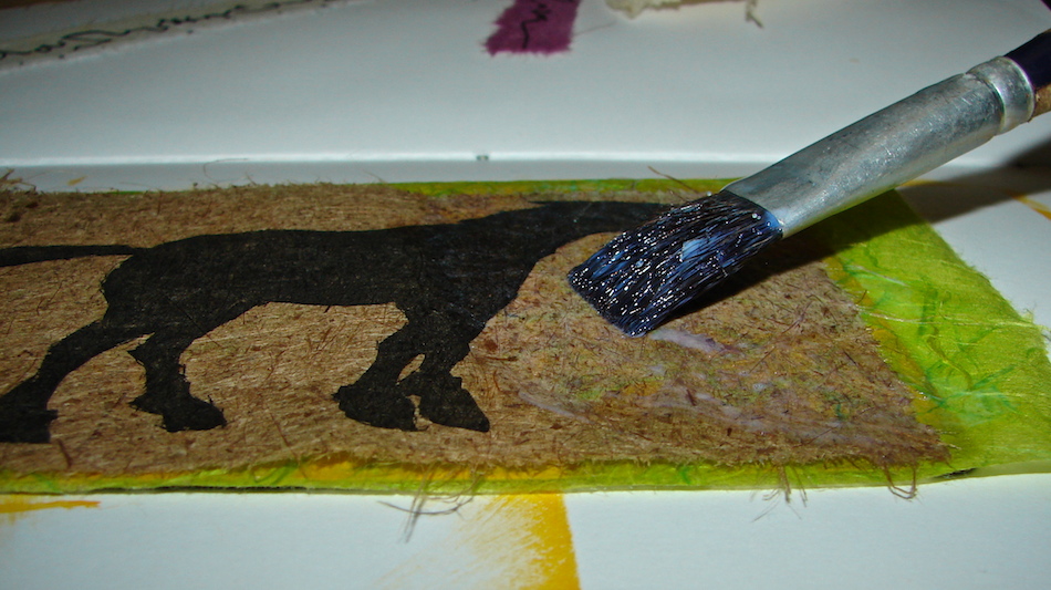
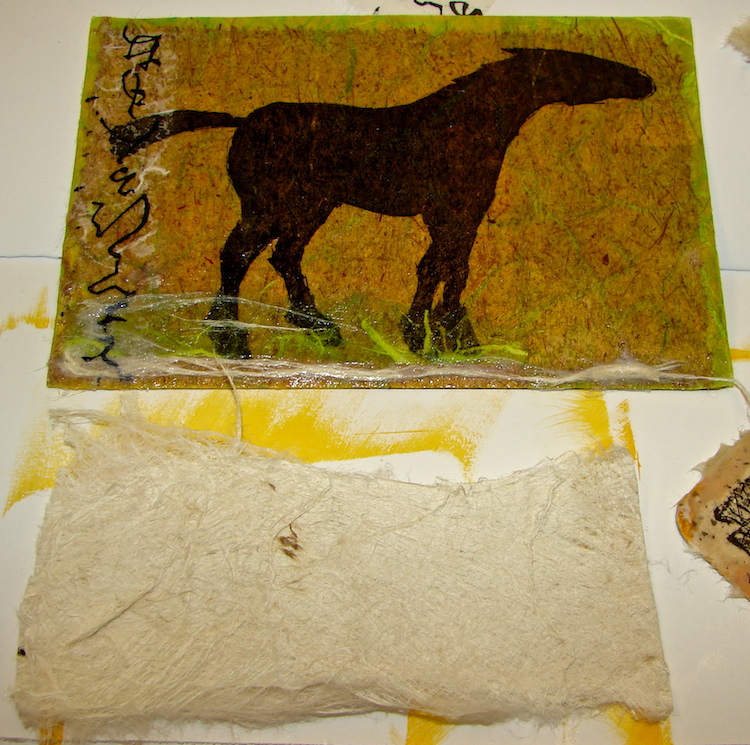
After the green was dry I applied the horse. Tip: Sometimes I want the edges to seem tattered, and instead of cutting the paper, I wet it with either my tongue or water on a brush, and tear it gently. See the brown tattered edges below?
 When applying the medium, hold the paper firmly where you want it and start from the middle and work out, as shown above, then turn and work the next part from the middle, again, out to the edges. Let the horse dry.
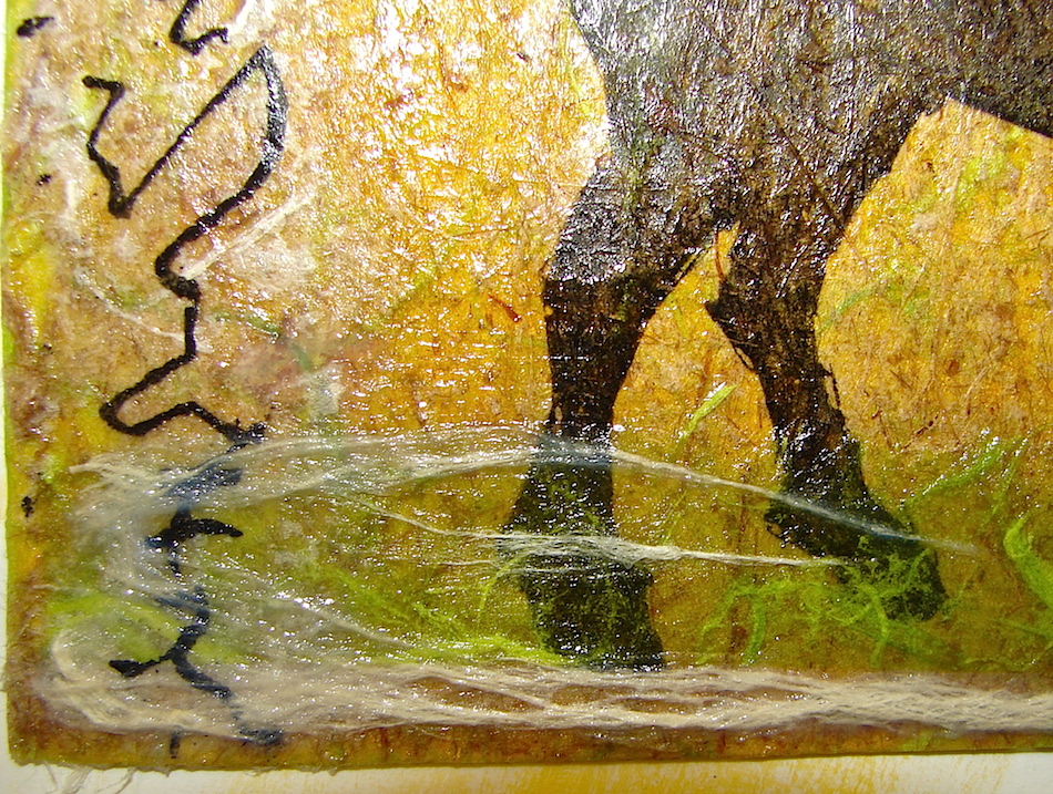
The next bits were applied all at once, but if you are a novice do them one at a time. I cut 1/2-inch strip of the green and wet the top edge, and then tattered it. I applied it with medium as if my horse was standing in the grass, brushing the tattered edges UP (let dry if you are doing so.)
 Next I added a strip of fake-calligraphy on rice paper with medium, because my horse will be a Zen horse. It looks a bit oriental! Let dry!
 Finally, I have some thick gampi/koza paper that can be torn, above, and I tore it to add some texture on the bottom. It does help to have lots of bits of paper, and I save all bits! If you have friends who like handmade decorative papers, it might be nice to have a paper swap.

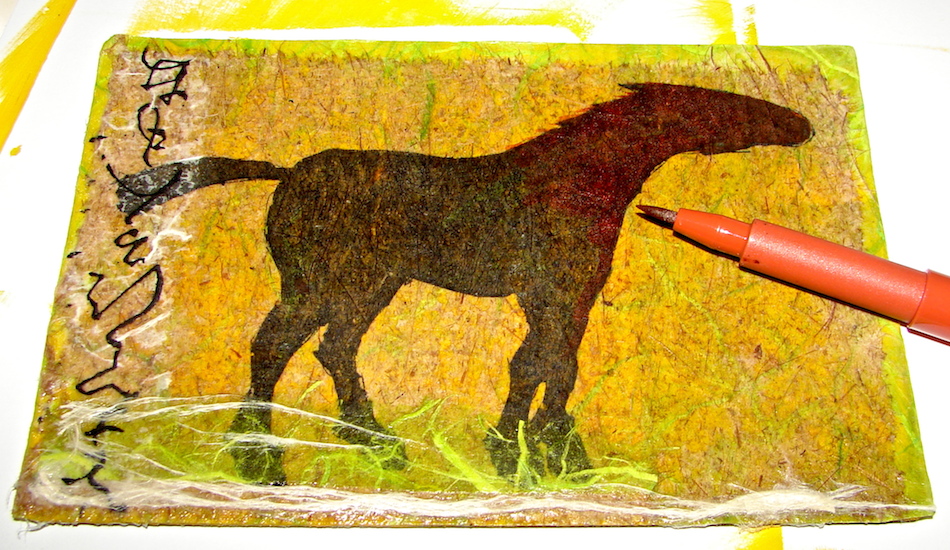
 When the collage work was thoroughly dry — NO early bird here — I decided to paint the piece with Golden Acrylic Ground for Pastels. It creates a porous surface, matte, for Pitt pens or pencils or pastel. I made another small bit of it in a herb jar (I collect them) and painted — you can see it does look white — and when it dries the white disappears.
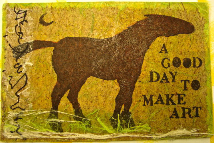
After it was dry I decided to add color to the top of the horse, added one of my moons (I swear they are in all my art) and a phrase I want to see on my fridge! And it is finished!
If you would like to know of classes I will be teaching, follow me on Facebook!
 Below, I show the fish from beginning to end without commentary. Tip: You’ll notice in the fish, below, I took some of that same gampi/kozo paper used in the horse, tore it and painted it with a bit of quinacridone gold on a piece of Plexiglas, then when it was just dry to the touch used it on the fish.

Yellow rice paper over painted magnet…

Dry, and trim the edges…

Wet where you want to tear the fish…

Playing with layout. . .

Playing with layout…

Painted the torn pieces on Plexiglas…

So they lift off easily when just barely dry…

Adding them, instant seaweed…

Acrylic Ground is applied… Dried…

And the details are added!

Finished! GO FISH!
Materials: Old flat magnets, Golden Acrylic paint + Medium + Acrylic Ground for Pastels, bits of handmade papers I had previously copied images on running them through my front loading computer, brushes, water + Faber-Castel Pitt pens (or other indelible waterproof pen, or pencils or?) to add the final touches. Tip: When I am doing collage put my medium in a clean herb jar — then I don’t worry about contaminating the medium.

My images/blog posts can be reposted with permission;
please link back to dkatiepowellart. Class is ©D.Katie Powell
0.000000
0.000000
I'd love it if you shared this; please mention my blog name!

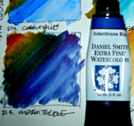
 Ultramarine blue is one of those amazing electric colors that you want to fall into. I first fell in love with the crayola color, then Golden Acrylic’s Ultramarine Blue Deep Hue. It was my go-to blue!
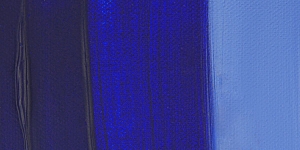
 Ultramarine blue was originally made from lapis lazuli, which contains rivers of pyrite (I grew up calling that “fool’s gold.”) It was finely ground into oil and used by Renaissance artists, especially in their depictions of the Virgin Mary’s gowns. lapis became the catch word associated with the color, and the names in various languages are azure, azur, and azul, to name a few.


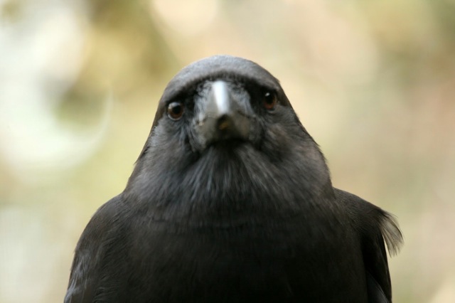
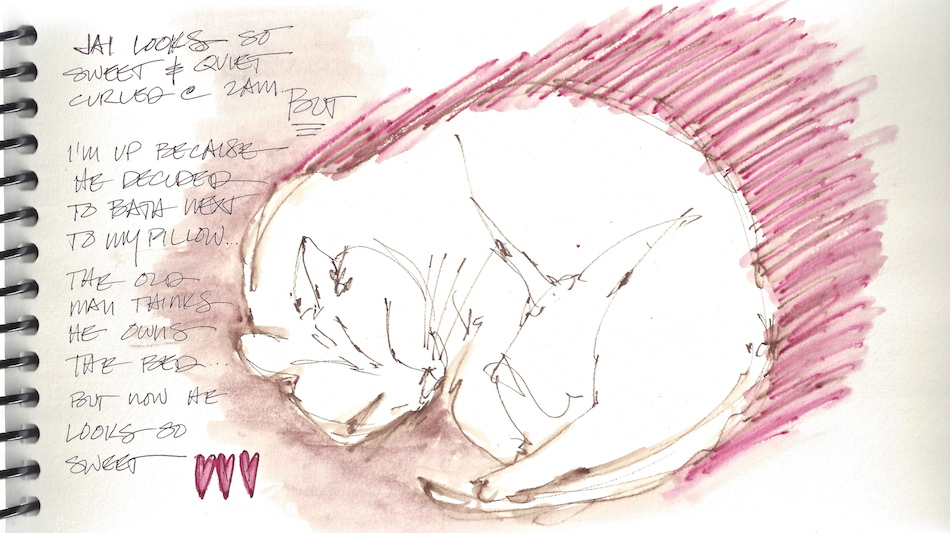
 “SERIOUSLY, you can’t take a break and give me my mid-morning morsel?”
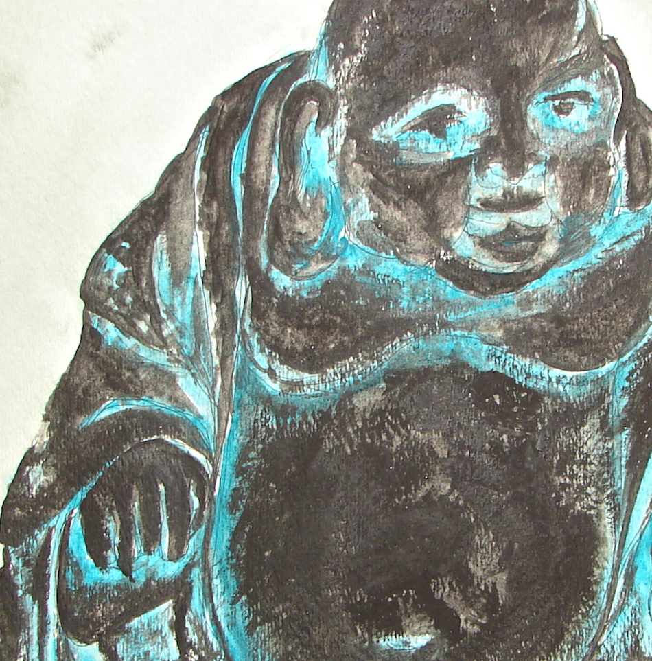

 I first encountered them in Golden Acrylics. They became a staple in glazes and undercoatings and all Tuscany colors, as in one of my horses, above, because I fell head over heels in love with


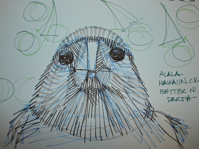

 I have couple of favorite line patterns I use in doodling, and sometimes as backgrounds in painting. My all time favorite, and a comfort to draw, is the architectural symbol for ground. I used it above to cover a background in acrylic, and right, as a decorative line in graphite.


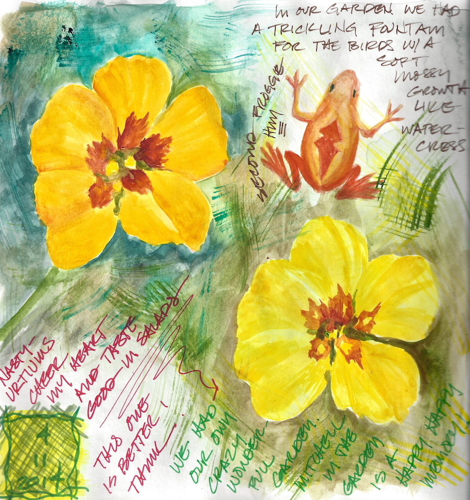
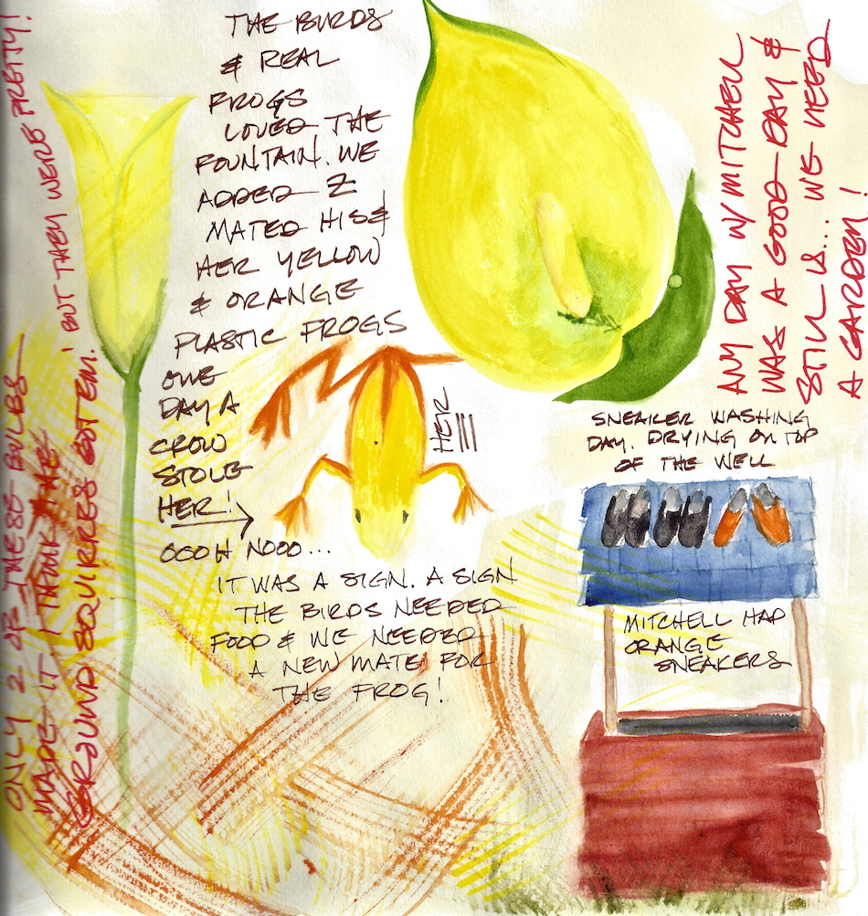
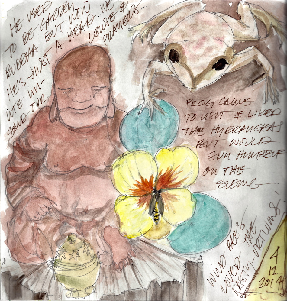


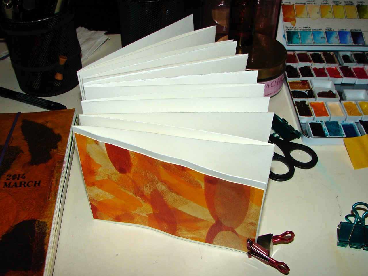
 There are other journals I use. Sometimes I like long shapes, and so have two longer format journals I use when it suites the subject:


 Hematite is a form of iron oxide, a mineral that contributes to several different paint colors. It has an undertone of reddish brown, which when placed in a glaze gives it a shimmering red cast. In its natural form is is quite heavy, and is called the Shaman Stone by Native Americans. It is believed to have the power to attract, as in a magnet. The Greek word for blood, as in blood red, gives us its name αἷμα (haima.)
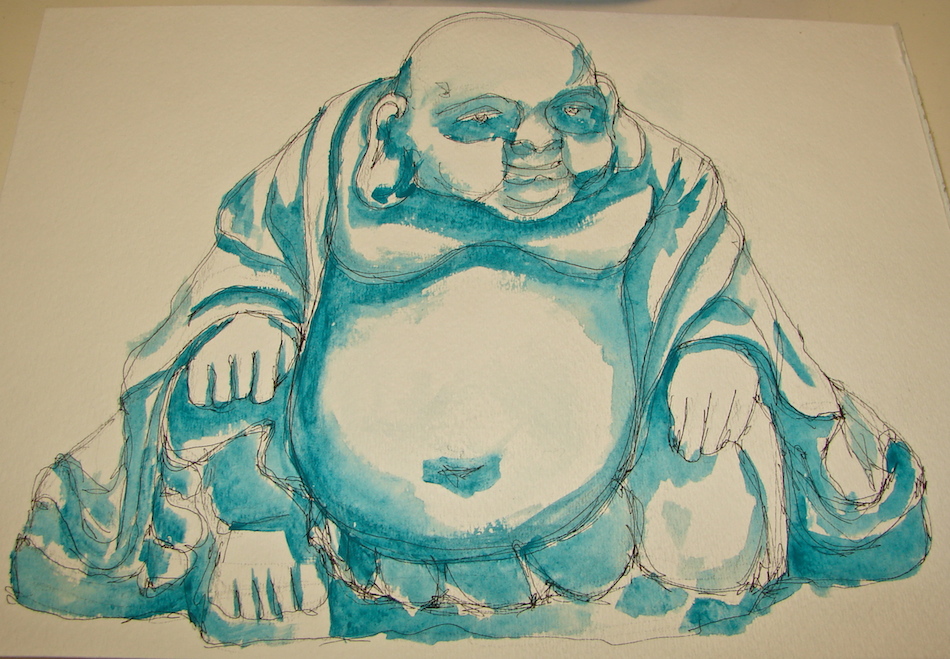
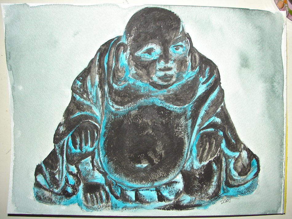
 I had no idea what granulating paint was until I began using watercolors. And you have to know or you get wonky things happening that you didn’t want, like the funny paint around Frank’s nose, below. Notice how most of the colors are smooth, but there is this odd granulation around his nose? I should have used Lamp Black or Ivory black, but I used a granulating black, and it left that odd texture.


