The brushes I use with watercolor are very different from the brushes I use when painting with acrylics.
When painting with acrylic, my life revolves around flats with an occasional liner or small round for detail.
When I started out, I didn’t study brushes, I simply
bought a bunch of brushes and dove in, experimenting. The size of the canvas and paper dictated the sizes of the flats I gravitated toward, which allowed me texture and control. Many of these same brushes followed me
into the world of shellac in our conservation business.

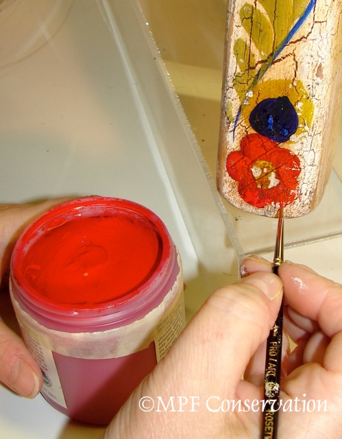
Shellac

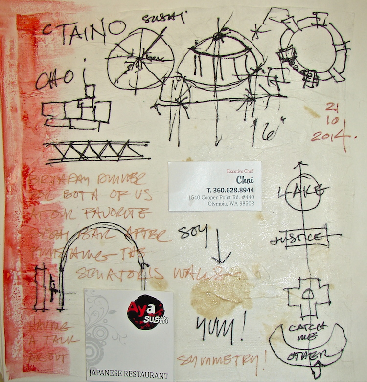
Oli infill on on stripped non-museum piece.

Applying a Strengthener.

Acrylic over a Barrier for Infill.

Oil paint on a previously stripped (damaged) chair.
In our conservation studio, I use medium stiff 1-inch flats for shellac, and extremely small liners and rounds for infill. I use flats when applying barriers on museum objects. When I need to touch up shellac color, paint details, or add wood grain to match an area that has been filled using museum materials, I go through liners of all sizes like crazy. With the unusual mix of chemicals I am using, the liners, which are temperamental anyway, are damaged quickly.

My damaged brushes are cleaned and used as glue brushes for hide glue in our conservation business, so nothing is wasted until it is falling apart!
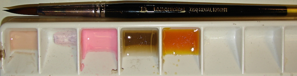
 Watercolors made me gravitate toward rounds, and to get to know rounds like never before. I still use flats, especially those that are a bit more like a mop for applying washes to skies or backgrounds, but now they must hold water without dropping it where I don’t want the color to drop!
Rounds hold exactly the right amount of water with enough control. Typically I use sizes 6-8-10, unless I need a mop, then I reach for my Windsor- Newton #12. And I love using liners or riggers, in the 5/0 size, because the smaller size just doesn’t hold enough watercolor.
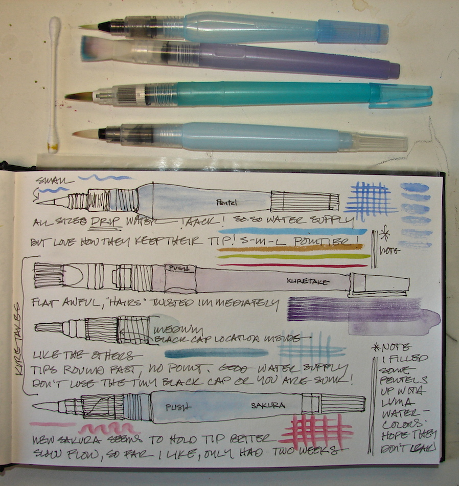
 But here is the best discovery in the quest to look at my unused materials and tools hanging about my studio: the Leow-Cornell Golden Taklon Series 7900 Miracle Wedge, size 8! I know I used it at least to try it, maybe 15 years ago? I’ve had it floating around the studio, and since it was not a win with acrylics, I never picked it up again. I picked it up Thursday, and WOW! What a great brush. It works a lot like my liners, but it stores much more water in its fat base, which flows out the lovely tip. I was able to paint all the lines as indicated above with just one wet dip! And it makes nice flowing ribbons too.
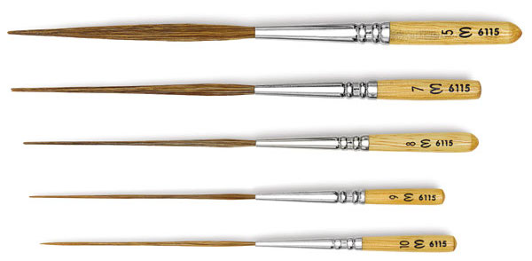
And then there are the brushes I want to try, the Escoda Long Liners. Their short handle and longer hairs intrigue me. I think with the shorter handle there might be more control.

favorite brush
More cheat cheets or pages on brushes:
Brush shapes — the best single page is at Blick’s, though the pages from Loew-Cornell offer excellent imagery, especially their miscellaneous shapes! That is where a second Golden Taklon Wedge and the Halcyon Rigger Brush, both on my list to Santa.
Blick’s also has a good single pages on brush hairs + how to measure, and a size chart for their brushes. There is a good overall history and discussion of various aspects of brushes on Handprint. In fact, Handprint is a great resource you need to know!
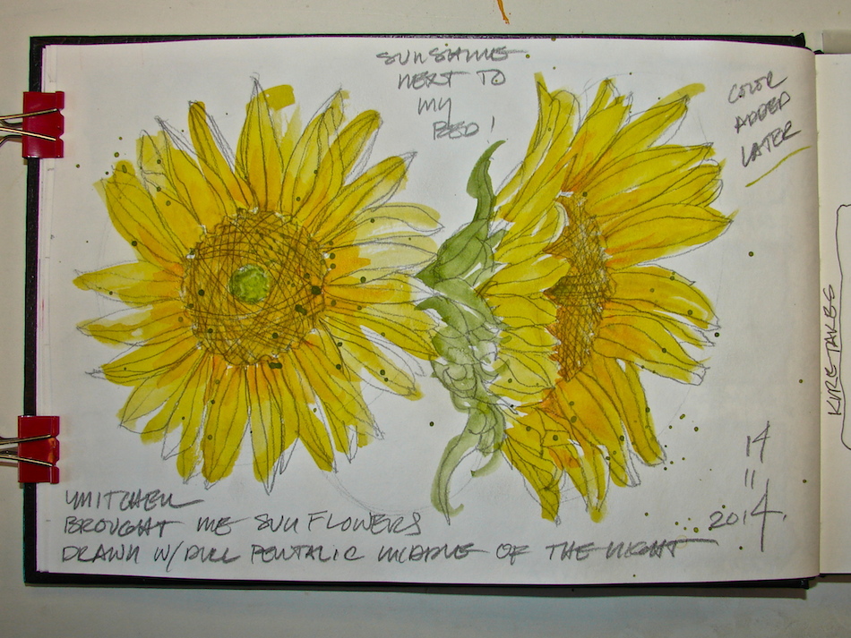
Painted images in Stillman & Birn Alpha journal with a Platinum Preppy fountain pen, and various Noodlers ink. Daniel Smith Deep Scarlet watercolor paint.

I agree to Creative Commons Attribution-Non-Commercial 4.0 International License, which you can learn more about by visiting the site, or,
visit my web page for a more user-friendly summary on my terms.
My images/blog posts may be reposted; please link back to dkatiepowellart.
I'd love it if you shared this; please mention my blog name!

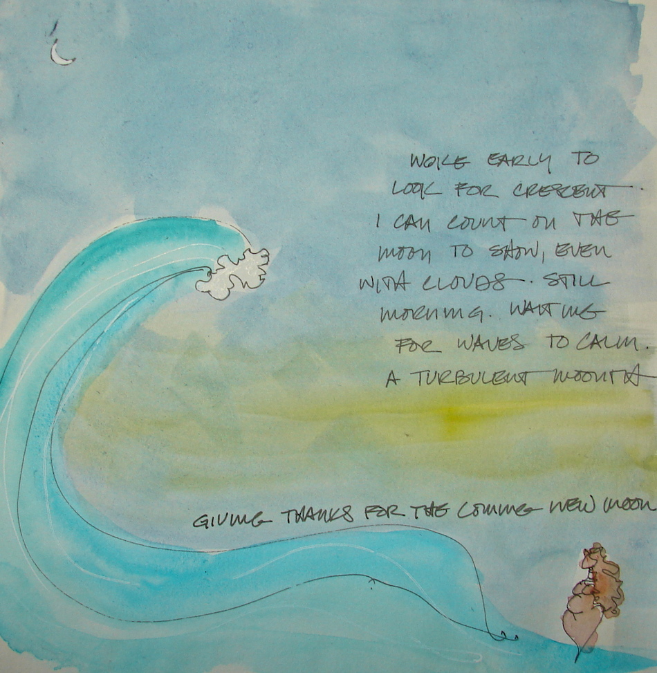
 More watercolor only, with lines added after.
 Images in Stillman & Birn Alpha journal with watercolor paints;


_01")