
 I love paint colors. Friends have been pushing me to get serious
about a travel palette so I can paint comfortably onsite, and I resist because
I love all my colors, especially the transparent parrot colors and
earthy mossy greens and don’t forget Daniel Smith’s Primatek minerals and . . . and . . .
Look at all those luscious colors in my primary palette. How to pick?


But I can’t carry all these colors around with me. I tried making a travel palette
from half-pans so I’d have more colors, but I hated the half-pan sizes.
I needed a good working travel palette of versatile colors.
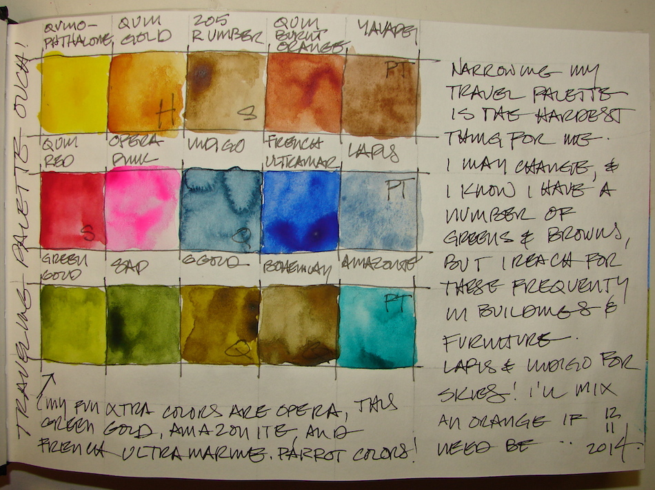
T he first pass was the fifteen colors above.
I based my travel palette choices on
building colors, Portland colors,
and also how a couple of the colors mixed
to give me a bronze color and a brilliant orange. I needed to methodically practice mixing. I began my career in acrylics,
which I mixed in small jars.


The problem was, after spending time mixing my first palette, I realized that I had too many colors which I could mix to give me close to the same hue, shown left. I also knew I would miss Caput Mortem, an odd purple-brown that I reach for so often when I am painting buildings. I chucked QoR’s Bohemian and Green Gold, and Sennelier’s Raw Umber. I pulled in two yellow oranges, and a few more Primateks. I chose Holbien’s Permanent Yellow Orange because it less muddy than M.Graham’s Indian Yellow. I was surprised that I could mix my Caput Mortem from Yavapei and Peimonite! I wanted to put in Serpentine but it will mix onsite like a Sap Green, and Sleeping Beauty Turquoise is quite close to Amazonite in the mixing ranges. I could not choose a third pan!
 Finally I said, “Enough!” Everything can be changed as I work with it.
I have a lovely range of the Primateks to play with, and parrot colors, and
Portland colors. Opera Pink (yes it is fugative but this is for my journal), Quin. Red (Sennelier), Quinophthalone Yellow, Piemonite, Permanent Yellow Orange (Holbien),
Sap Green Indigo, Quin. Burnt Orange, Green Gold, French Ultramarine,
Quin. Gold, Amazonite, Lapis, and Yavapei.
And room for one more color . . .
Stillman & Birn Alpha journal with a Lamy Safari pen, a Noodler’s giveaway pen, and various Noodlers ink. Daniel Smith, Holbien, QoR and Sennelier watercolors.

I agree to Creative Commons Attribution-Non-Commercial 4.0 International License, which you can learn more about by visiting the site, or,
visit my web page for a more user-friendly summary on my terms.
My images/blog posts may be reposted; please link back to dkatiepowellart.


I’m with you Katie, it’s hard to get the palette down to an easy to travel with amount. My usual way of dealing with it is to leave my watercolors and only take my pen and inks. Not a very suitable solution. I guess I’ll have to work on that. BTW, I haven’t forgotten the post I owe you. It is partially done, but I just need to find some more time to finish it up.
LikeLike
I also never take the watercolors with me, but I want to — it might be fun. It this one drove me crazy Tim! I still think I will change it ten more times. Fortunately I can simply pop the palette containers out and replace. Looking forward to the posting —
LikeLiked by 1 person
Changeable palettes, that’s brilliant! I have two regular palettes for my travel bag, but I haven’t used it much. Too much work and not enough painting! That’s why I take my pens instead. I draw while waiting at appointments or at road construction etc..
LikeLike
You can buy watercolor pans from many stores; I put them in an old Caran D’ache tin and secure them with artist’s putty (the stuff that you can use to keep your walls intact?) Look here: https://dkatiepowellart.me/2014/05/05/process-mixing-hematite-paints/
LikeLike
Wow – you have such gorgeous collection of watercolours, no wonder you are struggling to choose just a few.
LikeLike
Yes, maybe, but if I had half as many I’d still want to take them all. You never know when you will want more color! Nice site!
LikeLike
I love your palettes (they look like quilts) AND the paint names. I’m so happy you do this type of post peridically because the colors are so upbeat and reading the names is like hearing a foreign language that I ‘sort of’ know 💥
LikeLike
I always wanted to make a quilt . . . hey, how’d you make that sun sign at the end!?!
LikeLike
LOL Another blogger just asked the same q about my emoticons. It’s an app I downloaded free for my I-pad.
Do you have an I-Pad?
I don’t know how to get them for a Windows computer.
LikeLike
No iPad. All Mac I am tho.
LikeLike
You can download them to an I-phone. I don’t have a full-fledged Mac yet (Santa) but you might be able to find them for that. Google ’emoticons for Apple’ perhaps?
LikeLike
Thanks, I’ll look. Santa needs to drop off a Mac Pro for the biz!
LikeLiked by 1 person
lovely palettes I need to do the same!
missdaniellerenee.blogspot.com
LikeLike