The inspiration for this virtual walk came from a Preservation Leadership blog on
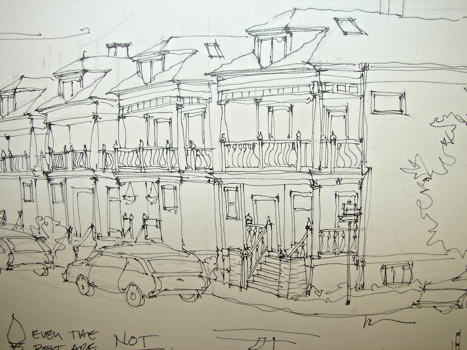
Early San Fransisco Parking Garages. I love funky old buildings, and these are anonymously designed (in some cases) and I don’t want them torn down!
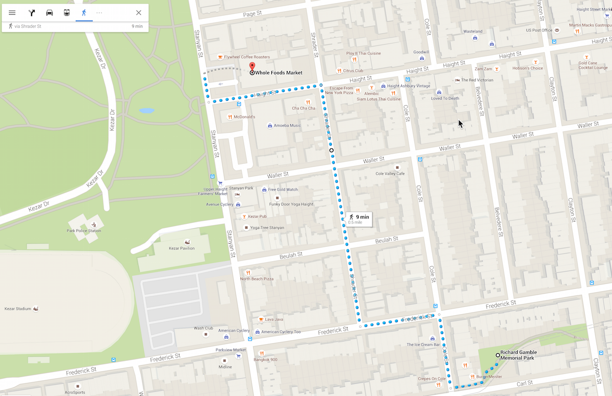
As usual, you can use this map and images or
you can focus on your own version of the walk and see what you find.
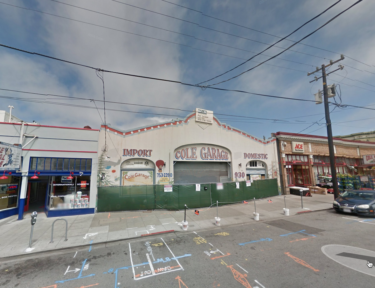
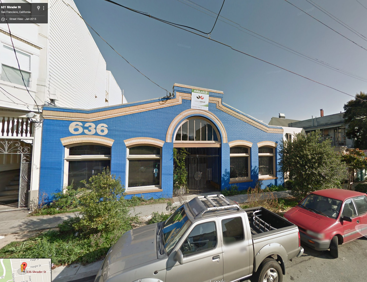
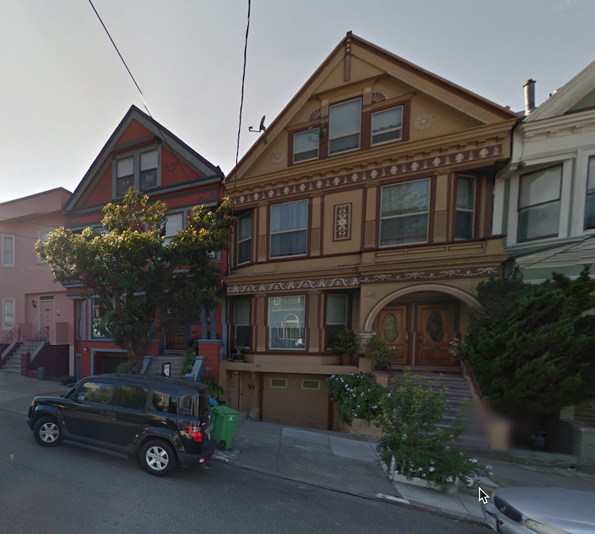
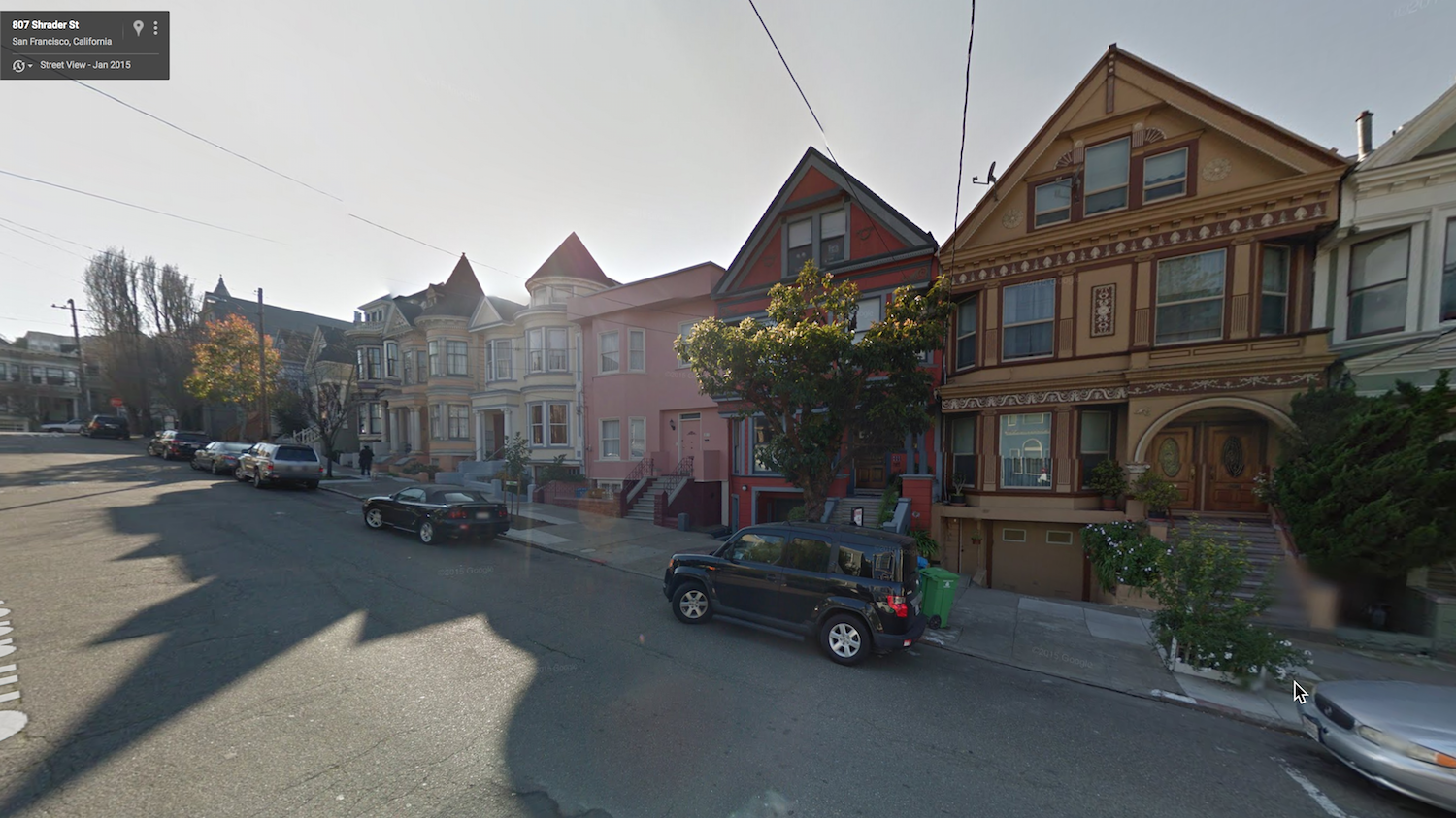
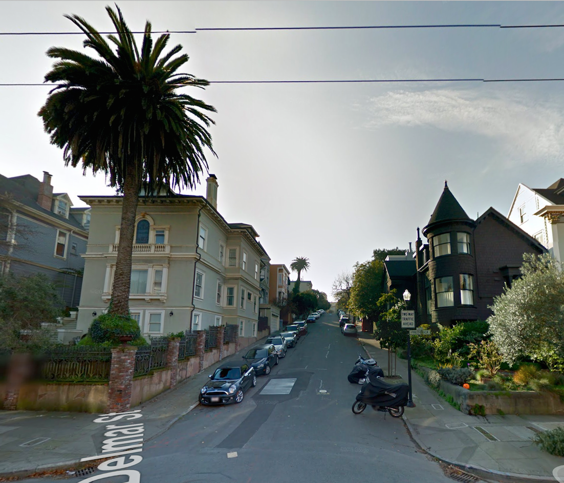
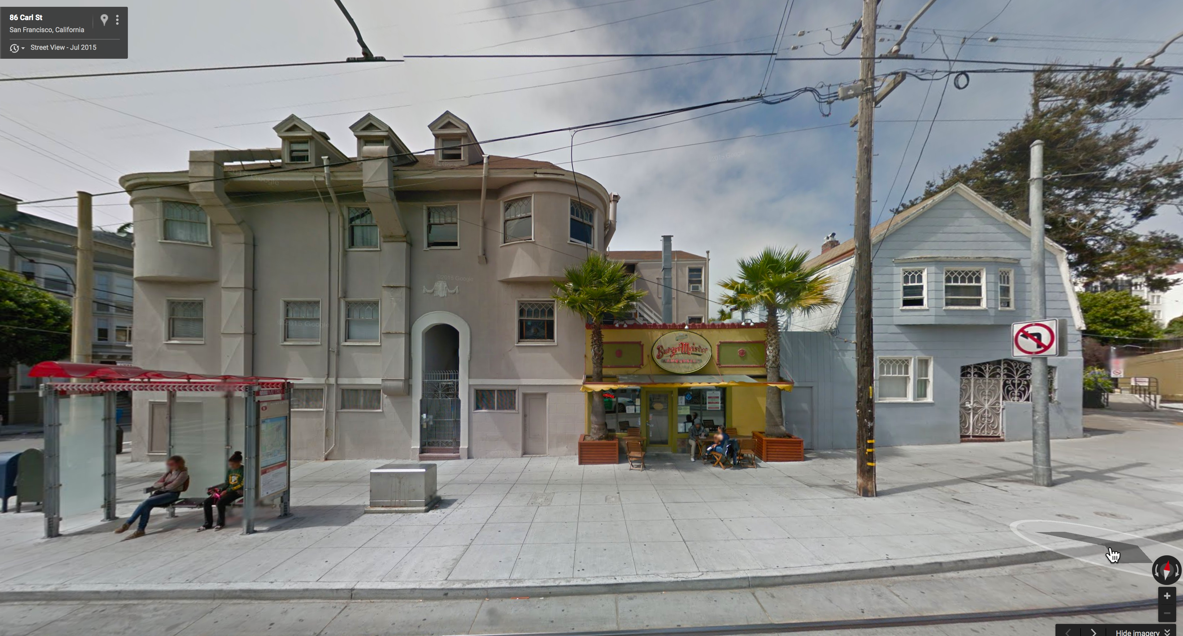
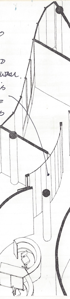
I “walked” the path shown and looked for interesting buildings,
and the images below (screen-saved from Google) are what caught my eye,
and what I will be choosing from for my drawings.
We’ll do this for several weeks — until around the end of the first week in November.
Then I have some other short but fun surprises for our virtual sketching.
Based upon feedback from our first walk, I hear this was overwhelming for some of you.
Those of you who are Artist’s Journal Workshop members will understand that
I want our group to run comfortably, being a welcome place for you to experiment
in a sketchbook (with a bit more focus) drawing as if you are walking a place.
That means tackling what is comfortable for you — my suggestions are simply that!
Remember too that you don’t have to draw the whole scene.
Below are some that I edited to show you what will interest me.
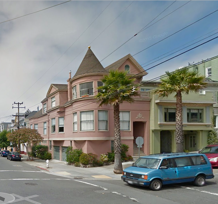

Or maybe you find a car you love or a PALM tree (I see several I love) you love
or a small outdoor dining area that would be fun to draw.
Or you can choose full scenes like the ones below!
Here is my “walk” from roughly Haight and Schrader
to Frederick to the Richard Gamble Memorial Dog Park:


Enjoy! All images are from Google street maps.

I started a Facebook group page to allow everyone to comfortably post their virtual sketches, and also where we will, from time to time, take virtual sketch walks. If you want to know more about what a virtual sketchwalk is review my first post.
I also created an accompanying Flickr group!
Don’t forget you can also post your images on Flickr!
Come join us On Facebook if you are inclined!
There are a few more notes/pointers on our first walk through Laguna Beach, California.
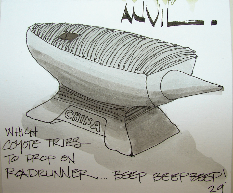
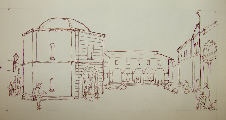
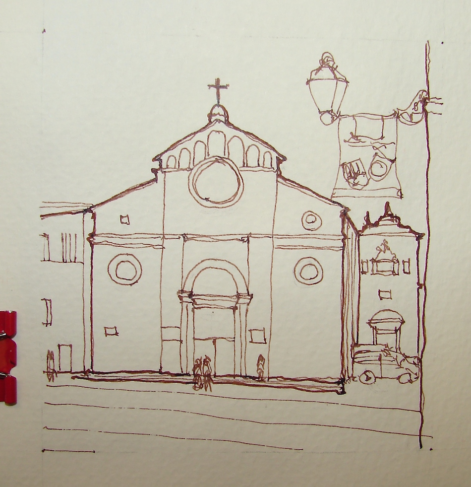
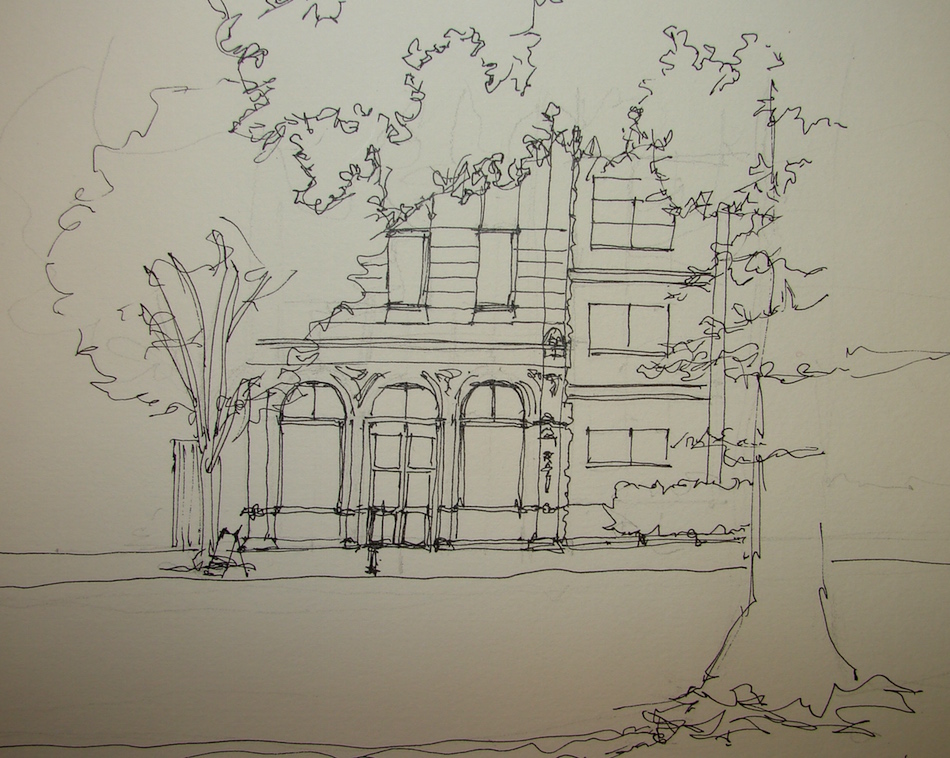
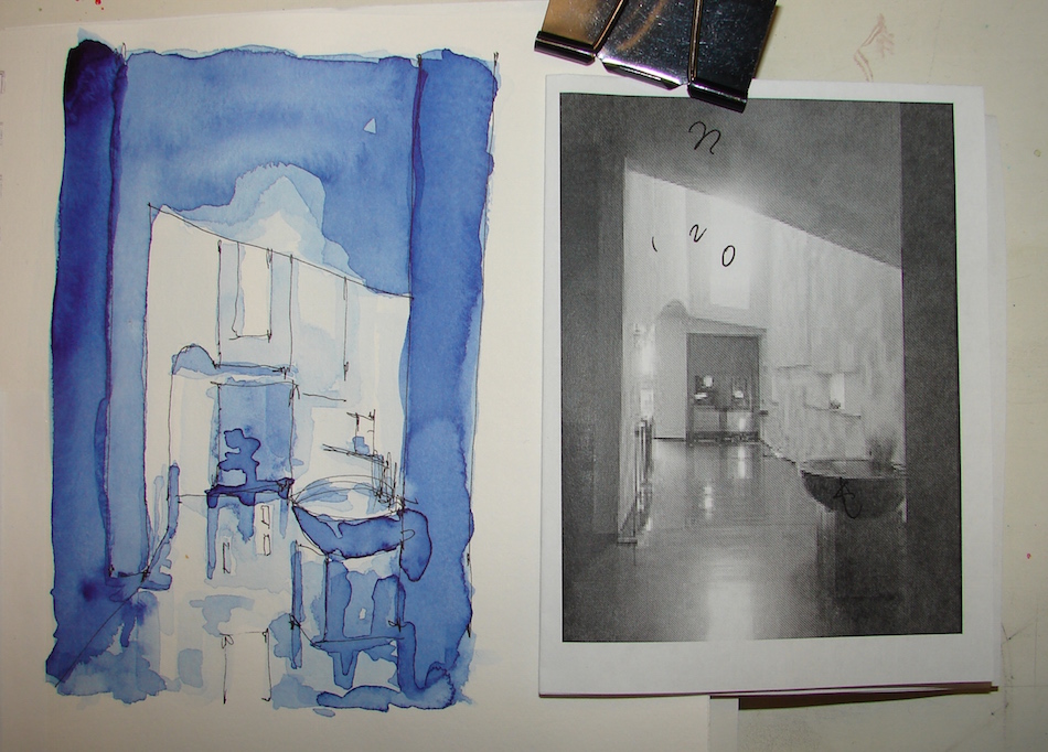
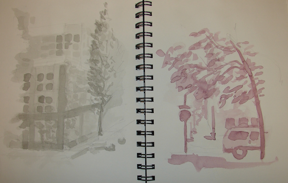
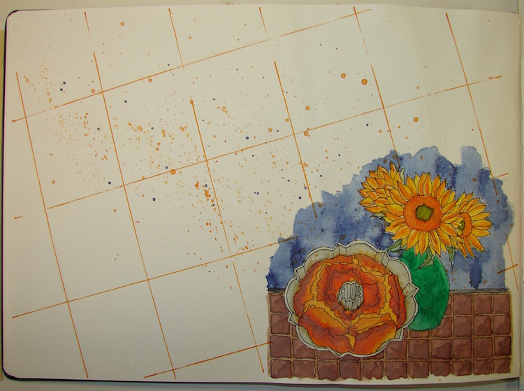
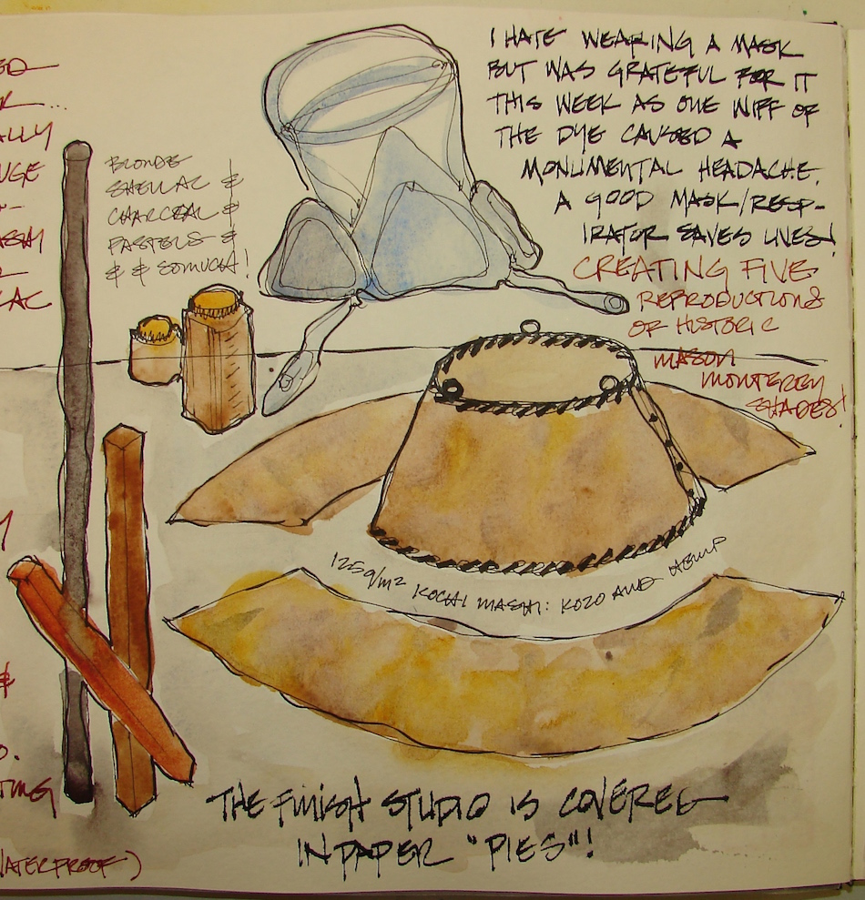
 Moleskin 8×11 watercolor journal, Pentalic HB woodless pencil,
De Artramentis Document, Super5 and Noodler’s inks.
I agree to Creative Commons Attribution-Non-Commercial 4.0 International License, which you can learn more about by visiting the site, or,
visit my web page for a more user-friendly summary on my terms.
My images/blog posts may be reposted; please link back to dkatiepowellart.


")