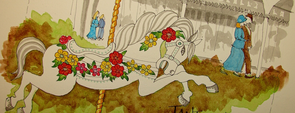
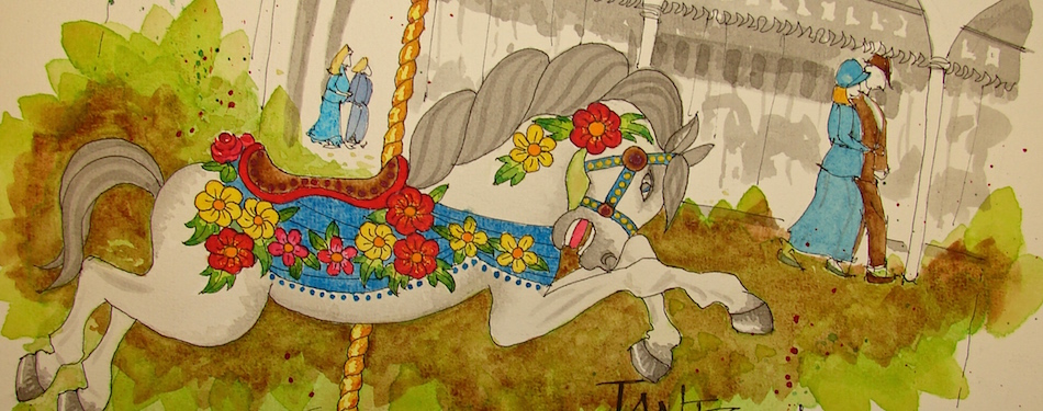
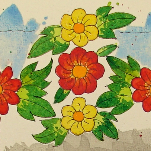
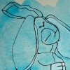
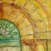
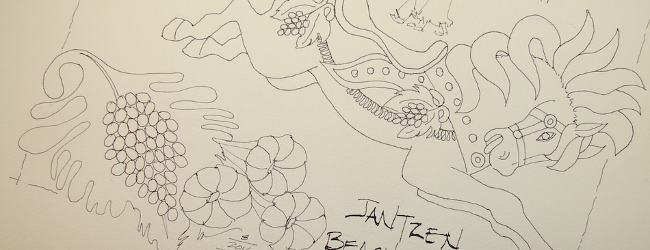
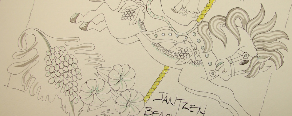
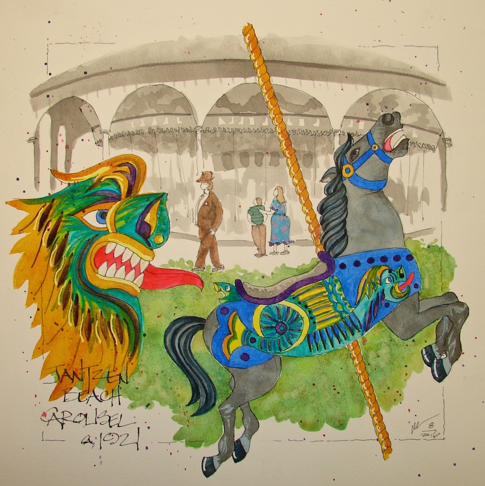
Jantzen Beach Carousel is a series, and this is the third in the set.
(Below are links to others previously posted.)
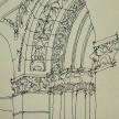
The many layers, above.
Grisaille(pronunciation, taken from the French word for grey) was used in each
of the Carousel horse paintings. In this case, I used waterproof Noodler’s Lexington ink
to add dimension to a “white” horse, and to paint the background carousel image, above.
(The blue is the Fineline Masking fluid.) Most of the ink was painted before
any watercolor was added, but in this case, I cam back in with grey at the end
and contoured the belly and legs, and finished in the tail and mane,
which I thought I would end up painting in watercolor.
(Video of grisaille techniques is in the works.)
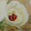
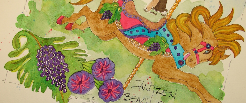
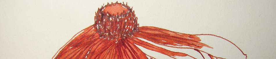
Floral Horse is my name for this image. The detailed images of the flowers on the horses reminded me of Mason Monterey
furniture, right. In real life the painted flowers on the horses and the garlands
are stunningly complex, created from many layers of colors. One reason to save these
historical carousels (besides the memories of so many — past — and the possibilities
to share those with today’s children — future) is experiencing a lovely
well-crafted carousel rather than the cartoonish plastic rides of today: they were SO beautiful! The garland I placed at the top is derivative of the pattern on the inside upper scenic panel: mirror, shields,
and floral patterns. On the carousel the centers of the flowers were light bulbs!
Bright prancing Floral Horse!
This slideshow requires JavaScript.
These images are donated to raise money for the restoration of the carousel!
Cold Press watercolor paper, with a Pentalic 2B woodless pencil,
Lamy Al-Star and Pilot Parallel pen with De Atramentis Document black ink
and Platinum Carbon pen with Platinum Carbon ink;
White Uniball Signo pen, Fineline Masking;
Sennelier, Holbein, QoR, M.Graham, and Daniel Smith watercolors.
As my Patreon supporter, you will have
access to some content not on this website,
sneak previews, goodies, discounts on classes.
I will teach architectural sketching,
art journaling (art+writing), creativity, watercolors.
That annoying loud-mouth editor/critic in your head? GONE! How great would that be?
I'd love it if you shared this; please mention my blog name!
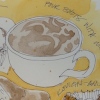
Another experiment…
Very very fast teapot sketch, middle-of-the-night.
Covered the sketch in water and dropped ink samples onto it.
Inktober is all about experimenting.
I think maybe it is time to stop the mad scientist. What do you think?
Fluid Hot Press pad, Lamy Al-Star with De Atramentis Document black ink
and Platinum Carbon pen with Platinum Carbon ink;
Noodler’s, De Atramentis Document, Diamine and Super5 inks.
Filling and cleaning go hand-in-hand. Goulet offers the pen cleaning package!
Goulet has amazing videos and I highly recommend Fountain Pens 101.
I was crazy not to take the time to watch the whole series *what, an hour? saved me ten* but then I never read instructions for ANYTHING growing up!
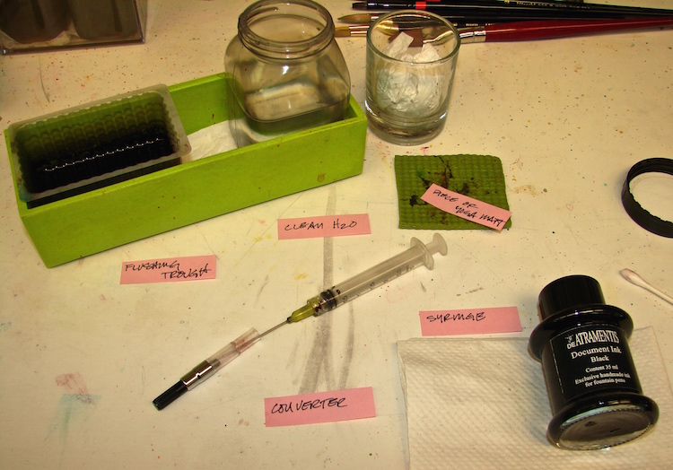
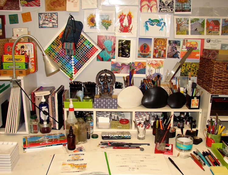
This is my easy desk set-up (you can see where it sits on my short shelf).
I tend to think in an organized way, so perhaps this will help others.
You’ll notice a large brown bottle of water with an eyedropper?
I use it to jump start a sluggish pen with a drop of water.
I strongly recommend you wear old clothes on when you first start filling; I have spluttered it everywhere until I got the hang of it!
Converters must be proper for pen. On Goulet they will list the appropriate converters for your pen or you can call them (as will other retail pen outlets).
To fill a pen efficiently I recommend aneedle syringe. You can do it by using the converter’s instructions, through suction or plunging, but I find that they waste ink and/or make things messier and/or don’t allow the pen to fill completely. If you don’t have enough ink and run out prematurely, you are more prone to a dry pen which leads to a clogged pen. I fill my pens to the hilt!
Make sure you know how to place the converter properly onto the pen
before you fill it with ink the first time. Look at it — I have found that some even have guide lines! Literally practice it a few times.
Otherwise, you may end up with ink everywhere!
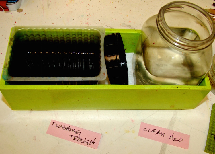
I wanted a way to easily fill my pens at my desk, have clean water to
flush the pen in a secure, stable container when necessary, and a place where
I could clean the needle syringe of ink as I flushed it in something
that I would eventually throw away rather than clean.
I fill the pen by dipping the CLEAN needle into the ink bottle, filling the syringe,
then placing the needle carefully into the converter and gently filling.
I lay the needle down, place converter on the pen,
then immediately tend to the needle syringe after:
Evacuate any extra ink into the bottle.
Dip needle in the open bottle of clean water (right, above) and
pull clean water into the dirty syringe.
Evacuate into the flushing trough (above left) next to it.
Repeat until your syringe is clean (it never will be perfectly clean but do the best you can.)
*Be gentle with me… still getting used to the new camera!
If pens need flushing with water before I refill with ink (sluggish feed —
you’ll know it when you’ve got one) I use the bulb syringe, right, and the desk setup above to grab clean water and flush into the trough to clean it on the spot.
(Here is a Pen Maintenance video from Goulet shows simple cleaning techniques.)
If I am cleaning many pens I take them into the bathroom into a CLEAN sink. Periodically flush your pens and you are less likely to end up with clogged pens. If I use a pen all the time (I have three I use daily) then I only flush them every couple months.
Yes I finally bought the Goulet cleaner and man that stuff works!
It is great for a dry clogged pen….
I repurpose all kinds of things. The green tray is older, and I usually use them for pens (on the desk below, right), but everything fits in it so that was lucky. I bought it at Storables. It happens to hold a plastic food container that held rice crackers in their package. The plastic bottle can be found at Michael’s, I am sure, or a grocery store, but a glass jam jar would work too. The shot glass with a wadded paper towel is to hold the needle or bulb syringe after I finish with it so it drains. Finally, I find a piece of yoga mat helpful in many situations so keep a couple on my desk.
You can see the entire bin sits within arms reach where I paint.
Next week, I will write about white ink….
and a early tip, do NOT put De Atramentis in any fountain pen….
As my Patreon supporter, you will have
access to some content not on this website,
sneak previews, goodies, discounts on classes.
I will teach architectural sketching,
art journaling (art+writing), creativity, watercolors.
That annoying loud-mouth editor/critic in your head? GONE! How great would that be?
I'd love it if you shared this; please mention my blog name!
How do I let go of family things that no one wants? Draw them!
Bright Ideas multi-color journal, with Platinum Carbon pen with Platinum Carbon cartridges and Lamy Al-Star with De Atramentis Document black ink,
White Uniball Signo pen, Fat white Pitt pen, and colored pencils.
One of the two challenges I look forward to, this one is drawing every day.
It is a great way to tone your drawing skills, play with texture in line-work.
For all my love of color, I love creating ink drawings…
I wrote on these pages after taking the images, about my mom, who had a fantastically small waist that even as a teenager I never came close to having — possibly from wearing Merry Widows (corsets) as a young woman. When I was a child I liked to wear this black velvet belt with the money attached and the sparkling rhinestones!
Bright Ideas multi-color journal, with Platinum Carbon pen with Platinum Carbon cartridges and Lamy Al-Star with De Atramentis Document black ink,
White Uniball Signo pen, Fat white Pitt pen, and colored pencils.
As my Patreon supporter, you will have
access to some content not on this website,
sneak previews, goodies, discounts on classes.
I will teach architectural sketching,
art journaling (art+writing), creativity, watercolors.
That annoying loud-mouth editor/critic in your head? GONE! How great would that be?
I'd love it if you shared this; please mention my blog name!
Sammy in the upholstery studio…
He even has his own chair, the Moon and Stars chair.
Black cats are not easy to paint. Black on black on black…
Pentalic Aqua Journal, Platinum Carbon pen with Platinum Carbon ink;
Noodler’s Lexington Grey ink, White Uniball Signo pen, Fineline Masking Fluid,
Sennelier, and Daniel Smith watercolors.
As my Patreon supporter, you will have
access to some content not on this website,
sneak previews, goodies, discounts on classes.
I will teach architectural sketching,
art journaling (art+writing), creativity, watercolors.
That annoying loud-mouth editor/critic in your head? GONE! How great would that be?
I'd love it if you shared this; please mention my blog name!
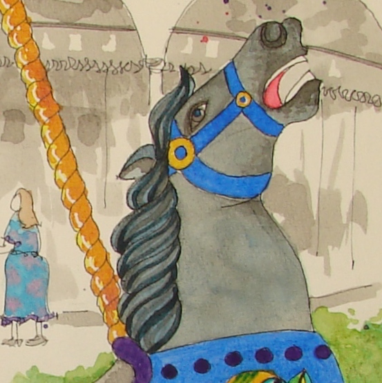
Jantzen Beach Carousel is a series, and this is the second in the set.
(Click here to see the first, the Chinese Water Serpent Horse.)
I named this Horse with Grapes!
Why am I naming them differently than CW Parker called them?
Because mine are not historically accurate but an homage to the various styles,
as I had to use many disparate images — black and white images, frontal images, detail images, and images from other carousels — while researching to create one horse.
I continue the background of a greyed image evoking an old photograph,
while tying the past to the present. The mane and tail also used waterproof grey
to lay in accents under the watercolor, using the technique called grisaille.
Bright yellow and green were undercoats to brighten the top coat.
As I built up color, the original pink looked a bit pale;
I switched it to Quinacridone Coral.
The Fineline Masking fluid was a part of painting on this horse,
where I used it to allow the tassels and the highlights of the grapes to remain white.
Sky, grass, and final touches added,and this cornucopia is complete!
These images are donated to raise money for the restoration of the carousel!
Cold Press watercolor paper, with a Pentalic 2B woodless pencil,
Lamy Al-Star and Pilot Parallel pen with De Atramentis Document black ink
and Platinum Carbon pen with Platinum Carbon ink; Fineline Masking;
Sennelier, Holbein, QoR, M.Graham, and Daniel Smith watercolors.
As my Patreon supporter, you will have
access to some content not on this website,
sneak previews, goodies, discounts on classes.
I will teach architectural sketching,
art journaling (art+writing), creativity, watercolors.
That annoying loud-mouth editor/critic in your head? GONE! How great would that be?
I'd love it if you shared this; please mention my blog name!
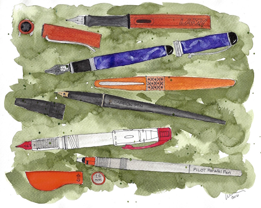
NOTE: UPDATED 1/2018!With Inktober arriving in a week, pens are an appropriate tool to review!
(BTW, yes I am doing the challenge — I love it — but
I don’t use the prompts. I just draw every day in ink!)
I’ve drawn my favorite pens, the ones I reach for, walk from desk to home to bed, the ones I love the feel of, that flow well. I will talk about a few others that are keepers but…
know that there are amazing artists who will disagree with me and love that which I tolerate or hate! (Thinking about Cathy Johnson and Noodler’s flex pens.)
My priorities in a pen are that it WORK. That is 90% of it.
I’ve had some pens that didn’t work at all, that had to be fussed with constantly,
and so they went to other homes. I hate fussing. I am all about the drawing.
If possible, I want them to be beautiful.
Being a former architect, designer and artist, I love beauty!
I love a well-designed object (see WORK above), though it is more than that. I want them to be able to post for the times I use them outside my studio.
The favorites:
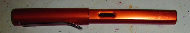
My favorite pen is the Lamy Al-Star.Reliable 100% of the time;
it only clogs if I abuse it — mostly by letting let the converter go dry unintentionally;
then I need to clean it. It feels good in my hand and is gorgeous!
I bought a converter, which is a must for me as I want waterproof inks for sketching with watercolors. I can easily change my nibs in a flash, meaning I only have to have one pen and I have all this nib variety. How cool is that for traveling? I confess to have it in several colors. Pen pig. I use this one exclusively with Diamine Ancient Copper.
The Lamy Joy(below) didn’t make my favorite list, but it is a good pen,
much better than the Safari. I’m not as thrilled with the feel of it in my hand,
and the colors/design are not as beautiful.
UPDATE: I now love my Joy….
I’m not sure why, but I’ve not had luck with the Lamy Safari with my inks. Clogging constantly… drove me nuts.
My husband loves his with their cartridges… Me, not so much.
☾
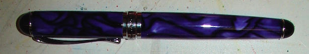
Mitchell bought me a gorgeous Jinhao as a memory of my first pen show.
I’m not a purple person, but this cobalt blue violet is stunning.
I said I’d never own another Jinhao (a dirty word in my studio) BUT
the dealer buys them and retrofits them and tweaks them with lovely Goulet nibs.
Mine has a 1.5 stub, and I love it. It is juicy and if I turn it I can get quite a thin line,
above, or flatten it and it is a good calligraphy pen.
I am still trying out colors but think I’ll chose the Diamine Regency Blue, above.
UPDATE: I now convert my own, as it is easy if you have
a little bit of technical ability. I used a Jinhao 750
and I like stubs so I bought Goulet’s stub nib! Yay!
*sigh* Still in love with my first purple PEN!
☾
If how often you reach for it is the way you decide which is your favorite pen
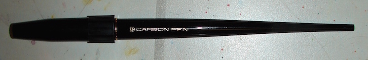
(the one you can’t live without), then the Platinum Carbon Pen with waterproof cartridges is my favorite.
A total workhorse. My first was the fine point,and I used it and used it and used it with no clogging then one day it stopped. I panicked, wondering what had I done?
I wet it and wiped it and babied it and then realized I had an empty cartridge!
I have it in both sizes, have the desk holders on my studio desk, and then have
two with cartridges for holding brown ink. I really love this pen!
The big downside is the dang pen doesn’t post! Really, how stupid is that?
Most of us are using our pens in the field and then you really want to post
so you don’t lose the pen. I haven’t done this, but Cathy Johnson
has solved the problem of the non-posting pen by cutting the tip off until it posts!
☾
Another workhorse that rarely clogs and can hold a ton of ink is the Platinum Preppie, in three sizes, including a truly extra fine.
I convert it to an eyedropper using O-rings and silicone grease
from Goulet, and have them filled in several ink samples to for play!
At under $4 these are also great to give as starter pens.
☾
The Pilot Metropolitan is also a favorite: inexpensive, comes with a converter at $15.
You can buy a better converter (Con-20 another squeeze converter — or Con-50),
but the squeeze jobber (bladder) works fine! Gorgeous bright colors or
an elegant subdued color with a bit of patterning around the band.
I admit to having them in several colors to match ink.
Downsides: You can’t easily swap out the nibs, and there is no stub nib.
I am fond of stub nibs, and like the option.
UPDATE: Now we can buy them with stubs! Yay!
I also have found they are fussy with some inks, and can’t get the hang of what makes them fussy. Daily I use a bronze with Super5 Australia ink (waterproof, left above.)
UPDATE: Wit the stub I find no problem, so perhaps the sluggishness is in the fine point.
☾
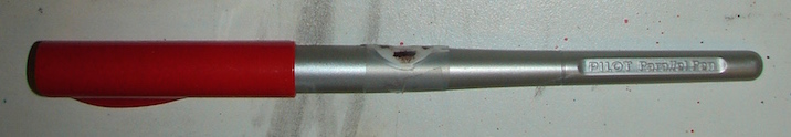
The Pilot Parallelis not quite a
fountain pen — it is unique! I have it in
the 1.5mm and 2.5mm, and larger than that would not suit me. I highly recommend the video by Rachel Goulet to see the capabilities of the pen — I use it in the most mundane manner, that is, for lettering.
Downside: The pens often feather on cold press (rough) watercolor papers.
Sometimes I am okay with that look, sometimes not.
☾
Noodler’s Ahab, the pen I hate even after I replaced it with a Goulet nib, and filled it with De Atramentis Tobacco ink. $23 + $15 for the nib….
I’m not a fan of Noodler’s inks or pens.
I’m not sure if it the nibs themselves or perhaps it is Noodler’s are just too fussy for me.
I also feel like the body is cheap — it FEELS cheap in my hand.
It’s a big pen, so for small hands (mine are medium) that might be a problem. If you want to try a flex nib, at least you know you can swap it out for a great nib if you hate it.
UPDATE: I tossed my Noodlers as the body was sort of disintegrating after 2 1/2 years…
Next for me is that I am going to learn dip pens!
I am adding this great set of test trials by Susan Bronsak. She diligently compared the pens and inks she had on hand — and it is a nice way to see the inked lines.
I may have to do this sometime. A good way to break in a journal!
Goulet also has a page called the Nib Nook, and this is great if you are determined to compare sizes because you are looking for a very bold or very fine nib.
Want to know more about taking care of your pens?
Goulet has 22 videos called Fountain Pen 101:
Just for fun:
Pens banners / samples as described.
Painting is in a Fabriano Watercolor journal, so not my favorite, using a
Platinum Carbon pen, Super5 Dublin ink, and Daniel Smith watercolors.
As my Patreon supporter, you will have
access to some content not on this website,
sneak previews, goodies, discounts on classes.
I will teach architectural sketching,
art journaling (art+writing), creativity, watercolors.
That annoying loud-mouth editor/critic in your head? GONE! How great would that be?
I'd love it if you shared this; please mention my blog name!
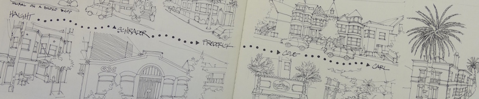
How do I paint from my car? What does my setup look like? I’ve been promising this post for a long time and I finally found a photographer willing to take some quick photos of me sketching (well, fake sketching in my driveway). Several things to note before you read the post in its entirety: the car is not always this clean and my palette is not always this dirty. But this is a good week because the car was just washed. As for the palette, a cleaning is a bit overdue, as you will see.
I am sometimes asked if I sit in the driver’s or the passenger’s seat. Well, as you can see, it’s the former, for two reasons. One is that I use the steering wheel as a support for my sketchbook. Secondly, I am right handed and that gives me easy access to the palette and water container.
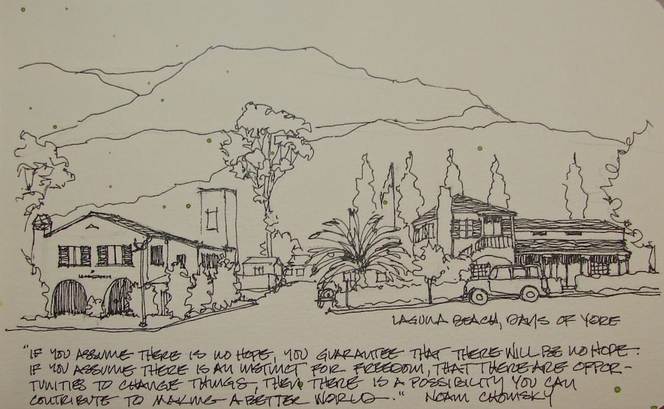
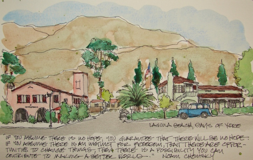
Sketch from an old black and white photo from who-knows-where,
looking East into the Laguna Hills, when they were pristine…
With more news of fracking pollution approved to dump in our oceans, I am homesick for better days. There was a time when we wanted to take care of and clean up; now the once pristine land is our sewer. I was taught not to relieve myself near any body of water — even hiking, we had to be 20 feet and on the down side from a creek. Now we allow fracking waste and every kind of chemical pollutant to be sprayed and dumped in our waters. I don’t think we need worry about the political differences of the candidates for President; both will continue to do an excellent job of polluting our HOME, and we will take all the creatures of the Earth with us, which is even more unfortunate.
Pentalic Aqua Journal, with a Pentalic HB woodless pencil,
Platinum Carbon pen/Platinum Carbon ink; Noodler’s Lexington Grey ink for grisaille;
Sennelier, Holbein, and Daniel Smith watercolors.
As my Patreon supporter, you will have
access to some content not on this website,
sneak previews, goodies, discounts on classes.
I will teach architectural sketching,
art journaling (art+writing), creativity, watercolors.
That annoying loud-mouth editor/critic in your head? GONE! How great would that be?
I'd love it if you shared this; please mention my blog name!
I am a lover of carousels; this set was a pleasure to paint!
Jantzen Beach Carousel has so many gorgeous carousel horses!
I wanted to set up a series whereby someone could buy the set or just one,
and they would all work together or alone,
changing only slightly with each horse or set of horses.
I’ve been calling this the Chinese Water Serpent Horse.
I began with a sketch in pencil, really, three sketches,
loosely sitting on bits of paper, as all of these pieces will be done as collages.
Graphically, the background of a greyed image evoking an old photograph ties them.
I want a version in all the carousel pieces, plus a detail of some aspect of the horses,
and the horse itself. The layout takes time; I play with it.
I’ve inked the image and laid in the masking fluid (blue) so I don’t have to try
to remember and fuss with the bits I want to stay clean and white.
It is important for me to lay in the background color of the carousel in a
waterproof ink wash before coming to this horse, which happens to be quite grey.
For this I use the technique called grisaille underpainting,
using layers of waterproof grey ink in both line and wash.
The background sets the tone, and I don’t want it overpowering;
I want it to evoke an older time. By using the same grey value ink, I can guarantee
(as much as there are any guarantees in this crazy medium) that the inked carousel background will stay looking the same from image to image in the series.
I began to darken my horse (grisaille) with ink washes.
Coming soon: A class showing how I do ink washes of this nature.
(*Must Buy Camera*)
My under-painting begins, bright yellow,
to provide a *pop* and variation of some of my top colors.
Layering the final colors begins, though some of these will also be “underpainting”
colors. This is always tricky for me, because of my background in acrylics.
I have to be careful not to rush the process, let it dry completely,
and not to layer too much or it gets muddy.
At this point the grey of the horse began to bother me against the grey background.
The horse I was looking at, often in bits and pieces, appeared to be grey or blue.
I added a very pale wash of Paynes Grey + Prussian blue + Lapis —
which I might use to create a moody night sky —
and it did the trick, pulling the horse forward while not competing with the other colors.
All bits of masking fluid were removed, and final details finalized. OOOOPS, the real background, that which he stands on and sky and earth —
I forgot to start with that!!! Now I had to be sooooo careful!
Done and done, no mishaps. May just do all of them this way, back-ass-wards!
If you are interested in a video class on the process follow me for announcements here
or on Facebook and/or support me on Patreon for discounts and specials.
These images are donated to raise money for restoration of the carousel!
C.W. Parker built his first Carousel in 1896.
Although built in Abilene, Kansas, it spent its first years on the Venice Beach Pier, from 1921 to 1928,
when it was relocated to North Portland’s
Hayden Island with the opening of Jantzen Beach Amusement Park in 1928. The Carousel was listed, then dropped from the National Register of Historic Places, but is eligible for relisting again. Fun fact:
Carousels were once called “Carry Us Alls.”
Cold Press watercolor paper, with a Pentalic 2B woodless pencil,
Lamy Al-Star and Pilot Parallel pen with De Atramentis Document black ink
and Platinum Carbon pen with Platinum Carbon ink;
White Uniball Signo pen, Fineline Masking;
Sennelier, Holbein, QoR, M.Graham, and Daniel Smith watercolors.
As my Patreon supporter, you will have
access to some content not on this website,
sneak previews, goodies, discounts on classes.
I will teach architectural sketching,
art journaling (art+writing), creativity, watercolors.
That annoying loud-mouth editor/critic in your head? GONE! How great would that be?
I'd love it if you shared this; please mention my blog name!
I’m happy with my travel case from Sennelier.
I recently cleaned it and changed out two colors.
There is one little thing: It doesn’t fit into my small purse.
I know, artists are always fussing, right? But it is about 11-inches long and
it lives happily next to the bed — it is my bedside case.
And yet, I have been dragging it along when I plan on painting outdoors,
but only when I take my large BRIGHT MARIGOLD sketch bag!
Then a FB mixed media gal talked about her collection of watercolor kits, and
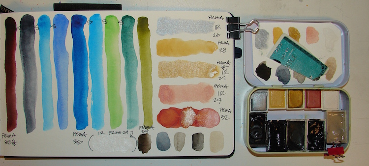
one caught my eye because it was so cheap! It wasn’t the watercolors — I assumed they would be student grade or worse — but the metal case was nice. I bought Prima Marketing Watercolor Confections: Decadent Pies just for the travel case.
The case is fantastic!
When you figure how much many other *ahem, unnamed* paint/case combos are, how can you not buy this one for $15.86? Two nice mixing wells for a juicy wash, four smaller wells for smaller mixes, and it can hold 21 half pans (ask me how I know… )
And it has a thumb ring-holder-thingie if you use that….
Now to the paints. None are transparent, and transparent floats my boat.
(Another post coming.)
Most are muddy, and I think it is a muddy that comes from cheap paints,
with the exception of #36 (blue), #34 (green-gold), and #30 (dried blood).
What really annoys me though, and why I can’t recommend the PAINTS
(but buy it for the dang case!!!!):
1) They are numbered, not named, so no clue to what is in them
2) They don’t TELL you pigment content
3) They don’t tell you if they are fugitive (assume they are)
4) They called mine “Decadent Pies”and many are iridescent!
(They should at least tell you that… What about pie is shiny and metallic?)
BTW, I did buy two more colors because I bought the cases for travel.
I kept the Prima Tropical colors for fun. Not so grainy. Prima Classics was a mixed bag.
I imagine the Shimmering Lights are no worse than most silly shimmer paints.
I did not try the Pastel Colors — I imagine they’d be chalky.
Tip: If you decide to use them up, put them in another order.
Prima knows nothing about painting, and put the dark colors right up next to the pale colors, which means they will end up mixing and ruining the pale paints.
I rarely use metallic (iridescent) paints because of the shine factor.
As you can see in the top photo, it glares in images. But out of these I like
#27 (bronze) and find #29 (white) intriguing.
I played around with them mixing all but the silver in a heavy #32 terra cotta color —
and #27 (copper) loses itself pretty fast (far left), but the white (far right)
and bronze (center) hold their own in the muddy terra cotta.
I said I’d use it as is for awhile…. HAH!
I hated the colors, and the box was calling me, saying, “purse size…. purse size.”
Yesh, boxes do that in the middle of the night.
I loaded my Sennelier half pans + a few of the Prima colors,
and filled my little Prima travel pan to the hilt!!!!
I really am doing a happy dance, and I also bought another one today —
the Tropical colors for $19.10. I am sure they too will be mediocre,
but I plan on taking them out and putting nine of my favorite Primateks for travel.
And here is the other thing about having a few small travel pans in different palettes:
I find that I can decide what to take for what venue.
IF I am heading out and know I am going to Urban sketch or head into the country,
I can pack all the small ones. Or just drop the one above into my bag always.
So what did I do with the iridescents? I have a teeny case that Cathy Johnson sent me loaded with some Yarka sample paints (long integrated), and I’ve been keeping a few mixing colors in them, but it turns out it had just enough space to squeeze the four iridescents and one other gold-pale-ocre #28 mixing color… WOW what a treat!
One last thing: I don’t like my paints to stay wet when not use, but I am also in a dusty industrial area, so I take a teeny clip and use it to prop the box open just a smidge.
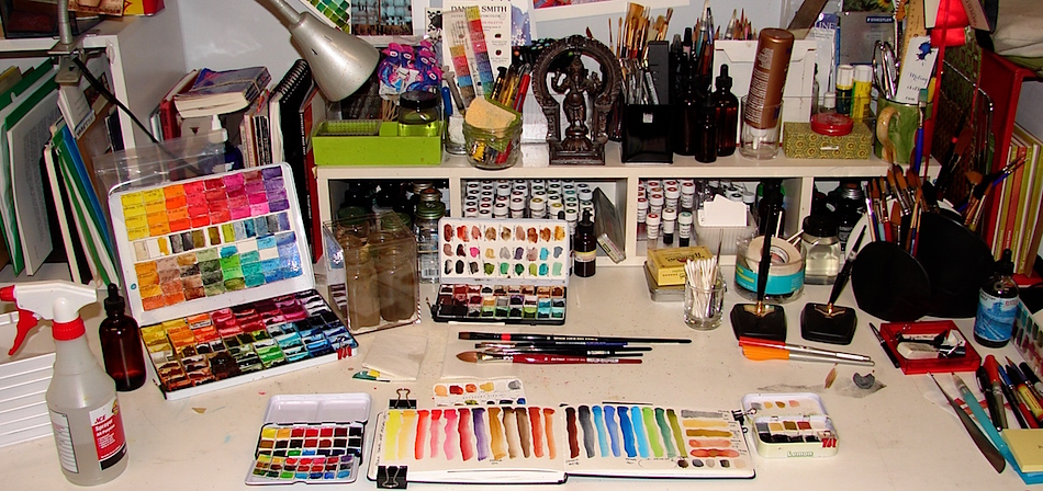
What is on my desk this morning…
I don’t know about you, but looking at artist’s desks satisfies the voyeur in me…
Yes, I really do keep a tidy desk when working on it…
As my Patreon supporter, you will have
access to some content not on this website,
sneak previews, goodies, discounts on classes.
I will teach architectural sketching,
art journaling (art+writing), creativity, watercolors.
That annoying loud-mouth editor/critic in your head? GONE! How great would that be?
I'd love it if you shared this; please mention my blog name!
You might remember that I painted a sketch of Fort Rock as part of a folding journal after the Endangered Places of 2015 was announced? It was based on the photograph by Craig Powell, #1 in the line-up, below, along with images from Bruce Swenson and Al Krause.
“The Fort Rock Valley Historical Society’s
Homestead Museum opened in 1988 with a goal of preserving some of the
few historic buildings remaining in Central Oregon’s remote Fort Rock Basin.
During the early 1900s, hundreds of families flocked to Oregon’s Great Basin to
“prove up” 320-acre parcels of land which was promoted by the Federal government as suitable for dry farming. Many communities sprang up in the Fort Rock Valley, an ancient lake basin, as a period of unusually heavy rain made long-term agricultural productivity seem likely. But the rain did not last, and neither did the people. They left, and the government repossessed much of the land for leased grazing use. The Homestead is a collection of original homestead era (early 1900s) buildings
including a church, school, houses, homestead cabins, and several other buildings
moved from nearby locations and assembled in a village setting.
The area’s extreme weather and the museum’s limited resources make ongoing maintenance a challenge, and several structures are in immediate need of repair.”
I created these sketches in response to two emotional impulses.
Old buildings are often shades of brown, and can seem drab, uninteresting.
The textures and the details are interesting when one has the eyes to see them.
The desert also can seem wide, dry, and uninviting. However, for those that have the eyes, and for those that live in these regions, the colors are often brilliant but in small doses.
The first is an interpretation of Al Krause’s image, and I love the colors of Indian Yellow and deep Prussian Blue and Diopside and Sap greens all together against the brown inks.
In the second I loved the reflection on Dr Thom’s office, and almost left it as shown in the first sketch. However, in he end I loved the Tobacco ink brushed loosely over the office.
These images donated will raise money for restoration efforts!
Strathmore 0r Fluid Cold Press papers, with a Pentalic 2B woodless pencil,
Platinum Carbon pen and Pilot Parallel pen with De Atramentis Document Brown ink ;
De Atramentis Tobacco ink and Sennelier, Holbein and Daniel Smith watercolors.
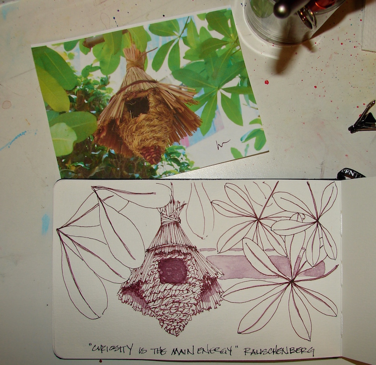
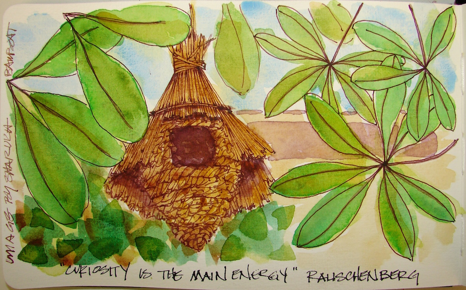
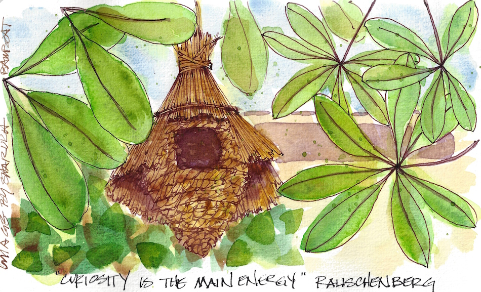
(Image provided by Sharukh Bamboat: friend, tour guide, writer!)
I thought it would be fun to show how the choice of an ink color can change-up your drawing. I keep a stash of good images (both mine and other folks) by my bed for nights when insomnia hits. Sharukh’s amazing birdhouse from India intrigued me.
Like a mini building of straw, the birdhouse was both complex and easy.
The basic form was not hard, but, once you start with detail, the question is, how muchdetail. Do you hint at it or draw every line. As an architect, my tendency is to draw every line but it can end up looking too formal, stilted. I want a looser, more exciting appearance, so I scribble and hint within the basic forms of the house. I began with a pencil sketch, then created light pencil guidelines, and loosely indicated the details with Pilot metropolitan in purpley-brown Super5 Australia ink, above.
Shadows followed, in diluted Super5 Australia ink with a round brush.
I choose the ink because of the purple in the leaf stems, which you can’t see easily in the image. I love working with colored inks under watercolors, which Reuven Dattner inspired me to try from the beginning of playing with watercolors. I also used a diluted wash of the Australia to hint at the apartment building behind the trees.
Under-painting of Cerulean + Primatek Lapis blue (sky),
Green-gold + a little Serpentine (leaves), and M.Graham Indian Yellow (house).
All colors are Daniel Smith (Primateks too) unless stated otherwise.
The leaves are a mix of three colors: Sennelier Phthalo green, Primatek Diopside green,
and an unknown old green mix with a bit of Graphite in it.
I layered the greens wet on wet on damp with my favorite brush — #16 Cosmotop Spin.
In fact, I used this versatile brush for the whole painting.
The more I use it, the more I fall in love with it. The excellent point can handle the tightest areas, and it can carry enough paint to wash the sky!
Finally, the brown tones were added, mostly Primatek, wet on damp:
Primatek Minnesota Pipestone, Primatek Yavapei, Primatek Goethe,
and a touch of Holbein Quin Gold. The image above was taken slightly wet;
after it dried I added green splatters and scanned it, below!
Pentalic Aqua Journal, Pentalic HB woodless pencil,
Pilot Metropolitan Fountain Pen with Super5 ink Australia,
Sennelier, Holbein, M.Graham, and Daniel Smith watercolors.
As my Patreon supporter, you will have
access to some content not on this website,
sneak previews, goodies, discounts on classes.
I will teach architectural sketching,
art journaling (art+writing), creativity, watercolors.
That annoying loud-mouth editor/critic in your head? GONE! How great would that be?
I'd love it if you shared this; please mention my blog name!
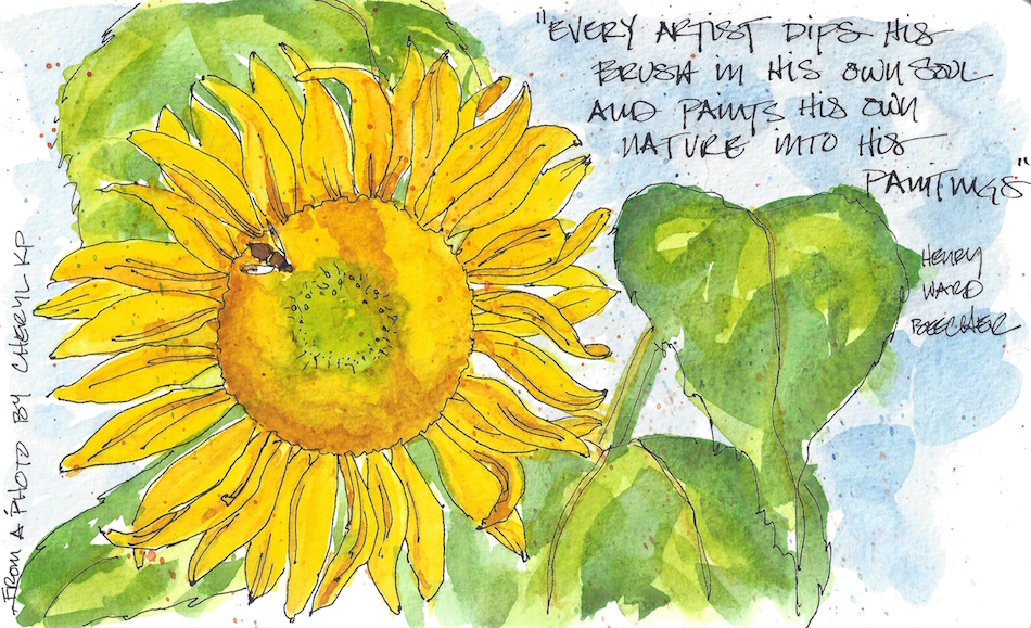
“Every artist dips [her] brush into [her] own soul
and paints [her] own nature into [her] paintings.” Henry Ward Beecher
I have been gifted by the Internet God/desses of Amazing Connections
to wonderful friends, and they’ve led to other friends, who led to writing buddies
and so many many great art buddies. Who would have thought?
Today I am giving thanks for the connections.
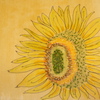
I love sunflowers and the season is ending; I should have bought a
bouquet at the last farmer’s market.
Luckily, I have friends who will let me paint their images!
What better way to lift spirits than gratitude and sunflowers?
Pentalic Aqua Journal, Pentalic HB woodless pencil, Platinum Carbon pen with Platinum Carbon ink; Lexington Gray Ink, Sennelier, Holbein, and Daniel Smith watercolors.
As my Patreon supporter, you will have
access to some content not on this website,
sneak previews, goodies, discounts on classes.
I will teach architectural sketching,
art journaling (art+writing), creativity, watercolors.
That annoying loud-mouth editor/critic in your head? GONE! How great would that be?
I'd love it if you shared this; please mention my blog name!
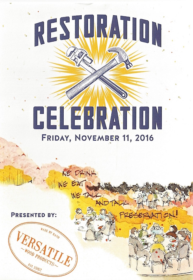
I am almost completed with my commitment to painting many of Oregon’s Most Endangered Places for Restore Oregon. They will auction the images at the Restoration Celebration dinner to raise monies to further the cause of restoration and saving pieces of our cultural heritage. When Restore Oregon asked me to paint the buildings, many of the available images were not inspiring to my painterly eye. They are worthy causes with interesting histories, but I need to be inspired or excited visually in order to create more than a mediocre but well executed rendering. I need to connect in some deeper way.
I was working sometimes with tiny black and white fuzzy photographs, or snapshots from family albums, or a boarded up place I could visit, but which would not be an inspiring subject. In retrospect, I connected to the locations by finding a way into the piece through contemplation or some other means. In doing so, I think I understand what others must find, possibly for themselves, in order to be excited about history, historical buildings, architectural restoration, or why “that old thing” should be saved.
Similarly, the importance of inspiration must not be overlooked when it comes to inducting the public into support for preservation efforts. How do we do that for the masses, who are not sitting around thinking of how to be inspired?
Art is one path. Artists induct people by communicating their thrill or love
through a medium that enters into the viewers (or listeners) senses unawares.
It is the difference in announcing that this or that event is going on, which is preaching to the crowd because the ones who will go are already connected or excited about the event, versus inspiring someone to become interested in an event or happening.
In creating these pieces, some were easy inspirations.
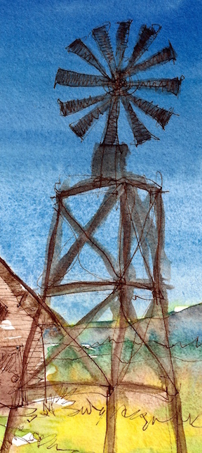
Barn red on blue water sings to my soul, taking me back to a Southern California where barns sat next to open ranches on the clear blue Pacific Ocean. Heaven.
Who doesn’t love a carousel horse?
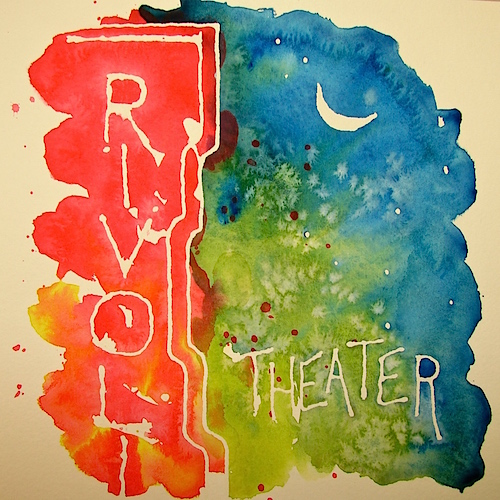
But to paint the Rivoli I had to imagine my mom, swooning over all-things-Hollywood when she was a girl, for whom going to the movies was an exciting happening! I walked in her shoes, imagining the neon sign in the small town of San Fernando, the ritual of going into the dark theater, a shrine, to be transported in an uncommon manner to a swashbuckling time. Coming out and walking down Main Street in San Fernando to the ice cream parlor to talk about Errol Flynn and Olivia de Havilland, and boys boys boys.
To paint Fort Rock I remembered growing up in California
when there were still places (now completely populated)
where you turned off your car or cabin lights and the world around you was silent except for the waves or the breath of horses.
You could see the horizon glow from the galaxy’s lights,
and smell the natural herbal smells of the earth and ocean.
I imagined being in that great Eastern Oregon basin as a homesteader, and the wonder of the wide open spaces.
And, how happy I might be to see other people!
How I would appreciate the creature comforts of dwelling!
I’ve shared my images, and if I am successful, my emotional connection may come through. Even if the viewer does not know why, they might feel some of what I felt when painting them. They might smell the sage or hear the music! However, in this day of blogging, it is also an adventure (for me) to be able to read or listen to why and how an artist connected with a subject. This is why I take the time to write about what I thought and felt, and how I found my way into the most difficult places.
NOTE TO ARTISTS: I know somewhere during this post artist’s eyes began to roll because they though “Never ever donate your art.” Yes, I know, and this is the first time, and I’ve made an exception because Restore Oregon is a cause I believe in, period.
As my Patreon supporter, you will have
access to some content not on this website,
sneak previews, goodies, discounts on classes.
I will teach architectural sketching,
art journaling (art+writing), creativity, watercolors.
That annoying loud-mouth editor/critic in your head? GONE! How great would that be?
I'd love it if you shared this; please mention my blog name!
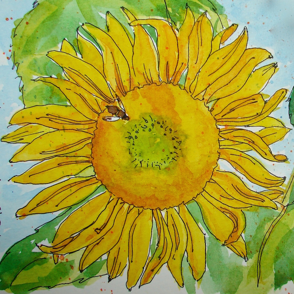
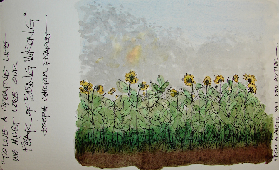
A dialogue with a friend yesterday about perfection in his painting
(he is learning gouache) reminded me that perfection freezes us. Also, NO artist is objective about their work after they’ve just finished it. We spent the time struggling with this or that mark/color and know what we wanted and how it is not THAT.
We see the screwy mark/color, not the forest, so to speak.
Anywho, I love sunflowers and the season is ending.
Painting sunflowers in early morning sun is a stretch for me.
Grisaille helped build tone under the washes of watercolor.
Middle-of-the-night, insomniac painting!
I’m happy with it, a happy image — except for the misdrawn leaves — JUST KIDDING.
Pentalic Aqua Journal, Platinum Carbon pen with Platinum Carbon ink;
Lexington Gray Ink, Sennelier, Holbein, and Daniel Smith watercolors.
As my Patreon supporter, you will have
access to some content not on this website,
sneak previews, goodies, discounts on classes.
I will teach architectural sketching,
art journaling (art+writing), creativity, watercolors.
That annoying loud-mouth editor/critic in your head? GONE! How great would that be?
I'd love it if you shared this; please mention my blog name!

 One of my favorites, the Floral Horse!


 The many layers, above.


 Floral Horse is my name for this image. The detailed images of the flowers on the horses reminded me of Mason Monterey
 Bright prancing Floral Horse!


 As my Patreon supporter, you will have


 I created these sketches in response to two emotional impulses.