
 (Image provided by Sharukh Bamboat: friend, tour guide, writer!)
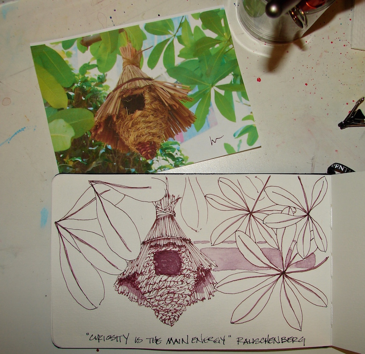
I thought it would be fun to show how the choice of an ink color can change-up your drawing. I keep a stash of good images (both mine and other folks) by my bed for nights when insomnia hits. Sharukh’s amazing birdhouse from India intrigued me.
 Like a mini building of straw, the birdhouse was both complex and easy.
The basic form was not hard, but, once you start with detail, the question is, how much detail. Do you hint at it or draw every line. As an architect, my tendency is to draw every line but it can end up looking too formal, stilted. I want a looser, more exciting appearance, so I scribble and hint within the basic forms of the house. I began with a pencil sketch, then created light pencil guidelines, and loosely indicated the details with Pilot metropolitan in purpley-brown Super5 Australia ink, above.
Shadows followed, in diluted Super5 Australia ink with a round brush.
I choose the ink because of the purple in the leaf stems, which you can’t see easily in the image. I love working with colored inks under watercolors, which Reuven Dattner inspired me to try from the beginning of playing with watercolors. I also used a diluted wash of the Australia to hint at the apartment building behind the trees.
 Under-painting of Cerulean + Primatek Lapis blue (sky),
Green-gold + a little Serpentine (leaves), and M.Graham Indian Yellow (house).
All colors are Daniel Smith (Primateks too) unless stated otherwise.
 The leaves are a mix of three colors: Sennelier Phthalo green, Primatek Diopside green,
and an unknown old green mix with a bit of Graphite in it.
 I layered the greens wet on wet on damp with my favorite brush — #16 Cosmotop Spin.
In fact, I used this versatile brush for the whole painting.
The more I use it, the more I fall in love with it. The excellent point can handle the tightest areas, and it can carry enough paint to wash the sky!
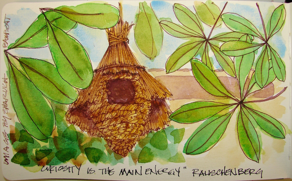 Finally, the brown tones were added, mostly Primatek, wet on damp:
Primatek Minnesota Pipestone, Primatek Yavapei, Primatek Goethe,
and a touch of Holbein Quin Gold. The image above was taken slightly wet;
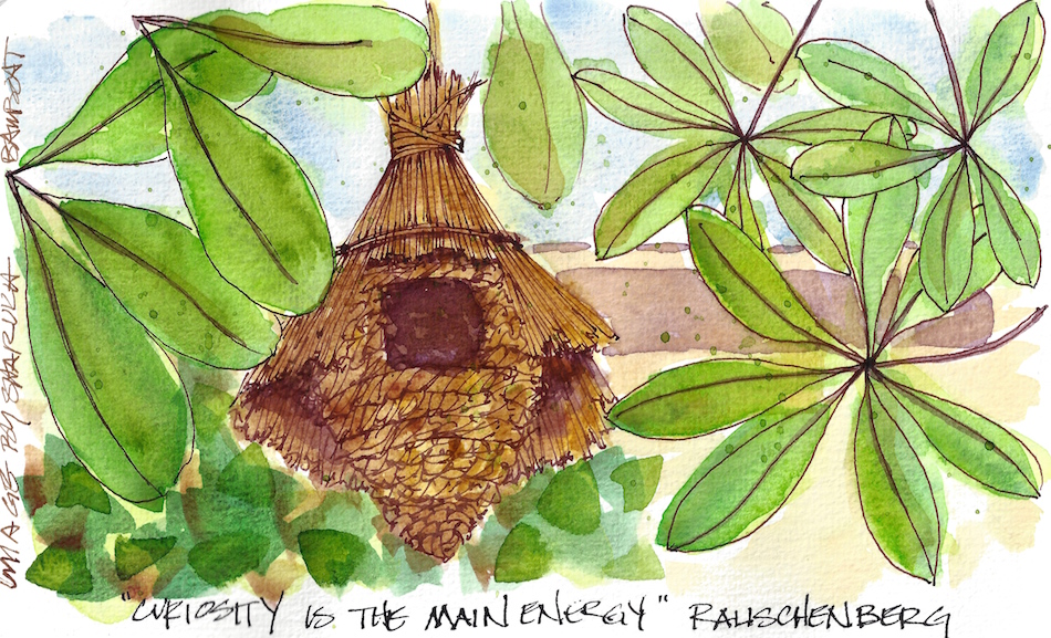
after it dried I added green splatters and scanned it, below!
 Pentalic Aqua Journal, Pentalic HB woodless pencil,
Pilot Metropolitan Fountain Pen with Super5 ink Australia,
Sennelier, Holbein, M.Graham, and Daniel Smith watercolors.
©D. Katie Powell.
My images/blog posts may be reposted; please link back to dkatiepowellart.
☾
 As my Patreon supporter, you will have
access to some content not on this website,
sneak previews, goodies, discounts on classes.
I will teach architectural sketching,
art journaling (art+writing), creativity, watercolors.
That annoying loud-mouth editor/critic in your head? GONE! How great would that be?


Very nice Kate. I remember really liking that photo, and this is such a good treatment of that image. Thanks for walking us through the process and for the in-progress photos.
LikeLike
Yes, I loved it when I saw it. I’d like to find one of those birdhouses — so pretty. Thanks!
LikeLiked by 1 person
quite a nice study
much love…
LikeLike
Thank you Gillena!
LikeLike
such a unique bird house and your painting of it is really fabulous! I tend to try to draw every line and it’s a constant struggle for me to be loose when doing watercolor art.
LikeLike
Thanks Linda; I struggle too!
LikeLike
I’m so thrilled to see the same image in ink colors. Thanks Kate. The funny part is even I haven’t seen such a birdhouse in the stores. I normally find the usual cages, but I will keep a close watch. I believe right now this very birdhouse is occupied being the breeding season.
LikeLike
I love how it turned out! What kind og bird uses these houses? While I’d love one the cost of mailing etc. is probably crazy! I love woven basket thangs! BTW, you should have my email address by if not, will you email me your mailing address?
LikeLike
Oriental Magpie Robin and Common House Sparrow usually use it here. I’ll share my mailing address with you. 🙂
LikeLike
Is the Magpie-Robin like a magpie in personality or in color only?
LikeLike
Honestly, I have no clue about it. I am no bird expert, but Oriental Magpie Robin is more of a thrush than a magpie. You know, small, cute sparrow size bird.
LikeLike
Here we have a magpie which is a crazy talkative bird, more like a jay if you have them there….
LikeLike
Yeah, same with this one. Talks a lot.
LikeLike
So magpie may be a commentary on the nature of the bird too…
LikeLike
Yup, maybe
LikeLike