What do you do when you have the flu?
Sick, fuzzy-brained, I was seduced by the new line of Daniel Smith watercolors!
I say seduced because I did not do what I should have, which is check the
the Munsell numbering System to see how close they might be to what I already own.
I don’t have unlimited funds so this is important… Ah well.
I am going to talk about the colors I have and the ones I am glad I bought…
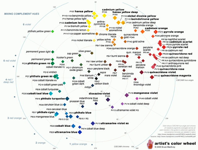
(If you don’t understand the Munsell system see the bottom of the article.)
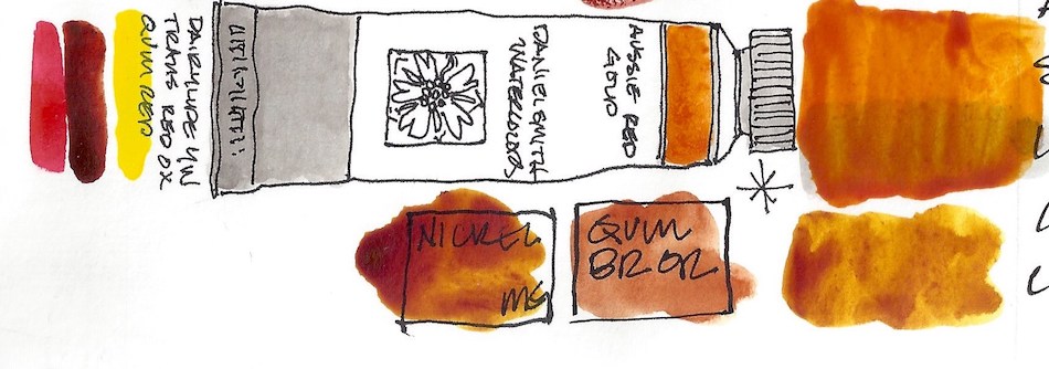
The colors I bought:
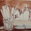
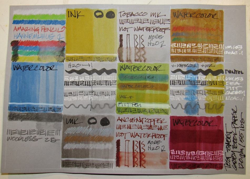
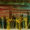
I tested them all over Noodler’s grey ink, to see the color shift over grisaille.
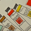
Reading the sides allows you to mix the paints if you prefer.
Also, you can get most of the info here by reading the paint tubes of artist grade paint.
In fact, one way to know that they are not artist grade is by the info on the tube.
 Verona Gold Ochre is made from Yellow Ochre PY43.
I like how transparent it is for an ocher! I own a sample of Ochre from QoR, above,
and it is very thick and muddy, as is raw ocher. I rarely use it because I love transparency in watercolors. Monte Amiata (a Primatek, Sienna PBr7) is quite close
(it is the long strip above the Verona Gold), and I think I like the Primatek a
bit more, but the test with this paint will be using it.
Note that Monte Amiata and Verona are different pigments : PBr7 versus PY43,
UPDATE: It is a color I won’t buy again. Just too *meh* for me, but for someone who paints golden fields far far away… Maybe.

Burnt Sienna Light is a keeper!
Made of Transparent Red Oxide PR101 + Quinacridone Gold PO48,
I love how it is both a deep hue and yet transparent.
BTW, Transparent Red Oxide; PR101 (the tiny vertical rust to the left)
is NOT transparent as far as I am concerned!
Some comparisons: Pompeii Red (made from Burnt Sienna PBr7) is an excellent comparison, but it is quite opaque, and so I like the Burnt Sienna Light better.
Terre Ercolano (Primatek, Raw Sienna PBr7) does not granulate quite as shown —
the scan was wonky — but I rarely use it because it is such a pale paint.
I may mix it with the Burnt Sienna Light.
 Aussie Red Gold is a lovely color, made from Diarylide Yellow PY83 +
Transparent Red Oxide; PR101 + Quinacridone Red PV19.
(I have shown M.Grahams which is PR209.)
M.Graham Nickel Quinacridone is the best comparison (Nickel Azo PO48 + Quinacridone Orange PY150), then DS Quinacridone Burnt Orange (Quinacridone Gold PO48).
M.Graham Indian Yellow (Isoindoline PY110) is a bit yellow.
If I were inclined to buy this color again
(I’m not as I use Holbein and DS Quin Gold all the time)
I’d replace M.Graham’s, only because of the drying time in the field.
Not a good buy… I bought it for the NAME!
UPDATE: I love this color!!!! It has an underlying brilliance none of the others have — I take it all back!
 Paynes Blue Grey is a keeper! Made with Indanthrone PB60 + Lamp Black PBk6, it is unnecessary — I mean, you cn add a bit of blue to Paynes Grey — BUT,
I will not bother to buy DS Paynes Grey again (Ultramarine Blue PB29 +
Ivory Black PBk9) because I like the smokey blue shadow color.
This will end up in two of my travel palettes.
 Okay, Quinacridone Lilac is just a sales snow job! It is Quinacridone Magenta PR122. Compare it to QoR’s Quinacridone Magenta PR122… same dang color!
 Rose Madder Permanent is a lovely color (Quinacridone Coral PR209 +
Quinacridone Red PV19 + Quinacridone Magenta PR202). These pinks are totally frivolous, but so pretty. To my eye this is not really a Rose Madder, as it is a bit bright — but on the plus side it is permanent, and true Rose Madder, like Opera Pink, is fugitive.
In my palette it is not close to any other color, and I am not inclined to mix pinks.
I admit to owning a dozen pink-coral colors and enjoy them all.
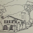
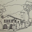
 I enjoy painting Victorian homes, or “Painted Ladies.” I have mixed quite a few of the Victorian paint colors in pans to carry with me, and this is one that I would keep. Lavender (made from Titanium White PW6 + Ultramarine Violet PV15 + Ultramarine Blue PB29) is close to Greenleaf & Blueberry’s Mayan Blue PB82. I love their paints, but they fill them to overflowing in the pan, and so I rarely use them — they are not convenient to my way of painting. I would probably buy this once every five years!
 Finally, Wisteria, made of Titanium White PW6 + Quinacridone Magenta PR122. Again, an excellent color for Painted Ladies and orchids and…
Not necessary, but quite pretty.
I do not think Daniel Smith is telling the truth about the pigments, however, because Quinacridone Magenta and White do not make this color…
There must be a blue in there! Just saying.
Keepers? Yes, a few…
But I would not have bought half of them
had I not been feverish!
☾
Note: To understand the initials after the colors you may need to read my post about learning not to buy unnecessary paints and how you can duplicate paints easily (different names for the same color), and eventually, you should visit and become familiar with handprint. I printed quite a bit of it so I can read in bed late at night… More info than you will ever need BUT dip into it and soon you will be amazed at how differently you look at your paints and make your choices. NOT while delirious in bed…
Here is another good article on palette, not color of paints!
 ☾
☾


©D. Katie Powell.
My images/blog posts may be reposted; please link back to dkatiepowellart.
☾
 As my Patreon supporter, you will have
access to some content not on this website,
sneak previews, goodies, discounts on classes.
I teach architectural sketching,
art journaling (art+writing), creativity, watercolors.
That annoying loud-mouth editor/critic in your head? GONE! How great would that be?
I'd love it if you shared this; please mention my blog name!


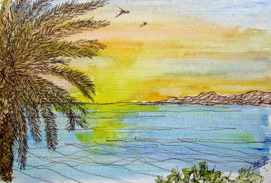
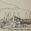
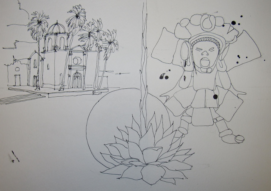
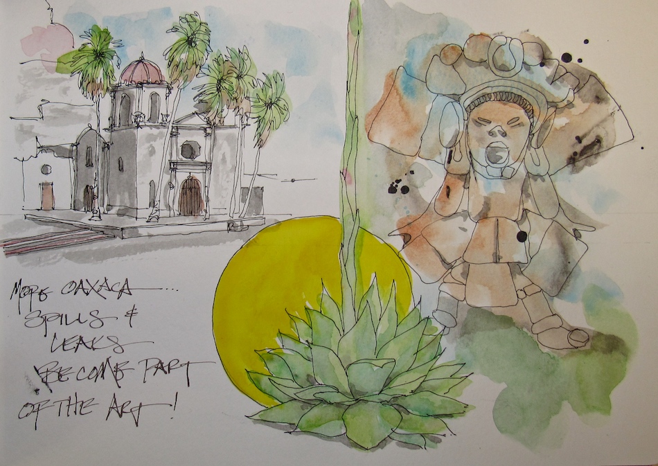
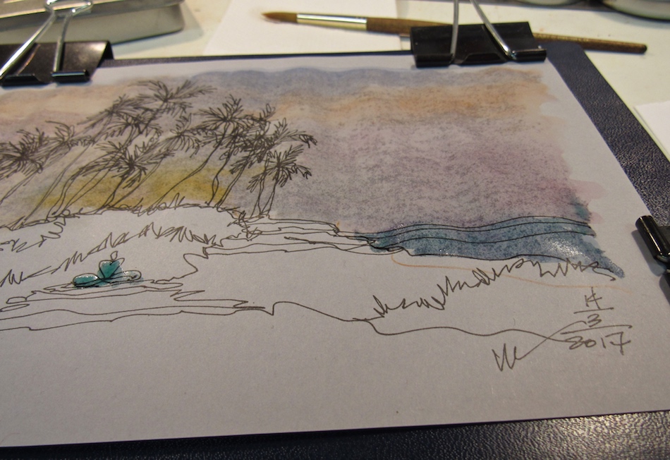
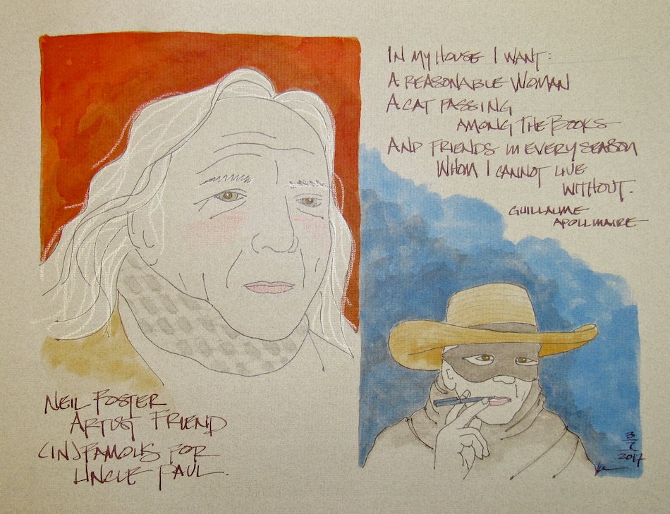
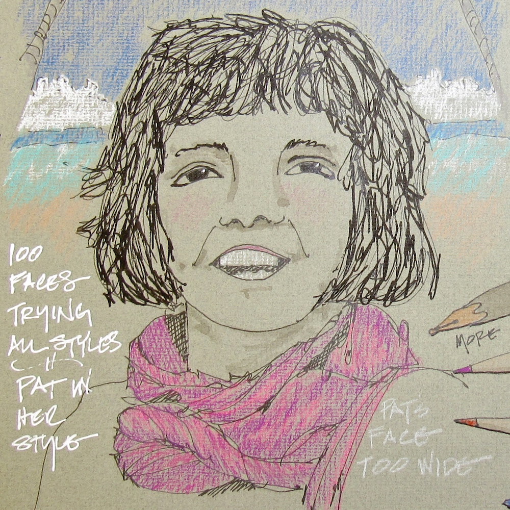
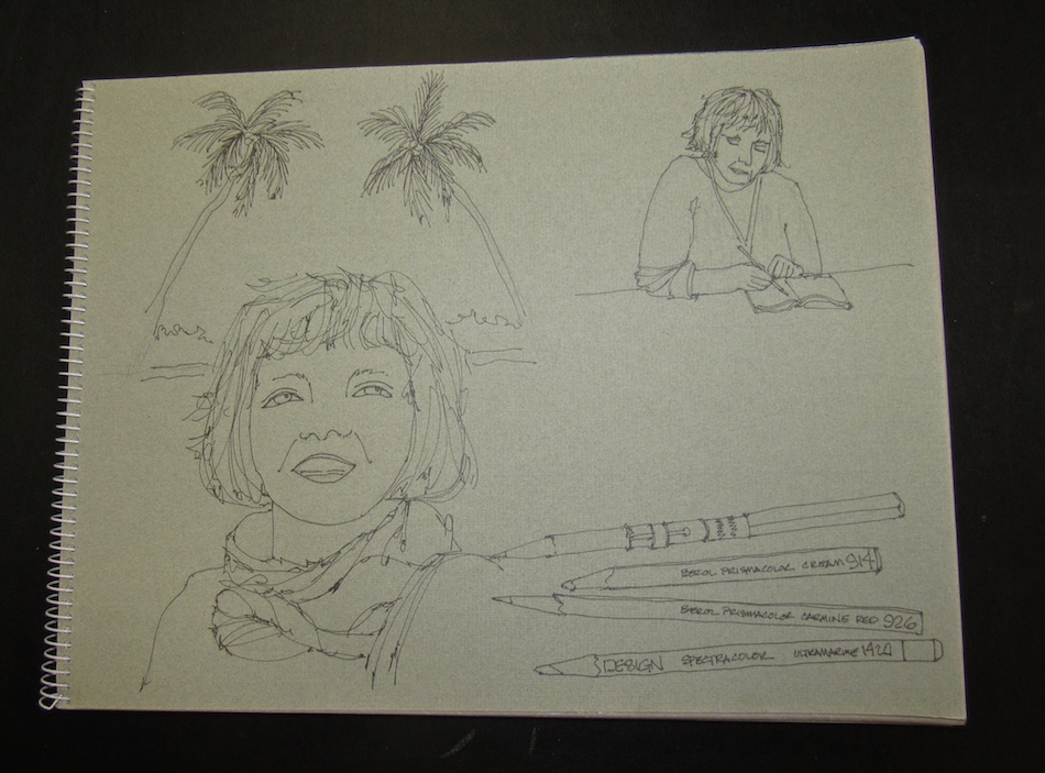
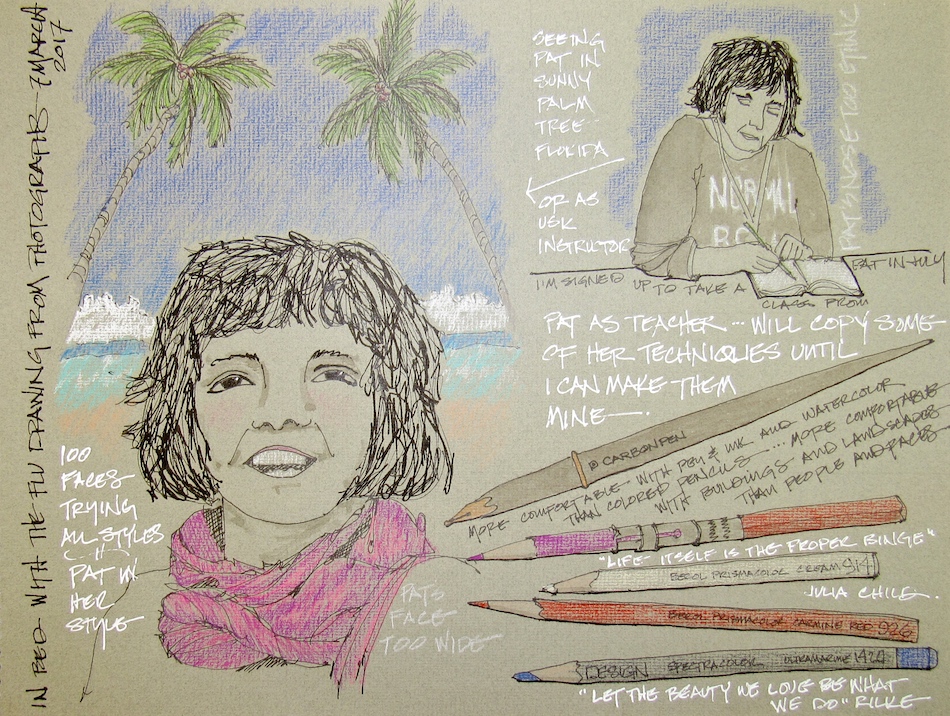
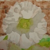
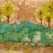
 Two versions of the exact same image — the top was a quick sketch with fat pens and bright colors experimenting. I make notes sometimes on “failures” to discuss it in my own journal and in my own head. I wasn’t paying attention and the fronds are not right —


 , which has a closed surface after it dries, meaning water won’t dissolve the dry paint.


WATWB: Roy DeLeon
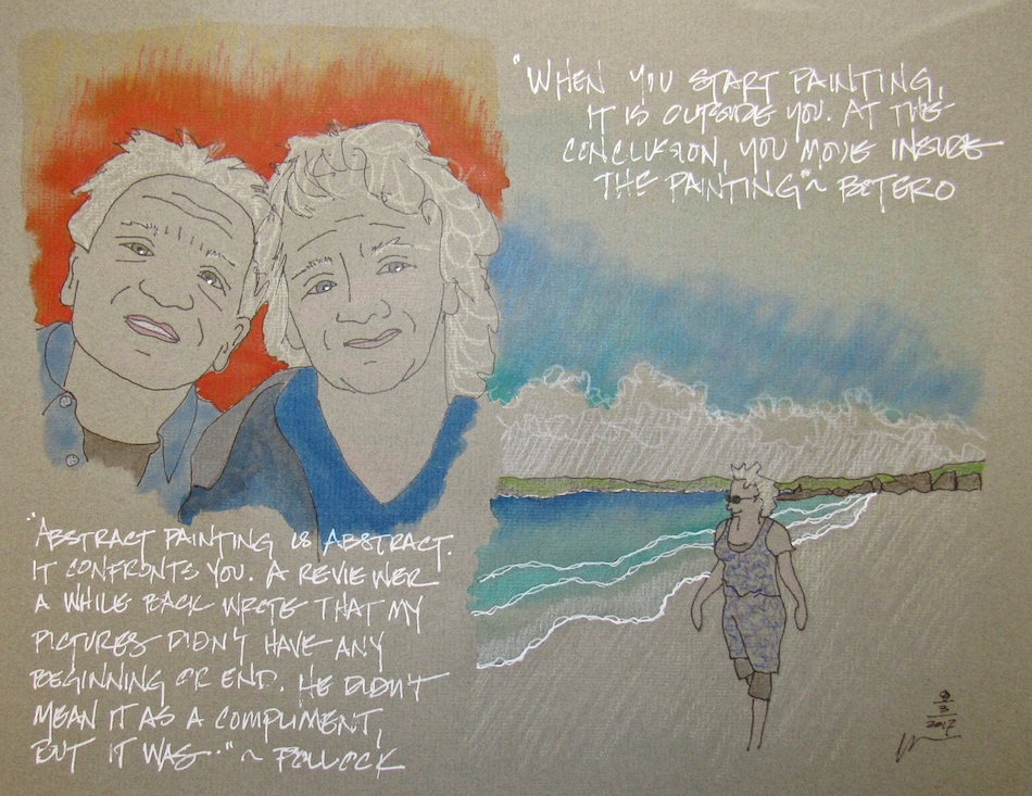
Roy DeLeon‘s stories are simple and mesmerizing, like a zen poem.
Simple truth, compassion, reflection.
His sketches are delightful.
They bring a smile to my face, even when they are dealing with sorrow,
because there is a message of compassion.
I can’t imagine a better artist to share for our first month of
We Are The World blogfest!
☾☾☾
Dark, frowning. Each step heavy. Instinctively, I breathed in, held it for a few secs,
then exhaled. And for the next few breaths until we passed each other, I inhaled as I imagined breathing in whatever was worrying her, whatever was burdening her.
Then I breathed out whatever will make her feel at peace and calm.
I hope it made her steps and her heart a little lighter.
☾
May we, during our dark hours, know that there’s always someone
praying for us or holding us in their heart without us knowing it.
Maybe even they don’t know they’re praying for you. Oremus.”
in the constant drip of rain
a daffodil sings”
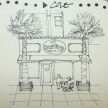
When I was done with my coffee and drawing, I nodded and smiled at
them as I handed them a few bills. At least as a thank you for being my
unwitting models for my drawing, which I also do for buskers.
☾
May donors and volunteers towards the end of hunger,
poverty and homelessness be doubly blessed by those they bless.”
Later, before we left, I asked if I can photograph her hands.
She asked: for real?
Me: of course.
She: I thought you were kidding.
(I got the vibes that her tats were not appreciated by some.)
And then she did this gesture.
On each of her 8 fingers was a calligraphic treatment of each letter spelling BONA FIDE. Latin for ‘in good faith.’ It also means genuine, authentic.
☾
Divine One,
Lead us from lies to truth,
From the fake to the authentic,
From meanness to kindness,
From fear into peace.
Peace. Peace. Peace.“
a guiding light in the dark
’til the morning light
☾
May we keep our light on for those lost in the darkness of or victimized by
fear, ignorance, lies, malice, unkindness, and hatred.“
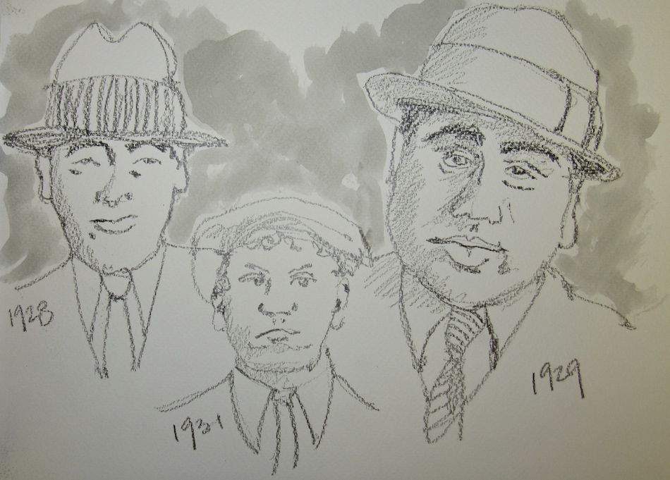
“As I drew this from a photo by the WPA photographer Dorothea Lange during
the depression in 1938, I felt the hot Texas sun on this lady’s skin and bones in
her tattered dress and pained expression. I felt the suffering, the injustice,
the violence of the widening divide between the haves and the have nots.
Sketching can be a powerful tool for meditation on compassion and loving-kindness.
☾
“If a free society cannot help the many who are poor,
it cannot save the few who are rich.”
~ John F. Kennedy
☾
May we help in anyway we can. Like the panhandler’s sign says: Anything helps.“
☾
WE ARE THE WORLD Linky List below to
join us and be visited on the last Friday when you post your article! Please help spread the word via
the hashtag #WATWB.
Click here to enter your link on this Linky Tools list…
☾
Sign up in the WE ARE THE WORLD Linky List below
if you want to join us and be visited on the 31st when you post your article!
Please help spread the word via the hashtag #WATWB.
Click here to enter your link and view this Linky Tools list… Powered by Linky Tools (BTW I am new to Linky so if there are problems please tell me!
☾
To hear about classes on art journaling,
follow me on Facebook!
☾
©D. Katie Powell.
My images/blog posts may be reposted; please link back to dkatiepowellart.
I'd love it if you shared this; please mention my blog name!